
- Latest SAPUI Version 1.124
- SAPUI5 Version 1.122
- SAPUI5 Version 1.120
- SAPUI5 Version 1.118
- SAPUI5 Version 1.116
- SAPUI5 Version 1.114
- SAPUI5 Version 1.112
- SAPUI5 Version 1.110
- SAPUI5 Version 1.108
- SAPUI5 Version 1.106
- SAPUI5 Version 1.104
- SAPUI5 Version 1.102
- SAPUI5 Version 1.100
- SAPUI5 Version 1.98
- SAPUI5 Version 1.96
- SAPUI5 Version 1.94
- SAPUI5 Version 1.92
- SAPUI5 Version 1.90
- SAPUI5 Version 1.88
- SAPUI5 Version 1.86
- SAPUI5 Version 1.84
- SAPUI5 Version 1.82
- SAPUI5 Version 1.80
- SAPUI5 Version 1.78
- SAPUI5 Version 1.74
- SAPUI5 Version 1.72
- SAPUI5 Version 1.70
- SAPUI5 Version 1.68
- SAPUI5 Version 1.66
- SAPUI5 Version 1.64
- SAPUI5 Version 1.62
- SAPUI5 Version 1.60
- SAPUI5 Version 1.58
- SAPUI5 Version 1.56
- SAPUI5 Version 1.54
- SAPUI5 Version 1.52
- SAPUI5 Version 1.50
- SAPUI5 Version 1.48
- SAPUI5 Version 1.46
- SAPUI5 Version 1.44
- SAPUI5 Version 1.42
- SAPUI5 Version 1.40
- SAPUI5 Version 1.38
- SAPUI5 Version 1.36
- SAPUI5 Version 1.34
- SAPUI5 Version 1.32
- SAPUI5 Version 1.30
- SAPUI5 Version 1.28
- SAPUI5 Version 1.26
- Latest SAPUI Version 1.124
- SAPUI5 Version 1.122
- SAPUI5 Version 1.120
- SAPUI5 Version 1.118
- SAPUI5 Version 1.116
- SAPUI5 Version 1.114
- SAPUI5 Version 1.112
- SAPUI5 Version 1.110
- SAPUI5 Version 1.108
- SAPUI5 Version 1.106
- SAPUI5 Version 1.104
- SAPUI5 Version 1.102
- SAPUI5 Version 1.100
- SAPUI5 Version 1.98
- SAPUI5 Version 1.96
- SAPUI5 Version 1.94
- SAPUI5 Version 1.92
- SAPUI5 Version 1.90
- SAPUI5 Version 1.88
- SAPUI5 Version 1.86
- SAPUI5 Version 1.84
- SAPUI5 Version 1.82
- SAPUI5 Version 1.80
- SAPUI5 Version 1.78
- SAPUI5 Version 1.76
- SAPUI5 Version 1.74
- SAPUI5 Version 1.72
- SAPUI5 Version 1.70
- SAPUI5 Version 1.68
- SAPUI5 Version 1.66
- SAPUI5 Version 1.64
- SAPUI5 Version 1.62
- SAPUI5 Version 1.60
- SAPUI5 Version 1.58
- SAPUI5 Version 1.56
- SAPUI5 Version 1.54
- SAPUI5 Version 1.52
- SAPUI5 Version 1.50
- SAPUI5 Version 1.48
- SAPUI5 Version 1.46
- SAPUI5 Version 1.44
- SAPUI5 Version 1.42
- SAPUI5 Version 1.40
- SAPUI5 Version 1.38
- SAPUI5 Version 1.36
- SAPUI5 Version 1.34
- SAPUI5 Version 1.32
- SAPUI5 Version 1.30
- SAPUI5 Version 1.28
- SAPUI5 Version 1.26
Object Display Components
sap.m.ObjectStatus | sap.m.ObjectIdentifier | sap.m.ObjectNumber | sap.m.ObjectMarker (since 1.38)
Intro
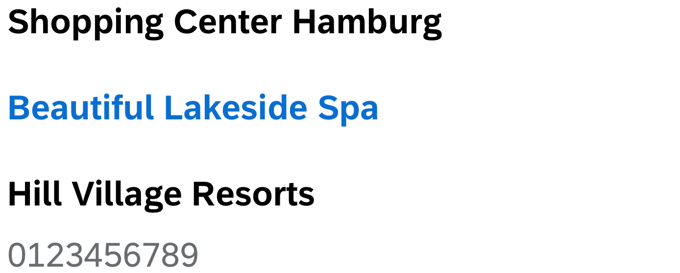
There are four types of object display components: object status, object identifier, object number, and object marker. Each one is connected to an object and displays a certain type of information (status, identifier, number, marker).
- Object status: a short text that represents the semantic status of an object
- Object identifier: a short text that represents the key identifier of an object
- Object number: a short text that represents the numeric (key) attribute of an object and its unit
- Object marker: indicates the technical status of an object
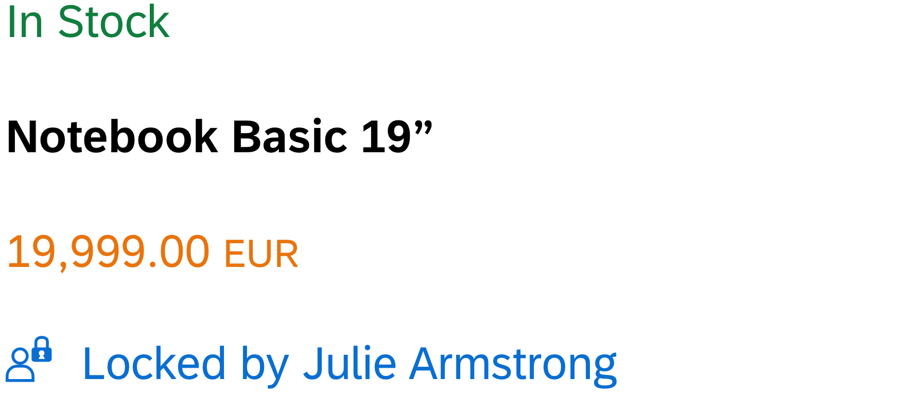
From top to bottom: exemplary object status, object identifier, object number, and object marker
Usage
Use the object display components if:
- You need to display the semantic status of an object: negative, critical, positive, or neutral. Use the object status for this.
- You want to display the key number of an object. In this case, use the object number and keep the default emphasized setting.
- You need to display one or more numeric attributes of an object (for example, for objects you want to compare). Use the object number for this.
- You want to indicate the key identifier of the object. Use the object identifier for this.
- You want to display the technical state of an object (draft, unsaved changes, locked, favorite, flagged). Use the object marker for this, unless you want to display the status of the object in the business life cycle. In the latter case, consider using the object status instead.
- You need to show that the current object instance is locked by another user. Use the object marker for this.
Do not use the object display components if:
- You want to display system messages.
- They are for decoration purposes only.
Responsiveness
- The object status wraps if it is longer than the available screen width.
- The object identifier text wraps if the size of the screen becomes too small to display the entire text on one line.
- The object number does not wrap or truncate. For large numbers, you need to consider using the appropriate formatting.
- The object marker does not wrap or truncate. It comes with different display options:
IconAndText,IconOnlyandText. On size S, the display optionIconAndTextonly displays the icon due to lack of space. The other options are displayed as normal.
For more information about the responsive behavior of text in general, see Wrapping and Truncating Text.
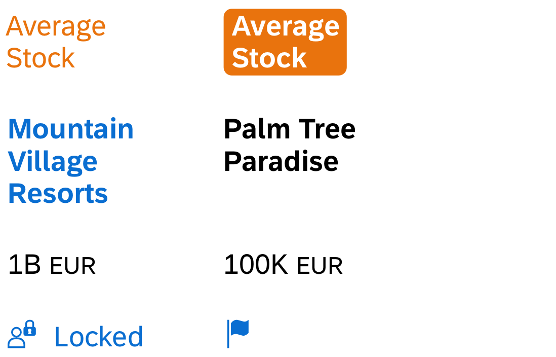
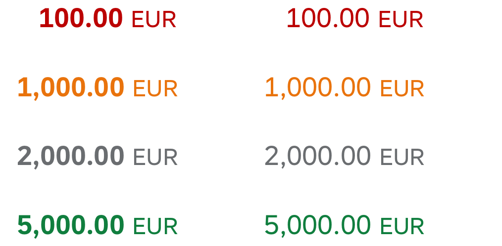
From top to bottom: Wrapping examples for the object status, object identifier, formatted object number, and two versions of the object marker
Components
Object Status
The object status is a short text that represents the semantic status of an object.
It consists of the following:
- A semantically colored text indicating its status (property:
text). We recommend using this semantically colored text-only option on its own. Check out the How to Use Semantic Colors / Industry-Specific Colors article for color options. - An optional icon (property:
icon). If you need to have an icon, use one of the following:
= positive/success
= critical/warning
= negative/error
Note that there is no generic icon for “neutral” across industries. If you have a neutral object status, use the text-only version, a blank icon, or an icon that means neutral in the app’s specific business context.
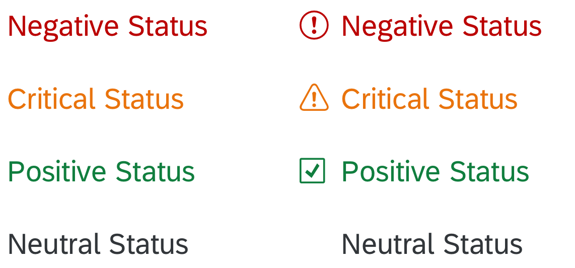
Text-only object status and icon with text object status
- An optional inverted visualization. Use the inverted object status if the information is crucial for the user’s actions and needs to stand out visually (for example, in table list items).
- An optional link (property:
active). If the object status is used as a link, a hover effect is shown on non-touch devices. Use this feature if the user needs additional information about the status (for example, in a popover). Note that if you use the object status as a combination of icon and text, there is no hover effect for the icon.
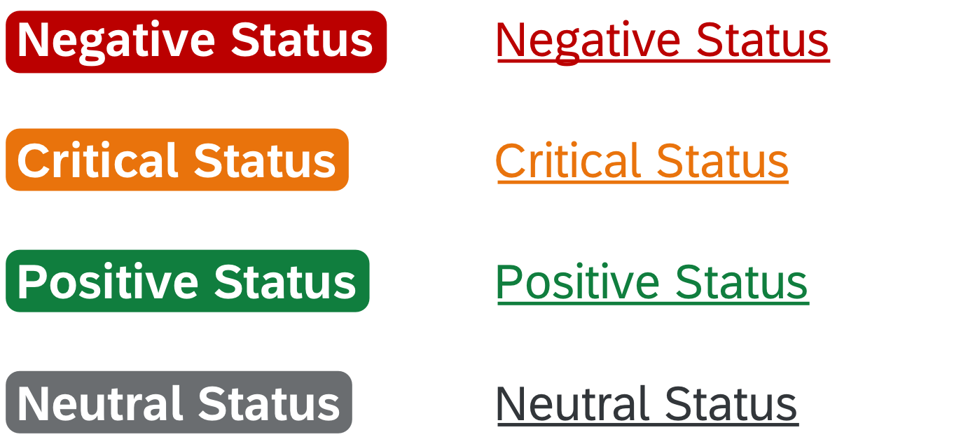
Inverted object status (left) and object status in hover state (right)
- An optional larger font (CSS class: sapMObjectStatusLarge). Use this feature if the object status is important in the business context and needs to stand out visually in the page header (for example, key value facets in an object page).

Larger object status
Object Identifier
The object identifier is a short text that represents the key identifier of an object.
It has the following characteristics:
- A title text (property:
title) - An optional link (property:
titleActive). In this case, the event can open the quick view of the object or a popover for example. - An optional additional descriptive text (property:
text)
Normal object identifier, object identifier with link, and object identifier with descriptive text
Object Number
The object number is a short text that represents the numeric (key) attribute of an object and its unit.
It consists of the following:
- A colored text (property:
number) based on the semantic color palette. Check out the How to Use Semantic Colors / Industry-Specific Colors article for more details. - An emphasized text which you can set to non-emphasized when you use it in the content area (property:
emphasized). - An optional unit (property:
unit).
Emphasized and non-emphasised object numbers
Object number used as a semantic attribute (weight)
- An optional larger font (CSS class: sapMObjectNumberLarge). Use this feature if the object number is important in the business context and needs to stand out visually in the page header (for example, key value facets in an object page). Once the large font is applied, the object number can no longer be emphasized.
Emphasized and non-emphasized object numbers
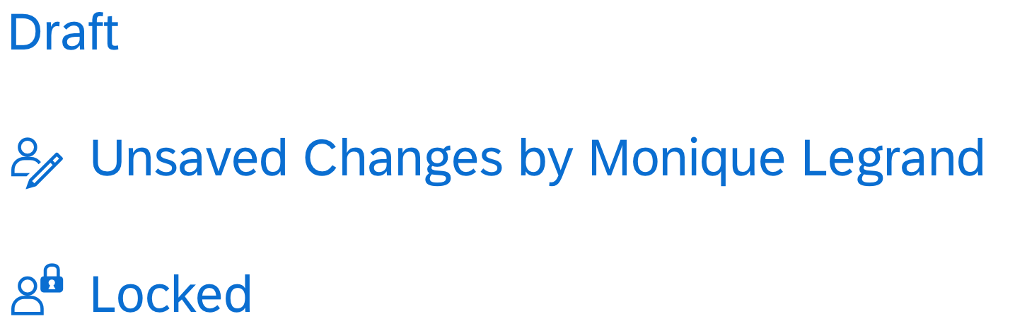
Object Marker
The object marker indicates the technical status of an object and can be interactive. It is enabled for the dynamic page layout, snapping header, object page header, upload collection, and object list item. The technical status can be represented as an icon, with an icon and text, or as text only, depending on the screen size.
Currently, the following technical statuses can be visualized by the object marker:
- Editing Status: Draft, Unsaved Changes, Locked. The editing status is part of the draft handling concept.
- Favorite
- Flag
Flag and Favorite are usually displayed as icons on all screen sizes. For more information, see Flag and Favorite.
An object can have multiple technical statuses at the same time. However, because the editing statuses are mutually exclusive, users will see a maximum of 3 technical statuses for an object: Flag, Favorite, and one Editing Status.

Icons for draft, unsaved changes, locked, favorite, and flag (from left to right)
Editing status examples
Resources
Want to dive deeper? Follow the links below to find out more about related controls, the SAPUI5 implementation, and the visual design.
Elements and Controls
- How to Use Semantic Colors (guidelines)
- Wrapping and Truncating Text (guidelines)
- Draft Handling (guidelines)
- Flag and Favorite (guidelines)
- Responsible Table (guidelines)
Implementation
- Object Status (SAPUI5 samples)
- Object Status (SAPUI5 API reference)
- Object Identifier (SAPUI5 samples)
- Object Identifier (SAPUI5 API reference)
- Object Number (SAPUI5 samples)
- Object Number (SAPUI5 API reference)
- Object Marker (SAPUI5 samples)
- Object Marker (SAPUI5 API reference)
 Your feedback has been sent to the SAP Fiori design team.