
- Latest SAPUI Version 1.124
- SAPUI5 Version 1.122
- SAPUI5 Version 1.120
- SAPUI5 Version 1.118
- SAPUI5 Version 1.116
- SAPUI5 Version 1.114
- SAPUI5 Version 1.112
- SAPUI5 Version 1.110
- SAPUI5 Version 1.108
- SAPUI5 Version 1.106
- SAPUI5 Version 1.104
- SAPUI5 Version 1.102
- SAPUI5 Version 1.100
- SAPUI5 Version 1.98
- SAPUI5 Version 1.96
- SAPUI5 Version 1.94
- SAPUI5 Version 1.92
- SAPUI5 Version 1.90
- SAPUI5 Version 1.88
- SAPUI5 Version 1.86
- SAPUI5 Version 1.84
- SAPUI5 Version 1.82
- SAPUI5 Version 1.80
- SAPUI5 Version 1.78
- SAPUI5 Version 1.76
- SAPUI5 Version 1.74
- SAPUI5 Version 1.72
- SAPUI5 Version 1.70
- SAPUI5 Version 1.68
- SAPUI5 Version 1.66
- SAPUI5 Version 1.64
- SAPUI5 Version 1.62
- SAPUI5 Version 1.60
- SAPUI5 Version 1.58
- SAPUI5 Version 1.56
- SAPUI5 Version 1.54
- SAPUI5 Version 1.52
- SAPUI5 Version 1.50
- SAPUI5 Version 1.48
- SAPUI5 Version 1.46
- SAPUI5 Version 1.44
- SAPUI5 Version 1.40
- SAPUI5 Version 1.38
- SAPUI5 Version 1.36
- SAPUI5 Version 1.34
- SAPUI5 Version 1.32
- SAPUI5 Version 1.30
- SAPUI5 Version 1.28
- SAPUI5 Version 1.26
- Latest SAPUI Version 1.124
- SAPUI5 Version 1.122
- SAPUI5 Version 1.120
- SAPUI5 Version 1.118
- SAPUI5 Version 1.116
- SAPUI5 Version 1.114
- SAPUI5 Version 1.112
- SAPUI5 Version 1.110
- SAPUI5 Version 1.108
- SAPUI5 Version 1.106
- SAPUI5 Version 1.104
- SAPUI5 Version 1.102
- SAPUI5 Version 1.100
- SAPUI5 Version 1.98
- SAPUI5 Version 1.96
- SAPUI5 Version 1.94
- SAPUI5 Version 1.92
- SAPUI5 Version 1.90
- SAPUI5 Version 1.88
- SAPUI5 Version 1.86
- SAPUI5 Version 1.84
- SAPUI5 Version 1.82
- SAPUI5 Version 1.80
- SAPUI5 Version 1.78
- SAPUI5 Version 1.76
- SAPUI5 Version 1.74
- SAPUI5 Version 1.72
- SAPUI5 Version 1.70
- SAPUI5 Version 1.68
- SAPUI5 Version 1.66
- SAPUI5 Version 1.64
- SAPUI5 Version 1.62
- SAPUI5 Version 1.60
- SAPUI5 Version 1.58
- SAPUI5 Version 1.56
- SAPUI5 Version 1.54
- SAPUI5 Version 1.52
- SAPUI5 Version 1.50
- SAPUI5 Version 1.48
- SAPUI5 Version 1.46
- SAPUI5 Version 1.44
- SAPUI5 Version 1.42
- SAPUI5 Version 1.40
- SAPUI5 Version 1.38
- SAPUI5 Version 1.36
- SAPUI5 Version 1.34
- SAPUI5 Version 1.32
- SAPUI5 Version 1.30
- SAPUI5 Version 1.28
- SAPUI5 Version 1.26
Object Display Components
sap.m.ObjectStatus | sap.m.ObjectIdentifier | sap.m.ObjectNumber | sap.m.ObjectMarker (since 1.38)
Intro
There are four types of object display component: object status, object identifier, object number and object marker.
Object Status
The object status is a short text that represents the semantic status of an object. It has a semantic color and an optional icon. As such, you can generally find the object status in the object header and in the table as a status attribute of a line item.
Object Identifier
The object identifier is a short text that represents the key identifier of an object.
You can find the object identifier in a table as an identifier of the line item.
Object Number
The object number is a short text that represents the numeric (key) attribute of an object and its unit. The number has a semantic color, and the unit inherits the same color from its number. The number can be emphasized (default setting) when it is used for the key attribute, and non-emphasized when it is used for any other numeric attribute of the item.
The object number is generally used to indicate the key attribute of an object in the object header, and as an attribute of a line item in a table.
The object marker allows you to express the technical status of an object.
The technical status can be represented as icon, icon and text, or as text only, depending on the screen size. See the guidelines section below to find out when to use which visibility option.
Currently, the following technical statuses can be visualized by the object marker:
- Flag
- Favorite
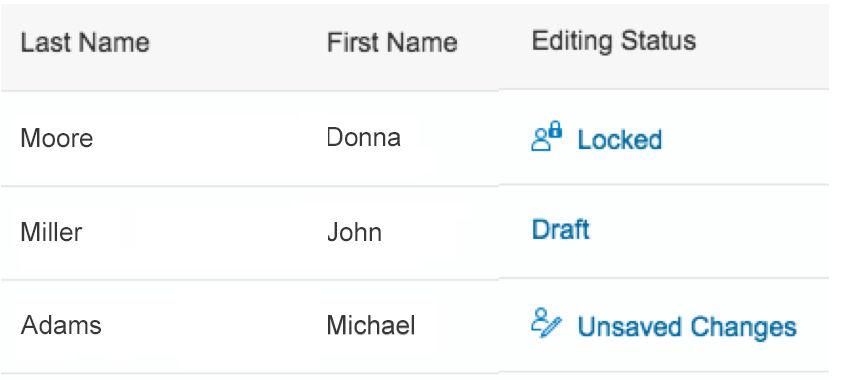
- Editing Status (Draft, Locked, Unsaved Changes)
Usage
Use the object status if:
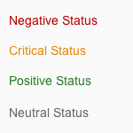
- You need to display the semantic status of an object: negative (property: error), critical (property: warning), positive (property: success), or neutral (property: none).
- You need to show that the current object instance is locked by another user.
Use the object number if:
- You want to display the key attribute of an object. In this case, keep the emphasized default setting (property: emphasized).
- You need to display one or more numeric attributes of an object that, for example, you want to compare (property: emphasized set to “false”).
Use the object identifier if:
- You want to indicate the key identifier of the object.
Use the object marker if:
- You want to display the technical state (locked, draft, unsaved changes, favorite, flagged) of an object. If you want to display the status of the object in the business lifecycle, consider using the object status display component instead.
Do not use an object display components if:
- You want to display system messages.
- They are for decoration purposes only.
Responsiveness
- The object status wraps if it is too long for the screen width available.
- The object identifier text wraps if the size of the screen becomes too small to display the entire text on one line.
- The object number does not wrap or truncate. For large numbers, you need to consider using the appropriate formatting.
- The object marker does not wrap or truncate. It comes with different display options. Depending on the screen size and the selected visibility option the object marker behaves as follows:
- On L/M size:
- If the visibility is set to IconAndText is selected, both are displayed.
- If the visibility is set to IconOnly is selected, only the icon is displayed.
- If the visibility is set to Text is selected, only the text is displayed.
- On S size:
- If the visibility is set to IconAndText is available, only the icon is displayed.
- If the visibility is set to Icon is available, only the icon is displayed.
- If the visibility is set to Text is available, only the text is displayed.
- On L/M size:
Components
Object Status
The object status consists of the following:
- A semantically colored text (property: text)
- An optional icon (property: icon)
- A title that serves as a label (property: title)
It is mainly used with semantically-colored text only.
Semantic colors for object status
Object Identifier
The object identifier has the following properties:
- A title text (property: title)
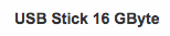
Object identifier – Text only
- An optional additional descriptive text (property: text)
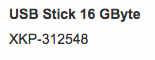
Object identifier – With subtitle
- The title can be set to active. In this case, it looks like a link and can fire an event (property: titleActive).

Object identifier – Actionable
- Both texts wrap if the space available is insufficient to fit each of them on one line.
Object identifier – Long texts wrap
Object Number
The object number consists of the following:
- A semantically-colored text (property: number), which can be set to non-emphasized when used in the content area (property: emphasized)
- An optional unit (property: unit)
Object numbers
Object Marker
The object marker comes with the following characteristics:
- Icon only (visibility: IconOnly)
- Text only (visibility: TextOnly)
- Icon and text (visibility: IconAndText)
- Interactive
- Non-interactive
The object marker is able to fire an an event when it is pressed (interactive). If the control is interactive and displayed as icon with text, the icon and text are one click area.

Draft

Favorite

Flagged

Unsaved changes

Locked
Guidelines
Object Status
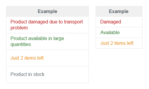
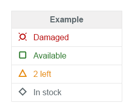
- Use semantic text only, and avoid using it with an icon.
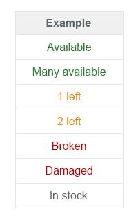
- Use the following semantics to indicate the status: negative (property: error), critical (property: warning), positive (property: success), and neutral (property: none).

Preferably use semantic text only
- Only use icons if they are unambiguous and easily understood (such as a padlock for locked items). If you feel your icon would need a descriptive text to be understood, use text only.
- For locked items, you may also add information about who is currently locking the item.

Status locked
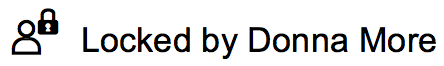
Status locked by a certain user
- Do not use the title of the object status outside the object header. Even though the title and the status text wrap, keep them both as short as possible.
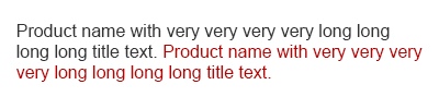
Avoid long titles and long text where possible
- When used in a table, center one-word information and icons. For the responsive table only, if status information is displayed as secondary information in a column, the status should follow the alignment of the main information.
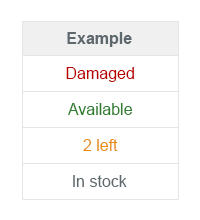
Object Status in table with one-word center-aligned
- Left-align the whole column if there is at least one status with more than two words in English.
Object Status in table with more than two words
-
Left-align status information containing an icon and a text.
Object Status in table with text and icon
- Ascending tables should be sorted from positive to negative, with neutral last.
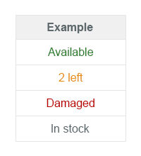
Sort - Ascending: From positive to negative
-
Descending tables should be sorted from negative to positive, with neutral first.
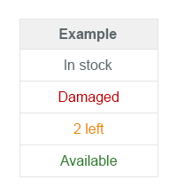
Sort - Descending: From negative to positive
-
Ascending tables should be sorted alphabetically within the states (from positive to negative, with neutral last).
Sort - Ascending alphabetically: From positive to negative
-
Descending tables should be sorted alphabetically within the states (from negative to positive, with neutral first).

Sort - Descending alphabetically: From negative to positive
Object Identifier
- The object identifier should be easily readable (preferably the display text and not the ID). If the ID is necessary to distinguish between items that use the same title, it should appear in brackets, such as Product ABC (1234567). The decision to include the ID in the text property can also depend on how long you expect the text to be.
- The object identifier can also be shown as a link. In this case, the event opens the quick view of the object.
Object Number
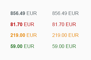
- Use the following semantics to indicate the status: negative (property: error), critical (property: warning), positive (property: success), and neutral (property: none).
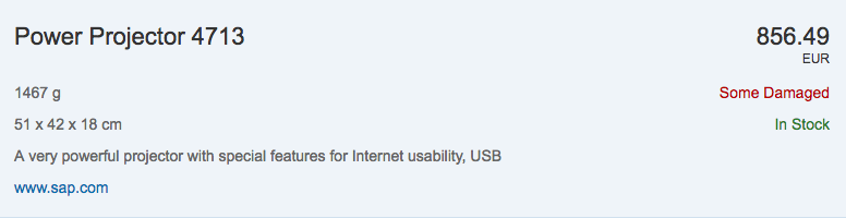
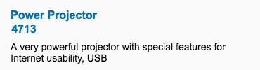
Neutral object number (856.49 EUR) used as a key attribute in the object header
- If the object number is the key attribute of the object inside the content area, the number should be emphasized when it is used as a line item status in a table.

Object number with key attribute
- The object number can also be used to visualize other semantic numeric attributes. In this case, they are not emphasized unless they are the key attribute, such as a sum.
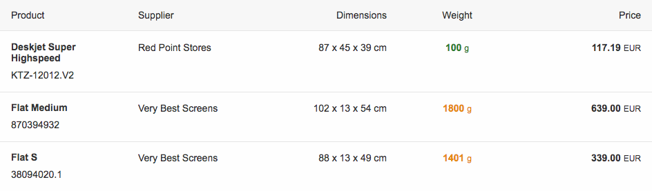
Object number used as an attribute (weight) and as a key attribute (price)
Object Marker
An object might contain multiple technical statuses at the same time. However, the editing statuses are mutually exclusive. As a result, an object can have a maximum of 3 technical status visible on the screen: Flag, Favorite and one Editing Status. The app developer is responsible for the technical statuses.
Every technical status has a default visualization that can be changed by the app developer depending on the usage context. See also “How to display the editing state” in the draft handling article.
Flag and Favorite are usually displayed as icon. The same applies to all screen sizes.
The default behavior for the editing status is as follows:
On L/M size:
- Locked and Unsaved Changes are displayed as icon and text, while Draft is displayed as text.
- Flag and Favorite are displayed as icons.
On S size:
- Locked and Unsaved Changes are displayed as icon, while Draft is displayed as text.
- Flag and Favorite are displayed as icons.
Object marker
Resources
Want to dive deeper? Follow the links below to find out more about related controls, the SAPUI5 implementation, and the visual design.
Elements and Controls
- No link
Implementation
- Object Status (SAPUI5 samples)
- Object Status (SAPUI5 API reference)
- Object Identifier (SAPUI5 samples)
- Object Identifier (SAPUI5 API reference)
- Object Number (SAPUI5 samples)
- Object Number (SAPUI5 API reference)
- Object Number (SAPUI5 samples)
 Your feedback has been sent to the SAP Fiori design team.