
- Latest SAPUI Version 1.124
- SAPUI5 Version 1.122
- SAPUI5 Version 1.120
- SAPUI5 Version 1.118
- SAPUI5 Version 1.116
- SAPUI5 Version 1.114
- SAPUI5 Version 1.112
- SAPUI5 Version 1.110
- SAPUI5 Version 1.108
- SAPUI5 Version 1.106
- SAPUI5 Version 1.104
- SAPUI5 Version 1.102
- SAPUI5 Version 1.100
- SAPUI5 Version 1.98
- SAPUI5 Version 1.96
- SAPUI5 Version 1.94
- SAPUI5 Version 1.92
- SAPUI5 Version 1.90
- SAPUI5 Version 1.88
- SAPUI5 Version 1.86
- SAPUI5 Version 1.84
- SAPUI5 Version 1.82
- SAPUI5 Version 1.80
- SAPUI5 Version 1.78
- SAPUI5 Version 1.74
- SAPUI5 Version 1.72
- SAPUI5 Version 1.70
- SAPUI5 Version 1.68
- SAPUI5 Version 1.66
- SAPUI5 Version 1.64
- SAPUI5 Version 1.62
- SAPUI5 Version 1.60
- SAPUI5 Version 1.58
- SAPUI5 Version 1.56
- SAPUI5 Version 1.54
- SAPUI5 Version 1.52
- SAPUI5 Version 1.50
- SAPUI5 Version 1.48
- SAPUI5 Version 1.46
- SAPUI5 Version 1.44
- SAPUI5 Version 1.42
- SAPUI5 Version 1.40
- SAPUI5 Version 1.38
- SAPUI5 Version 1.36
- SAPUI5 Version 1.34
- SAPUI5 Version 1.32
- SAPUI5 Version 1.30
- SAPUI5 Version 1.28
- SAPUI5 Version 1.26
- Latest SAPUI Version 1.124
- SAPUI5 Version 1.122
- SAPUI5 Version 1.120
- SAPUI5 Version 1.118
- SAPUI5 Version 1.116
- SAPUI5 Version 1.114
- SAPUI5 Version 1.112
- SAPUI5 Version 1.110
- SAPUI5 Version 1.108
- SAPUI5 Version 1.106
- SAPUI5 Version 1.104
- SAPUI5 Version 1.102
- SAPUI5 Version 1.100
- SAPUI5 Version 1.98
- SAPUI5 Version 1.96
- SAPUI5 Version 1.94
- SAPUI5 Version 1.92
- SAPUI5 Version 1.90
- SAPUI5 Version 1.88
- SAPUI5 Version 1.86
- SAPUI5 Version 1.84
- SAPUI5 Version 1.82
- SAPUI5 Version 1.80
- SAPUI5 Version 1.78
- SAPUI5 Version 1.76
- SAPUI5 Version 1.74
- SAPUI5 Version 1.72
- SAPUI5 Version 1.70
- SAPUI5 Version 1.68
- SAPUI5 Version 1.66
- SAPUI5 Version 1.64
- SAPUI5 Version 1.62
- SAPUI5 Version 1.60
- SAPUI5 Version 1.58
- SAPUI5 Version 1.56
- SAPUI5 Version 1.54
- SAPUI5 Version 1.52
- SAPUI5 Version 1.50
- SAPUI5 Version 1.48
- SAPUI5 Version 1.46
- SAPUI5 Version 1.44
- SAPUI5 Version 1.42
- SAPUI5 Version 1.40
- SAPUI5 Version 1.38
- SAPUI5 Version 1.36
- SAPUI5 Version 1.34
- SAPUI5 Version 1.32
- SAPUI5 Version 1.30
- SAPUI5 Version 1.28
- SAPUI5 Version 1.26
SAP Fiori Launchpad Spaces
Intro
With SAPUI5 1.75, we introduced SAP Fiori launchpad spaces in parallel to the launchpad home page. Users can switch between the two with the user actions menu.
A space and its pages structure the most relevant apps for users with a certain business role. The content of a space is visualized by tiles that allow users to quickly launch apps to access the business content they need to complete their tasks.
Users can personalize the pages by renaming sections, adding and removing apps, or bundling them in groups.
SAP Fiori launchpad spaces must be used for all SAP Fiori apps.
Responsiveness
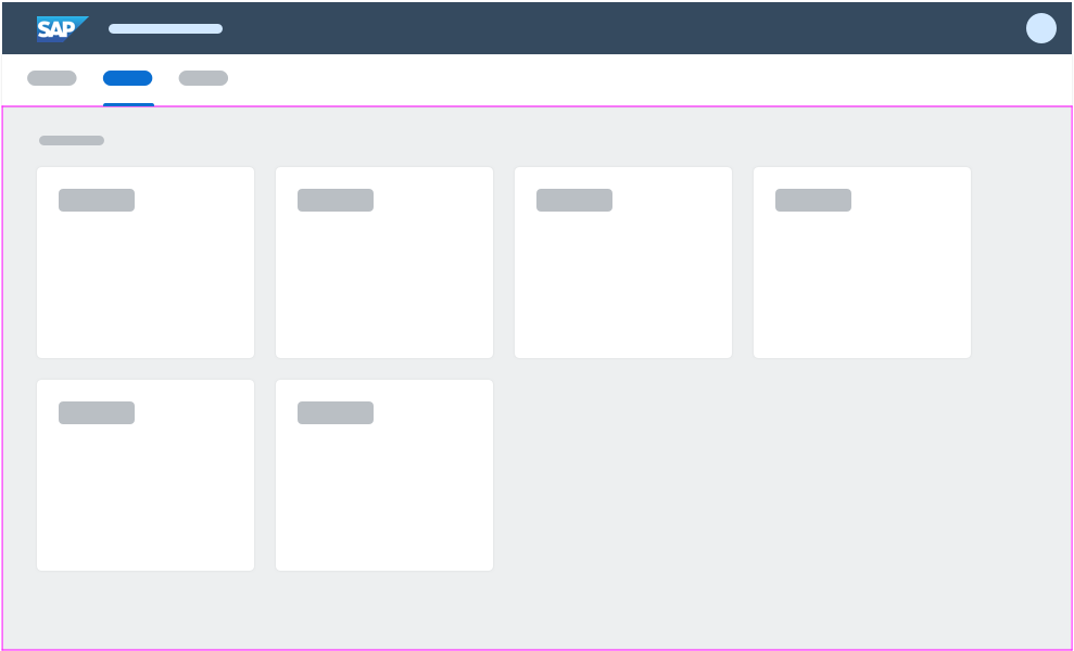
SAP Fiori launchpad spaces are fully responsive. For smaller screens, the tiles are smaller so that at least two tiles can be shown side by side.
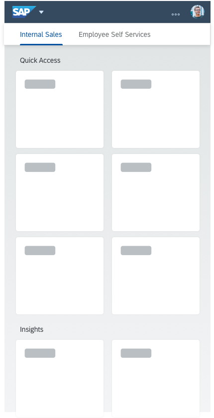
Launchpad spaces - Size S

Launchpad spaces - Size L
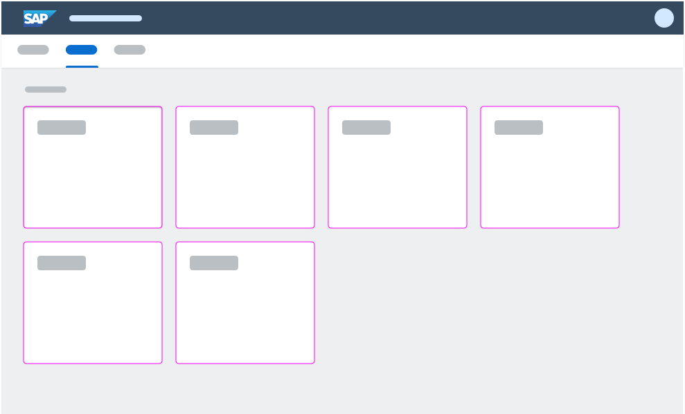
Components
The following overview explains the concept of spaces and its pages.
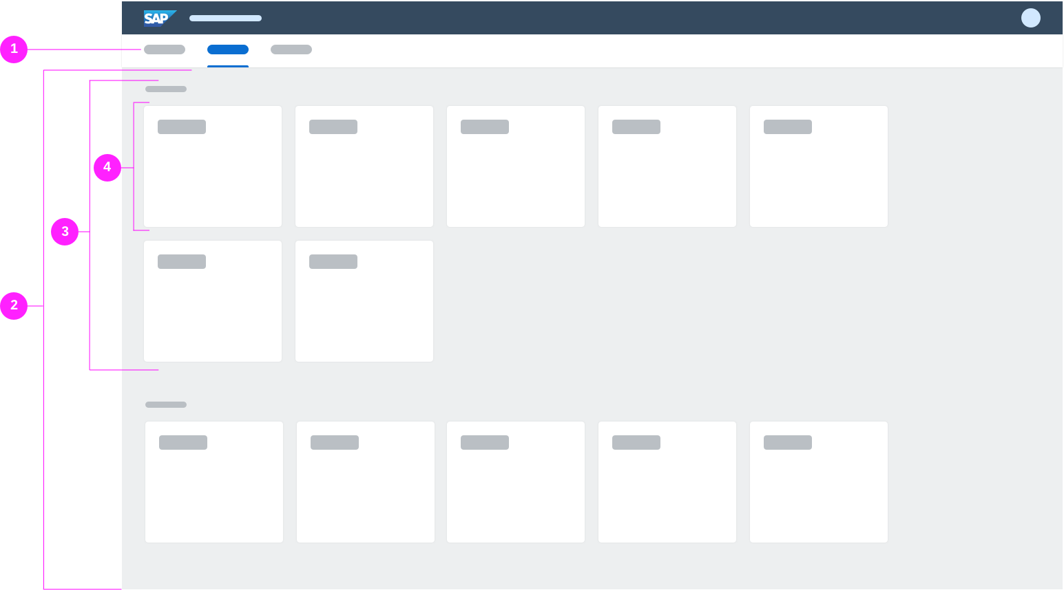
Fiori launchpad spaces - components - overview
(1) Top-level navigation where the space is visually represented as a navigation item
(2) One page per space
(3) Sections on a page
(4) Tiles in a section
Top-Level Navigation
The top-level navigation is part of a space. It gives users access to all spaces and pages that they are assigned to, and enables users to navigate between them. An entry in the top-level navigation indicates a space. By selecting a space, users can access the page belonging to the space.
The top-level navigation is part of a space. It gives users access to all spaces and pages that they are assigned to, and enables users to navigate between those. An entry in the top-level navigation indicates a space. By selecting a space, users can access the page belonging to the space.
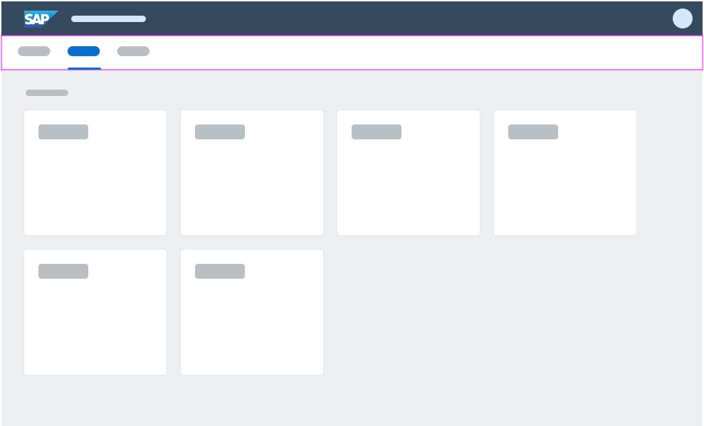
Top-level navigation
Spaces
A space serves as an entry point for a business role and shows information and functions that are assigned to this business role. A space is represented as a navigation item in the top-level navigation. A user may have multiple spaces assigned, which results in multiple entries in the top-level navigation. A space consists of exactly one page.
A space title is mandatory. Do not use the business role name as a space title. Use the name of the work area for a business role instead.
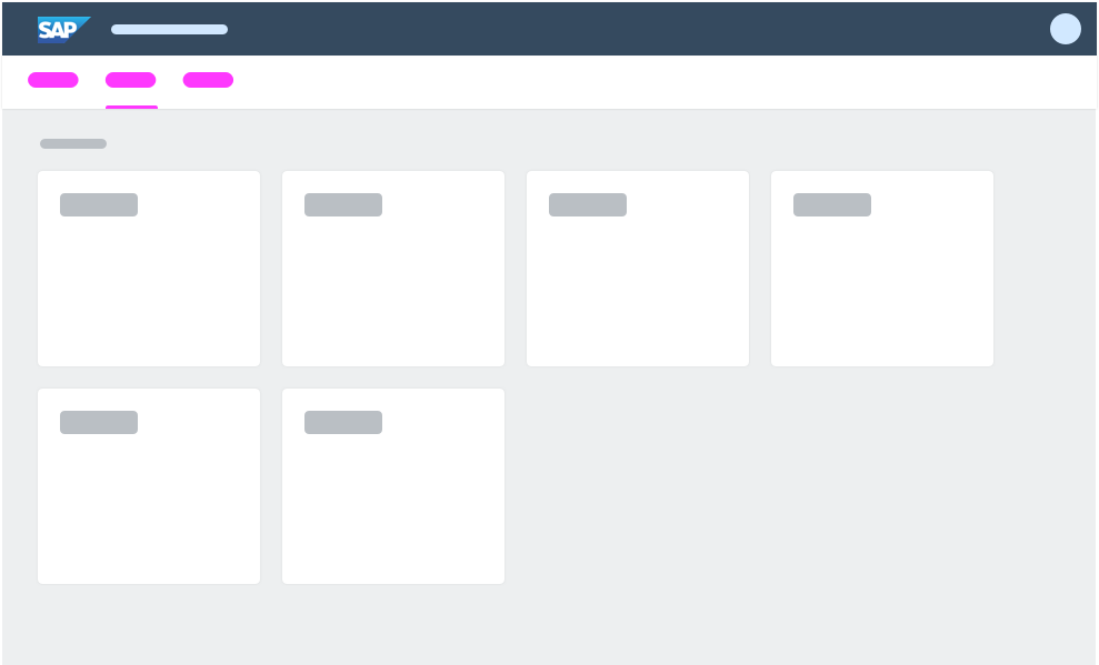
Top-level navigation
Pages
A page is part of a space. A page consists of sections that are used to further structure the content.
Top-level navigation
Sections
A section structures the content of a page semantically. A section consists of tiles that visualize the content of a space.
A section title is optional.
Top-level navigation
Tiles
The content of a space is visualized by tiles. Tiles allow users to quickly access business applications to complete their tasks. Different tile types are available.
Top-level navigation
Behavior and Interaction
Users can personalize their spaces in a variety of ways. Tiles can be rearranged directly, but most actions require the user to activate the edit mode (for example, rearranging groups or customizing tiles).
To switch to edit mode, the user needs to open the user actions menu and select Edit Current Page.
To close [or quit] the edit mode and return to the normal space view, the user clicks Close in the footer toolbar.
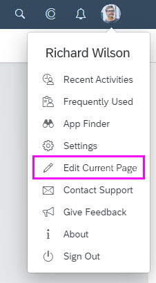
User actions menu - Edit current page
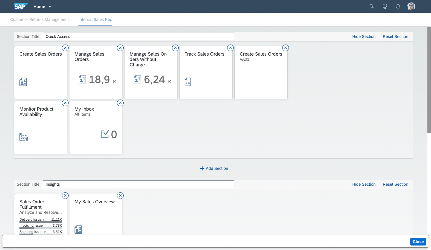
Page in edit mode
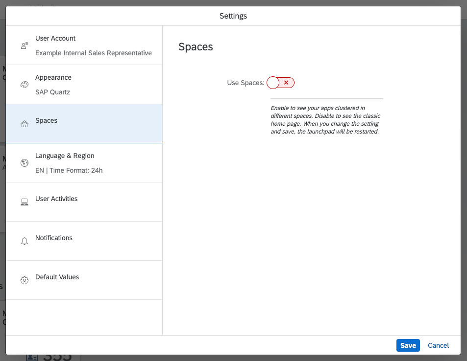
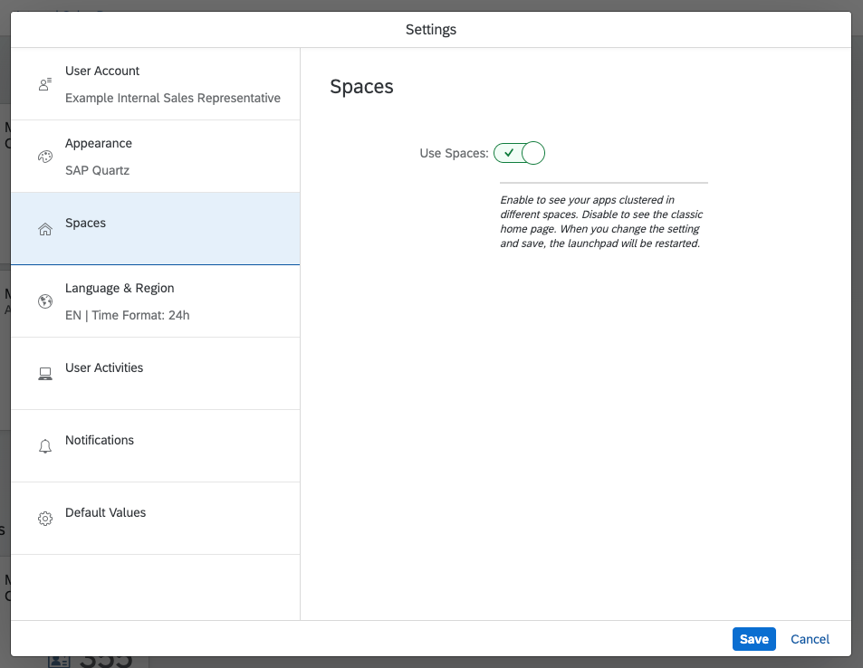
Switching Between Spaces and Home Page
Users can switch between the launchpad home page and launchpad spaces with the user actions menu. To enable or disable spaces, they click Settings and then Spaces. The launchpad then reloads.
General Actions
Remove
(via Edit Current Page)
Users can remove tiles with the Remove icon .
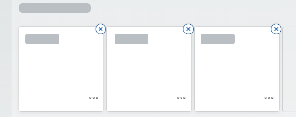
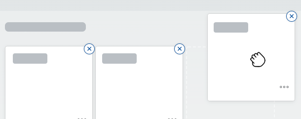
Move
Users can rearrange tiles and links by dragging them to a new location in the same group or a different group.
Open
Clicking a tile opens the underlying app or content item.

Section Actions
Users can customize sections to their needs with the Edit Current Page function:
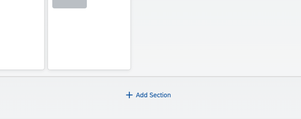
Add Sections
Users can add a new section by clicking the Add Section button. The user is prompted to enter a new section name. If no name is entered, the placeholder text Enter section name appears by default. Once the section is created, it appears below Add Group in the launchpad space.
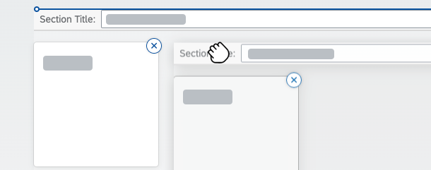
Move Sections
Users can rearrange a section by dragging individual section panels to a new location.
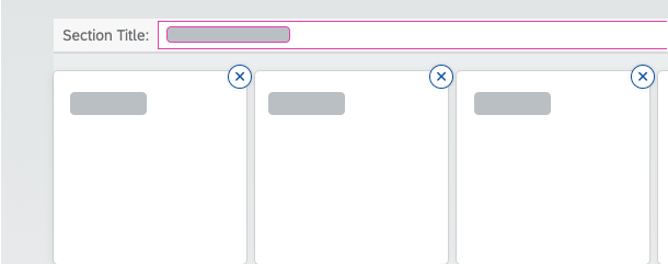
Rename Sections
Users can rename sections by typing the new name in the input field for the section title.
Delete Sections
Users can delete sections that they have created by clicking Delete Section.

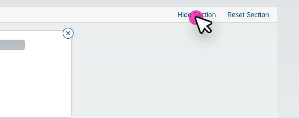
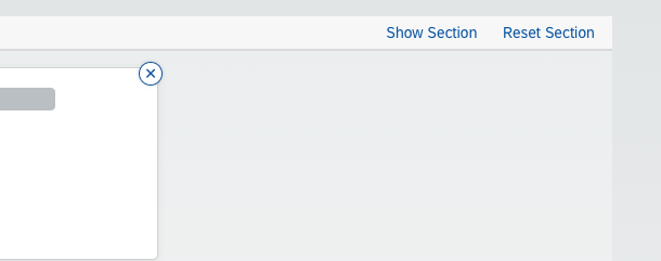
Reset Sections
By clicking Reset Section, a user can reset a predefined section to its initial state, as defined by an administrator.

Hide Sections
Users can temporarily hide one or more sections on a page within a space.
Hide Section hides the section in display mode. Show Section displays it again.
Top Tips
Spaces
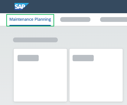
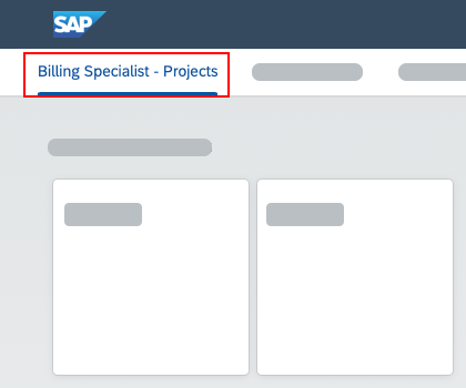
- A space title is mandatory.
- For the space title, use a label that describes the work area, such as Maintenance Planning. Don’t use a label that describes the user role (for example, Billing Specialist – Projects).
Section
- A section title is optional.
Related Links
 Your feedback has been sent to the SAP Fiori design team.