
- Latest SAPUI Version 1.124
- SAPUI5 Version 1.122
- SAPUI5 Version 1.120
- SAPUI5 Version 1.118
- SAPUI5 Version 1.116
- SAPUI5 Version 1.114
- SAPUI5 Version 1.112
- SAPUI5 Version 1.110
- SAPUI5 Version 1.108
- SAPUI5 Version 1.106
- SAPUI5 Version 1.104
- SAPUI5 Version 1.102
- SAPUI5 Version 1.100
- SAPUI5 Version 1.98
- SAPUI5 Version 1.96
- SAPUI5 Version 1.92
- SAPUI5 Version 1.90
- SAPUI5 Version 1.88
- SAPUI5 Version 1.86
- SAPUI5 Version 1.84
- SAPUI5 Version 1.82
- SAPUI5 Version 1.80
- SAPUI5 Version 1.78
- SAPUI5 Version 1.76
- SAPUI5 Version 1.74
- SAPUI5 Version 1.72
- SAPUI5 Version 1.70
- SAPUI5 Version 1.68
- SAPUI5 Version 1.66
- SAPUI5 Version 1.64
- SAPUI5 Version 1.62
- SAPUI5 Version 1.60
- SAPUI5 Version 1.58
- SAPUI5 Version 1.56
- SAPUI5 Version 1.54
- SAPUI5 Version 1.52
- SAPUI5 Version 1.50
- SAPUI5 Version 1.48
- SAPUI5 Version 1.46
- SAPUI5 Version 1.44
- SAPUI5 Version 1.42
- SAPUI5 Version 1.40
- SAPUI5 Version 1.38
- SAPUI5 Version 1.36
- SAPUI5 Version 1.34
- SAPUI5 Version 1.32
- SAPUI5 Version 1.30
- SAPUI5 Version 1.28
- SAPUI5 Version 1.26
- Latest SAPUI Version 1.124
- SAPUI5 Version 1.122
- SAPUI5 Version 1.120
- SAPUI5 Version 1.118
- SAPUI5 Version 1.116
- SAPUI5 Version 1.114
- SAPUI5 Version 1.112
- SAPUI5 Version 1.110
- SAPUI5 Version 1.108
- SAPUI5 Version 1.106
- SAPUI5 Version 1.104
- SAPUI5 Version 1.102
- SAPUI5 Version 1.100
- SAPUI5 Version 1.98
- SAPUI5 Version 1.96
- SAPUI5 Version 1.94
- SAPUI5 Version 1.92
- SAPUI5 Version 1.90
- SAPUI5 Version 1.88
- SAPUI5 Version 1.86
- SAPUI5 Version 1.84
- SAPUI5 Version 1.82
- SAPUI5 Version 1.80
- SAPUI5 Version 1.78
- SAPUI5 Version 1.76
- SAPUI5 Version 1.74
- SAPUI5 Version 1.72
- SAPUI5 Version 1.70
- SAPUI5 Version 1.68
- SAPUI5 Version 1.66
- SAPUI5 Version 1.64
- SAPUI5 Version 1.62
- SAPUI5 Version 1.60
- SAPUI5 Version 1.58
- SAPUI5 Version 1.56
- SAPUI5 Version 1.54
- SAPUI5 Version 1.52
- SAPUI5 Version 1.50
- SAPUI5 Version 1.48
- SAPUI5 Version 1.46
- SAPUI5 Version 1.44
- SAPUI5 Version 1.42
- SAPUI5 Version 1.40
- SAPUI5 Version 1.38
- SAPUI5 Version 1.36
- SAPUI5 Version 1.34
- SAPUI5 Version 1.32
- SAPUI5 Version 1.30
- SAPUI5 Version 1.28
- SAPUI5 Version 1.26
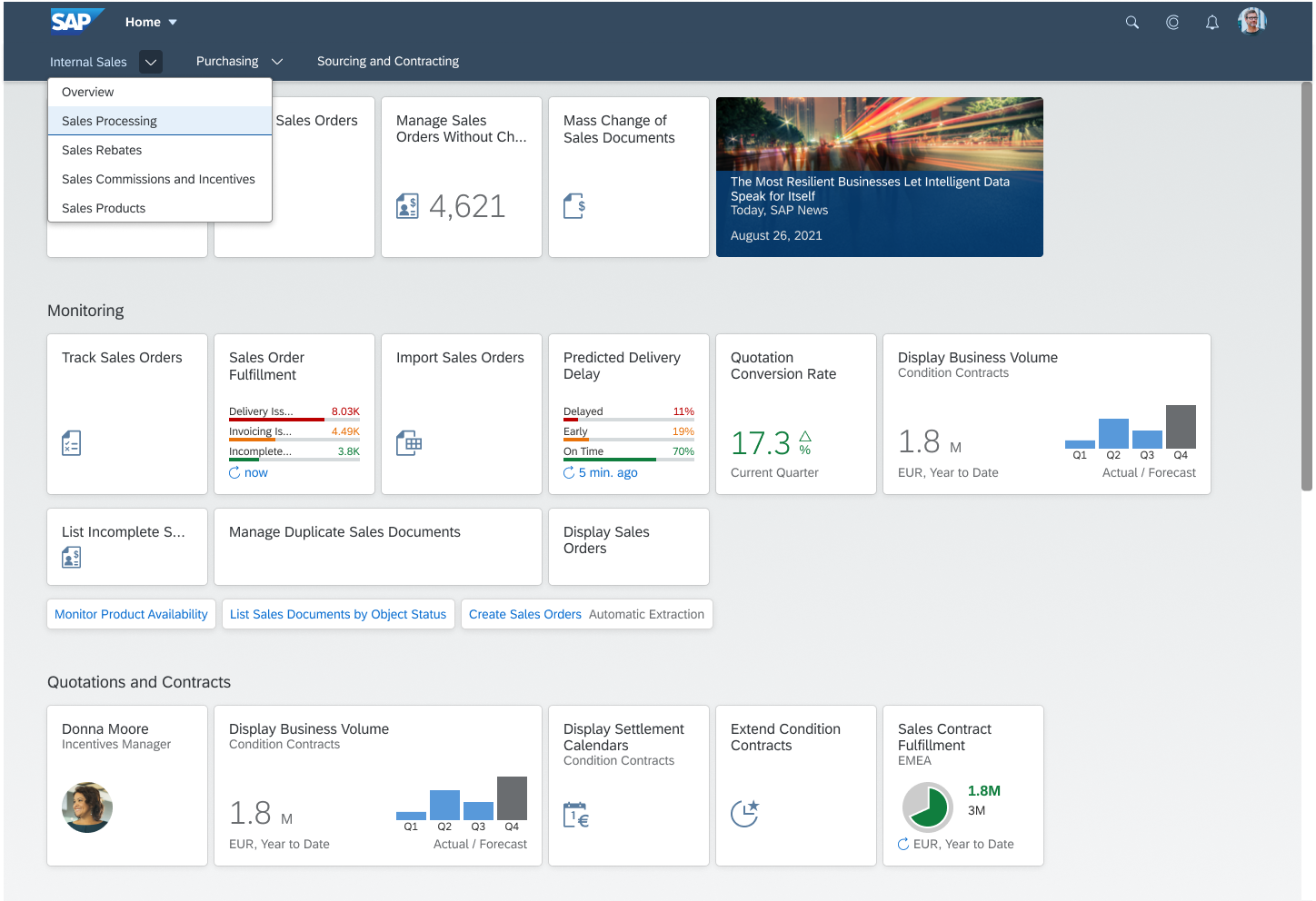
SAP Fiori Launchpad Spaces
Intro
With SAPUI5 1.75, we introduced SAP Fiori launchpad spaces in parallel to the SAP Fiori launchpad home page. Users can switch between the two with the user actions menu.
A space and its pages structure the most relevant apps for users with a certain business role. The content of a space is visualized by tiles which allow users to quickly launch apps to access the business content they need to complete their business related tasks.
Users can easily personalize their pages directly by rearranging or adding tiles. Users have access to advanced personalization options via the edit mode. Users may have a personalized space “My Home”.
Video: Introducing SAP Fiori launchpad spaces
When to Use
SAP Fiori launchpad spaces must be used to give access to SAP Fiori apps.
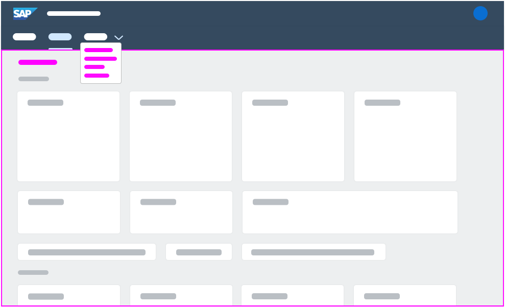
Components
The following overview explains the concept of spaces and its pages.
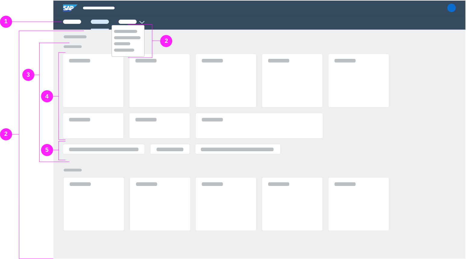
SAP Fiori launchpad spaces - Components - Overview
(1) Top-level navigation where the space is visually represented as an navigation item
(2) One page or multiple pages per space
(3) Sections on a page
(4) Tiles in a section
(5) Links in a section
Top-Level Navigation
The top-level navigation is part of a space. It gives users access to all spaces and pages that they are assigned to, and enables users to navigate between those. An entry in the top-level navigation indicates a space. Multiple spaces are visualized by multiple entries. By selecting a space, users can access one or more pages belonging to the space.
Top-level navigation
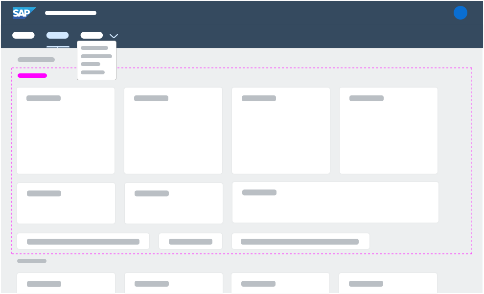
Spaces
A space serves as an entry point for a business role and shows information and functions that are assigned to this business role. A space is represented as a navigation item in the top level navigation. A user may have multiple spaces assigned, which results in multiple entries in the top-level navigation. A space consists of one or multiple pages that are used to further structure the content of a space.
A space title is mandatory. Do not use the business role name as a space title, use the name of the work area of a business role instead.
Spaces
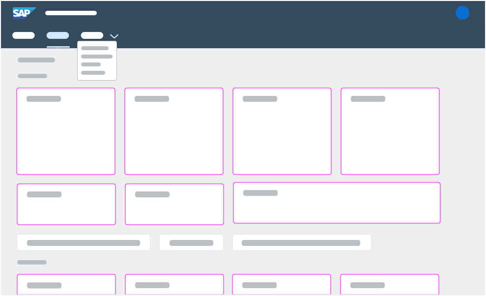
Pages
A page is part of a space, and a space may have one or multiple pages. Multiple pages allow users to structure the space into multiple self-contained work-contexts. Business roles with fewer apps may use one page per space, whereas business roles with more apps may use multiple pages per space. A page consists of sections that are used to further structure the content.
Do not use function or product-oriented page titles, and do not repeat the space title. Use task-oriented page titles that summarize the tasks that can be performed on the page.
Pages
Sections
A section structures the content of a page semantically. To ensure consistency across pages within a space and across spaces, we highly recommend using a section “Quick Access” to summarize the most important apps and/or a section “Insights” to summarize the most important analytical apps. To aim for lean pages, we recommend using between 2 and 5 sections per page. A section consists of tiles that visualize the content of a space.
A section title is optional. Use a term summarizing the tasks that can be performed in the section.
Recently Added Apps
When the user adds an app to a page using the app finder, a dedicated Recently Added Apps section appears at the top of the page that contains the added app. Once the user moves the app to another section, the Recently Added Apps section disappears.
Sections
Tiles
The content of a space is visualized by tiles. Tiles allow users to quickly access business applications to complete their tasks. Different tile types and tile sizes are available. To aim for lean pages, we recommend using between 3-7 apps per section and 25 apps at most per page.
Tiles
Links
The content of a space is visualized also by links. Links allow users to quickly access business applications to complete their tasks.
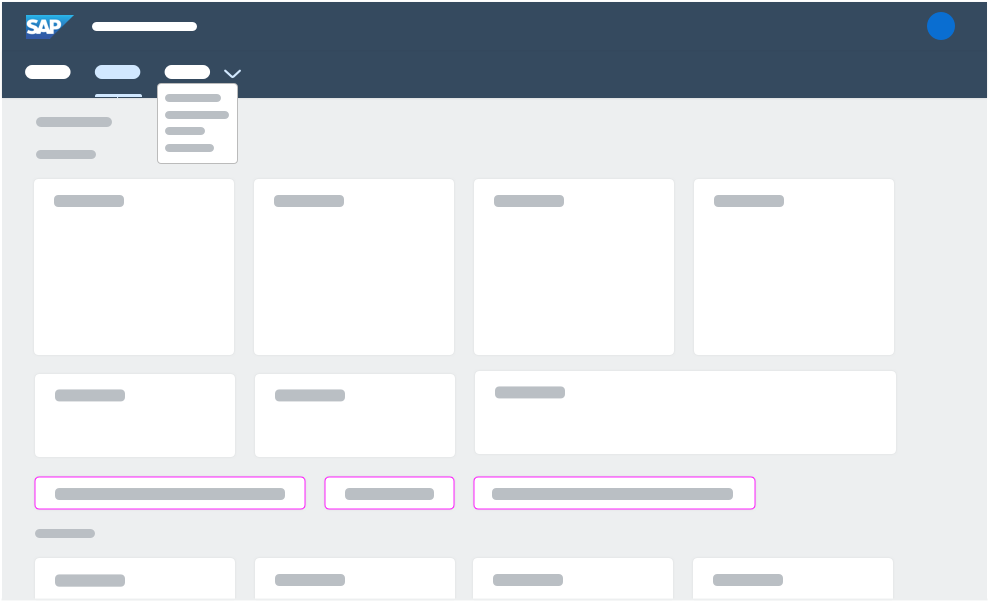
Tiles
Behavior and Interaction
Users can switch between the launchpad home page and launchpad spaces. To personalize the pages, users may either directly rearrange tiles on a page or open the edit mode to have access to advanced personalization options.
Switching between Spaces and Home Page
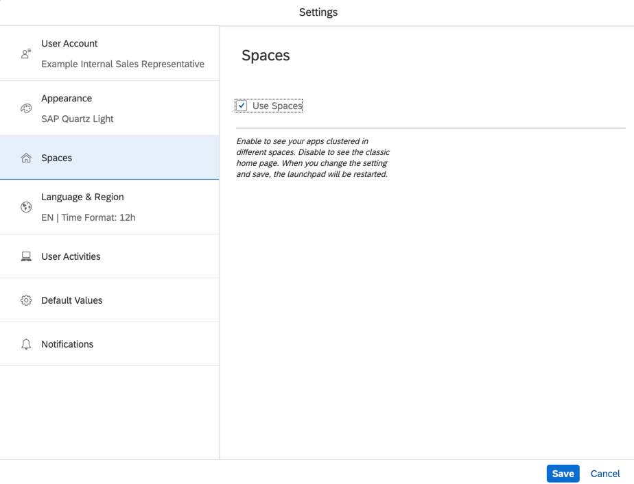
Users can switch between the launchpad home page and launchpad spaces with the user actions menu. Navigate to Settings, then Spaces, and activate Use Spaces to switch to launchpad spaces. Deactivate Use Spaces to switch back to the launchpad home page. In both cases the launchpad reloads.
Switch to Spaces
Personalization
To directly personalize the page, users can rearrange or add apps.
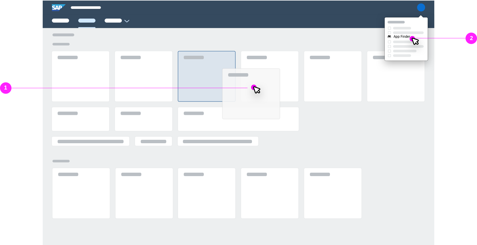
(1) Move: Users can rearrange tiles and links by dragging them to a new location in the same section or to another section.
(1) Add: Users can add apps by selecting App Finder in the user actions menu.
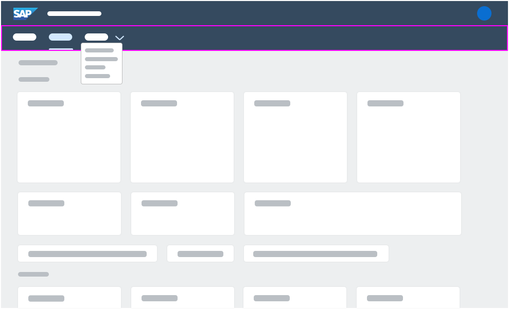
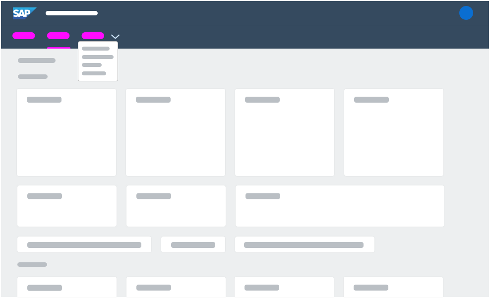
Open and Close Edit Mode
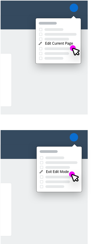
To open the edit mode, users need to open the user actions menu and select Edit Current Page. To close the edit mode, users need to select Exit Edit Mode or select Close in the footer toolbar.
User actions menu
Launchpad in edit mode
Edit Mode
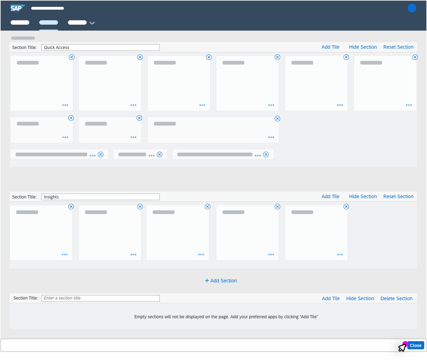
Users may use the Edit Mode to access advanced personalization options, such as tile actions or section actions to personalize a page.
Tile Actions
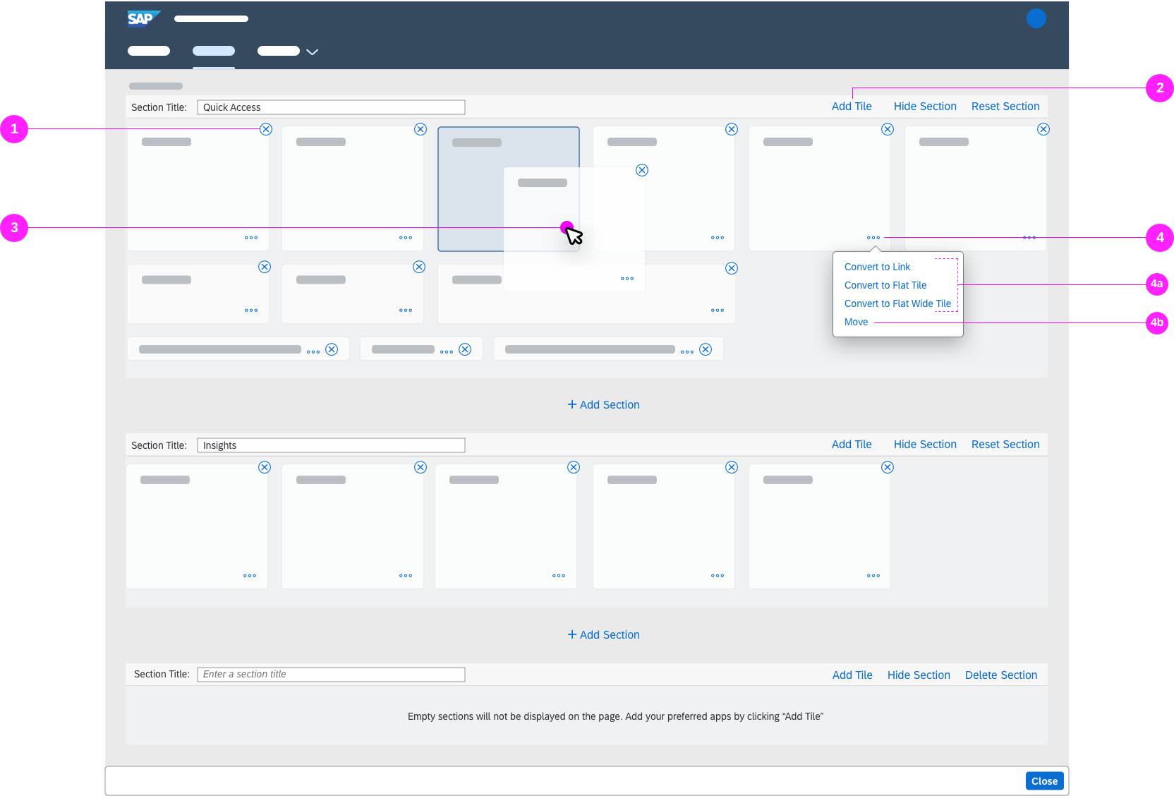
(1) Remove: Users can remove tiles with the Remove icon .
(2) Add: Users can add apps by clicking the Add Tile button.
(3) Move: Users can rearrange tiles and links by dragging them to a new location in the same section or to another section.
(4) Action Menu: Users can open the tile action menu to access further tile actions by clicking on the overflow icon .
- (4a) Convert: Users can convert the size of a tile based on the current tile size into a link, a tile, a flat tile or a flat wide tile by clicking on the respective Convert action in the action menu.
- (4b) Move: Users can also select Move in the action menu to rearrange tiles.
Section Actions
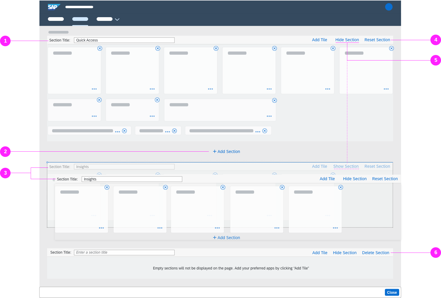
(1) Rename Sections: Users can rename sections by typing the new name in the input field for the section title.
(2) Add Sections: Users can add a new section by clicking the Add Section button. The user is prompted to enter a new section name. If no name is entered, the placeholder text Enter section tile appears by default. Once the section is created, it appears below Add Section in the launchpad space.
(3) Move Sections: Users can rearrange a section by dragging individual section panels to a new location.
(4) Reset Sections: By clicking Reset Section, a user can reset a predefined section to its initial state, as defined by an administrator.
(5) Hide/Show Sections: Users can temporarily hide one or more sections on a page within a space by clicking the toggle button Hide Section. The Show Section button displays the section again.
(5) Delete Sections: Users can delete an empty section by clicking the Delete Section button.
Responsiveness
The SAP Fiori launchpad spaces is fully responsive. For smaller screens, the tiles are smaller so that at least two tiles can be shown side by side.
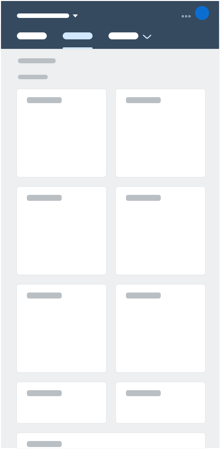
Launchpad spaces - Size S

Launchpad spaces - Size L
Top Tips
How to Design a SAP Fiori Launchpad Space
There are several means available to semantically structure and visualize the content of a space. Use multiple pages and sections to semantically structure the content of a space. Page and section titles may help identify the tasks that the content relates to. Use tiles to visualize the content of a space. Beside tiles, more options to visualize the content will be available in later releases.
Spaces
A space comes with a predefined set of apps related to the user’s business role. Show only the most important and most used apps per space that users need to complete their daily tasks. To identify those apps, we recommend following the “Day in a life of…” approach: What are the most important apps for the users? How often do they use them? What do they need first, what do they need next? Are there any dependencies in the workflow? What are the insights they need on a regular basis? Which apps can be semantically bundled? Are there self-contained work-contexts? Structure the space according to these patterns.
To further structure a space you might use one or multiple pages depended on the number of assigned apps associated with the users’ business role.
Note: Don´t worry about the apps you leave out. Users still can access all apps in the app finder which they might use to add apps to their pages or to directly launch apps that they rarely use.
Sections
Use sections to semantically structure the content of a page. To ensure consistency across pages within a space and across spaces, we recommend using a section called “Quick Access” to summarize the most important apps, and/or a section called “Insights” to summarize the most important analytical apps.
Pages
Use multiple pages if you identify during the “Day in a life of…” approach several self-contained work-contexts. This might be the case for business roles which have many apps assigned. Each page should then reflect one self-contained work-context. Aim for lean pages and show only the most important and used apps on each page. Therefore, a page serves as a “favorites” page.
“Overview” Page – If you would like to provide a page which summarizes the most important and most used apps across the multiple work-context pages use a term which summarizes the most important tasks of the whole space or use “Overview” as page title. The Overview page may contain additional overall apps or generic apps such as “My Inbox”. To ensure consistency position this page as the first page on a multiple-pages space.
Tiles
To aim for lean pages do not overwhelm sections with apps, go for lean pages instead. Check the chapter tiles to choose appropriate tile types.
Guideline
In General
- Aim for lean spaces and pages:
- Try to use between 2 and 5 sections per page.
- Try to show between 2 and 7 apps per section, but 25 apps at most per page.
- Go for consistency for all titles within a space and across SAP Fiori.
Space Titles
- A space title is mandatory.
- Do not use business role names as space titles, use the name of the work area of the business role instead.
- Use specific terms for the application area such as “Internal Sales”, rather than “Sales”, or “Accounts Receivables” rather than “Accounting”.
- Try to avoid the term “Management” for non-managerial roles.
- In rare cases, you may need to use specifications or a space title to differentiate spaces for similar but not identical roles. In this exceptional case, a dash “-” can be used. Example: Project Controller – Finance.
- Examples for space titles are:
- “Internal Sales” for the business role Internal Sales Representative
- “Accounts Receivables” for the business role Accounts Receivables Accountant
- “Convergent Invoicing” for the business role Invoicing Specialist
- “In-House Repair” for the business role Service Representative – In-House Repair
Page Titles
- Do not use function or product-oriented page titles. Use work-context related terms that summarize the tasks that can be performed on the page. Example: “Long-Term Planning” instead of “Predictive Material and Resource Planning”.
- Do not repeat the space title.
- If a work-context specific term can’t be found for the page that summarizes the content of the pages across the space, use “Overview” as a page title.
Section Titles
- A section title is optional.
- In case you summarize the most important apps in a section to provide quick access, do not use “Quick Start” as a section title, but “Quick Access”.
- In case you summarize the most important analytical apps in a section, do not use section titles such as “Analytics”, “Analysis”, “Reporting”; use “Insights” instead.
- For all other section titles, use task-oriented titles to summarize the tasks that can be performed. Example: “Sales Order Creation” instead of “Create Sales Order”.
Related Topics
Elements and Controls
- SAP Fiori Launchpad – Overview (guidelines)
- SAP Fiori Launchpad Home Page (guidelines)
- Tiles (guidelines)
- App Finder (guidelines)
Implementation
- No links.
 Your feedback has been sent to the SAP Fiori design team.