
Updated: May 20, 2020
SAPUI5 Version 1.84
- Latest SAPUI5 Version 1.120
- Version 1.118
- SAPUI5 Version 1.116
- SAPUI5 Version 1.114
- SAPUI5 Version 1.112
- SAPUI5 Version 1.110
- SAPUI5 Version 1.108
- SAPUI5 Version 1.106
- SAPUI5 Version 1.104
- SAPUI5 Version 1.102
- SAPUI5 Version 1.100
- SAPUI5 Version 1.98
- SAPUI5 Version 1.96
- SAPUI5 Version 1.94
- SAPUI5 Version 1.92
- SAPUI5 Version 1.90
- SAPUI5 Version 1.88
- SAPUI5 Version 1.86
- SAPUI5 Version 1.82
- SAPUI5 Version 1.80
- SAPUI5 Version 1.78
- SAPUI5 Version 1.76
- SAPUI5 Version 1.74
- SAPUI5 Version 1.72
- SAPUI5 Version 1.70
- SAPUI5 Version 1.68
- SAPUI5 Version 1.66
- SAPUI5 Version 1.64
- SAPUI5 Version 1.62
- SAPUI5 Version 1.60
- SAPUI5 Version 1.58
- SAPUI5 Version 1.56
- SAPUI5 Version 1.54
- SAPUI5 Version 1.52
- SAPUI5 Version 1.50
- SAPUI5 Version 1.48
- SAPUI5 Version 1.46
- SAPUI5 Version 1.44
- SAPUI5 Version 1.42
- SAPUI5 Version 1.40
- SAPUI5 Version 1.38
- SAPUI5 Version 1.36
- SAPUI5 Version 1.34
- SAPUI5 Version 1.32
- SAPUI5 Version 1.30
- SAPUI5 Version 1.28
- SAPUI5 Version 1.26
- Latest SAPUI5 Version 1.120
- Version 1.118
- SAPUI5 Version 1.116
- SAPUI5 Version 1.114
- SAPUI5 Version 1.112
- SAPUI5 Version 1.110
- SAPUI5 Version 1.108
- SAPUI5 Version 1.106
- SAPUI5 Version 1.104
- SAPUI5 Version 1.102
- SAPUI5 Version 1.100
- SAPUI5 Version 1.98
- SAPUI5 Version 1.96
- SAPUI5 Version 1.94
- SAPUI5 Version 1.92
- SAPUI5 Version 1.90
- SAPUI5 Version 1.88
- SAPUI5 Version 1.86
- SAPUI5 Version 1.84
- SAPUI5 Version 1.82
- SAPUI5 Version 1.80
- SAPUI5 Version 1.78
- SAPUI5 Version 1.76
- SAPUI5 Version 1.74
- SAPUI5 Version 1.72
- SAPUI5 Version 1.70
- SAPUI5 Version 1.68
- SAPUI5 Version 1.66
- SAPUI5 Version 1.64
- SAPUI5 Version 1.62
- SAPUI5 Version 1.60
- SAPUI5 Version 1.58
- SAPUI5 Version 1.56
- SAPUI5 Version 1.54
- SAPUI5 Version 1.52
- SAPUI5 Version 1.50
- SAPUI5 Version 1.48
- SAPUI5 Version 1.46
- SAPUI5 Version 1.44
- SAPUI5 Version 1.42
- SAPUI5 Version 1.40
- SAPUI5 Version 1.38
- SAPUI5 Version 1.36
- SAPUI5 Version 1.34
- SAPUI5 Version 1.32
- SAPUI5 Version 1.30
- SAPUI5 Version 1.28
- SAPUI5 Version 1.26
Color Picker
sap.ui.unified.ColorPicker
Intro
The color picker allows users to choose any color and provides different input options for selecting colors.
Color picker
Usage
Use the color picker if:
- Selecting any color freely is the typical use case.
Do not use the color picker if:
- Users need to select one color from a predefined set of colors. Use the color palette instead.
- Selecting a color from a predefined palette is the typical case, but users should still be able to define their own colors. Use the color palette popover instead.
Responsiveness
The color picker supports cozy and compact content densities.
Size S: Color picker opens in responsive popover
Size M – Cozy form density
Size L – Compact form density
Layout
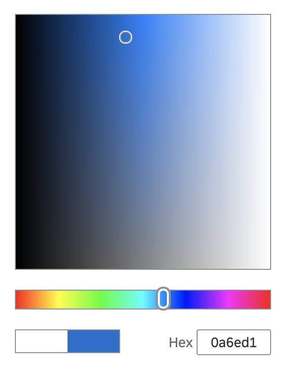
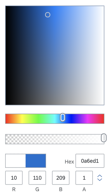
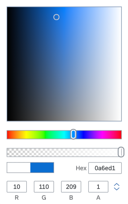
The color picker consists of the following elements:
- The color picker box for setting lightness and saturation
- Sliders for setting the hue and transparency (“alpha channel”)
- Form elements for:
- Displaying the current and new color settings (Prior to any selection, the default color is white. However, the app developer can set a different predefined color using the
setSelectedmethod.) - Setting the color as a hexadecimal value
- Setting the color as red/green/blue (RGB) value (0 to 255 each) (optional)
- Setting the color as hue/saturation/lightness (HSL) value (hue: 0 to 360 degrees, saturation: 0% to 100%, lightness: 0% to 100%) (optional)
- Switching between RGB and HSL values (if applicable)
- Setting the transparency (“alpha channel”) value of the color (0.00 for full transparency to 1.00 for opaque)
- Displaying the current and new color settings (Prior to any selection, the default color is white. However, the app developer can set a different predefined color using the
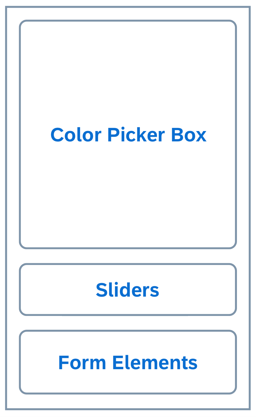
Schematic visualization of the color picker
Types
The color picker comes in 3 flavors:
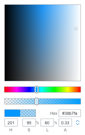
- Simplified: The simplified color picker offers settings for hue, saturation, and lightness, but not for the alpha channel. It shows the current and new color. Text input is only possible for hex values.
'Simplified' color picker
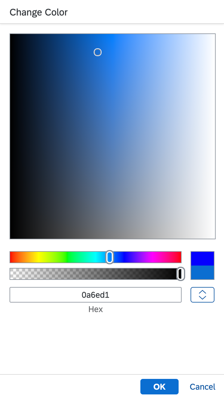
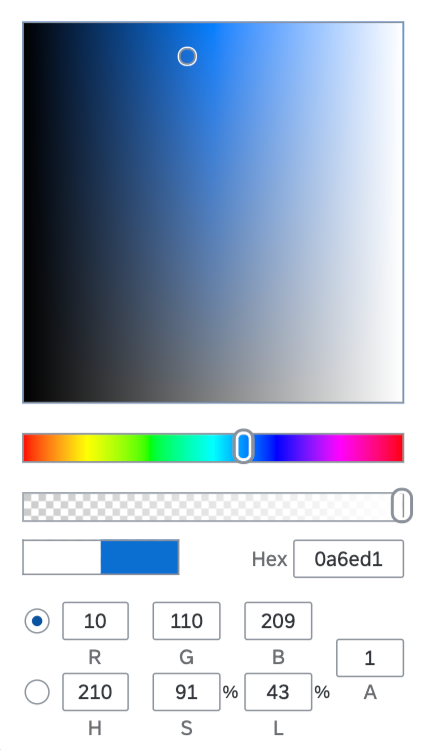
- Default: The default color picker allows all settings. It displays input fields either for red / green / blue / alpha or for hue / saturation / lightness / alpha. End users can switch between both sets of input fields.
'Default' color picker
- Large: The large color picker allows all settings and displays all fields at the same time.
'Large' color picker
Behavior and Interaction
- Mouse/touch: Users select a combination of saturation and lightness in the color picker box (click and drag). Hue and alpha values are selected with sliders.
- Keyboard: The tab key is used to set the focus on the sliders and input fields. Values are entered using the corresponding input controls. The sliders react on arrow keys, page up / page down keys, as well as on home and end keys. The color picker box is not keyboard-enabled.
Resources
Want to dive deeper? Follow the links below to find out more about related controls, the SAPUI5 implementation, and the visual design.
Elements and Controls
- Color Palette (guidelines)
- Color Palette Popover (guidelines)
- Color Picker Popover (guidelines)
 Your feedback has been sent to the SAP Fiori design team.