- Latest SAPUI Version 1.124
- SAPUI5 Version 1.122
- SAPUI5 Version 1.120
- SAPUI5 Version 1.118
- SAPUI5 Version 1.116
- SAPUI5 Version 1.114
- SAPUI5 Version 1.112
- SAPUI5 Version 1.110
- SAPUI5 Version 1.108
- SAPUI5 Version 1.106
- SAPUI5 Version 1.104
- SAPUI5 Version 1.102
- SAPUI5 Version 1.100
- SAPUI5 Version 1.98
- SAPUI5 Version 1.96
- SAPUI5 Version 1.94
- SAPUI5 Version 1.92
- SAPUI5 Version 1.90
- SAPUI5 Version 1.88
- SAPUI5 Version 1.84
- SAPUI5 Version 1.82
- SAPUI5 Version 1.80
- SAPUI5 Version 1.78
- SAPUI5 Version 1.76
- SAPUI5 Version 1.74
- SAPUI5 Version 1.72
- SAPUI5 Version 1.70
- SAPUI5 Version 1.68
- SAPUI5 Version 1.66
- SAPUI5 Version 1.64
- SAPUI5 Version 1.62
- SAPUI5 Version 1.60
- SAPUI5 Version 1.58
- SAPUI5 Version 1.56
- SAPUI5 Version 1.54
- SAPUI5 Version 1.52
- SAPUI5 Version 1.50
- SAPUI5 Version 1.48
- SAPUI5 Version 1.46
- SAPUI5 Version 1.44
- SAPUI5 Version 1.42
- SAPUI5 Version 1.40
- SAPUI5 Version 1.38
- SAPUI5 Version 1.36
- SAPUI5 Version 1.34
- SAPUI5 Version 1.32
- SAPUI5 Version 1.30
- SAPUI5 Version 1.28
- SAPUI5 Version 1.26
- Latest SAPUI Version 1.124
- SAPUI5 Version 1.122
- SAPUI5 Version 1.120
- SAPUI5 Version 1.118
- SAPUI5 Version 1.116
- SAPUI5 Version 1.114
- SAPUI5 Version 1.112
- SAPUI5 Version 1.110
- SAPUI5 Version 1.108
- SAPUI5 Version 1.106
- SAPUI5 Version 1.104
- SAPUI5 Version 1.102
- SAPUI5 Version 1.100
- SAPUI5 Version 1.98
- SAPUI5 Version 1.96
- SAPUI5 Version 1.94
- SAPUI5 Version 1.92
- SAPUI5 Version 1.90
- SAPUI5 Version 1.88
- SAPUI5 Version 1.86
- SAPUI5 Version 1.84
- SAPUI5 Version 1.82
- SAPUI5 Version 1.80
- SAPUI5 Version 1.78
- SAPUI5 Version 1.76
- SAPUI5 Version 1.74
- SAPUI5 Version 1.72
- SAPUI5 Version 1.70
- SAPUI5 Version 1.68
- SAPUI5 Version 1.66
- SAPUI5 Version 1.64
- SAPUI5 Version 1.62
- SAPUI5 Version 1.60
- SAPUI5 Version 1.58
- SAPUI5 Version 1.56
- SAPUI5 Version 1.54
- SAPUI5 Version 1.52
- SAPUI5 Version 1.50
- SAPUI5 Version 1.48
- SAPUI5 Version 1.46
- SAPUI5 Version 1.44
- SAPUI5 Version 1.42
- SAPUI5 Version 1.40
- SAPUI5 Version 1.38
- SAPUI5 Version 1.36
- SAPUI5 Version 1.34
- SAPUI5 Version 1.32
- SAPUI5 Version 1.30
- SAPUI5 Version 1.28
- SAPUI5 Version 1.26
Panel
sap.m.Panel
Intro
The panel is a container for grouping and displaying information. It can be collapsed to save space on the screen.
Usage
Use the panel if:
- You need to group or display information.
- You want to give users the option of hiding this information.
- You want to show additional information on demand (for example, a panel could show optional input fields for an advanced search).
Do not use the panel if:
- You are designing an object page. Never use panels in the object page content area.
Responsiveness
If the width of the panel is set to 100% (default), the panel and its children are resized responsively, depending on its parent container.
Layout
- The panel control is a container for controls.
- The panel can have a solid or semi-transparent background.
- The panel always includes a header.
- An infobar can be added to the panel to show extra information.
Examples

Panel with a header text
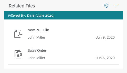
Panel with a header toolbar and a infobar
Types
There are two types of panels: fixed and expandable.
Fixed Panel
Fixed panels are useful for grouping custom content. They include headers and infobars.
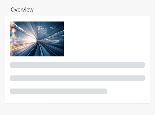
Fixed panel with a picture
Components
A panel consists of a title bar with a header text or header toolbar, an infobar (optional), and a content area.
The title inside the title bar can be added by using the “headerText” property. If you use the “headerToolbar” aggregation, the “headerText” property is ignored. With the “headerToolbar” aggregation, you can add a toolbar with any toolbar content inside the title bar. For example, if you need a title text on the left and some action buttons on the right, add a title to the toolbar’s content aggregation, toolbar spacer, and then your buttons.
Behavior and Interaction
Expand/Collapse
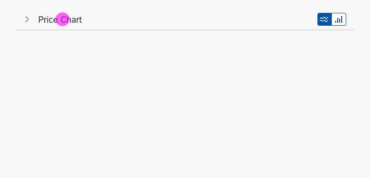
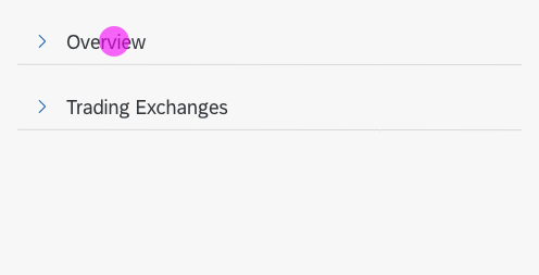
- When the panel is expandable, an arrow icon (pointing to the right) appears in front of the header.
- Click anywhere on the title bar to expand and collapse the content area.
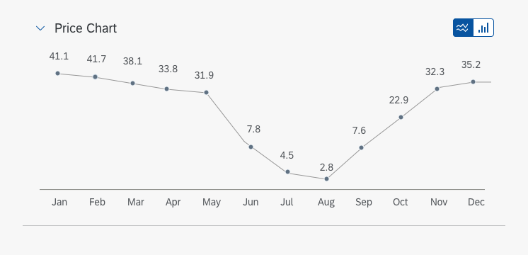
- When the animation is activated, expand/collapse uses a smooth animation to open or close the content area.
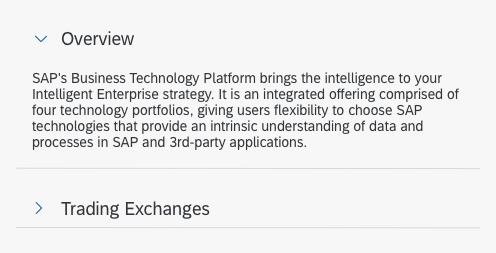
- When the panel expands, the arrow icon rotates 90 degrees clockwise.
- When the panel collapses, the arrow icon rotates 90 degrees counterclockwise.
- The buttons in the header can be clicked separately.
Example
Overflow Scrolling (Content Area)
- By setting the height to use the default property “auto”, the height of the content area will automatically be adjusted to match the height of its content.
- When the height of the panel is set to a fixed size, the content area can be scrolled through.
Guidelines
- Nesting two or more panels is not recommended.
- Do not stack too many panels on one page.
Exceptions
If you add a header toolbar (sap.m.Toolbar) via aggregations, it will overwrite the “headerText” property.
Resources
Want to dive deeper? Follow the links below to find out more about related controls, the SAPUI5 implementation, and the visual design.




 Your feedback has been sent to the SAP Fiori design team.