
- Latest SAPUI Version 1.124
- SAPUI5 Version 1.122
- SAPUI5 Version 1.120
- SAPUI5 Version 1.118
- SAPUI5 Version 1.116
- SAPUI5 Version 1.114
- SAPUI5 Version 1.112
- SAPUI5 Version 1.110
- SAPUI5 Version 1.108
- SAPUI5 Version 1.106
- SAPUI5 Version 1.104
- SAPUI5 Version 1.102
- SAPUI5 Version 1.100
- SAPUI5 Version 1.98
- SAPUI5 Version 1.96
- SAPUI5 Version 1.94
- SAPUI5 Version 1.92
- SAPUI5 Version 1.90
- SAPUI5 Version 1.88
- SAPUI5 Version 1.84
- SAPUI5 Version 1.82
- SAPUI5 Version 1.80
- SAPUI5 Version 1.78
- SAPUI5 Version 1.76
- SAPUI5 Version 1.74
- SAPUI5 Version 1.72
- SAPUI5 Version 1.70
- SAPUI5 Version 1.68
- SAPUI5 Version 1.66
- SAPUI5 Version 1.64
- SAPUI5 Version 1.62
- SAPUI5 Version 1.60
- SAPUI5 Version 1.58
- SAPUI5 Version 1.56
- SAPUI5 Version 1.54
- SAPUI5 Version 1.52
- SAPUI5 Version 1.50
- SAPUI5 Version 1.48
- SAPUI5 Version 1.46
- SAPUI5 Version 1.44
- SAPUI5 Version 1.42
- SAPUI5 Version 1.40
- SAPUI5 Version 1.38
- SAPUI5 Version 1.36
- SAPUI5 Version 1.34
- SAPUI5 Version 1.32
- SAPUI5 Version 1.30
- SAPUI5 Version 1.28
- SAPUI5 Version 1.26
- Latest SAPUI Version 1.124
- SAPUI5 Version 1.122
- SAPUI5 Version 1.120
- SAPUI5 Version 1.118
- SAPUI5 Version 1.116
- SAPUI5 Version 1.114
- SAPUI5 Version 1.112
- SAPUI5 Version 1.110
- SAPUI5 Version 1.108
- SAPUI5 Version 1.106
- SAPUI5 Version 1.104
- SAPUI5 Version 1.102
- SAPUI5 Version 1.100
- SAPUI5 Version 1.98
- SAPUI5 Version 1.96
- SAPUI5 Version 1.94
- SAPUI5 Version 1.92
- SAPUI5 Version 1.90
- SAPUI5 Version 1.88
- SAPUI5 Version 1.86
- SAPUI5 Version 1.84
- SAPUI5 Version 1.82
- SAPUI5 Version 1.80
- SAPUI5 Version 1.78
- SAPUI5 Version 1.76
- SAPUI5 Version 1.74
- SAPUI5 Version 1.72
- SAPUI5 Version 1.70
- SAPUI5 Version 1.68
- SAPUI5 Version 1.66
- SAPUI5 Version 1.64
- SAPUI5 Version 1.62
- SAPUI5 Version 1.60
- SAPUI5 Version 1.58
- SAPUI5 Version 1.56
- SAPUI5 Version 1.54
- SAPUI5 Version 1.52
- SAPUI5 Version 1.50
- SAPUI5 Version 1.48
- SAPUI5 Version 1.46
- SAPUI5 Version 1.44
- SAPUI5 Version 1.42
- SAPUI5 Version 1.40
- SAPUI5 Version 1.38
- SAPUI5 Version 1.36
- SAPUI5 Version 1.34
- SAPUI5 Version 1.32
- SAPUI5 Version 1.30
- SAPUI5 Version 1.28
- SAPUI5 Version 1.26
Quartz Light Colors
Intro
Quartz Light is the standard theme for SAP Fiori applications. Color communicates importance and association, and provides direction to users. By applying the color palette, user interfaces guarantee a clean and lightweight design that is consistent and coherent across all SAP Fiori applications.
Color Balance
Color balance refers to the recommended mixture of light and dark, and colored and non-colored areas of any SAP Fiori app interface.
Approaching the ideal color balance for each page creates a visual rhythm throughout the application. It also helps to draw the user’s attention to the most important information and functions. Furthermore, it promotes a distinct and consistent look and feel throughout all SAP Fiori apps.
- The Quartz Light theme background colors are subtle, calm, reduced, and minimalistic.
- A reduced background color scheme ensures a stable base for any application content. Foreground colors support the importance, prominence, and visual connection of the information displayed.
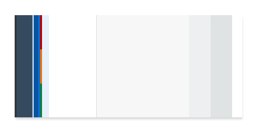
Color balance (Quartz Light)
Color Usage
Each theme is based on a set of individual base reference values. These are:
- Primary (main user interface colors)
- Secondary (accent colors)
- Grayscale (neutral values)
- Semantic (value state colors)
The reference colors listed on this page give a helpful indication as to where they are used in the UI controls and layouts. However, it is extremely important that reference values are not used directly in the control styling. The Quartz Light reference color values are specific to this particular theme, but are assigned to control parameters.
The reference colors are used as base values, whichare then distributed into the UI controls via a stable set of theme control parameters that are available in each theme. Theme control parameters represent semantically named parts of the controls. They are decoupled from the actual color values so that the color values can be easily replaced. The theming guideline explains how these reference values are mapped to the user interface controls.
Primary Colors
The recommended primary colors leverage the uniqueness of SAP Fiori apps. The primary colors represent the overall look and feel.
SAP Fiori Standard Theme Primary Colors
Primary 1
Home/ Shell Header
#354a5f
rgb(53, 74, 95)
Primary 2
Brand / Links
#0a6ed1
rgb(10, 110, 209)
darken Primary 2 10%
Highlight / Selected / Icons
#0854A0
rgb(8, 84, 160)
Primary 3
App Headers and Containers
#ffffff
rgb(255, 255, 255)
Primary 4
Home/ Shell Background Base
#edeff0
rgb(237, 239, 240)
Primary 5
Borders and Derived Controls
#89919a
rgb(137, 145, 154)
Primary 6
Text and Titles
#32363a
rgb(50, 54, 58)
Primary 7
Subtitles and Labels
#6a6d70
rgb(106, 109, 112)
SAP Fiori Launchpad Gradient
The gradient is mainly applied to launchpad or dashboard overview page types.
Top
#dfe3e4
rgb(223, 227, 228)
Bottom
#f3f4f5
rgb(243, 244, 245)
Accent Colors
Secondary colors can be applied to accentuate important elements. They make a vivid contribution to the overall UI and should be used sparingly.
Accent 1
#d08014
rgb(208, 128, 20)
Accent 2
#d04343
rgb(208, 67, 67)
Accent 3
#db1f77
rgb(219, 31, 119)
Accent 4
#c0399f
rgb(219, 31, 119)
Accent 5
#6367de
rgb(99, 103, 222)
Accent 6
#286eb4
rgb(40, 110, 180)
Accent 7
#0f828f
rgb(15, 130, 143)
Accent 8
#7ca10c
rgb(124, 161, 12)
Accent 9
#925ace
rgb(146, 90, 206)
Accent 10
#647987
rgb(100, 121, 135)
Grayscale
Grayscale areas play an important role in any SAP Fiori user interface. They minimize the risk of over-stimulation and foster simplicity. White and the light grays are mainly used for areas in the background or for borders. Darker gray shades are primarily used for text.
Text and Titles
#32363a
rgb(50, 54, 58)
Subtitles and Labels
#6a6d70
rgb(106, 109, 112)
Prompt / Placeholder Text
#74777a
rgb(116, 119, 122)
Borders and Derived Controls
#89919a
rgb(137, 145, 154)
Header / Container Borders
#d9d9d9
rgb(217, 217, 217)
List / Table Borders
#e5e5e5
rgb(229, 229, 229)
Column Header Background
#f2f2f2
rgb(242, 242, 242)
Application Content Background
#f7f7f7
rgb(247, 247, 247)
Header / Card / Container Background
#ffffff
rgb(255, 255, 255)
Semantic Colors
Semantic colors can be used to represent a negative, critical, positive, neutral, or information status. For more information, see How To Use Semantic Colors / Industry-Specific Colors.
Semantic Foreground Colors
Negative
#bb0000
rgb(187, 0, 0)
Critical
#e9730c
rgb(233, 115, 12)
Positive
#107e3e
rgb(16, 126, 62)
Neutral
#6a6d70
rgb(106, 109, 112)
Information
(foreground elements)
#0a6ed1
rgb(10, 110, 209)
Semantic Background Colors
Negative
#ffebeb
rgb(255, 235, 235)
Critical
#fef7f1
rgb(254, 247, 241)
Positive
#f1fdf6
rgb(241, 253, 246)
Neutral
#f4f4f4
rgb(244, 244, 244)
Information
#f5faff
rgb(245, 250, 255)
Indication Colors
The indication color palette is used to follow the color conventions in a line of business or industry. All values are themeable and the meaning of each color depends on the business context. For more information, see How To Use Semantic Colors / Industry-Specific Colors.
UI Indication 1
#880000
rgb(136, 0, 0)
UI Indication 2
#bb0000
rgb(233, 115, 12)
UI Indication 3
#e9730c
rgb(233, 115, 12)
UI Indication 4
#107e3e
rgb(16, 126, 62)
UI Indication 5
#0a6ed1
rgb(10, 110, 209)
UI Indication 6
#0f828f
rgb(15, 130, 143)
UI Indication 7
#925ace
rgb(146, 90, 206)
UI Indication 8
#c0399f
rgb(192, 57, 159)
 Your feedback has been sent to the SAP Fiori design team.