
- Latest SAPUI Version 1.124
- SAPUI5 Version 1.122
- SAPUI5 Version 1.120
- SAPUI5 Version 1.118
- SAPUI5 Version 1.116
- SAPUI5 Version 1.114
- SAPUI5 Version 1.112
- SAPUI5 Version 1.110
- SAPUI5 Version 1.108
- SAPUI5 Version 1.106
- SAPUI5 Version 1.104
- SAPUI5 Version 1.102
- SAPUI5 Version 1.100
- SAPUI5 Version 1.98
- SAPUI5 Version 1.96
- SAPUI5 Version 1.94
- SAPUI5 Version 1.90
- SAPUI5 Version 1.88
- SAPUI5 Version 1.86
- SAPUI5 Version 1.84
- SAPUI5 Version 1.82
- SAPUI5 Version 1.80
- SAPUI5 Version 1.78
- SAPUI5 Version 1.76
- SAPUI5 Version 1.74
- SAPUI5 Version 1.72
- SAPUI5 Version 1.70
- SAPUI5 Version 1.68
- SAPUI5 Version 1.66
- SAPUI5 Version 1.64
- SAPUI5 Version 1.62
- SAPUI5 Version 1.60
- SAPUI5 Version 1.58
- SAPUI5 Version 1.56
- SAPUI5 Version 1.54
- SAPUI5 Version 1.52
- SAPUI5 Version 1.50
- SAPUI5 Version 1.48
- SAPUI5 Version 1.46
- SAPUI5 Version 1.44
- SAPUI5 Version 1.42
- SAPUI5 Version 1.40
- SAPUI5 Version 1.38
- SAPUI5 Version 1.36
- SAPUI5 Version 1.34
- SAPUI5 Version 1.32
- SAPUI5 Version 1.30
- SAPUI5 Version 1.28
- SAPUI5 Version 1.26
- Latest SAPUI Version 1.124
- SAPUI5 Version 1.122
- SAPUI5 Version 1.120
- SAPUI5 Version 1.118
- SAPUI5 Version 1.116
- SAPUI5 Version 1.114
- SAPUI5 Version 1.112
- SAPUI5 Version 1.110
- SAPUI5 Version 1.108
- SAPUI5 Version 1.106
- SAPUI5 Version 1.104
- SAPUI5 Version 1.102
- SAPUI5 Version 1.100
- SAPUI5 Version 1.98
- SAPUI5 Version 1.96
- SAPUI5 Version 1.94
- SAPUI5 Version 1.92
- SAPUI5 Version 1.90
- SAPUI5 Version 1.88
- SAPUI5 Version 1.86
- SAPUI5 Version 1.84
- SAPUI5 Version 1.82
- SAPUI5 Version 1.80
- SAPUI5 Version 1.78
- SAPUI5 Version 1.76
- SAPUI5 Version 1.74
- SAPUI5 Version 1.72
- SAPUI5 Version 1.70
- SAPUI5 Version 1.68
- SAPUI5 Version 1.66
- SAPUI5 Version 1.64
- SAPUI5 Version 1.62
- SAPUI5 Version 1.60
- SAPUI5 Version 1.58
- SAPUI5 Version 1.56
- SAPUI5 Version 1.54
- SAPUI5 Version 1.52
- SAPUI5 Version 1.50
- SAPUI5 Version 1.48
- SAPUI5 Version 1.46
- SAPUI5 Version 1.44
- SAPUI5 Version 1.42
- SAPUI5 Version 1.40
- SAPUI5 Version 1.38
- SAPUI5 Version 1.36
- SAPUI5 Version 1.34
- SAPUI5 Version 1.32
- SAPUI5 Version 1.30
- SAPUI5 Version 1.28
- SAPUI5 Version 1.26
Mask Input
Intro
The mask input control (sap.m.MaskInput) governs what a user is permitted to enter in an input field. It allows users to easily enter data in a certain format and in a fixed-width input (such as a date, time, phone number, credit card number, currency, and IP address).
Usage
Use mask input if:
- You have to govern what a user is allowed to enter in an input field.
- You have to enter data easily in a certain format and in a fixed-width input.
- You have to enter input such as a date, time, phone number, serial number, ISBN, or product activation key.
Do not use mask input if:
- The mask prevents users from entering essential data.
- The users need to enter data in a format other than the one used by the mask (for example, if users have to enter a phone number with a format for a different region).
Responsiveness
Mask input extends the input control (sap.m.Input) and has all the normal properties of an input field.
Components
The mask input control has a fixed length format to which the user’s input must conform. This can be particularly useful when the user needs to enter text or numbers with specific formatting, such as a phone number, postal code, or credit card number.
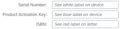
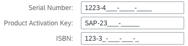
Mask input or a placeholder text are not substitutes for the input label. Using a label is mandatory. Placeholder texts in an input field are optional. Note that if there is no placeholder text, the input field will initially look empty. The mask formatting is revealed as soon as the focus is on the field.

Mask input without placeholder text

Mask input with placeholder text
Immutable Characters
When defining the mask format, the developer can place immutable characters, such as brackets and dashes, in specific positions. The format also specifies the range of valid characters for each separate position, thus preventing the user from entering invalid input.
For example, when the user enters a phone number, the area code in brackets and the space between the numbers are already present.
Note that the sap.m.MaskInput control extends sap.m.Input and has all the normal properties of an input field.
When creating a new mask, the developer can change the configuration of some default properties. For example, the default placeholder symbol “_” can be changed to something else.
Behavior and Interaction (incl. Gestures)
Entering Text
- Mask string appears in the input field on focus.
- The default placeholder symbol is “_” and can be changed to something else.

Entering text into a mask input
Copying and Pasting
Copying to a mask input field:
Users can copy both formatted and unformatted strings into a mask input field. When the texts are pasted, they take on the format defined for the mask input field.
Example: Mask input field for a number with the format: (000) 000 000000
| Copied source string | Value in mask input field after pasting |
| (555) 333 123456 | (555) 333 123456 |
| 555-333-123456 | (555) 333 123456 |
| 555 (333) 12 34 56 | (555) 333 123456 |
Copying from a mask input field:
If you copy a string from a mask input field and paste it elsewhere, the format of the mask input field is copied as well.
Deleting Content
Deleting a character from the string leaves the input information unchanged, except for the deleted character, which is replaced by a placeholder. (The mask does not shift if a character is deleted.)

Deleting individual characters in mask input
Select the entire string and delete it. The placeholders will reappear.

Deleting all characters in mask input
Guidelines
Validation Rules
Another option is to define new validation rules, such as allowing lowercase characters from “a” to “e” only. This is particularly flexible because these rules are defined with regular expression syntax.
The mask comes with two predefined validation rules: one for all characters in the English alphabet, and one for the numbers from zero to ten.
Therefore, when the mask format is being defined, the alphabetic rule is represented by the letter “a”, and the numeric rule by the number “9”. For example, a numeric mask format with a length of five characters would be specified as “99999”, a mask that accepts only alphabetical characters would be specified as “aaaaa”, and a mixed mask could be “aaa99”. In the mixed mask example, the user would not be able to enter numeric characters anywhere other than in the last two positions.
When you create the MaskInput instance, you can specify the following settings:
- Mask: The format specification, such as (123) 999-999.
- PlaceholderSymbol: A single character used to represent empty positions in a mask value, such as _ _ _ _ _.
- Rules: A collection of sap.m.MaskInputRule instances.
Unit of Measurement
You can use the layout options of the form to can add the unit of measurement (UoM) after the mask input control. Apps can use the label-field ratio to show the UoM after the field. However, you must make sure that the UoM is properly visualized and doesn’t wrap to the next row.
Properties
Mask string
The mask is defined by its character type (or by its length, as applicable). You should consider the following important facts:
- The mask characters normally correspond to an existing rule (one rule per unique character). Characters that do not are considered immutable characters. For example, the mask ‘2099’, where ‘9’ corresponds to a rule for digits, has ‘2’ and ‘0’ as immutable characters.
- Adding a rule that corresponds to the symbol placeholder is not recommended and would lead to unpredictable behavior.
Placeholder symbol string “_”
This defines a placeholder symbol. It is shown in a position where there has not yet been any user input.
Resources
Want to dive deeper? Follow the links below to find out more about related controls, the SAPUI5 implementation, and the visual design.
 Your feedback has been sent to the SAP Fiori design team.