
- Latest SAPUI Version 1.124
- SAPUI5 Version 1.122
- SAPUI5 Version 1.120
- SAPUI5 Version 1.118
- SAPUI5 Version 1.116
- SAPUI5 Version 1.114
- SAPUI5 Version 1.112
- SAPUI5 Version 1.110
- SAPUI5 Version 1.108
- SAPUI5 Version 1.106
- SAPUI5 Version 1.104
- SAPUI5 Version 1.102
- SAPUI5 Version 1.100
- SAPUI5 Version 1.98
- SAPUI5 Version 1.96
- SAPUI5 Version 1.94
- SAPUI5 Version 1.90
- SAPUI5 Version 1.88
- SAPUI5 Version 1.86
- SAPUI5 Version 1.84
- SAPUI5 Version 1.82
- SAPUI5 Version 1.80
- SAPUI5 Version 1.78
- SAPUI5 Version 1.76
- SAPUI5 Version 1.74
- SAPUI5 Version 1.72
- SAPUI5 Version 1.70
- SAPUI5 Version 1.68
- SAPUI5 Version 1.66
- SAPUI5 Version 1.64
- SAPUI5 Version 1.62
- SAPUI5 Version 1.60
- SAPUI5 Version 1.58
- SAPUI5 Version 1.56
- SAPUI5 Version 1.54
- SAPUI5 Version 1.52
- SAPUI5 Version 1.50
- SAPUI5 Version 1.48
- SAPUI5 Version 1.46
- SAPUI5 Version 1.44
- SAPUI5 Version 1.42
- SAPUI5 Version 1.40
- SAPUI5 Version 1.38
- SAPUI5 Version 1.36
- SAPUI5 Version 1.34
- SAPUI5 Version 1.32
- SAPUI5 Version 1.30
- SAPUI5 Version 1.28
- SAPUI5 Version 1.26
- Latest SAPUI Version 1.124
- SAPUI5 Version 1.122
- SAPUI5 Version 1.120
- SAPUI5 Version 1.118
- SAPUI5 Version 1.116
- SAPUI5 Version 1.114
- SAPUI5 Version 1.112
- SAPUI5 Version 1.110
- SAPUI5 Version 1.108
- SAPUI5 Version 1.106
- SAPUI5 Version 1.104
- SAPUI5 Version 1.102
- SAPUI5 Version 1.100
- SAPUI5 Version 1.98
- SAPUI5 Version 1.96
- SAPUI5 Version 1.94
- SAPUI5 Version 1.92
- SAPUI5 Version 1.90
- SAPUI5 Version 1.88
- SAPUI5 Version 1.86
- SAPUI5 Version 1.84
- SAPUI5 Version 1.82
- SAPUI5 Version 1.80
- SAPUI5 Version 1.78
- SAPUI5 Version 1.76
- SAPUI5 Version 1.74
- SAPUI5 Version 1.72
- SAPUI5 Version 1.70
- SAPUI5 Version 1.68
- SAPUI5 Version 1.66
- SAPUI5 Version 1.64
- SAPUI5 Version 1.62
- SAPUI5 Version 1.60
- SAPUI5 Version 1.58
- SAPUI5 Version 1.56
- SAPUI5 Version 1.54
- SAPUI5 Version 1.52
- SAPUI5 Version 1.50
- SAPUI5 Version 1.48
- SAPUI5 Version 1.46
- SAPUI5 Version 1.44
- SAPUI5 Version 1.42
- SAPUI5 Version 1.40
- SAPUI5 Version 1.38
- SAPUI5 Version 1.36
- SAPUI5 Version 1.34
- SAPUI5 Version 1.32
- SAPUI5 Version 1.30
- SAPUI5 Version 1.28
- SAPUI5 Version 1.26
Dynamic Page
sap.f.DynamicPage
Intro
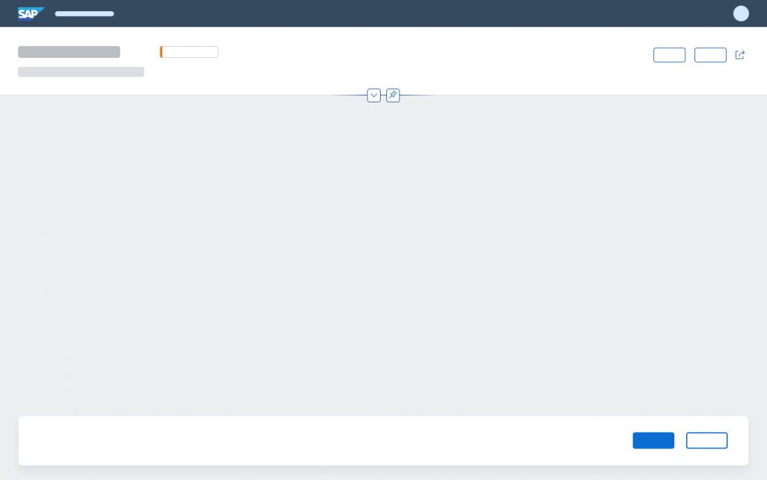
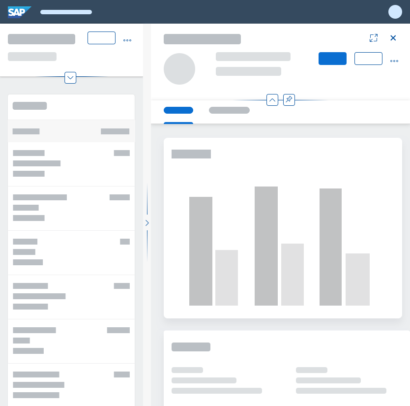
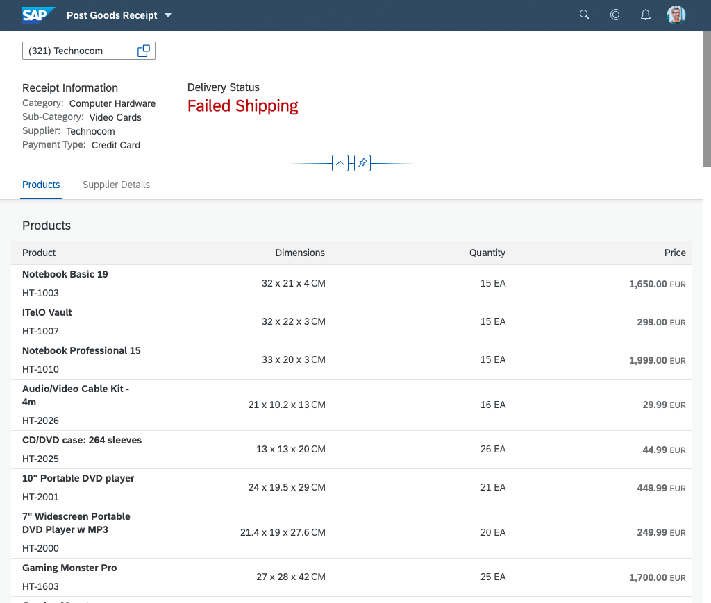
The dynamic page is the foundation for all pages in SAP Fiori. It is a generic layout control designed to support various floorplans and use cases. As a result, the content of both the header and the page can vary. Depending on your use case, you can either use one of the predefined floorplans or create your own layout.
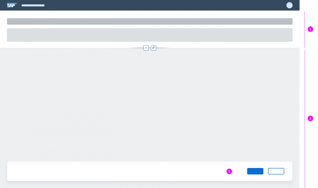
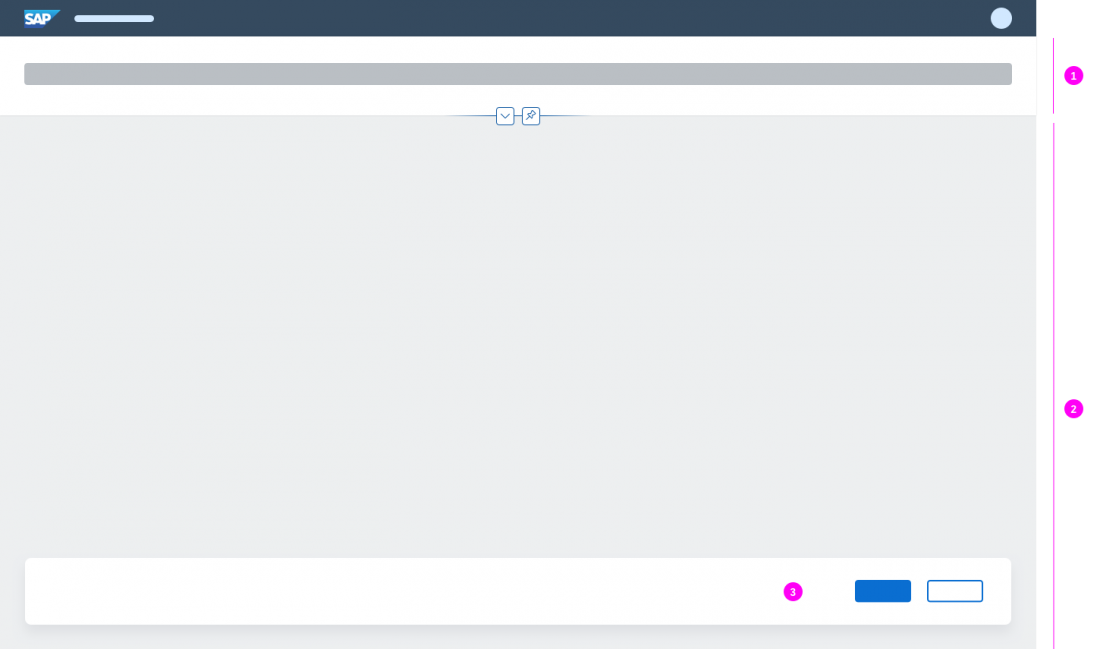
One part of the dynamic page header (1) is collapsible, which helps users to focus on the actual page content (2), while ensuring that important header information and actions are readily available. The dynamic page also includes an optional footer toolbar (3) for closing or finalizing actions that impact the whole page.
When to Use
Use the dynamic page if:
- You want to build a freestyle application that uses the foundation layout components for SAP Fiori pages, such as the dynamic page header and the footer toolbar. Also see the related semantic page.
- You want to build a simple object page with only one section.
- You want to represent your application in full screen. Also the combination within the flexible column layout is possible.
Do not use the dynamic page if:
- You are planning to use SAP Fiori elements, such as the list report, analytical list page, overview page, or object page. These floorplans already incorporate the dynamic page.
- You want to implement an initial page or an object page floorplan with complex content and several sections. These floorplans only use the dynamic page header.
- You only need to display a small amount of information. In this case, use a dialog instead. If you can’t avoid using the dynamic page, use letterboxing to mitigate the issue.
Dynamic Page vs. Semantic Page
The dynamic page is a skeleton structure that comes with empty content containers (page header, page content) and built-in responsive behavior.
This basic structure can be “filled” with content elements in three ways:
- Automatically: If you are using an SAP Fiori element floorplan, the content of the dynamic page is provided out of the box.
- Via the semantic page (recommended for freestyle apps): If you are creating a floorplan from scratch, you can use the semantic page (
sap.f.semanticPage) to create a freestyle page. The semantic page is a separate control that comes with built-in logic for adding predefined content elements to the page, such as a title, global actions, and a footer toolbar. Using the semantic page significantly reduces the development effort for app teams, and ensures that the header and footer content is structured consistently.
Note that in this case, the app developer uses only the semantic page control (which already embeds the dynamic page), and not the dynamic page control itself. - Manually: Technically, it’s possible to build the dynamic page from scratch. However, implementing the dynamic page manually is a significant development effort! Only consider this option in exceptional cases (for example, if you have special requirements for a freestyle app that cannot be implemented using the preconfigured semantic page control).
Components
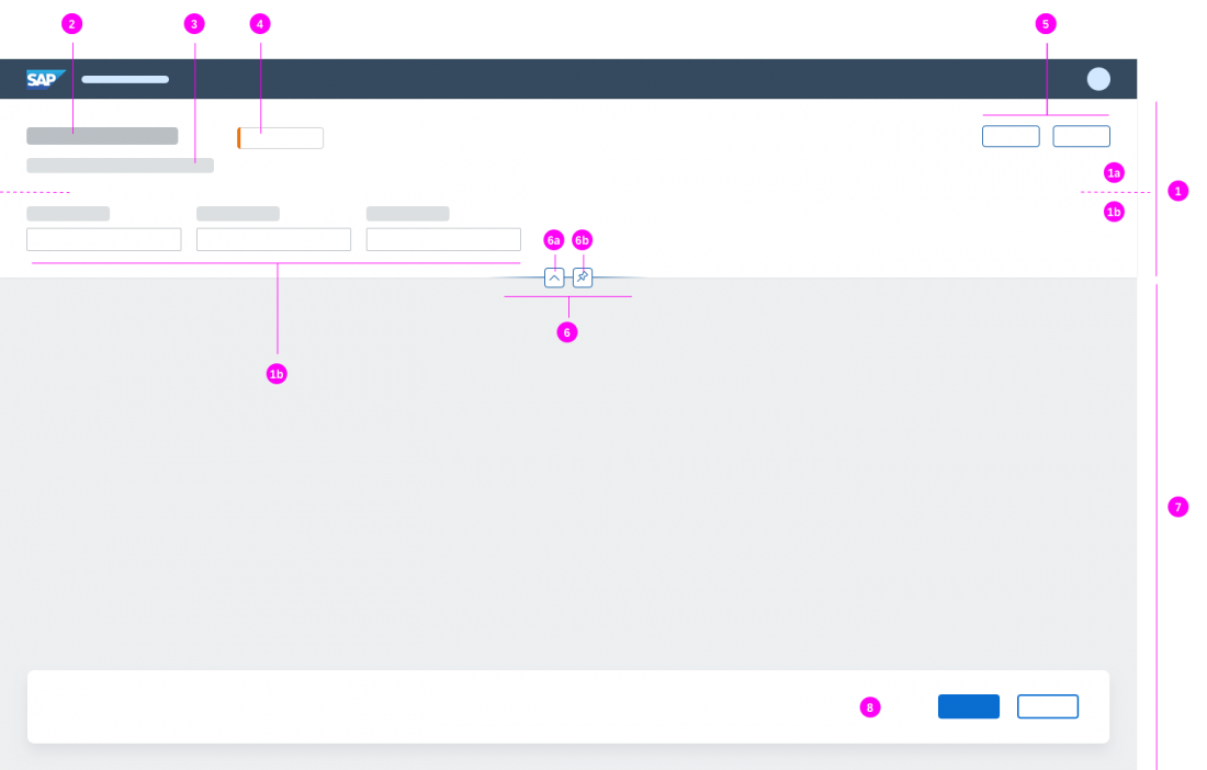
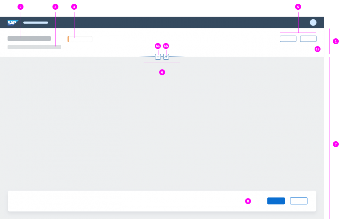
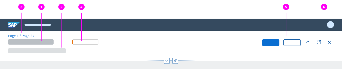
Like all layouts, the dynamic page is below the shell bar of the SAP Fiori launchpad, which is always at the very top. The dynamic page consists of the following areas:
- Dynamic page header, comprising the header title (1a) and the expandable/collapsible header content (1b)
- Title
- Subtitle/summary
- Key information / KPI
- Global actions
- Header features to expand/collapse (6a) and pin/unpin (6b) the header
- Page content (differs depending on the use case and floorplan)
- Footer toolbar with finalizing actions
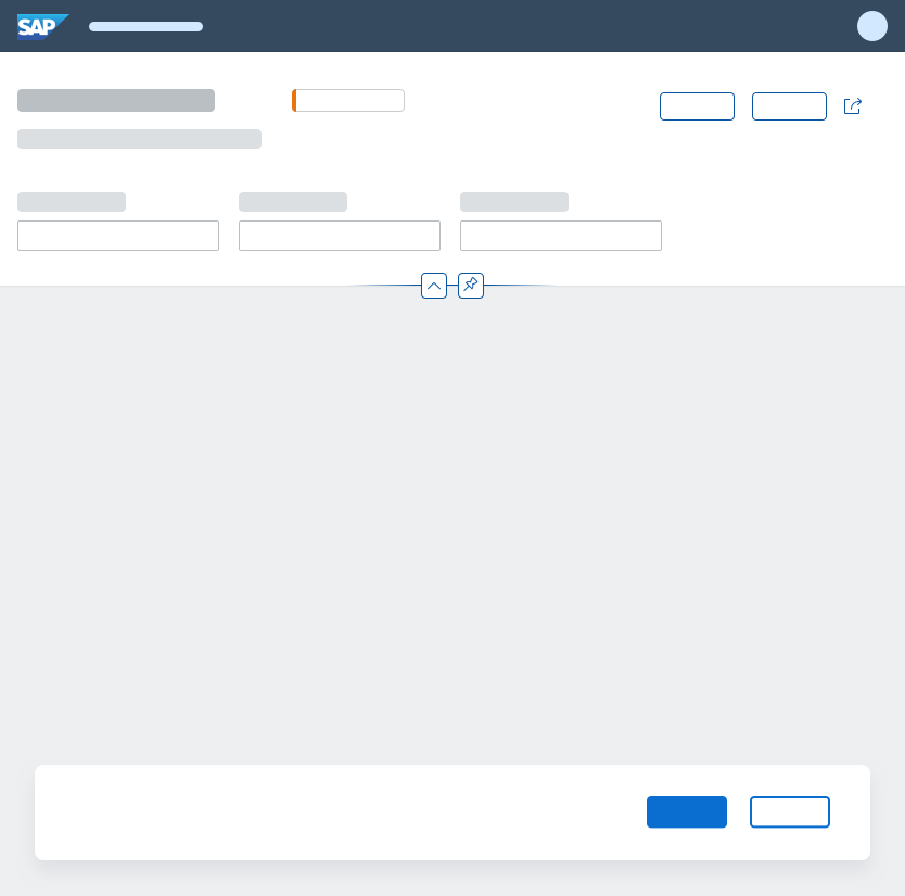
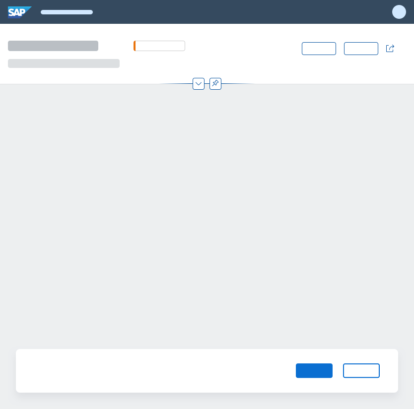
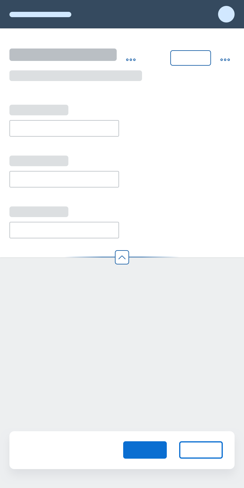
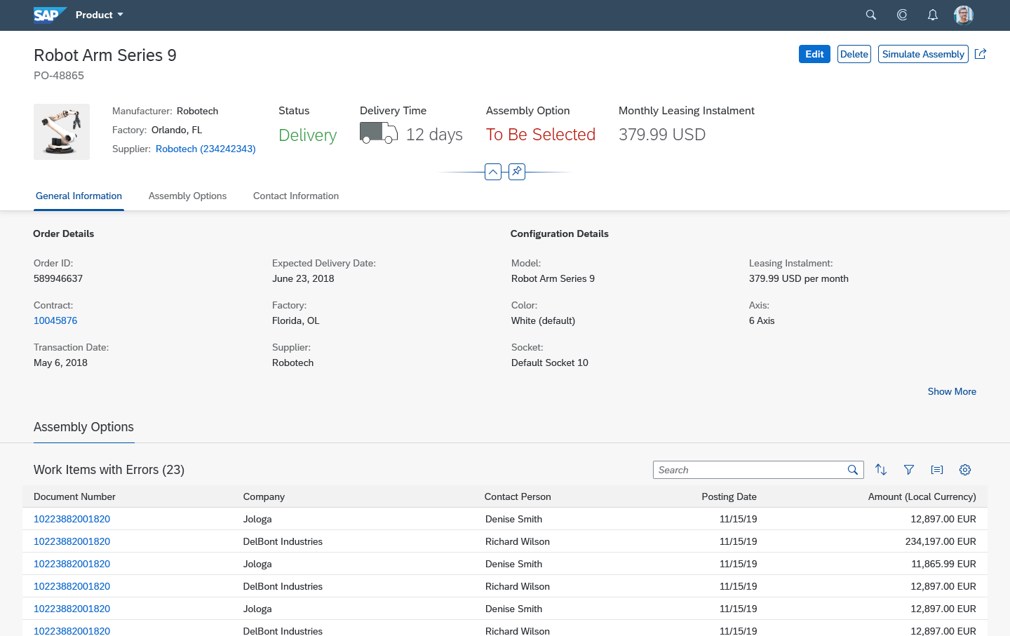
Dynamic Page Header
The dynamic page header contains the header title (mandatory) and the header content (optional).
Header Title
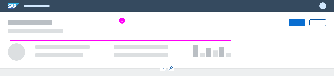
Dynamic page - Header title example
The header title bar (sap.f.DynamicPageTitle) always contains one of the following elements:
- Title (1): The title is located on the left of the header title bar, and is always visible. The title can contain one of the following components:
-
- Title (text)
- Link
- Variant management
- Input field (for the initial page)
Optional Elements
- Subtitle/summary (2)
Placement: Always below the title. The subtitle is often used to summarize the most important information in the collapsed header content. For example, if the header area contains a filter (as in a list report, analytical list page, or overview page), the subtitle can be used to display the “Filtered By” information. - Breadcrumb (3)
Placement: Above the title. Depending on the floorplan and use case, you can add breadcrumb navigation. The breadcrumb is located above the header title, and is primarily used to display the hierarchy of subpages within an object page.
Note that in the flexible column layout, the breadcrumb is only available in full screen mode, and only if just one column is visible. - Key information (4)
Placement: In the middle area, but left-aligned. Floorplans can also contain key information, such as text, mini facets, and KPI tags.
Note that currently, KPI tags are only used within the analytical list page and worklist floorplans. - Global actions (5)
Placement: Global actions for the entire floorplan appear on the right-hand side of the header title bar. Always offer the actions as buttons, visualized either as text or icons. For more information, see Header Toolbar. In the collapsed mode, the header title offers the same actions as in the expanded mode and keeps them actionable. - Layout actions (6)
Placement: Typical layout actions are the Close, Full Screen, or Exit Full Screen icons, which are mainly offered by the flexible column layout. Depending on the screen size, the layout actions are placed either on the very right of the global actions toolbar, separated by a divider line, or above the global actions (see more in the Responsiveness section). Note that the dynamic page only provides the area for the layout actions. The navigation actions themselves are defined separately (for example, using the semantic page).
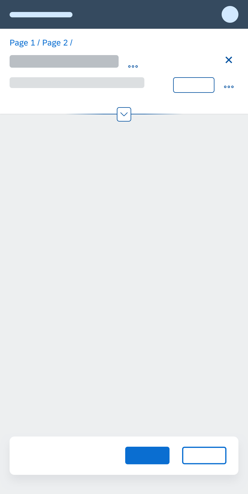
Header Content
Dynamic page - Header content example
The optional header content (sap.f.DynamicPageHeader) is located below the header title. You can place any components in the header content area (1) as long as they follow the guidelines for the respective floorplan.
When the dynamic page header collapses, the header content area is hidden. If there is no header content, the header content area is hidden automatically. In the latter case, the header title is not interactive (snap on scroll or snap on click) and there is no expand/collapse header feature.
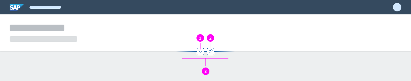
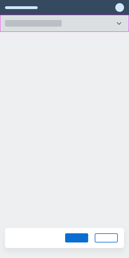
Dynamic page - Header features
The header features (3) allow users to control the visibility of header content using two icon buttons at bottom of the header content area:
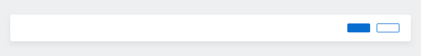
Dynamic page - Footer toolbar
The footer toolbar (sap.m.Toolbar) is an optional part of the dynamic page. You can use it to offer closing or finalizing actions.
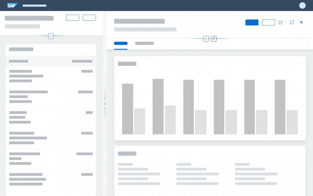
The layout of the dynamic page is responsive and optimized for use within a flexible column layout. Each column (1, 2, 3) can contain its own dynamic page with a different floorplan, depending on the use case.
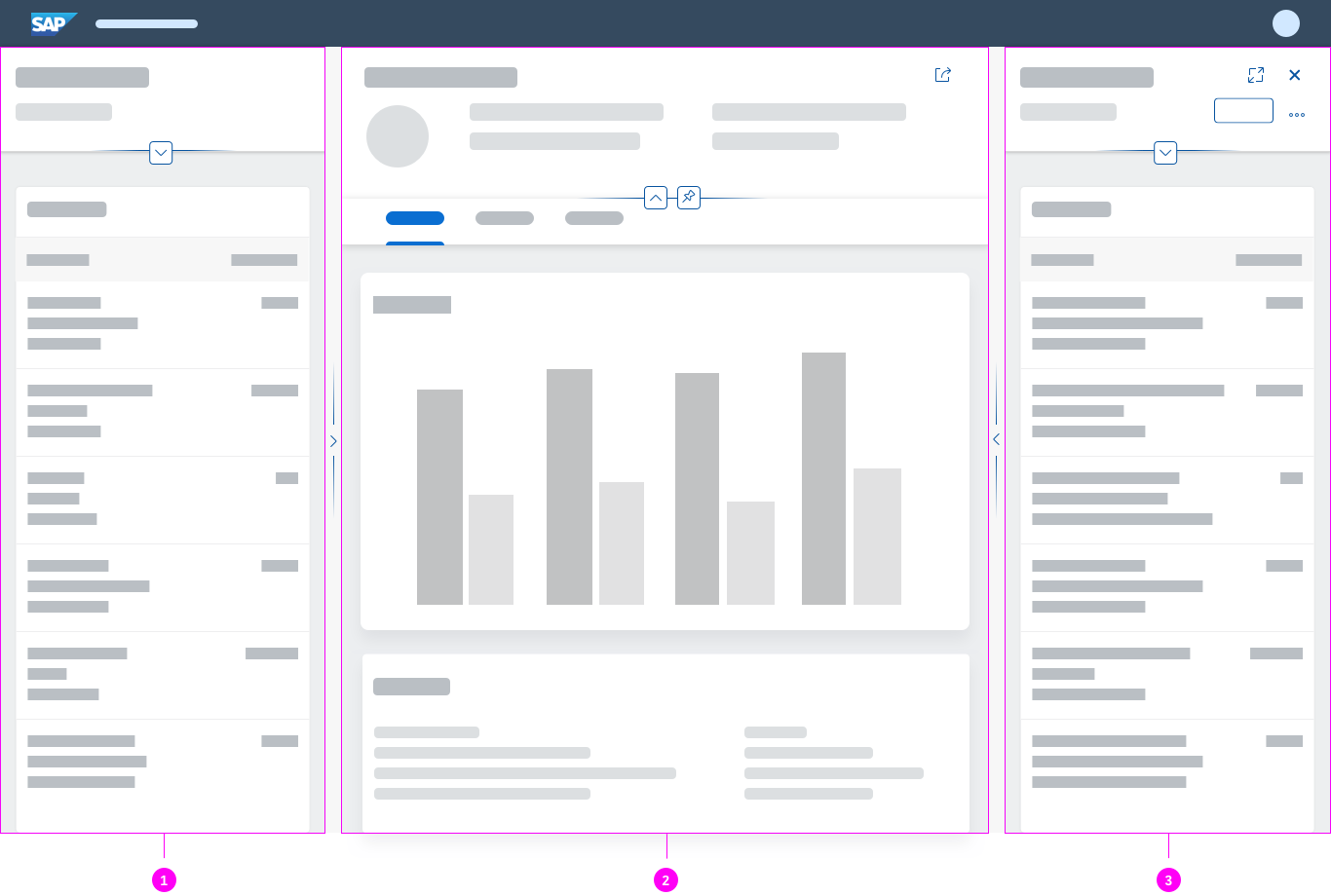
Dynamic page inside the flexible column layout
Initial Focus
The dynamic page itself doesn’t set an initial focus. The initial focus depends on the floorplan that is using the dynamic page and the specific app use case.
Dynamic Page Header
The dynamic page header supports three optional interaction patterns that can be combined. To show more of the actual page content, the header content can collapse or expand using defined triggers (snap on scroll and snap on click). In addition, users can fix the header content while scrolling through the page content with the pin feature. The combined usage of all three patterns is recommended and activated by default.

Dynamic page - Snap on scroll

Dynamic page - Snap on click

Dynamic page - Pin/unpin
Starting in Expanded or Collapsed Mode
By default, the header content is initially expanded. In certain cases, it can also make sense to deviate from the default and allow the header to appear in collapsed mode when initiating the app. However, the idea is to always expand the header content when the application starts without a query (and the content area is therefore empty).
Snap on Scroll
Scrolling is the typical trigger for collapsing the header content. When the user scrolls down the page, the header content scrolls away. The header title switches to collapsed mode and stays fixed. When the user scrolls up the page, the header content expands again.
Note that this interaction pattern works only in combination with an expandable/collapsible header content. It can be combined with snap on click, but does not have to be.
Snap on Click
The snap on click pattern is another way of expanding and collapsing the header content. The user can collapse the header without scrolling, and expand it again even when it has been collapsed by scrolling down. Two interaction variants are offered, which always appear in combination: clicking the header title and clicking the Expand Header / Collapse Header icon button in the header features area.
Again, the interaction pattern works only in combination with expandable/collapsible header content. It can be combined with snap on scroll, but does not have to be.
The user can expand and collapse the header content by clicking anywhere on the header title bar that has no active elements (such as links or active buttons). When using a mouse, the cursor changes from an arrow to a hand to support the user’s interaction. In addition, a hover effect is visible on the header title and on the Expand Header / Collapse Header icon button in the header area. If the header is expanded and the user clicks the title bar, the header content collapses, and vice versa.
Clicking the Expand/Collapse Header Button
The expand/collapse header feature is a small icon button directly below the header, which is also used to expand or collapse the header content. When the pin is active, the expand/collapse header button is still available and overrules the pin. The icon buttons for expanding and collapsing the header are an alternative to clicking on the header title bar, which might not have much clickable space. They also support keyboard actions.
Pinning the Header Content
Activating the pin feature keeps the header expanded while the user scrolls through the page content. This mode remains fixed until the user clicks the pin icon again or triggers snap on click. This feature is optional and can be switched off if it is not useful for your application.
The expand/collapse header button remains visible when the pin is activated. Clicking the Collapse Header icon overrules the pin, collapses the header, and switches the pin button off. Do not offer the pin feature for floorplans without scrollbars (see special case below), or if there is no header content.
In the smartphone version, the pin action is not provided, as the pinned header would take up too much screen real estate. The same applies whenever the dynamic page header would occupy more than 60% of the screen, regardless of the device type. Overruling the pin feature keeps the focus on the content.
Note that this interaction works only in combination with expandable/collapsible header content. The pin button is available as soon as snap on scroll (or snap on click) is activated.
Special Case: No Page Scrolling Possible
The following special case applies for pages containing desktop-centric tables, such as the analytical table, grid table, or tree table.
Because these tables use up all of the available screen space, there should not be a vertical scroll function, and hence no snap on scroll. In this special case, an explicit interaction via the expand/collapse header button is required to expand or collapse the content area. The pin feature is obsolete and is not provided.
This exceptional case also applies to chart containers that use up all the available screen space in a similar way to desktop-centric tables.
The dynamic page header expands automatically as soon as keyboard actions like tabbing or group jumps (F6) bring the content of the dynamic page header into focus.
The dynamic page header collapses as soon as the keyboard focus leaves the dynamic page header content area.
| Key(s) | Behavior |
| Tab | Move the focus to the dynamic page header / header title bar. The dynamic page header expands automatically. If the focus is inside the header content area, move the focus to the next UI element within the header.
If the focus is on the last UI element within the header content area (expand/collapse header feature), leave the header. Collapse the header content. |
| Shift+Tab | See Tab, in reverse order. |
| F6 | If the focus is before the header title bar, set the focus to the header title bar. Expand the header content. If the focus is within the header content, move the focus out of the header and collapse the header content. |
| Shift+F6 | See F6, in reverse order. |
Responsiveness
The dynamic page offers considerable freedom and flexibility. In addition, the dynamic page header and the footer toolbar are designed to adapt automatically to small, medium, and large screen sizes.
The title (sap.m.Title) and subtitle (sap.m.Text) on the left truncate in collapsed mode to save vertical space, and wrap in expanded mode to offer the full text. This behavior needs to come from the respective controls for the title and subtitle. Overall, we recommend showing a maximum of 2 lines of text in collapsed mode. This prevents a disproportionate header height, especially on mobile devices if no summary line is used. The 2 lines can either be a combined title and subtitle, or a longer wrapping title. For more information, see wrapping and truncating text.
Key information, such as a KPI (middle area, left aligned), stays as long as possible before it moves into the overflow.
Global actions stay as long as possible. If there is no key information, the title and the global actions automatically get more space. The toolbar follows the standard toolbar overflow guidelines, and adds the available buttons to the overflow menu from right to left.
Layout actions: The dynamic page offers a specific area for layout actions, which reacts to the predefined breakpoint of 1280 px:
- Less than 1280 px: Navigation actions are placed in a separate row above the global actions.
- 1280 px or more: Navigation actions are placed to the right of the global actions on the same line.
This breakpoint corresponds to the page width and not to the window width. Therefore it doesn’t matter whether the page is used in the flexible column layout, on a desktop device, or on a mobile device.
Letterboxing limits the width of the content area to 1280 px. This prevents the app content from becoming too “stretched” on wide screens, and optimizes readability. Letterboxing can be used together with the dynamic page if the use case requires it. However, most business apps offer so much content that the page is typically shown across the entire screen, without letterboxing.
Size L
Size M
Size S

Summary Line
To save vertical space on smartphones, you can opt to display a smaller summary line instead of the collapsed header. The header content scrolls away as soon as the user scrolls up the page. The header converts to a summary line, which shows only the title and an arrow icon button on the very right of the screen. Tapping the summary line also expands and collapses the whole header. The rest of the page stays in the same position.
Size S with summary line
Examples
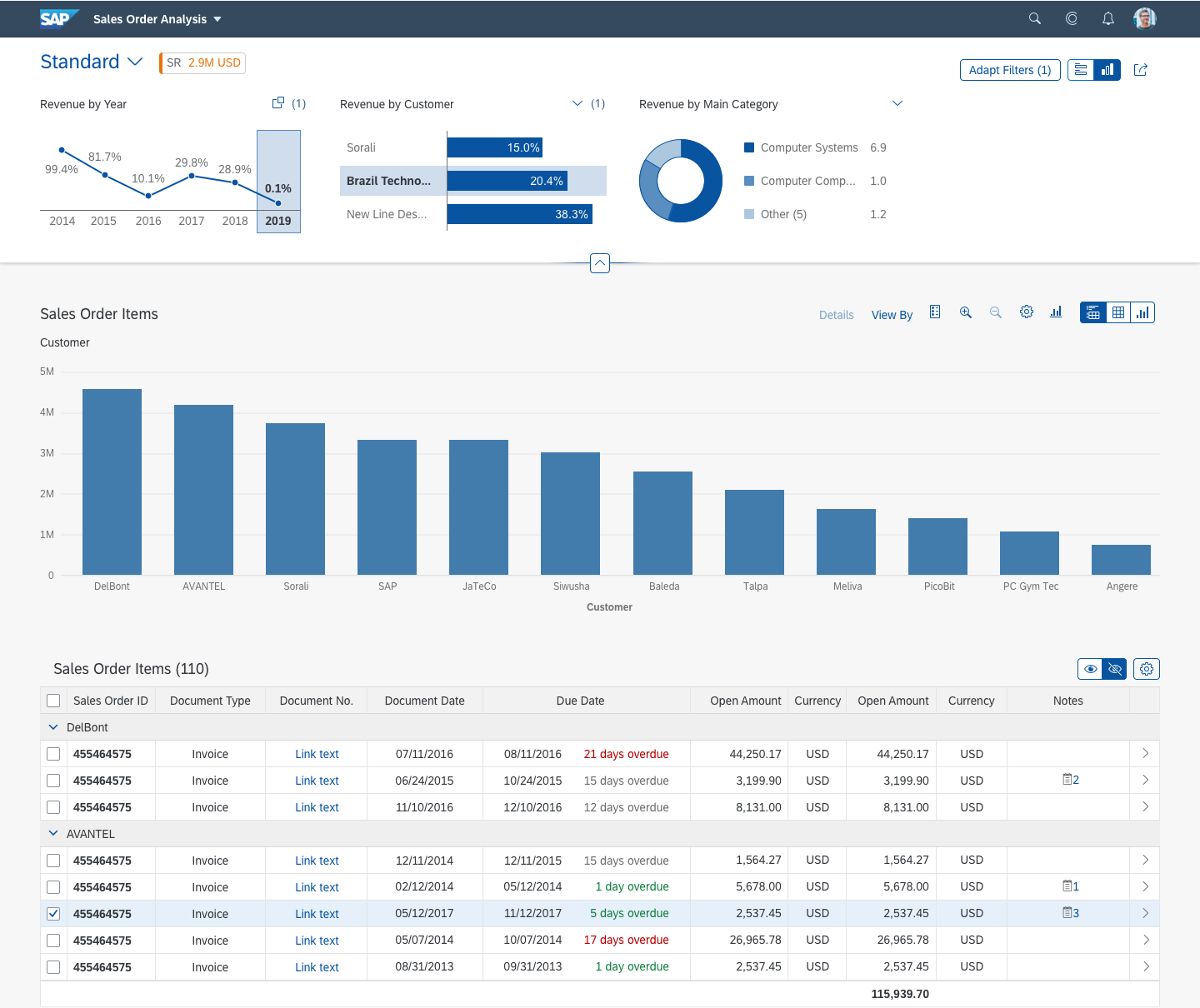
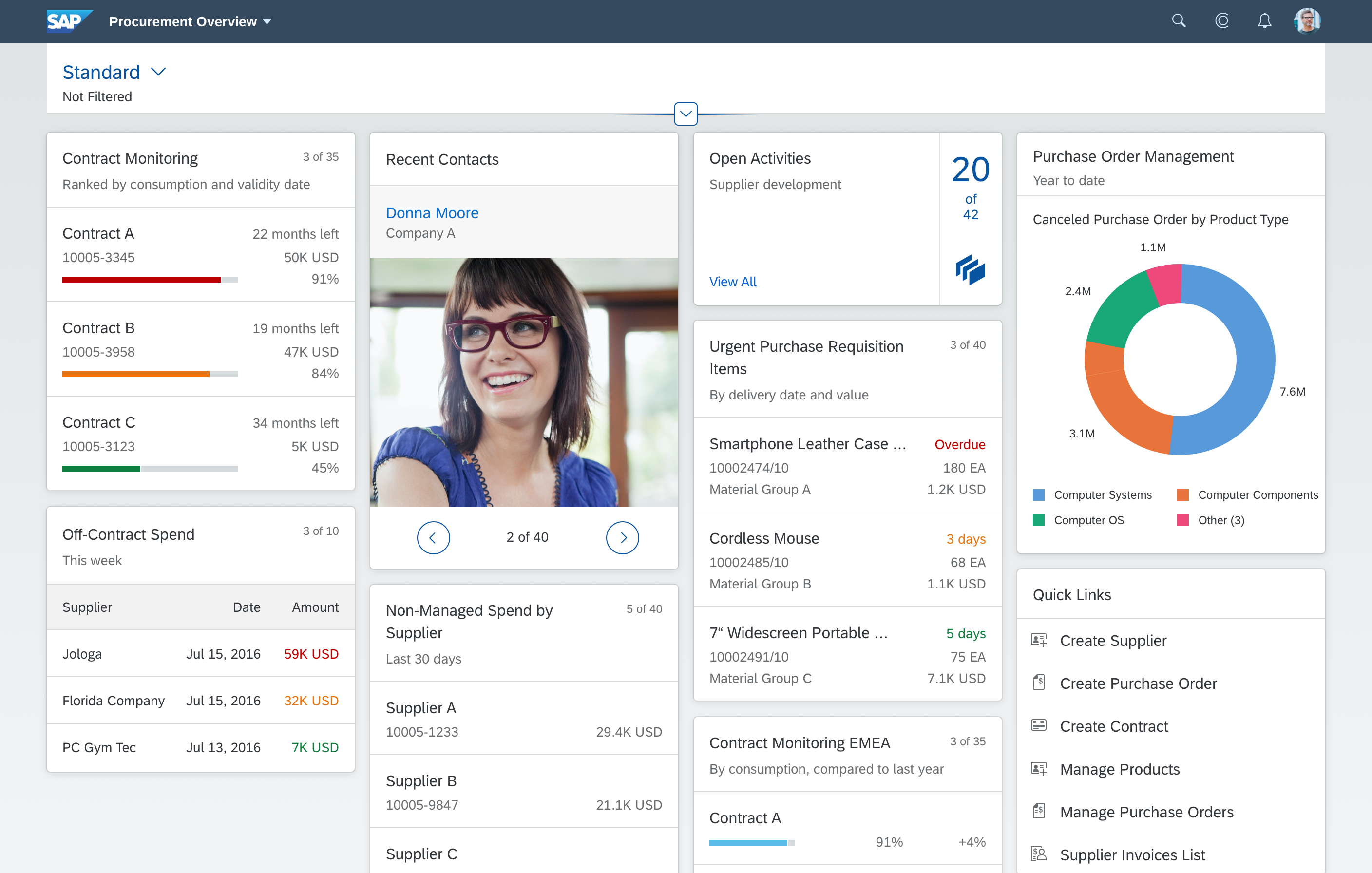
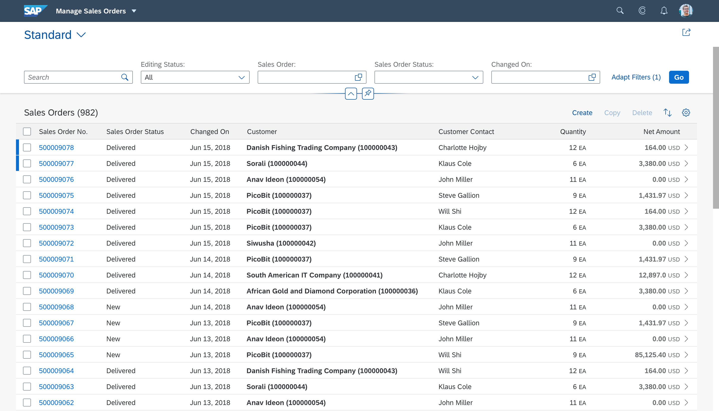
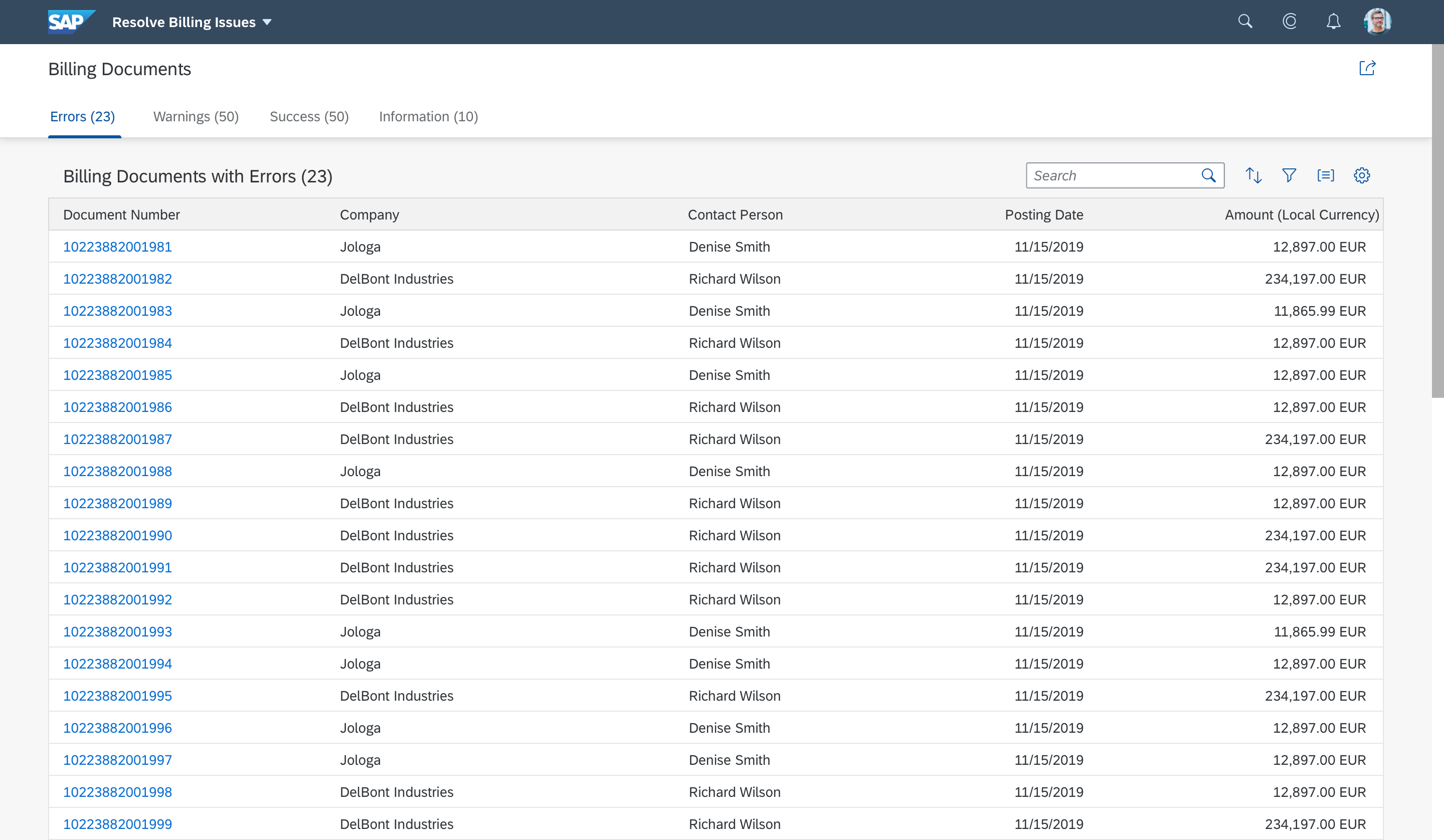
The dynamic page is a generic control. The content of both the header and the page differs from floorplan to floorplan. Here are some examples showing the most frequently-used variants for each type of floorplan. For detailed guidance, see the corresponding floorplan guidelines (analytical list page, overview page, list report, worklist, initial page, object page, wizard).
Floorplan Examples
Top Tips
- Always use a header title – either as a text or link, or by including variant management. For the initial page floorplan, use an input field.
- Use the header title and header content to provide the most relevant information and actions for your use case.
- Only use KPI tags within the analytical list page and worklist floorplans.
- Do not remove or disable the actions within the global action toolbar when the header content is collapsed.
- Make sure that the layout actions in the flexible column layout are displayed correctly and never get hidden in the overflow.
- Start your application in expanded mode if users need further content or adjustment options to get started.
- Offer the pin feature whenever users may need to fix the header content while scrolling through the page content.
- Activate the summary line on smartphones to help users focus on the page content.
Related Links
Elements and Controls
- Floorplan Overview (guidelines)
- SAP Fiori Elements (guidelines)
- Footer Toolbar (guidelines)
- Flexible Column Layout (guidelines)
- Semantic Page (guidelines)
Implementation
- Dynamic Page – Freestyle and analytical table sample (SAPUI5 samples)
- Dynamic Page – List Report Sample (SAPUI5 samples)
- Dynamic Page (SAPUI5 API reference)
- Overflow Toolbar (SAPUI5 API reference)
- Flexible Column Layout (SAPUI5 samples)
- Semantic Page (SAPUI5 samples)
 Your feedback has been sent to the SAP Fiori design team.