
- Latest SAPUI Version 1.124
- SAPUI5 Version 1.122
- SAPUI5 Version 1.120
- SAPUI5 Version 1.118
- SAPUI5 Version 1.116
- SAPUI5 Version 1.114
- SAPUI5 Version 1.112
- SAPUI5 Version 1.110
- SAPUI5 Version 1.108
- SAPUI5 Version 1.106
- SAPUI5 Version 1.104
- SAPUI5 Version 1.102
- SAPUI5 Version 1.100
- SAPUI5 Version 1.98
- SAPUI5 Version 1.96
- SAPUI5 Version 1.94
- SAPUI5 Version 1.90
- SAPUI5 Version 1.88
- SAPUI5 Version 1.86
- SAPUI5 Version 1.84
- SAPUI5 Version 1.82
- SAPUI5 Version 1.80
- SAPUI5 Version 1.78
- SAPUI5 Version 1.76
- SAPUI5 Version 1.74
- SAPUI5 Version 1.72
- SAPUI5 Version 1.70
- SAPUI5 Version 1.68
- SAPUI5 Version 1.66
- SAPUI5 Version 1.64
- SAPUI5 Version 1.62
- SAPUI5 Version 1.60
- SAPUI5 Version 1.58
- SAPUI5 Version 1.56
- SAPUI5 Version 1.54
- SAPUI5 Version 1.52
- SAPUI5 Version 1.50
- SAPUI5 Version 1.48
- SAPUI5 Version 1.46
- SAPUI5 Version 1.44
- SAPUI5 Version 1.42
- SAPUI5 Version 1.40
- SAPUI5 Version 1.38
- SAPUI5 Version 1.36
- SAPUI5 Version 1.34
- SAPUI5 Version 1.32
- SAPUI5 Version 1.30
- SAPUI5 Version 1.28
- SAPUI5 Version 1.26
- Latest SAPUI Version 1.124
- SAPUI5 Version 1.122
- SAPUI5 Version 1.120
- SAPUI5 Version 1.118
- SAPUI5 Version 1.116
- SAPUI5 Version 1.114
- SAPUI5 Version 1.112
- SAPUI5 Version 1.110
- SAPUI5 Version 1.108
- SAPUI5 Version 1.106
- SAPUI5 Version 1.104
- SAPUI5 Version 1.102
- SAPUI5 Version 1.100
- SAPUI5 Version 1.98
- SAPUI5 Version 1.96
- SAPUI5 Version 1.94
- SAPUI5 Version 1.92
- SAPUI5 Version 1.90
- SAPUI5 Version 1.88
- SAPUI5 Version 1.86
- SAPUI5 Version 1.84
- SAPUI5 Version 1.82
- SAPUI5 Version 1.80
- SAPUI5 Version 1.78
- SAPUI5 Version 1.76
- SAPUI5 Version 1.74
- SAPUI5 Version 1.72
- SAPUI5 Version 1.70
- SAPUI5 Version 1.68
- SAPUI5 Version 1.66
- SAPUI5 Version 1.64
- SAPUI5 Version 1.62
- SAPUI5 Version 1.60
- SAPUI5 Version 1.58
- SAPUI5 Version 1.56
- SAPUI5 Version 1.54
- SAPUI5 Version 1.52
- SAPUI5 Version 1.50
- SAPUI5 Version 1.48
- SAPUI5 Version 1.46
- SAPUI5 Version 1.44
- SAPUI5 Version 1.42
- SAPUI5 Version 1.40
- SAPUI5 Version 1.38
- SAPUI5 Version 1.36
- SAPUI5 Version 1.34
- SAPUI5 Version 1.32
- SAPUI5 Version 1.30
- SAPUI5 Version 1.28
- SAPUI5 Version 1.26
Chart Toolbar
sap.suite.ui.commons.ChartContainer | sap.m.Bar
Intro
The chart toolbar acts as a container for charts.
The width and height of the chart container are never defined by the app, but are always set by the container itself (as explained in Size of the Chart Container).
The toolbar is mandatory. Small charts or micro charts, such as dashboards, table cells, and small frames are an exception to this rule. In these cases, the developer must provide a consistent UI to enable action on the chart.
The toolbar is always placed on top of the chart. It provides actions such as multiple box selection for selecting dimensions, full screen format, personalization actions, and a toggle function for showing and hiding legends.
Responsiveness
The chart container uses the sap.m.OverflowToolbar control. It is a container based on sap.m.Toolbar that provides overflow when its content does not fit in the visible area. For more information, please refer to the toolbar overview article (under Responsiveness).
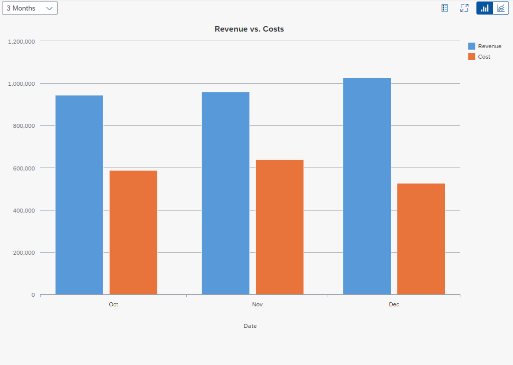
Chart toolbar – Size L
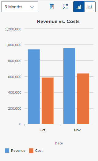
Chart toolbar – Size S
Components
The following content can be part of the chart toolbar. Use only the content your users really need and display them in the order shown below:
- Title
- Variant management or perspective switch
- Business actions (app-specific)
- Actions for content management
- Show Legend / Hide Legend
- Zoom In
- Zoom Out
- Settings
- Minimize / Maximize
- View switch (between different chart types or between chart and table)
- Overflow

Components of the chart toolbar
Behavior and Interaction
Business Actions (app-specific)
If needed, you can define your own actions for the app using transparent text buttons only. If multiple actions are required, sort them, starting with the most important action (= primary action) on the left. You can emphasize the primary action using a ghost button.
More information:

Chart toolbar with business actions

Chart toolbar with emphasized primary business action
Title
A title provides a short, meaningful summary of the content, often in a single word. To display a title, use the title control.
Use a title if you need the chart toolbar, and if the title of the chart is not indicated in the surrounding area. Note that the title is truncated if there is not enough space.

Chart toolbar - Title
Variant Management
In charts, a variant stores all the settings that define the chart view (for example, the selected dimensions and the sort and filter settings). The variant management control enables users to load, save, and change variants. In most cases, variant management replaces the title.

Chart toolbar - Variant management
Title and Variant Management
If you need both a title and variant management, place the variant management control directly after the title. Use a separator between the title and variant management.
Since using both controls often leads to truncation problems, this pattern is not recommended.

Chart toolbar - Title with variant management
Perspective Switch

Chart toolbar - Perspective switch
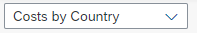
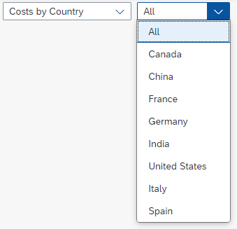
The perspective switch is left-aligned in the toolbar. It can be used to switch between different dimensions. We recommend using a select control, but any other dropdown control can be used as well. The perspective switch replaces the title and the variant management control.
For SAP Smart Business apps, the view incorporates and defines the chart description, the dimension, the measure, and the defaulted chart type. The various views are preconfigured and maintained by an SAP Smart Business administrator.
Ensure that all switches have a meaningful title. We recommend using a short chart description followed by the dimensions:
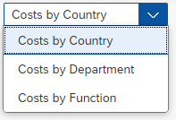
Simple perspective
You also have the option of extending the perspective switch if the app needs to switch between specific subdimensions. The number of dimensions and subdimensions that are needed depends on the app.

Perspective view with subdimension
If the app does not need a perspective switch, use the chart title (property: title).

Chart with title
Legend (Generic)

Chart toolbar with legend button
The Legend button (property: ShowLegend) is the first generic action. The user clicks this button to hide or show the chart legend.
The legend also allows the user to select or deselect data points.
Zoom In/Zoom Out
We recommend offering the zoom feature on the chart toolbar. Two icon buttons depicting a magnifying glass are then displayed. When the user clicks the Zoom In or Zoom Out button, the chart zooms accordingly.

Chart with zoom in/out buttons
Settings
You can add a Settings button to the chart toolbar to enable app-specific settings (property: ShowPersonalization). The corresponding popover or dialog must also be implemented by the app team.
We do not recommend using this feature. If you do choose to use it, exercise caution. Bear in mind that the perspective switch feature already allows preconfiguration of several combinations of dimensions, measures, and chart type selections.
When viewing charts, users do not usually want to think about which chart types, dimensions, or measures are most suitable in a particular use case. Instead, decide on the most valuable chart/dataset combinations for the end user beforehand and provide users with the most appropriate preconfigured chart view.

Chart personalization action
View Switch (Generic)

Chart toolbar with view switch
View switches are right-aligned in the toolbar. They allow the user to switch between different chart types or table layouts. You need to offer the view switch if the chart relies on subtle color differences or color gradients. Users with visual impairments can then use the table view.
Switches are optional. The buttons can be hidden if there is no need to switch between different charts or tables.
Be careful when choosing the chart types and the number of switches. For each app, decide which chart types are best suited to visualizing data in the user’s context.
We recommend using no more than three types of visualization. The sequence of chart type switches is not fixed, but we recommend sorting them by importance and usage within the respective app.
The segmented button control is used to display the chart types. The control highlights the chart that is currently displayed.
View Switch – Switch Between Chart and Table
The view switch allows you to switch easily between tables and charts.
Some actions are only available in certain views. For example, the Legend icon is only visible in the chart view. If the user selects the table view, the Filter action is visible and the Legend icon is hidden.
Icon Usage
Each visualization of a chart is represented by an icon. The icon explorer helps you to find the most appropriate icon.

Bar chart: "SAP-icons" font - Unicode: #e02c - Name: horizontal-bar-chart

Horizontal bullet chart: "SAP-icons" font - Unicode: #e215

Vertical bullet chart: "SAP-icons" font - Unicode: #e216

Combined column line chart: "SAP-icons" font - Unicode: #e11f - Name: business-objects-experience

Stacked bar chart: "SAP-icons" font - Unicode: #e183 - Name: horizontal-stacked-chart

Stacked column 100% chart: "SAP-icons" font - Unicode: #e180 - Name: full-stacked-column-chart

Bar chart: "SAP-icons" font - Unicode: #e182 - Name: horizontal-bar-chart-2

Column chart: "SAP-icons" font - Unicode: #e0ef - Name: vertical-bar-chart

Pie chart: "SAP-icons" font - Unicode: #e015 - Name: pie-chart

Stacked bar 100% chart: "SAP-icons" font - Unicode: #e17f - Name: full-stacked-chart

Table chart: "SAP-icons" font - Unicode: #e0bb - Name: table-chart

Heatmap: "SAP-icons" font - Unicode: #e214

Bubble chart: "SAP-icons" font - Unicode: #e18e - Name: bubble-chart

Column chart: "SAP-icons" font - Unicode: - Name: vertical-bar-chart-2

Donut chart: "SAP-icons" font - Unicode: #e213

Scatter chart: "SAP-icons" font - Unicode: & #xe18f; - Name: scatter-chart

Stacked column chart: "SAP-icons" font - Unicode: #e184 - Name: vertical-stacked-chart
Map: "SAP-icons" font - Unicode: #e185 - Name: choropleth-chart
Maximize / Minimize

Chart toolbar with maximize button
In addition to zooming, the app can use the full screen mode of the chart container (property: FullScreen).
The user can open the chart in a full screen dialog via this toggle button. When the chart is maximized, the Maximize button is replaced by a corresponding Minimize button.
Overflow (Generic)
See Overflow in the Toolbar Overview article.
Guidelines
See the detailed Guidelines section in the Toolbar Overview article.
Additional Guidelines
- Think carefully about what actions you really need in the chart toolbar – do not overload the toolbar with actions.
- Try to put the actions as close to the content as possible.
- Use appropriate tooltips to label icon buttons in the chart toolbar.
Resources
Elements and Controls
- Chart Overview (guidelines)
- Chart Types (guidelines)
- Chart – Behavior and Interaction (guidelines)
- Chart – Embedding (guidelines)
- Chart – Color Palettes (guidelines)
Implementation
- Bar (SAPUI5 samples)
- Buttons (SAPUI5 samples)
- Chart Container (SAPUI5 samples)
- Overflow Toolbar (SAPUI5 samples)
- Bar (SAPUI5 API reference)
- Buttons (SAPUI5 API reference)
- Chart Container (SAPUI5 API reference)
- Overflow Toolbar (SAPUI5 API reference)
 Your feedback has been sent to the SAP Fiori design team.