Modalities
Intro
Conversational products enable users to interact with technology in a more natural way. After all, what could be more natural than conversation to get things done?
Conversational products have evolved from voice-only systems to a multimodal system that integrates text, voice, and graphics.
A voice-only interface
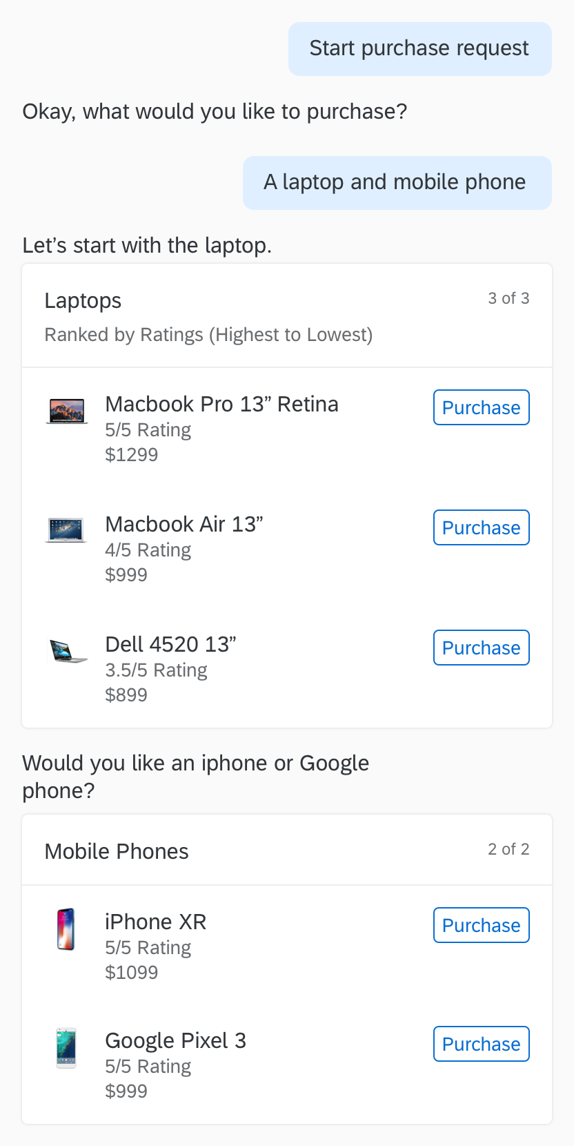
Conversational interface

Here are some things to consider when designing multimodal interactions:
- Who and where are your users?
- What are the characteristics of each modality?
- How do you approach designing multimodal interactions?
Who and Where
“Know your users,” a basic precept of user experience design, goes a step further when designing multimodal interactions. You must understand the business goals and tasks of your users, as well as their preferences and behavior.
In a multimodal design, one problem can have different solutions. Think of designing multiple solutions for a problem, so users can choose their path, depending on their context.
As shown in the example on the right, when a user asks about her quarterly bonus, the system offers to provide the information in different ways:
Placeona
Bill Buxton, a Canadian computer scientist and researcher, coined the term “placeona” to refer to how location influences how people interact with technology. The location of users determines which of their senses they can use to interact with their devices.
Consider the following placeonas:
Car
Your placeona is “hands busy, eyes busy, voice free, ears free.”
So in the car, a voice interface is more appropriate.
Office
Your placeona is “hands free, eyes busy, voice restricted, ears free.”
In the office, voice and graphics are appropriate, depending on the context and type of information.
Placeona = Place plus Persona
Placeona is an extra layer on top of “persona” to highlight the context of the user. It’s another aspect of the user that you should consider when designing multimodal interactions.
Modality Characteristics
All modalities are equal, depending on the context of the user. Consider the following scenario where a sales person needs information about the next sales kick off.
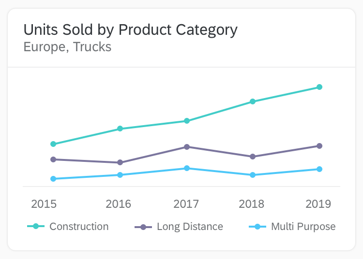
But when she wants to know about the sales performance of her team, it’s much easier to absorb the information by seeing it in a graphical interface than just by listening to it, as shown in the example.
Consider the capabilities and limitations of each, along with the user’s context, when designing conversational products. Integrate modalities, so you can offset the weaknesses of one by the strengths of the other.
Input
How users enter requests and information
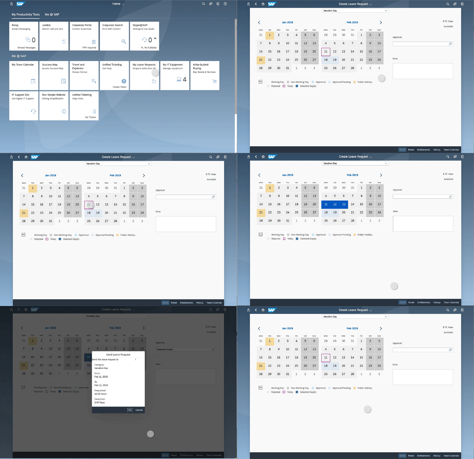
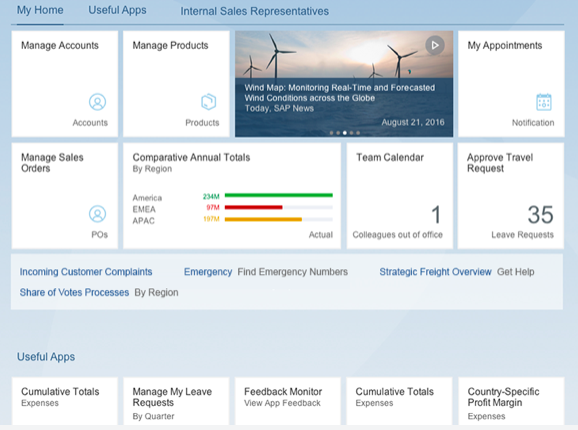
Graphical Interface
Users navigate through menus and pages to get to the information they need or to complete tasks. In this example, an employee is requesting time off.

Voice Interface
Users simply tell the system what they need.
Output
How the system responds to a user’s request or shows information to the user
Graphical Interface
Graphical interfaces are better for these types of information:
- Complex information. For example, a comparison of sales figures in the past 2 years, can be more easily understood through charts and graphs.
- Lists of more than 3 items.

Voice Interface
Voice interfaces are better for these types of information:
- Small bites of information, such as when a user’s next meeting is.
- Lists of up to 3 items.
User Focus
Whether the interface requires the user’s full attention
Graphical Interface
Requires most of the user’s attention.
Voice Interface
Doesn’t require full attention, allowing the user to multitask.
Things to Consider
Here are a few other things to consider:
- Avoid the inherent bias to design a graphical interface first then, add voice to it. Because you’re designing a conversational product, start with the conversation, then introduce other modalities to supplement it or to offset its limitations. This ensures that you are truly designing a conversational product, and not just a graphical interface with voice added.
- Also, keep in mind that just because conversational products can provide a multi-sensory experience, it doesn’t mean that it’s needed. People interact with technology all the time everywhere, and this can result in digital overload.
Consider the principles of calm technology to design effective, but less obtrusive interactions. Calm technology is an approach to designing technology that’s part of a user’s life, but that doesn’t intrude on it. Design products that don’t require all the user’s attention – just some of it, and only when necessary.
- Lastly, look beyond existing interactions, and explore new use cases and opportunities to help the user.
For example, in the past when Pat, a sales manager, scheduled a visit to a client, she had to prepare at least a day in advance. She would look up the address and the best route to the client’s site, and then pull up and save information about the client so she could easily retrieve it during her meeting. A digital assistant could streamline this process by proactively providing her with the relevant information on the day of her meeting.


