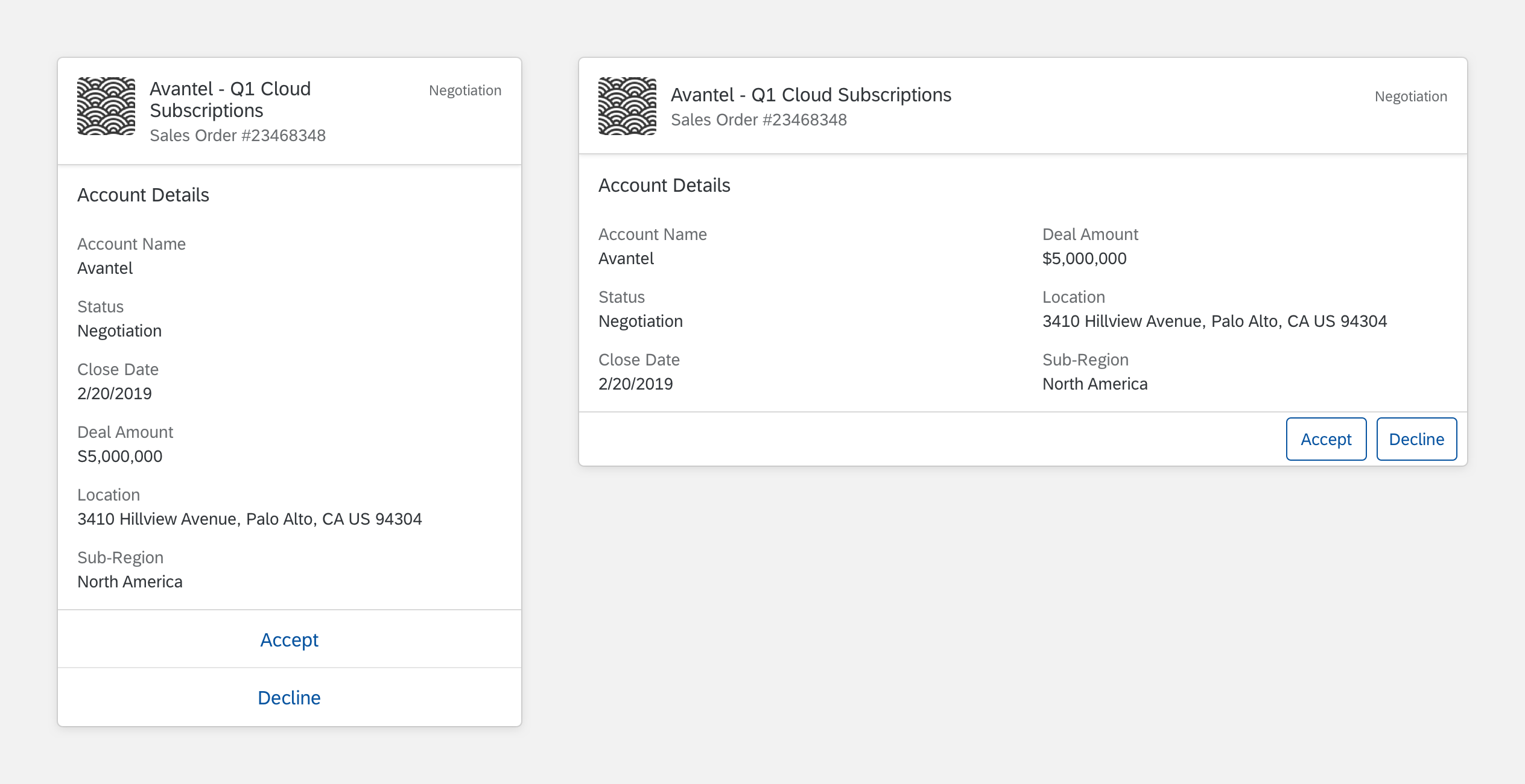
Object Card
Intro
Object cards add more information to the conversation. Object cards have flexible structure to meet the needs for a variety of use cases. The object card lets users take action or go to SAP Fiori for the information source.
Object Card
Usage
Dos
- Do use the card content to summarize the object.
- Do use statuses to highlight progress, importance, and numerical scores. Use semantic colors to represent positive, negative, and urgent information.
- Do present relevant information and prioritize the information in the list by level of importance.
Don’ts
- Don’t overwhelm the user with too much content. Present relevant information and keep it concise.
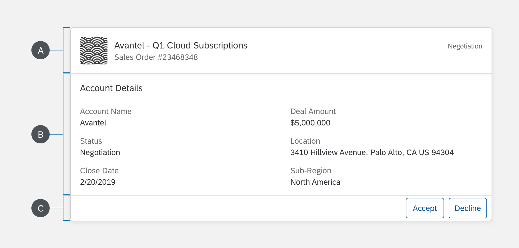
Structure
The object card can include text, images, and action buttons. All object cards must have a title. Other optional features are subtitle, footnote, description, status, and action button.
A. Header
The header displays a title and introduces the object card.
B. Content (Optional)
The object card content is flexible. You can use different combinations of object details, maps, images, and more.
C. Footer (Optional)
The footer includes action buttons that users can select to perform an action. An object card can have up to three actions.
Object Card Structure
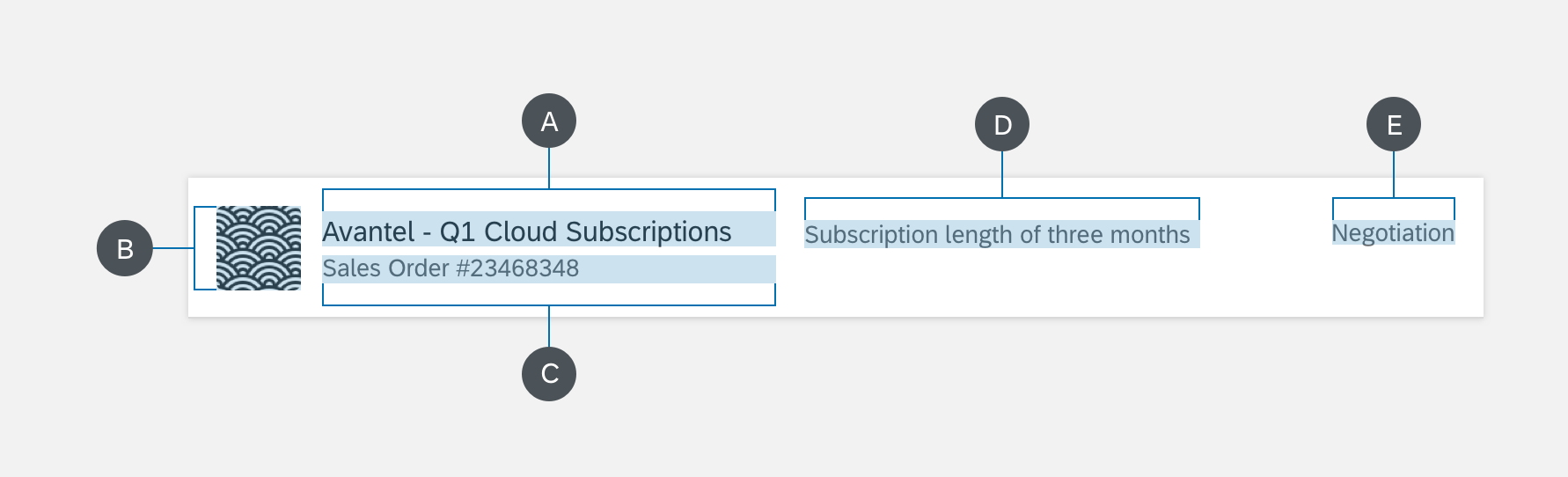
Header
A. Title
The title introduces the header.
B. Icon (Optional)
The icon gives a visual reference for the header.
C. Subtitle (Optional)
The subtitle gives more details for the header.
D. Description (Optional)
The description gives details for the header. The description can only be implemented on an eight-column card (medium- and large-size screens).
E. Status (Optional)
The status indicates the current stage of the object card. Statuse can also be replaced with buttons.
Object Card Header
Content (Optional)
You can build content with several combinations of object details, maps, images, etc. If you are using object detail, it includes a set of attributes, as explained below.
A. Section Title
The section title introduces the content area.
B. Label
The label describes an item in the object detail.
C. Value
The value can include text or a link. The value gives information about the label.
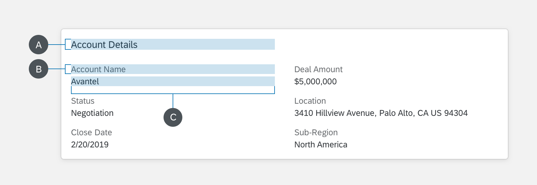
Object Card Content
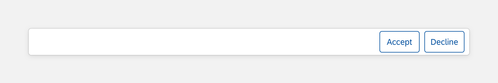
Footer (Optional)
The footer includes action buttons that the user can select. Quick actions let the user select a response to the displayed information. An object card can include up to three actions.
Object Card Footer
Variations
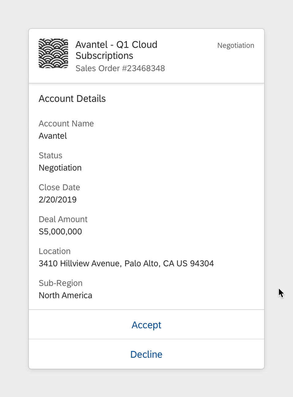
Details (Optional)
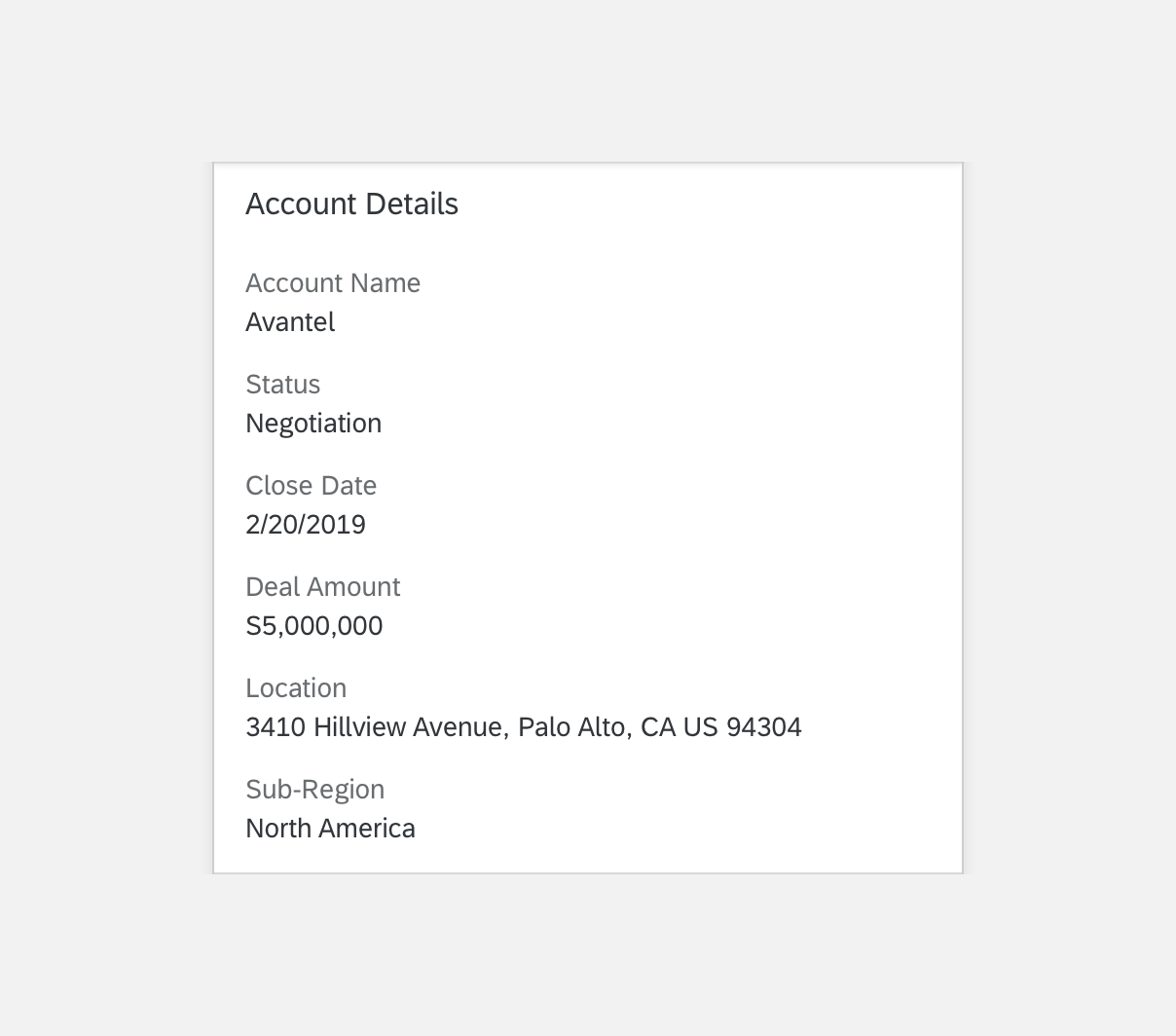
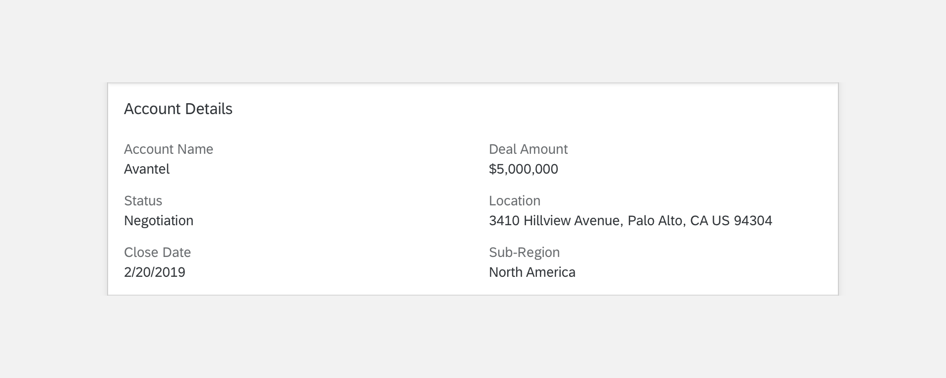
Object card details show an overview of an object with one or more attributes. When the user selects the object information, the card detail displays and can include links to more details. The card is responsive and supports all SAP Fiori screen sizes. Depending on the view, the card adjusts to a narrower or wider length with several columns. See more information on object detail details in the Specifications section.
Object Card Details
Header
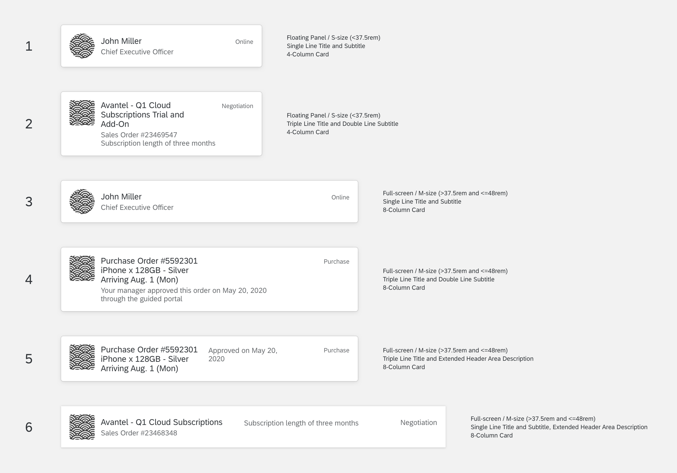
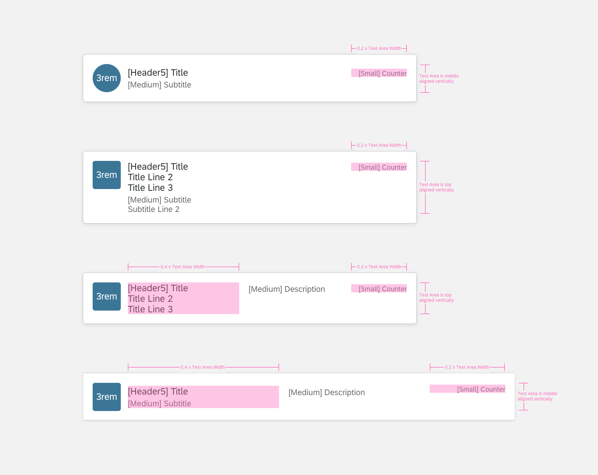
The object card header can adjusts to various screen sizes and devices users have. The object card header displays with different variations.
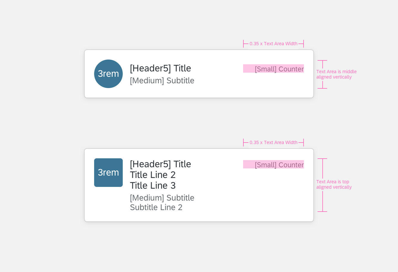
- For card headers with a single line title and subtitle, the text is center aligned vertically when the image is taller than the text content area (Image 1, 3, 6 to the right).
- For card headers with multiple lines of title and subtitle, the text is top aligned vertically when the text content area is taller than the image (Image 2, 4, 5 to the right).
Object Card Header Variations
Content Area
Object card content can adjust to the variety of screen sizes and devices.
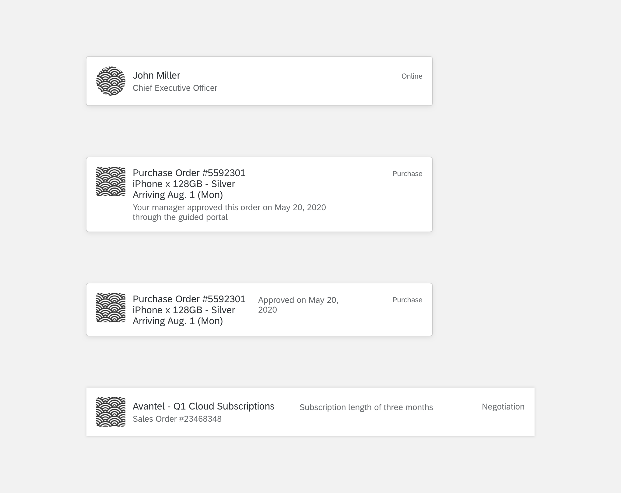
- Small screens (floating panel): content area fits in a 4-column card (image 1 to the right).
- Medium and large screens (full size): content area fits in an 8-column card. The text wraps to form another column (image 2 to the right).
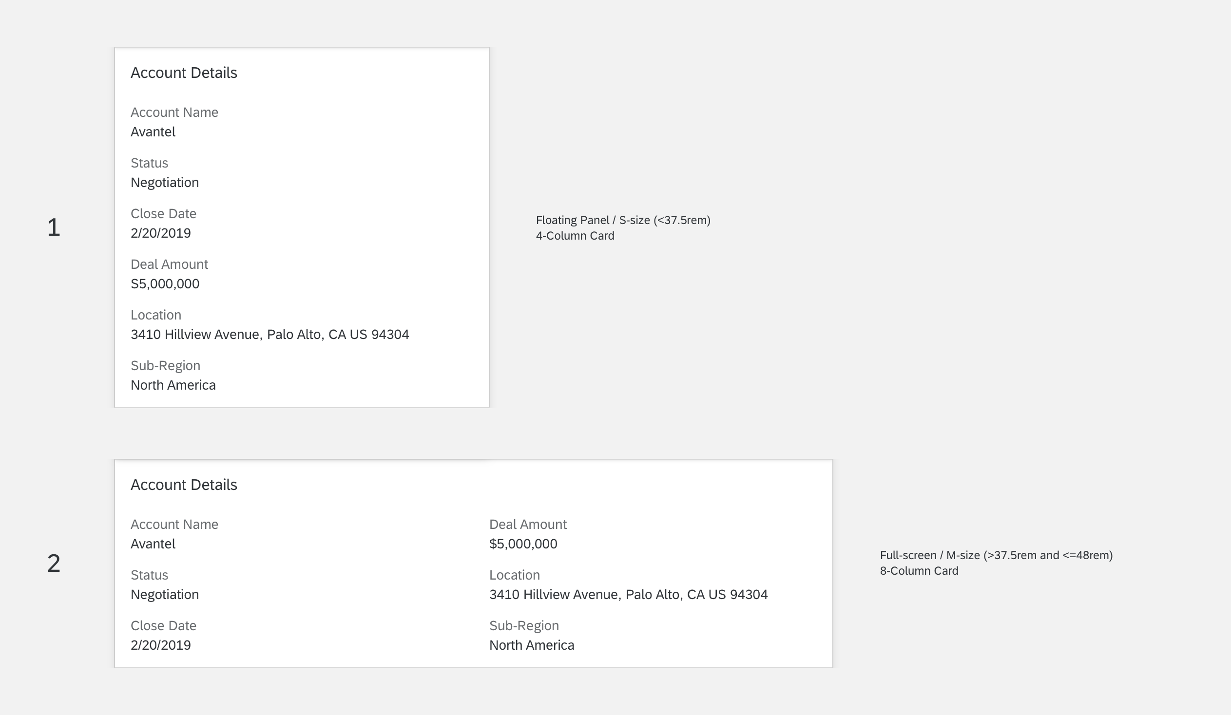
Object Card Content Area
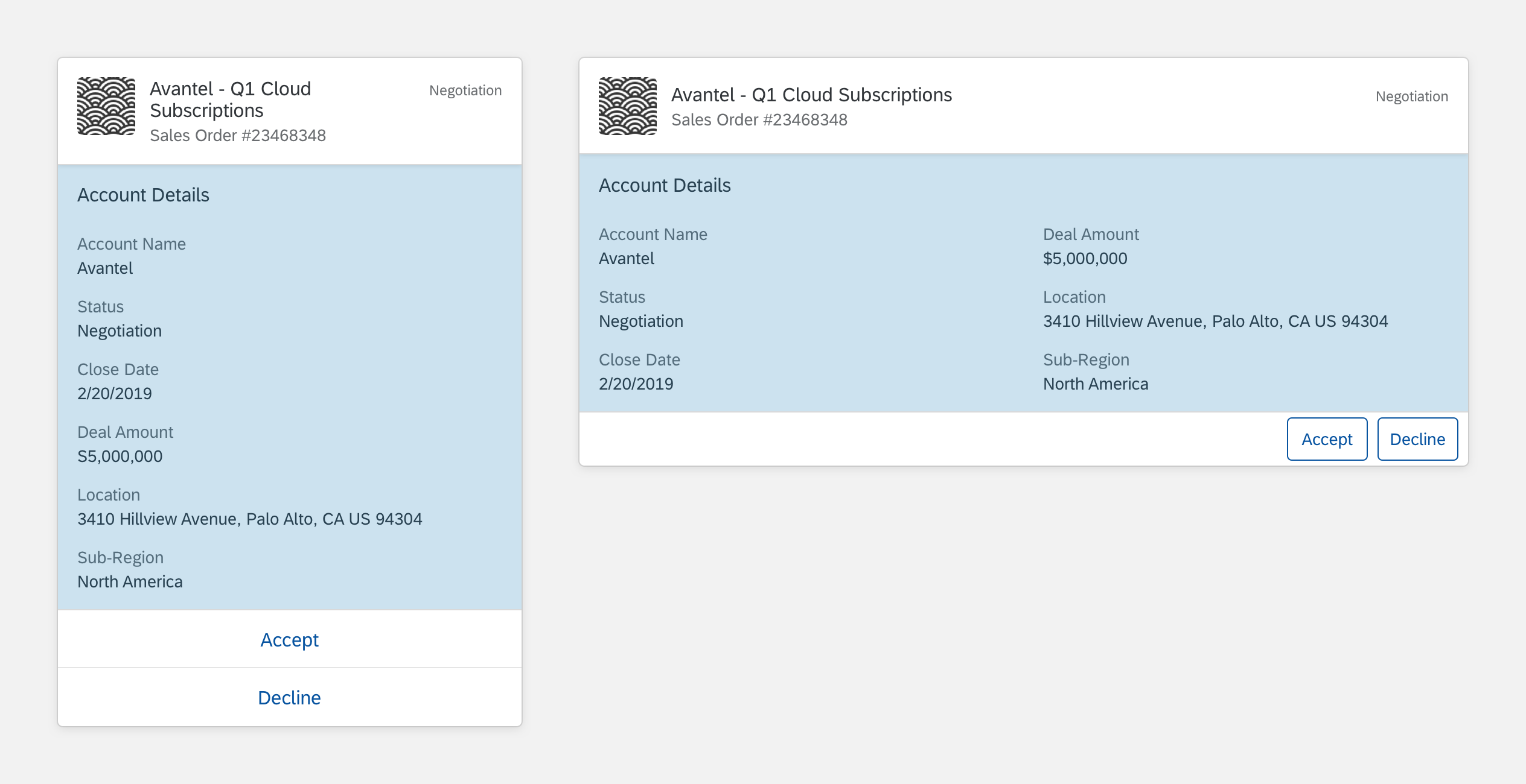
Footer
The object card footer can adjust to the variety of screen sizes and devices. Spacing between buttons changes based on the device (compact vs. cozy).
- Small screens (floating panel): footer has a stacked button layout (image 1, 2 to the right).
- Medium and large screens (full size): footer has a side-by-side button layout (image 3, 4 to the right).
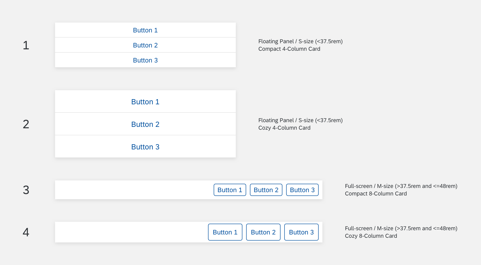
Object Card Footer
Behavior & Interaction
After the user selects a buttons on the object card, the button doesn’t display any more.
User Selects Button

User Selects Button
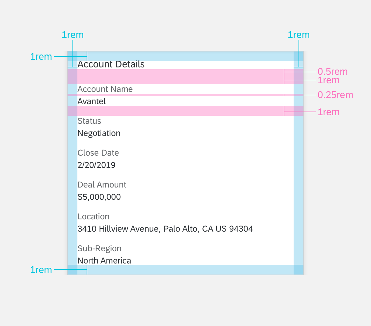
Specifications
These visual design specifications apply to the object card style and spacing.
Header
Floating Panel
Here are some examples and specifications for a floating panel in an object card header.
Floating Panel for Object Card Header
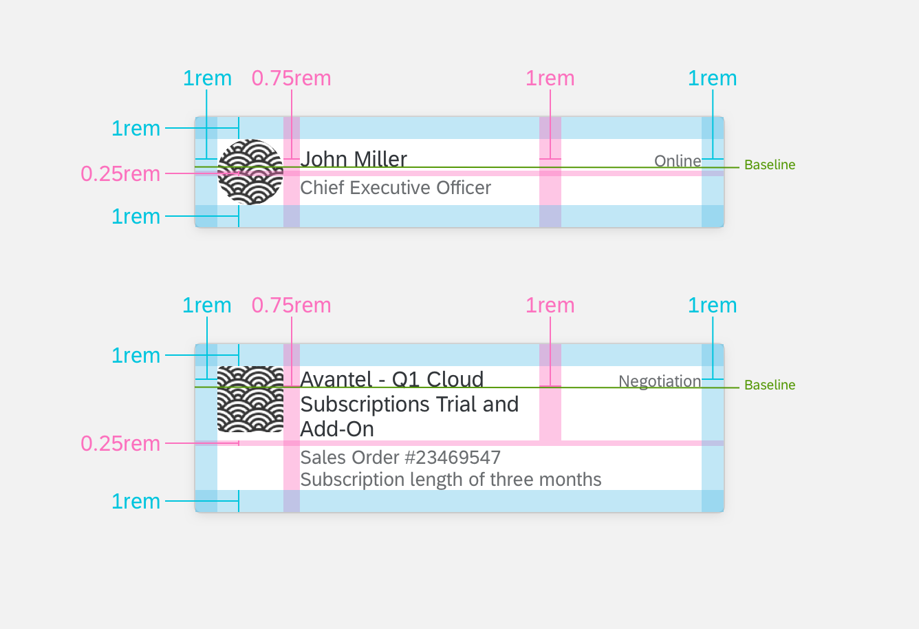
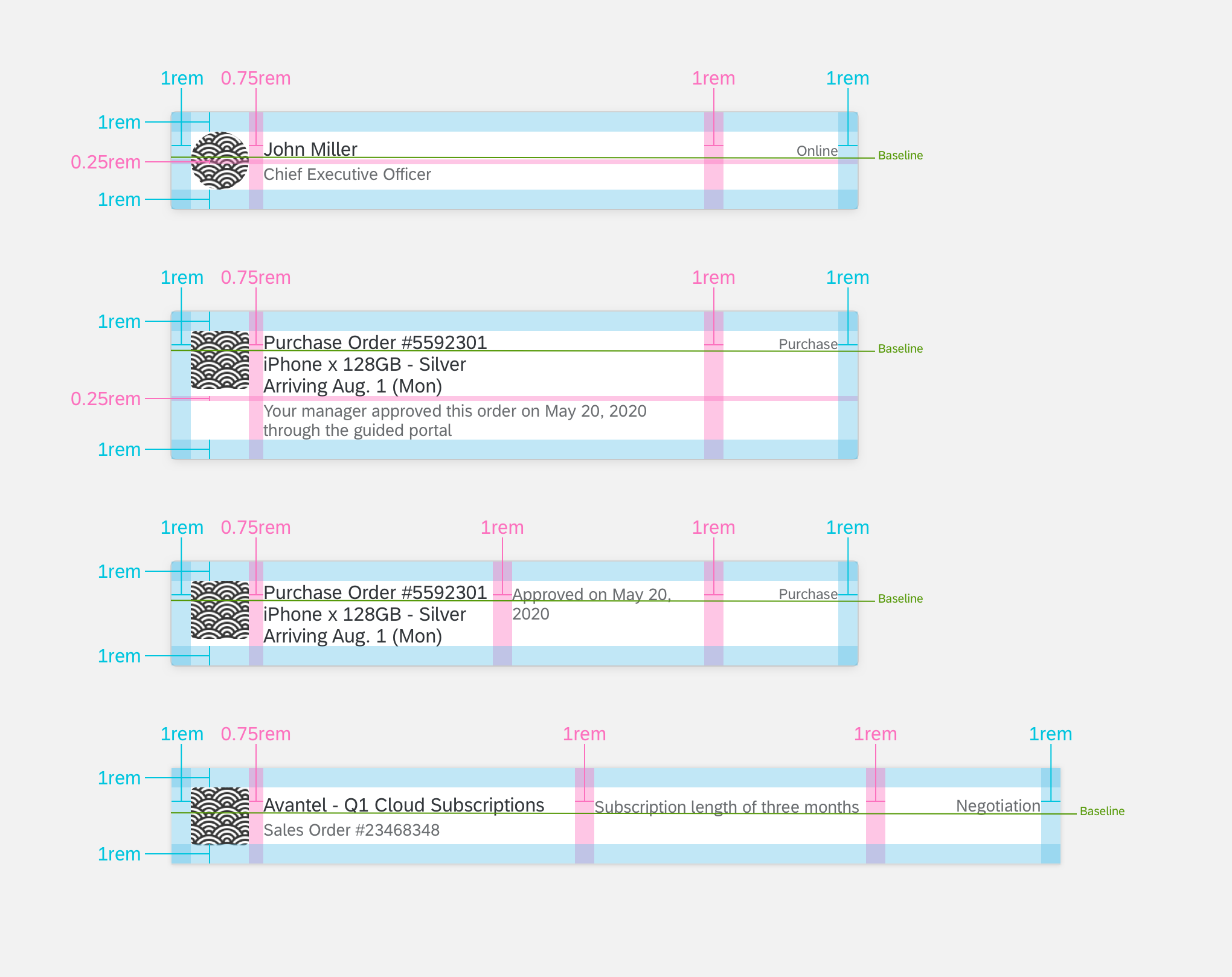
Floating Panel Specifications for Object Card Header
Floating Panel Specifications for Object Card Header
Full Screen
Here are some examples and specifications for a full screen in an object card header.
Full Screen for Object Card Header
Full Screen Specifications for Object Card Header
Full Screen Specifications for Object Card Header
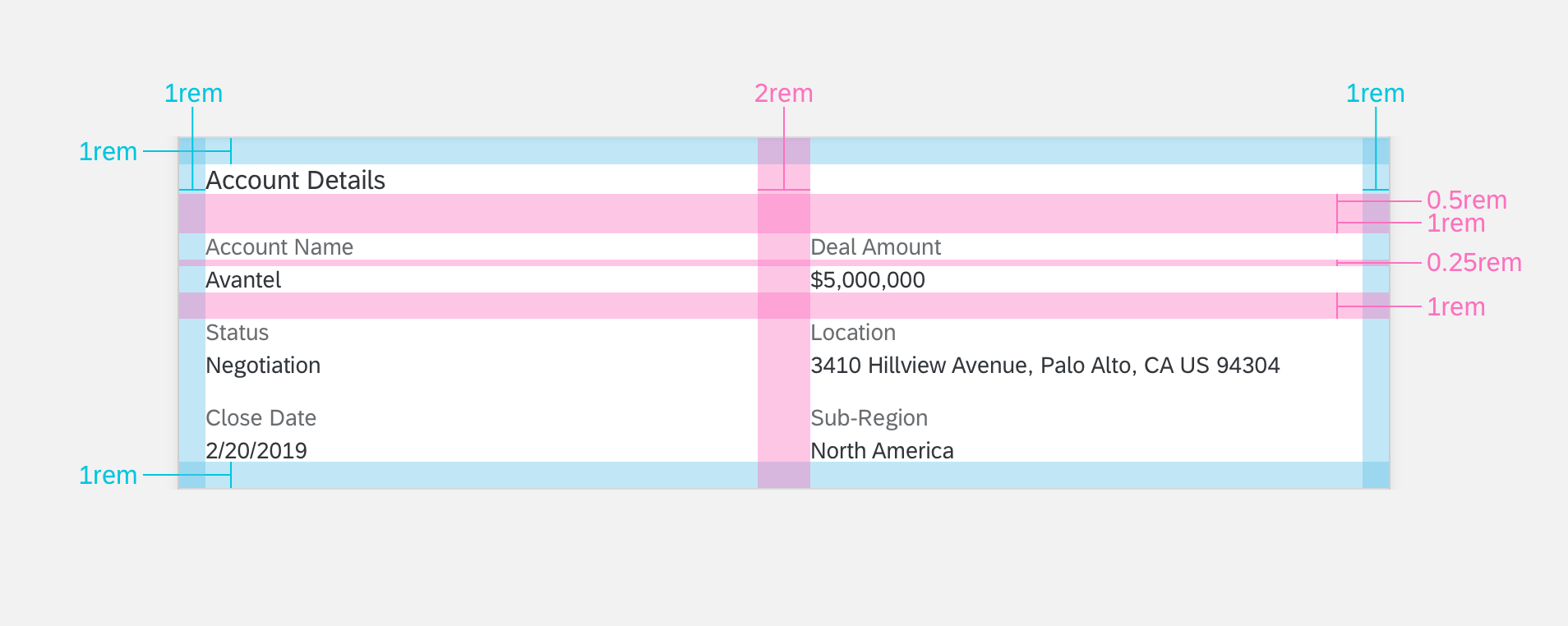
Content Area
Floating Panel
Here are some examples and specifications for a floating panel in object card content.
Floating Panel for Object Card Content
Floating Panel Specifications for Object Card Content
Full Screen
Here are some examples and specifications for a full screen in object card content.
Full Screen for Object Card Content
Full Screen Specifications for Object Card Content
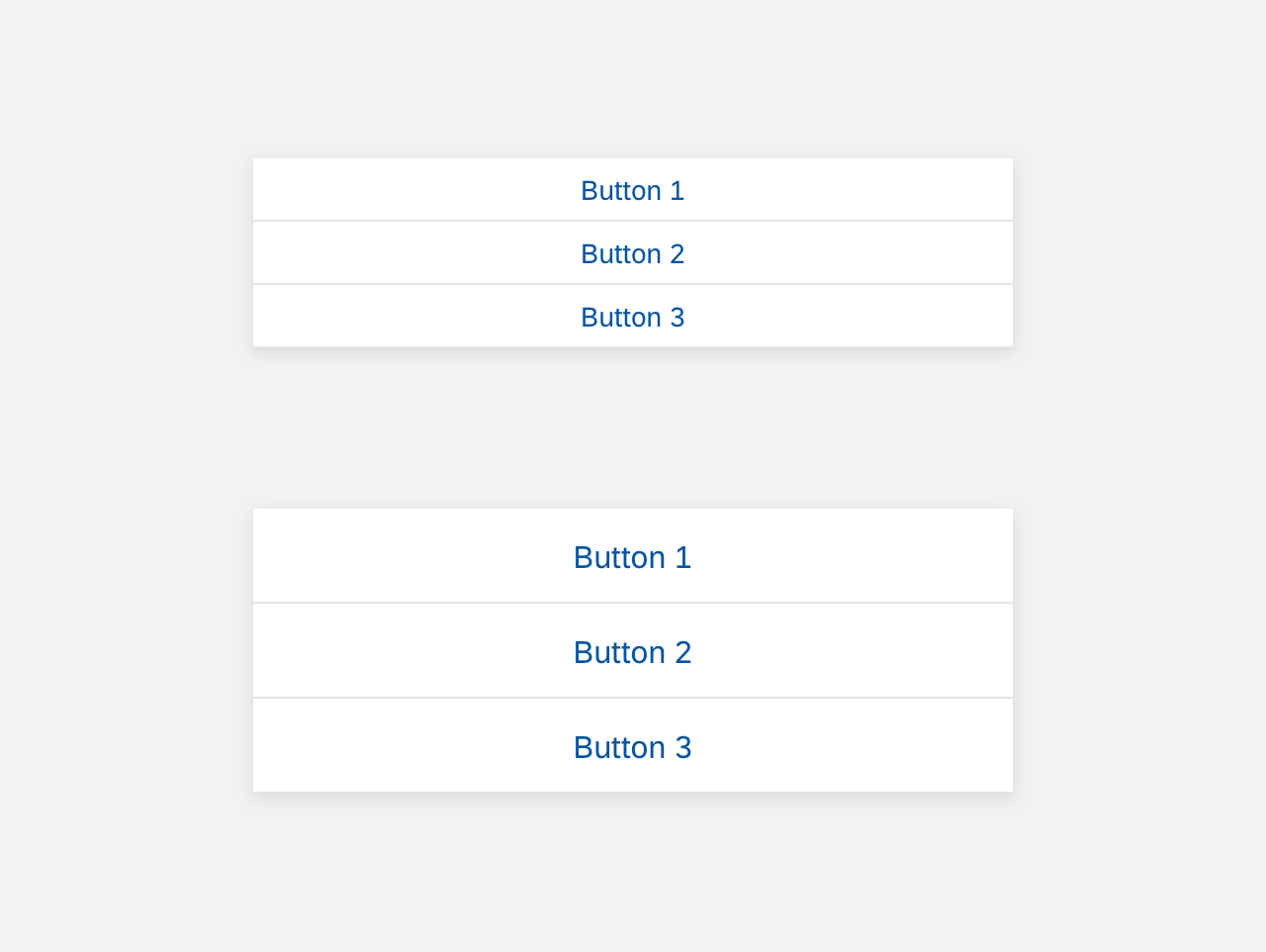
Footer
Floating Panel
Here are some examples and specifications for a floating panel in the object card footer.
Floating Panel for Object Card Footer
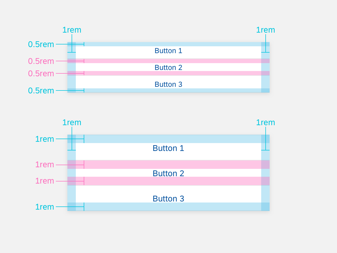
Floating Panel Specifications for Object Card Footer
Full Screen
Here are some examples and specifications for a full screen panel in the object card footer.

Full Screen for Object Card Footer

Full Screen Specifications for Object Card Footer
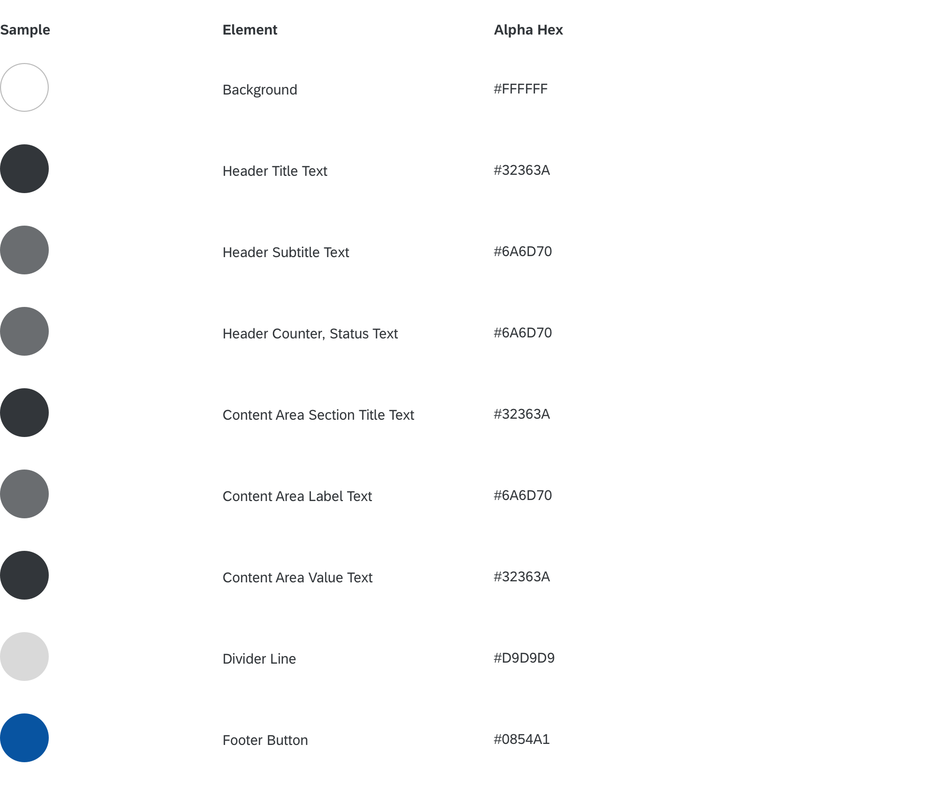
Colors