
Carousel
Intro
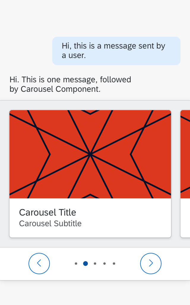
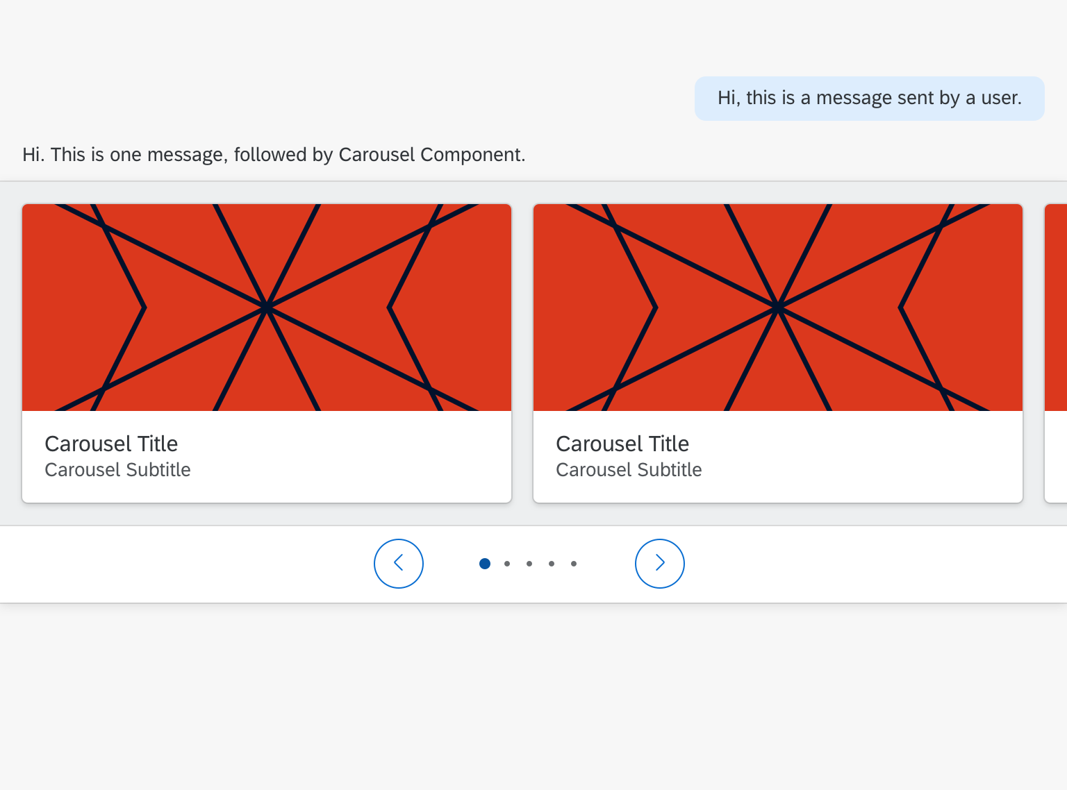
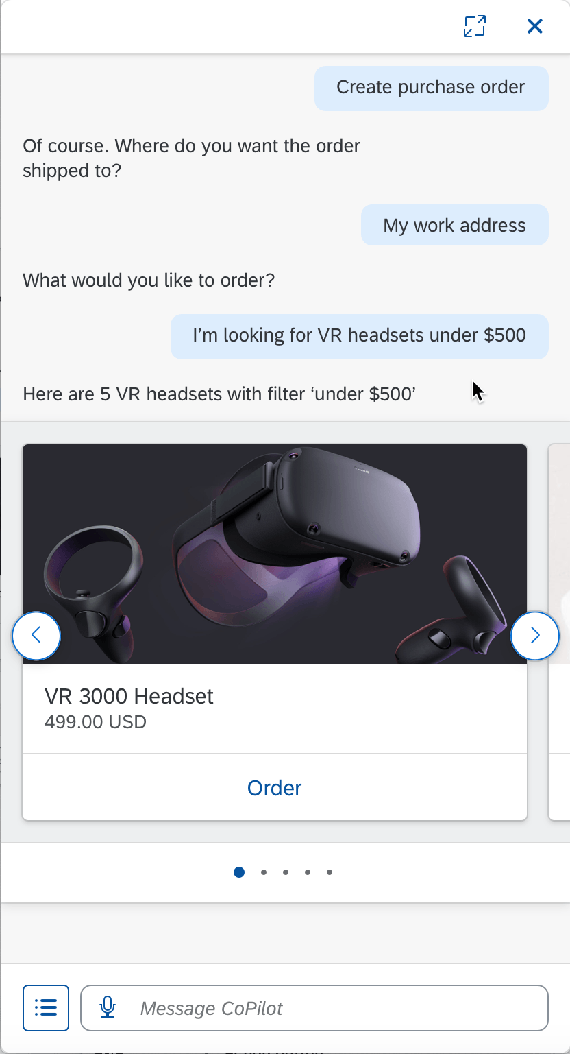
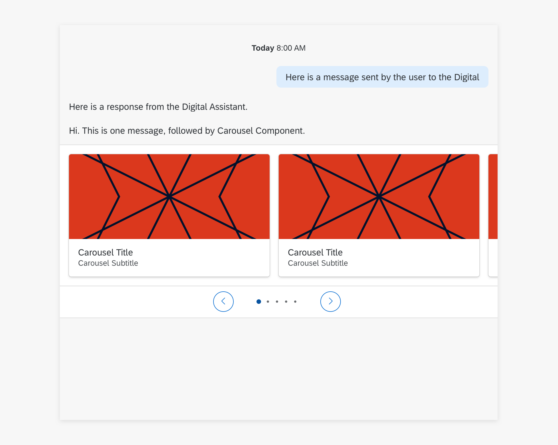
Carousel allows the user to browse through a set of items and view at least one item at a time. The user can navigate to the next or previous item by selecting paging indicators. Carousel is most helpful when the items within the set are visually distinct, as in images, and can be viewed side by side for comparison.
Floating Carousel
Full screen Carousel
Usage
Dos
- Show strong visual representations of the items in the set.
- Ensure that the message preceding the component clarifies to the user what happens when they select an item.
Don’ts
- Don’t use if there is only one item in the set.
- Don’t show items that are visually similar to each other.
Layout
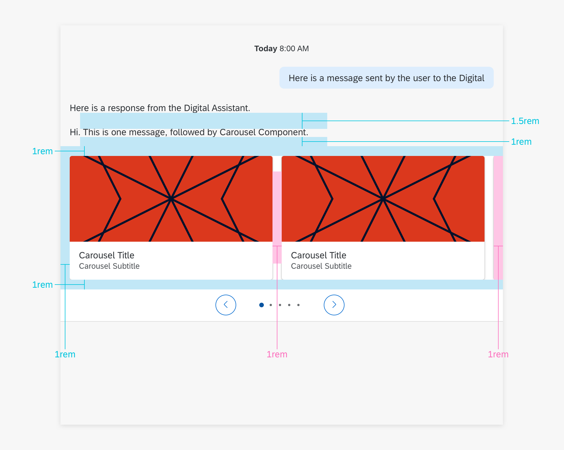
Main View Carousel
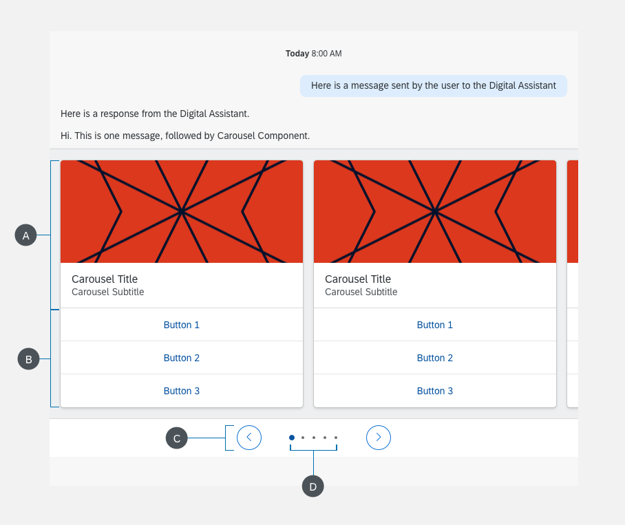
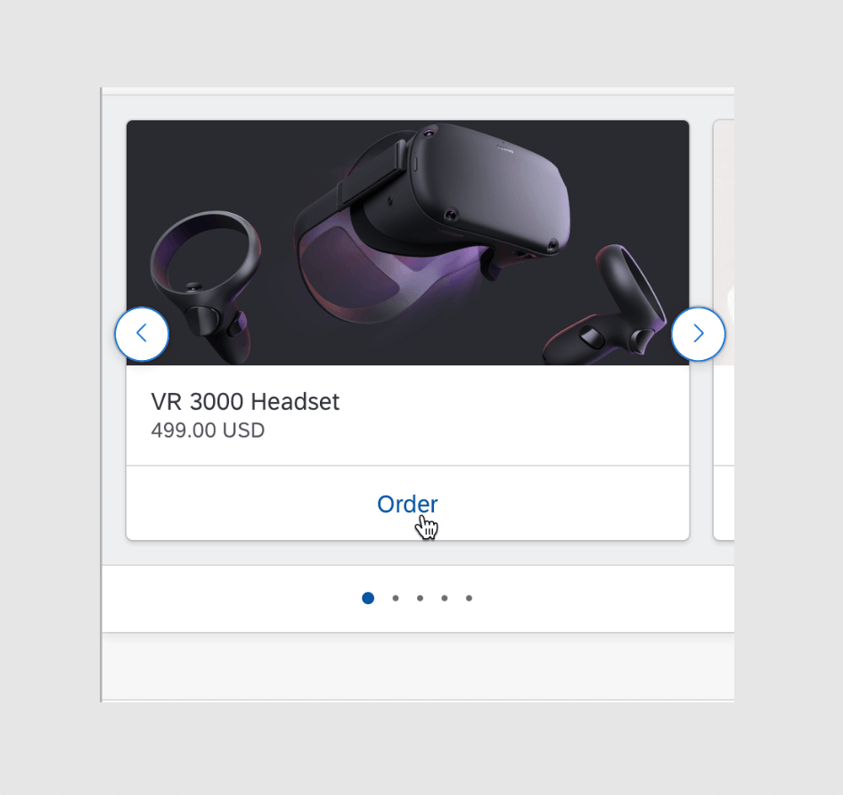
The Carousel component is composed of content, page indicators, navigation and navigation buttons. Buttons are optional.
A. Content
The content includes all the items in the set to be displayed in the Carousel. Each item is shown as a Media Card.
B. Action List Items
Action List Items can be attached to the content, allowing users to trigger actions directly with Carousel.
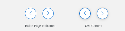
C. Navigation Buttons
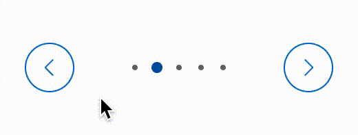
Navigation buttons allow the user to traverse the items in the Carousel by going forward or backward in the list. The backward button appears on the left of the Carousel, while the forward button appears on the right. The Navigation Buttons can appear either inside the Page Indicators or inside the Content.
D. Page Indicators
The Page Indicators show the total number of items in the Carousel and the current position in the set that the user is on. They appear either above or below the Content. Page Indicators that have 8 or less items appear as dots, with each one representing each item in the Carousel Content. Page Indicators with 9 or more items appear as just a number, showing which item is currently in view out of the total number of items.
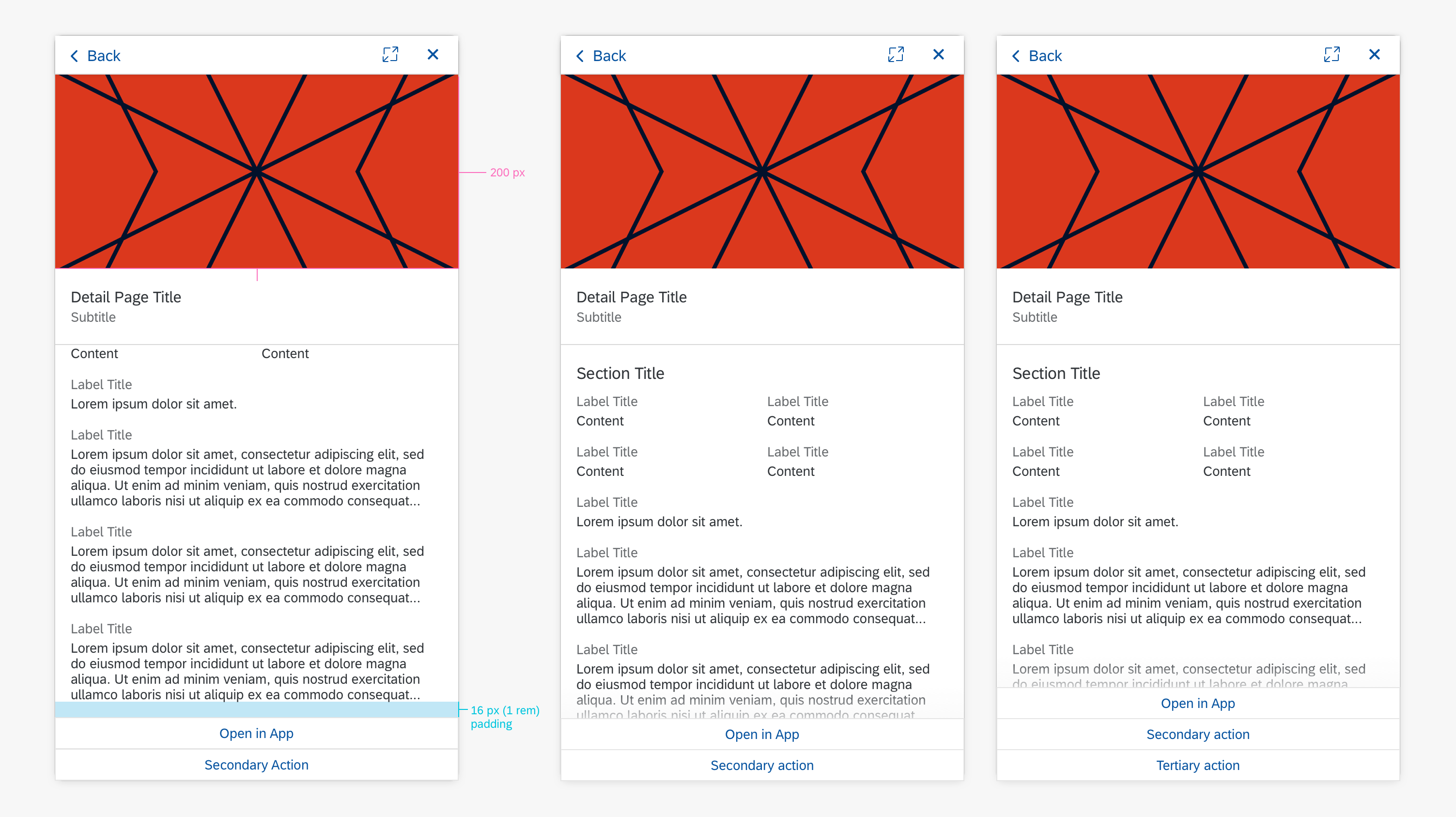
Detail Page
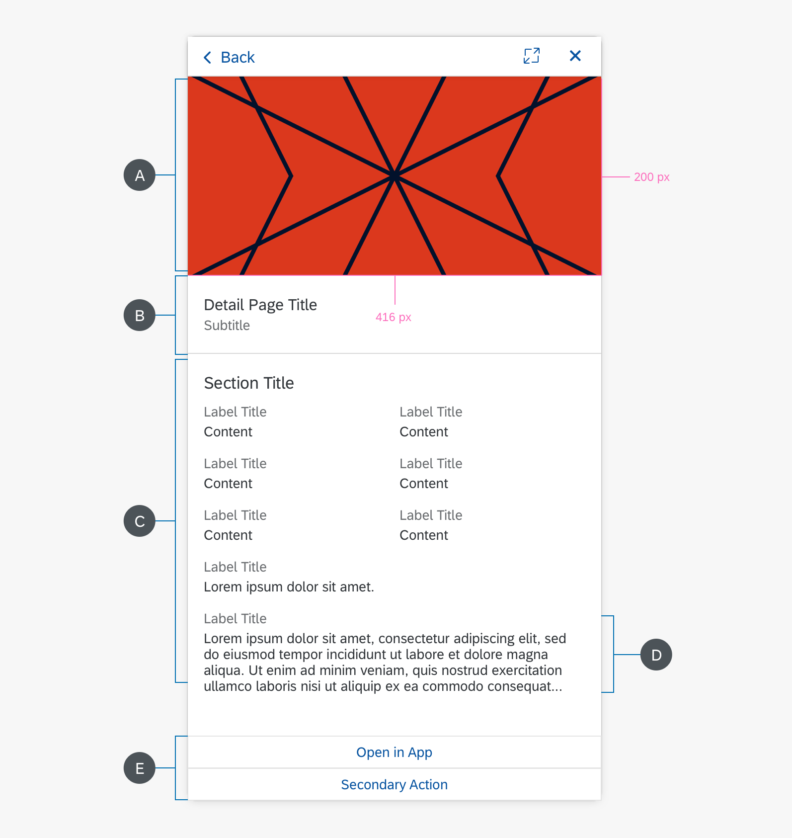
The detail page contains more information about an item in the carousel. It consists of an image, header, a section, and action list buttons (if there are actions in the Carousel).
A. Image
Image is center-aligned and scaled to display the full image within the following constraints:
Max height: 200 px
Max width: 416 px
Empty space is filled with background color: HEX #FFFFFF
B. Header
Header consists of a title and subtitle corresponding with the information in the main view Carousel.
C. Section
The section consists of a maximum of 8 value-pairs (Label Title + Content). Display as 2-columns if there’s 1 line of content. Use a 1-column display if there’s more than 1 line of content.
2-column value-pairs are always displayed above 1-column value-pairs.
D. Value-Pair
A value-pair consists of a Label Title + Content.
In 1-column display, the value-pair content is constrained to a maximum of 250 characters. Truncate after 250 characters using ellipses.
If there is truncated content, the primary action button is “Open in App,” which will allow the user to see the full content.
E. Action List Items
Actions available in the Carousel should be available in the Detail Page as action list items, with a maximum of 3 actions.
F. Gradient
If the action items list buttons cover the content (i.e., there’s less than 1 rem padding between the end of the content and action items list), the content is scrollable. A gradient will overlay the content above the action items list to indicate that there’s more scrollable content.

Behavior and Interactions
Navigation Button
The Navigation Button changes on hover, while pressing, and on select.
Action Items List
All the items of the list are clickable buttons. Action will be performed immediately after clicking, after which a message will follow.
Content
Upon hovering the content, there will be a light shadow below the card indicating that it is clickable. Clicking Content of the carousel indicates clicking the entire carousel, after which a new view model will open showing more details.
Detail Page
Upon clicking the content, the detailed page opens in the panel. Any actions, up to a maximum of 3, that are available on the carousel (i.e., “Order”) are also available in the detailed page as action list buttons.

Specifications
The following visual design specifications apply to the Carousel style and spacing in a compact conversation stream.

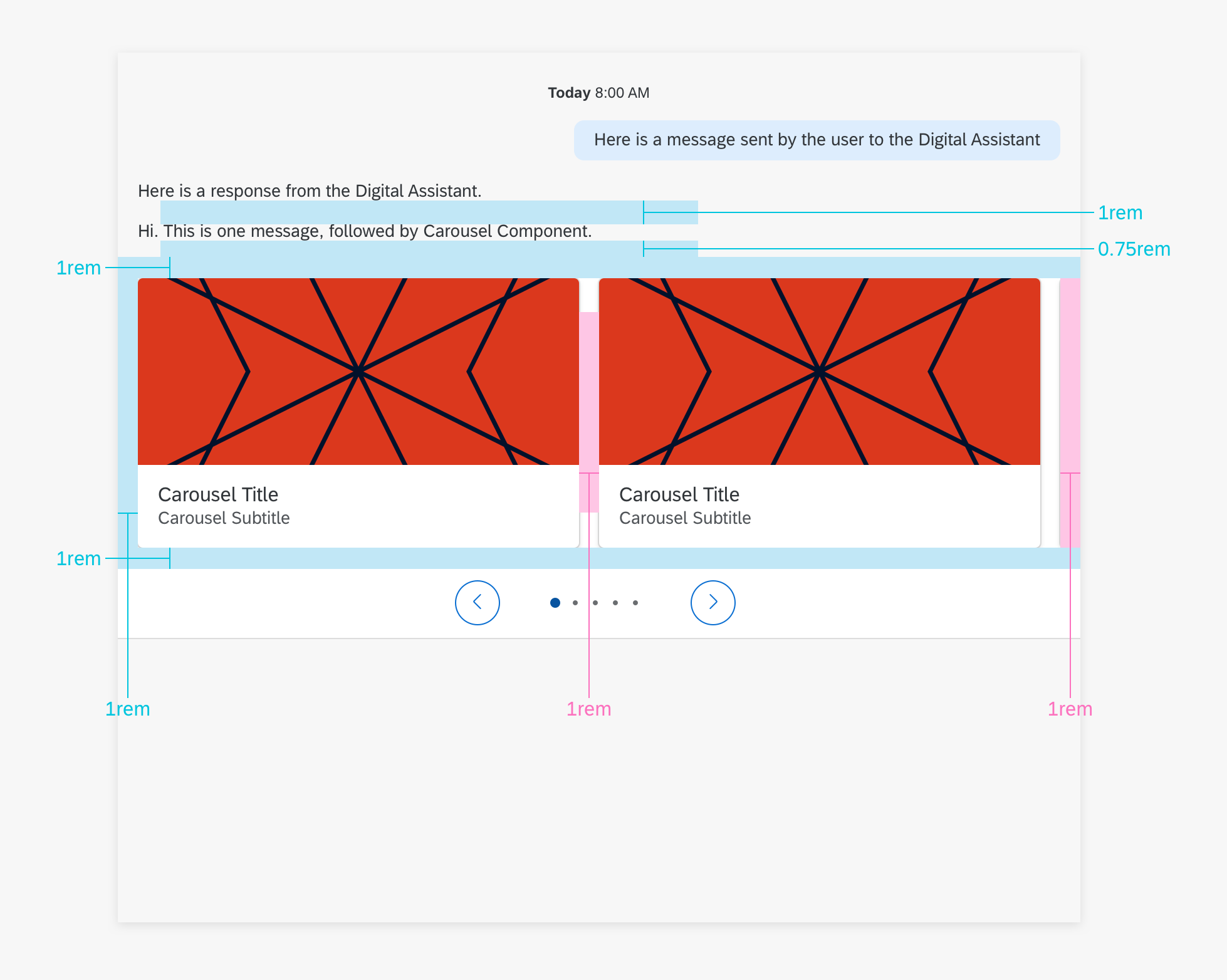
The following visual design specifications apply to the Carousel style and spacing in a cozy conversation stream.
Detail Page
There’s a padding of 16 px (1 rem) between the end of the detail page content and the action items list. If the list covers content, the content is scrollable and there’s a gradient overlaying the content above the action items list.
Navigation Buttons
The appearance of the navigation buttons depends on whether it is placed in the Page Indicators or over the Content. As shown in the image, navigation buttons over the Content have the shallow which don’t exist in Page Indicators.
Action List Items
Apply specs for Action List Items if they are attached to the content. Note to apply the cozy mode specs for that.
Colors
