Quick Reply
Intro
Quick reply buttons in the digital asssistant let users continue the interaction and select the next steps related to the their primary request. The buttons help users discover actions that are relevant to the request.
Quick Reply
Usage
These are some best practices when using Quick Reply with the digital assistant.
Dos
- Do keep labels concise, straightforward, and under 30 characters.
Don’ts
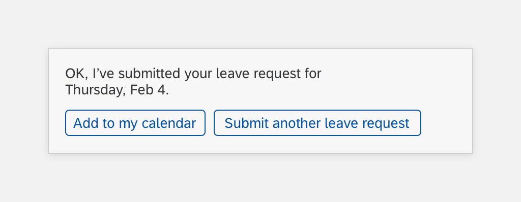
- Don’t use labels to negate an action, such as “Add to my calendar and “No, don’t add it”. Give users easy actions to select.
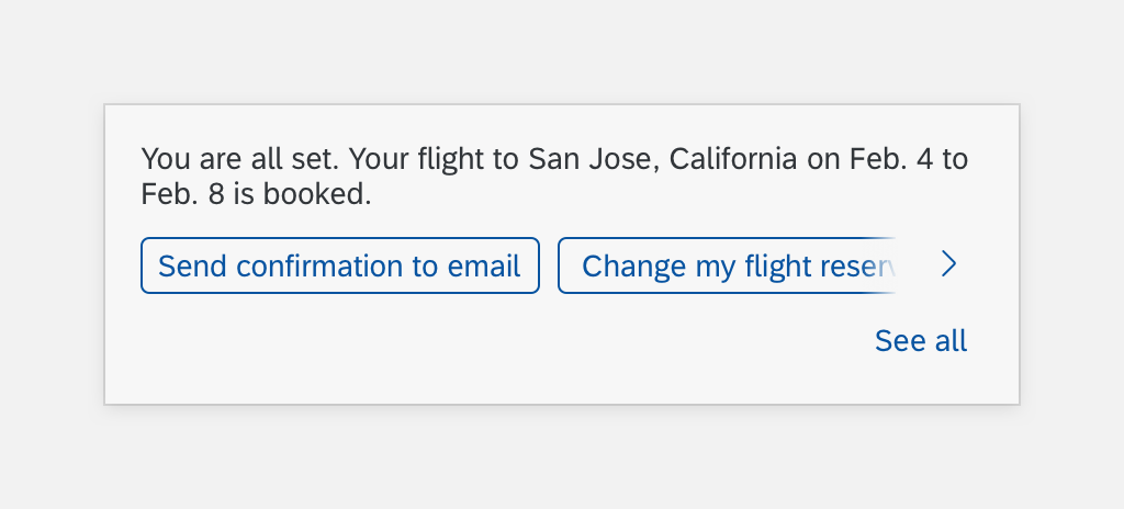
Do Use Actions

Quick Reply: Don't Use Negating Buttons
Structure
Quick reply must include a header. Content and footers are optional. Here are some best practices for the quick reply structure.
A. Header Text
The header text includes a response from the digital assistant and introduces users to the quick reply buttons.
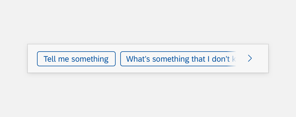
B. Quick Reply Button
The quick reply buttons gives users suggestions of how to interact and respond to the digital assistant.
C. Horizontal Scroll Button
The horizontal scroll button can be left or right arrows. If you have more quick reply buttons that extend beyond the digital assistant area, the horizontal scroll helps users scroll through the options.
D. “See All” Button
The “See All” button lets users see all the quick reply buttons at one time. You can include up to 11 buttons at a time.
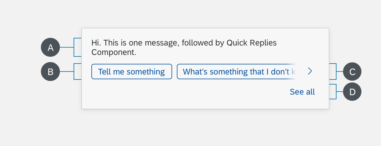
Quick Reply Structure
Placement
You can put quick reply buttons under a response or under a card. Don’t put these actions inside a card. For actions that need to be inside the card, use standard buttons instead.

Quick Reply Buttons Under Response
Quick Reply Buttons Under Card
Behavior & Interaction
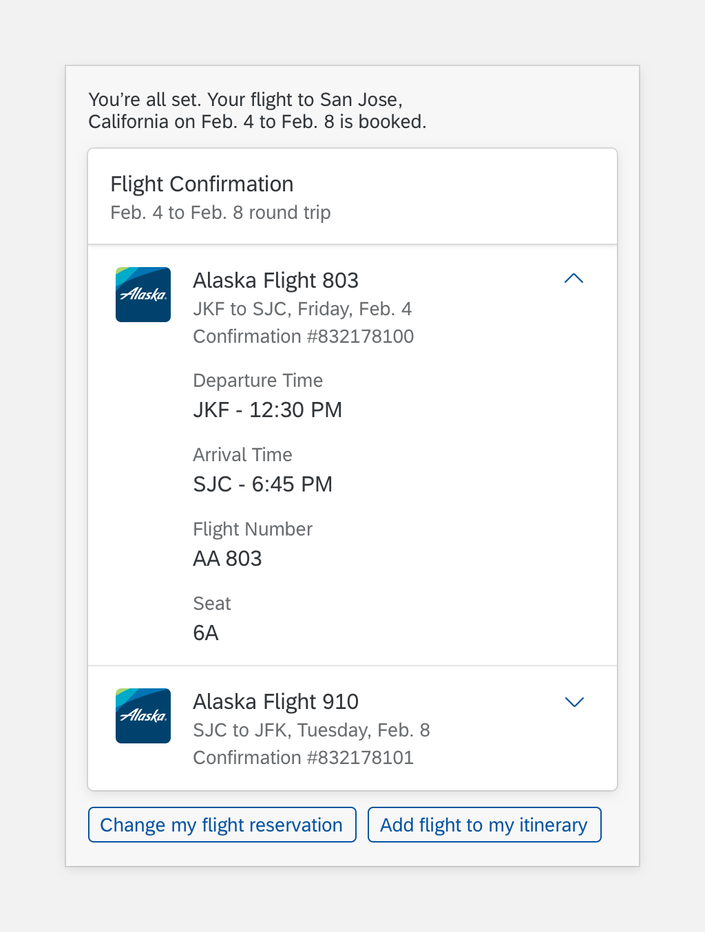
Horizontal scroll and “See All” buttons only display if the total width of the quick reply buttons is larger than the width of the content area. The user can scroll horizontally to explore more buttons.
The user can select the horizontal scroll buttons to move through the quick reply options.
Quick Reply Horizontal Scroll Buttons
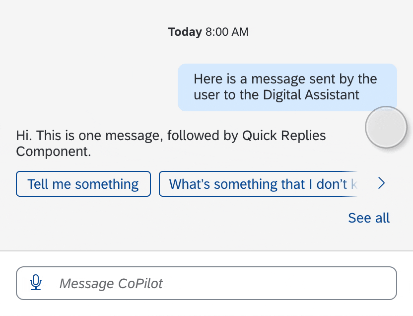
The “See All” button helps the user access and find buttons easily. When the user selects the “See All” button, up to 11 buttons display and fit into the content area.
Quick Reply See All Button
When the user selects the “See All” button to expand the quick reply buttons, the “See All” and arrow buttons disappear.
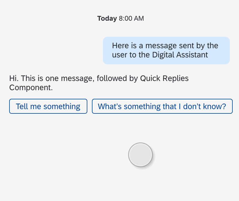
Quick Reply User Selects See All
Specifications
These visual design specifications apply to the quick reply component.

Quick Reply Example
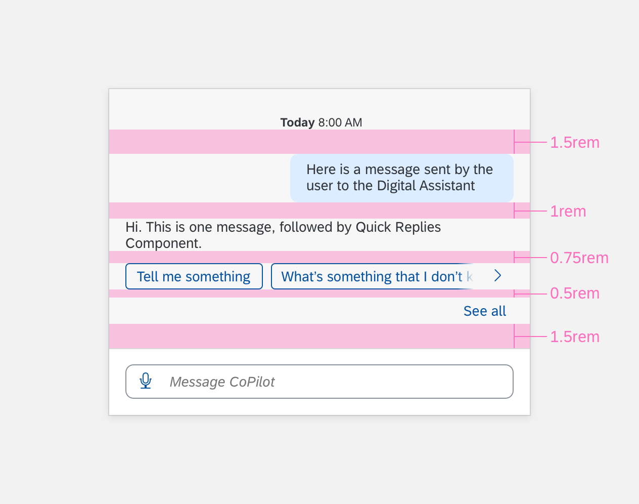
Quick Reply Specifications
Quick Reply Buttons
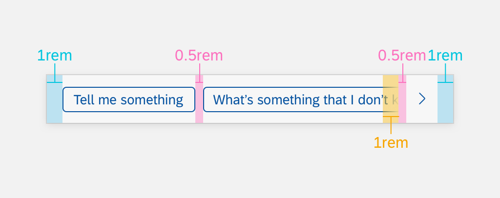
Quick Reply Button Specifications
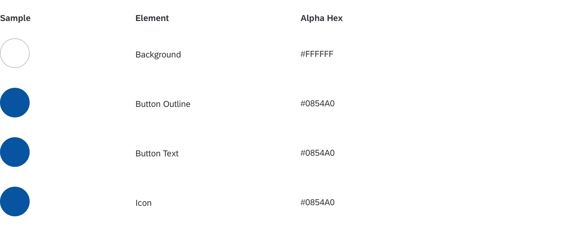
Colors
These color specifications apply to the quick reply component.