
Get Started
Intro
SAP Fiori for Android is made up of a wide variety of design foundations, components, and patterns that is packaged together in a harmonious system. Learn more about each detail to understand how you can use it for your own application.
Foundation of SAP Fiori for Android
Get started with our rich library of foundations, components, patterns, and more!
Learn about the design principles that make up SAP Fiori and how it is essential for creating effective and engaging apps.
Typography plays a crucial role in establishing hierarchy in the content with great legibility and scalability. Discover how SAP Fiori for Android utilizes SAP Fiori’s new proprietary font.
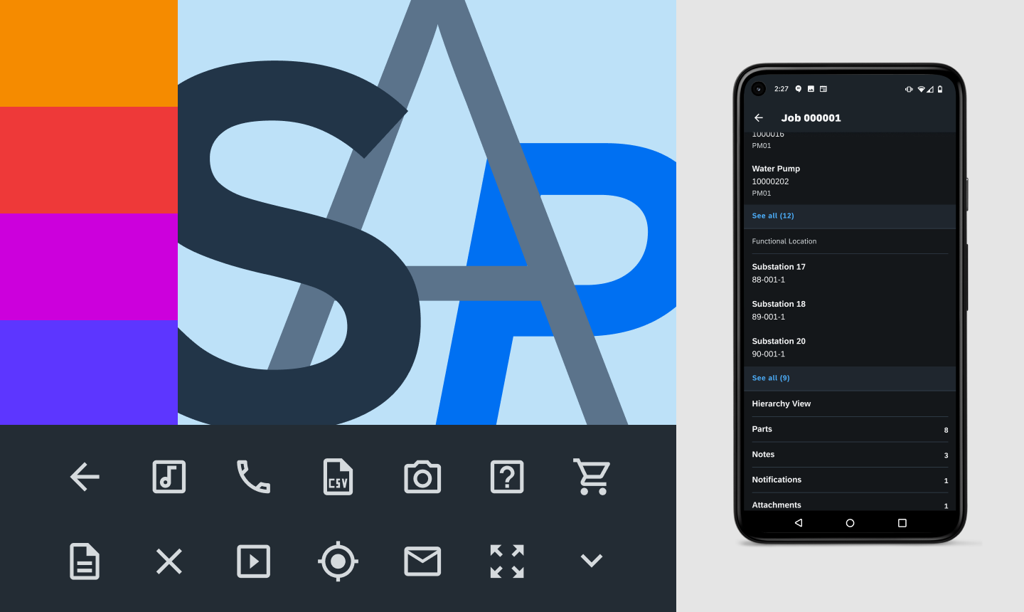
Color is essential in setting a delightful Fiori-based user experience that guides the user through the functions of the application in a concise manner. Find out more about the color palette to understand how to use it effectively.
The icons of SAP Fiori for Android follow the Material Design icon system. In the case that there is a need for a custom icon, check this guide for creating your own.
The layout of the app follows certain logic that makes the app accessible, scalable, and readable. Components are designed in increments that make it easier to scale between different devices. Keylines are device-specific lines where content is aligned in order to maintain consistency in composition within an interface. Learn about the rules behind the layout to create an organized and clean interface.
Material Design, Google’s design language, is used for all Google-developed native Android apps and has recently been updated to a more modern design system. SAP Fiori for Android applies the latest Material Design practices to bring the freshest UI and UX design principles to your SAP Fiori for Android application. Check out the new Material Design guidelines for more information on their updated design language.
UI Components
Components are the building blocks for any SAP Fiori for Android application. Each component serves a unique functional purpose to meet the application requirements.
Basic Components are a group of components that follow exactly how Material Design defines them as they with the Fiori theming.
Banners
Bottom Sheet
Buttons
Dialogs
Menus
Pickers
Progress Indicators
Snackbar
Cards are a summarized view into an object or objects. It can support a variety of different content based on the needs of the user depending on the card type.
Form Cells
Form Cells are components that the user can interact with for making decisions or providing information. There are several types of different inputs, depending on what the user needs to provide.
Checkboxes
Chips
List Picker Form Cell
Radio Button
Signature Form Cell
Sliders
Switches
Text Inputs
Time Picker Form Cell
Patterns
Patterns define how you can use designs – from how they function to how the user moves within a specific flow from screen to screen.
Resources
Download the design kits to start designing your own SAP Fiori for Android app.
Download/access our design stencils and font files to start designing your own SAP Fiori for Android app.
 Your feedback has been sent to the SAP Fiori design team.