
Data Table
Fiori: DataTableView
Intro
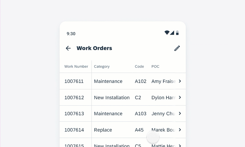
The data table is a grid layout of columns and rows showing labeled data, such as numbers, text, and images.
On mobile, a horizontal scrollable data table with a sticky header is available. Alternatively, the data table will be converted to object cells by default on mobile if horizontal scrolling is disabled.
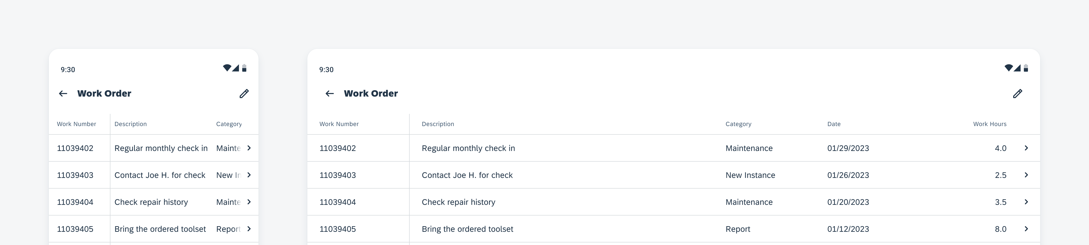
Data table on mobile (left) and tablet (right)
Usage
- Use data tables when the user needs to compare multiple sets of data across items in a large data set.
- Use data tables as a tool to query, consume, and navigate to specific data.
- Use data tables if there are at least two columns or more of data parameters.
Don’t use data tables when the user doesn’t need to compare multiple attributes across items.
Anatomy
A. Header Rows
Located at the top of each column is a label. It’s recommended for the data table to have at least three columns.
B. Data Rows
Follows after the header row. There is no maximum number of data rows.
C. Sticky Horizontal Column (Optional)
The first column can be sticky (mobile only).
The sticky column’s maximum width is 30% of the screen width in order to not take up too much space. Any content that is longer will be truncated.
D. Divider (Optional)
Between the first and second column a divider can be displayed. If the first column is set to sticky (Mobile only), a divider must be added.
E. Chevron Column
The user can tap on a row or on the chevron to navigate to the row details.
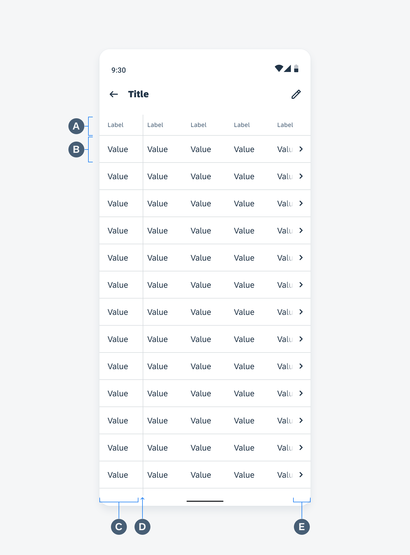
Data table anatomy
Text Alignment
The text alignment within the columns depends on the type of content to maximize legibility.
Left aligned:
- The first column (from the left)
- Text value column
- String value column
Right aligned:
Numeric value column, such as currency, distance, or time duration.
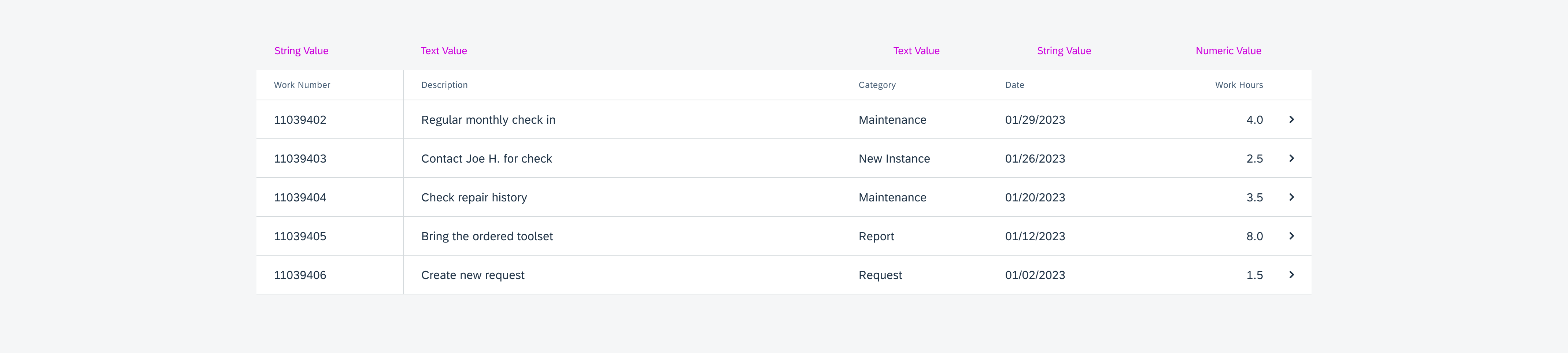
Text alignment in table cell
Dynamic Width Column
- The dynamic column takes up all the remaining space after the widths of the other columns are determined.
- A row contains only one dynamic column.
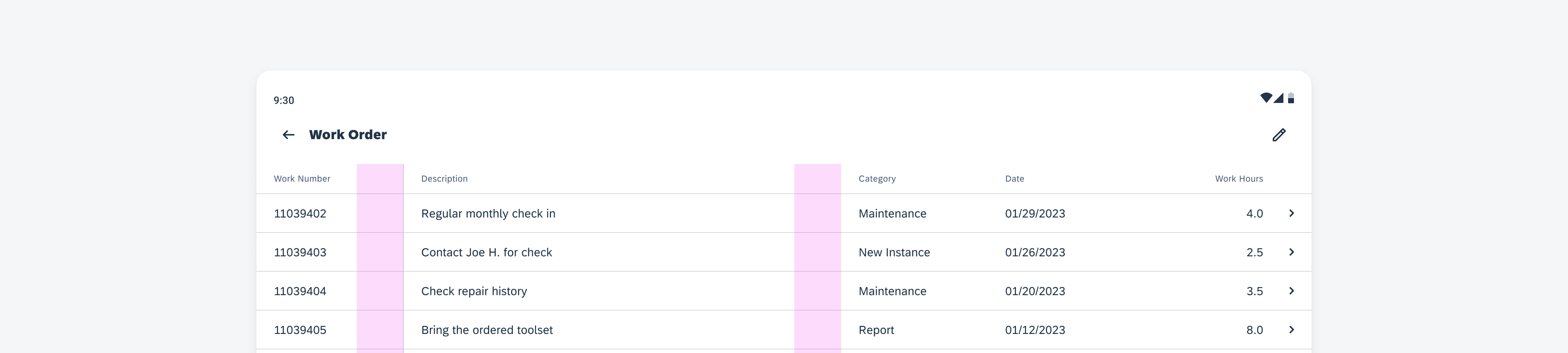
Table columns with dynamic width
Maximum Height of a Row
- The maximum number of lines of text is two. Users can choose to determine max-height of text line as one or two.
- If the text is longer than the maximum number of lines, the text will be truncated.
Maximum Width of a Column
- If there are more than two columns, any one column will have a maximum width including padding of 50% of the screen width to avoid a column to take up too much space. This width can be overridden.
- If the content exceeds the width of the column, the content will be truncated or switched to a two line if the data table is set to two lines.
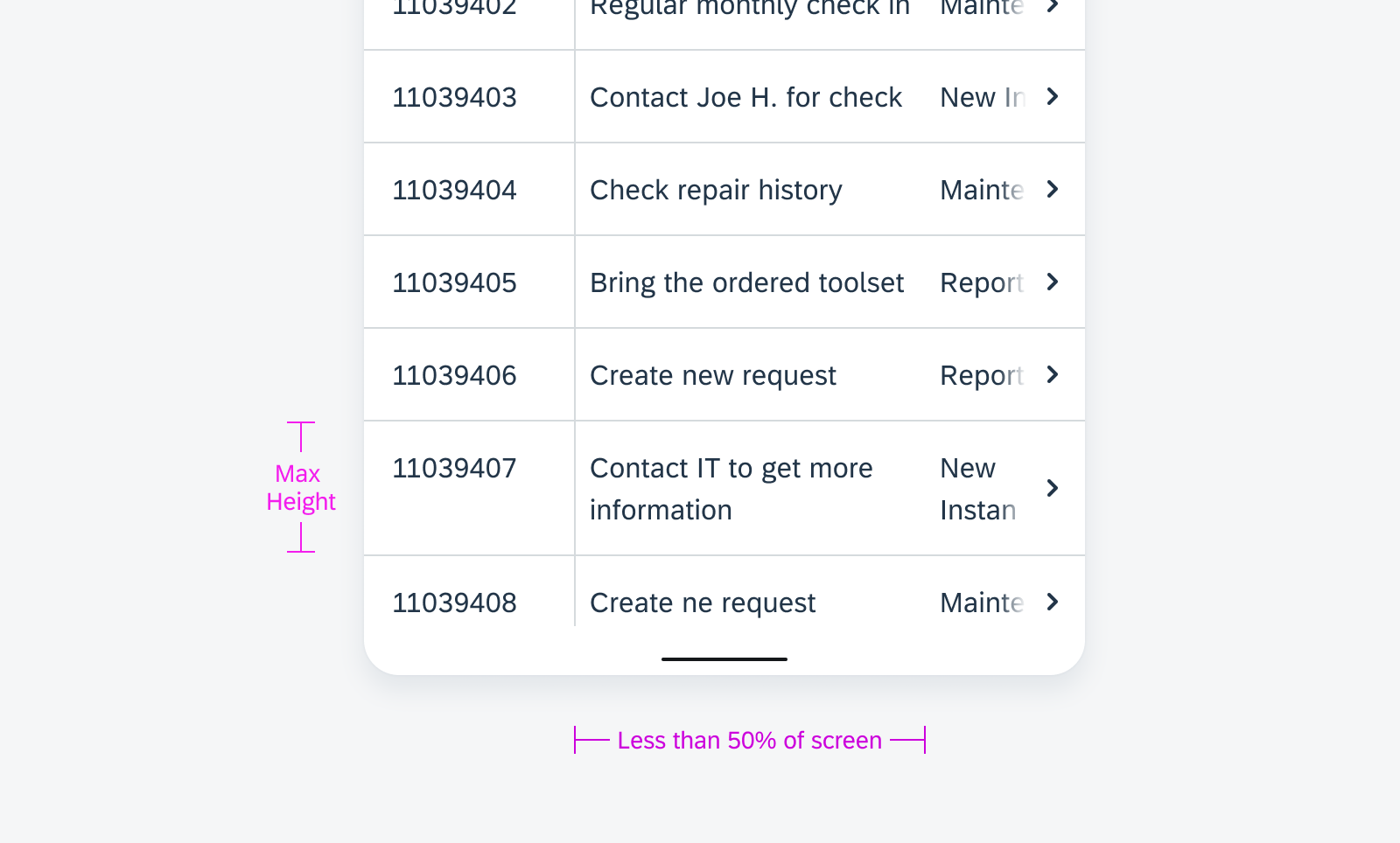
Maximum height of a row and maximum width of a column
Behavior and Interaction
Scrolling
The header stays at the top as the user scrolls. A drop shadow will appear once the user scrolls to differentiate the header and data rows.
Horizontal, vertical, and diagonal scrolling are available to allow for flexibility.
Horizontal scrolling
Vertical scrolling
Diagonal scrolling
Push to View
The user can tap on any row to see the row details in a key object cell view.
This allows users to be able to see the full row at once, or view the full text of any truncated text.
Opening the key object cell view
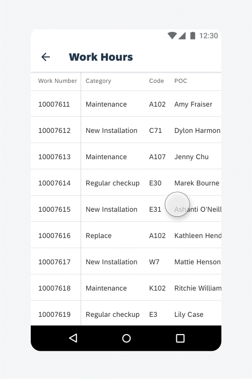
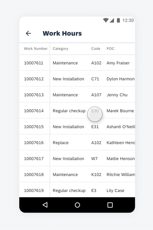
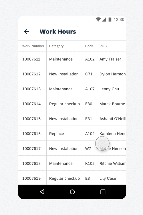
Inline Edit
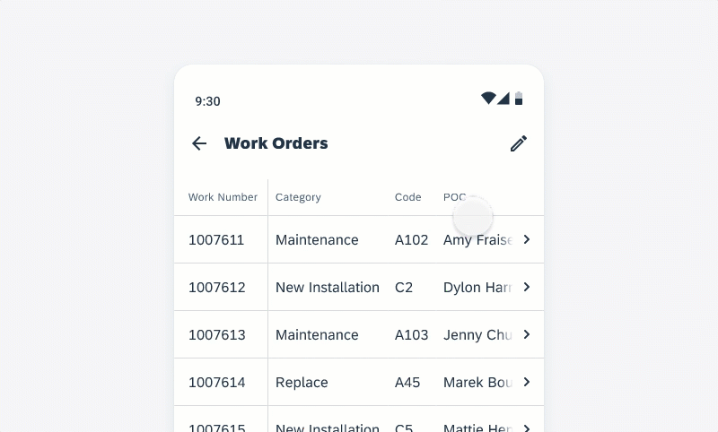
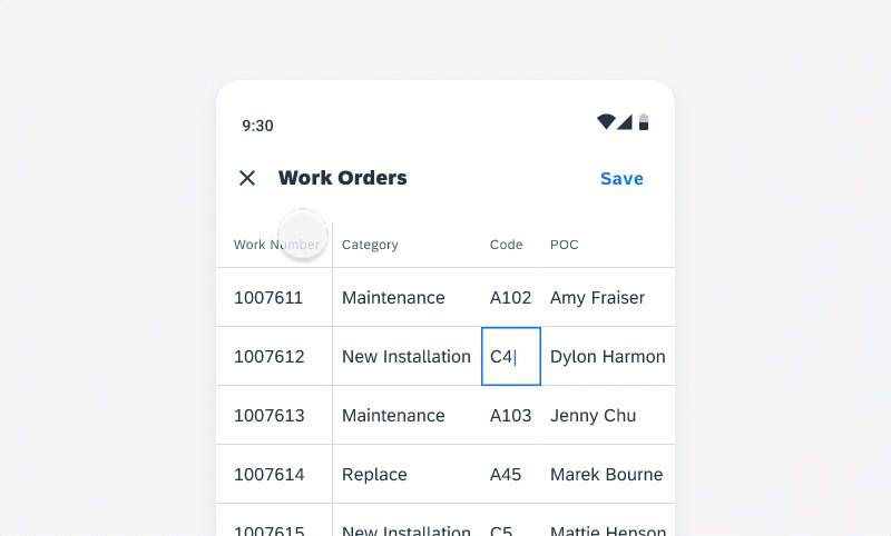
In the inline edit mode, users can edit multiple lines without opening the key object cell view. To activate the inline edit mode, users have to tap on the “Edit” icon in the top app bar.
When the inline edit is activated, the chevron column on the right is hidden and it is not possible to open the key object cell view while editing. The user can tap on a cell to select it. The selected cell gets highlighted with a blue border.
The inline edit mode is available for text, list picker and time picker.
Activate the inline edit mode and select a text cell
If there is an invalid entry, the cell is highlighted in red and a banner with an error message pops up. If the user deselects the cell, the error is still visible with a red underline and a banner with an error message is displayed.
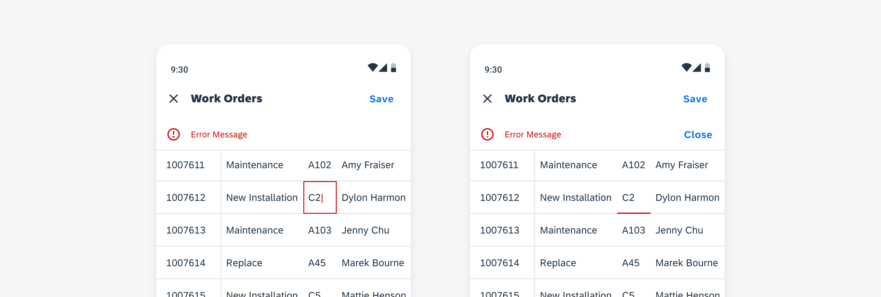
Invalid cell entry and banner with error message while cell is selected (left) and cell is deselected (right)
To save the changes, users have to tap on the “Save” button in the top app bar. We recommend showing a snackbar with a confirmation message stating that new changes have been saved.
If users want to discard the new changes, they must tap on the “x”.
A dialog appears and the users have to confirm that they want to discard all changes.
Discard changes in the inline edit mode
Resources
Development: DataTableView
SAP Fiori for iOS: Data Table
 Your feedback has been sent to the SAP Fiori design team.