
Hierarchy View
Fiori: HierarchyView
Intro
The hierarchy view is a set of columns that show the hierarchical relationships between objects. Typically, the hierarchy view shows a parent/child and sibling relationship but may also show more complex relationships that are several levels deep, such as a great-grandparent/great-grandchild.
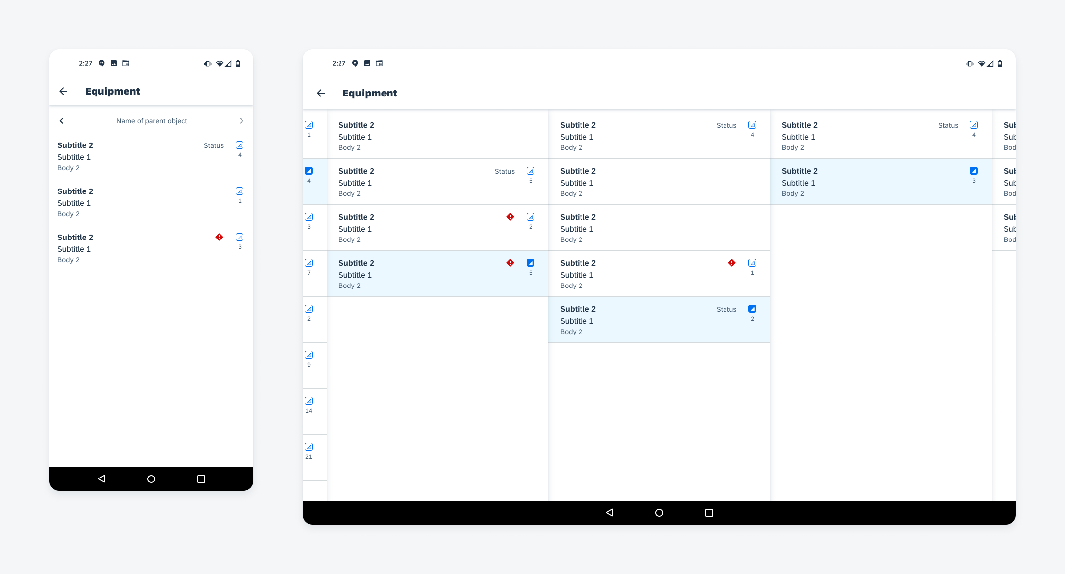
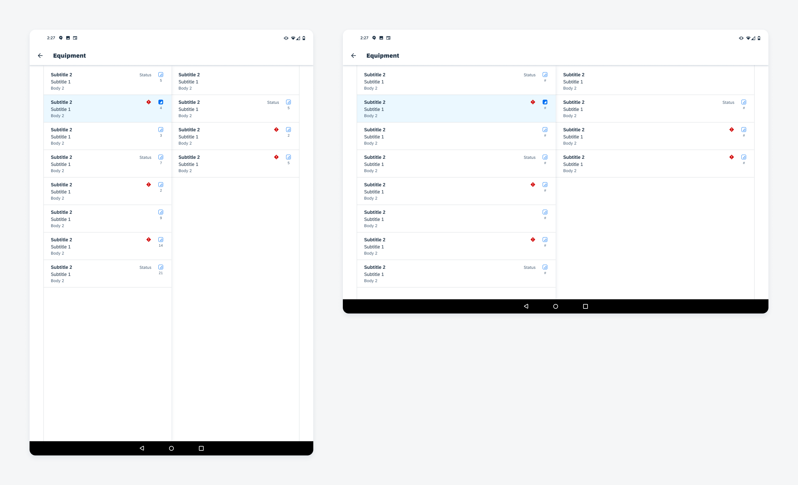
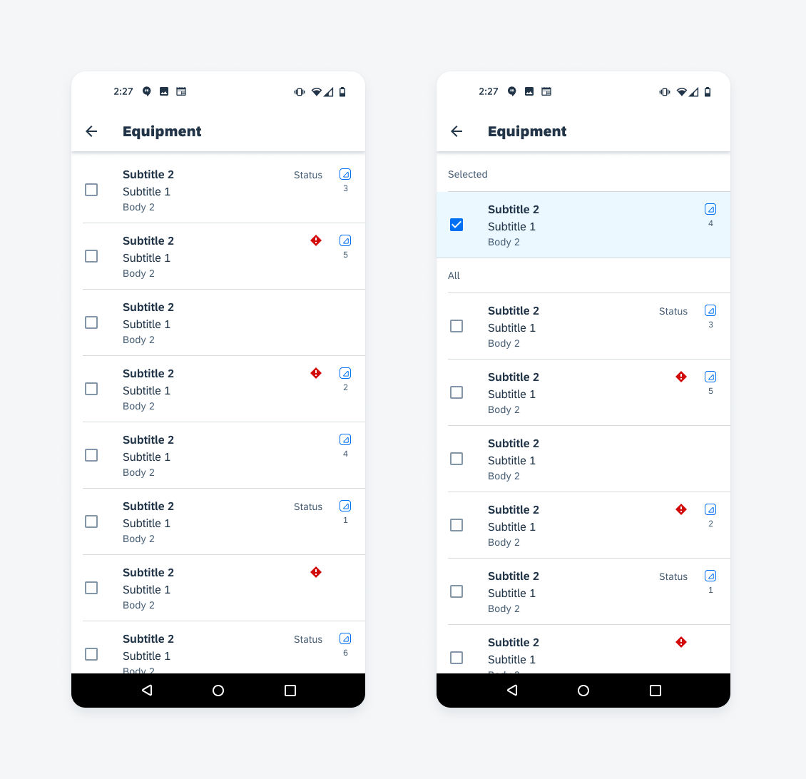
Example of hierarchy view on mobile (left) and tablet (right)
Usage
Use the hierarchy view if the user needs to see the relationship of an object, such as its parent, children, and sibling objects.
- Do not use the hierarchy view for a single level of data. Instead, use a list of standard object cells.
- Limit the content used in the hierarchy object cell. Due to the hierarchy accessory, space is limited.
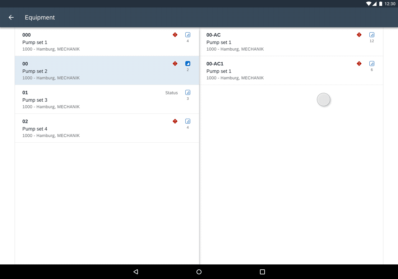
Anatomy
The hierarchy view is organized into columns depending on how many levels are expanded and the kind of device that the user is using.
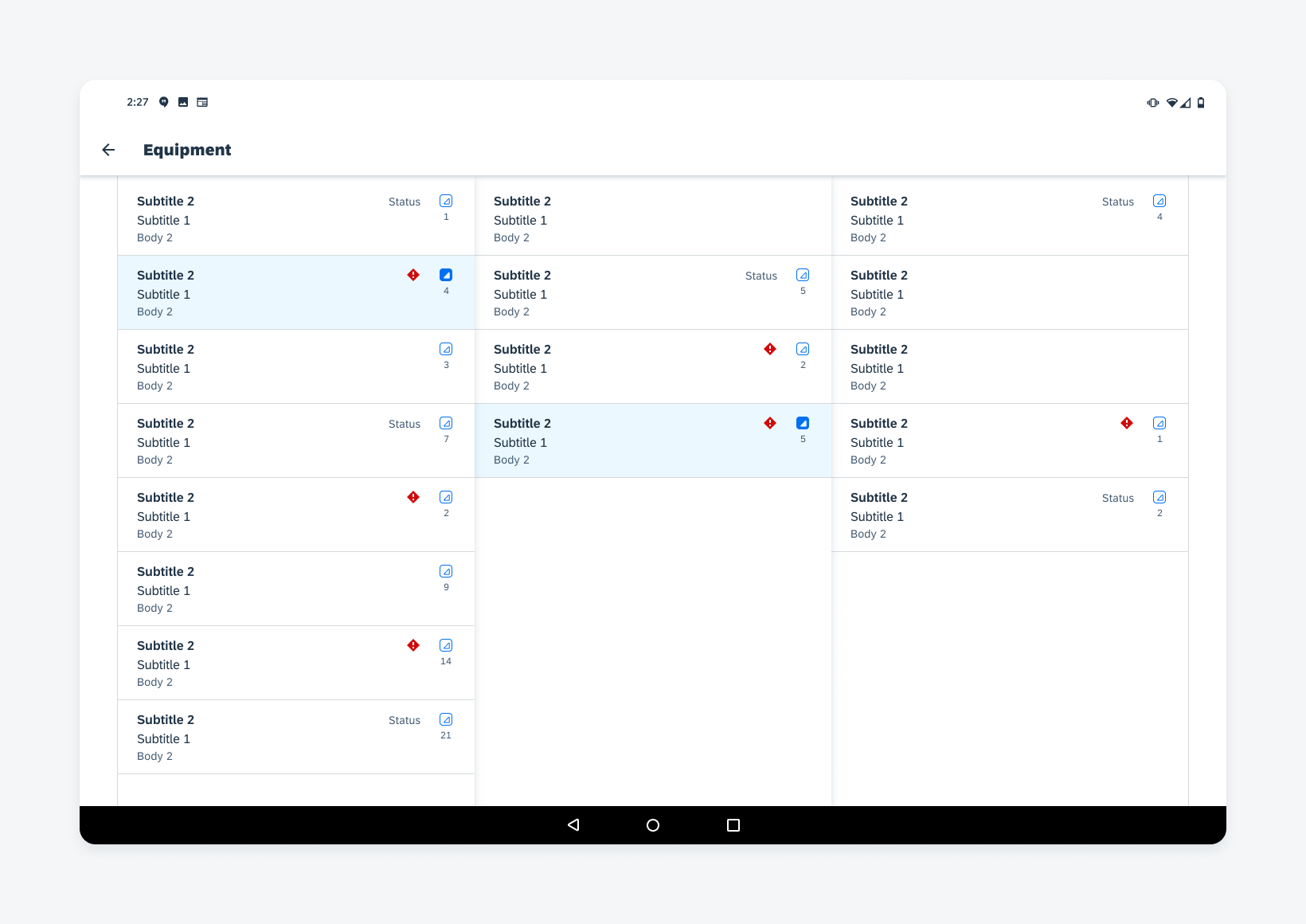
Mobile
A. Navigation Bar
The navigation bar is used only for the hierarchy view on small screens. It is used to navigate up and down the hierarchy levels. It would be used for the hierarchy view on mobile and hierarchy view in a dialog.
B. Object Cell
The hierarchy view cell is based on the object cell. The only difference is the additional hierarchy accessory. For more information, see object cells.
C. Hierarchy Icon
The hierarchy icon allows users to view an object’s children. When selected, the icon toggles from a default state to a selected state. If there are no further children, the hierarchy accessory is empty.
D. Direct Objects Count
The direct objects count shows the total number of direct child objects. Displaying the direct objects count is optional.
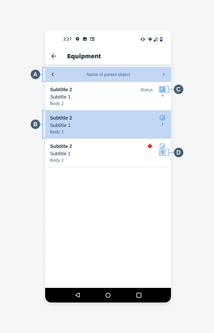
Hierarchy view on mobile
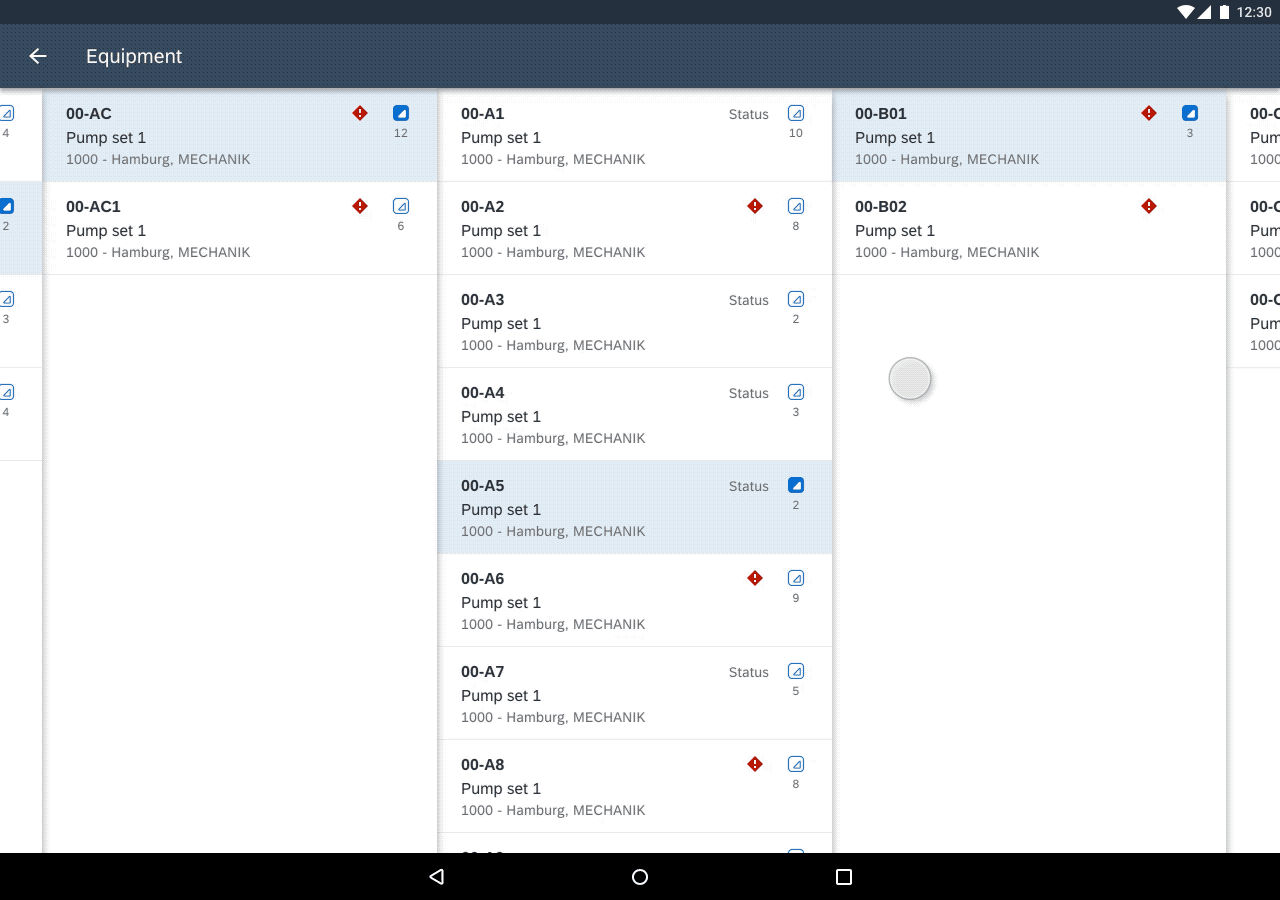
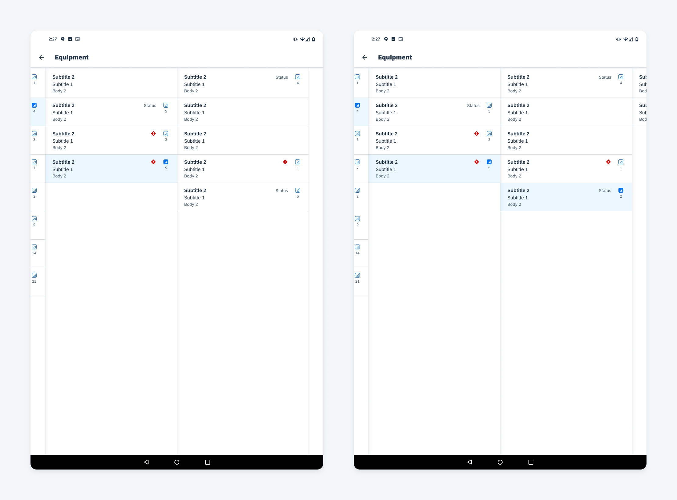
Tablet
E. Object Cell
The hierarchy view cell is based on the object cell. The only difference is the additional hierarchy accessory. For more information, see object cells.
F. Overflow Preview
The overflow preview displays a hint of the parent and/or child level that is outside of the viewport. This is only available on large screen sizes.
G. Hierarchy Icon
The hierarchy icon allows users to view an object’s children. When selected, the icon toggles from a default state to a selected state. If there are no further children, the hierarchy accessory is empty.
H. Direct Objects Count
The direct objects count shows the total number of direct child objects. Displaying the direct objects count is optional.
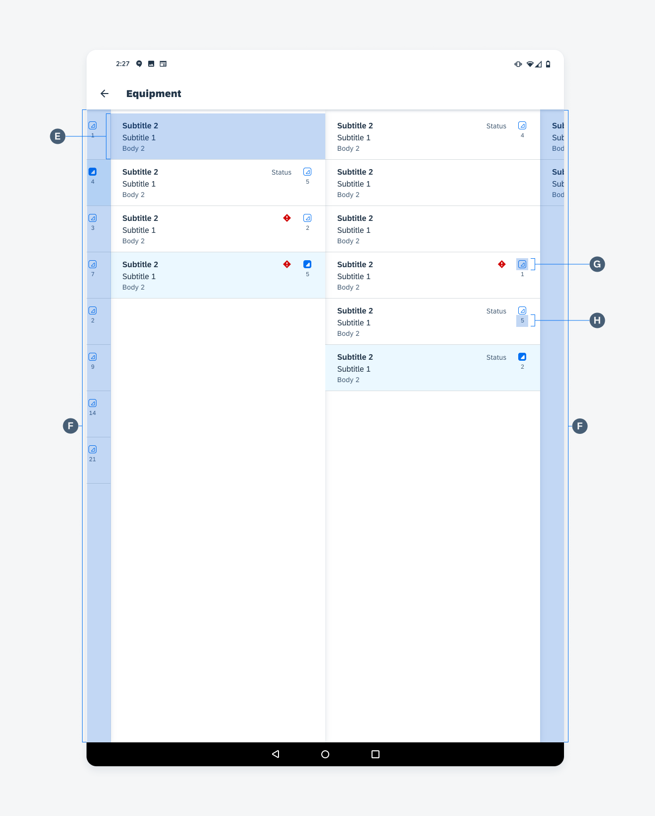
Hierarchy view on tablet
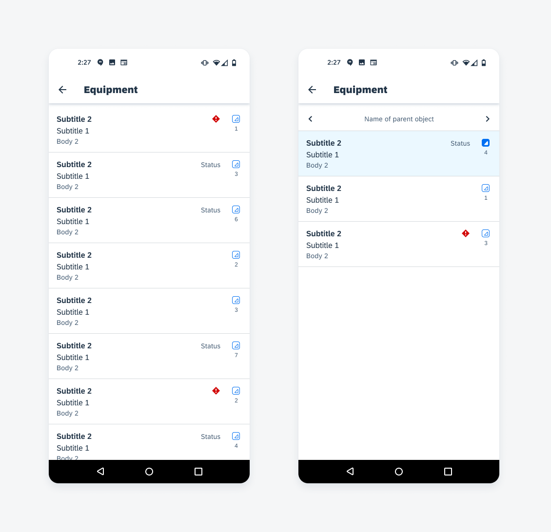
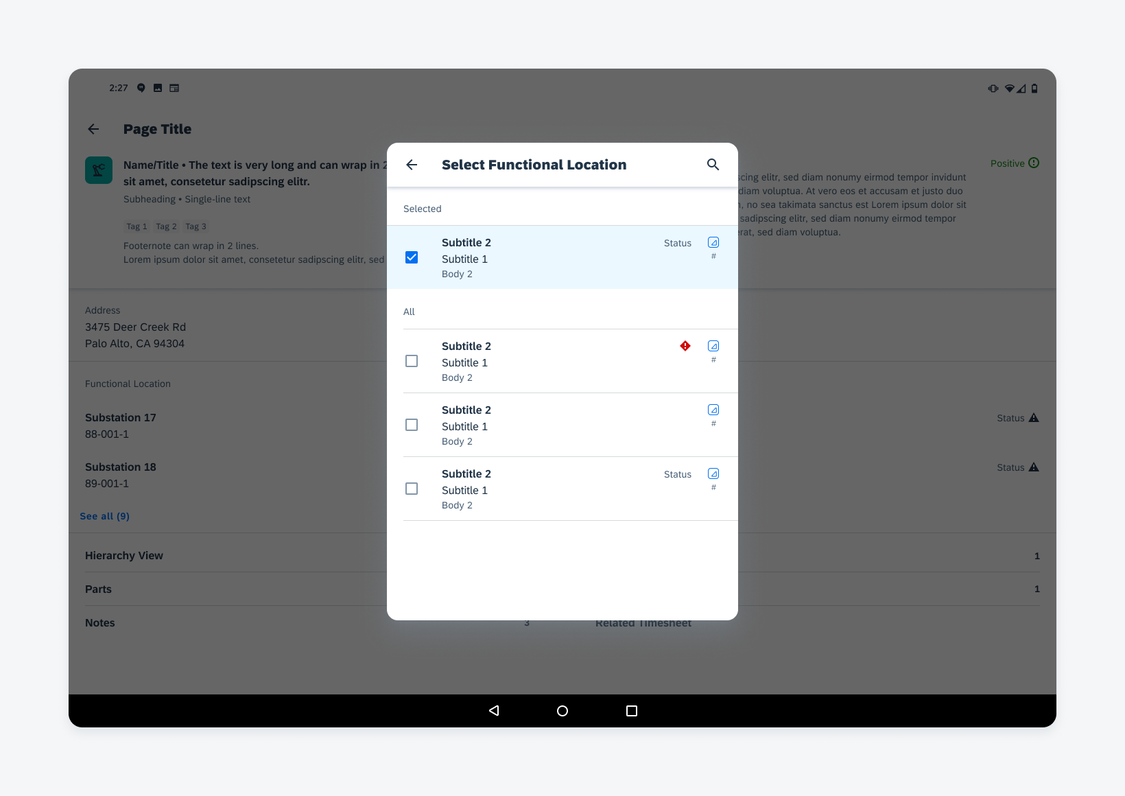
Hierarchy List Picker
I. Navigation Bar
The navigation bar is used only for the hierarchy view on small screens. It is used to navigate up and down the hierarchy levels. Users can see the hierarchy view on mobile and hierarchy view in a dialog.
J. List Picker Form Cell
The list picker allows users to select options that have different hierarchy levels. Provide the hierarchy view cell with either radio buttons for single select or checkboxes for multi-select. For more information, see list picker form cells.
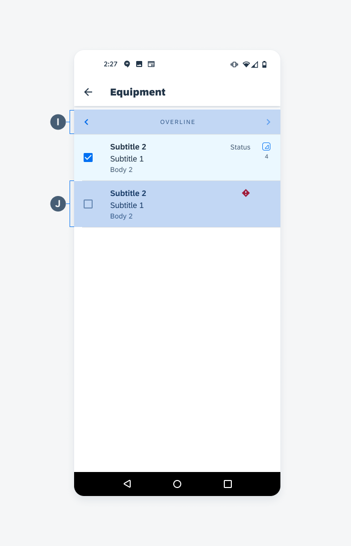
Hierarchy list picker on mobile
Behavior and Interaction
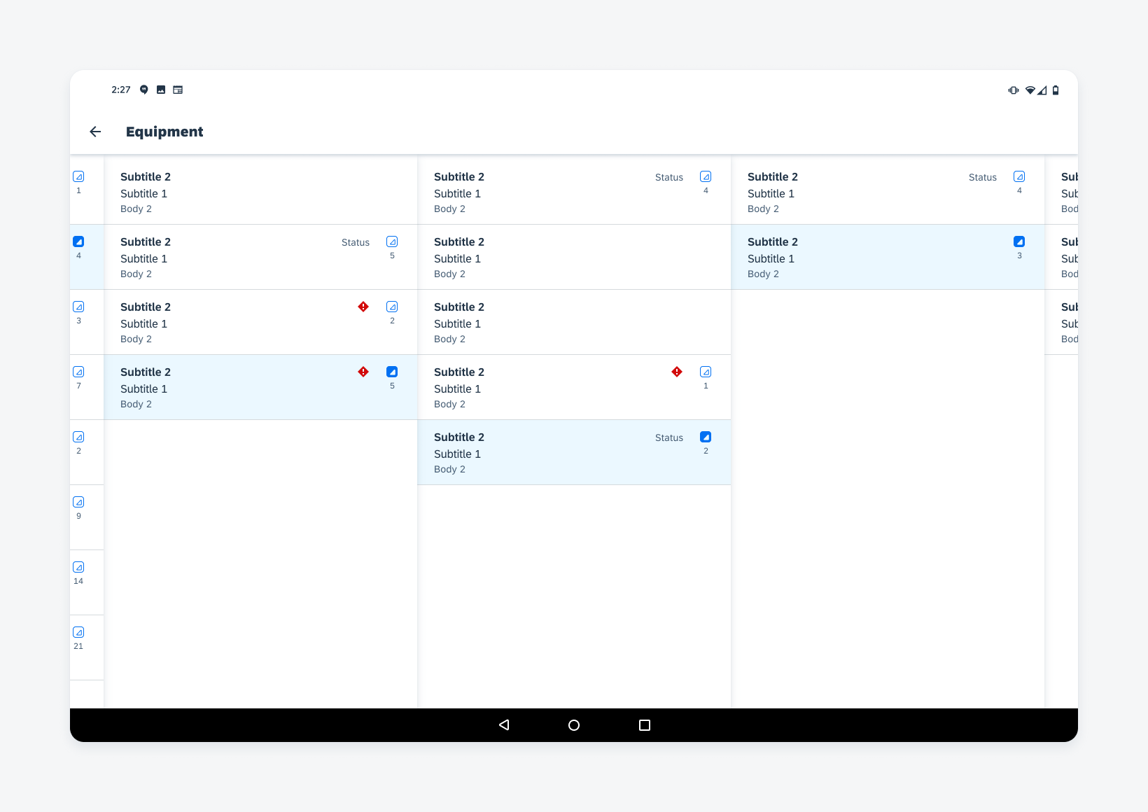
Hierarchy Accessory
Tapping on the hierarchy accessory leads the hierarchy view to access the selected object’s children. On tablet, it expands into another column. On mobile, the screen transitions to another view. If the user has navigated into more levels than the device can display, the view shifts to display the newest views and the highest ancestor level is out of view.
Expanding the hierarchy view
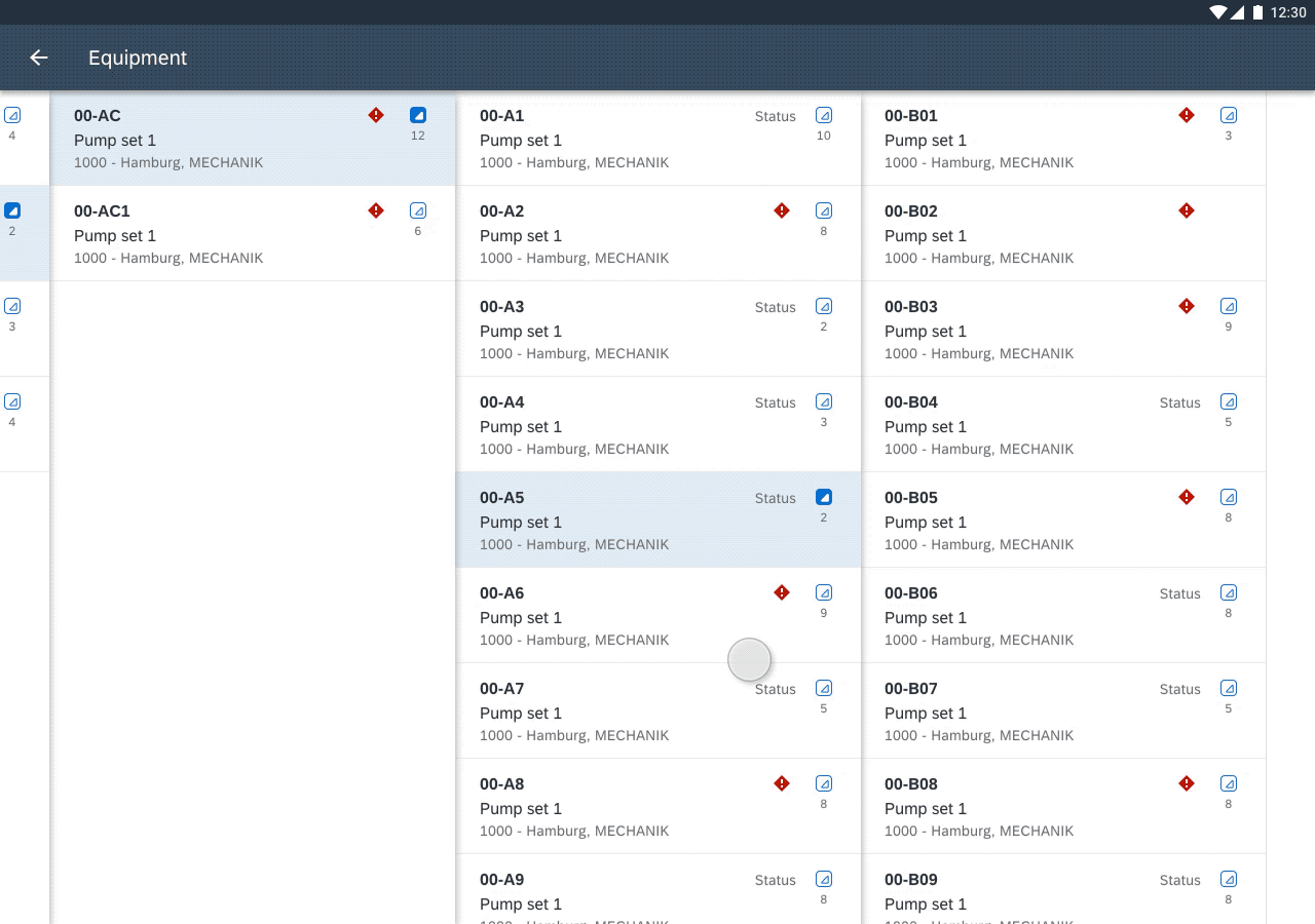
Horizontal Scroll
Swiping horizontally allows the user to navigate to see additional ancestor or child levels in the hierarchy.
Horizontally scrolling the hierarchy view
Vertical Scroll
Scrolling up and down in a column allows the user to see the siblings within a hierarchy level.
Vertically scrolling the hierarchy view
Adaptive Design
The hierarchy view can accommodate several levels of content that is organized within columns.
One Column with Navigation Bar (Mobile Only)
One column hierarchy view with navigation bar, only available on mobile
Two Columns (Tablet Only)
Two columns hierarchy view, only available on tablet
Two Columns with Overflow Preview (Tablet Portrait Only)
Two columns hierarchy view with higher and lower columns visible as preview, only available on tablet portrait
Three Columns (Tablet Landscape Only)
Three columns hierarchy view, only available on tablet landscape
Three Columns with Overflow Preview (Tablet Landscape Only)
Three columns hierarchy view with higher and lower columns visible as preview, only available on tablet landscape
Hierarchy List Picker (Mobile)
Hierarchy view as list picker on mobile
Hierarchy List Picker (Tablet)
 Your feedback has been sent to the SAP Fiori design team.