
Progress Indicators
FioriLinearProgressIndicator
Intro
Progress indicators keep users informed about the status of ongoing processes, such as logging in, uploading files, or refreshing content. They communicate the state of an app and indicate available actions, such as whether users can navigate away from the current screen.
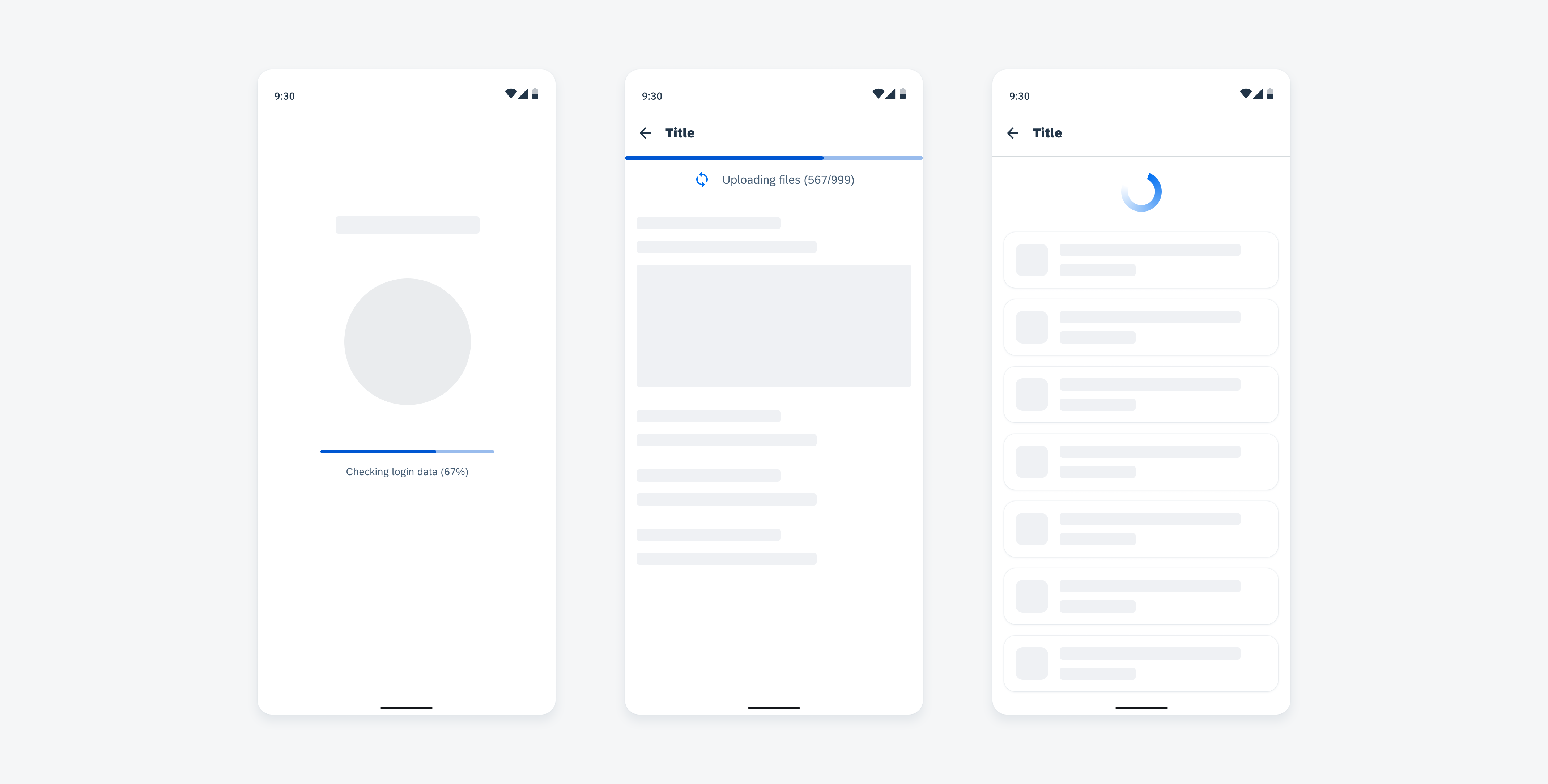
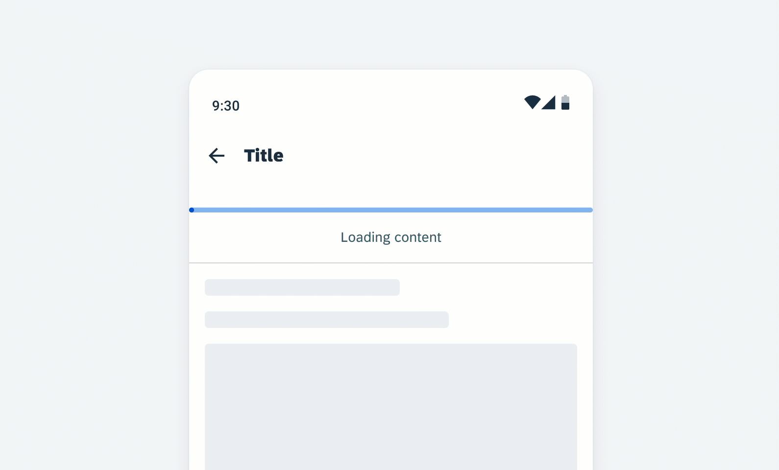
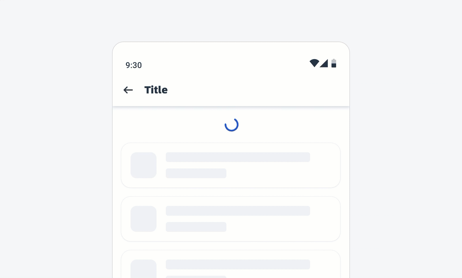
Login screen with linear progress indicator (left), uploading files (middle), content refresh with circular progress indicator (right)
Usage
- Use progress indicators if the wait time takes longer than one second.
- Use only one indicator type for each activity in an app, for example, if a circular indicator represents a refresh action on a screen, a linear indicator should not be used for the same action elsewhere in the app.
- Keep labels short – we recommend one line of text.
- For determinate indicators, include a progress value, for example, 60%, 30/100, at the end of the label.
- It is mandatory to use labels for error and success states.
- Don’t transition from a linear to a circular progress indicator or vice versa.
- Don’t use labels when a loading process takes less than 10 seconds, or when the height or the width is too constrained.
- Try to avoid using progress indicators with two lines of text. Wrapping is not recommended and is only available for compact window sizes.
- Don’t display a progress value for the error/fail and success states.
Anatomy
Active State
A. Indicator
B. Track
C. Label (Optional)
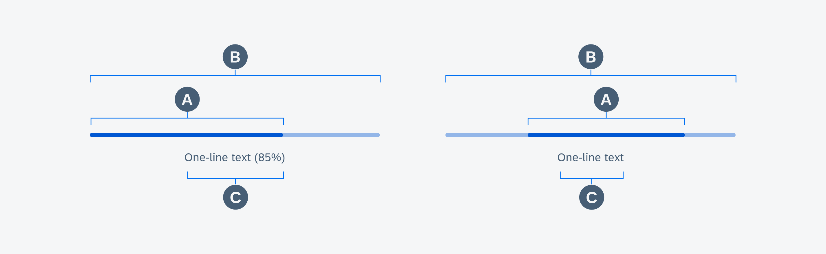
Anatomy of determinate and indeterminate linear progress indicators in active state
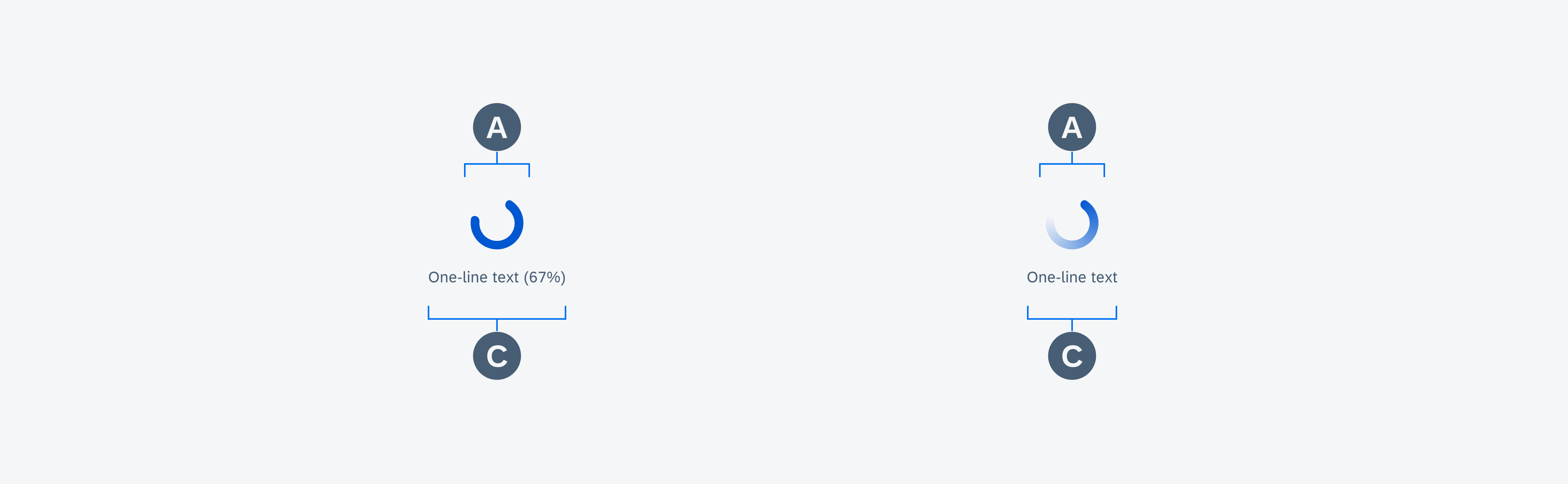
Anatomy of determinate and indeterminate circular progress indicators in active state
Value State
A. Indicator (Hidden by Track)
B. Track
C. Validation Message
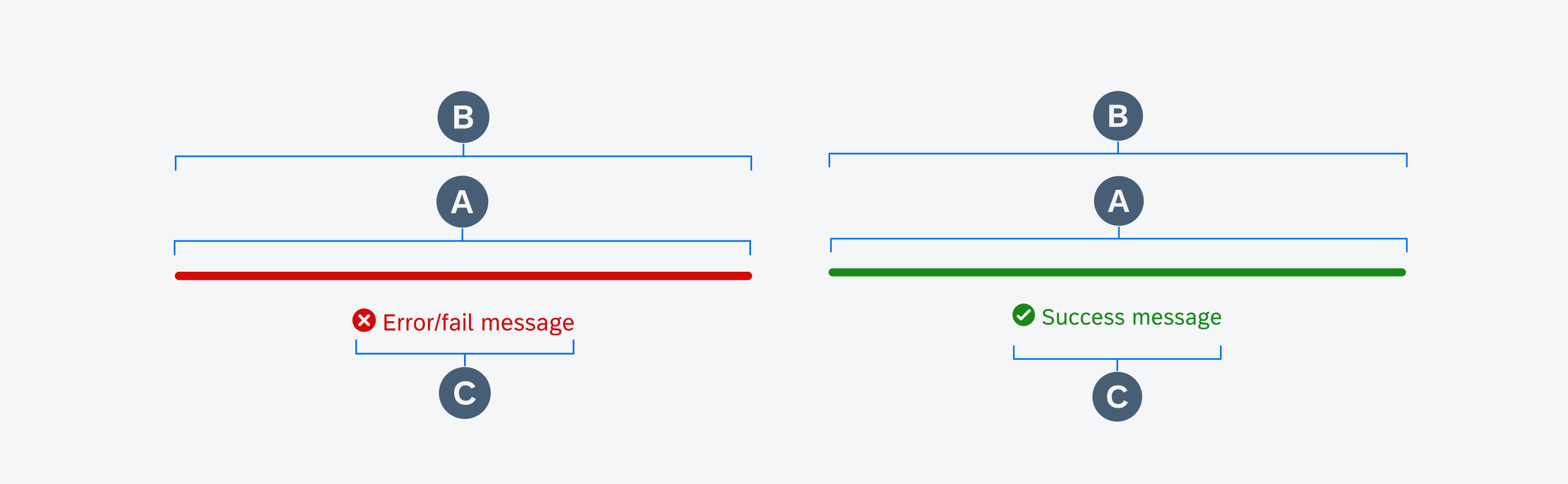
Anatomy of linear progress indicators in error/fail (left) and success state (right)
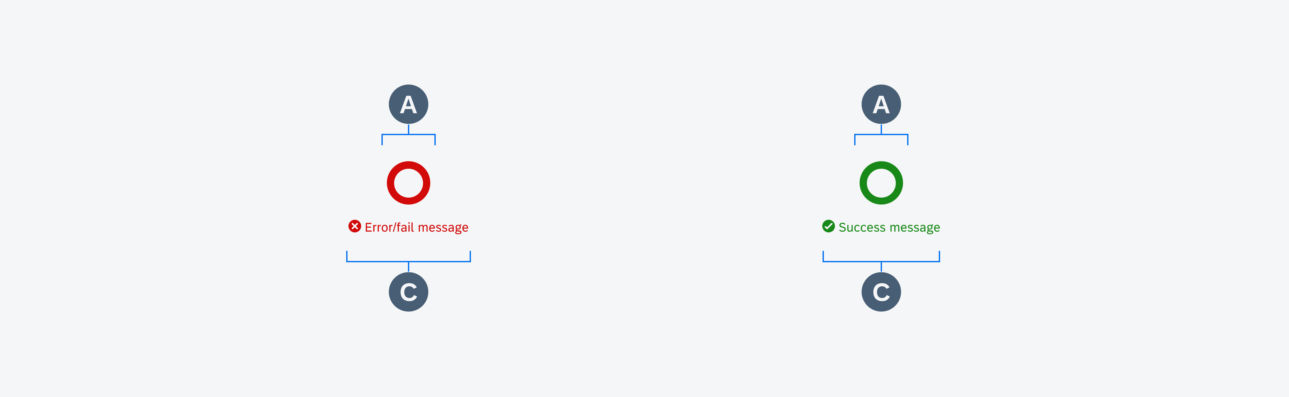
Anatomy of circular progress indicators in error/fail (left) and success state (right)
Behavior and Interaction
Text Wrapping (Only for Mobile)
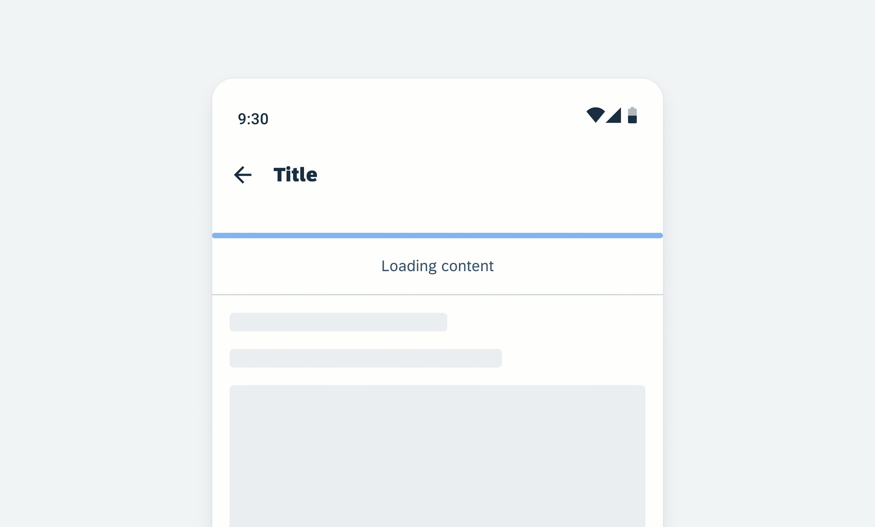
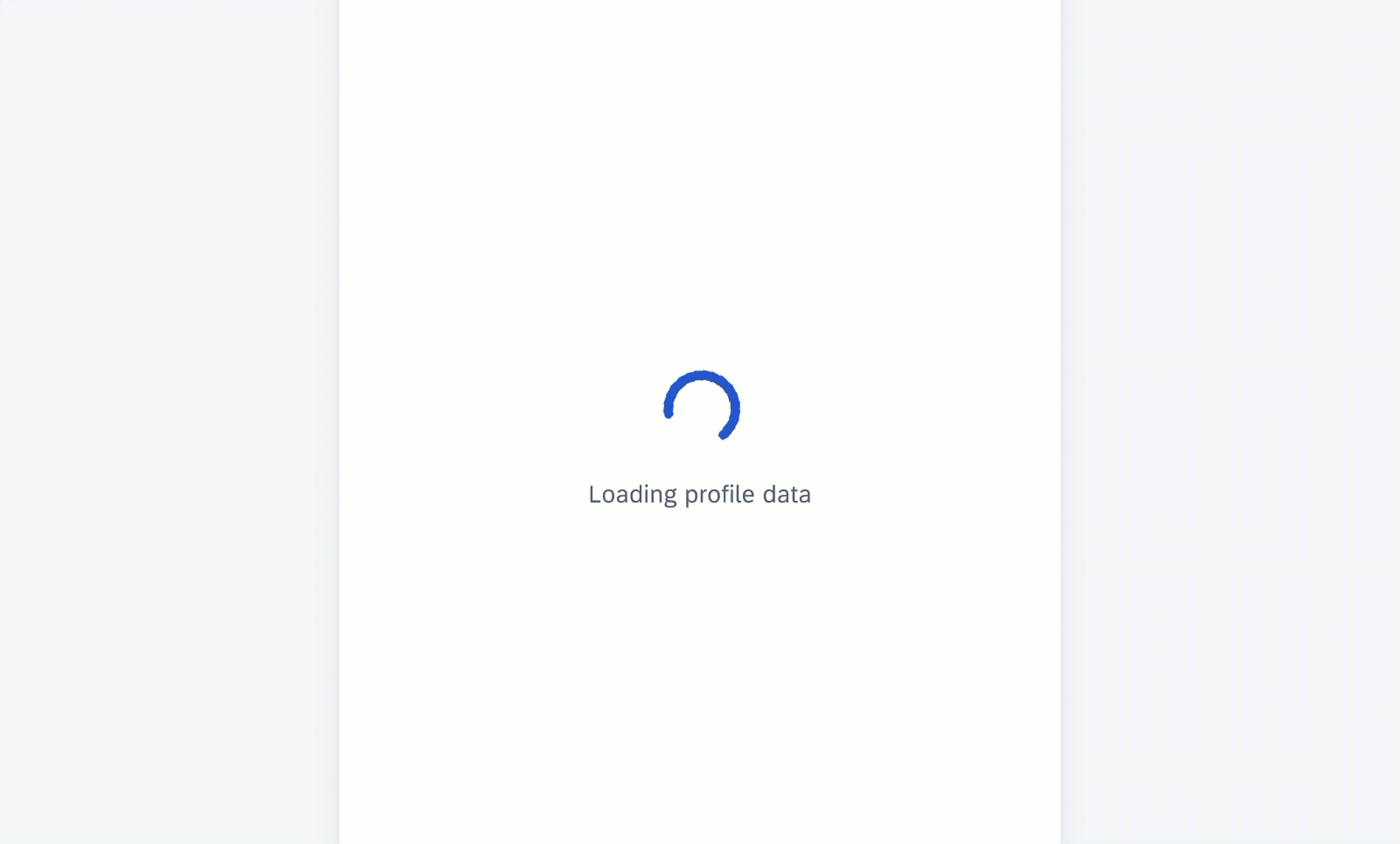
Labels are optional and should only be used when the process takes 10 seconds or more. They should be concise and, ideally, not exceed one line of text.
If the length of the text exceeds the available space, the text wraps into the next line and the progress indicator will keep its position on the top. Wrapping is not recommended and is only available for mobile window sizes ranging from 0-599 dp. Labels can’t exceed two lines of text.
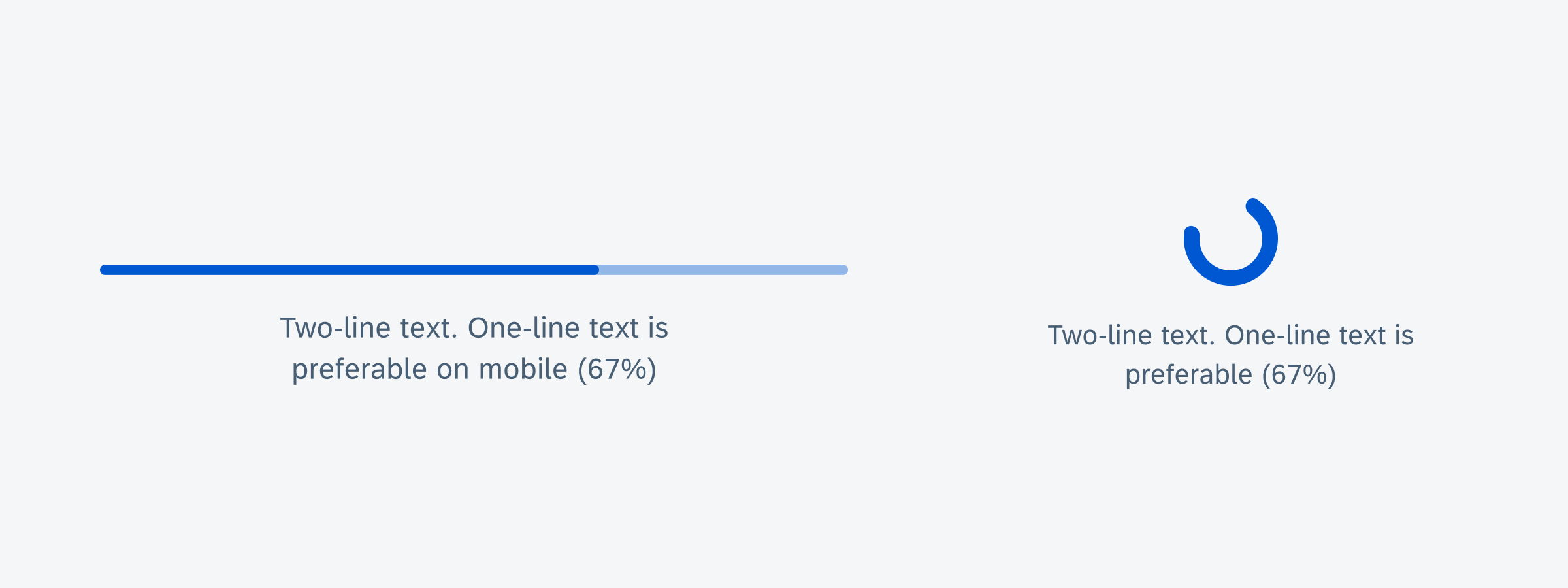
Text wrapping examples of linear progress indicator (left) and circular progress indicator (right)
Value States
Error/Fail State
If an error occurs or a process fails, the loading animation stops. The indicator turns red and the entire track fills with the error color.
Error/fail state behavior of a linear progress indicator
Error/fail state behavior of a circular progress indicator
Success State
The success state appears after the successful completion of a process or request. The indicator turns red and the entire track fills with the success color.
Depending on the use case, you can choose one of the following options for the success indicator
- Persisting until the user triggers another action, such as closing or changing screens
- Disappearing after 3 seconds
Success state behavior of a linear progress indicator
Success state behavior of a circular progress indicator
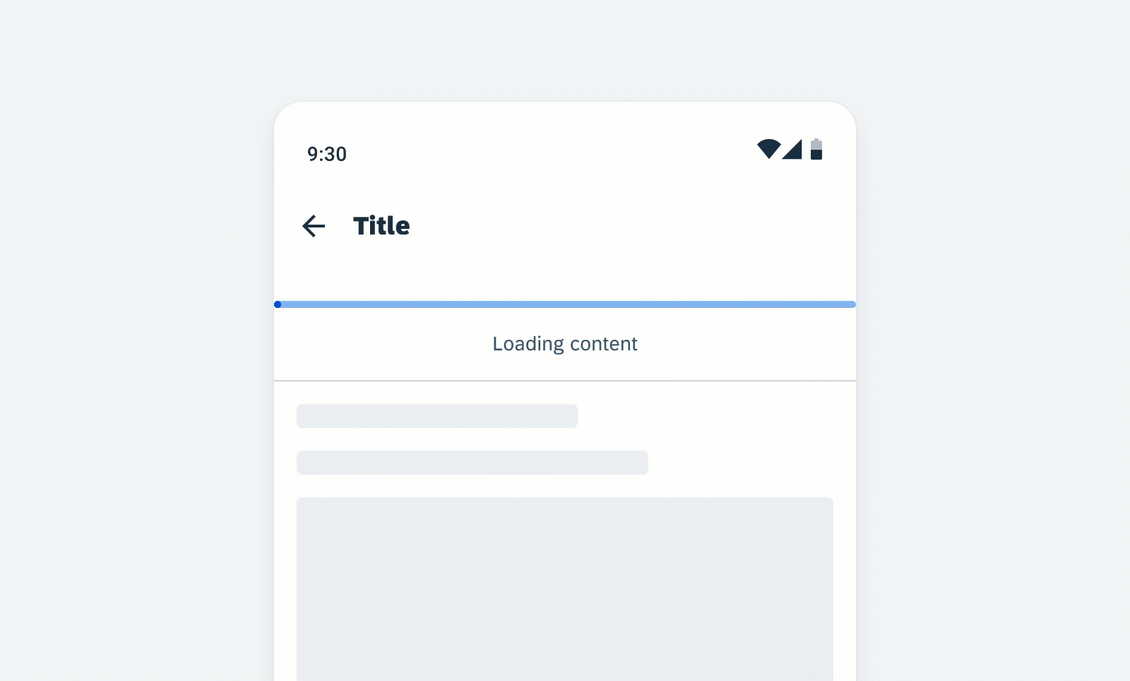
Swipe-to-Refresh (Circular Progress Indicator Only)
The circular loading indicator appears at the top of the existing content when the user triggers the content refresh by swiping down the page. This action loads new data from the server and displays it in the interface. The indicator disappears once the loading process is complete, or when the user navigates away from the content that is being refreshed.
The swipe-to-refresh behavior should be used with dynamic content sorted in descending order. In these cases, the most recent content always appears on top. Common examples are inboxes sorted by descending date, or other types of lists and card collections.
Swipe-down behavior of the circular progress indicator
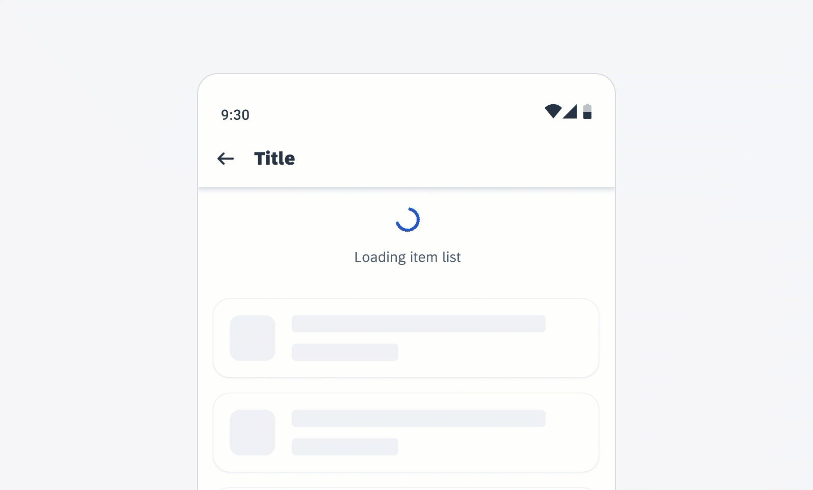
Scroll Up to Load (Circular Progress Indicator Only)
The circular loading indicator appears at the bottom of the existing content when a user scrolls beyond the end of the data that the application has loaded in memory. The indicator disappears when the loading process is complete, or when the user navigates away from the content that is being refreshed.
Scroll-up behavior of the circular progress indicator
Variations
Linear Progress Indicator
Linear progress indicators display progress by animating an indicator along the length of a fixed, visible track. The behavior of the indicator is dependent on whether the progress of a process is known.
A. Determinate
Determinate linear progress indicators display how long a process will take. They should be used when the process can be completed within a specified amount of time. They fill from 0% to 100% and never decrease in value. For example, downloading/uploading a file of known size.

Determinate linear progress indicator
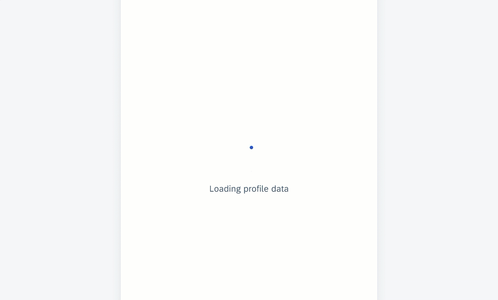
B. Indeterminate
Indeterminate linear progress indicators express an indefinite waiting time. They should be used when the process completion can’t be determined, or when it is not necessary to indicate how long an activity will take. It conveys that a user’s action, request, or data is being processed.
Indeterminate linear progress indicator
C. Indeterminate to Determinate
The indicator can switch from an indeterminate state to a determinate state. It should be used when an indeterminate process reaches a point where its duration can be determined, and the loading animation can be stopped.
Linear progress indicator (indeterminate to determinate)
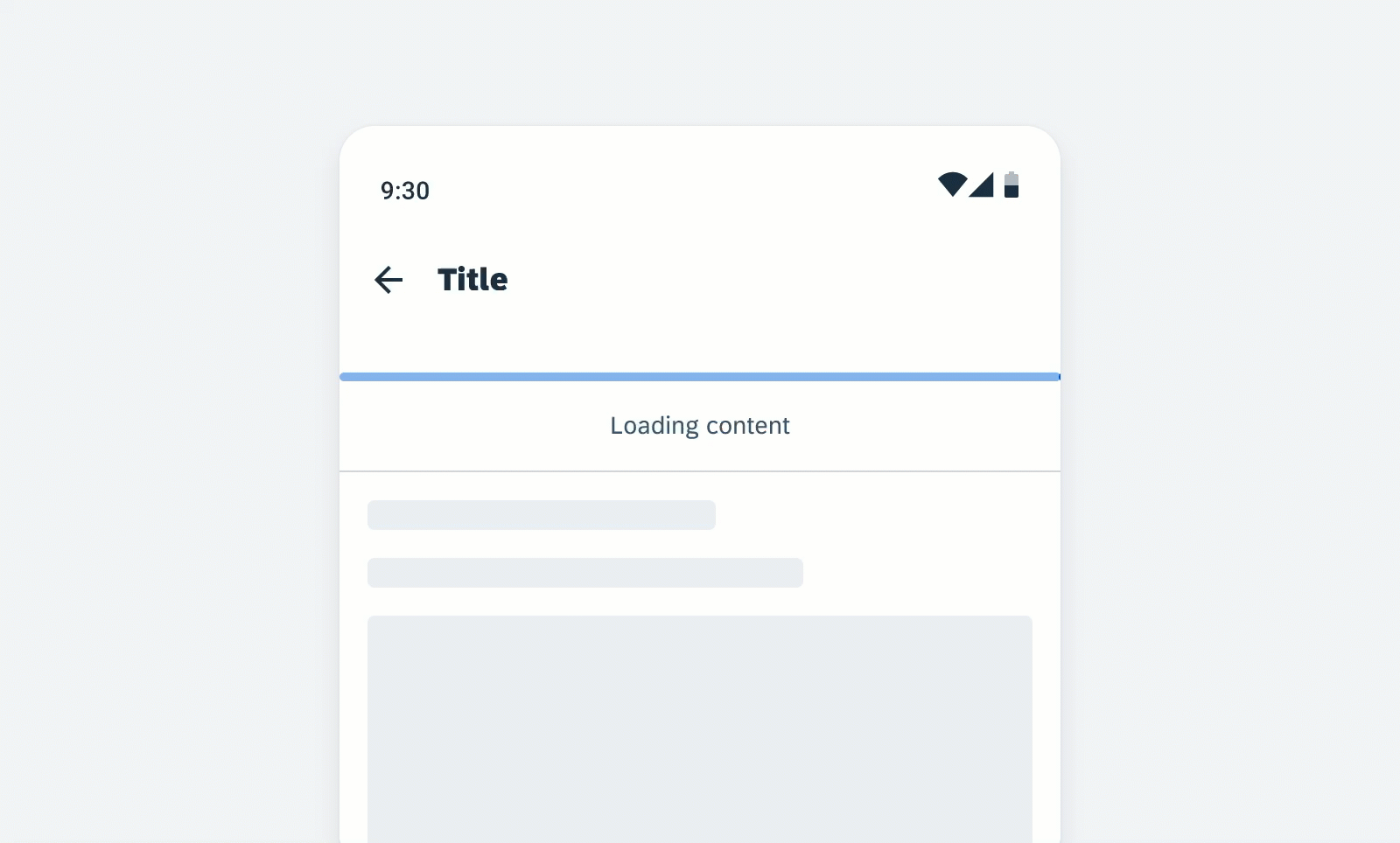
D. With Label
- Labels are optional to communicate the status and progress. If there is nothing to communicate, having no label is valid.
- Only include labels to give extra context or to provide useful information, for example, what information the progress bar is processing. Avoid using terms such as “loading” that don’t add any value.
- If the label is comprised of one or more sentences, use sentence-style capitalization.
- We recommend including a progress value, for example, 60%, 30/100, at the end of the label for determinate indicators to show how much of the process is already completed, the current progress, and how much is remaining.
- The display of the progress value is under application control. The application should be able to turn the progress value off.
- Keep labels short – we recommend one line of text.
Linear progress indicator with label
Circular Progress Indicator
Circular progress indicators display progress by animating an indicator along an invisible circular track in a clockwise direction. They can be applied directly to a surface or a card.
A. Determinate
The determinate circular indicator moves from 0 to 360 degrees along an invisible circular track and fills it with color. Use this variation when the process completion can be determined.
Determinate circular progress indicator
B. Indeterminate
Indeterminate circular progress indicators grow and shrink in size as they move along an invisible track. They should be used when the process completion can’t be determined, or when it is not necessary to indicate how long an activity will take.
Indeterminate circular progress indicator
C. Indeterminate to Determinate
The indicator can switch from an indeterminate state to a determinate state. It should be used when an indeterminate process reaches a point where its duration can be determined and the loading animation can be stopped.
Circular progress indicator (indeterminate to determinate)
C. With Label
- Labels are optional to communicate the status and progress. If there is nothing to communicate, then having no label is valid.
- Only include labels to give extra context or to provide useful information. For example, what information the progress bar is processing. Avoid using terms such as “loading” that don’t add any value.
- Use sentence style capitalization.
- We recommend including a progress value, for example, 60%, 30/100, etc., at the end of the label for determinate indicators to show how much of the process is already completed, the current progress, and how much is remaining.
- The display of the progress value is under application control. The application should be able to turn the progress value off.
- Keep labels short – we recommend one line of text.
Circular progress indicator with label
States
The following states are available for indeterminate and determinate progress indicators. Keep in mind that the error/fail and success states should not display a progress value.
Error/Fail State
The error/fail state indicates that an action or request could not be completed successfully. Labels are mandatory and should always inform the user what kind of error/fail happened and how this issue can be resolved. The message should be as concise as possible. Follow the guideline for indicators with a label.
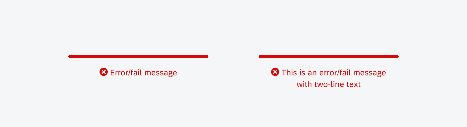
Linear progress bar with one-line error message (left) and two-line error message (right)
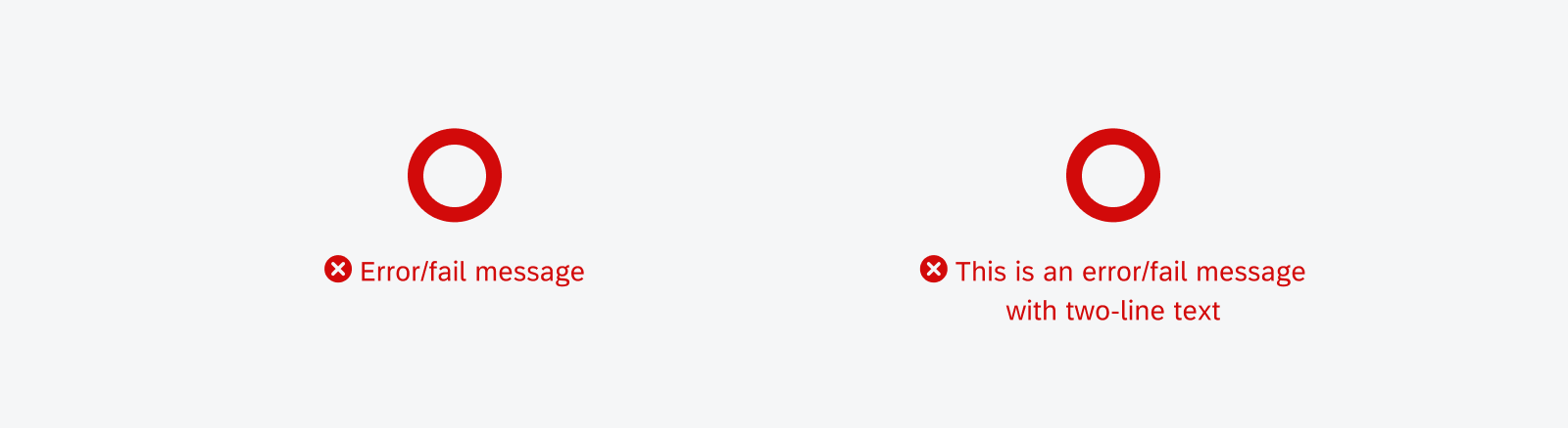
Circular progress indicator with one-line error message (left) and two-line error message (right)
Success State
The success state indicates the successful completion of a process or request. Labels are mandatory for the success message and should be concise. A short information about the completed process or the executed action is sufficient, for example, “Download completed”. One line of text is recommended.
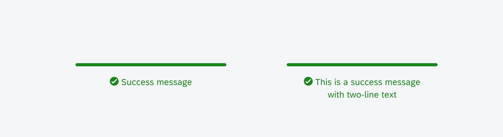
Linear progress bar with one-line success message (left) and two-line success message (right)
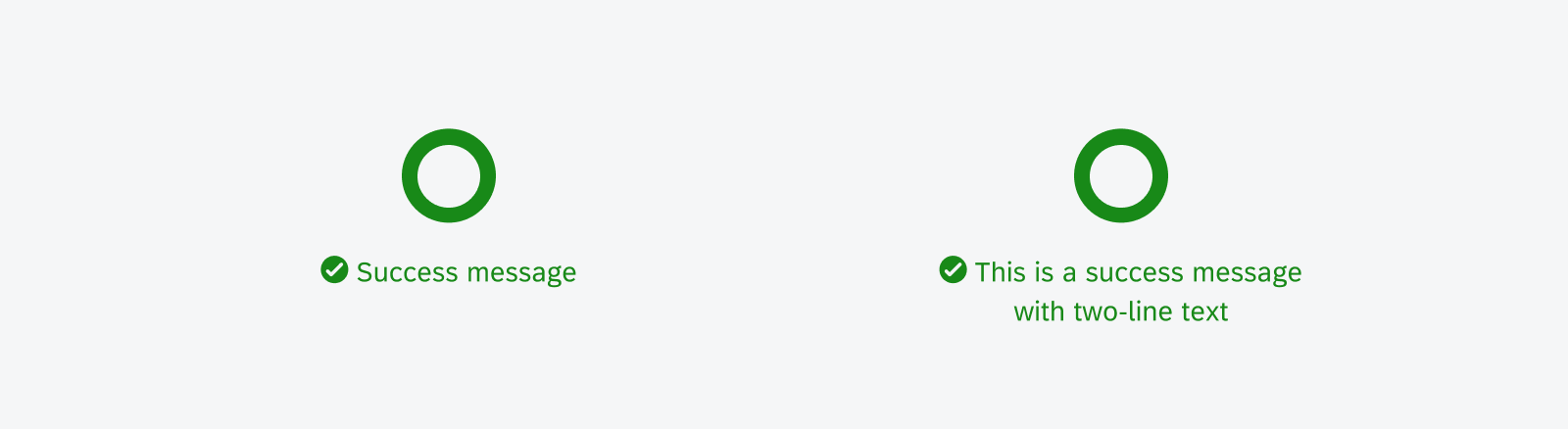
Circular progress indicator with one-line success message (left) and two-line success message (right)
Resources
Development: FioriLinearProgressIndicator, FioriProgressBar
Material Design: Progress Indicator
 Your feedback has been sent to the SAP Fiori design team.