
Toolbar
FUIToolbar
Intro
The toolbar is a component with one or more buttons that is always located at the bottom edge of the screen. It is used for closing or finalizing actions that impact the current view. When scrolling, the toolbar remains fixed and does not scroll away.
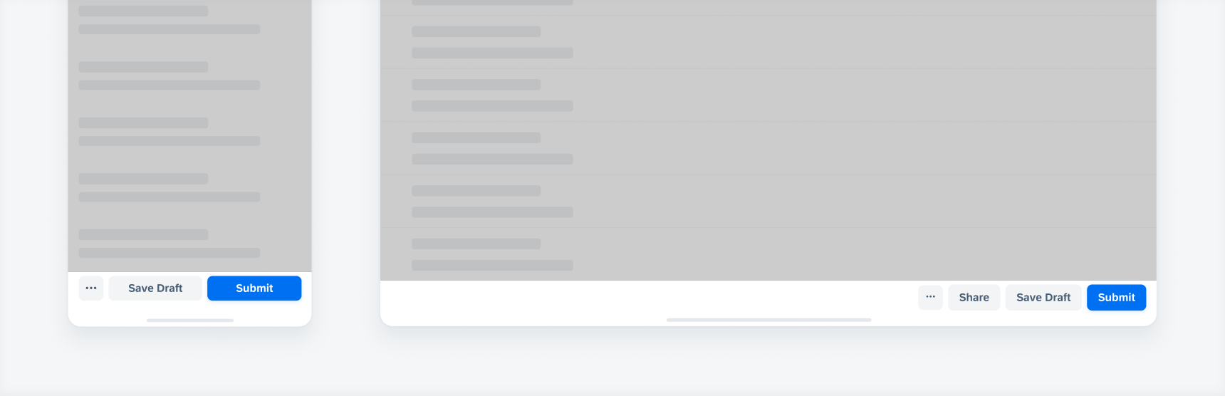
Toolbar in compact width (left) and regular width (right)
- Use the toolbar if you need closing or finalizing actions.
- Use descriptive and concise verbs as button labels.
- Only use a primary button if your app has a clear primary action.
- Use text-only buttons or buttons with icons and text.
- Use an overflow menu if your toolbar on iPhone requires more than two text buttons.
- Use an overflow menu if your toolbar on iPad requires more than three text buttons.
- Don’t use the toolbar if its action influences only specific items instead of the entire view.
- Don’t combine icon-only and text-only buttons within a toolbar.
- Don’t mix tertiary buttons with secondary or primary buttons within a toolbar.
- Don’t use the helper text if your toolbar has an overflow button.
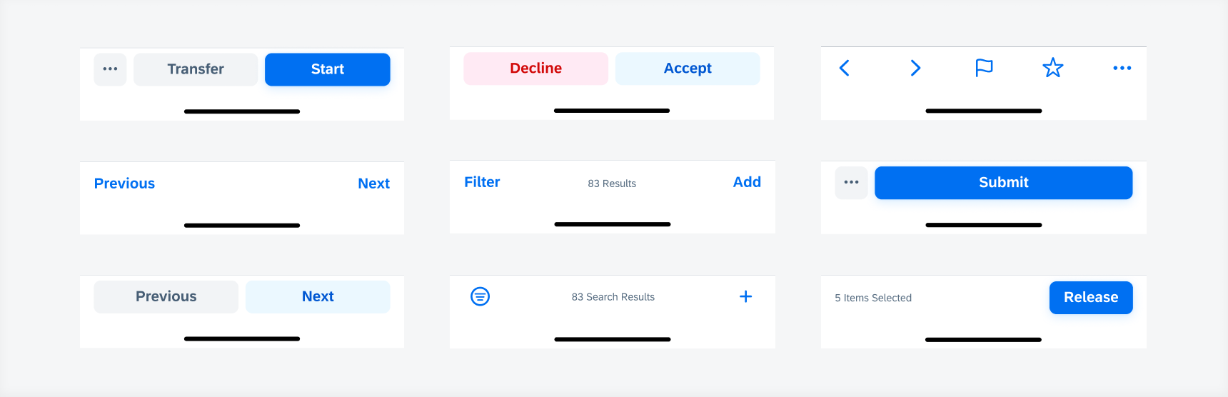
A. Toolbar Container
The toolbar container contains one or more buttons. The toolbar is always visible, even when users scroll down.
B. Secondary Text Button
Actions that are not the primary action should be formatted as secondary buttons. If the view has no clear primary action or if the displayed actions have the same relevance, the toolbar can consist of only secondary buttons. Use the secondary style only if there are two or more buttons within the toolbar.
C. Primary Text Button
Emphasize the most important action with the primary button style. Show only one primary action for the entire view. If the toolbar has only one button, we recommend formatting the button in primary style.
D. Overflow Button
If the toolbar has more than two text buttons in compact view, the additional text buttons move into an overflow menu. The most important actions are displayed first. In regular view, the overflow appears after three text buttons.
E. Tertiary Text Button
Tertiary text buttons can be used if the toolbar consists of additional actions that the user may need to access. Tertiary text buttons can be used if the toolbar should be subtle, yet perceivable.
F. Helper Text
The helper text can be used for displaying information or status. It is read-only and not tappable.
G. Tertiary Icon Button
Tertiary icon buttons can be used if the toolbar consists of additional actions that the user may need to access. Tertiary icon buttons can be used if the toolbar should be subtle, yet perceivable. Keep in mind to use icon buttons that can be represented by universally recognized icons.
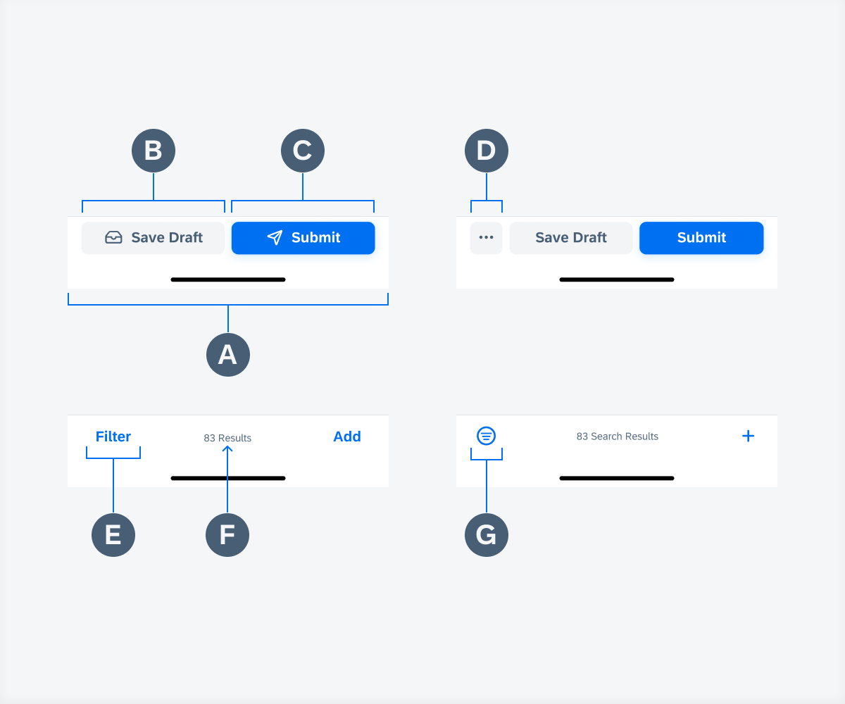
Toolbar anatomy with variants
Semantic Actions
We recommend formatting semantic buttons in secondary button style. For negative or destructive actions, the negative red button can be used. For positive actions, use the secondary style in tint color. The positive action should be placed on the right side.
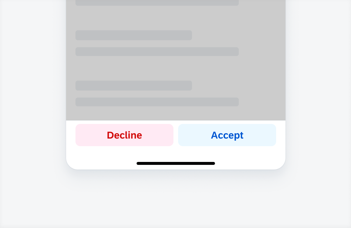
Semantic actions within a toolbar
Overflow Menu
Text Buttons
A maximum of two text buttons can be displayed in the toolbar in compact view. If the toolbar has more than two text buttons, the additional text buttons move into an overflow menu. The most important actions are displayed first. In regular view, the overflow appears if there are more than three text buttons.
Overflow Interaction
Tapping on the overflow button opens an action sheet with additional action buttons.
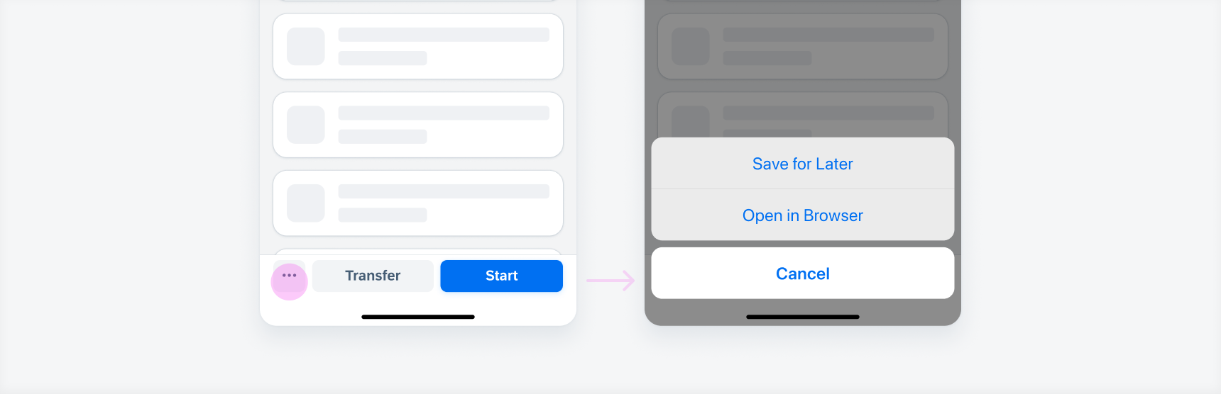
Tapping on the overflow button (left) opens an action sheet with additional actions (right)
Long Button Labels
The overflow should always be activated when there is not enough space to display all the buttons. If there is not enough space to display two buttons because the button text is too long, the secondary button moves into the overflow and the more important action is stretched across the full width of the toolbar.
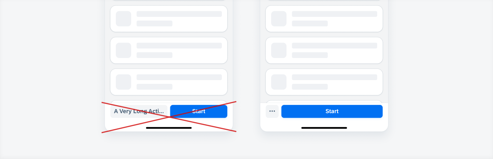
An overflow button should also be used when both buttons do not fit into the toolbar’s width
The toolbar spacing follows the global layout margins of the iOS and iPadOS size classes. It uses 100% of the screen width.
In compact view, the buttons are equally distributed across the container of the toolbar. In regular view, the buttons are aligned to the right side of the container to provide convenient access to the buttons.
Toolbar in compact (left) and regular width (right)
The toolbar can be flexibly adapted depending on the context, amount and importance of the actions. App designers must decide here which toolbar variant makes the most sense for their app. If the current view has a clear primary action, then a toolbar with primary action might be a good choice. If there is no clear primary action, then a toolbar with only secondary or only tertiary buttons should be considered.
Toolbar variations
Development: FUIToolbar
SAP Fiori for Android: Persistent Footer
SAP Fiori for Web: Footer Toolbar
Human Interface Guidelines: Toolbars
 Your feedback has been sent to the SAP Fiori design team.