- Latest Version 1.128
- Version 1.126
- SAPUI Version 1.124
- SAPUI5 Version 1.122
- SAPUI5 Version 1.120
- SAPUI5 Version 1.118
- SAPUI5 Version 1.116
- SAPUI5 Version 1.114
- SAPUI5 Version 1.112
- SAPUI5 Version 1.110
- SAPUI5 Version 1.108
- SAPUI5 Version 1.106
- SAPUI5 Version 1.104
- SAPUI5 Version 1.102
- SAPUI5 Version 1.100
- SAPUI5 Version 1.98
- SAPUI5 Version 1.96
- SAPUI5 Version 1.94
- SAPUI5 Version 1.92
- SAPUI5 Version 1.90
- SAPUI5 Version 1.88
- SAPUI5 Version 1.86
- SAPUI5 Version 1.84
- SAPUI5 Version 1.82
- SAPUI5 Version 1.80
- SAPUI5 Version 1.78
- SAPUI5 Version 1.76
- SAPUI5 Version 1.74
- SAPUI5 Version 1.72
- SAPUI5 Version 1.70
- SAPUI5 Version 1.68
- SAPUI5 Version 1.66
- SAPUI5 Version 1.64
- SAPUI5 Version 1.62
- SAPUI5 Version 1.60
- SAPUI5 Version 1.58
- SAPUI5 Version 1.56
- SAPUI5 Version 1.54
- SAPUI5 Version 1.52
- SAPUI5 Version 1.50
- SAPUI5 Version 1.48
- SAPUI5 Version 1.46
- SAPUI5 Version 1.44
- SAPUI5 Version 1.42
- SAPUI5 Version 1.40
- SAPUI5 Version 1.38
- SAPUI5 Version 1.36
- SAPUI5 Version 1.34
- SAPUI5 Version 1.32
- SAPUI5 Version 1.30
- SAPUI5 Version 1.26
- Latest Version 1.128
- Version 1.126
- SAPUI Version 1.124
- SAPUI5 Version 1.122
- SAPUI5 Version 1.120
- SAPUI5 Version 1.118
- SAPUI5 Version 1.116
- SAPUI5 Version 1.114
- SAPUI5 Version 1.112
- SAPUI5 Version 1.110
- SAPUI5 Version 1.108
- SAPUI5 Version 1.106
- SAPUI5 Version 1.104
- SAPUI5 Version 1.102
- SAPUI5 Version 1.100
- SAPUI5 Version 1.98
- SAPUI5 Version 1.96
- SAPUI5 Version 1.94
- SAPUI5 Version 1.92
- SAPUI5 Version 1.90
- SAPUI5 Version 1.88
- SAPUI5 Version 1.86
- SAPUI5 Version 1.84
- SAPUI5 Version 1.82
- SAPUI5 Version 1.80
- SAPUI5 Version 1.78
- SAPUI5 Version 1.76
- SAPUI5 Version 1.74
- SAPUI5 Version 1.72
- SAPUI5 Version 1.70
- SAPUI5 Version 1.68
- SAPUI5 Version 1.66
- SAPUI5 Version 1.64
- SAPUI5 Version 1.62
- SAPUI5 Version 1.60
- SAPUI5 Version 1.58
- SAPUI5 Version 1.56
- SAPUI5 Version 1.54
- SAPUI5 Version 1.52
- SAPUI5 Version 1.50
- SAPUI5 Version 1.48
- SAPUI5 Version 1.46
- SAPUI5 Version 1.44
- SAPUI5 Version 1.42
- SAPUI5 Version 1.40
- SAPUI5 Version 1.38
- SAPUI5 Version 1.36
- SAPUI5 Version 1.34
- SAPUI5 Version 1.32
- SAPUI5 Version 1.30
- SAPUI5 Version 1.28
- SAPUI5 Version 1.26
Flat Object View Floorplan
Intro
Usage
Use the flat object view floorplan if:
- You want to switch to edit mode without disrupting the layout of the page.
- You want to show the different sections for an object on one page.
Do not use the flat object view floorplan if:
- The objects contain too much information for one page. Instead, use the object view floorplan, and build tabs to organize and simplify the content.
Structure
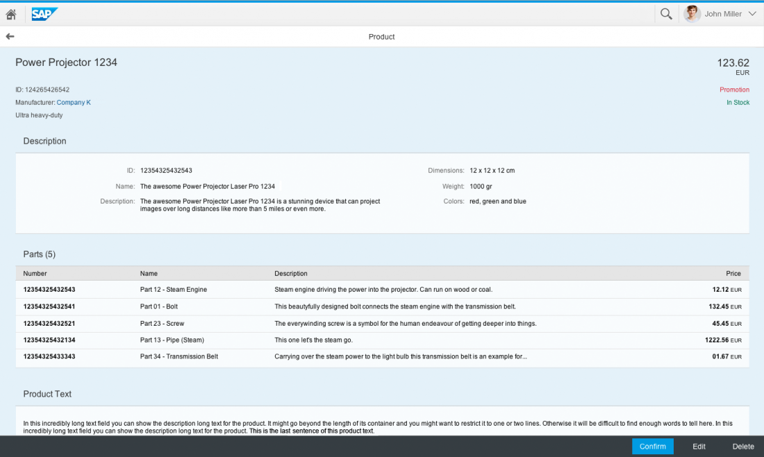
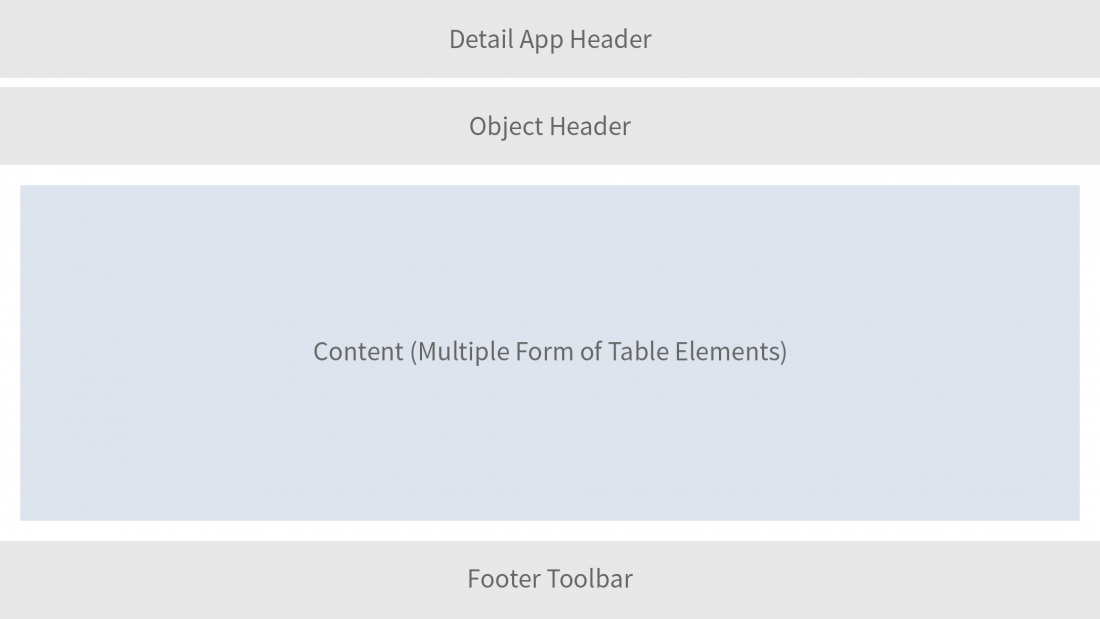
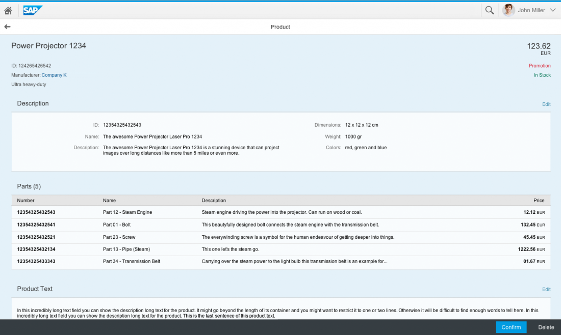
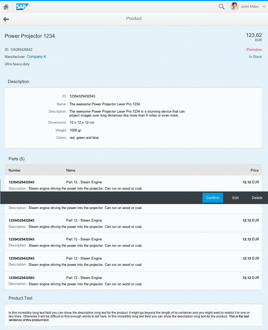
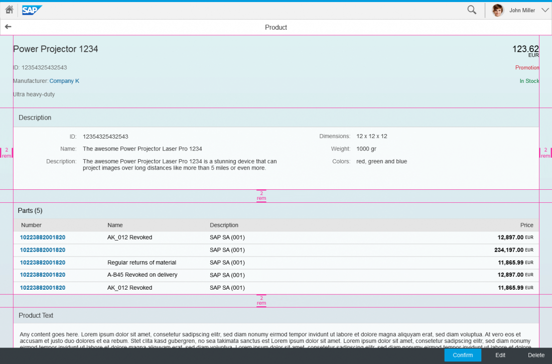
The flat object view has the same basic structure as the object view floorplan, with the object header control at the top and a footer toolbar at the bottom. However, unlike the object view floorplan, the flat object view does not have a tab container to switch between different facets of the object. Instead, it has one long flat layout with multiple form or table elements underneath each other. The flat object view builds entirely on existing controls.
Responsivness and Adaptiveness
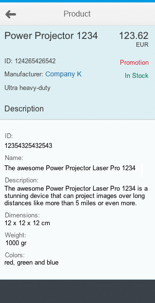
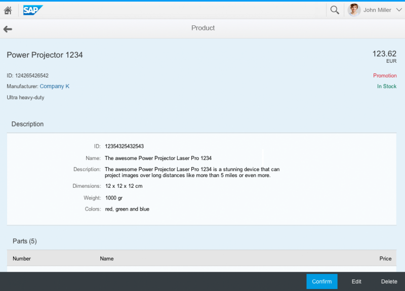
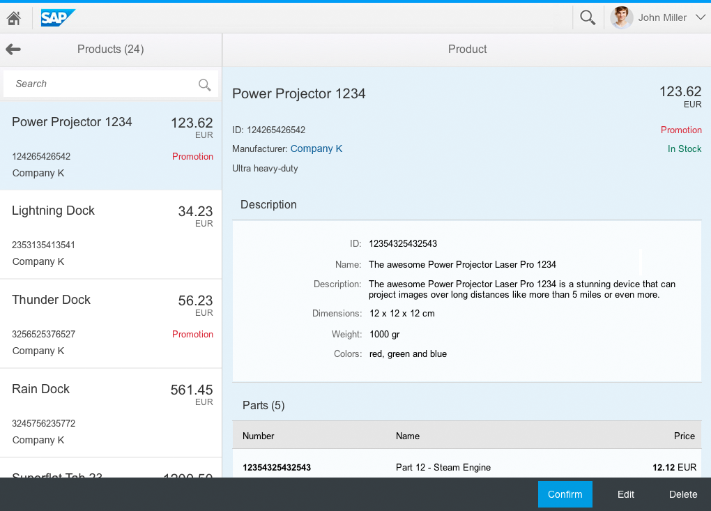
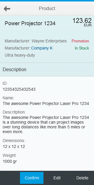
You can embed the flat object view floorplan in a full screen layout or split-screen layout. In both cases, it can be used as an alternative to the object view floorplan.
Edit
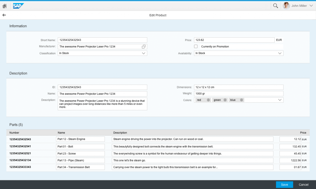
The flat object view is optimized for switching between the display and edit modes – the structure and layout of the page remain intact. In the object view, the tabs have to be flattened out in edit mode to avoid hidden editing errors and inconsistencies between tabs. In the flat object view, all elements are always visible, so any error messages and inconsistencies can be highlighted directly on the page.
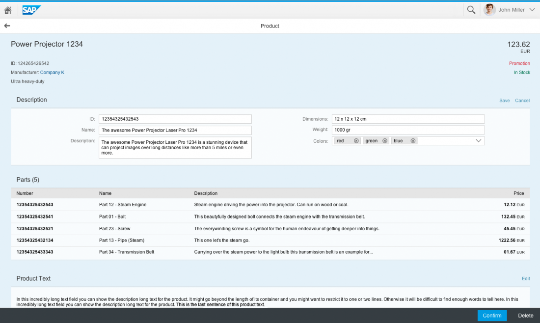
In addition to the full page edit mode, the flat object view also supports a partial edit flow, where only certain sections switch to edit mode.
Scrolling
Because the flat object view displays everything on one page, users might need to scroll to reach the end. While scrolling itself is no longer critical – today’s devices all support optimized scroll gestures – usability issues can still occur with large tables and collapsible panels.
Embedding Large Tables
If the view contains a long embedded table, the remaining content may be pushed down too far. Therefore, when embedding a large table, make sure that you limit the number of items that are initially loaded. This ensures that the user can reach the content below the table.
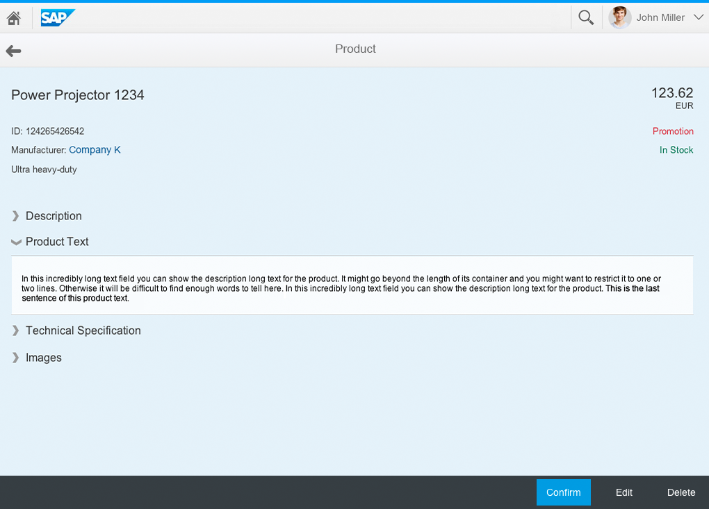
Collapsible Panels
If your object has several sections, you might be tempted to use collapsible panels to reduce the length of the page and minimize scrolling. However, placing several collapsed panels below each other can look broken. It also forces the user to open and close containers, which can shift their position. This behavior has been proven to cause usability issues. Where possible, avoid using collapsible panels in the flat object view.
Guidelines
- Avoid showing long tables in full when a page is first loaded. Instead, use lazy loading to display only the first 5 or 10 table items.
- Avoid using collapsible panels to minimize scrolling.
- Use either the panel or table controls as basic elements of the flat object page and avoid embedding elements in other elements. Placing the elements underneath each other makes the layout very clean and stable.
- Use the object header at the top of the flat object view to give the page structure.
- Choose between the global or local edit flow (the global flow is usually easier to handle).
Visual Design
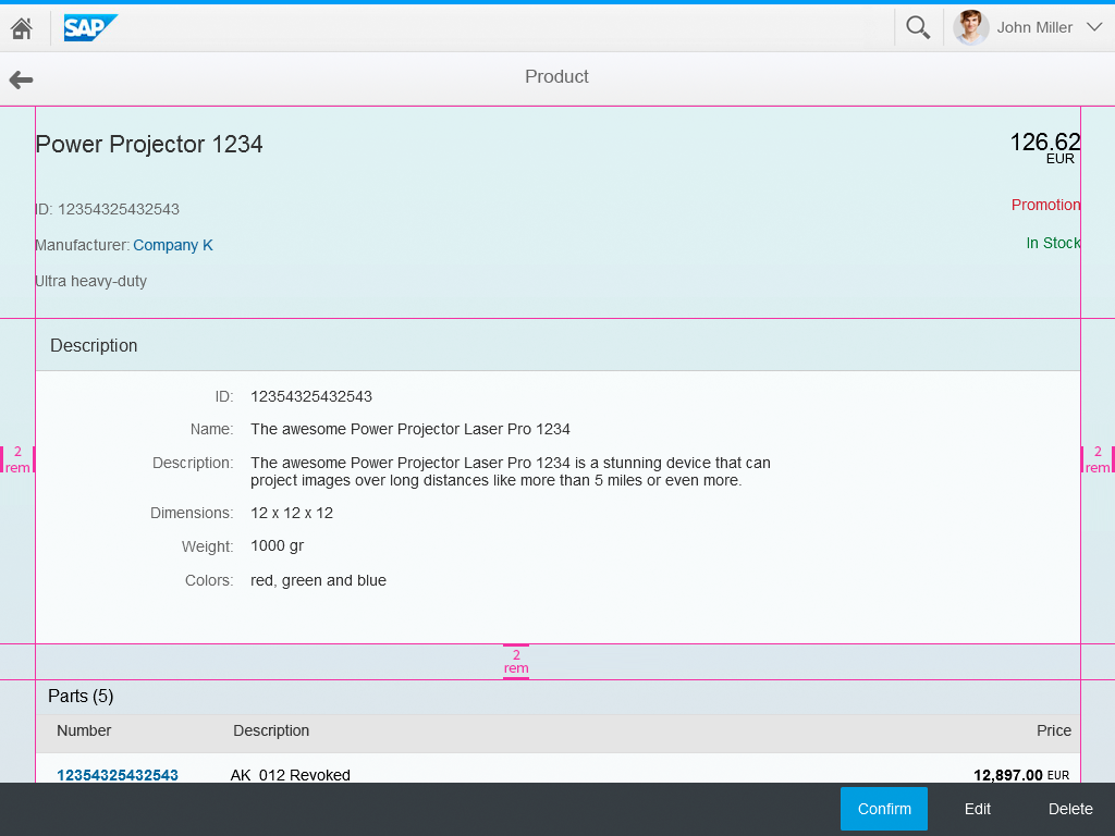
Flat object view floorplan has no visual design on its own, but application design and development should make sure that the margins and paddings are similar to the normal page layout (e.g. the controls should have the same margins inside the Side Content container).
Resources
Want to dive deeper? Follow the links below to find out more about related controls, the SAPUI5 implementation, and the visual design.


 Your feedback has been sent to the SAP Fiori design team.