
- Latest SAPUI Version 1.124
- SAPUI5 Version 1.122
- SAPUI5 Version 1.120
- SAPUI5 Version 1.118
- SAPUI5 Version 1.116
- SAPUI5 Version 1.114
- SAPUI5 Version 1.112
- SAPUI5 Version 1.110
- SAPUI5 Version 1.108
- SAPUI5 Version 1.106
- SAPUI5 Version 1.104
- SAPUI5 Version 1.102
- SAPUI5 Version 1.100
- SAPUI5 Version 1.98
- SAPUI5 Version 1.96
- SAPUI5 Version 1.94
- SAPUI5 Version 1.92
- SAPUI5 Version 1.90
- SAPUI5 Version 1.88
- SAPUI5 Version 1.86
- SAPUI5 Version 1.84
- SAPUI5 Version 1.82
- SAPUI5 Version 1.80
- SAPUI5 Version 1.78
- SAPUI5 Version 1.76
- SAPUI5 Version 1.74
- SAPUI5 Version 1.72
- SAPUI5 Version 1.70
- SAPUI5 Version 1.68
- SAPUI5 Version 1.66
- SAPUI5 Version 1.64
- SAPUI5 Version 1.62
- SAPUI5 Version 1.60
- SAPUI5 Version 1.58
- SAPUI5 Version 1.56
- SAPUI5 Version 1.54
- SAPUI5 Version 1.52
- SAPUI5 Version 1.50
- SAPUI5 Version 1.48
- SAPUI5 Version 1.46
- SAPUI5 Version 1.44
- SAPUI5 Version 1.42
- SAPUI5 Version 1.40
- SAPUI5 Version 1.38
- SAPUI5 Version 1.36
- SAPUI5 Version 1.34
- SAPUI5 Version 1.32
- SAPUI5 Version 1.28
- SAPUI5 Version 1.26
- Latest SAPUI Version 1.124
- SAPUI5 Version 1.122
- SAPUI5 Version 1.120
- SAPUI5 Version 1.118
- SAPUI5 Version 1.116
- SAPUI5 Version 1.114
- SAPUI5 Version 1.112
- SAPUI5 Version 1.110
- SAPUI5 Version 1.108
- SAPUI5 Version 1.106
- SAPUI5 Version 1.104
- SAPUI5 Version 1.102
- SAPUI5 Version 1.100
- SAPUI5 Version 1.98
- SAPUI5 Version 1.96
- SAPUI5 Version 1.94
- SAPUI5 Version 1.92
- SAPUI5 Version 1.90
- SAPUI5 Version 1.88
- SAPUI5 Version 1.86
- SAPUI5 Version 1.84
- SAPUI5 Version 1.82
- SAPUI5 Version 1.80
- SAPUI5 Version 1.78
- SAPUI5 Version 1.76
- SAPUI5 Version 1.74
- SAPUI5 Version 1.72
- SAPUI5 Version 1.70
- SAPUI5 Version 1.68
- SAPUI5 Version 1.66
- SAPUI5 Version 1.64
- SAPUI5 Version 1.62
- SAPUI5 Version 1.60
- SAPUI5 Version 1.58
- SAPUI5 Version 1.56
- SAPUI5 Version 1.54
- SAPUI5 Version 1.52
- SAPUI5 Version 1.50
- SAPUI5 Version 1.48
- SAPUI5 Version 1.46
- SAPUI5 Version 1.44
- SAPUI5 Version 1.42
- SAPUI5 Version 1.40
- SAPUI5 Version 1.38
- SAPUI5 Version 1.36
- SAPUI5 Version 1.34
- SAPUI5 Version 1.32
- SAPUI5 Version 1.30
- SAPUI5 Version 1.28
- SAPUI5 Version 1.26
Approval App
Intro
The approval app allows the user to quickly scan through a list of work items and take action. This app type has already been used in multiple occasions within SAP Fiori, and therefore is well established and mature.
The approval app is based on the split-screen layout and also can make use of all capabilities of the master list.
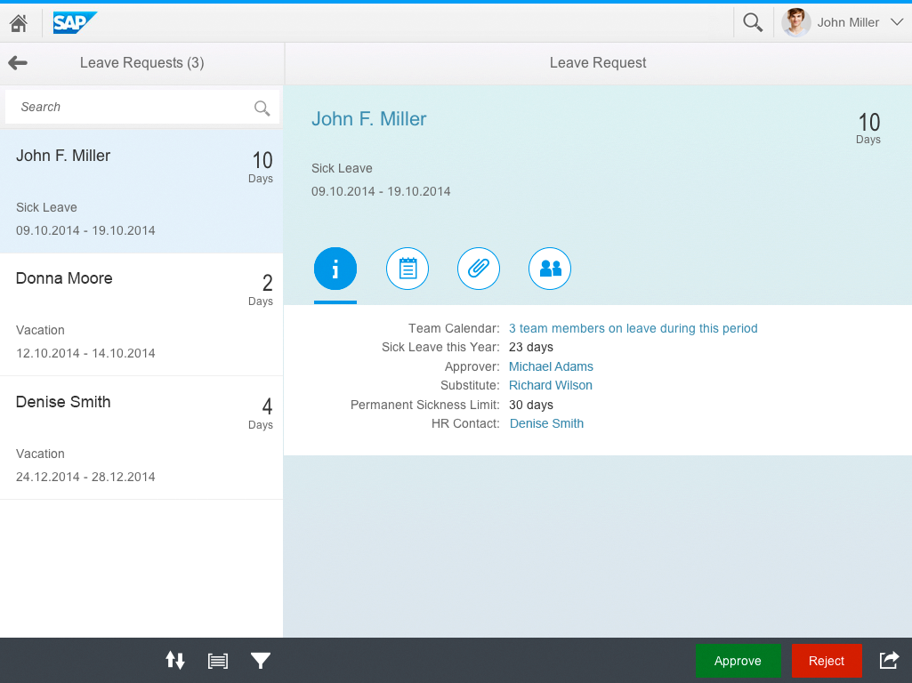
An approval app on a tablet
Responsiveness
The approval app works well on any form factor. It inherits the responsive behavior from the split-screen layout.
Approval app on a tablet
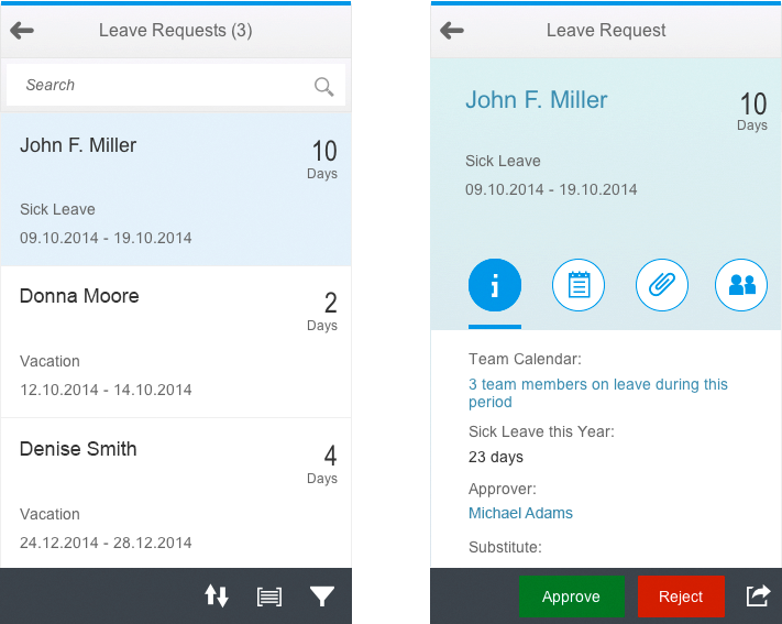
Approval app on a smartphone
Behavior and Interaction
The approval app is used to display a number of work items in the master list and the work item’s details in the details area. This allows the user to get a quick overview of the work items, directly select them, and take action without navigation.
Ideally, the switch between work items should be fast an seamless. Otherwise, please indicate loading with a busy indicator every time the switch between items takes longer than two seconds.
On startup, the first work item should be selected and displayed in the details area. If there are no items in the list, please show an empty page in the details area.
The approval app consists of the following components:
- Master list containing object list items (sap.m.ObjectListItem).
- Detail area containing an object view page.
In the approval app, the master list usually uses the object list item. This corresponds to the object header used in the object view page in the details area. The object list item should contain the most important information about the item. It contains the following elements:
- Title: Used to display information to identify the object.
- Key figure: Used to give a good understanding of the value of the item. If required, use formatters to shorten the number.
- Attributes (max. three): Used to display additional information such as an ID, content information,and more.
- Status fields (max. two): Displays icons or text that describe the status of the item. Consider using semantic colors to highlight critical statuses.
The object header in the details area should repeat the fields that are shown in the master list. This helps to recognize the item, especially if master and detail are split into two different pages when running on a smartphone. It can also show additional information, however, please try to avoid having too much different information between the object header and the object list item.
The rules for the master list and the split-screen layout also apply to the approval app. This includes the possibility to offer the selection modes for mass approval (usually not wanted by customers), Search, Filter, Group, and Sort.
Info Tab
The object view page in the approval app can have different tabs in the icon tab bar.
Most apps use the info tab to display the header information of the work item. This means the info tab contains the most important information that describes the items and allows the user to take action.
This is usually displayed as a form with a one column layout. We do not recommend to use a two column layout unless you switch off letterboxing. In most cases, form group headers are not needed within the tab, as the information is often limited to a few fields.
An app could also place micro charts, charts, or other controls into the info tab if this is relevant for the use case.
In most cases, the info tab is the first tab the user sees when opening the item. This is not mandatory and can be treated differently when required by the use case.
When navigating between items in the master list, the selected tab in the detail areas should always be the same. This means that if a user switches to the second tab on one detail page and then navigates to the next item in the list, this item should also show the second tab.
The information tab
Notes Tab
Work items are often annotated through the use of attached otes.
The notes tab contains and displays these notes. If possible, the notes tab also allows the user to add a new note using the feed input control (sap.m.FeedInput).
The notes themselves are displayed using the feed list item control (sap.m.FeedListItem).
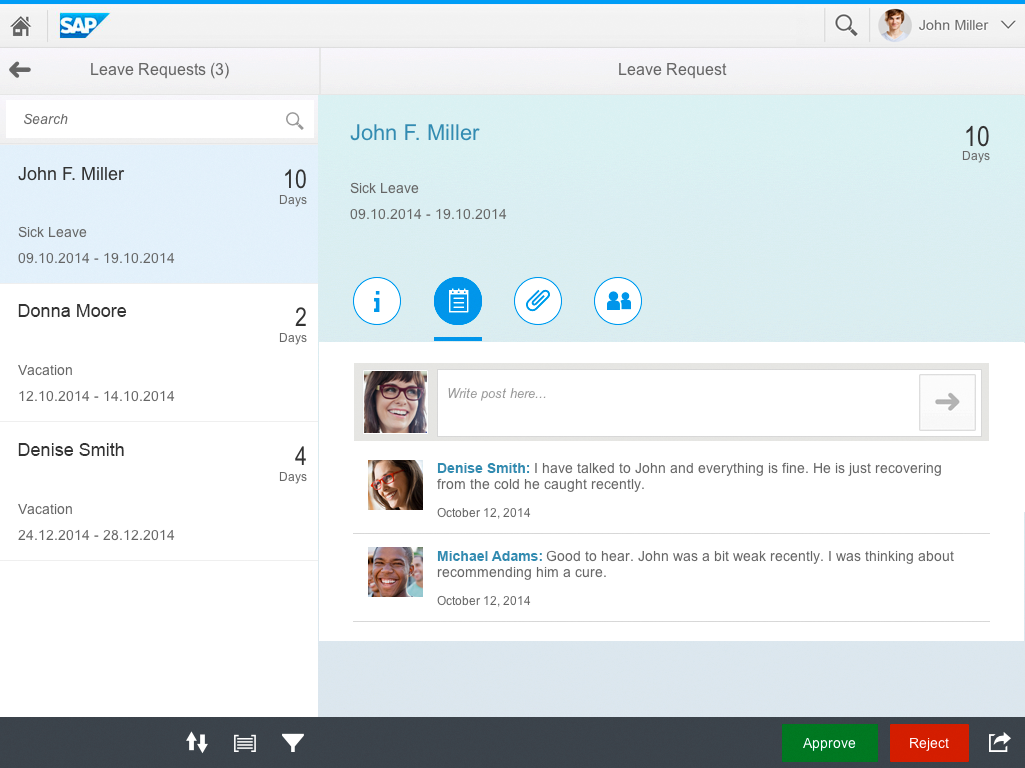
The notes tab
Attachment Tab
For many work items, it is possible to attach files. These files are often used to provide more information and additional media to explain the requested action. There is a standard control that can be used to manage the entire functionality around uploading, editing and deleting file attachments. This control is called the upload collection (sap.m.UploadCollection). It can be placed in the attachments tab.
Attachments tab
Approver Tab
In many cases it is important for the approver to see who else is part of the approval chain, either to discuss with others or delegate the decision to somebody else. This approval chain is displayed using the feed list item (sap.m.FeedListItem) similar to the notes tab. You should only display the information about the person and the approval status here.
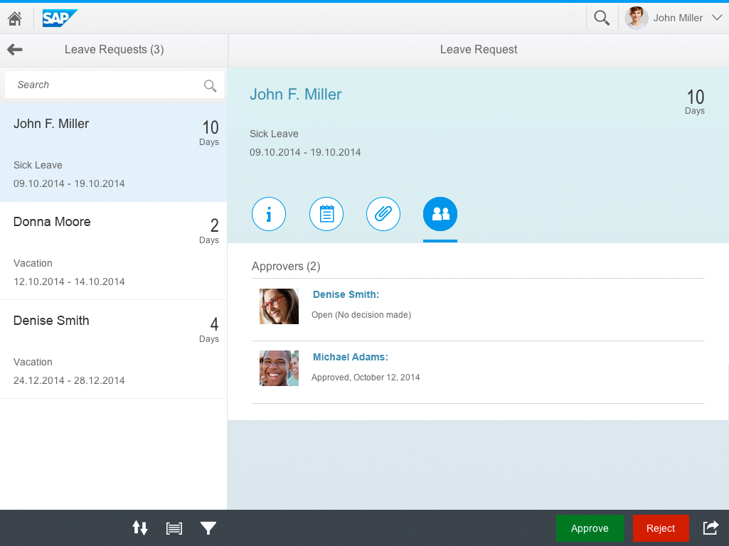
Approver tab
The approval app can also contain other tabs. The four tabs mentioned above are the most common tabs and should be used consistently.
Approve and Reject
The action on the individual work item is offered in the footer bar (sap.m.Toolbar) on the detail area.
In approval apps, it is common to have two primary actions:
- Approve (positive action using button type Accept)
- Reject (negative action using the button type Reject)
These default actions in the approval app make it very easy for the user to map the decision to the right action. Using semantic values allows customers to remap semantics to other colors if established within a company or culture.
It is still allowed to offer other or additional actions if the use case requires it.
In addition to the approve and reject action, the app should also offer access to the sharing actions.
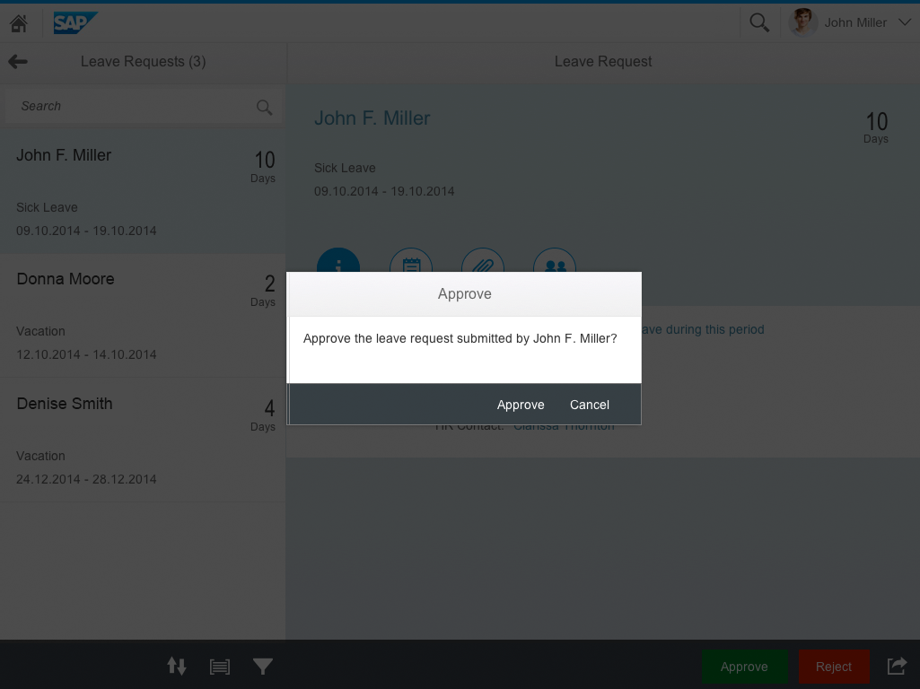
Approval dialog
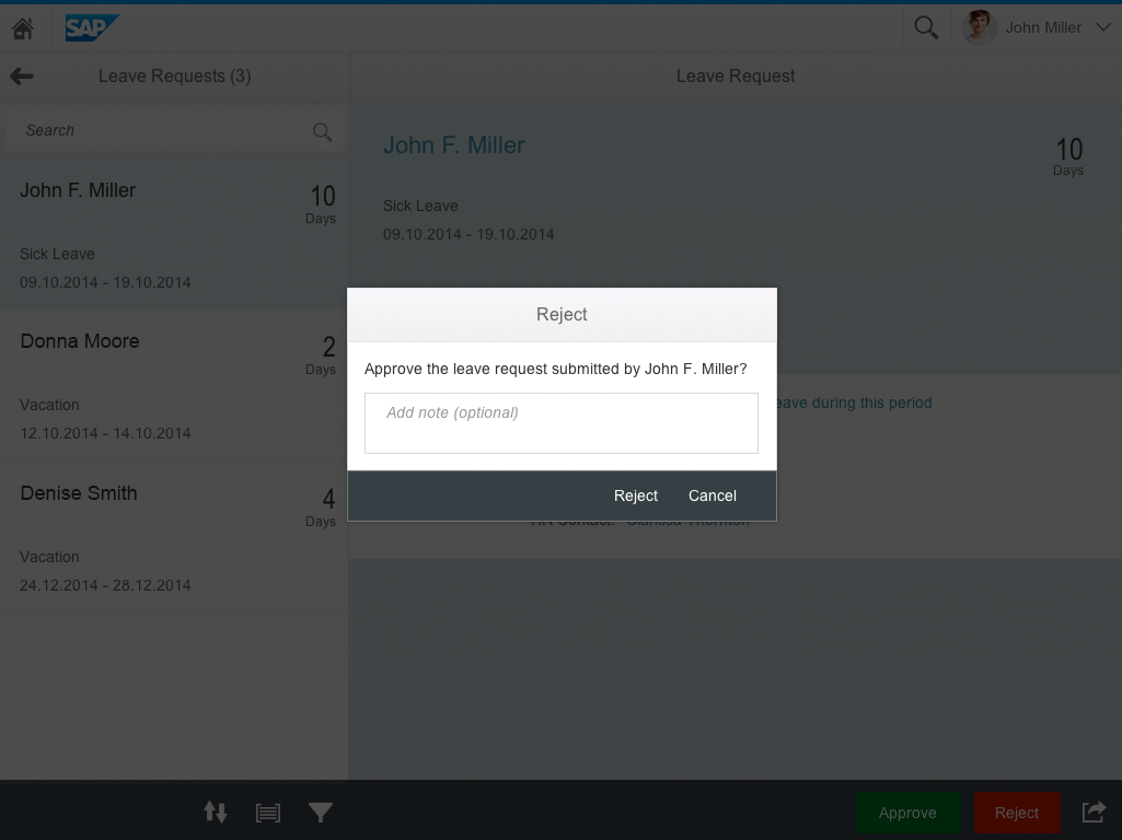
Rejection dialog
In some cases, it is required to ask for a confirmation on either the approve or the reject action.
A rejection needs to be especially confirmed to avoid an erroneous rejection and any follow-up confusion. In addition, the user might want to add a reason to the rejection to explain the decision.
To achieve this in a consistent manner, please use the confirmation dialog (sap.ca.ui.dialog).
Once the user has made a decision, the work item is processed. Processing might take some time and a busy indicator might be necessary for longer delays. When the processing is completed, the processed item should be removed from the master list and the next item should be selected and displayed. A success message should be shown.
In some cases it might be required for the processed item to remain in the master list (such as if a decision can be reverted). In this case, the item remains selected and the status is switched according to the decision.
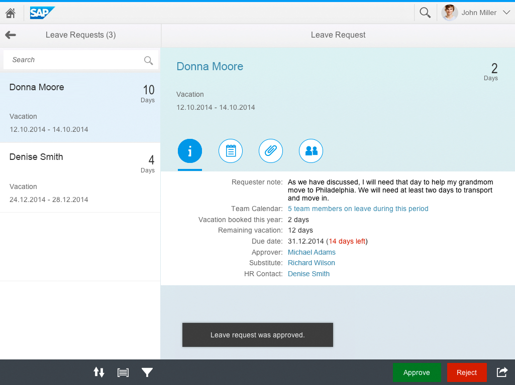
Success message after approval
Navigating Line Items
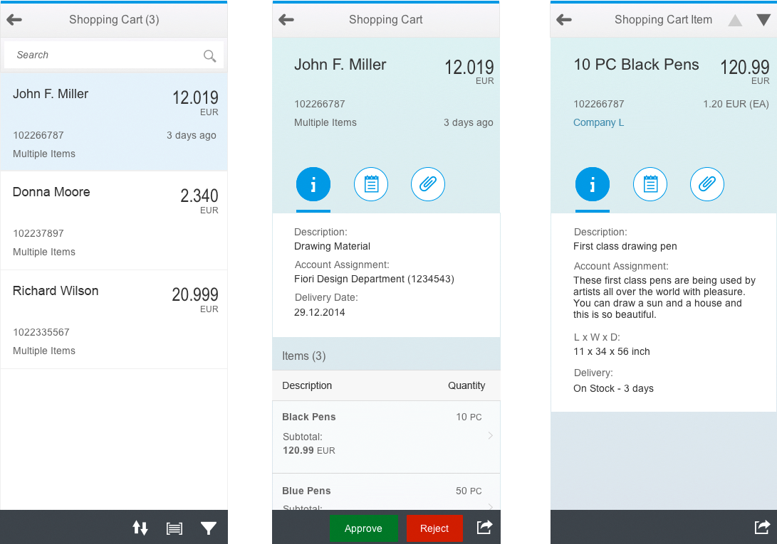
In some cases a work item contains a list of line items. For instance, a shopping cart that contains shopping cart items representing the products that are to be purchased as part of the shopping cart.
In this case, the list of items should be displayed in a list (sap.m.List) or table (sap.m.Table) below the icon tab bar.
In most cases, the app should offer a drilldown navigation into the line item details. The list should show the navigation arrow (list item type=”navigation”) and allow a drilldown navigation to the line item details.
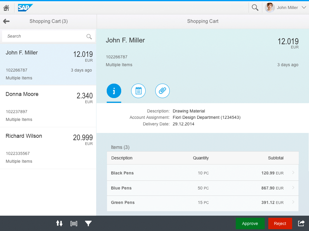
Work item with line items contained
The line item details should be displayed using the object view or the flat object view page.
The app title of the details area should display the object type of the line item (such as Shopping Cart Item).
If there are multiple items in the list, the title should also indicate the number of items available and the relative position of the current item in the list (such as Shopping Cart Item (2 of 5).
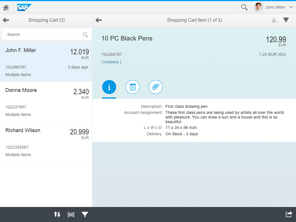
Navigation into a line item
To simplify the direct navigation between the line items, the app should offer iterator buttons on the top right corner of the app title bar. An up and down arrow allows the user to directly navigate to the previous or the next item in the list. When reaching the first item, the up arrow should be disabled, the same holds true to the down arrow when the last item is reached (see more on the split-screen layout).
A back arrow on the app title of the details area allows the user to navigate back to the main item.

Cross-navigation between line items
On smartphones, the drilldown navigation to the line item is more consistent. There is no difference between master and detail so that a drill down happens constantly on the full page, the back navigation is always offered with the back navigation arrow.
Furthermore, we recommend offering iterator buttons. Due to limited space available, it might not be possible to display the numbering properly.
 Your feedback has been sent to the SAP Fiori design team.