
- Latest SAPUI Version 1.124
- SAPUI5 Version 1.122
- SAPUI5 Version 1.120
- SAPUI5 Version 1.118
- SAPUI5 Version 1.116
- SAPUI5 Version 1.114
- SAPUI5 Version 1.112
- SAPUI5 Version 1.110
- SAPUI5 Version 1.108
- SAPUI5 Version 1.106
- SAPUI5 Version 1.104
- SAPUI5 Version 1.102
- SAPUI5 Version 1.100
- SAPUI5 Version 1.98
- SAPUI5 Version 1.96
- SAPUI5 Version 1.94
- SAPUI5 Version 1.92
- SAPUI5 Version 1.90
- SAPUI5 Version 1.88
- SAPUI5 Version 1.86
- SAPUI5 Version 1.84
- SAPUI5 Version 1.82
- SAPUI5 Version 1.80
- SAPUI5 Version 1.78
- SAPUI5 Version 1.76
- SAPUI5 Version 1.74
- SAPUI5 Version 1.72
- SAPUI5 Version 1.70
- SAPUI5 Version 1.66
- SAPUI5 Version 1.64
- SAPUI5 Version 1.62
- SAPUI5 Version 1.60
- SAPUI5 Version 1.58
- SAPUI5 Version 1.56
- SAPUI5 Version 1.54
- SAPUI5 Version 1.52
- SAPUI5 Version 1.50
- SAPUI5 Version 1.48
- SAPUI5 Version 1.46
- SAPUI5 Version 1.44
- SAPUI5 Version 1.42
- SAPUI5 Version 1.40
- SAPUI5 Version 1.38
- SAPUI5 Version 1.36
- SAPUI5 Version 1.34
- SAPUI5 Version 1.32
- SAPUI5 Version 1.30
- SAPUI5 Version 1.28
- SAPUI5 Version 1.26
- Latest SAPUI Version 1.124
- SAPUI5 Version 1.122
- SAPUI5 Version 1.120
- SAPUI5 Version 1.118
- SAPUI5 Version 1.116
- SAPUI5 Version 1.114
- SAPUI5 Version 1.112
- SAPUI5 Version 1.110
- SAPUI5 Version 1.108
- SAPUI5 Version 1.106
- SAPUI5 Version 1.104
- SAPUI5 Version 1.102
- SAPUI5 Version 1.100
- SAPUI5 Version 1.98
- SAPUI5 Version 1.96
- SAPUI5 Version 1.94
- SAPUI5 Version 1.92
- SAPUI5 Version 1.90
- SAPUI5 Version 1.88
- SAPUI5 Version 1.86
- SAPUI5 Version 1.84
- SAPUI5 Version 1.82
- SAPUI5 Version 1.80
- SAPUI5 Version 1.78
- SAPUI5 Version 1.76
- SAPUI5 Version 1.74
- SAPUI5 Version 1.72
- SAPUI5 Version 1.70
- SAPUI5 Version 1.68
- SAPUI5 Version 1.66
- SAPUI5 Version 1.64
- SAPUI5 Version 1.62
- SAPUI5 Version 1.60
- SAPUI5 Version 1.58
- SAPUI5 Version 1.56
- SAPUI5 Version 1.54
- SAPUI5 Version 1.52
- SAPUI5 Version 1.50
- SAPUI5 Version 1.48
- SAPUI5 Version 1.46
- SAPUI5 Version 1.44
- SAPUI5 Version 1.42
- SAPUI5 Version 1.40
- SAPUI5 Version 1.38
- SAPUI5 Version 1.36
- SAPUI5 Version 1.34
- SAPUI5 Version 1.32
- SAPUI5 Version 1.30
- SAPUI5 Version 1.28
- SAPUI5 Version 1.26
Footer Toolbar
sap.m.Toolbar
Intro
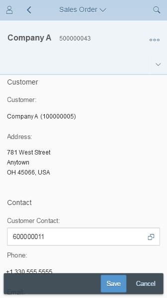
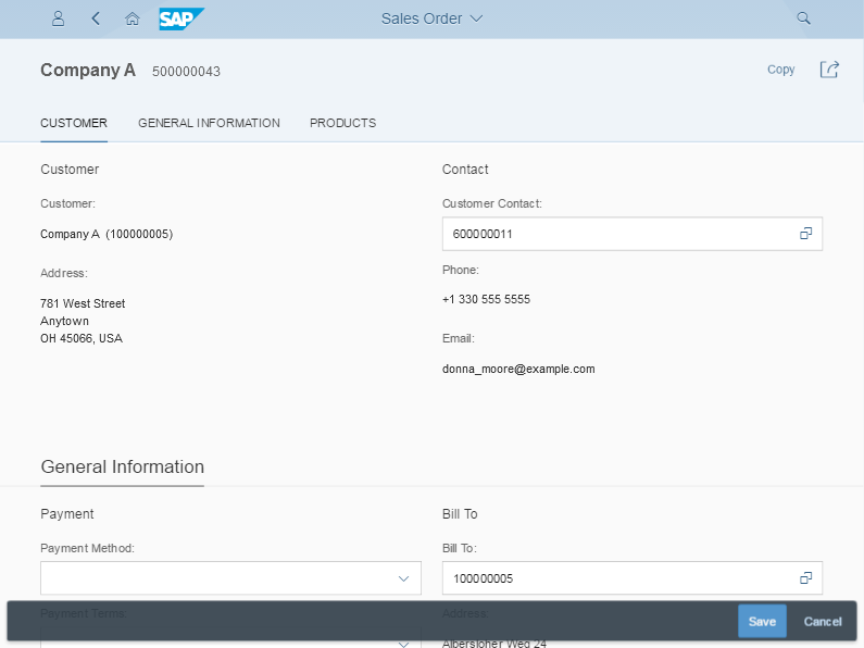
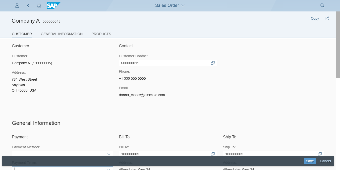
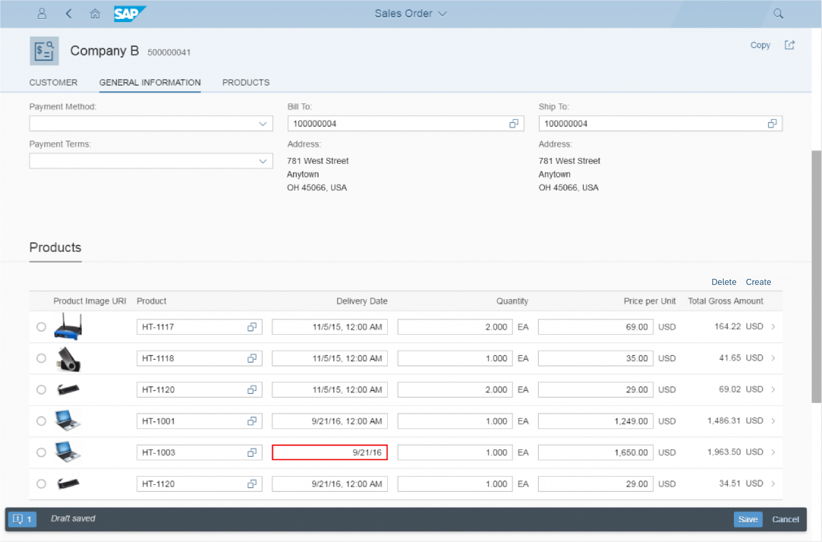
The footer toolbar always appears as floating footer at the bottom of the screen. The floating footer property creates some padding between screen and toolbar, improving visibility.
The control is used for closing or finalizing actions that impact the whole page. It is only visible when actions appear, when message handling is visible, or when the draft indicator is displayed. One main advantage of the footer bar is that this bar is always visible and will not scroll away.
Our general guideline is to use only icon buttons or text buttons. Icon and text should not be combined into one button. Buttons are always right-aligned.
Buttons are sorted from frequently-used to seldom-used. This ensures that the most important buttons will go into the overflow last.
Usage
Use the footer toolbar:
- If you have closing or finalizing actions on your page that apply to the whole page.
Do not use the footer toolbar:
- If you have different containers on your page (such as charts, tables, and forms) and the action influences only certain items. In this case, place the action as close to the corresponding item(s) as possible.
- If you have global actions (such as Edit or Delete) that are not finalizing or closing actions. In this case, use the header toolbar instead.
Responsiveness
To enable responsiveness, use the OverflowToolbar control. For more information, please refer to the corresponding section in the toolbar overview article.
The height of the toolbar changes on desktops (compact mode), tablets, and smartphones (cozy mode). For more information about cozy and compact modes, see content density.
Footer toolbar - Size S
Footer toolbar - Size M
Footer toolbar - Size L
Components
The footer toolbar can contain the following components:
- Message indicator
- Draft indicator
- Finalizing/closing actions
Examples of possible components
All closing or finalizing actions are placed on the right side of the toolbar.
The footer toolbar can also include a message and draft indicator. For more information, see draft handling and messaging.
Behavior and Interaction
Our general guideline is to use only icon buttons or text buttons. Icon and text should not be combined into one button. Buttons are always right-aligned.
The buttons are sorted from frequently-used to seldom-used. This ensures that the most important buttons will go into the overflow last.
Styles
- Use button styles only if they help the user, and not for decoration.
- Use them for the most common actions, such as Save.
- Use a positive/negative style (property:
type=acceptorreject) or an emphasized style (property:type=emphasized). - Use only one emphasized button per toolbar and never mix emphasized and semantic buttons.
Exception: Additional messaging button for the message popover
For more information, see Button.
Guidelines
See the guidelines for the toolbar overview.
Resources
Want to dive deeper? Follow the links below to find out more about related controls, the SAPUI5 implementation, and the visual design.
Implementation
- Overflow Toolbar (SAPUI5 samples)
- Footer Toolbar (SAPUI5 API reference)
- Action Sheet (SAPUI5 API reference)
 Your feedback has been sent to the SAP Fiori design team.