
- Latest SAPUI Version 1.124
- SAPUI5 Version 1.122
- SAPUI5 Version 1.120
- SAPUI5 Version 1.118
- SAPUI5 Version 1.116
- SAPUI5 Version 1.114
- SAPUI5 Version 1.112
- SAPUI5 Version 1.110
- SAPUI5 Version 1.108
- SAPUI5 Version 1.106
- SAPUI5 Version 1.104
- SAPUI5 Version 1.102
- SAPUI5 Version 1.100
- SAPUI5 Version 1.98
- SAPUI5 Version 1.96
- SAPUI5 Version 1.94
- SAPUI5 Version 1.92
- SAPUI5 Version 1.90
- SAPUI5 Version 1.88
- SAPUI5 Version 1.86
- SAPUI5 Version 1.84
- SAPUI5 Version 1.82
- SAPUI5 Version 1.80
- SAPUI5 Version 1.78
- SAPUI5 Version 1.76
- SAPUI5 Version 1.74
- SAPUI5 Version 1.72
- SAPUI5 Version 1.70
- SAPUI5 Version 1.68
- SAPUI5 Version 1.66
- SAPUI5 Version 1.64
- SAPUI5 Version 1.62
- SAPUI5 Version 1.60
- SAPUI5 Version 1.58
- SAPUI5 Version 1.56
- SAPUI5 Version 1.54
- SAPUI5 Version 1.52
- SAPUI5 Version 1.50
- SAPUI5 Version 1.48
- SAPUI5 Version 1.46
- SAPUI5 Version 1.44
- SAPUI5 Version 1.42
- SAPUI5 Version 1.40
- SAPUI5 Version 1.38
- SAPUI5 Version 1.36
- SAPUI5 Version 1.34
- SAPUI5 Version 1.32
- SAPUI5 Version 1.28
- SAPUI5 Version 1.26
- Latest SAPUI Version 1.124
- SAPUI5 Version 1.122
- SAPUI5 Version 1.120
- SAPUI5 Version 1.118
- SAPUI5 Version 1.116
- SAPUI5 Version 1.114
- SAPUI5 Version 1.112
- SAPUI5 Version 1.110
- SAPUI5 Version 1.108
- SAPUI5 Version 1.106
- SAPUI5 Version 1.104
- SAPUI5 Version 1.102
- SAPUI5 Version 1.100
- SAPUI5 Version 1.98
- SAPUI5 Version 1.96
- SAPUI5 Version 1.94
- SAPUI5 Version 1.92
- SAPUI5 Version 1.90
- SAPUI5 Version 1.88
- SAPUI5 Version 1.86
- SAPUI5 Version 1.84
- SAPUI5 Version 1.82
- SAPUI5 Version 1.80
- SAPUI5 Version 1.78
- SAPUI5 Version 1.76
- SAPUI5 Version 1.74
- SAPUI5 Version 1.72
- SAPUI5 Version 1.70
- SAPUI5 Version 1.68
- SAPUI5 Version 1.66
- SAPUI5 Version 1.64
- SAPUI5 Version 1.62
- SAPUI5 Version 1.60
- SAPUI5 Version 1.58
- SAPUI5 Version 1.56
- SAPUI5 Version 1.54
- SAPUI5 Version 1.52
- SAPUI5 Version 1.50
- SAPUI5 Version 1.48
- SAPUI5 Version 1.46
- SAPUI5 Version 1.44
- SAPUI5 Version 1.42
- SAPUI5 Version 1.40
- SAPUI5 Version 1.38
- SAPUI5 Version 1.36
- SAPUI5 Version 1.34
- SAPUI5 Version 1.32
- SAPUI5 Version 1.30
- SAPUI5 Version 1.28
- SAPUI5 Version 1.26
Chart – Legend
Intro
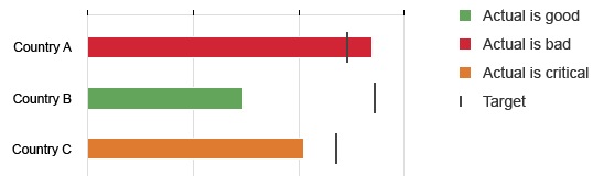
The legend explains the meaning of all the visual elements contained in the plot area.
Layout
You can decide where you want to legend to be positioned. By default, it is displayed to the right of the plot area, but it can also be displayed below it when the chart scrolls horizontally. However, we recommend displaying to the right of the plot area when you have many legend items.
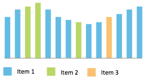
Legend at the bottom
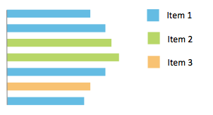
Legend on the right
Responsiveness
When the legend is displayed to the right of the plot area, it automatically moves to the bottom when the horizontal space is reduced as illustrated below.
Responsive Legend
Responsive-Legend2
Behavior and Interaction
Show/Hide Legend
The legend can be hidden or shown via a dedicated standard button in the chart toolbar (not a toggle button). The visibility of the legend changes each time the button is pressed.
Select Legend Item
Clicking (or tapping) on a legend item selects or deselects all the associated data points. It does not show or hide them, although this functionality is in the roadmap for this control.
Custom Legend Items
By default, the chart component displays a legend based on the dataset and the colors used by the chart. All colors displayed in the chart are listed in the legend.
By default, the order of the legend item is the same as the order used to render the dataset, although the order and labels of legend items can be customized.
Order
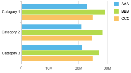
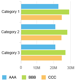
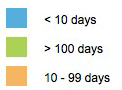
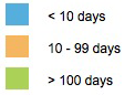
The order of the legend items can be customized to help users read it. In the example below, the default order does not respect the chronological order (which makes the legend difficult to read). Changing the order helps users recognize the information better.
Legend with default order
Legend with new order
Text
It is not possible to customize the legend labels when colors are automatically assigned by the chart component. When the colors are set programmatically (such as by using value-based colors), it’s possible to customize the legend items in order to clearly describe the meaning of the color.
Legend with custom texts
Titles
By default, the legend does not display a title, although a title can be displayed manually on top of the legend. However, we recommend only displaying a title if doing so will help users understand the legend items or make the legend item labels shorter.
Resources
Want to dive deeper? Follow the links below to find out more about related controls, the SAPUI5 implementation, and the visual design.
 Your feedback has been sent to the SAP Fiori design team.