
- Latest SAPUI Version 1.124
- SAPUI5 Version 1.122
- SAPUI5 Version 1.120
- SAPUI5 Version 1.118
- SAPUI5 Version 1.116
- SAPUI5 Version 1.114
- SAPUI5 Version 1.112
- SAPUI5 Version 1.110
- SAPUI5 Version 1.108
- SAPUI5 Version 1.106
- SAPUI5 Version 1.104
- SAPUI5 Version 1.102
- SAPUI5 Version 1.100
- SAPUI5 Version 1.98
- SAPUI5 Version 1.96
- SAPUI5 Version 1.94
- SAPUI5 Version 1.92
- SAPUI5 Version 1.90
- SAPUI5 Version 1.88
- SAPUI5 Version 1.86
- SAPUI5 Version 1.84
- SAPUI5 Version 1.82
- SAPUI5 Version 1.80
- SAPUI5 Version 1.78
- SAPUI5 Version 1.76
- SAPUI5 Version 1.74
- SAPUI5 Version 1.72
- SAPUI5 Version 1.70
- SAPUI5 Version 1.68
- SAPUI5 Version 1.66
- SAPUI5 Version 1.64
- SAPUI5 Version 1.62
- SAPUI5 Version 1.60
- SAPUI5 Version 1.58
- SAPUI5 Version 1.56
- SAPUI5 Version 1.54
- SAPUI5 Version 1.50
- SAPUI5 Version 1.48
- SAPUI5 Version 1.46
- SAPUI5 Version 1.44
- SAPUI5 Version 1.42
- SAPUI5 Version 1.40
- SAPUI5 Version 1.38
- SAPUI5 Version 1.36
- SAPUI5 Version 1.34
- SAPUI5 Version 1.32
- SAPUI5 Version 1.30
- SAPUI5 Version 1.28
- SAPUI5 Version 1.26
- Latest SAPUI Version 1.124
- SAPUI5 Version 1.122
- SAPUI5 Version 1.120
- SAPUI5 Version 1.118
- SAPUI5 Version 1.116
- SAPUI5 Version 1.114
- SAPUI5 Version 1.112
- SAPUI5 Version 1.110
- SAPUI5 Version 1.108
- SAPUI5 Version 1.106
- SAPUI5 Version 1.104
- SAPUI5 Version 1.102
- SAPUI5 Version 1.100
- SAPUI5 Version 1.98
- SAPUI5 Version 1.96
- SAPUI5 Version 1.94
- SAPUI5 Version 1.92
- SAPUI5 Version 1.90
- SAPUI5 Version 1.88
- SAPUI5 Version 1.86
- SAPUI5 Version 1.84
- SAPUI5 Version 1.82
- SAPUI5 Version 1.80
- SAPUI5 Version 1.78
- SAPUI5 Version 1.76
- SAPUI5 Version 1.74
- SAPUI5 Version 1.72
- SAPUI5 Version 1.70
- SAPUI5 Version 1.68
- SAPUI5 Version 1.66
- SAPUI5 Version 1.64
- SAPUI5 Version 1.62
- SAPUI5 Version 1.60
- SAPUI5 Version 1.58
- SAPUI5 Version 1.56
- SAPUI5 Version 1.54
- SAPUI5 Version 1.52
- SAPUI5 Version 1.50
- SAPUI5 Version 1.48
- SAPUI5 Version 1.46
- SAPUI5 Version 1.44
- SAPUI5 Version 1.42
- SAPUI5 Version 1.40
- SAPUI5 Version 1.38
- SAPUI5 Version 1.36
- SAPUI5 Version 1.34
- SAPUI5 Version 1.32
- SAPUI5 Version 1.30
- SAPUI5 Version 1.28
- SAPUI5 Version 1.26
Tree
sap.m.Tree
Intro
Within SAP Fiori, we distinguish between tree tables and trees. Both usually allow the user to display and work with a hierarchical set of items. While tree tables are usually used for more complex data, trees are generally used for rather basic data. Trees are mostly used in the master list section of the split-screen layout and in popovers or dialogs. In certain use cases, they can also be used in full screen layouts.
In the case of tree tables and trees, items that contain additional items are called nodes, while items that do not contain any other items are called leaves. If available, a single topmost node is called a root node. Apart from the hierarchical structure of its nodes and leaves, a tree is quite similar to a list.
Usage
Use the tree if:
- You need to display the key identifier of hierarchically structured items, for example in the master list of split-screen layouts.
- Selecting one or more items out of a set of hierarchically structured items is a main use case.
- The hierarchy has a restricted number of levels (up to about 12, depending on the content) and items (around 200).
- You want to have only one implementation for all devices.
Do not use the tree if:
- The main use case is to select one item from a very small number of non-hierarchical items, without viewing additional details. In this case, a select or combo box might be more appropriate.
- Items are not structured hierarchically. Use a list instead.
- The hierarchy turns out to have only two levels. In this case, use a grouped list.
- The hierarchy turns out to be just a categorization based on several details of the item. In this case, an analytical table provides multi-level grouping. Note that the analytical table is not fully responsive. It is only available for desktops and tablets, so you will need to take an adaptive approach by offering an additional UI for smartphones.
- You need to display very deep hierarchies with additional data per item. In this case, use a tree table. Note that the tree table is not fully responsive. It is only available for desktops and tablets, so you will need to take an adaptive approach by offering an additional UI for smartphones.
- The structure contains more than 200 items. In this case, use the tree table. It is optimized for large item sets and provides better performance. Note that the tree table is not fully responsive. It is only available for desktops and tablets, so you will need to take an adaptive approach by offering an additional UI for smartphones.
- You need an overview of a large amount of data. In this case, use a chart.
Check out the table overview to decide which SAP Fiori table is most suitable for your needs.
Responsiveness
The tree is like a list containing hierarchical data. It acts as a container for items, with the possibility to expand and collapse nodes. When reducing the width, item texts wrap to ensure that the tree adapts to the new size.
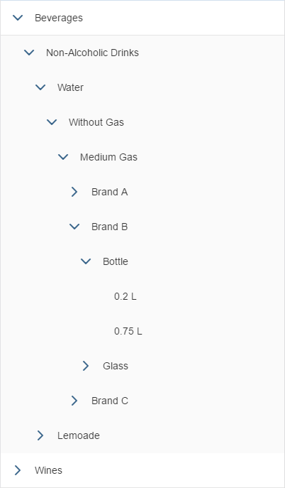
In addition, the tree changes the indentation per level dynamically when the user expands a node, based on number of levels currently showing.
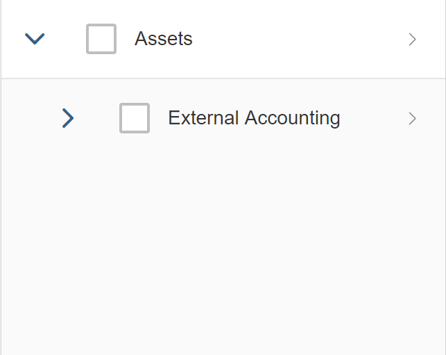
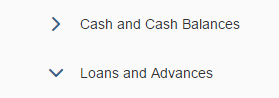
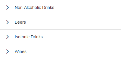
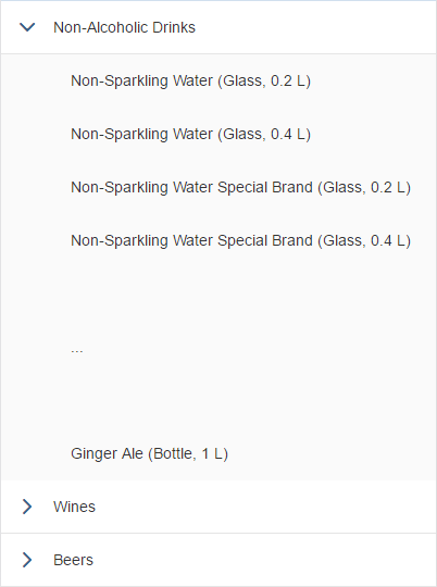
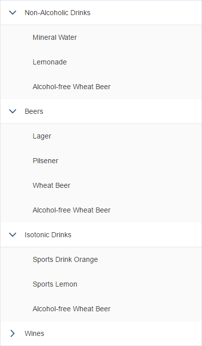
Tree displaying 2 levels
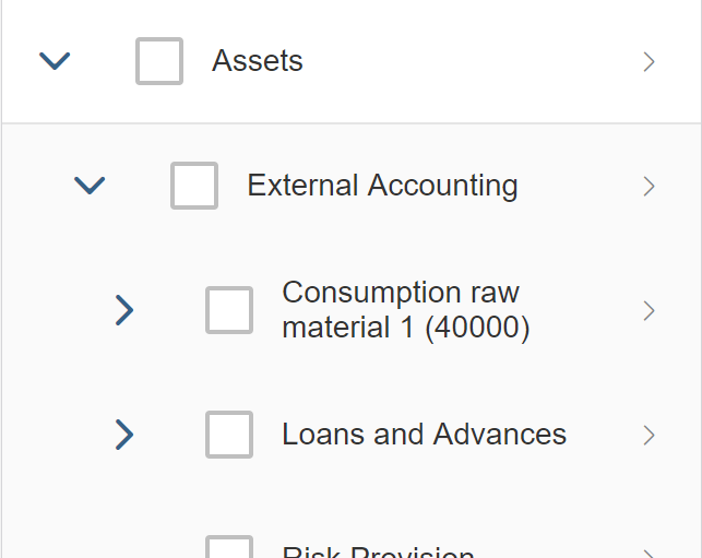
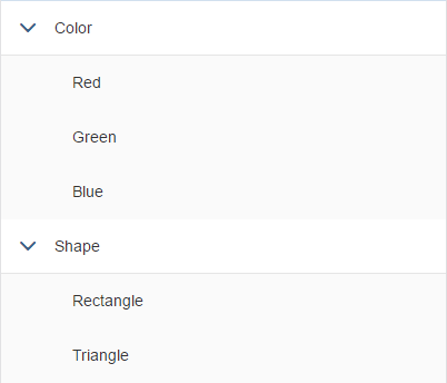
Tree displaying 3 levels
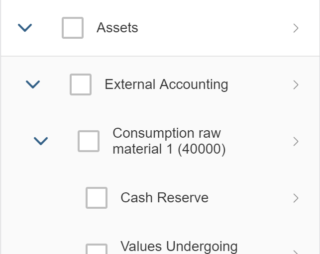
Tree displaying 4 levels
Layout
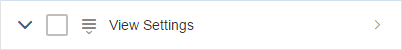
The title bar (optional) contains the title of the tree. In addition, an item counter and toolbar items can be placed on the title bar.
The collection of hierarchical items occupies the main part of the tree.
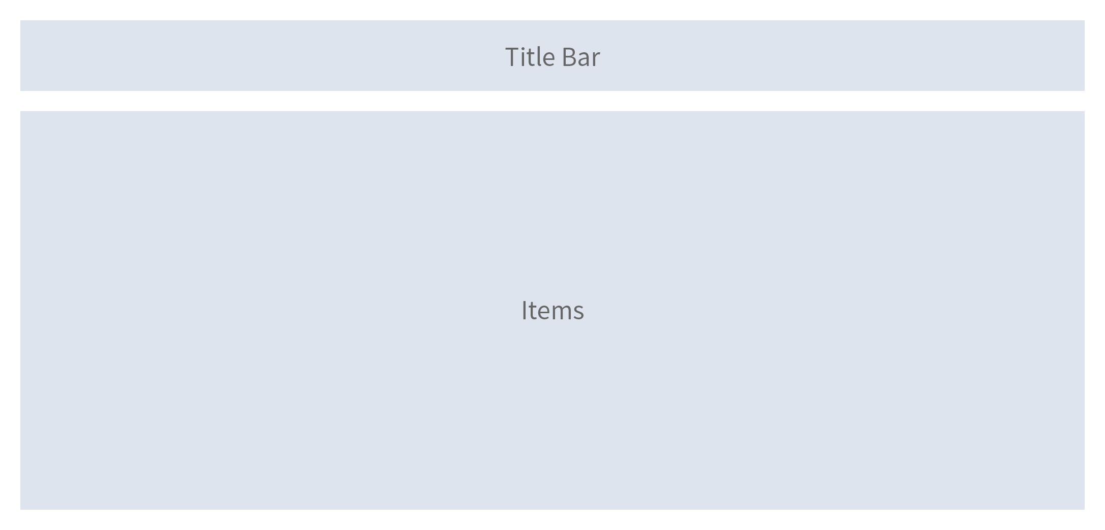
Schematic visualization of the tree
Components
The title bar consists of a toolbar. The toolbar can contain a title, an item count, and other toolbar items such as actions or view settings, for example.
The standard tree item consists of:
- A highlight indicator (optional)
- An expand/collapse button for nodes
- A selector in form of a checkbox or a radio button (optional)
- An icon (optional)
- A text
- A counter (optional)
- Additional buttons with actions such as Edit, Navigate, or Delete (optional)
If additional controls are needed, use a custom tree item. The custom tree item allows you to use any combination of controls inside the tree.
Standard tree item
Behavior and Interaction (incl. Gestures)
Tree Level
Scrolling
The height of the tree is defined by the numbers of items it contains. It does not have a scroll container on its own, but is scrolled together with the page or its parent.
Same tree, with different expand state
Selecting
A tree can have one of the following selection modes (sap.m.Tree / sap.m.ListBase, property: mode):
None: Items cannot be selected (sap.m.ListMode.None).
Beware: Items can, nevertheless, use the sap.m.ListType “navigation” which allows click-handling on specific items. This should only be used when the click triggers a navigation to a corresponding item details page.

Tree without selectable items
Single select master: One item of the tree can be selected. To select an item, click anywhere on the item. Single select master does not add any visual indication to the tree and therefore cannot be differentiated from trees without selection if no item is selected. Therefore, always keep one item selected. For single selection, this is the preferred mode. (sap.m.ListMode.SingleSelectMaster)

Single selection: only one item is selected.
Single select left: One item of the tree can be selected. For this, the tree provides radio buttons on the left side of each line item. Use this selection mode only if clicking on the item triggers something else, such as a navigation. Ideally, always keep one item selected, even in initial state (sap.m.ListMode.SingleSelectLeft).
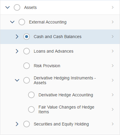
Single selection with radio buttons. Use only if row clicks are used for something else, such as for navigation.
Multiple selection: Allows the selection of one or more items. For this, the tree provides checkboxes on the left side of each line item. Each item is selected independently of the others (sap.m.ListMode.MultiSelect).
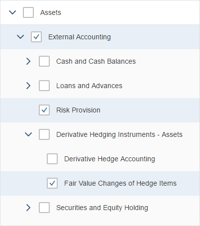
Multiple selection
Deleting
To delete single items, use the tree in “delete” mode (sap.m.Tree / sap.m.ListBase, property: mode, value: sap.m.ListMode.Delete). This adds a Delete button to each item. Clicking or tapping this button triggers the deletion of the corresponding item. Do not use this mode if deleting multiple items at once is the preferred use case. Delete is a mode of the tree and therefore cannot be used together with single selection or multi selection.

Tree in “delete” mode
Item Level
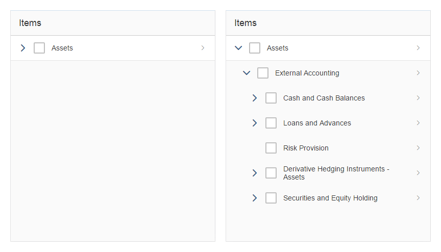
Expandable and Collapsible Nodes
An Expand/Collapse button is provided automatically for each node.
Expand/collapse button
Navigating
To allow navigation from an item, set type to “navigation” within the corresponding item (sap.m.StandardTreeItem / sap.m.ListItemBase, property: type, value: sap.m.ListType.Navigation). This will create an indicator at the end of the line (“>”) and the entire item will become selectable. Clicking or tapping the line triggers the navigation event. However, clicking or tapping a selectable area or an expandable/collapse node does not. Use the navigation event to navigate to a new page containing item details.
If no navigation is possible, set type to “inactive”.
Navigation is an item type and therefore cannot be used together with “edit” or in combination with click events for the entire item (“active”).

Tree items with navigation indicator

Navigation indicators can be set per item
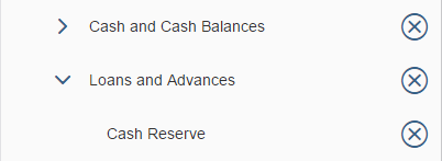
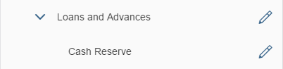
Editing Items
To allow the user to edit an item, set type to “detail” within the corresponding item (sap.m.StandardTreeItem / sap.m.ListItemBase, property: type, value: sap.m.ListType.Detail or sap.m.ListType.DetailAndActive). This will create an edit button at the end of the line. Clicking the button triggers the edit event. Use this event to either open a dialog or a details page where the item can be edited.
Edit is an item type and therefore cannot be used together with “navigation” or in combination with click events for the entire item (“active”).

Edit button
Clicking an Item
Items as a whole can be clickable. An event is fired by clicking on the item (anywhere except when triggering a selection or when expanding/collapsing a node). Apps can react to the event, such as by opening a dialog (sap.m.StandardTreeItem / sap.m.ListItemBase, property: type, value: sap.m.ListType.Active or sap.m.ListType.DetailAndActive).
Active elements do not have a visual indication and therefore cannot be differentiated from non-active elements.
“Active” is an item type and therefore cannot be used together with “navigation” or “edit”. In addition, “active” uses the entire item as a clickable area and thus cannot be used together with single select master.

Active items
Guidelines
Tree vs. List
Trees are more complex than lists due to their hierarchical view. Users tend to have more problems finding items in hierarchical views than in flat lists, except where the hierarchical view is natural. By natural we mean that every child node should be part of only one parent, and this relationship between the child and parent is clear and well known.
Example of an acceptable use of trees
A clear parent-child relationship
Broad vs. Deep Hierarchies
When you use trees, you should choose broad hierarchies over deep hierarchies. Deep hierarchies make finding items more complicated. So try to reduce hierarchical levels where possible, especially if the hierarchy is not natural. Ideally, a tree should have a maximum of four levels, the first two of which should contain the most important items.
Avoid unnecessary depth in the hierarchy
Favor breadth over depth in a hierarchy
You can use the following methods to reduce hierarchy levels:
- Avoid a single root node. It is usually not needed.
- Container nodes at the top level can usually be replaced by tabs or value pickers.
- Eliminate unnecessary mid-level containers, for example, by combining redundant ones.
- Exercise care when using a tree due to its overall complexity. The hierarchical structure of the data does not necessarily mean that a tree control is required.
Acceptable: repeat entries to optimize finding items
Design Concepts
The tree can be used to display hierarchical data. Unfortunately, trees convey an immediate feeling of complexity. Ideally, show trees only if there is no other option. You should instead try the following:
- Flatten the data. A list is still complex, but less so than a tree. A combo box might also fit in some use cases.
- When only two levels are needed, a grouped list control can be used. This works well, where group nodes are used for categorizing their children and where the group nodes themselves do not need to be selectable.
- Break down the data into manageable chunks. Allow the user to navigate or drill down between them.
- Use charts with drilldown functionality until the amount of data is more manageable.
Title
If needed, implement the title text by adding a title to a toolbar. Place the toolbar above the tree.
Use a title text if it is not already provided by the surrounding area. Do not use a title text if it would just repeat text that is already in the context above the tree.
Use a title if you need a toolbar. To avoid repeating text, feel free to use generic text as a title, such as Items.
If you use a title, be sure to include the following:
- A title text for the tree.
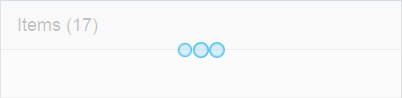
- An (optional) item count using the following format: Title (Number of Items). For example, Items (17). Depending on the use case, either count all items or leaves only (for example, if nodes are mainly used for categorization).
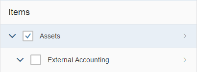
Title
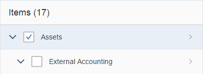
Title with item count
Loading Data
To indicate that the tree is currently loading items, use the busy state (sap.m.Tree, property: busy). Do not show any items or text. As soon as the data is loaded, remove the busy state and show all items.
Tree in busy state while loading data
Initial Display
Think of the initial expandable/collapsible state of a tree. If your structure contains many items on the root level, it might make sense to collapse the whole tree in its initial state.
In contrast, if the most important items are displayed on a deeper level (if, for example, the parent nodes are simply a kind of categorization), the tree should be expanded up to the first level where the most important items immediately appear.
Content
The standard tree item allows you to set one text per item. The text wraps, which can lead to items of different heights depending on the length of the text. An icon can be shown before the text. Try not to use the icons, and only use them if the meaning of the icons is clear and unambiguous. In addition, a counter can be placed on the right side of the item (sap.m.StandardTreeItem / sap.m.ListItemBase, property: counter).
The custom tree item allows you to use any combination of controls inside a tree, including editable controls (selection controls, Expand/Collapse buttons, navigation indicators, counters).
When designing a custom tree item, consider the responsive behavior. Take into account that all the controls you can add to a tree require additional width. Their position cannot be changed.
Standard tree item with all options
Content Formatting
To display object names with an ID, show the ID in brackets after the corresponding object name.
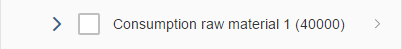
Place the ID in brackets after the corresponding object name
Try not to display an empty tree. If there is no way around this, provide instructions on how to fill the tree with data (sap.m.Tree / sap.m.ListBase, properties: showNoData, noDataText).

Provide meaningful instructions within an empty tree
Highlighting Items
To show that an item needs attention, a highlight indicator can be shown in front of the item. The highlight indicator can be used to show:
- A semantic state (for example, red or orange if the item contains an error or warning)
- A neutral state (for example, blue to highlight newly added items)
(sap.m.StandardTreeItem / sap.m.ListIemBase, property: highlight)
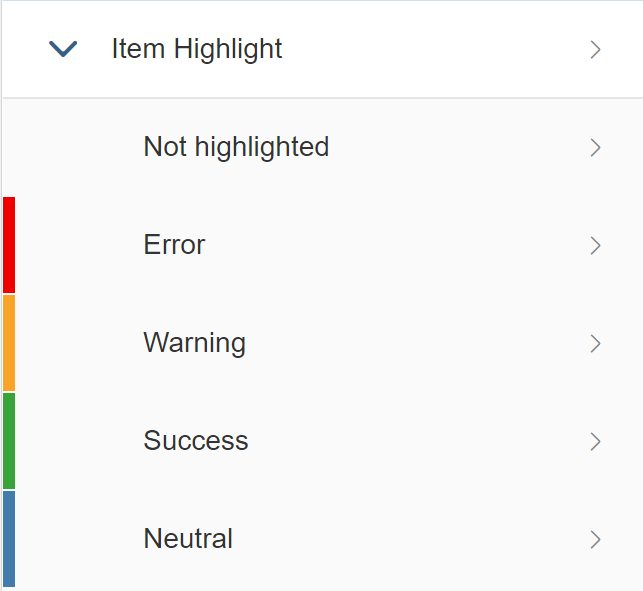
Highlighted items
Item States
To show that an item has been modified, for example within the global edit flow, add the string (Modified) to the text of the item.
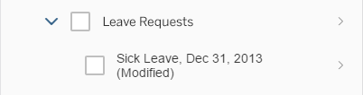
A modified item
To show that a modified item has an error, for example within the global edit flow, add the string (Contains errors) to the text of the item.
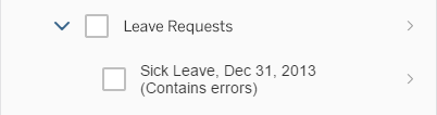
A modified item with an error
To show that an item is locked, add the string (Locked by [name]) to the text of the item.
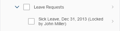
A locked item
To show that an item is in a draft state, add the string (Draft) to the text of the item.
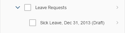
Item in draft state
Show only one state at any one time.
Actions
To trigger actions on items, show the actions on a toolbar above the tree. Do not offer action triggering on multiple items if the tree is expected to have fewer than 10 items in most cases.
The following actions on single items must always be in-line:
Delete: Use “Delete” mode (sap.m.Tree / sap.m.ListBase, property: mode, value: sap.m.ListMode.Delete). This places a delete button at the end of each item.
Items with Delete button
Navigation: Use the “Navigation” item type (sap.m.StandardTreeItem / sap.m.ListItemBase, property: type, value: sap.m.ListType.Navigation). This places a navigation indicator at the end of the corresponding items. Use this to navigate to a new page containing item details.

Items with navigation indicator
Edit: Use the “Detail” item type (sap.m.TreeItem / sap.m.ListItemBase, property: type, value: sap.m.ListType.Detail). This places an edit icon at the end of the corresponding items.
Edit button
From these three actions (delete, navigation, and edit), you can combine delete and edit, or delete and navigation. Edit and navigation cannot be combined.
To trigger actions that are independent of the selection, show the actions on a toolbar above the tree. For example: Add, Collapse All, Expand All, …
To trigger a default action on the entire item, use the “Active” or “DetailAndActive” item type (sap.m.TreeItem / sap.m.ListItemBase, property: type, value: sap.m.ListType.Active). Active items trigger an event when clicked, which can be handled by apps, for example, to open a dialog. Selection and expanding/collapsing a node does not trigger the event, but are handled by the tree. Do not use this for navigation, to switch the line item to an edit state, or to delete the item.
Active can be combined with edit and delete, but not with navigation. Do not combine active with single selection master.
When you add an item, add the new item as the first item of the corresponding node.
Editing Items
To edit items, add an Edit button either in-line on the toolbar above the tree. Triggering the button either opens a dialog or navigates to an editable details page.
For mass editing:
- Provide multiselection (sap.m.Tree/ sap.m.ListBase, property: mode, value: sap.m.ListMode.MultiSelect).
- Provide an Edit button on the toolbar above the tree.
- If several items are selected, triggering the Edit button opens a dialog in which the user edits the corresponding fields for all selected items.
For more details, see mass editing.
Properties
sap.m.Tree
The following additional properties are available for the tree:
- The property: insert adds a margin on all sides of the tree.
- The property: footerText adds a small additional row below the last item of the tree. This row can contain text only. Do not use this property.
- The property: width defines the width of the whole tree.
- The property: includeItemInSelection uses a click on the entire line item to select the corresponding item if the tree is in a selection mode. This competes with other settings such as “Navigation” or “Active” and should therefore not be used.
- The property: enableBusyIndicator automatically shows a busy indicator while data is being loaded.
- The property: modeAnimationOn plays a short animation it the selection mode is changed. Do not use it.
- The property: showSeparators allows you to show all, none, or some separators. The default setting, which shows all separators, works well in most cases.
- The property: swipeDirection allows you to define the direction in which to swipe if additional actions are hidden behind a tree item. This works only on touch devices. Do not use this property for functionality which is not available somewhere else.
- The property: rememberSelections leaves items selected even if they are not currently visible, for example, through filtering. If this behavior is not wanted, set the flag to “false”, but you should do so only in exceptional cases.
- The property: busy sets the tree to a busy state. While in busy state, the entire tree cannot be used and items cannot be read due to an overlay.
- The property: busyIndicatorDelay defines the time after which a busy state is shown after the tree has been set to this state. Use the default value.
- The property: visible shows the tree (“true”) or hides it (“false”).
- The property: tooltip adds a tooltip to the entire tree. The tooltip is only shown on mouse interaction. It will not work on tablets, smartphones, or other touch devices. Do not use it.
sap.m.StandardTreeItem / sap.m.CustomTreeItem
The following additional properties are available for sap.m.StandardTreeItem:
- The property: selected allows an item to be selected programmatically.
- The property: busy sets the item to a busy state. While in busy state, the whole item cannot be used and cannot be read due to an overlay. In most cases, this should not be needed. Do not use it.
- The property: busyIndicatorDelay defines the time after which a busy state is shown after the item has been set to this state. Do not use it.
- The property: visible shows or hides the item.
- The property: tooltip adds a tooltip to a whole item. The tooltip is only shown on mouse interaction. It will not work on tablets, smartphones, or other touch devices. Do not use it.
Resources
Want to dive deeper? Follow the links below to find out more about related controls, the SAPUI5 implementation, and the visual design.
Elements and Controls
- Table Toolbar (guidelines)
- Table Overview (guidelines)
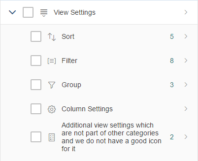
- View Settings Dialog (guidelines)
Implementation
- Tree (SAPUI5 samples)
- Tree (SAPUI5 API reference)
- Standard Tree Item (SAPUI5 API reference)
- Custom Tree Item (SAPUI5 API reference)
 Your feedback has been sent to the SAP Fiori design team.