
- Latest SAPUI Version 1.124
- SAPUI5 Version 1.122
- SAPUI5 Version 1.120
- SAPUI5 Version 1.118
- SAPUI5 Version 1.116
- SAPUI5 Version 1.114
- SAPUI5 Version 1.112
- SAPUI5 Version 1.110
- SAPUI5 Version 1.108
- SAPUI5 Version 1.106
- SAPUI5 Version 1.104
- SAPUI5 Version 1.102
- SAPUI5 Version 1.100
- SAPUI5 Version 1.98
- SAPUI5 Version 1.96
- SAPUI5 Version 1.94
- SAPUI5 Version 1.92
- SAPUI5 Version 1.90
- SAPUI5 Version 1.88
- SAPUI5 Version 1.86
- SAPUI5 Version 1.84
- SAPUI5 Version 1.82
- SAPUI5 Version 1.80
- SAPUI5 Version 1.78
- SAPUI5 Version 1.76
- SAPUI5 Version 1.74
- SAPUI5 Version 1.72
- SAPUI5 Version 1.70
- SAPUI5 Version 1.68
- SAPUI5 Version 1.66
- SAPUI5 Version 1.64
- SAPUI5 Version 1.62
- SAPUI5 Version 1.60
- SAPUI5 Version 1.58
- SAPUI5 Version 1.56
- SAPUI5 Version 1.54
- SAPUI5 Version 1.50
- SAPUI5 Version 1.48
- SAPUI5 Version 1.46
- SAPUI5 Version 1.44
- SAPUI5 Version 1.42
- SAPUI5 Version 1.40
- SAPUI5 Version 1.38
- SAPUI5 Version 1.36
- SAPUI5 Version 1.34
- SAPUI5 Version 1.32
- SAPUI5 Version 1.30
- SAPUI5 Version 1.28
- SAPUI5 Version 1.26
- Latest SAPUI Version 1.124
- SAPUI5 Version 1.122
- SAPUI5 Version 1.120
- SAPUI5 Version 1.118
- SAPUI5 Version 1.116
- SAPUI5 Version 1.114
- SAPUI5 Version 1.112
- SAPUI5 Version 1.110
- SAPUI5 Version 1.108
- SAPUI5 Version 1.106
- SAPUI5 Version 1.104
- SAPUI5 Version 1.102
- SAPUI5 Version 1.100
- SAPUI5 Version 1.98
- SAPUI5 Version 1.96
- SAPUI5 Version 1.94
- SAPUI5 Version 1.92
- SAPUI5 Version 1.90
- SAPUI5 Version 1.88
- SAPUI5 Version 1.86
- SAPUI5 Version 1.84
- SAPUI5 Version 1.82
- SAPUI5 Version 1.80
- SAPUI5 Version 1.78
- SAPUI5 Version 1.76
- SAPUI5 Version 1.74
- SAPUI5 Version 1.72
- SAPUI5 Version 1.70
- SAPUI5 Version 1.68
- SAPUI5 Version 1.66
- SAPUI5 Version 1.64
- SAPUI5 Version 1.62
- SAPUI5 Version 1.60
- SAPUI5 Version 1.58
- SAPUI5 Version 1.56
- SAPUI5 Version 1.54
- SAPUI5 Version 1.52
- SAPUI5 Version 1.50
- SAPUI5 Version 1.48
- SAPUI5 Version 1.46
- SAPUI5 Version 1.44
- SAPUI5 Version 1.42
- SAPUI5 Version 1.40
- SAPUI5 Version 1.38
- SAPUI5 Version 1.36
- SAPUI5 Version 1.34
- SAPUI5 Version 1.32
- SAPUI5 Version 1.30
- SAPUI5 Version 1.28
- SAPUI5 Version 1.26
Message Handling
Intro
This article describes how to display messages to the user such as errors, warnings, success messages, confirmation, and information. You can choose from various controls to display different types of messages.
Messages should be expressed in plain language (no codes), precisely indicate the problem, and constructively suggest a solution. Always help your user to recognize, diagnose, and resolve messages. Good messages are important, but a careful design that prevents a problem from occurring in the first place is even better.
Types of Messages
The following message categories are available:
- Error
- Warning
- Success
- Information
- Confirmation
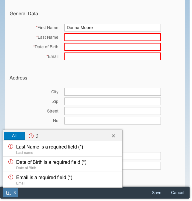
Handling for State Messages
State messages are related to a field on the UI (such as an input field), and are displayed within the message popover (sap.m.MessagePopover).
- The message is displayed next to input field that uses form field validation and inside the message popover.
- If a message long text is available in the back-end system, the user can drill into the second page of the message popover.
Lifecycle
The messages are retained until a validation is triggered (for example, when the user leaves the field), and the issue has since been resolved by the system or user.
Handling for Transient Messages
Transient messages are related to an action and are displayed in the following way.
- To display one transient message, use the message box.
- To display multiple transient messages, use a dialog with an embedded message view.
Lifecycle
As soon as the user closes the dialog, the messages in the message box or dialog are removed from the technical message manager, and are no longer valid.
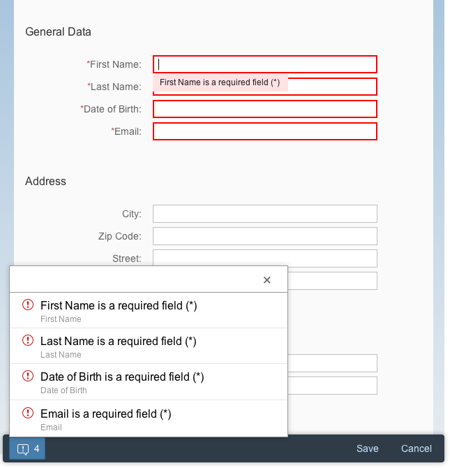
Example for State Messages
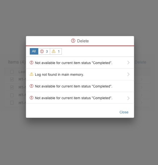
Example for Transient Messages
Components
Form Field Validation
Error, warnings and success messages on form fields are shown directly on the form by setting the status of the field (valueState) and by providing a meaning full text to the user. For more information, see form field validation.
Controls
The following controls can be used to display inline error, warning, and success messages. Consequently, the application can set the status of a control error, warning, or success state.
- sap.m.ComboBox
- sap.m.DatePicker
- sap.m.DateTimeInput
- sap.m.DateRangeSelection
- sap.m.MultiComboBox
- sap.m.MultiInput
- sap.m.Input
- sap.m.TextArea
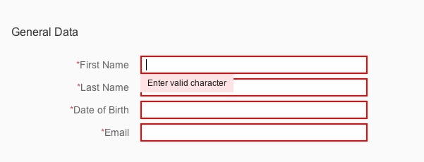
Example of a form field validation
Message Popover
The message popover (sap.m.MessagePopover) control can communicate automatically with a message manager. With a message popover, the application can easily display multiple messages that occur after a UI interaction. For more information, see message popover.
Message popover in SAP Fiori
Message Box
The message box (sap.m.MessageBox) displays a message that interrupts the user in the course of an action. We recommend that you use the message box carefully because of its disruptive behavior. For more information, see message box.
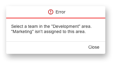
Message box with a helpful error message
Message Toast
This is a standard message component for success messages. For more information, see message toast.
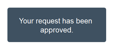
Example of a message toast
Message Strip
The message strip is used to display general information or inform about a status of an object. It can be placed within the detail area of a page. For more information, see message strip.
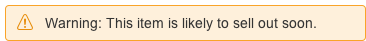
Message strip with a warning message
Behavior and Interaction
Highlight the Fields
Change the Value State
Messages are intended to help the user to rectify a problem which is generally field-related. As such, it’s very important that you highlight all relevant fields to which the message relates. This section gives an overview of the changes that should appear on the UI after a validation.
If a value is incorrect:
- Highlight the relevant field and add a useful message to the value state.
- Display a button for the message popover on the left side of the footer toolbar.
- If the user is still allowed to continue the action, the message no longer needs to be displayed.
As SAP Fiori is role-based, there may also be situations in which the application cannot establish a relation to a field, such as issues concerning configuration, data needing to be changed in a different system, and so on. In this case, you can still display a message box that interrupts the user in the course of an action. For more information, see message box.
Data Loss
Quick Confirmation Popover
Quick Confirmation for “Cancel” Use Case
The quick confirmation popover can be used to display a confirmation message in case the user selects Cancel. The quick confirmation popover is less disruptive than a dialog and the following guidelines apply:
- It should be displayed close to the action the user has triggered (such as Cancel)
- For all the other confirmation use cases (including Delete), please use a dialog.
“Create” Case
If the user creates an object and presses Cancel, show a quick confirmation popover with the following text:
Text: “Discard this draft?”
Button: “Discard”
“Edit” Case
If the user edits an object and presses Cancel, show a quick confirmation popover with the following text:
Text: “Discard all changes?”
Button: “Discard”
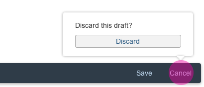
Quick confirmation popover for "create" case
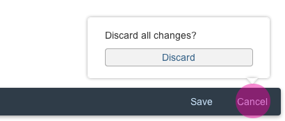
Quick confirmation popover for "edit" case
Data Loss Message Box
Behavior for “Cancel” Use Case
If a data loss popover is not feasible, display a data loss warning in a message box.
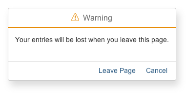
Data loss warning in a message box
Guidelines
Messaging Overview
- No messages to display?
If there are no messages to display, do not show a messages button in the toolbar. - Highlight the fields
If possible, first highlight the relevant field(s) and change its value state according to the message type, such as error, warning, or success. - Message popover
In addition highlighting the fields, a button appears in the toolbar displaying an icon and the number of messages that occurred. This number matches the number of fields that have been highlighted. If multiple messages occurred, they should be displayed in the message popover, which can be triggered via a button on the left side, inside the footer toolbar. - Display single messages in a message box
There may also be messages that have to interrupt the user. At present, we are only aware of technical issues such as network errors and connection issues.
Resources
Want to dive deeper? Follow the links below to find out more about related controls, the SAPUI5 implementation, and the visual design.
Elements and Controls
- Form Field Validation (guidelines)
- Message Box (guidelines)
- Message Popover (guidelines)
- Message Toast (guidelines)
- Message Strip (guidelines)
 Your feedback has been sent to the SAP Fiori design team.