
- Latest SAPUI Version 1.124
- SAPUI5 Version 1.122
- SAPUI5 Version 1.120
- SAPUI5 Version 1.118
- SAPUI5 Version 1.116
- SAPUI5 Version 1.114
- SAPUI5 Version 1.112
- SAPUI5 Version 1.110
- SAPUI5 Version 1.108
- SAPUI5 Version 1.106
- SAPUI5 Version 1.104
- SAPUI5 Version 1.102
- SAPUI5 Version 1.100
- SAPUI5 Version 1.98
- SAPUI5 Version 1.96
- SAPUI5 Version 1.94
- SAPUI5 Version 1.92
- SAPUI5 Version 1.90
- SAPUI5 Version 1.88
- SAPUI5 Version 1.86
- SAPUI5 Version 1.84
- SAPUI5 Version 1.82
- SAPUI5 Version 1.80
- SAPUI5 Version 1.78
- SAPUI5 Version 1.76
- SAPUI5 Version 1.74
- SAPUI5 Version 1.72
- SAPUI5 Version 1.70
- SAPUI5 Version 1.68
- SAPUI5 Version 1.66
- SAPUI5 Version 1.64
- SAPUI5 Version 1.62
- SAPUI5 Version 1.60
- SAPUI5 Version 1.58
- SAPUI5 Version 1.56
- SAPUI5 Version 1.54
- SAPUI5 Version 1.50
- SAPUI5 Version 1.48
- SAPUI5 Version 1.46
- SAPUI5 Version 1.44
- SAPUI5 Version 1.42
- SAPUI5 Version 1.40
- SAPUI5 Version 1.38
- SAPUI5 Version 1.36
- SAPUI5 Version 1.34
- SAPUI5 Version 1.32
- SAPUI5 Version 1.30
- SAPUI5 Version 1.28
- SAPUI5 Version 1.26
- Latest SAPUI Version 1.124
- SAPUI5 Version 1.122
- SAPUI5 Version 1.120
- SAPUI5 Version 1.118
- SAPUI5 Version 1.116
- SAPUI5 Version 1.114
- SAPUI5 Version 1.112
- SAPUI5 Version 1.110
- SAPUI5 Version 1.108
- SAPUI5 Version 1.106
- SAPUI5 Version 1.104
- SAPUI5 Version 1.102
- SAPUI5 Version 1.100
- SAPUI5 Version 1.98
- SAPUI5 Version 1.96
- SAPUI5 Version 1.94
- SAPUI5 Version 1.92
- SAPUI5 Version 1.90
- SAPUI5 Version 1.88
- SAPUI5 Version 1.86
- SAPUI5 Version 1.84
- SAPUI5 Version 1.82
- SAPUI5 Version 1.80
- SAPUI5 Version 1.78
- SAPUI5 Version 1.76
- SAPUI5 Version 1.74
- SAPUI5 Version 1.72
- SAPUI5 Version 1.70
- SAPUI5 Version 1.68
- SAPUI5 Version 1.66
- SAPUI5 Version 1.64
- SAPUI5 Version 1.62
- SAPUI5 Version 1.60
- SAPUI5 Version 1.58
- SAPUI5 Version 1.56
- SAPUI5 Version 1.54
- SAPUI5 Version 1.52
- SAPUI5 Version 1.50
- SAPUI5 Version 1.48
- SAPUI5 Version 1.46
- SAPUI5 Version 1.44
- SAPUI5 Version 1.42
- SAPUI5 Version 1.40
- SAPUI5 Version 1.38
- SAPUI5 Version 1.36
- SAPUI5 Version 1.34
- SAPUI5 Version 1.32
- SAPUI5 Version 1.30
- SAPUI5 Version 1.28
- SAPUI5 Version 1.26
Launchpad Shell Bar
Intro
The launchpad shell bar is the uppermost section of the SAP Fiori launchpad. It is always visible to give users access to various launchpad functions.
With SAPUI5 version 1.40, the shell bar was merged with the application bar. For more information, see merged header.

Launchpad shell bar - Home view

Launchpad shell bar - App view
Responsiveness
The launchpad shell bar is fully responsive.
On size S, the branding area becomes part of the Me Area, and the search and CoPilot are displayed behind the overflow menu icon.
When an application is launched, the launchpad shell bar changes its appearance. The app title merges into the shell bar, and a navigation dropdown menu is displayed. In addition, a Home button and a Back button are visible next to the profile image.
If a deep link to an application is called, and there are no SAP Fiori entries in the browser history, do not display the Back button.
Home View
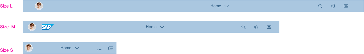
Shell bar sizes L/M/S - Home view
App View
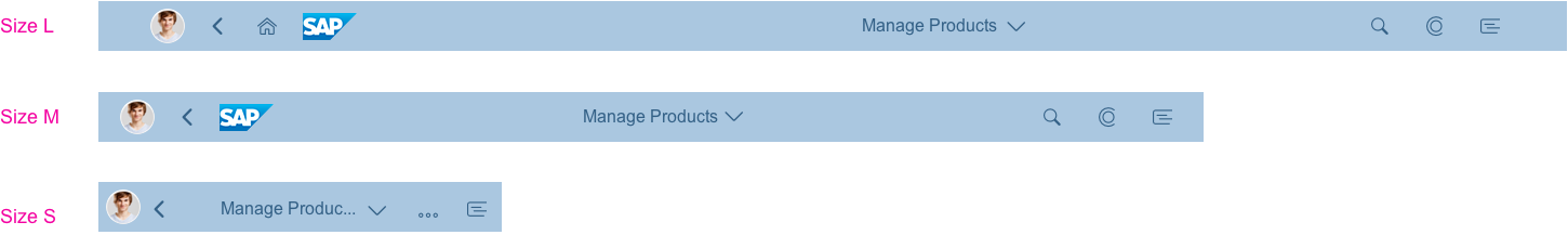
Shell bar sizes L/M/S - App view
Components
The SAP Fiori launchpad always contains the following:
- Toggle button for the Me Area
- Area for branding purposes
- Page title (and an optional second title)
- Enterprise search
- CoPilot button
- Notifications toggle button
- Home and Back buttons (when an app is launched)
- Navigation menu next to the title (when an app is launched)
- Optional actions
Viewport Toggle Buttons
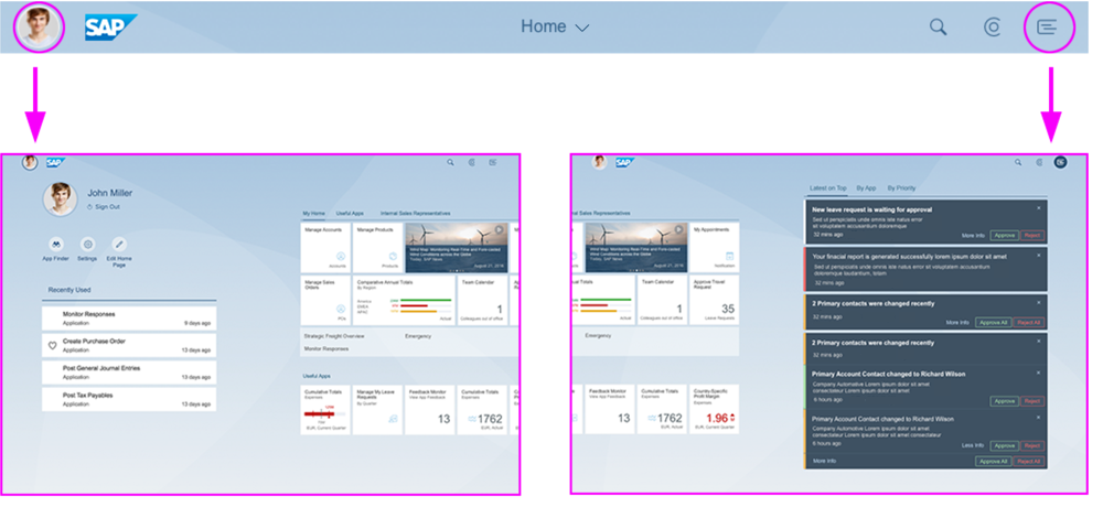
Clicking on the Me Area or Notifications toggle buttons opens the corresponding areas with a smooth transition. The viewport moves to the right or left, and the main content area zooms out. No page title is displayed.
Clicking the same toggle buttons again leads the user back to the SAP Fiori launchpad home page.
If no profile picture is set, a default icon is displayed.
Shell bar toggle buttons for 'Me Area' and notifications area

Me Area: Default icon - Normal state

Me Area: Default icon - Pressed state
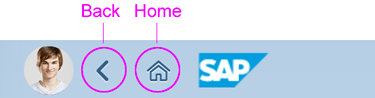
Back and Home
When an app is launched, Back and Home icons are displayed next to the profile image.
Back navigates to the previously visited screens. Home takes the user directly to the home page.
If the user is editing an object in an application without draft handling, and tries to navigate away via Back or Home, show a data loss message.
Note:
- On size S and size M, the Home button is not displayed.
- If a deep link to an application is called, and there are no SAP Fiori entries in the browser history, do not display the Back button.
Shell bar with Back and Home icons
Optional Actions
In addition to the buttons for the enterprise search, CoPilot, and notifications, key users or administrators can add 3 more actions from the Me Area to the shell bar. The optional actions are placed between the CoPilot and Notifications buttons. If an action is placed in the shell bar, it is no longer available in the Me Area.
Since actions in the shell bar are very prominent, we only recommend placing additional actions in the shell bar if users need to access them frequently.
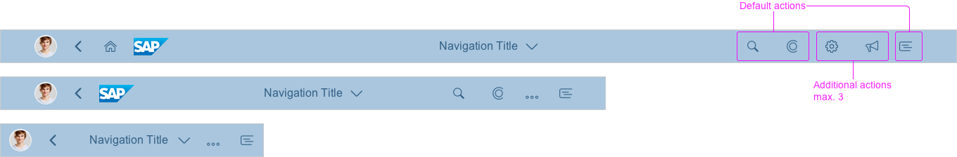
Shell bar with optional actions
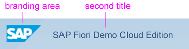
Branding Area and Second Title
The branding area usually shows the company logo as defined by the administrator. The branding area cannot be skipped over.
The second title is an optional part of the launchpad shell bar. You can use it to declare specific system specifications, such as SAP Fiori Demo Cloud Edition. Do not use it for a welcome text or for similar purposes.
Shell bar with branding area and second title
Page Title and Navigation Menu
Page Title
The title inside the shell always indicates the user’s position in the system. The navigation menu provides the user with a quick way to browse the hierarchical structure of applications.
For the home page, the title is Home. In the app finder, it changes to App Finder.
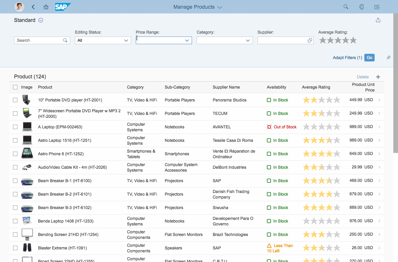
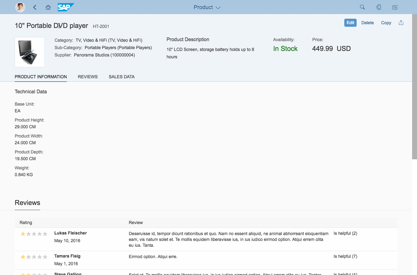
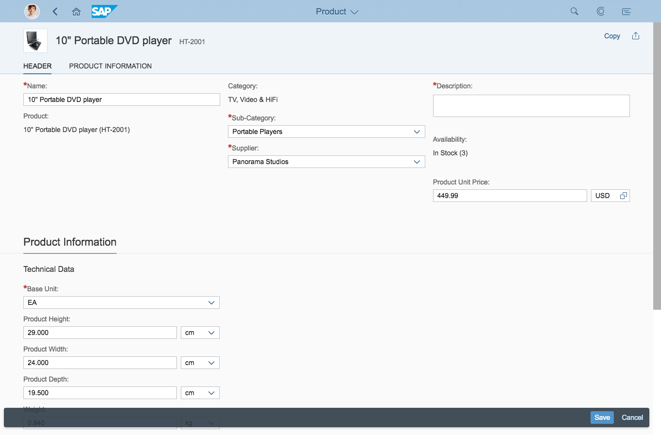
The initial screen of an application usually displays the application name, such as Manage Products. This name must match the app name used on the launchpad tile. When the user navigates to a different page, the title should change.
Exceptions: Flexible Column Layout
In the flexible column layout, the shell bar displays the application name. The title only changes when the user switches to full screen mode or navigates. On size S, the title changes when the user navigates between the different panels.
Navigation Menu
Clicking or tapping the page title in the shell bar opens the navigation menu as a dropdown.
To close it again, users can click or tap on the page title again, click anywhere outside the navigation menu, or click the dropdown arrow.
The height of the container depends on its content.
This interaction applies for all device types, such as desktop, tablet, and mobile.
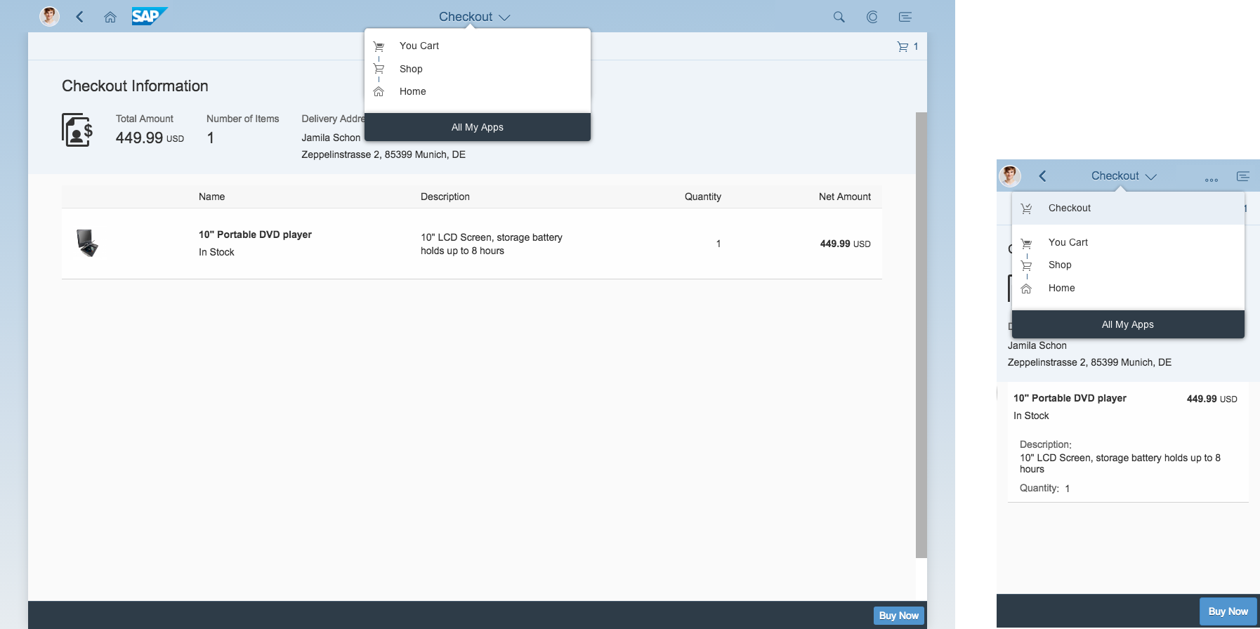
All My Apps
Clicking or tapping All My Apps provides access to the main assigned applications for a user’s role. For example, apps from the home page group and the app finder (catalog) only.
Left: Navigation menu on size M/L; Right: Navigation menu on size S
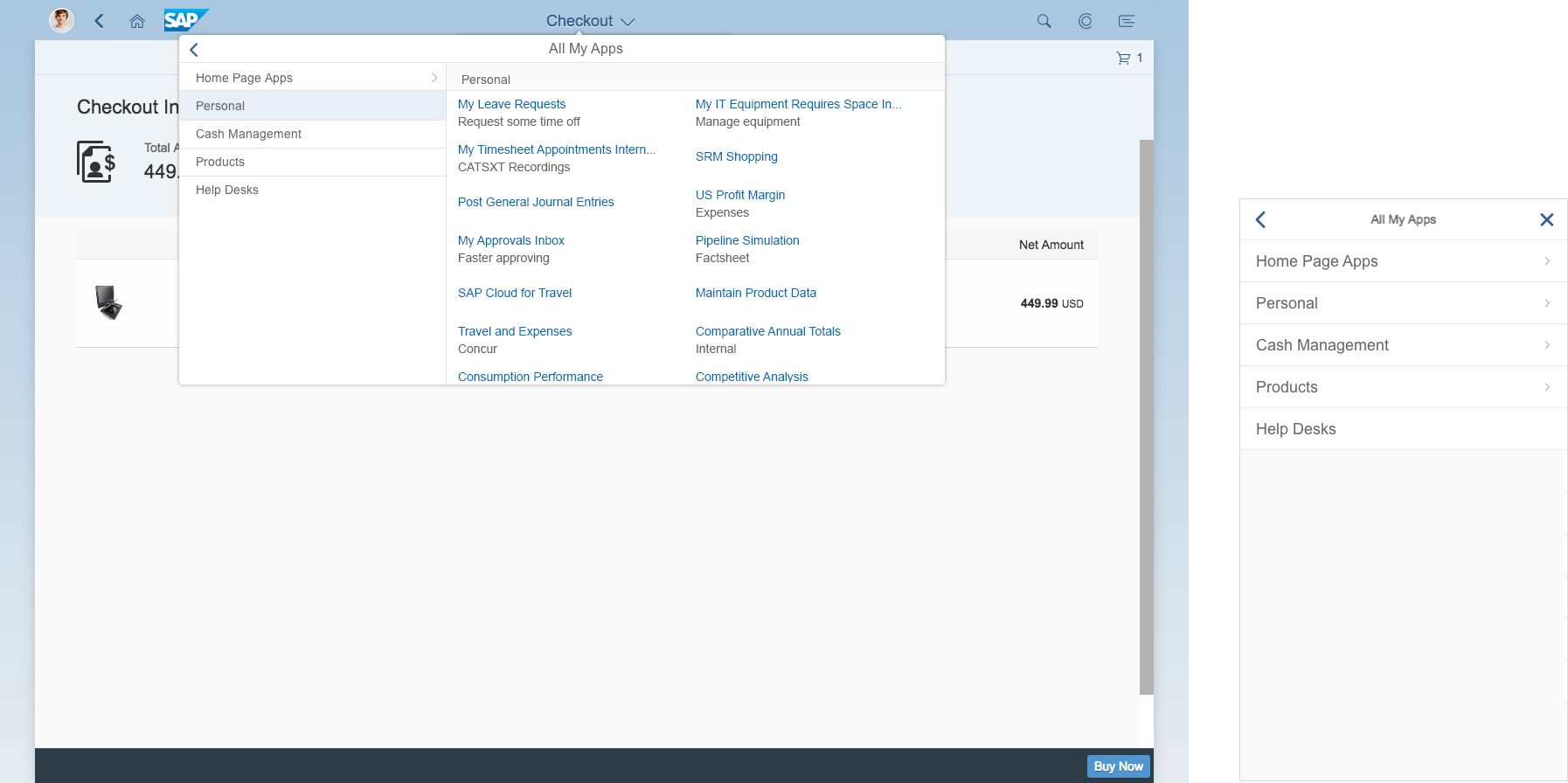
Left: All My Apps navigation menu on size M/L; Right: Navigation menu on size S
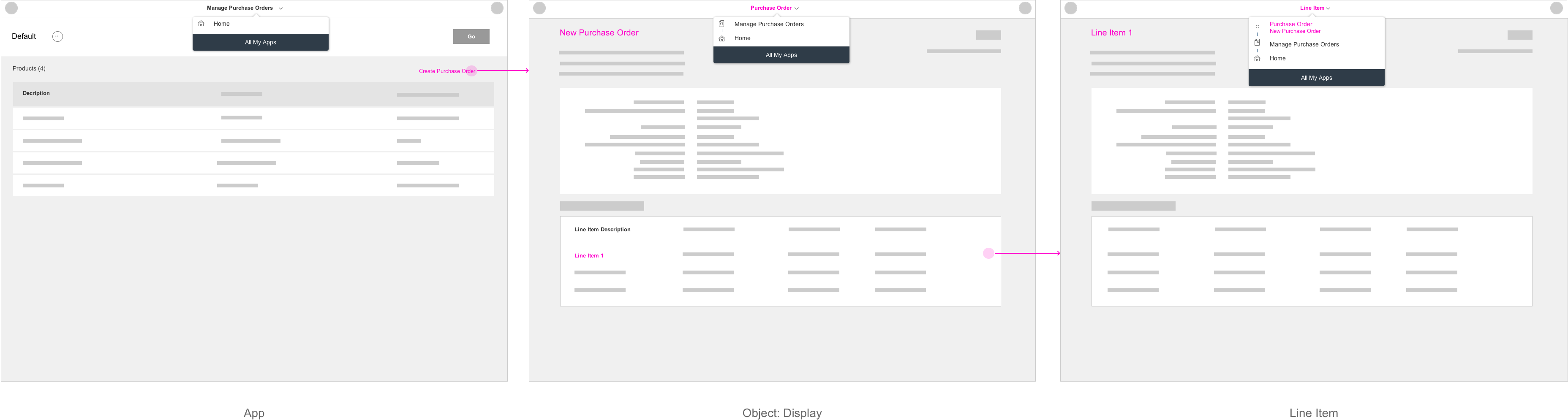
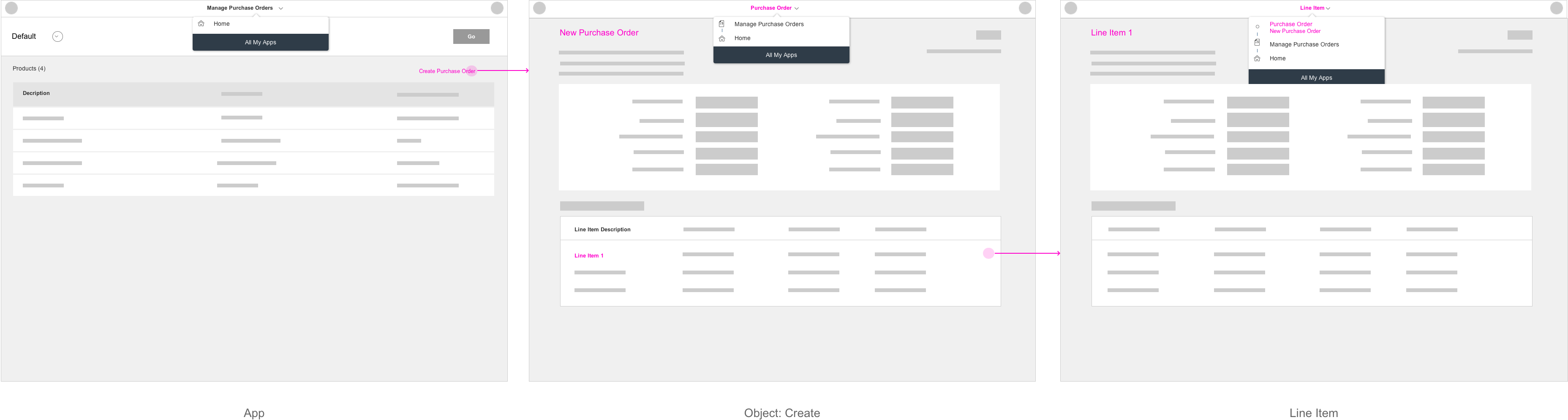
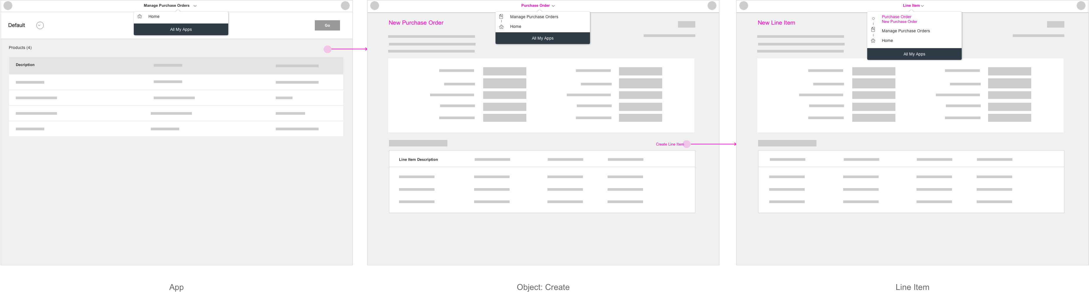
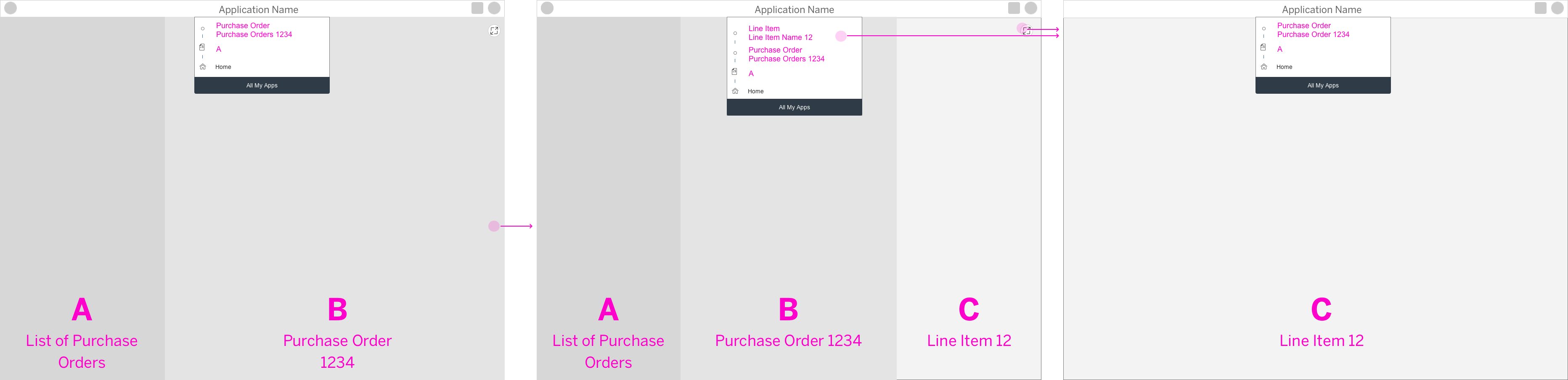
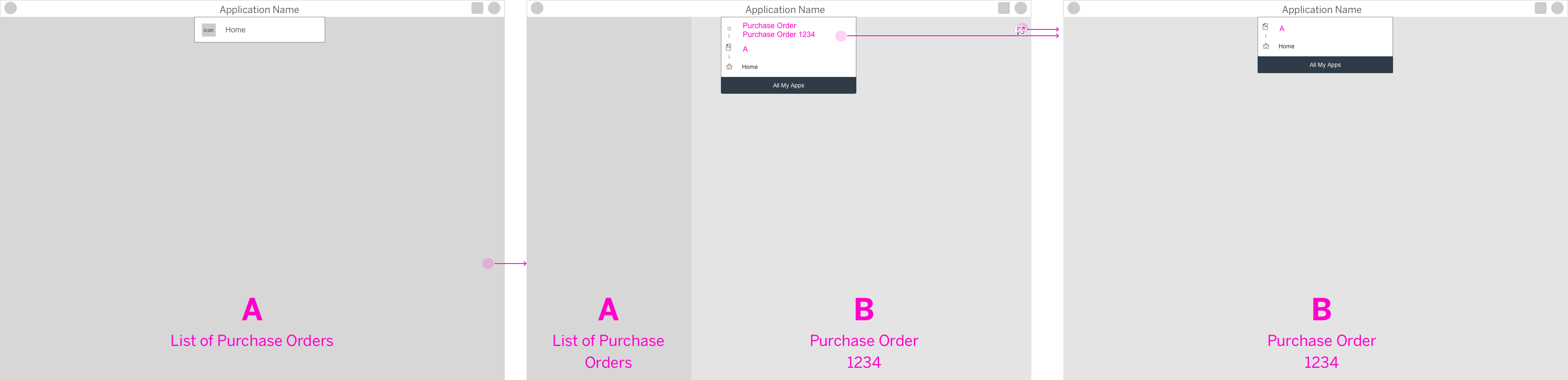
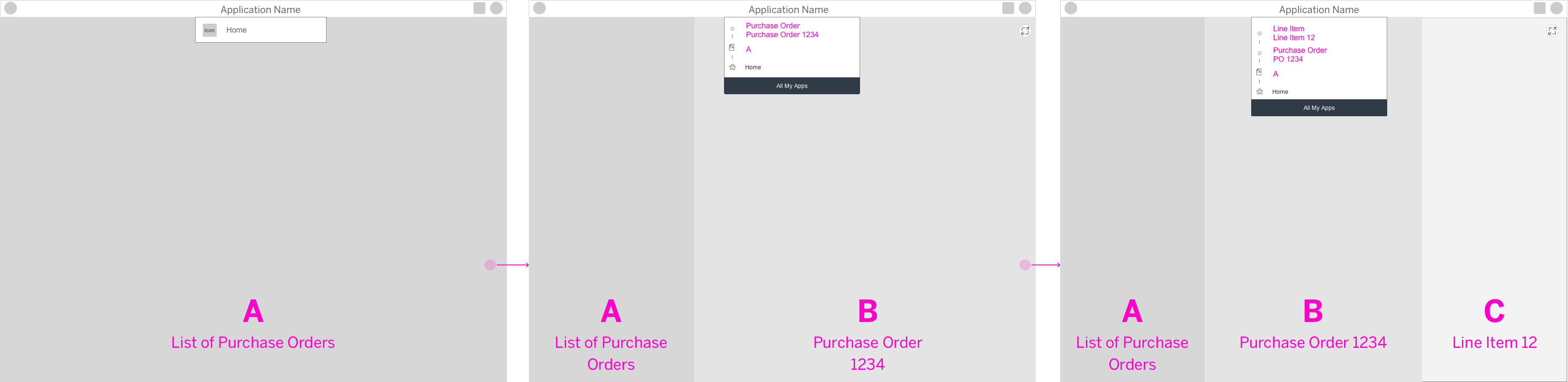
Navigation Hierarchy
The navigation menu displays the previous navigation steps within an application that lead to the current page. The current hierarchy level is represented by the page name only. Selecting a navigation entry opens the respective page in-place.
The menu only shows hierarchy levels within the current application, and there is only one entry per hierarchy level.
The entry page of an app always displays as “Home”, and is the first entry. Drill-in navigation adds further hierarchical entries to the navigation menu. If a user navigates to an app using a deep link, the navigation menu also shows the hierarchy levels for the previous app.
The entries are ordered according to the hierarchy, starting with Home, down to the current hierarchy level (= page name). Each entry consists of a title, subtitle, and icon.
- Use the title to display the name of the previous page (mandatory).
- Use the subtitle to describe the previous object (optional).
- Use the application icon if the previous page was the application start page (mandatory, where applicable).
- Use the default icon for further navigation steps, or when no application icon was defined.
Check out the Resources section below for more information on how to implement the content of the navigation menu (such as the SAPUI5 API reference).
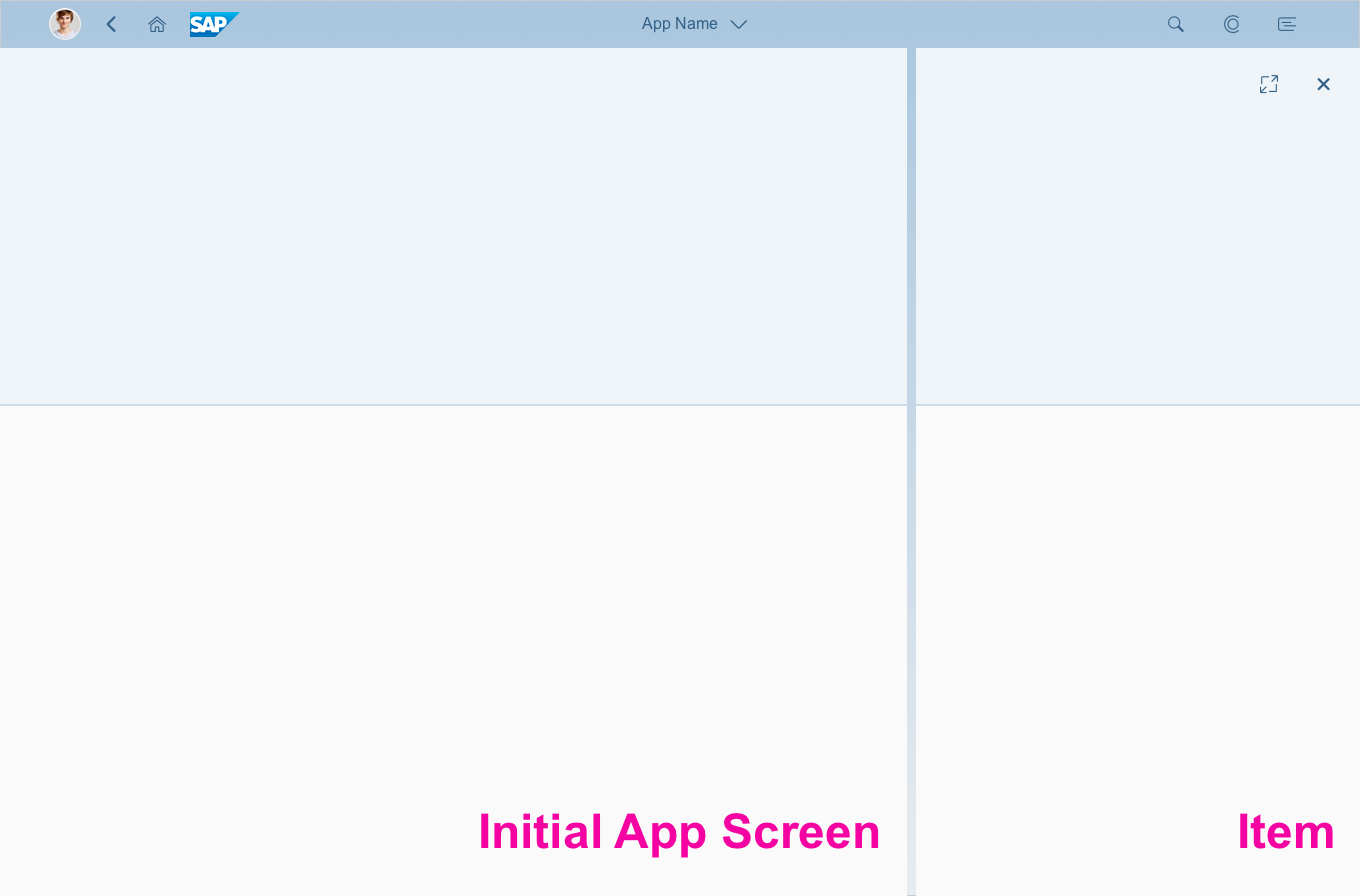
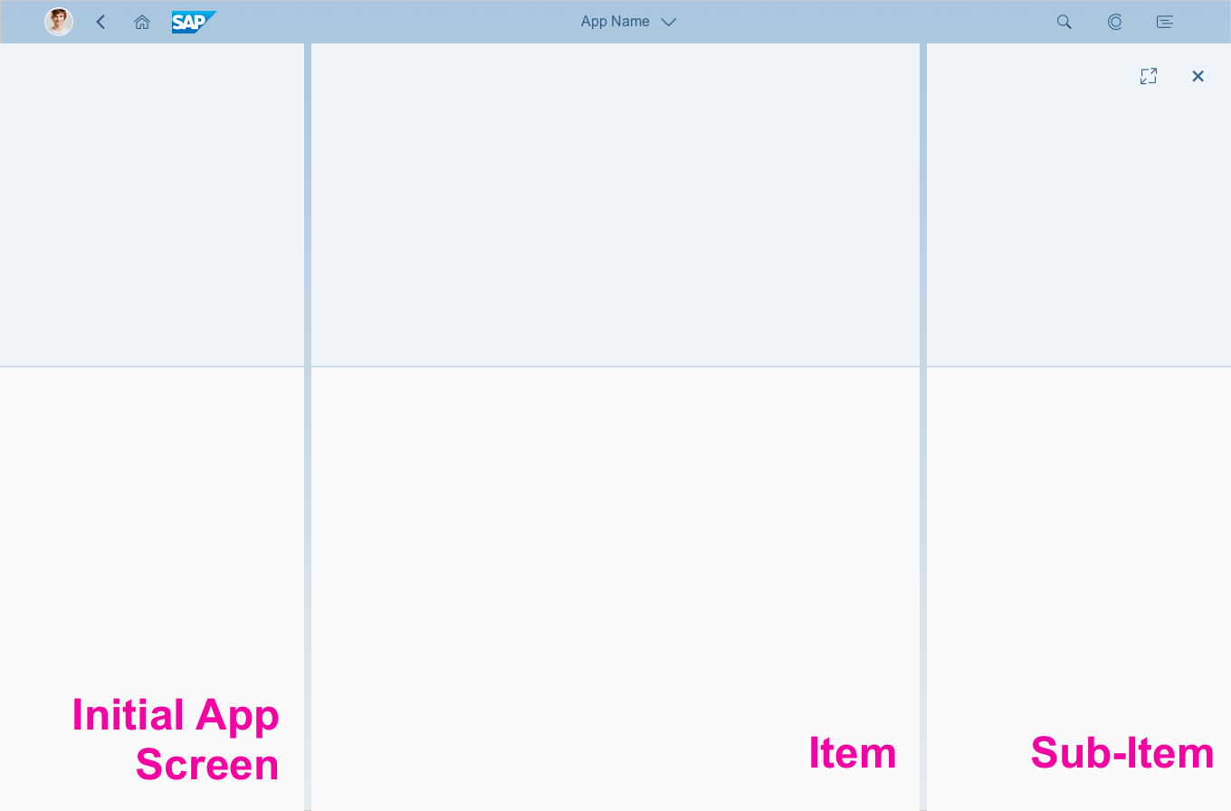
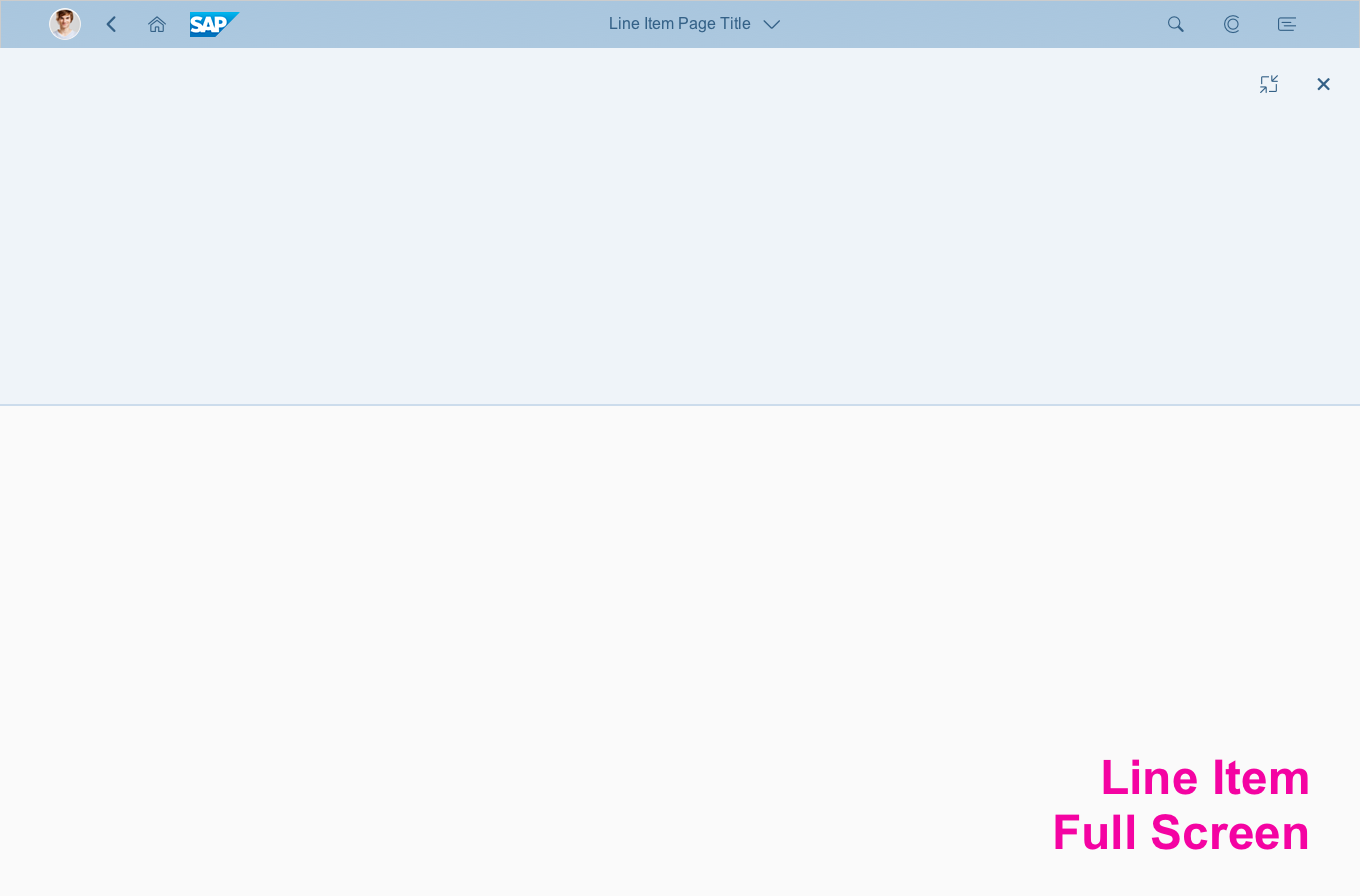
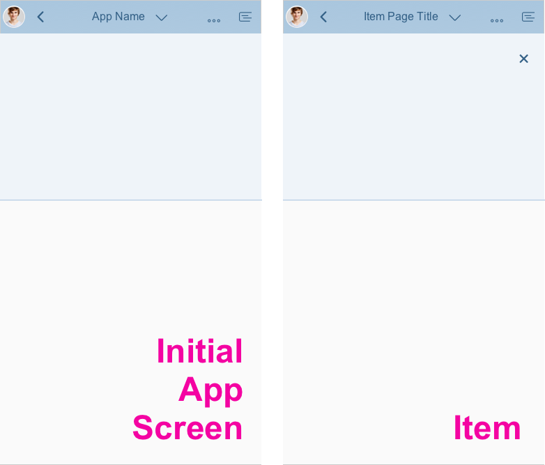
Examples for the page title and the navigation menu for full screen and flexible column layouts:
SAP CoPilot
Clicking or tapping the Open CoPilot button in the shell bar opens SAP CoPilot in a pop-up window. Users can drag the window to the desired position. The system memorizes this position and opens CoPilot in the same spot next time.
To close CoPilot, users can either click the cross icon ( ) on the top right of the dialog, or click Close CoPilot in the shell bar.
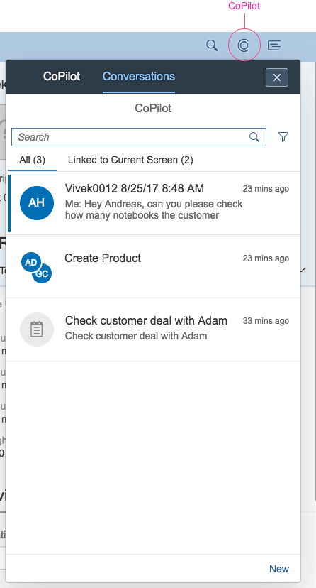
SAP CoPilot and the CoPilot button on the shell bar
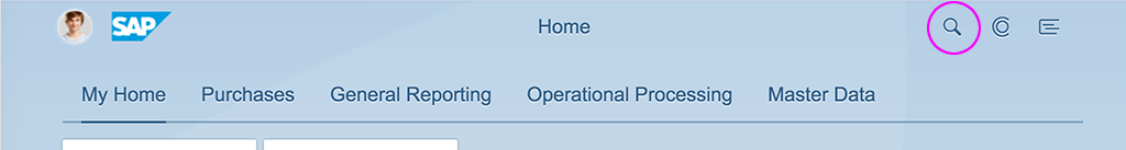
Enterprise Search
The Search icon for the enterprise search is on the top right, to the left of the CoPilot button. You can use it to search across all apps and business objects, such as materials, customers, and maintenance plans. Users can call up the search function from any screen within the SAP Fiori launchpad.
Enterprise search - Inactive view
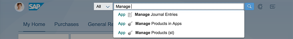
Enterprise search - Active view
Visibility
When the Me Area or Notifications are being displayed, the page title is omitted.
Shell bar - Home Page

Shell bar when Me Area is open

Shell bar when notifications are open
In size S, the branding area is displayed in the Me Area, but not in Notifications.

Shell bar on mobile devices with open Me Area

Shell bar on mobile devices with open notifications
Standalone Mode
If an application supports standalone mode, it can be run directly by specifying the SAPUI5 component of the application in the URL. In this case, administrators don’t need to configure target mapping and a catalog, or assign the catalog to relevant users on an ABAP-based front-end server. Administrators can also configure the header bar of a standalone application to hide some of the UI elements provided by the shell bar, or hide the header bar altogether.
The standalone mode gives users direct access to selected apps that do not require contextual navigation. It is relevant for the following two use cases:
- Launch an SAP Fiori app directly by calling a URL, without showing the SAP Fiori launchpad to the end user
- Launch an app as an iView in the SAP Portal without showing the SAP Fiori launchpad to the end user
As a result, some shell bar components might not be necessary in certain contexts. For more information on the different standalone modes, see SAP Help Portal.
Clicking the Me Area opens a popover with access to available services.
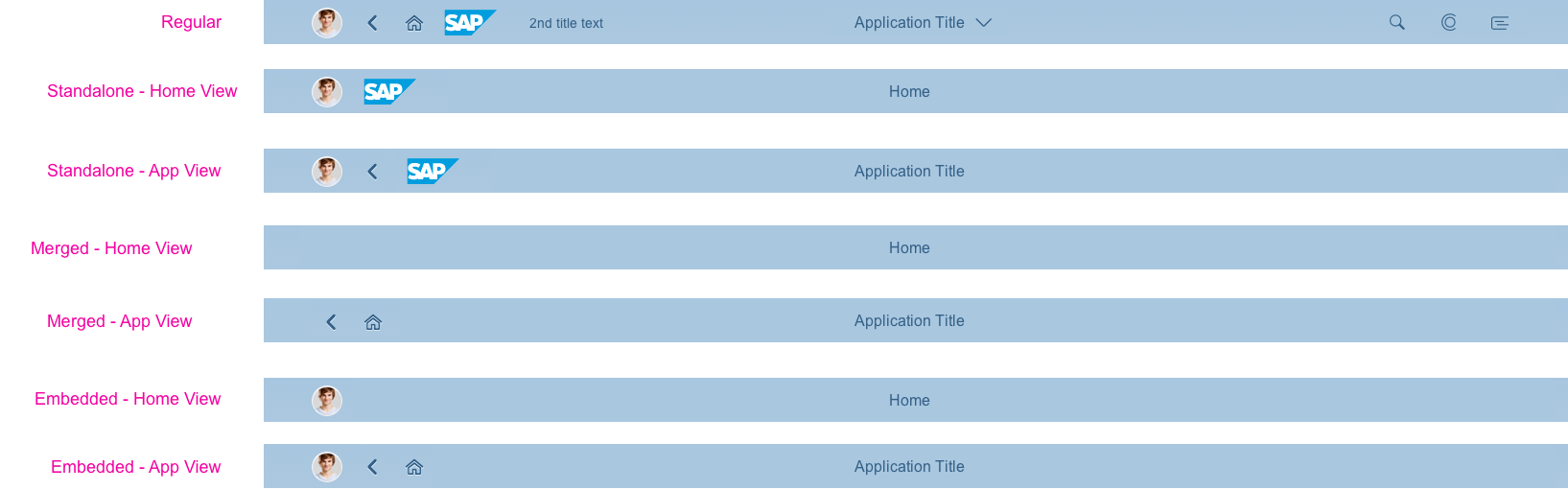
Different standalone modes (from top to bottom: regular, standalone home view, standalone app view, merged home view, merged app view, embedded home view, and embedded app view)
Resources
Want to dive deeper? Follow the links below to find out more about related controls, the SAPUI5 implementation, and the visual design.
 Your feedback has been sent to the SAP Fiori design team.