- Latest SAPUI Version 1.124
- SAPUI5 Version 1.122
- SAPUI5 Version 1.120
- SAPUI5 Version 1.118
- SAPUI5 Version 1.116
- SAPUI5 Version 1.114
- SAPUI5 Version 1.112
- SAPUI5 Version 1.110
- SAPUI5 Version 1.108
- SAPUI5 Version 1.106
- SAPUI5 Version 1.104
- SAPUI5 Version 1.102
- SAPUI5 Version 1.100
- SAPUI5 Version 1.98
- SAPUI5 Version 1.96
- SAPUI5 Version 1.94
- SAPUI5 Version 1.92
- SAPUI5 Version 1.90
- SAPUI5 Version 1.88
- SAPUI5 Version 1.86
- SAPUI5 Version 1.84
- SAPUI5 Version 1.82
- SAPUI5 Version 1.80
- SAPUI5 Version 1.78
- SAPUI5 Version 1.76
- SAPUI5 Version 1.74
- SAPUI5 Version 1.72
- SAPUI5 Version 1.70
- SAPUI5 Version 1.68
- SAPUI5 Version 1.66
- SAPUI5 Version 1.64
- SAPUI5 Version 1.62
- SAPUI5 Version 1.60
- SAPUI5 Version 1.58
- SAPUI5 Version 1.56
- SAPUI5 Version 1.54
- SAPUI5 Version 1.50
- SAPUI5 Version 1.48
- SAPUI5 Version 1.46
- SAPUI5 Version 1.44
- SAPUI5 Version 1.42
- SAPUI5 Version 1.40
- SAPUI5 Version 1.38
- SAPUI5 Version 1.36
- SAPUI5 Version 1.34
- SAPUI5 Version 1.32
- SAPUI5 Version 1.30
- SAPUI5 Version 1.28
- SAPUI5 Version 1.26
- Latest SAPUI Version 1.124
- SAPUI5 Version 1.122
- SAPUI5 Version 1.120
- SAPUI5 Version 1.118
- SAPUI5 Version 1.116
- SAPUI5 Version 1.114
- SAPUI5 Version 1.112
- SAPUI5 Version 1.110
- SAPUI5 Version 1.108
- SAPUI5 Version 1.106
- SAPUI5 Version 1.104
- SAPUI5 Version 1.102
- SAPUI5 Version 1.100
- SAPUI5 Version 1.98
- SAPUI5 Version 1.96
- SAPUI5 Version 1.94
- SAPUI5 Version 1.92
- SAPUI5 Version 1.90
- SAPUI5 Version 1.88
- SAPUI5 Version 1.86
- SAPUI5 Version 1.84
- SAPUI5 Version 1.82
- SAPUI5 Version 1.80
- SAPUI5 Version 1.78
- SAPUI5 Version 1.76
- SAPUI5 Version 1.74
- SAPUI5 Version 1.72
- SAPUI5 Version 1.70
- SAPUI5 Version 1.68
- SAPUI5 Version 1.66
- SAPUI5 Version 1.64
- SAPUI5 Version 1.62
- SAPUI5 Version 1.60
- SAPUI5 Version 1.58
- SAPUI5 Version 1.56
- SAPUI5 Version 1.54
- SAPUI5 Version 1.52
- SAPUI5 Version 1.50
- SAPUI5 Version 1.48
- SAPUI5 Version 1.46
- SAPUI5 Version 1.44
- SAPUI5 Version 1.42
- SAPUI5 Version 1.40
- SAPUI5 Version 1.38
- SAPUI5 Version 1.36
- SAPUI5 Version 1.34
- SAPUI5 Version 1.32
- SAPUI5 Version 1.30
- SAPUI5 Version 1.28
- SAPUI5 Version 1.26
Action Placement
Intro
Actions allow users to change views, manipulate data or objects, navigate to another page, perform generic actions, and so on. Actions are mostly placed in toolbars and follow guidelines that are specific to the UI elements in which they are used.
Layout
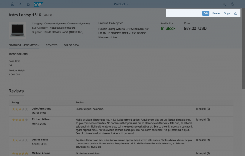
Global actions are actions that affect the whole page. They should be placed in the header toolbar or, if they are finalizing actions, in the footer toolbar. Unless they are empty, both the header toolbar and the footer toolbar are always visible and maintain their position when the user scrolls.
Local actions are actions that affect only a part of the page, or specific controls only, such as tables, charts, or elements. These actions should be placed as close as possible to the content they affect. Generally, this would be the control’s toolbar.
Usage
Different guidelines apply for global and local actions.
Global Actions
Global actions are actions that affect the whole page.
Header Toolbar
Use the header toolbar for the following global actions:
- Global Edit, which switches the whole page to edit mode
- Delete, which deletes the object currently being displayed
- Actions that navigate to a different page or app
- Actions that control the page settings
- Generic actions, such as Share and Favorite
Footer Toolbar
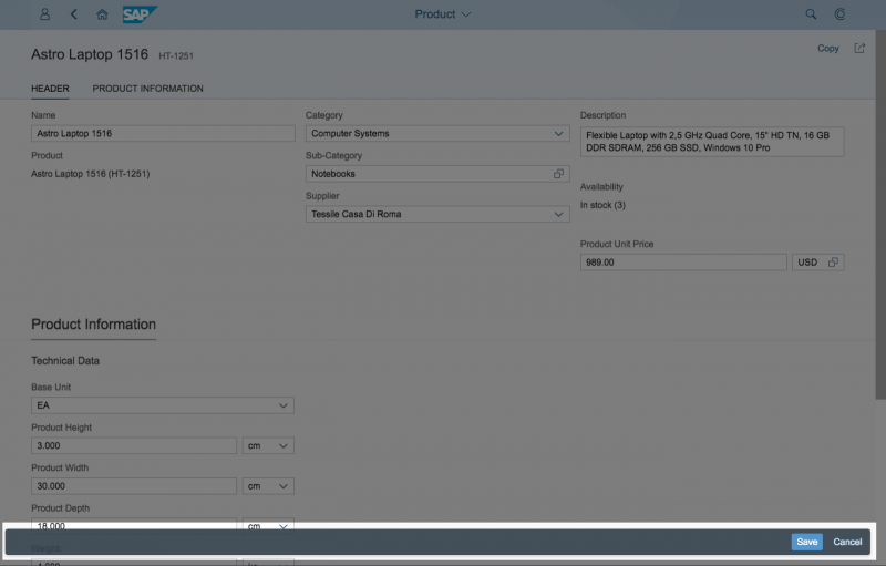
Use the footer toolbar for closing or finalizing actions such as:
- Submit
- Save and Cancel
- Approve and Reject actions for an object
Tip: For more information, see footer toolbar.
Examples of actions in footer toolbars
Local Actions
Always place local actions in a table row, on the toolbar, or on the chart toolbar, depending on the use case.
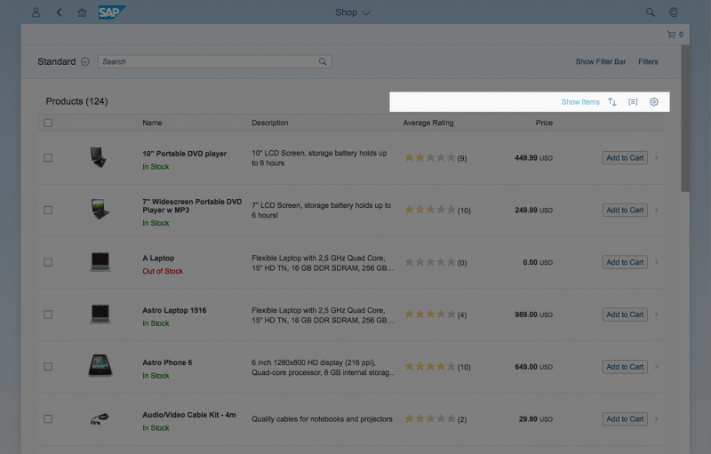
Table Toolbar
Use the table toolbar for the following local actions:
- Adding a new line item to a table.
- Editing or deleting selected items in a table.
- Switching the table to edit mode.
- Controlling the table settings, such as filter, views, or analysis.
For more information, see table toolbar.
If a user selects multiple items in a table, the actions that are not valid for this selection should be disabled.
Example of actions in table toolbars
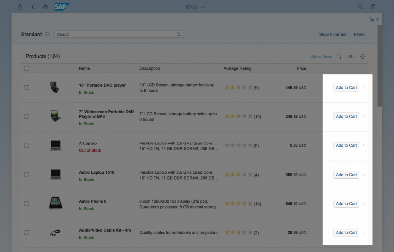
Table Row
If an action affects only a single line or single field of a table, place the action in the table row. When placing actions in a table row, apply the following general rules:
- Only place an action in the table row if there is a substantial use case.
- Offer only one action per row (the most important).
- Place actions that affect an entire table row into the last column of the table.
- Place actions that affect an individual field as close to that field as possible.
Use the table row for the following local actions:
- Navigating to a detailed view of a line item
- Deleting items (in edit mode)
- Editing a row directly (input fields on edit mode)
- Enabling a toggle between two states (switch control)
- Switching between multiple states (select control)
For more information about actions in table rows, see responsive table.
Examples of actions in a table row
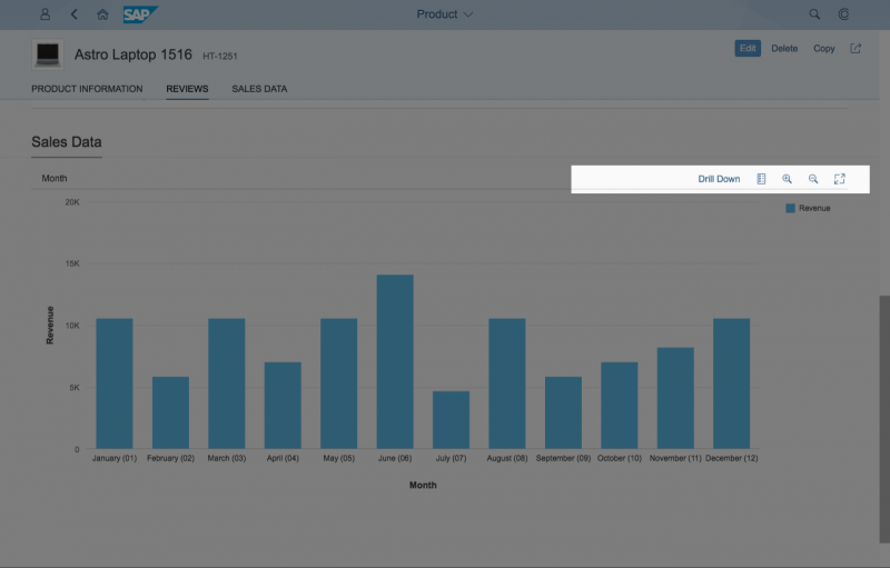
Chart Toolbar
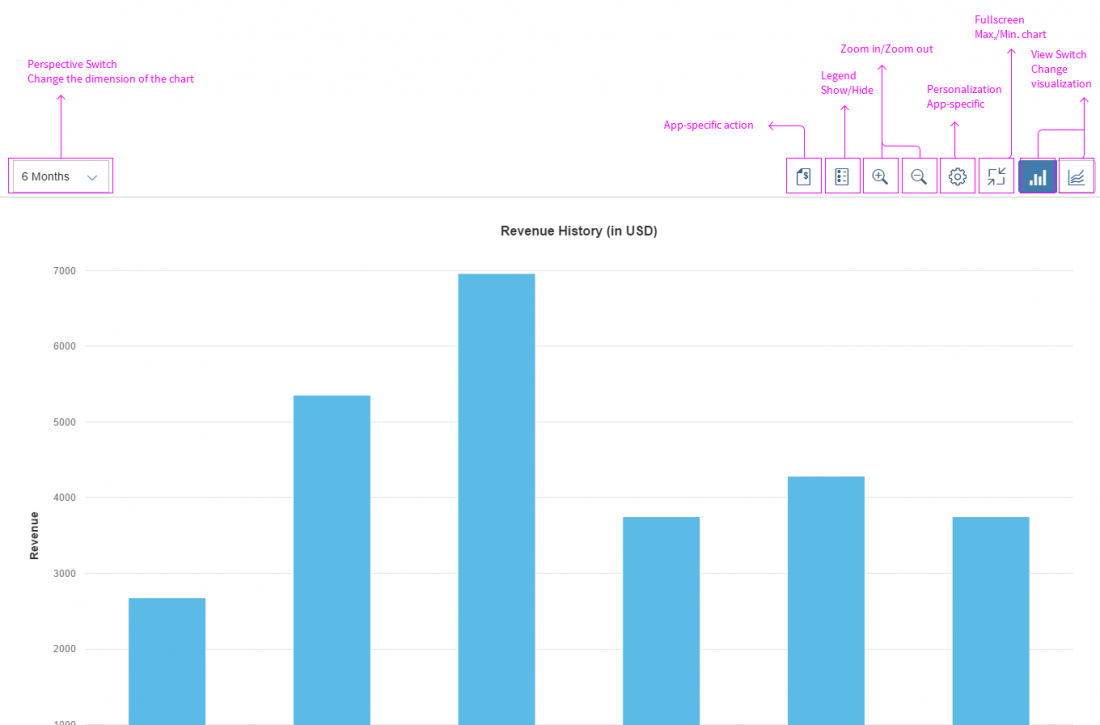
Place the following local actions in the chart toolbar:
- Perspective switch for charts
- View switch to change between chart and table view, or between different chart types
- Standard actions such as legend toggle, the personalization menu, and full screen mode
- App-specific actions
For more information, see chart toolbar.
Guidelines
General
- Actions should be placed as close as possible to the content they affect.
- Enable finalizing actions that validate something, such as Save or Accept.
- Hide finalizing actions in edit or partial edit mode.
- Hide actions for which the user has no authorization
- Hide actions if the mode changes so that the action is not valid anymore for the displayed objects.
Enable
- Actions that the user can currently use.
- Actions that the user cannot currently use, but which can be enabled by the user. Use the enabled action to display a message on click, which informs the user where and how to enable the action.
- Finalizing actions such as Accept, Reject, or Save.
Examples
Enable table toolbar actions such as Personalize, Sort, Filter, Full Screen, and so on. If the use case doesn’t require them, don’t offer these actions at all.
Enable page actions such as Email or Print. If the use case doesn’t require them, don’t offer the actions at all.
Enable Delete on a table toolbar, even if the selection contains some items which may not be deleted by the user. In this case, inform the user with a pop-up message before the operation starts or, depending on the use case, after it is completed. For example, “X of Y items cannot be deleted due to…”.
Enable actions even if they can only be performed on another page, or subsection of the same page. Include a pop-up message that clarifies where and how to fully enable the action. This supports cases in which the enabling option cannot be placed close enough to the action.
Disable
Disable actions that the user cannot currently not use, but which are easy and clear for the user to enable. For example, disable table toolbar actions which cannot be currently used, but which can be used once items are selected.
Hide
Actions, which the user cannot use at all or which are not available for the user in the current mode.
Examples:
Hide actions for which the user does not have authorization due to:
- Role/ group assignment
- Action hidden by key user
- Action hidden by runtime authoring
Hide finalizing actions in edit and partial edit modes. Finalizing actions include Accept, Reject, Save, Cancel, and Share.
Hide Delete on a table toolbar if the table cannot contain deletable items at all, for example, due to an app-specific filter settings. However, you should disable Delete on a table toolbar if the table generally contains items which can be deleted, but which are only currently not deletable due to a user filter setting, for example.
Hide actions which are not available in the current state. For example:
- Hide Delete on a page in undeletable state such as Send.
- Hide Delete as line-item action from an undeletable line item.
Do not show/hide actions dynamically at runtime in a current mode.
Display as “Not Actionable”
Text links that give the user an option to navigate to more detailed information such as factsheets, object pages, related apps or websites, should be hidden or displayed as “not actionable” (meaning as plain text) if that user role has no rights to visit this detailed information. For line items, hide the navigation indicator (chevron).
Examples:
- Hide the text link Factsheet if the user has no right to visit the factsheet, as the link description Factsheet itself does not hold relevant information for the user.
- If the user doesn’t have the rights to visit the object page of a sales order, show the sales order number as a non-actionable text.
Resources
Want to dive deeper? Follow the links below to find out more about related controls, the SAPUI5 implementation, and the visual design.
Elements and Controls
- Toolbar Overview (guidelines)
- Chart Toolbar (guidelines)
- Footer Toolbar (guidelines)
- Table Toolbar (guidelines)
- Responsive Table (guidelines)
Implementation
- No links





 Your feedback has been sent to the SAP Fiori design team.