
- Latest SAPUI Version 1.124
- SAPUI5 Version 1.122
- SAPUI5 Version 1.120
- SAPUI5 Version 1.118
- SAPUI5 Version 1.116
- SAPUI5 Version 1.114
- SAPUI5 Version 1.112
- SAPUI5 Version 1.110
- SAPUI5 Version 1.108
- SAPUI5 Version 1.106
- SAPUI5 Version 1.104
- SAPUI5 Version 1.102
- SAPUI5 Version 1.100
- SAPUI5 Version 1.98
- SAPUI5 Version 1.96
- SAPUI5 Version 1.94
- SAPUI5 Version 1.92
- SAPUI5 Version 1.90
- SAPUI5 Version 1.88
- SAPUI5 Version 1.86
- SAPUI5 Version 1.84
- SAPUI5 Version 1.82
- SAPUI5 Version 1.80
- SAPUI5 Version 1.78
- SAPUI5 Version 1.76
- SAPUI5 Version 1.74
- SAPUI5 Version 1.72
- SAPUI5 Version 1.70
- SAPUI5 Version 1.68
- SAPUI5 Version 1.66
- SAPUI5 Version 1.62
- SAPUI5 Version 1.60
- SAPUI5 Version 1.58
- SAPUI5 Version 1.56
- SAPUI5 Version 1.54
- SAPUI5 Version 1.52
- SAPUI5 Version 1.50
- SAPUI5 Version 1.48
- SAPUI5 Version 1.46
- SAPUI5 Version 1.44
- SAPUI5 Version 1.42
- SAPUI5 Version 1.40
- SAPUI5 Version 1.38
- SAPUI5 Version 1.36
- SAPUI5 Version 1.34
- SAPUI5 Version 1.32
- SAPUI5 Version 1.30
- SAPUI5 Version 1.28
- SAPUI5 Version 1.26
- Latest SAPUI Version 1.124
- SAPUI5 Version 1.122
- SAPUI5 Version 1.120
- SAPUI5 Version 1.118
- SAPUI5 Version 1.116
- SAPUI5 Version 1.114
- SAPUI5 Version 1.112
- SAPUI5 Version 1.110
- SAPUI5 Version 1.108
- SAPUI5 Version 1.106
- SAPUI5 Version 1.104
- SAPUI5 Version 1.102
- SAPUI5 Version 1.100
- SAPUI5 Version 1.98
- SAPUI5 Version 1.96
- SAPUI5 Version 1.94
- SAPUI5 Version 1.92
- SAPUI5 Version 1.90
- SAPUI5 Version 1.88
- SAPUI5 Version 1.86
- SAPUI5 Version 1.84
- SAPUI5 Version 1.82
- SAPUI5 Version 1.80
- SAPUI5 Version 1.78
- SAPUI5 Version 1.76
- SAPUI5 Version 1.74
- SAPUI5 Version 1.72
- SAPUI5 Version 1.70
- SAPUI5 Version 1.68
- SAPUI5 Version 1.66
- SAPUI5 Version 1.64
- SAPUI5 Version 1.62
- SAPUI5 Version 1.60
- SAPUI5 Version 1.58
- SAPUI5 Version 1.56
- SAPUI5 Version 1.54
- SAPUI5 Version 1.52
- SAPUI5 Version 1.50
- SAPUI5 Version 1.48
- SAPUI5 Version 1.46
- SAPUI5 Version 1.44
- SAPUI5 Version 1.42
- SAPUI5 Version 1.40
- SAPUI5 Version 1.38
- SAPUI5 Version 1.36
- SAPUI5 Version 1.34
- SAPUI5 Version 1.32
- SAPUI5 Version 1.30
- SAPUI5 Version 1.28
- SAPUI5 Version 1.26
How To Use Semantic Colors
Intro
Semantic colors visualize a meaning or value state. SAP Fiori has four semantic colors that are associated with the following predefined value states:
This article provides guidance on when to use which semantic color.
For more information about the color values for the Belize theme, check out the Colors article.
Bad / error value state
Warning / critical value state
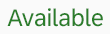
Good / positive value state
Neutral value state
Information value state
Usage
Use semantic colors if:
- You want to highlight an important status.
- You want to validate fields using form field validation.
- Your app needs message handling.
- You want to use the value states for a control.
Do not use semantic colors if:
- The color has no meaning and is only used for decoration.
When To Use Which Semantic Color
Only use a semantic color if you need to convey the meaning defined for that color. This section looks at each semantic color in turn, and indicates when to use each one.
Bad / Error
This color is used for errors, or to indicate a bad or negative status or consequence.
Use bad/error semantic color if:
- Something bad has happened, or is about to happen. The issue requires the user’s attention. Until the issue is resolved, the user can’t carry on working.
- You want to indicate that a value has caused an error.
- The user needs to be prevented from finalizing the current mode or page.
- The user input failed a validation, and the problem must be fixed before the user can continue.
- A message contains information about an error.
Do not use the bad/error semantic color if:
- A status or event is fine. Use the good/positive color instead.
- The user input was validated successfully. Use the neutral color instead.
- The user input was validated and only minor problems occurred. The user can still finalize the current mode or page. Use the warning/critical color instead.
- You are using form field validation, and the surrounding page (or part of it) is in display mode.
Examples
An object has been damaged. The negative object status is used.

Negative object status
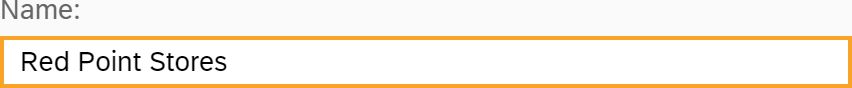
An error was identified while validating the entry for a checkbox. The checkbox has an error value state.

Error value state for a checkbox
An error occurred while saving a draft. An error message box is used.
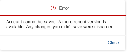
Error message
Warning / Critical
This color indicates a critical situation or warning.
Use the warning/critical semantic color if:
- You want to highlight a critical status.
- A minor problem has occurred. The user can carry on working, but might run into an error later on.
- The current mode or page can be finalized, but doing so might lead to an error later on.
- The user input was validated and a minor problem occurred. The user can continue without fixing the problem, but might run into an error later on.
- A message contains information about a warning.
Do not use the warning/critical semantic color if:
- The user input was validated successfully. Use the neutral color instead.
- The user input was validated and a major problem occurred. The user must fix the problem before finalizing the current mode or page. Use the bad/error color instead.
- You are using form field validation, and the surrounding page (or part of it) is in display mode.
Examples
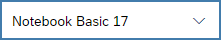
The stock level for a product is low. The critical object status is used.

Critical object status
The user’s input could lead to an error later on. The input field has a warning value state.
Warning value state for an input field
The user tries to leave a page without saving. A warning message box is used.
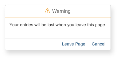
Warning message
Good / Positive
This color stands for a good, positive situation, or for successful completion of a task.
Use the good/positive semantic color if:
- You want to highlight a good or positive status.
- A message contains information about a process that was finalized without any issues. Users will need this information later on (for example, values that need to be copied to another app).
Do not use the good/positive semantic color if:
- A process completed successfully and a short notification is enough. In this case, use a message toast instead.
- You are using form field validation, and the surrounding page (or part of it) is in display mode.
Examples
A product is available. The positive object status is used.
Positive object status
You want to indicate that the user’s input was successful. The input field has a success value state.
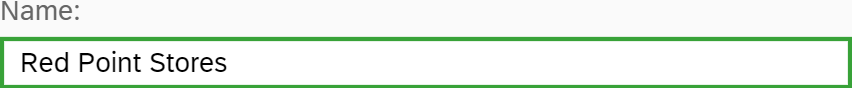
Success value state for an input field
A success message needs to be acknowledged by the user. A success message box is used.
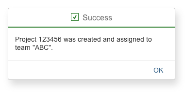
Success message
Neutral
This color is used for a neutral state.
Use the neutral semantic color if:
- You want to indicate a neutral object status.
- There is no reason to use another value state.
- A message contains non-critical, additional information for users.
Do not use the neutral semantic color if:
- The user input was validated and a problem occurred. Depending on the severity, use the warning or error state instead.
- You want to highlight a positive or good thing. Use the good/positive color instead.
- A message contains information about a warning or error.
- You want to highlight a control.
Examples
You want the user to acknowledge a message, but no further action is required. Use the neutral information message box.
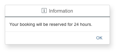
Information message
Information
This color is used for an information state.
Use the information semantic color if:
- You want to draw attention to a control for an important purpose, such as visualizing the recommendations from intelligent systems in input fields.
- You want to highlight newly added items, such as a new table row.
Do not use the information semantic color if:
- The user input was validated and a problem occurred. Depending on the severity, use the warning or error state instead.
- You want to highlight something positive. Use the good/positive color instead.
- You want to highlight an information text. The blue text color is explicitly reserved for links.
Examples
The first row has just been added to the table. This is highlighted using the information color.
Row for a newly added item is highlighted for information
The input field is highlighted to draw attention to a system recommendation.
Input field with information state
Styles
The semantic colors are themeable.
Resources
Want to dive deeper? Follow the links below to find out more about related controls, the SAPUI5 implementation, and the visual design.
Elements and Controls
- Colors (guidelines)
- UI Element States (guidelines)
- Form Field Validation (guidelines)
- Message Handling (guidelines)
- Object Display Components (guidelines)
 Your feedback has been sent to the SAP Fiori design team.