
- Latest SAPUI Version 1.124
- SAPUI5 Version 1.122
- SAPUI5 Version 1.120
- SAPUI5 Version 1.118
- SAPUI5 Version 1.116
- SAPUI5 Version 1.114
- SAPUI5 Version 1.112
- SAPUI5 Version 1.110
- SAPUI5 Version 1.108
- SAPUI5 Version 1.106
- SAPUI5 Version 1.104
- SAPUI5 Version 1.102
- SAPUI5 Version 1.100
- SAPUI5 Version 1.98
- SAPUI5 Version 1.96
- SAPUI5 Version 1.94
- SAPUI5 Version 1.92
- SAPUI5 Version 1.90
- SAPUI5 Version 1.88
- SAPUI5 Version 1.86
- SAPUI5 Version 1.84
- SAPUI5 Version 1.82
- SAPUI5 Version 1.80
- SAPUI5 Version 1.78
- SAPUI5 Version 1.76
- SAPUI5 Version 1.74
- SAPUI5 Version 1.72
- SAPUI5 Version 1.70
- SAPUI5 Version 1.68
- SAPUI5 Version 1.66
- SAPUI5 Version 1.62
- SAPUI5 Version 1.60
- SAPUI5 Version 1.58
- SAPUI5 Version 1.56
- SAPUI5 Version 1.54
- SAPUI5 Version 1.52
- SAPUI5 Version 1.50
- SAPUI5 Version 1.48
- SAPUI5 Version 1.46
- SAPUI5 Version 1.44
- SAPUI5 Version 1.42
- SAPUI5 Version 1.40
- SAPUI5 Version 1.38
- SAPUI5 Version 1.36
- SAPUI5 Version 1.34
- SAPUI5 Version 1.32
- SAPUI5 Version 1.30
- SAPUI5 Version 1.28
- SAPUI5 Version 1.26
- Latest SAPUI Version 1.124
- SAPUI5 Version 1.122
- SAPUI5 Version 1.120
- SAPUI5 Version 1.118
- SAPUI5 Version 1.116
- SAPUI5 Version 1.114
- SAPUI5 Version 1.112
- SAPUI5 Version 1.110
- SAPUI5 Version 1.108
- SAPUI5 Version 1.106
- SAPUI5 Version 1.104
- SAPUI5 Version 1.102
- SAPUI5 Version 1.100
- SAPUI5 Version 1.98
- SAPUI5 Version 1.96
- SAPUI5 Version 1.94
- SAPUI5 Version 1.92
- SAPUI5 Version 1.90
- SAPUI5 Version 1.88
- SAPUI5 Version 1.86
- SAPUI5 Version 1.84
- SAPUI5 Version 1.82
- SAPUI5 Version 1.80
- SAPUI5 Version 1.78
- SAPUI5 Version 1.76
- SAPUI5 Version 1.74
- SAPUI5 Version 1.72
- SAPUI5 Version 1.70
- SAPUI5 Version 1.68
- SAPUI5 Version 1.66
- SAPUI5 Version 1.64
- SAPUI5 Version 1.62
- SAPUI5 Version 1.60
- SAPUI5 Version 1.58
- SAPUI5 Version 1.56
- SAPUI5 Version 1.54
- SAPUI5 Version 1.52
- SAPUI5 Version 1.50
- SAPUI5 Version 1.48
- SAPUI5 Version 1.46
- SAPUI5 Version 1.44
- SAPUI5 Version 1.42
- SAPUI5 Version 1.40
- SAPUI5 Version 1.38
- SAPUI5 Version 1.36
- SAPUI5 Version 1.34
- SAPUI5 Version 1.32
- SAPUI5 Version 1.30
- SAPUI5 Version 1.28
- SAPUI5 Version 1.26
Info Bar
sap.ui.commons.Toolbar | sap.m.sample.ToolbarActive.Toolbar | sap.m.SelectDialog
Intro
The info bar is a type of toolbar that appears above a list or panel, and shows filter or selection settings:
- Filter criteria: The info bar indicates the filter criteria that have been applied for a filter or contextual filter. Do not show the info bar if no filter is applied.
- Selected items: In a multi-select dialog, the info bar shows the number of selected items.
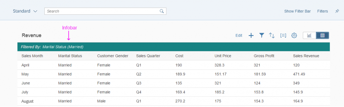
The info bar is placed above the content and shows the applied filters
Responsiveness
The bar has the same height, text size, and icon size in both cozy and compact formats. The text inside the bar will be truncated if there’s not enough space.
Text is truncated on a small screen. The example shows an info bar for a contextual filter.
Types
There are three situations in which an info bar is shown:
- After a general filter has been applied.
- After a contextual filter has been applied.
- After the user has selected multiple items in a select dialog.
General Filter
All applied filters are shown as labels in the info bar.

Info bar after a filter has been applied
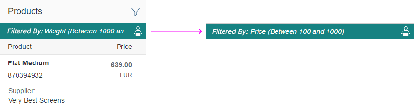
Contextual Filter
The contextual filter allows the user to see a prefiltered view of a list. The title on the left side and an icon on the right side display the filter criteria. The Filter icon should represent the filter category. Do not use a generic filter icon, otherwise it may be confused with the user-triggered filters. For more information, see contextual filter.

Info bar after a contextual filter has been applied
Multiselection
If the user selects multiple items, the info bar shows the number of selected items. For more information, see select dialog.

Info bar after multiselection has been applied
Components
The info bar is a toolbar that consists of a label on the left side and an icon on the right side.
The label shows the filter criteria, and the icon selected depends on the use case.
General Filter and Multiselection
No icon is shown. The only exception is the Cancel icon, which is used to reset the current filter criteria.
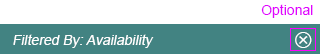
Info bar with optional Cancel icon
Contextual Filter
The icon is mandatory and represents the current filter criterion.
There is one exception in which it is useful to be able to cancel the contextual filter. In this special case, the contextual filter is used to prefilter the listed items in a select dialog. For this case, use the Cancel icon instead of the Filter icon. For more information, see contextual filter.
In all other use cases, show an icon that represents the filter criterion.
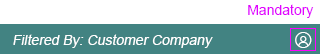
Contextual filter with filter icon
Behavior and Interaction
The bar can have two active areas: either the entire bar can be active, or if an icon is added, it creates a second active area. We recommend that you use the active behavior for the bar and the icon.
Bar Area
When the user clicks or taps the bar, the filter dialog from the view settings dialog is shown. If only one filter is applied, the filter can be changed directly in the detailed filter selection. If more than one filter is applied, the filter dialog shows a list with general filter categories.

Clicking the info bar with a single filter shows the detailed filter selection.
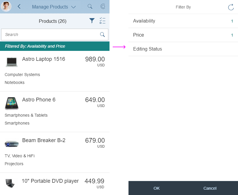
Clicking the info bar with multiple filters shows the filter categories.
Icon Area
- Cancel: The user clicks or taps the icon to delete the current filter settings. We recommend that you use the cancel icon.
- Filter (only contextual filter): Clicking the icon has the same effect as clicking the bar. The filter dialog is shown.
Properties
The contextual filter is not a separate control. If you want to build an info bar, you need to use the sap.m.toolbar control. To achieve the info bar design, set the design toolbar property to “info”.
Resources
Want to dive deeper? Follow the links below to find out more about related controls, the SAPUI5 implementation, and the visual design.
Elements and Controls
- Select Dialog (guidelines)
- Contextual Filter (guidelines)
- Toolbar (guidelines)
- View Settings Dialog (guidelines)
Implementation
- No links
 Your feedback has been sent to the SAP Fiori design team.