
- Latest SAPUI Version 1.124
- SAPUI5 Version 1.122
- SAPUI5 Version 1.120
- SAPUI5 Version 1.118
- SAPUI5 Version 1.116
- SAPUI5 Version 1.114
- SAPUI5 Version 1.112
- SAPUI5 Version 1.110
- SAPUI5 Version 1.108
- SAPUI5 Version 1.106
- SAPUI5 Version 1.104
- SAPUI5 Version 1.102
- SAPUI5 Version 1.100
- SAPUI5 Version 1.98
- SAPUI5 Version 1.96
- SAPUI5 Version 1.94
- SAPUI5 Version 1.92
- SAPUI5 Version 1.90
- SAPUI5 Version 1.88
- SAPUI5 Version 1.86
- SAPUI5 Version 1.84
- SAPUI5 Version 1.82
- SAPUI5 Version 1.80
- SAPUI5 Version 1.78
- SAPUI5 Version 1.76
- SAPUI5 Version 1.74
- SAPUI5 Version 1.72
- SAPUI5 Version 1.70
- SAPUI5 Version 1.68
- SAPUI5 Version 1.66
- SAPUI5 Version 1.62
- SAPUI5 Version 1.60
- SAPUI5 Version 1.58
- SAPUI5 Version 1.56
- SAPUI5 Version 1.54
- SAPUI5 Version 1.52
- SAPUI5 Version 1.50
- SAPUI5 Version 1.48
- SAPUI5 Version 1.46
- SAPUI5 Version 1.44
- SAPUI5 Version 1.42
- SAPUI5 Version 1.40
- SAPUI5 Version 1.38
- SAPUI5 Version 1.36
- SAPUI5 Version 1.34
- SAPUI5 Version 1.32
- SAPUI5 Version 1.30
- SAPUI5 Version 1.28
- SAPUI5 Version 1.26
- Latest SAPUI Version 1.124
- SAPUI5 Version 1.122
- SAPUI5 Version 1.120
- SAPUI5 Version 1.118
- SAPUI5 Version 1.116
- SAPUI5 Version 1.114
- SAPUI5 Version 1.112
- SAPUI5 Version 1.110
- SAPUI5 Version 1.108
- SAPUI5 Version 1.106
- SAPUI5 Version 1.104
- SAPUI5 Version 1.102
- SAPUI5 Version 1.100
- SAPUI5 Version 1.98
- SAPUI5 Version 1.96
- SAPUI5 Version 1.94
- SAPUI5 Version 1.92
- SAPUI5 Version 1.90
- SAPUI5 Version 1.88
- SAPUI5 Version 1.86
- SAPUI5 Version 1.84
- SAPUI5 Version 1.82
- SAPUI5 Version 1.80
- SAPUI5 Version 1.78
- SAPUI5 Version 1.76
- SAPUI5 Version 1.74
- SAPUI5 Version 1.72
- SAPUI5 Version 1.70
- SAPUI5 Version 1.68
- SAPUI5 Version 1.66
- SAPUI5 Version 1.64
- SAPUI5 Version 1.62
- SAPUI5 Version 1.60
- SAPUI5 Version 1.58
- SAPUI5 Version 1.56
- SAPUI5 Version 1.54
- SAPUI5 Version 1.52
- SAPUI5 Version 1.50
- SAPUI5 Version 1.48
- SAPUI5 Version 1.46
- SAPUI5 Version 1.44
- SAPUI5 Version 1.42
- SAPUI5 Version 1.40
- SAPUI5 Version 1.38
- SAPUI5 Version 1.36
- SAPUI5 Version 1.34
- SAPUI5 Version 1.32
- SAPUI5 Version 1.30
- SAPUI5 Version 1.28
- SAPUI5 Version 1.26
Analytical Card
Intro
The analytical card is used for data visualization. It consists of two areas – a header area (either a standard header or a KPI header) and a chart area with a visual representation of the data. The analytical card is a single object card and does not contain a footer area. It can only be used in the overview page (OVP).
Responsiveness
The analytical card has a uniform horizontal width of either 20 or 25 rem, depending on the screen size. The height is flexible.
The VizFrame charts within the cards are fully responsive.
Header Area
You can use two header types for the analytical card, depending on the use case:
Standard Header
- Title (mandatory): The title provides the most important information. We recommend using a single-line text, but you can also wrap the title to two lines.
- Subtitle (optional): The subtitle can wrap to two lines, and gets truncated at the end of the second line. If the subtitle contains multiple qualifiers, separate them with comma. Do not repeat the chart title.

Standard header
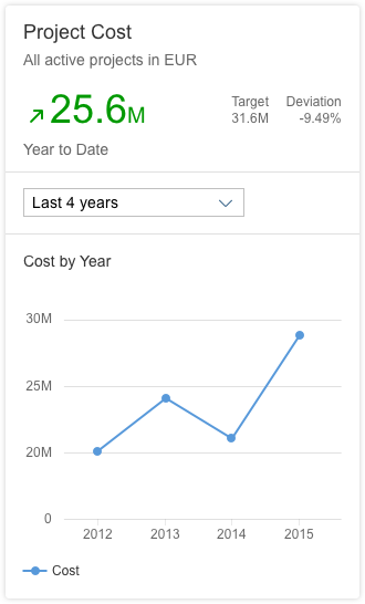
KPI Header
- Title (mandatory): The title provides the most important information. We recommend using a single-line text, but you can also wrap the title to two lines.
- Subtitle (mandatory): The subtitle can wrap to two lines, and gets truncated at the end of the second line. The unit of measure is shown at the end of the subtitle. We therefore recommend keeping the subtitle short and within one line. If the subtitle contains multiple qualifiers, separate them with comma. Do not repeat the chart title.
- KPI area, containing the following elements:
- Trend arrow (optional)
- KPI value (mandatory): The KPI value uses semantic colors.
- Percentage symbol (optional)
- Value selection information (optional): Manually-entered text to provide a better description of the key value (for example, Number of Products). Use this element if the sorting information and the filters do not provide enough information to properly describe the value. This text truncates after one line.
- Sorting information (mandatory): Describes the KPI/value.
- Filters (optional): Can be modified to show meaningful texts.
- Target and deviation (both mandatory). Can be relative or absolute values.
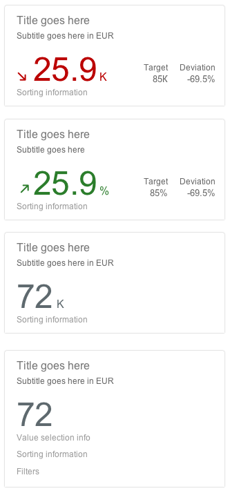
KPI header
Types
8 chart types are currently supported by the analytical card:
- Avoid showing more than four lines on the same card.
- When showing more than one line in the chart, do not use different units. All the lines should use the same unit, such as “EUR”.
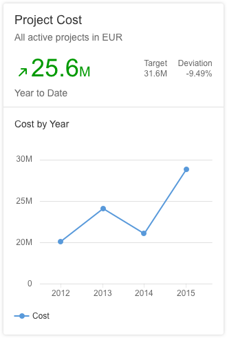
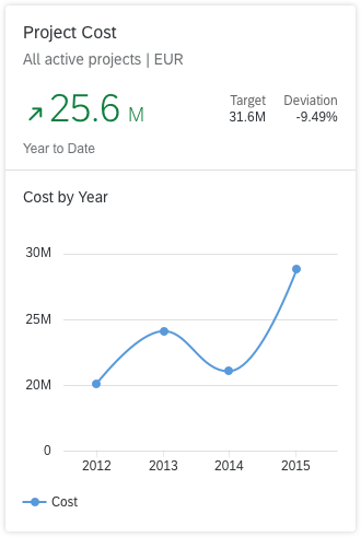
- You can use a line chart with both a time axis and another color dimension.
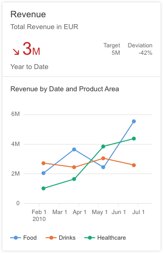
Line chart with time axis + color dimension
Use the line chart if…
- You want to emphasize the evolution of a trend over a period of time.
- You want to visualize data that has an intrinsic order, such as age, ranges, or ratings (but excluding time).
Do not use the line chart if…
- You want to emphasize the values themselves. Use a column chart instead.
- The data does not have an intrinsic order.
Note: For time series, we recommend using the time axis.
Analytical card with line chart and view switch
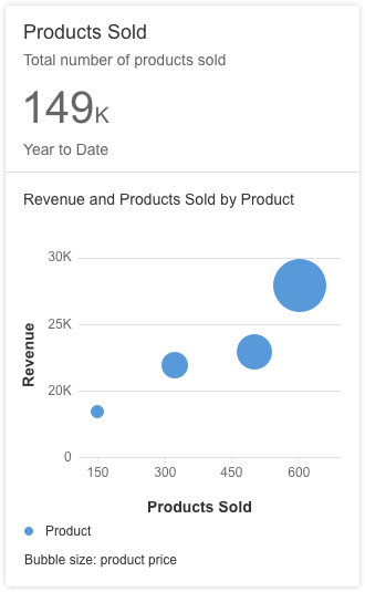
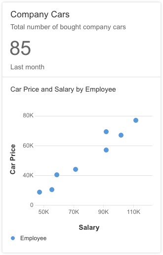
A bubble chart displays the correlation between three sets of numerical values. One set is represented by the horizontal axis, another set is represented by the vertical axis, and the third set is encoded in the size of the bubbles.
We recommend showing only one or two series. Because series are represented by specific bubble colors, having too many series/colors can make the chart hard to read.
The sizes of the bubbles are determined by the values in the third data series. The measure that is represented by the bubble size is defined below the chart.
Bubble charts are often used to facilitate the understanding of social, economic, medical, and scientific relationships.
Color
- If the goal is to isolate outliers within a cloud of other bubbles, use the same color for all bubbles.
- If the goal is to group bubbles that have the same characteristic, use one color per group. Warning: Too many colors can make the chart hard to read.
- If the goal is to compare bubbles individually, use one color per bubble. Only use this option if there are very few bubbles.
Use the bubble chart if…
- You need a rough approximation of the values encoded in the bubble size.
- You want to represent data with three dimensions on a 2D chart.
- You want to compare and show the relationships between labeled/categorized circles using positioning and proportions.
- You want to display the correlation between three sets of numerical values.
Do not use the bubble chart if…
- You need to represent information with only two dimensions.
Note: For time series, we recommend using the time axis.
Analytical card with bubble chart
Column charts are used to compare multiple values over time, or values that have an intrinsic order (such as age).
Columns are clustered side-by-side along the horizontal axis and are color-coded by series.
- We recommend using no more than two series and a maximum of four category items.
- If you want to show the trend over time for two series, you can use the line chart with two lines instead of two series of columns.
Use the column chart if…
- Category items represent a time series. The natural orientation for time is from left to right.
- Category items have an intrinsic order (such as age, range, or ranking).
- You want to emphasize the values themselves, rather than the trend.
Do not use the column chart if…
- Your data is not related to a time category or to a category with an intrinsic order.
- You want to emphasize the trend. In this case, use the line chart instead.
Note: For time series, we recommend using the time axis.
For more detailed information, see column chart.
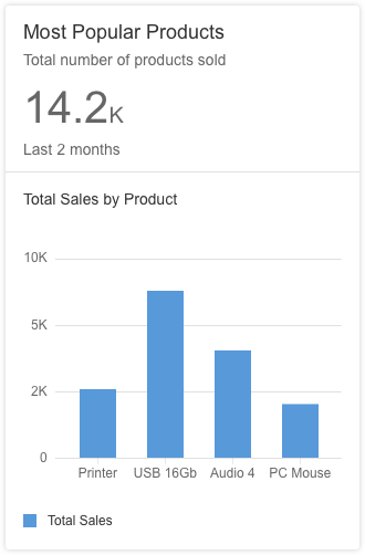
Analytical card with column chart
This type of visualization depicts items stacked on top of one other in columns, with the item categories differentiated by colored bars or strips.
This chart works only for time series and categories with an intrinsic order.
Use the stacked column chart if…
- You want to display the variation of a sum of measures over a period of time.
- The sum of the values is as important as the individual items.
Do not use the stacked column chart if…
- Accuracy or comparisons are of primary importance. In this case, a line graph might be the better option.
Note: For time series, we recommend using the time axis.
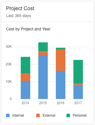
Analytical card with stacked column chart
Vertical Bullet Chart
The bullet chart is used to compare a primary value to a secondary value over time, or for a category that has an intrinsic order (such as age, range, or ranking).
The bullet chart supports primary values, secondary/comparison values, and additional values. For more information, see bullet chart.
Use the bullet chart if…
- You want to compare a primary value to a secondary value using a reference point (for example, if you want to compare actual and planned costs per quarter).
- The category items represent a time series. The natural orientation for time is from left to right.
- The category items have an intrinsic order.
Do not use the bullet chart if…
- Your data does not have an intrinsic order.
- You have only one series of data.
- There is no data series that can act as a reference point for the other data series.
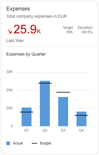
Analytical card with bullet chart
The donut chart represents parts of a whole, where the whole is always 100%. The data is displayed in rings. Each ring represents a distinct data series.
The donut chart can display absolute values (default) or relative values (%). To make the values easier to read, we recommend showing a maximum of 2 decimal places.
- If NumberOfFractionalDigits is not specified in the annotation, the default is to display a single decimal place.
- If NumberOfFractionalDigits is specified in the annotation, the chart shows the values with the defined number of decimal places (0, 1, 2, 3, and so on).
We recommend using a maximum of four sections in the donut chart. If there are more than four sections in the chart, you can use an Other section, which merges several sections into one. The number of sections included in the Other section is mentioned in the legend item.
Use the donut chart if…
-
You want to visualize the part as a percentage of the whole.
-
You have one or more category items that you want to plot.
Do not use the donut chart if…
- You want to plot negative or zero values.
- You have more than four categories or sections.
- You want to compare data over time. You can use the column chart, line chart, stacked column chart, or bullet chart instead.

Analytical card with donut chart
Combined Column and Line Chart
Combined column and line charts are used to compare two sets of values over time, or for a category that has an intrinsic order (such as age, range, or ranking).
You could also use a column chart or a line chart instead, but using a combined column and line chart is the better choice if you want to clearly distinguish between the two sets of values, or if the values represent different measures, such as revenue and profit.
Use the combined column and line chart if…
-
You want to compare values in different categories.
-
You want to give a clear view of which category is higher or lower.
- You want to use more than one measure.
Do not use the combined column and line chart if…
- The combination of the data shown in the line and columns is not logical.
Note: For time series, we recommend using the time axis.
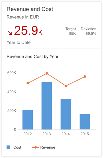
Analytical card with combined column and line chart
A scatter plot chart displays the correlation between two sets of numerical values. The data is displayed as a set of points plotted on a horizontal and vertical axis.
We recommend showing only one or two series. Because bubbles in a series are color-coded, having too many series/bubbles can make the chart hard to read.
While the scatter plot chart can support different shapes, we recommend that you only use bubbles to make the chart easier to read.
If you need to increase or decrease the size of the bubbles, you can adjust the plotArea.markerSize property. The available range is from “4” to “32”. The default value of the bubbles is “10”.
Use the scatter plot chart if…
- You want to show the correlation between two sets of numerical values (for example, the correlation between age and income).
Do not use the scatter plot chart if…
- You want to show the correlation between three sets of numerical values. Use the bubble chart instead.
Analytical card with scatter plot chart
A waterfall chart is a form of data visualization that helps users to understand the cumulative effect of a sequence of positive or negative values.
This type of chart is helpful for a variety of different scenarios. For example, it could be used to visualize financial statements or changes in performance, or to navigate data on population, births and deaths.
We recommend showing only the subtotal and total information (up to 4 columns).The waterfall chart can be used with categorical axis, time axis and semantic colors.
Use the waterfall chart if…
- You want to show intermediate totals along the way before showing the final cumulative total.
- You want to show the net value, by breaking down the cumulative effect of positive and negative contributions.
Do not use the waterfall chart if…
- You want to compare multiple values over time, or for values that have an intrinsic order (such as age). In this case, use the column chart instead.
Note: For time series, we recommend using the time axis. Note that totals and subtotals are not supported when using a time axis.
For more information, see Waterfall Chart.
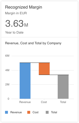
Analytical card with waterfall chart
Behavior and Interaction
The entire header area of the card is clickable. From there, the user can navigate to the specific app or view from which the card content originates. If you need to show detailed information about a specific data point, you can use single selection mode. In this case, it is up to the app developer to provide meaningful navigation. For example, clicking or tapping on a section from the donut chart could lead to an object page that provides more information.
Analytical cards support 3 navigation modes. In all modes, clicking or tapping a blank area on the chart does not trigger any actions.
No navigation
If navigation is not defined in the identification annotation, clicking or tapping the header or the chart does not trigger any actions.
Data point navigation
If data point navigation is enabled, navigation within the chart is available only for data points. This is the default behavior: users can navigate from the header and from the individual data points.
For this header and chart navigation, set the navigation property to “dataPointNav”.
Header navigation
If you only need to offer header navigation without chart navigation, set the navigation property to “headerNav”.
Guidelines
Number of Data Points
There is no technical limitation on the number of data points, but be aware that too many data points can diminish the user experience. For example, if the card is only one column wide, and there is not enough space, the labels for the horizontal axis are displayed at 45°.
Chart Title
The chart title is always visible for each chart type. It describes the axes of the chart, and is constructed using the measures and dimensions of the chart. For example, Revenue by Quarter indicates that the y-axis represents the revenue, and the x-axis represents the quarters. The title is truncated at the end of the line.
Time Axis
You can use the different chart types with either a time axis or a category axis. We recommend using the time axis when the category items represent a time series. The time axis is more responsive and displays information in a more user-friendly manner than the category axis. Currently, the time axis is supported for the line, column, bubble, waterfall and combination charts.
The time axis has three main advantages:
- It allows you to display dates and times in a responsive manner.
- All the complexity involved with formatting the axis labels is taken care of automatically.
- The physical spacing between the data points accurately represents the time scale, as opposed to being equidistant.
The analytical cards on the overview page automatically use the time axis if the following conditions are met:
- The chart type is “Line”, “Bubble”, “Column”, “Waterfall” or “Combination”.
- The chart is configured with only one dimension.
- The data type of the dimension is either “datetime” or “edm.string”. If the data type is “edm.string”, it must contain the additional annotation in the OData metadata annotation (
sap:semantics =“yearmonthday”). - If the chart type is “Bubble”, there must be exactly 2 measures.
- If the chart type is “Combination”, there must be at least 2 measures.
Axis Title
The axis titles are always hidden, except in the bubble and scatter plot charts. Where the axis titles are hidden, use the chart title of the analytical card to describe the chart content. For example, Revenue by Quarter indicates that the y-axis represents the revenue, and the x-axis represents the quarters.
Axis Scaling
There are 3 axis scaling options for line charts, bubble charts, and scatter charts:
- Default: The minimum and maximum are calculated from the dataset. 0 is always visible.
- Adjust scale: The minimum and maximum are calculated from the dataset. 0 is not always visible.
- Min-max: Manually set by the app developer.
Axis Labels
Try to avoid displaying labels at 45°. Use abbreviations for time periods, such as Jan or Feb for months, or Q1 or Q2 for quarters.
Semantic Patterns
The analytical card supports semantic patterns, such as dashes, dots, or hatches, in order to distinguish:
- Actual values: What values are (solid pattern).
- Projected values: What values might be (dashed line, hatched areas).
Currently, semantic patterns are supported for the following chart types: line chart, column chart, and vertical bullet chart.
Semantic Colors Based on Values
Use semantic coloring based on values when you want to show data points that are positive, neutral, or negative. Based on the defined threshold values, the color of each data point could be red, green, or orange. For more information, see colors.
Legend
Colors are assigned automatically and cannot be customized.
View Switch
You can use the view switch to offer the user different views of the data on one card. It can be used for filtering, sorting, or grouping (for example, by supplier or material group). The view switch is optional.
Resources
Want to dive deeper? Follow the links below to find out more about related controls, the SAPUI5 implementation, and the visual design.
 Your feedback has been sent to the SAP Fiori design team.