
- Latest SAPUI5 Version 1.120
- Version 1.118
- SAPUI5 Version 1.116
- SAPUI5 Version 1.114
- SAPUI5 Version 1.112
- SAPUI5 Version 1.110
- SAPUI5 Version 1.108
- SAPUI5 Version 1.106
- SAPUI5 Version 1.104
- SAPUI5 Version 1.102
- SAPUI5 Version 1.100
- SAPUI5 Version 1.98
- SAPUI5 Version 1.96
- SAPUI5 Version 1.94
- SAPUI5 Version 1.92
- SAPUI5 Version 1.90
- SAPUI5 Version 1.88
- SAPUI5 Version 1.86
- SAPUI5 Version 1.84
- SAPUI5 Version 1.82
- SAPUI5 Version 1.80
- SAPUI5 Version 1.78
- SAPUI5 Version 1.76
- SAPUI5 Version 1.74
- SAPUI5 Version 1.72
- SAPUI5 Version 1.70
- SAPUI5 Version 1.68
- SAPUI5 Version 1.66
- SAPUI5 Version 1.62
- SAPUI5 Version 1.60
- SAPUI5 Version 1.58
- SAPUI5 Version 1.56
- SAPUI5 Version 1.54
- SAPUI5 Version 1.52
- SAPUI5 Version 1.50
- SAPUI5 Version 1.48
- SAPUI5 Version 1.46
- SAPUI5 Version 1.44
- SAPUI5 Version 1.42
- SAPUI5 Version 1.40
- SAPUI5 Version 1.38
- SAPUI5 Version 1.36
- SAPUI5 Version 1.34
- SAPUI5 Version 1.32
- SAPUI5 Version 1.30
- SAPUI5 Version 1.28
- SAPUI5 Version 1.26
- Latest SAPUI5 Version 1.120
- Version 1.118
- SAPUI5 Version 1.116
- SAPUI5 Version 1.114
- SAPUI5 Version 1.112
- SAPUI5 Version 1.110
- SAPUI5 Version 1.108
- SAPUI5 Version 1.106
- SAPUI5 Version 1.104
- SAPUI5 Version 1.102
- SAPUI5 Version 1.100
- SAPUI5 Version 1.98
- SAPUI5 Version 1.96
- SAPUI5 Version 1.94
- SAPUI5 Version 1.92
- SAPUI5 Version 1.90
- SAPUI5 Version 1.88
- SAPUI5 Version 1.86
- SAPUI5 Version 1.84
- SAPUI5 Version 1.82
- SAPUI5 Version 1.80
- SAPUI5 Version 1.78
- SAPUI5 Version 1.76
- SAPUI5 Version 1.74
- SAPUI5 Version 1.72
- SAPUI5 Version 1.70
- SAPUI5 Version 1.68
- SAPUI5 Version 1.66
- SAPUI5 Version 1.64
- SAPUI5 Version 1.62
- SAPUI5 Version 1.60
- SAPUI5 Version 1.58
- SAPUI5 Version 1.56
- SAPUI5 Version 1.54
- SAPUI5 Version 1.52
- SAPUI5 Version 1.50
- SAPUI5 Version 1.48
- SAPUI5 Version 1.46
- SAPUI5 Version 1.44
- SAPUI5 Version 1.42
- SAPUI5 Version 1.40
- SAPUI5 Version 1.38
- SAPUI5 Version 1.36
- SAPUI5 Version 1.34
- SAPUI5 Version 1.32
- SAPUI5 Version 1.30
- SAPUI5 Version 1.28
- SAPUI5 Version 1.26
Network Graph
sap.suite.ui.commons.networkgraph.Graph
Intro
The network graph displays a large amount of data by highlighting the relationships between individual records. Records are displayed as nodes, and connectors (lines) show the relationships between them. The vivid display of network nodes can highlight non-trivial data discrepancies that would have been previously overlooked.
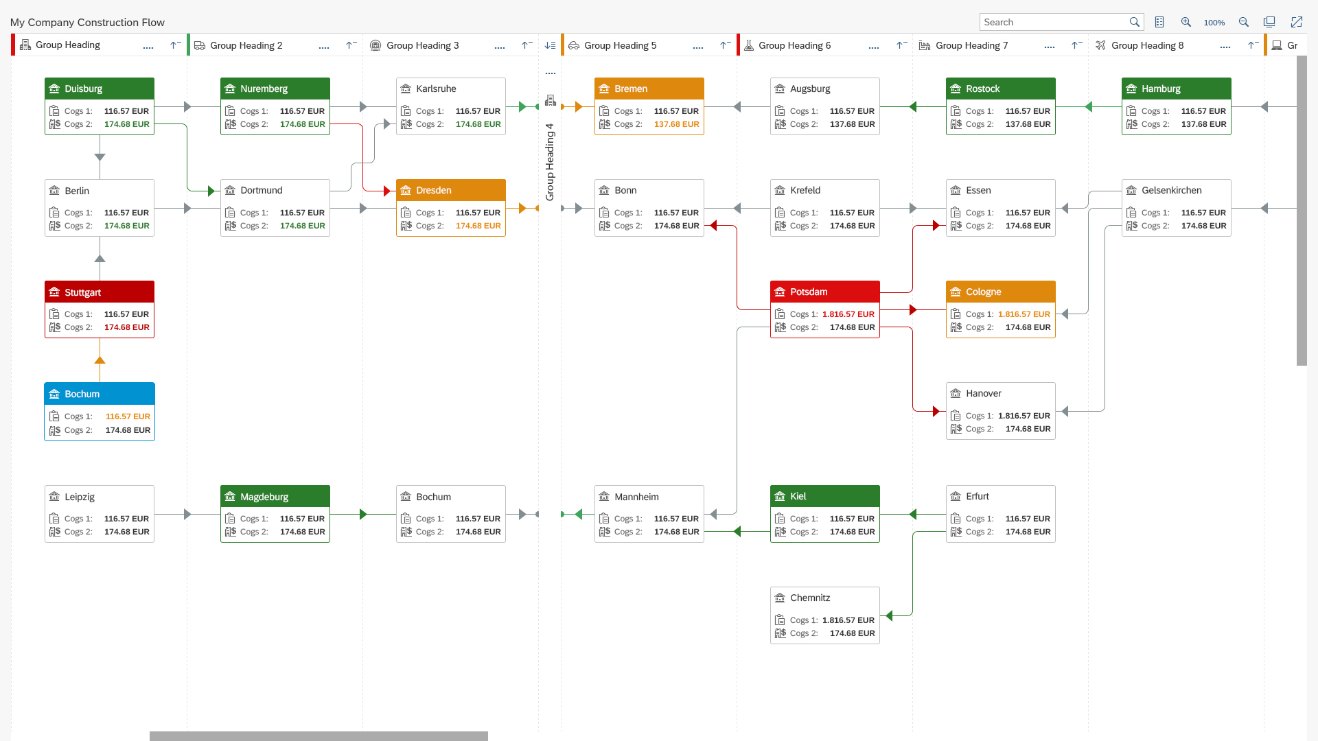
Sample implementation of a network graph
Usage
Use the network graph if:
- You need to display a large amount of data and contextual information. Use cases include material management and supply chains, logistics structures, and value chains.
- You want to display complex nonlinear structures, trees, and generic charts (such as organizational charts).
- You want to give the data a spatial context.
Do not use the network graph if:
- You want to visualize a document flow. Use the Process Flow control instead.
- You want to enable editing of displayed data. Note that the network graph is available in read-only display mode.
- You need to embed the chart into smaller areas or use it as embedded analytics.
Responsiveness
The network graph is not a responsive control. Only the top bar and dialogs are fully responsive. The graph content, including all the groups, nodes and connectors, keeps the same proportions regardless of the screen size. The proportions are changed only with zoom.
Size S
Size M

Size L
Layout
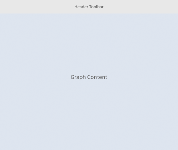
The network graph is split into a header toolbar that contains all the controls, and the chart.
As an extension to this layout, the control can provide a separate column either on the right or left side of the graph. This column contains a chart map to enable users to navigate to a very large structure more easily. The map displays a smaller version of the graph and the corresponding active area. This column can also be extended by other SAP Fiori controls in order to provide users with enhanced application capabilities.
Schematic visualization of a network graph
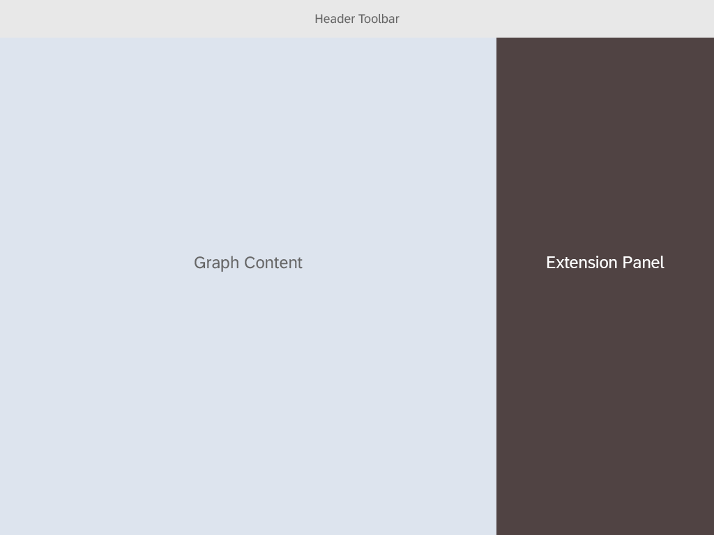
Extension panel on the right

Extension panel on the left
Types
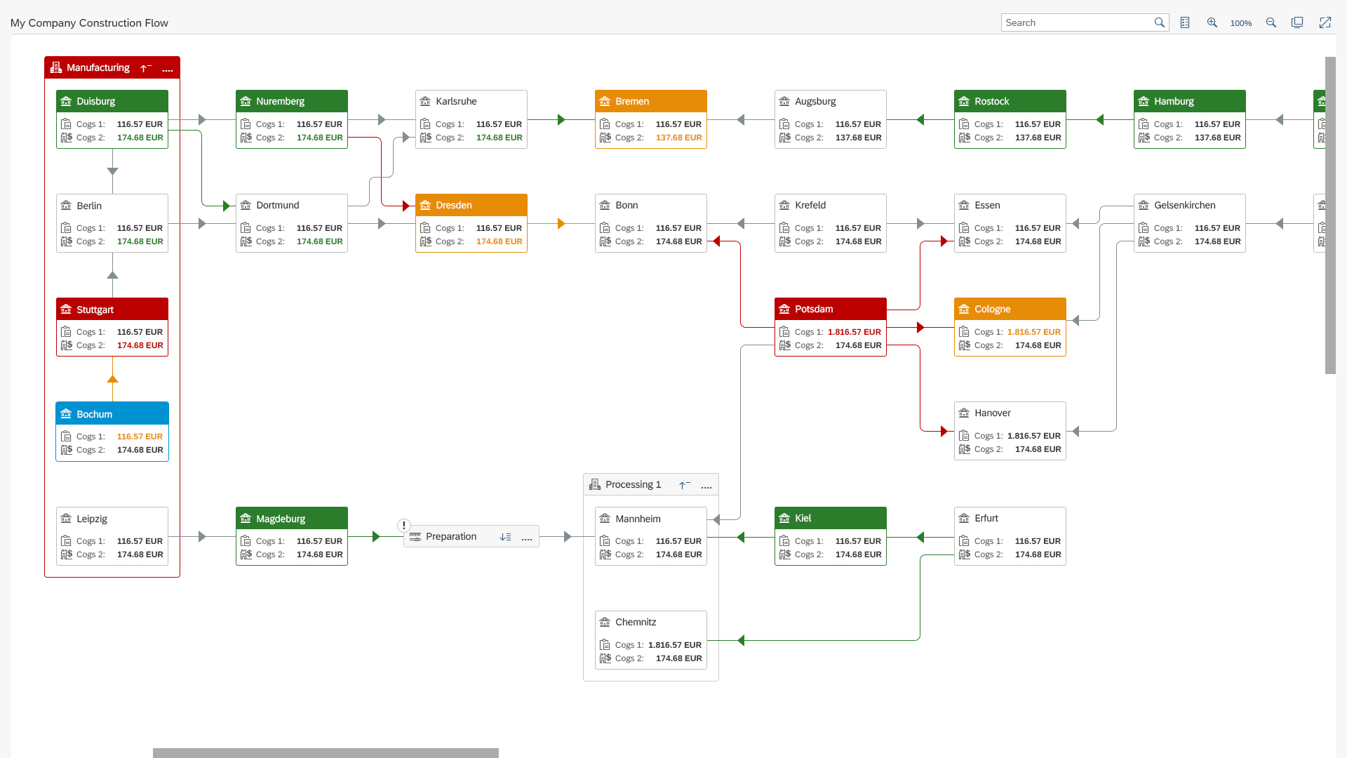
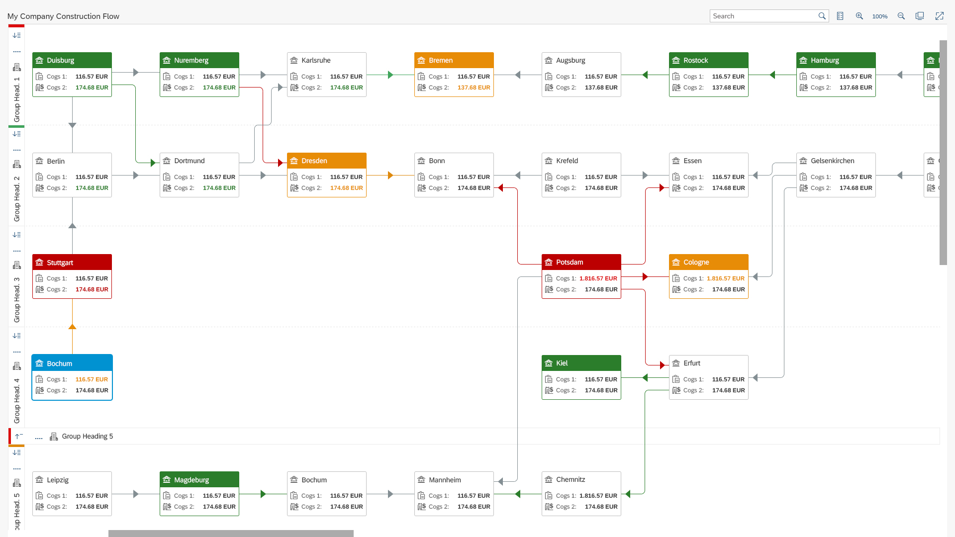
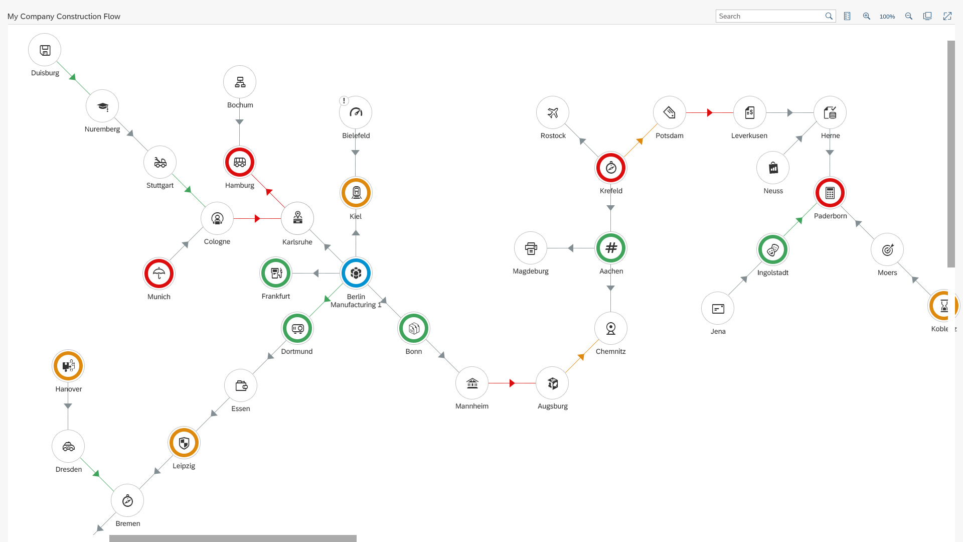
The network graph comes with three different layout algorithms:
- Generic unordered KLay layout
- Column-based layout displayed as either vertical or horizontal swim lanes
- Force layout
Each of the layouts can be visualized as a directed or undirected chart. A bi-directional mode is also supported.
Undirected: Data dependency (parent-child) or data flow is not implemented.
Directed: Data dependency is implemented, and different chart orientation can be set. By default, the network graph is oriented left-to-right. Other chart orientations include top-down, center-out, or right-to-left.
Generic unordered KLay
Column-based layout - Vertical
Column-based layout - Horizontal
Force layout
Components
By default, the network graph is split into the header toolbar area and the graph content. Within the graph content, groups, nodes, and connectors are displayed. All of these elements are interactive and display action menus or popups with additional information.
Header Toolbar
- A – Title: Provides a short, meaningful summary of the chart contents.
- B – Search Field: Standard search component with variant suggestions enabled by default.
- C – Legend: Toggles the legend on/off.
- D – Zoom In: Zoom in with both mouse wheel or by clicking the icon.
- E – Current Zoom Level: Zoom level is expressed as a percentage of the original current chart size.
- F – Zoom Out: Zoom out with both mouse wheel or clicking the icon.
- G – Fit to Viewport: The network graph automatically applies a zoom level to fit the whole chart into your viewport.
- I – Fullscreen: Toggles the full-screen view.
Chart Area
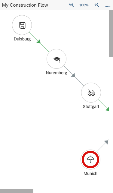
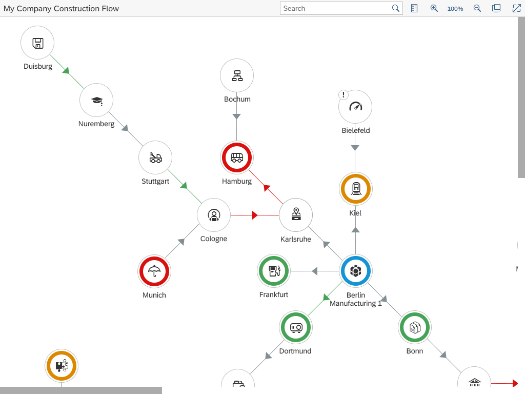
Node
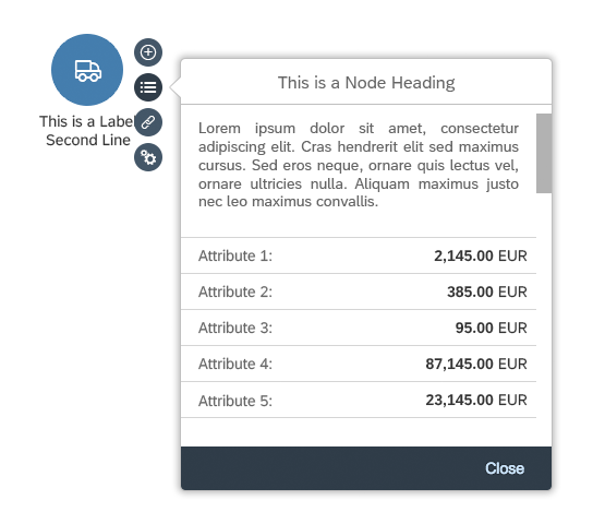
A node represents a single record in the underlying dataset comprising multiple field values. You can use two different shapes to represent a node: a rounded rectangle or a circle.
You click a node to select it. A menu is then displayed, which enables you to expand or collapse the connecting chart structure, display a details dialog, or a links popup.
Connector
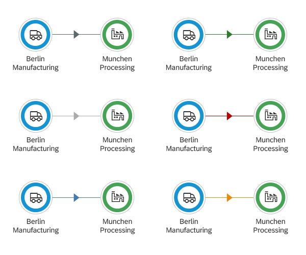
A connector represents the relationship between two records and can be displayed as a straight line or a line with arrows.
You click a connector or the surrounding area to call up the details dialog of that specific connector.
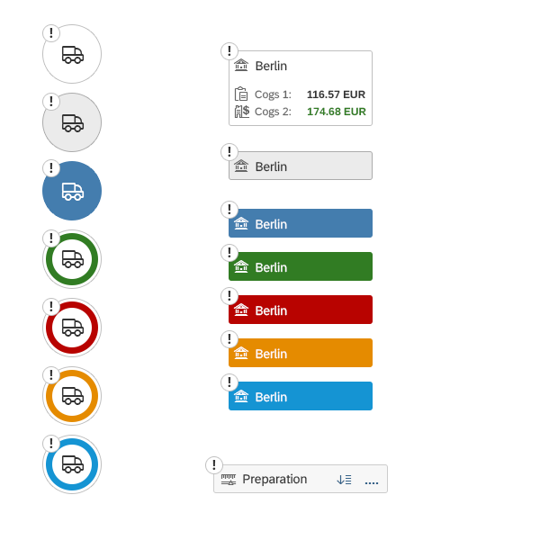
Group
A group is a chart element that represents a collection of nodes. A group is envisioned as a slightly larger box containing 1-n nodes. When a group is collapsed it behaves like a node.
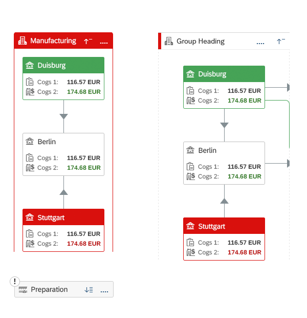
Overview of groups

Network graph toolbar
Overview of nodes
Overview of connectors
Behavior and Interaction
Navigation and Zoom
A user can navigate around the entire network graph by holding down the left mouse button and dragging the mouse. By dragging the graph, the user changes the active area of the available graph map extension. Clicking or dragging the selected area in the graph map extension changes the focus area of the network graph.
To zoom in or out, the user can use the mouse wheel, pinch open or pinch close on the touch devices, or click the respective buttons on the top bar. Each of these actions changes the number label, located between the zoom in and zoom out icon buttons, and indicates the current zoom level.
Fit to Viewport automatically adjusts the zoom level to fit the entire network graph into the user’s viewport.
Component Interaction
Clicking a node displays a menu, which provides the users with the option to collapse the following chart structure, display the details dialog, or display the links popup.
Clicking a connector or the area surrounding it calls up the connector’s details dialog.
For group interactions, clicking the display details icon button nested in the group heading calls up the group’s details dialog (it also contains the list of the nodes included in the group).
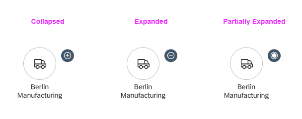
Collapsed Structure Indication
In more complex structures, many structures may be hidden within the graph. To indicate collapsed structures, we use a visual indication to represent collapsed structures following the node and collapsed structures within a group.
Partially Expanded Indication
In a directed graph, Expand/Collapse applies only to the subtree directly connected to the selected node. Each node supports a three-state action button for expanding or collapsing:
- Fully expanded
- Partially expanded
- Collapsed
When a user clicks the action button in a fully expanded state, the affected node’s subtree is collapsed, and the action button of that node is indicated as collapsed. All other nodes sharing parts of the subtree with this node and will then be indicated as partially expanded.
When a user clicks the action button in a partially expanded state, the affected node’s subtree is collapsed, and the action button of that node is indicated as collapsed. All other nodes affected by this action are indicated as partially expanded.
When a user clicks the action button in a collapsed state, the affected node’s subtree is expanded and the action button of that node is indicated as expanded.
Node interaction showing 'More' menu and 'Details' popup
Visual indication of collapsed structure following the node or group
Indication of collapsed, expanded, and partially expanded structures
Styles
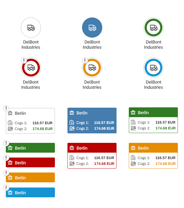
Each node can be visualized with a circle or rounded rectangle shape. These two shapes can be combined inside one graph to provide users with deeper semantic meanings: for example, circular nodes represent customers, whereas rounded rectangles represent suppliers.
Semantic meanings can be assigned to line styles for connectors, and semantic colors can be assigned to both nodes and connectors.
Node Types
As mentioned above, there are two default node shapes: circle or rounded rectangle. In addition, these node shapes have different label and title (icon) positioning.
If needed, the application owner can also define the number of the allowed lines for a node title.
Connector Types
You can give connectors semantic meaning by assigning them semantic colors or different line types. You can also use both semantic colors and different line types to provide connectors with a deeper meaning.
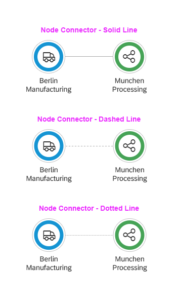
Connector types and their semantics
Guidelines
In applications, embed the network graph only within components that use the whole canvas area, such as the tab container on the object page. Do not embed the network graph in smaller containers, such as panels, headers, tables, forms, and dialogs.
The network graph is not a substitute for a Process Flow. For more details, see the Usage section at the top of this article.
Keep the amount of information inside each node to a minimum. You can reveal more information via the details popover.
Resources
Want to dive deeper? Follow the links below to find out more about related controls, the SAPUI5 implementation, and the visual design.
 Your feedback has been sent to the SAP Fiori design team.