
- SAPUI5 Version 1.122
- SAPUI5 Version 1.120
- SAPUI5 Version 1.118
- SAPUI5 Version 1.116
- SAPUI5 Version 1.114
- SAPUI5 Version 1.112
- SAPUI5 Version 1.110
- SAPUI5 Version 1.108
- SAPUI5 Version 1.106
- SAPUI5 Version 1.104
- SAPUI5 Version 1.102
- SAPUI5 Version 1.100
- SAPUI5 Version 1.98
- SAPUI5 Version 1.96
- SAPUI5 Version 1.94
- SAPUI5 Version 1.92
- SAPUI5 Version 1.90
- SAPUI5 Version 1.88
- SAPUI5 Version 1.86
- SAPUI5 Version 1.84
- SAPUI5 Version 1.82
- SAPUI5 Version 1.80
- SAPUI5 Version 1.78
- SAPUI5 Version 1.76
- SAPUI5 Version 1.74
- SAPUI5 Version 1.72
- SAPUI5 Version 1.70
- SAPUI5 Version 1.68
- SAPUI5 Version 1.66
- SAPUI5 Version 1.64
- SAPUI5 Version 1.62
- SAPUI5 Version 1.60
- SAPUI5 Version 1.58
- SAPUI5 Version 1.56
- SAPUI5 Version 1.54
- SAPUI5 Version 1.52
- SAPUI5 Version 1.50
- SAPUI5 Version 1.48
- SAPUI5 Version 1.46
- SAPUI5 Version 1.44
- SAPUI5 Version 1.42
- SAPUI5 Version 1.40
- SAPUI5 Version 1.38
- SAPUI5 Version 1.36
- SAPUI5 Version 1.34
- SAPUI5 Version 1.32
- SAPUI5 Version 1.30
- SAPUI5 Version 1.28
- SAPUI5 Version 1.26
- Latest SAPUI Version 1.124
- SAPUI5 Version 1.122
- SAPUI5 Version 1.120
- SAPUI5 Version 1.118
- SAPUI5 Version 1.116
- SAPUI5 Version 1.114
- SAPUI5 Version 1.112
- SAPUI5 Version 1.110
- SAPUI5 Version 1.108
- SAPUI5 Version 1.106
- SAPUI5 Version 1.104
- SAPUI5 Version 1.102
- SAPUI5 Version 1.100
- SAPUI5 Version 1.98
- SAPUI5 Version 1.96
- SAPUI5 Version 1.94
- SAPUI5 Version 1.92
- SAPUI5 Version 1.90
- SAPUI5 Version 1.88
- SAPUI5 Version 1.86
- SAPUI5 Version 1.84
- SAPUI5 Version 1.82
- SAPUI5 Version 1.80
- SAPUI5 Version 1.78
- SAPUI5 Version 1.76
- SAPUI5 Version 1.74
- SAPUI5 Version 1.72
- SAPUI5 Version 1.70
- SAPUI5 Version 1.68
- SAPUI5 Version 1.66
- SAPUI5 Version 1.64
- SAPUI5 Version 1.62
- SAPUI5 Version 1.60
- SAPUI5 Version 1.58
- SAPUI5 Version 1.56
- SAPUI5 Version 1.54
- SAPUI5 Version 1.52
- SAPUI5 Version 1.50
- SAPUI5 Version 1.48
- SAPUI5 Version 1.46
- SAPUI5 Version 1.44
- SAPUI5 Version 1.42
- SAPUI5 Version 1.40
- SAPUI5 Version 1.38
- SAPUI5 Version 1.36
- SAPUI5 Version 1.34
- SAPUI5 Version 1.32
- SAPUI5 Version 1.30
- SAPUI5 Version 1.28
- SAPUI5 Version 1.26
Semantic Page Layout
sap.f.SemanticPage
Intro
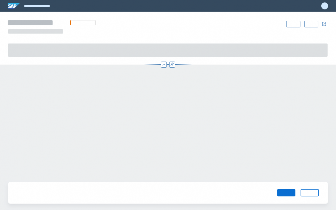
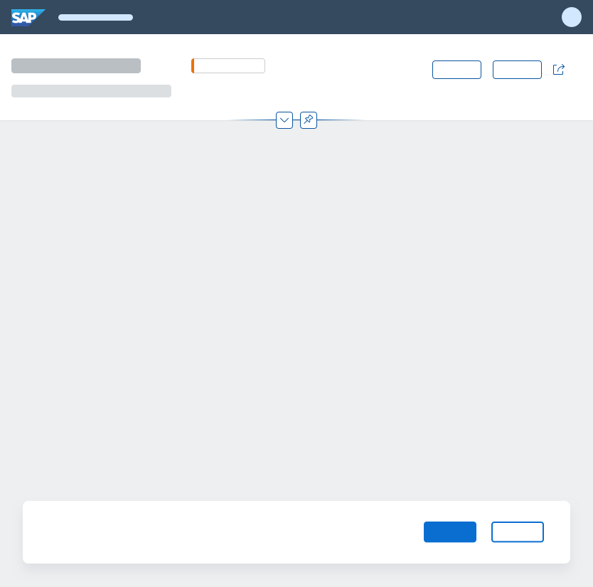
The semantic page is recommended as the basic layout for freestyle applications. It builds on the basic functionality of the dynamic page and adds predefined content elements to the header toolbar (1) and footer toolbar (2), such as a title, global actions, and finalizing actions.
Using the semantic page significantly reduces the development effort for app teams, and ensures that the placement of the header and footer content conforms with the SAP Fiori Design Guidelines.
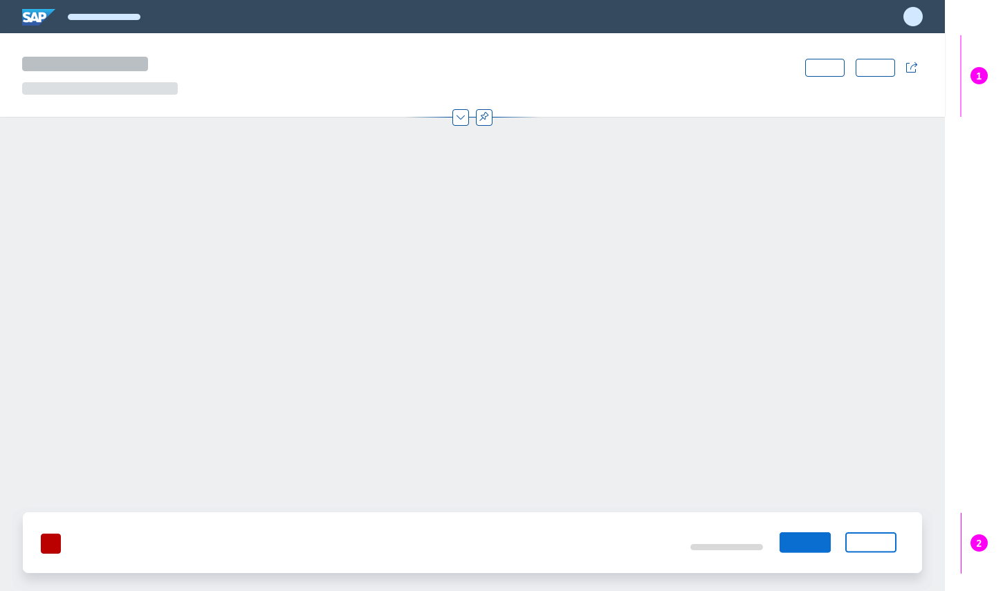
Semantic page
When to Use
Use the semantic page if:
- You are building a freestyle application.
- You want to use a predefined layout to reduce development time.
Do not use the semantic page if:
- You are planning to use SAP Fiori elements, such as the list report, analytical list page, overview page, or object page.
- You want to implement an initial page or object page floorplan.
- You only need to display a small amount of information. In this case, use a dialog. If you must use the dynamic page, use letterboxing to mitigate the issue.
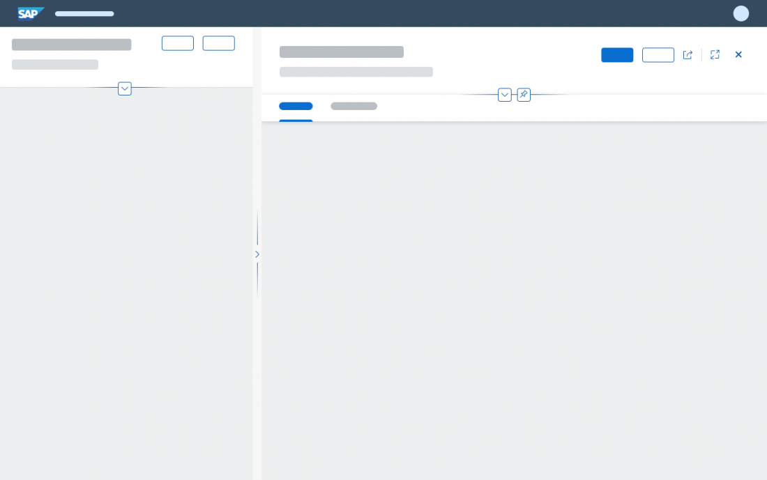
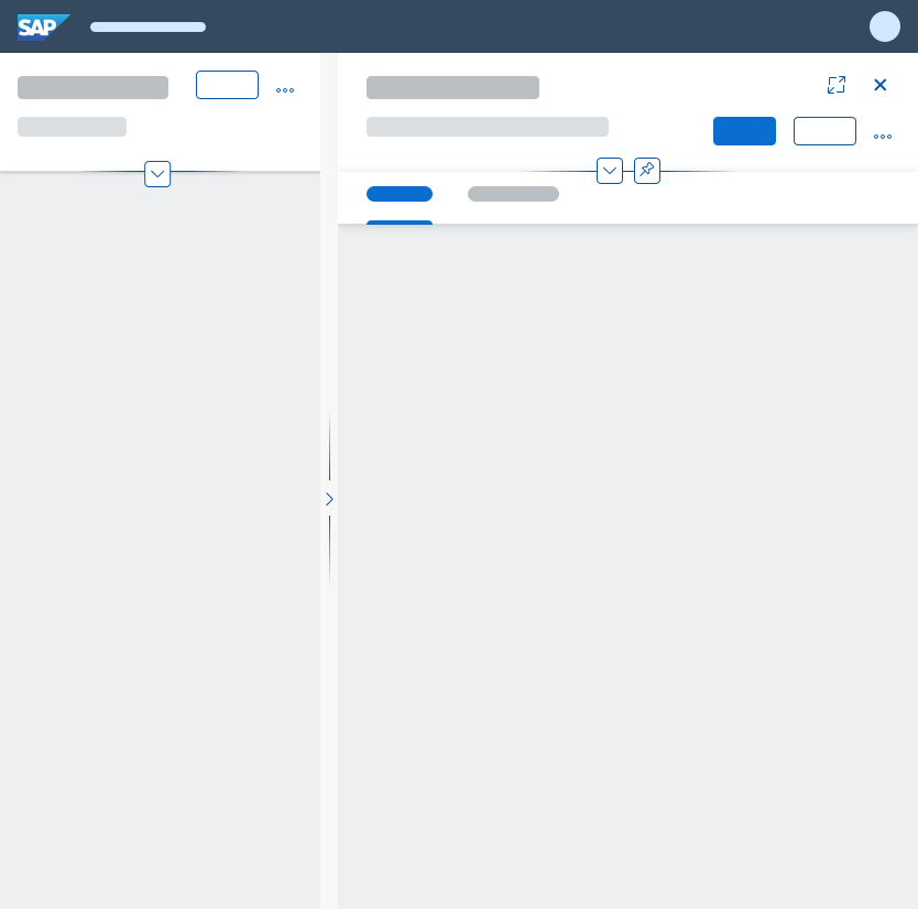
Components
The semantic page is based on the structure of the dynamic page. In short, the semantic page has the following elements:
- Header title
- Header content
- Page content, dependent on the use case
- Footer toolbar with finalizing actions
The control’s semantics determine whether content specified in the control appears in the header toolbar or footer toolbar.
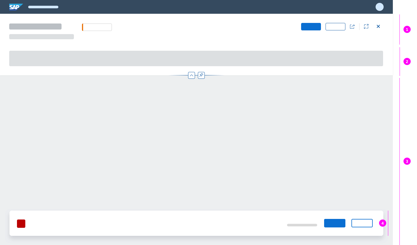
Semantic page structure
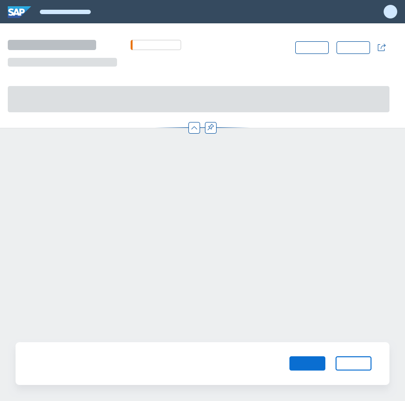
Mandatory Elements
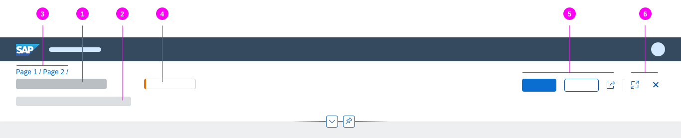
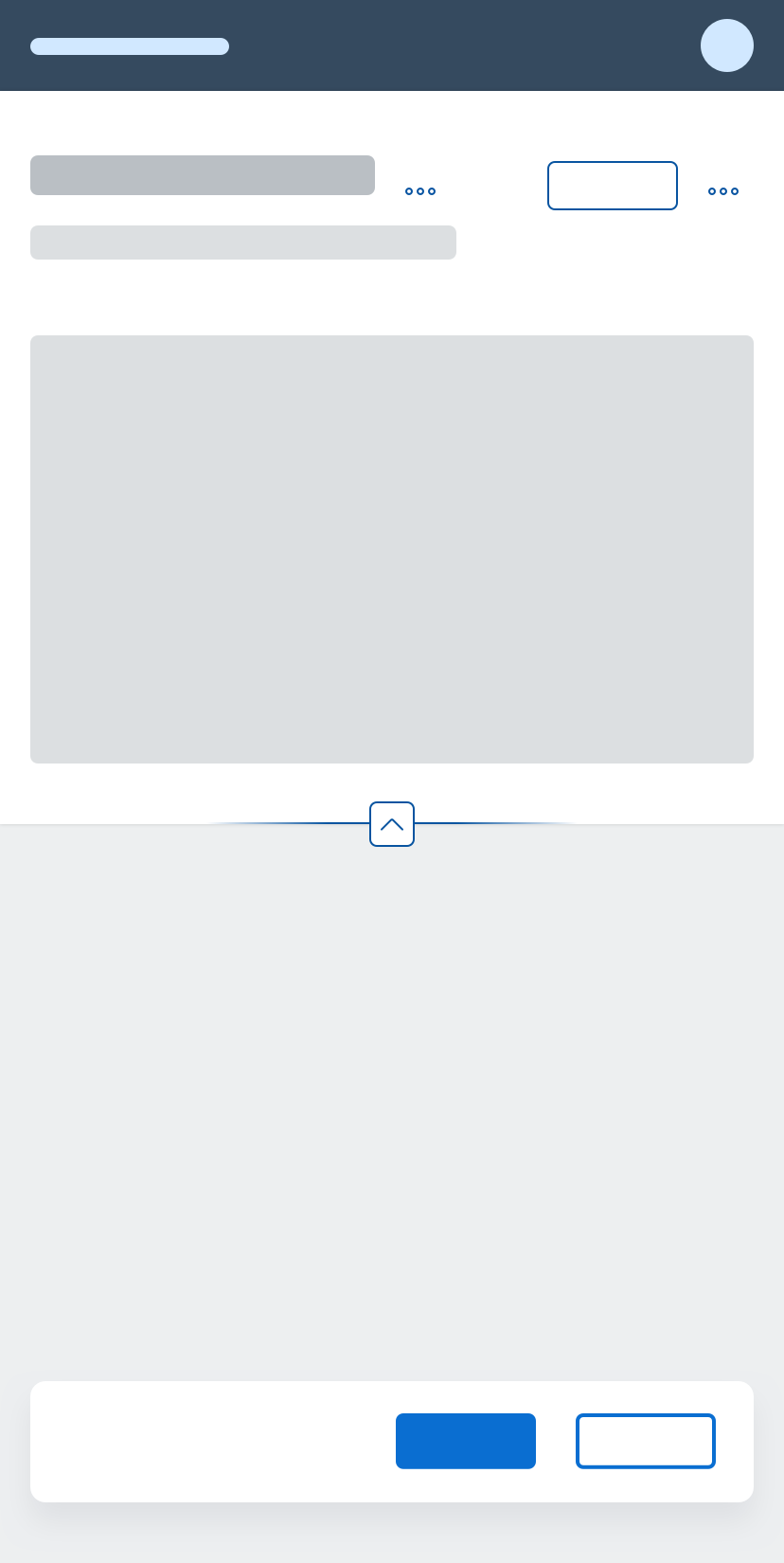
- Title (1): The title is located on the left-hand side of the header title bar and is always visible.
Optional Elements
- Subtitle (2): The subtitle is always below the title and is often used to summarize the most important information.
- Breadcrumb (3): Depending on the use case, you can add a breadcrumb navigation.
- Key information (4): Key information is located in the middle area, and is left aligned. This can be text, mini facets, or KPI tags, for example.
- Global actions toolbar (5): The global actions toolbar for the entire floorplan is located on the right-hand side. Always use buttons for global actions, visualized either as text or icons. For more information, see header toolbar.
Overflow menu: Actions move into the overflow from right to left. Icons are shown in the overflow menu with a corresponding text. - Layout actions (6): These are actions like the Close or Full Screen / Exit Full Screen icons, which are mainly offered by the flexible column layout. Depending on the screen size, layout actions are placed either to the right of the global actions toolbar, separated by a divider line, or above the global actions.
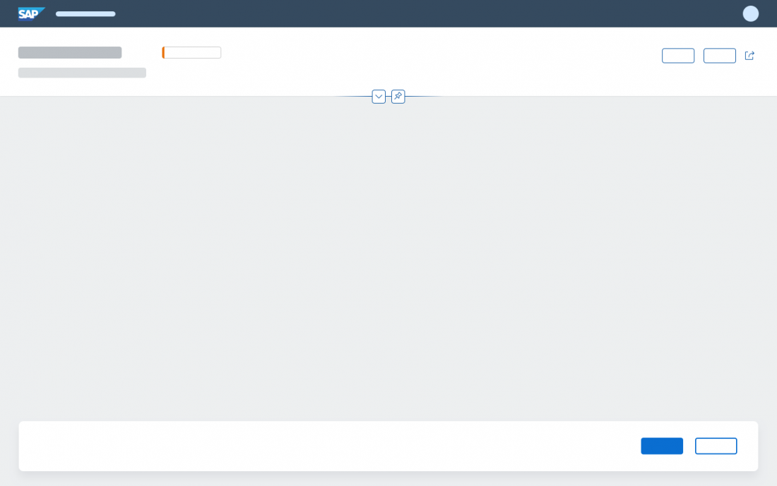
For more information about the expandable and collapsible header and its features, see dynamic page.
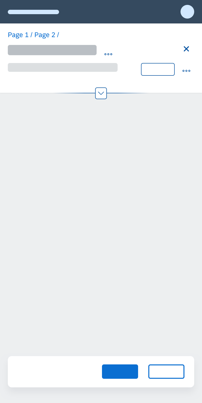
Semantic page - Footer toolbar
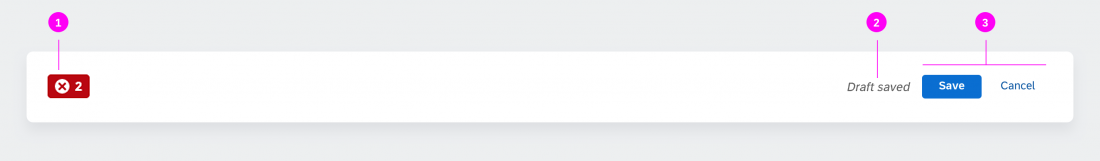
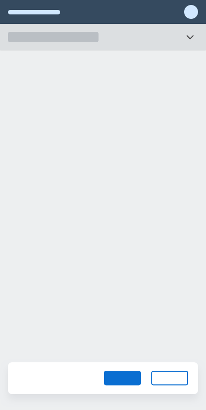
The footer toolbar is optional and contains the following components:
- Message button (containing the message popover) on the left-hand side
- Draft indicator on the right-hand side, just before the finalizing actions
- Finalizing actions on the right-hand side
Behavior and Interaction
The interaction and guidelines for the dynamic page also apply for the semantic page. The actions in the semantic page and their order are predefined and follow the rules of the action placement concept. For more information about toolbars in general, see toolbar overview.
Initial Focus
When the semantic page is loaded, set the initial focus as follows:
- If the page is in display mode, set the focus on the first section.
- If the page is in edit mode, set the focus on the first empty mandatory field.
- If there are no mandatory fields in edit mode, set the focus on the first editable element or first action.
Responsiveness
The semantic page offers considerable freedom and flexibility. It is designed to adapt automatically to small, medium, and large screen sizes. Next to that the responsive behavior depends on the behavior of the content being displayed.
The title (sap.m.Title) and subtitle (sap.m.Text) on the left truncate in collapsed mode to save vertical space and wrap in expanded mode to offer the full text. This behavior needs to come from the respective controls for the title and subtitle. Overall, it is recommend not to show more than 2 lines of text in collapsed mode to avoid a disproportionate header height, especially on mobile devices, when no summary line is used. This can either be a combined title and subtitle or a longer wrapping title. For more information see wrapping and truncating text.
Key information (middle area, left aligned) stays as long as possible before it moves into the overflow.
Global actions also stay as long as possible, but have a predefined width depending on the available space. If no key information is available, the title and global actions automatically get more space. The toolbar follows the standard toolbar overflow guidelines, and adds buttons to the overflow menu from right to left.
The combination of a semantic page within in a flexible column layout and accompanying layout actions works as described for the dynamic page. The same applies for the summary line and letterboxing.
Size L
Size M
Size S

Top Tips
- Use always a header title.
- Use the header title and header content to provide the most relevant information and actions for your use case.
- Do not remove or disable actions within the header title when it is collapsed.
- Make sure that the layout actions in the flexible column layout are displayed correctly and never get hidden in the overflow.
- Start your application in expanded mode if users need further content or adjustment options to get started.
- Offer the pinning feature whenever users may need to fix the header content while scrolling through the page content.
- Activate the summary line on smartphones to help users focus on the actual content of the page.
Related Topics
Elements and Controls
- Dynamic Page (guidelines)
- Flexible Column Layout (guidelines)
- Floorplan Overview (guidelines)
- Header Toolbar (guidelines)
- Footer Toolbar (guidelines)
Implementation
- Semantic Page – Freestyle Sample (SAPUI5 samples)
- Semantic Page using Draft Indicator (SAPUI5 samples)
- Semantic Page (SAPUI5 API reference)
 Your feedback has been sent to the SAP Fiori design team.