
- Latest SAPUI5 Version 1.120
- Version 1.118
- SAPUI5 Version 1.116
- SAPUI5 Version 1.114
- SAPUI5 Version 1.112
- SAPUI5 Version 1.110
- SAPUI5 Version 1.108
- SAPUI5 Version 1.106
- SAPUI5 Version 1.104
- SAPUI5 Version 1.102
- SAPUI5 Version 1.100
- SAPUI5 Version 1.98
- SAPUI5 Version 1.96
- SAPUI5 Version 1.94
- SAPUI5 Version 1.92
- SAPUI5 Version 1.90
- SAPUI5 Version 1.88
- SAPUI5 Version 1.86
- SAPUI5 Version 1.84
- SAPUI5 Version 1.82
- SAPUI5 Version 1.80
- SAPUI5 Version 1.78
- SAPUI5 Version 1.76
- SAPUI5 Version 1.72
- SAPUI5 Version 1.70
- SAPUI5 Version 1.68
- SAPUI5 Version 1.66
- SAPUI5 Version 1.64
- SAPUI5 Version 1.62
- SAPUI5 Version 1.60
- SAPUI5 Version 1.58
- SAPUI5 Version 1.56
- SAPUI5 Version 1.54
- SAPUI5 Version 1.52
- SAPUI5 Version 1.50
- SAPUI5 Version 1.48
- SAPUI5 Version 1.46
- SAPUI5 Version 1.44
- SAPUI5 Version 1.42
- SAPUI5 Version 1.40
- SAPUI5 Version 1.38
- SAPUI5 Version 1.36
- SAPUI5 Version 1.34
- SAPUI5 Version 1.32
- SAPUI5 Version 1.30
- SAPUI5 Version 1.28
- SAPUI5 Version 1.26
- Latest SAPUI5 Version 1.120
- Version 1.118
- SAPUI5 Version 1.116
- SAPUI5 Version 1.114
- SAPUI5 Version 1.112
- SAPUI5 Version 1.110
- SAPUI5 Version 1.108
- SAPUI5 Version 1.106
- SAPUI5 Version 1.104
- SAPUI5 Version 1.102
- SAPUI5 Version 1.100
- SAPUI5 Version 1.98
- SAPUI5 Version 1.96
- SAPUI5 Version 1.94
- SAPUI5 Version 1.92
- SAPUI5 Version 1.90
- SAPUI5 Version 1.88
- SAPUI5 Version 1.86
- SAPUI5 Version 1.84
- SAPUI5 Version 1.82
- SAPUI5 Version 1.80
- SAPUI5 Version 1.78
- SAPUI5 Version 1.76
- SAPUI5 Version 1.74
- SAPUI5 Version 1.72
- SAPUI5 Version 1.70
- SAPUI5 Version 1.68
- SAPUI5 Version 1.66
- SAPUI5 Version 1.64
- SAPUI5 Version 1.62
- SAPUI5 Version 1.60
- SAPUI5 Version 1.58
- SAPUI5 Version 1.56
- SAPUI5 Version 1.54
- SAPUI5 Version 1.52
- SAPUI5 Version 1.50
- SAPUI5 Version 1.48
- SAPUI5 Version 1.46
- SAPUI5 Version 1.44
- SAPUI5 Version 1.42
- SAPUI5 Version 1.40
- SAPUI5 Version 1.38
- SAPUI5 Version 1.36
- SAPUI5 Version 1.34
- SAPUI5 Version 1.32
- SAPUI5 Version 1.30
- SAPUI5 Version 1.28
- SAPUI5 Version 1.26
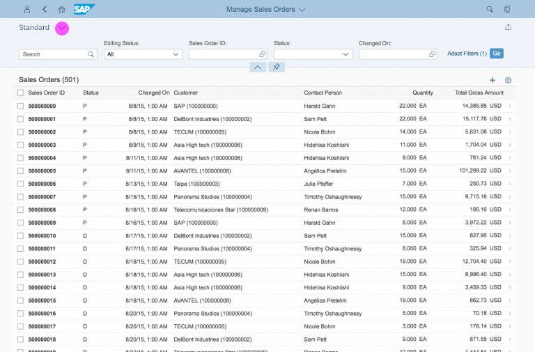
Filter Bar
sap.ui.comp.filterbar.FilterBar
Intro
The filter bar filters item lists and tables according to various filter criteria. You can use it for both simple and complex lists, regardless of their size. To handle complex lists with multiple filters, the filter bar provides predefined, customizable filter sets (variants).
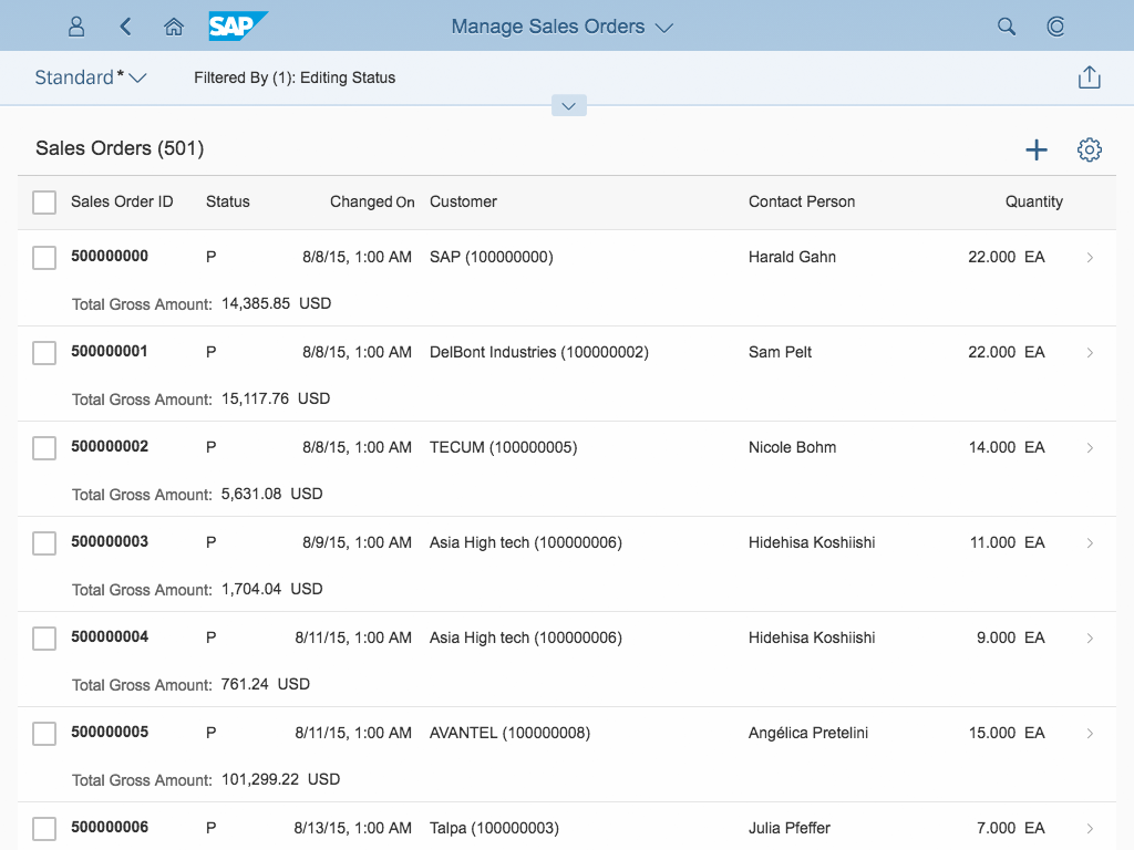
Filter bar within the dynamic page
Responsiveness
Because tables appear in many apps, from simple to complex ones, the filter bar needs to run on all form factors. While the main concept of the filter bar remains stable across the devices, its responsive design adapts the control’s behavior to match the ability of each device.
Size S (Smartphones)
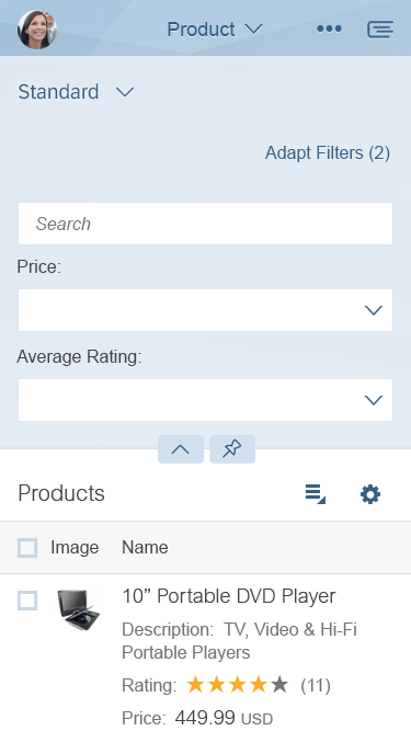
Expanded filter bar (size S)
Collapsed filter bar (size S)

Filter dialog (size S)
Size M (Tablet)
Expanded filter bar (size M)
Collapsed filter bar (size M)

Filter dialog (size M)
Size L/XL (Desktops)
Expanded filter bar (size L/XL)
Collapsed filter bar (size L/XL)
Filter dialog (size L/XL)
Layout
Filter Dialog
Filter dialog (size L)
Filter dialog (size S)
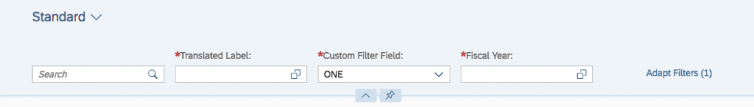
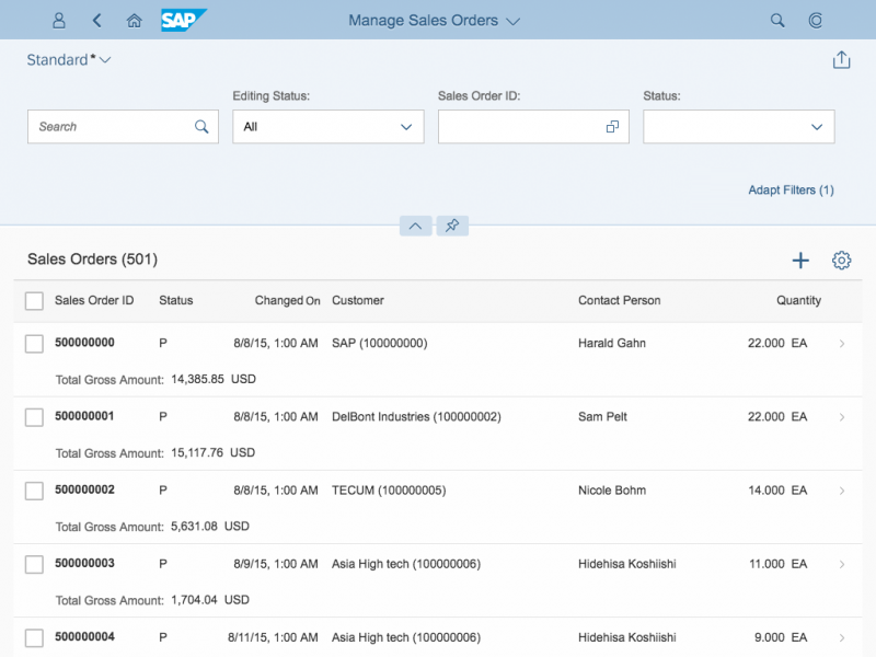
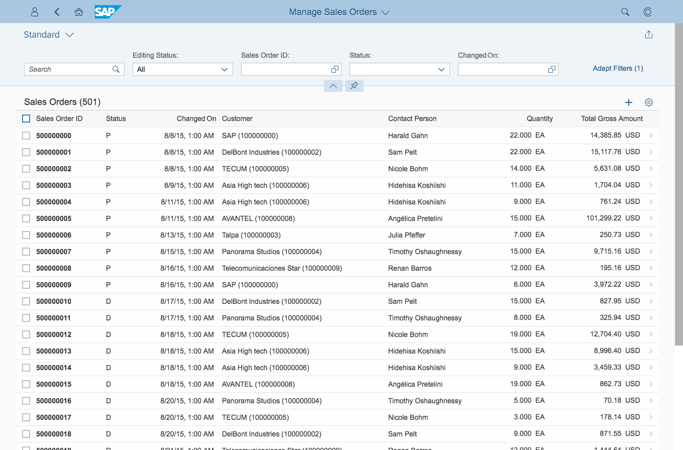
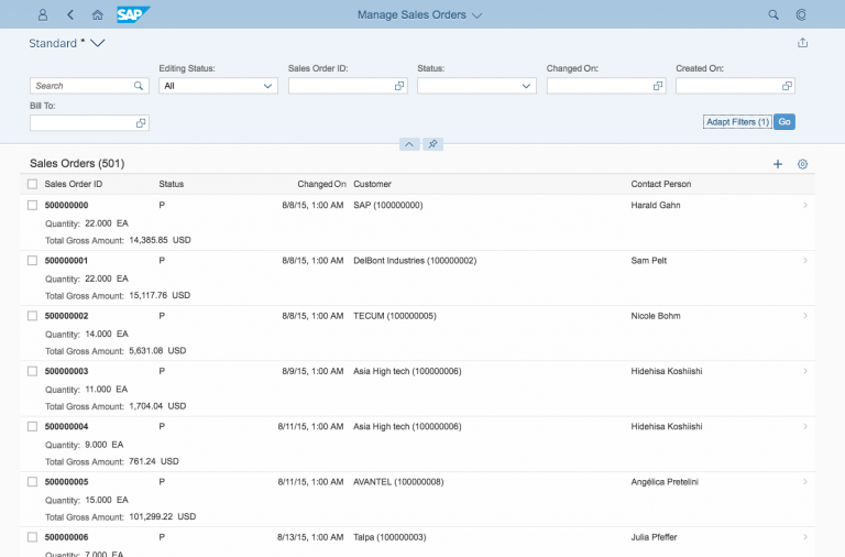
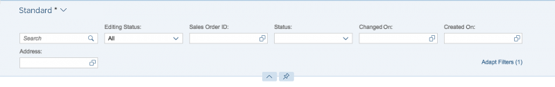
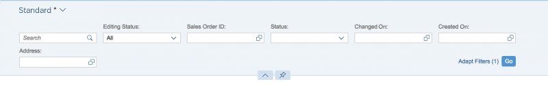
Expanded Filter Bar
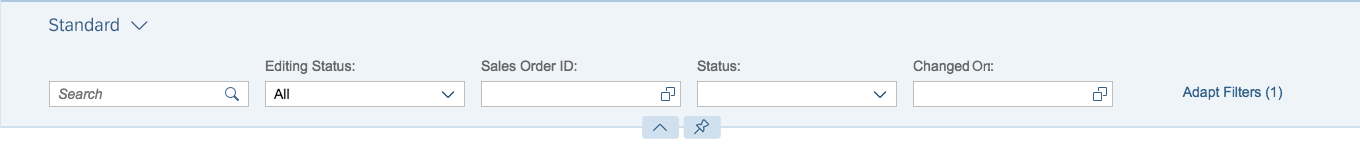
Filter bar (size L) with one row of filters

Filter Bar (Size L) with more than one row of filters

Filter bar (size S) with vertical filters
Components
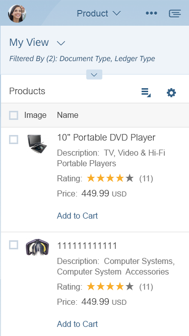
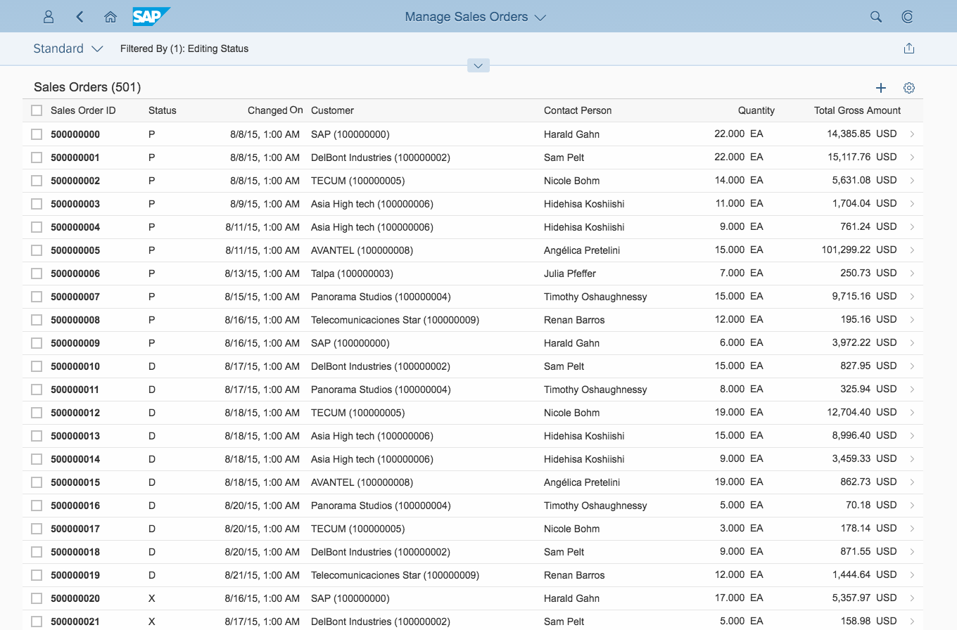
Collapsed Filter Bar

Collapsed filter bar
Expanded Filter Bar
Expanded filter bar
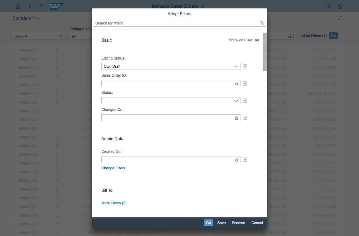
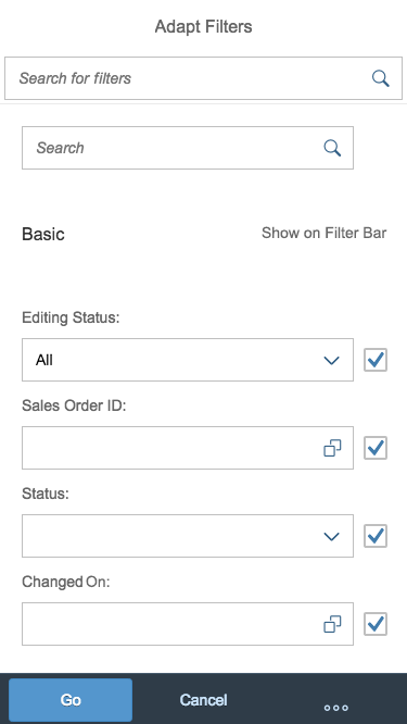
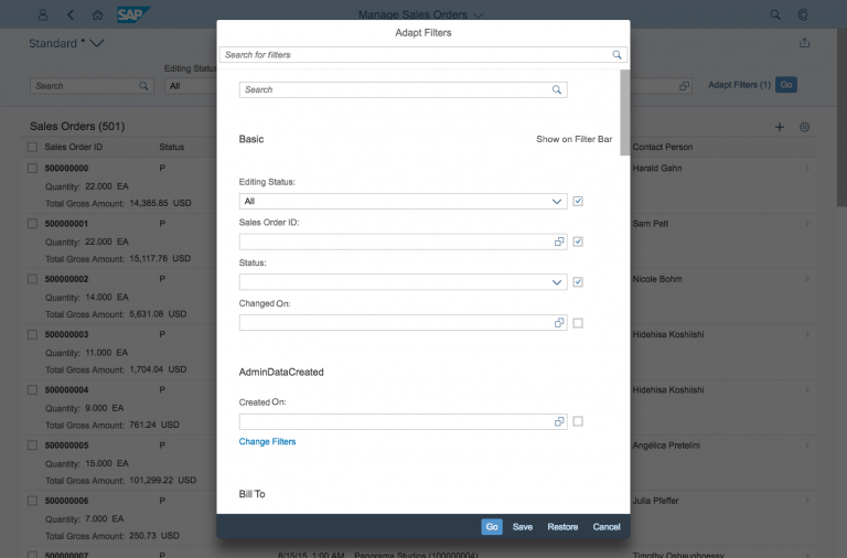
Filter Dialog
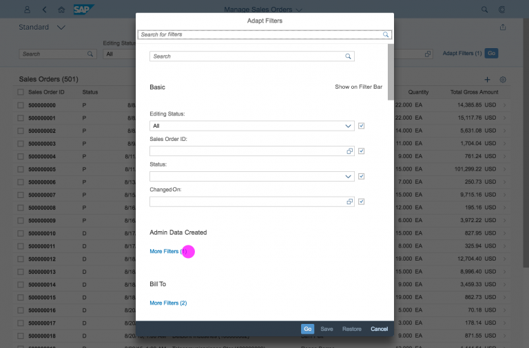
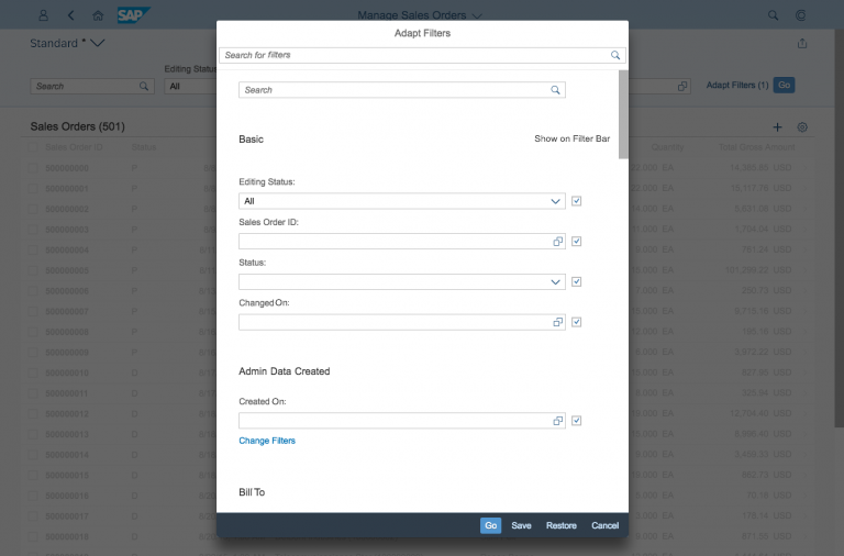
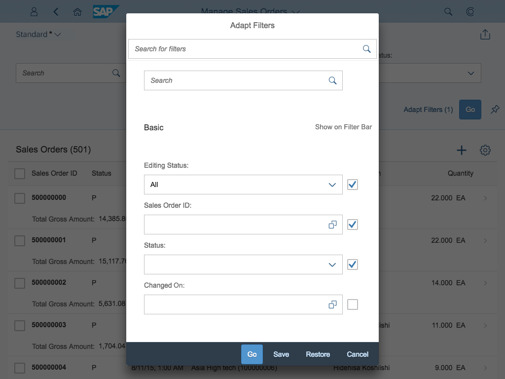
The filter dialog is the central component that shows all filters of the selected variant, allowing the user to add filters to the variant or remove them. Filters are arranged into their respective filter groups. The user can search for a specific filter by name in the search bar at the top.
The footer toolbar at the bottom of the dialog provides the following functions:
- Save: Saves your modified variant filter set (Save and Save As can be provided)
- Cancel: Closes the dialog and undoes all changes
- Restore: Restores the initial variant values (you can hide this button if it does not fit the app’s use case)
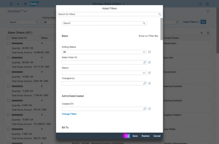
- Go: Executes the selected filter set
- Clear (optional): Clears all input fields/filters (this button should only be used if it fits the app’s use case)
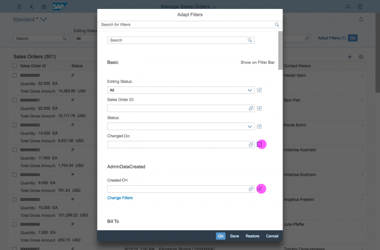
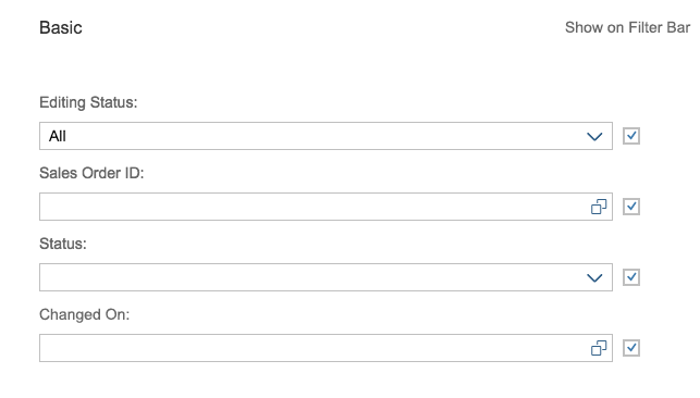
The user can choose to hide filters on the expanded filter bar by deselecting the relevant checkbox next to the filter in the filter dialog (for example, if a filter is rarely edited, or unimportant).
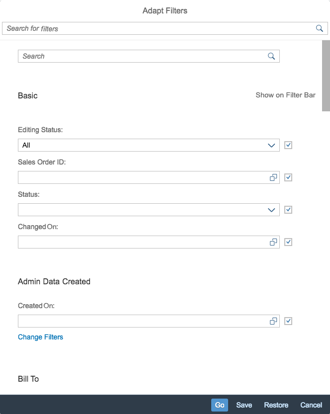
Filter dialog
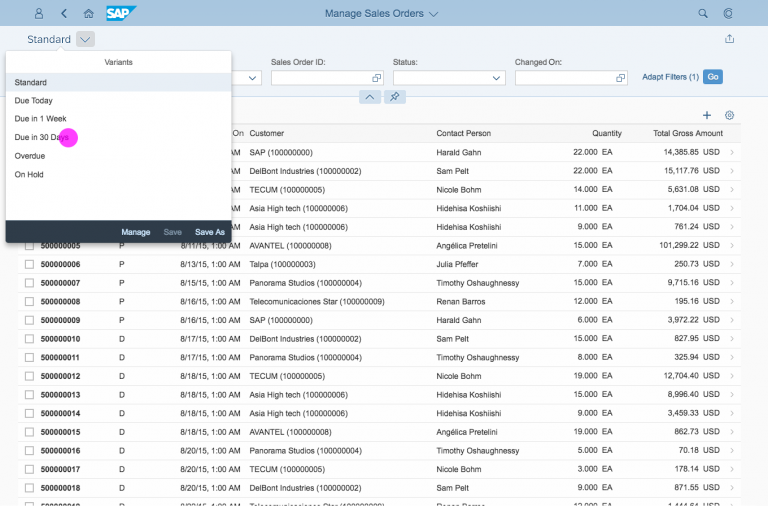
Variant Selector
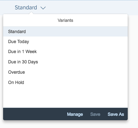
Variant selector
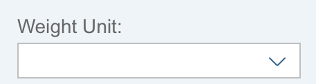
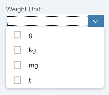
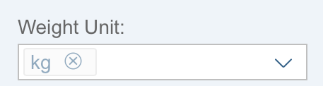
Filter/Input Controls
Filter/input controls
When designing the filter bar, pick the simplest input control that works for your use case. Avoid unnecessary complexity in the filter bar.
If there is a predefined list for single or multiple selection, use the select control or combo box control. For temporal information, you can use the date picker or date range selector. To help the user enter a valid value for multi-input fields, you can enable suggestions.
For a comprehensive overview of when to use which input field, see Selection Controls – Overview.
Use the value help control only as a last resort. It is especially beneficial if you want to offer an advanced function for selecting single or multiple items either inline (by entering text) or by means of a dialog.
Recommended input fields:
Behavior and Interaction
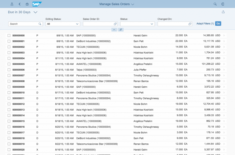
Selecting a Variant
Selecting a Variant
Personalizing the Expanded Filter Bar
Personalizing the Expanded Filter Bar
Adding Filters to a Variant
Adding Filters to a Variant

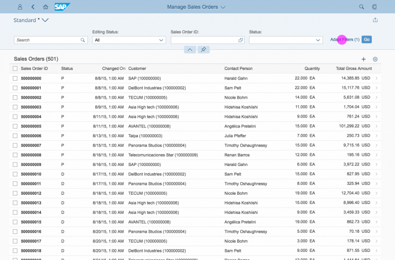
Saving a New Variant
You can save new filter variants either in the variant selector or in the filter dialog.
Once you have changed an existing variant, an asterisk (*) is displayed next to the current variant name, indicating its “dirty state”.
You can either save the adapted variant with the current name (overwrite), or save it under a new name.
Option 1 – Variant Selector
Open the variant selector and choose Save As. Type your desired variant name into the input field and select OK.
Save new variant in variant selector
Option 2 – Filter Dialog
Choose Adapt Filters to open the filter dialog. Choose Save from the footer toolbar and type your desired variant name into the input field. Select OK.
Save new variant in filter dialog
Guidelines
Default Variant Filters
- Mandatory / crucial to the use case
- Frequently used
- Vital for reducing the number of items in the list
Default variant "Basic"
Default Values
Provide a meaningful default value for as many filters as possible. Meaningful default values depend on your use case.
A default value for date ranges, for example, should reflect the time frame the user would normally apply. App designers need to decide which time frame is appropriate.
Appropriate default values are particularly crucial for filter sets and list reports that operate on large datasets. In this case, consider making certain default filters mandatory to help the user avoid loading very large datasets unnecessarily.
For list reports and overview pages, ensure that mandatory filter fields always have default values. Otherwise, users will see error messages when the page loads.
Filter without default value
Filter with available values
Filter with a default value
Table Filtering and Table Searching
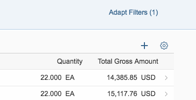
Table without filtering option
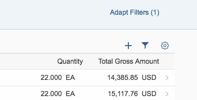
Table with filtering option
Initial State
The filter bar can initially be collapsed or expanded, depending on the use case:
Initial State Collapsed
If the app has a default variant that is executed on loading, the table is prefilled, and the user seldom changes the filters, the app can start with a collapsed filter bar.
Initial State Expanded
If the app does not use a default variant and the user has to set a filter to obtain a first result set for the table, start with an expanded filter bar. Also, if a vast number of items are expected, include some mandatory filters with default values. Since the user first has to enter values for these filters, start with an expanded filter bar. If you are in any doubt, start the app with an expanded filter bar.
Note: At least one filter must be defined to begin with. This filter is set within the basic group by app designers. If the use case allows, and depending on the size of the result set, provide a table that is initially filled.
Initial state collapsed
Initial state expanded
Basic Search Field
Filter bar with basic search field
Live Update / Manual Update
The filter bar is available in two separate modes: Live update mode and manual update mode.
Live Update
The live update mode is the default mode. The filter bar reacts instantly to every input change. The result table is updated every time the user changes a filter field or the search field. Therefore, a Go button is not necessary and is not shown if live update mode is used.
The search is triggered with every letter that is entered, starting with the first letter the user types. The table is updated with the results that match all set filters and include the search term.
Manual Update
In the manual update mode, the filter results are only updated when the user clicks or taps Go. A Go button is therefore mandatory in manual update mode. Pressing ENTER on the keyboard also triggers the filter.
Which Mode Should I Use?
We recommend using live update mode, which is more convenient for the user. However, if the user has to configure multiple filters to obtain a useful result set, or if the resulting traffic is expected to be excessively high, consider using manual update mode instead.
Filter bar in live update mode
Filter bar in manual update mode
Resources
Want to dive deeper? Follow the links below to find out more about related controls, the SAPUI5 implementation, and the visual design.
Implementation
- Filter Bar (SAPUI5 samples)
- Smart Filter Bar (SAPUI5 samples)
- Filter Bar (SAPUI5 API reference)
- Smart Filter Bar (SAPUI5 API reference)
- Variant Management Example (SAPUI5 samples)
- Variant Management Example (SAPUI5 API reference)
- Filter Item (SAPUI5 API reference)
- Filter Group Item (SAPUI5 API reference)
 Your feedback has been sent to the SAP Fiori design team.