
- Latest SAPUI Version 1.124
- SAPUI5 Version 1.122
- SAPUI5 Version 1.120
- SAPUI5 Version 1.118
- SAPUI5 Version 1.116
- SAPUI5 Version 1.114
- SAPUI5 Version 1.112
- SAPUI5 Version 1.110
- SAPUI5 Version 1.108
- SAPUI5 Version 1.106
- SAPUI5 Version 1.104
- SAPUI5 Version 1.102
- SAPUI5 Version 1.100
- SAPUI5 Version 1.98
- SAPUI5 Version 1.96
- SAPUI5 Version 1.94
- SAPUI5 Version 1.92
- SAPUI5 Version 1.90
- SAPUI5 Version 1.88
- SAPUI5 Version 1.86
- SAPUI5 Version 1.84
- SAPUI5 Version 1.82
- SAPUI5 Version 1.80
- SAPUI5 Version 1.78
- SAPUI5 Version 1.76
- SAPUI5 Version 1.74
- SAPUI5 Version 1.72
- SAPUI5 Version 1.70
- SAPUI5 Version 1.68
- SAPUI5 Version 1.66
- SAPUI5 Version 1.64
- SAPUI5 Version 1.62
- SAPUI5 Version 1.60
- SAPUI5 Version 1.58
- SAPUI5 Version 1.56
- SAPUI5 Version 1.54
- SAPUI5 Version 1.52
- SAPUI5 Version 1.50
- SAPUI5 Version 1.48
- SAPUI5 Version 1.46
- SAPUI5 Version 1.44
- SAPUI5 Version 1.42
- SAPUI5 Version 1.40
- SAPUI5 Version 1.38
- SAPUI5 Version 1.36
- SAPUI5 Version 1.34
- SAPUI5 Version 1.32
- SAPUI5 Version 1.30
- SAPUI5 Version 1.28
- SAPUI5 Version 1.26
Filter Bar / Smart Filter Bar
sap.ui.comp.filterbar.FilterBar & sap.ui.comp.filterbar.SmartFilterBar
Intro
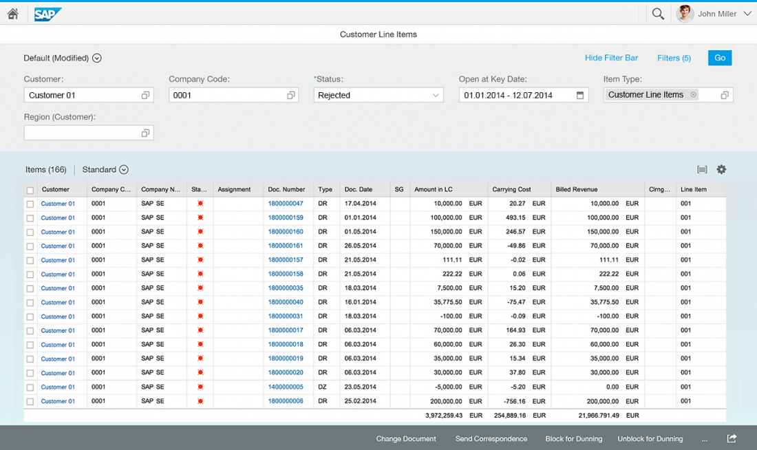
The filter bar filters item lists and tables according to various filter criteria. You can use it for both simple and complex lists, regardless of their size. To handle complex lists with multiple filters, the filter bar provides predefined, customizable filter sets (variants).
Responsiveness
Because tables appear in many apps, from simple to complex ones, the filter bar needs to be able to run on all form factors. While the main concept of the filter bar remains stable across the devices, its responsive design adapts the control’s behavior to match the ability of each device. The desktop mode (XL/L) and tablet mode (M) provide a special optimization (expanded filter bar) to make use of the desktop’s additional screen real estate.
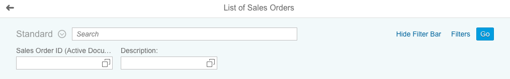
Size S (Smartphones)
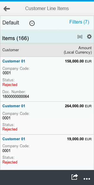
Filter bar (size S)
Filter dialog (size S)
Size M (Tablet)

Filter bar (size M)
Filter dialog (size M)
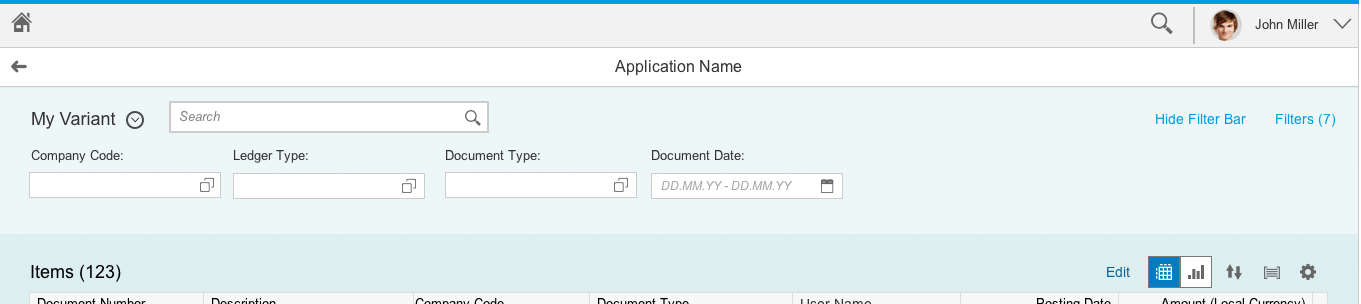
Size L/XL (Desktops)
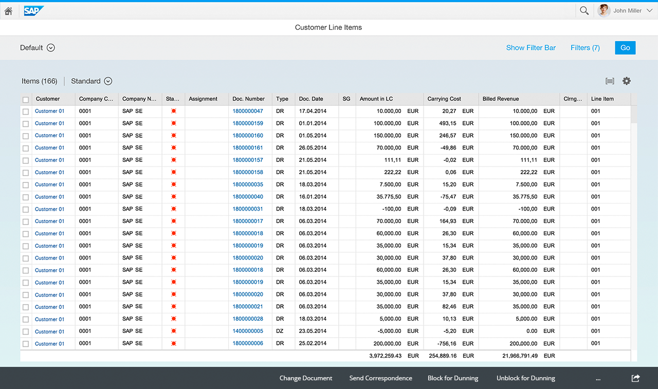
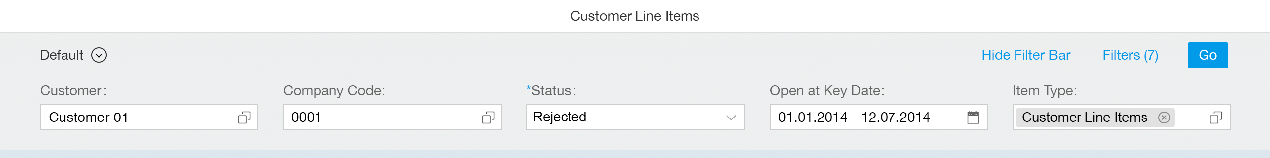
Collapsed filter bar (size L/XL)
Filter dialog (size L/XL)
Expanded filter bar (size L/XL)
Layout
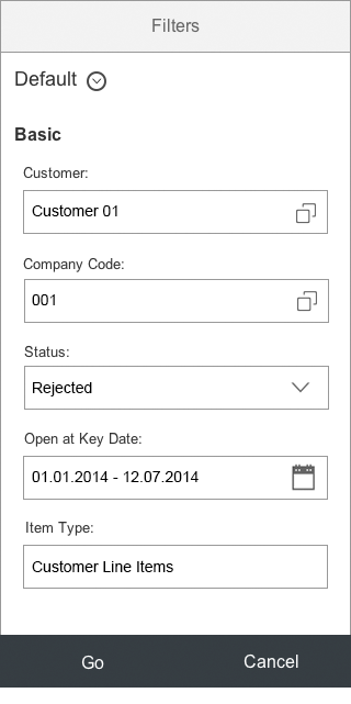
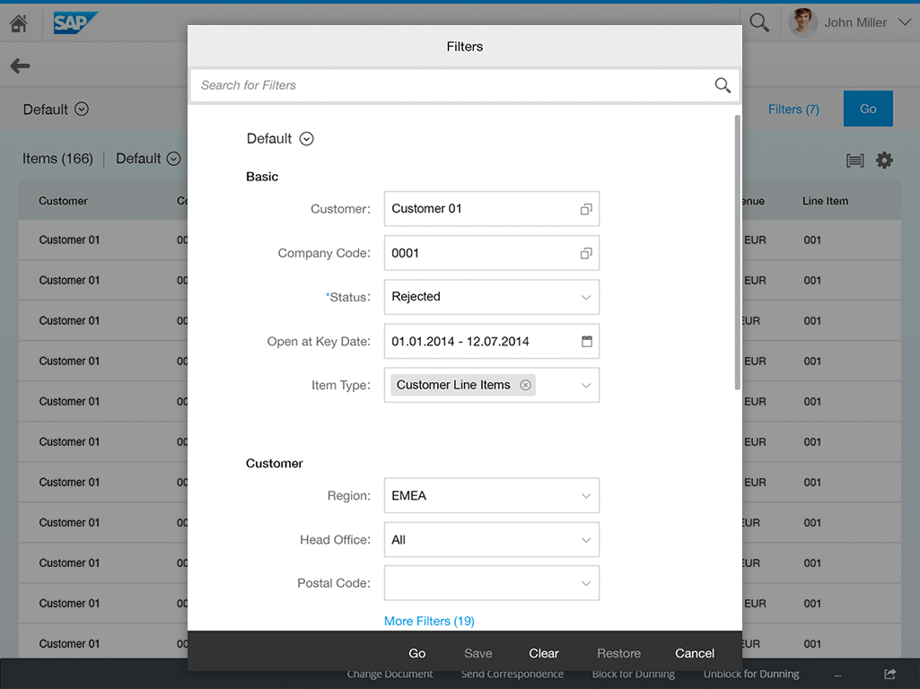
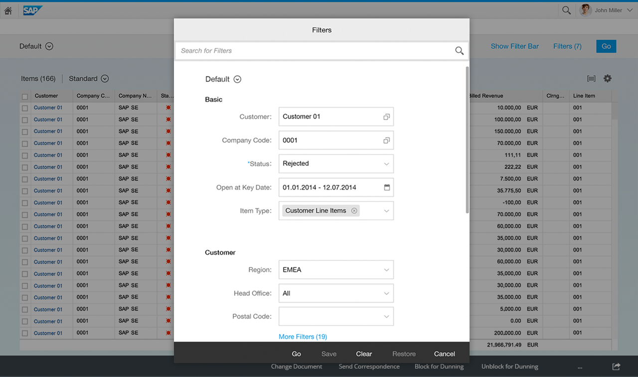
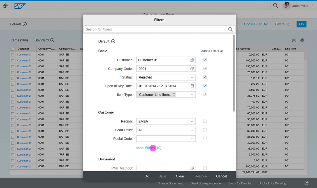
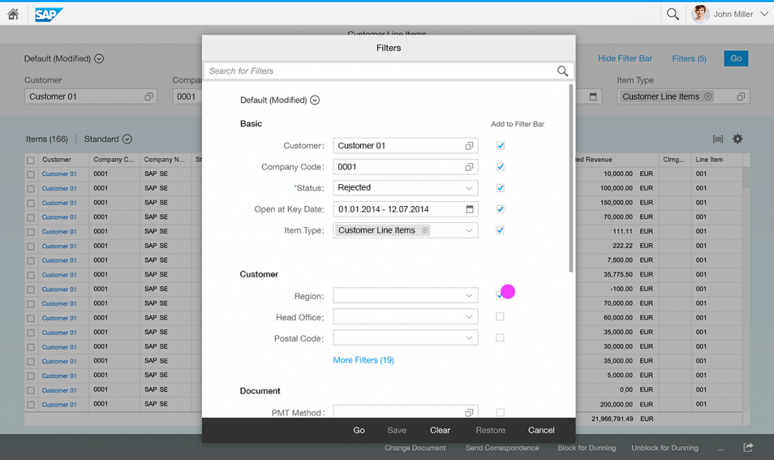
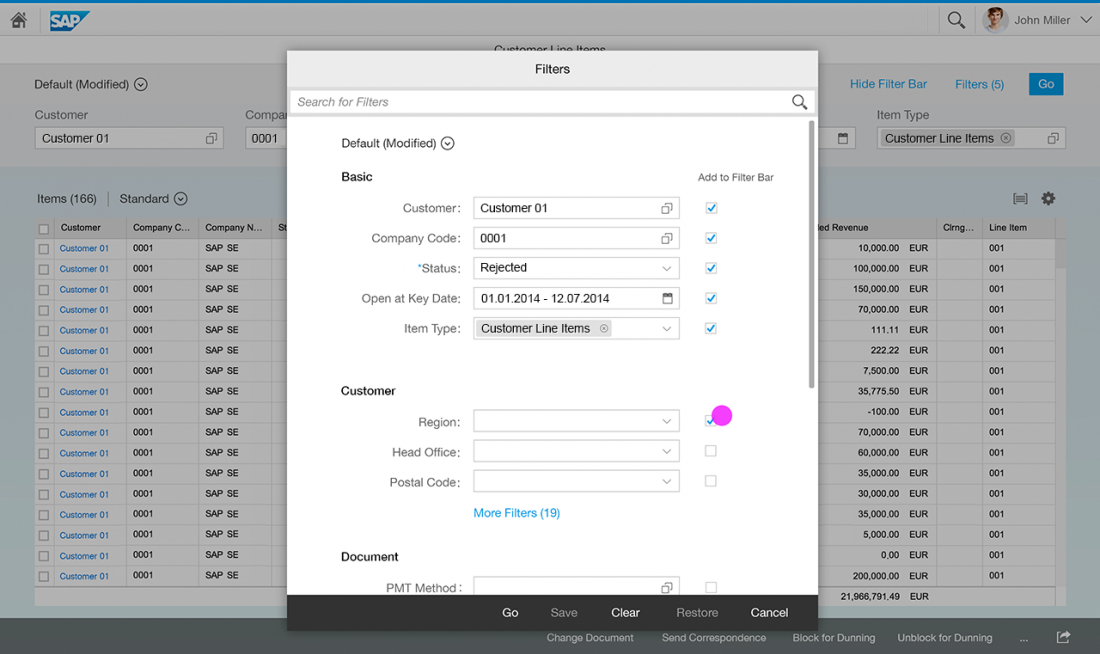
Filter Dialog
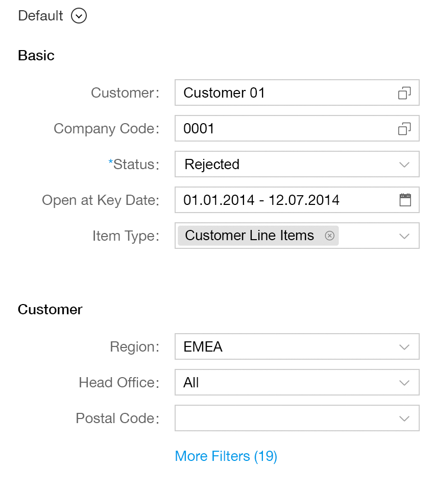
Filters dialog
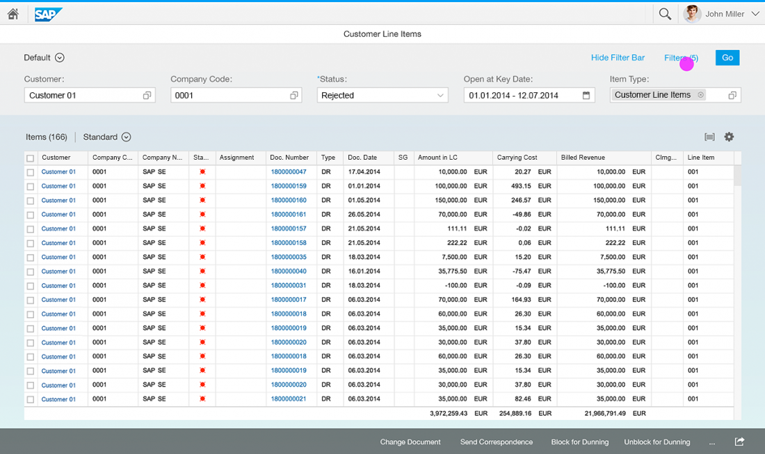
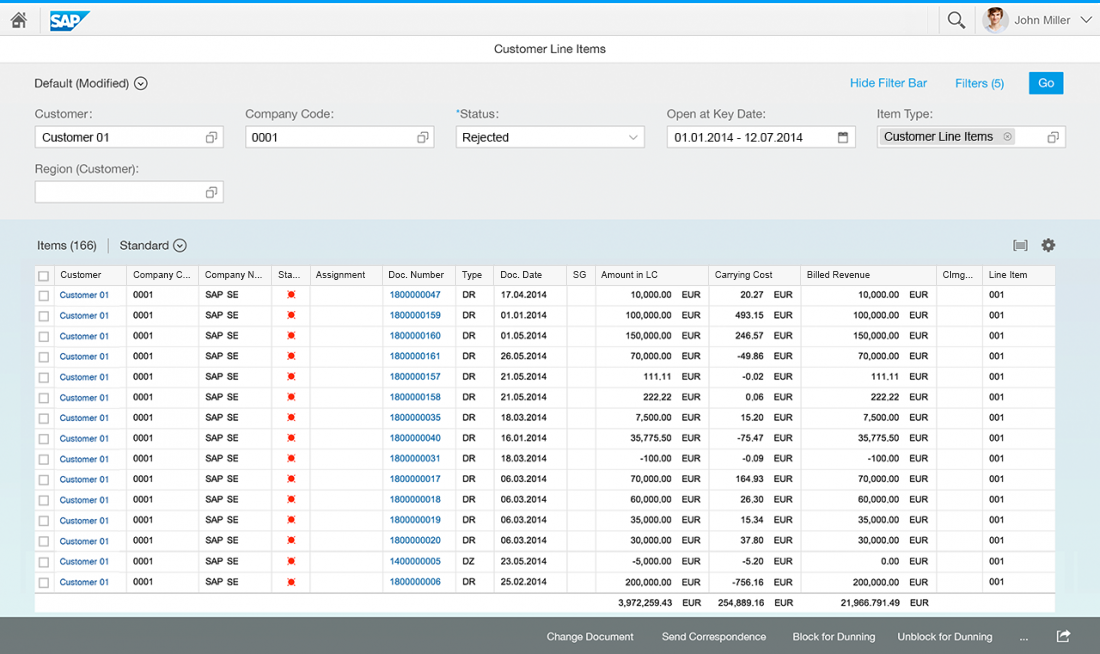
Expanded Filter Bar (Desktop and Tablet Only)

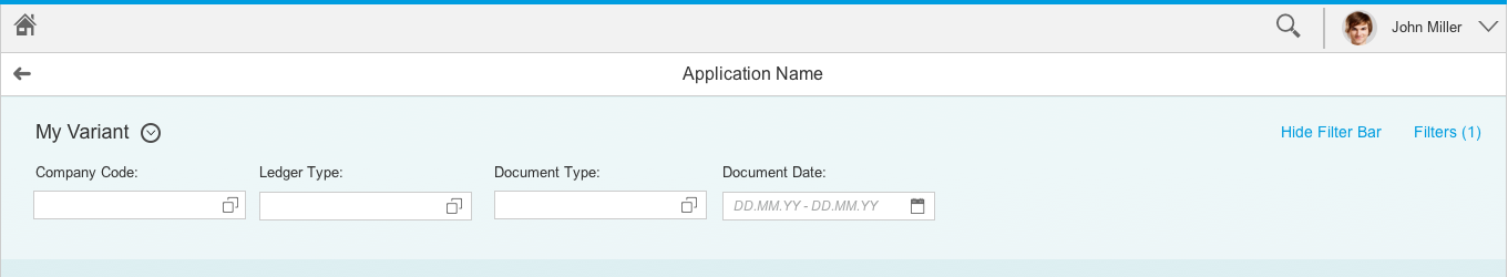
Expanded filter bar (desktop only)
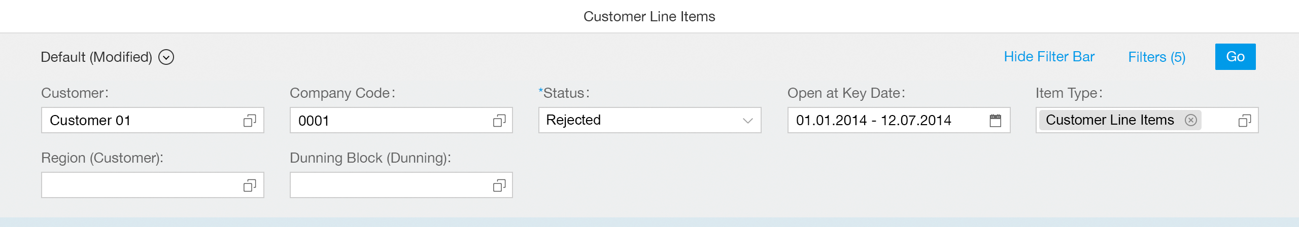
Expanded filter bar (desktop only)
Components
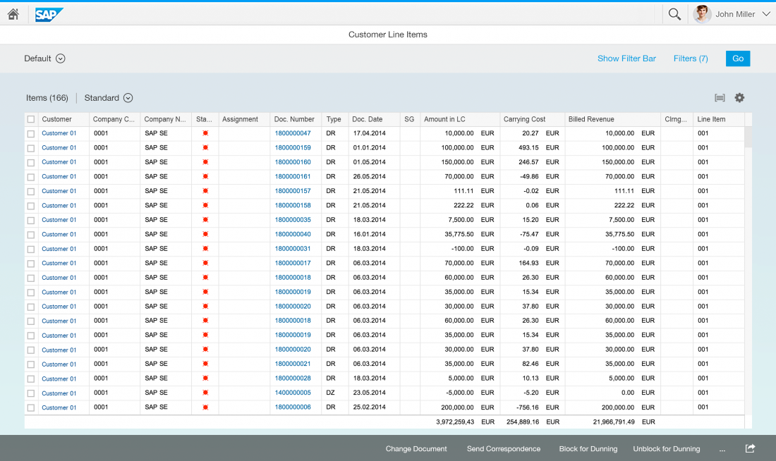
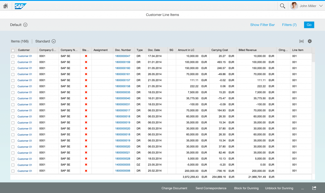
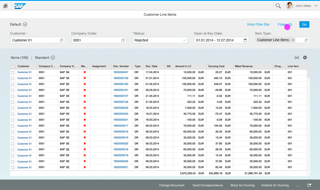
Collapsed Filter Bar

Collapsed filter bar
Expanded Filter Bar
Expanded filter bar
Filter Dialog
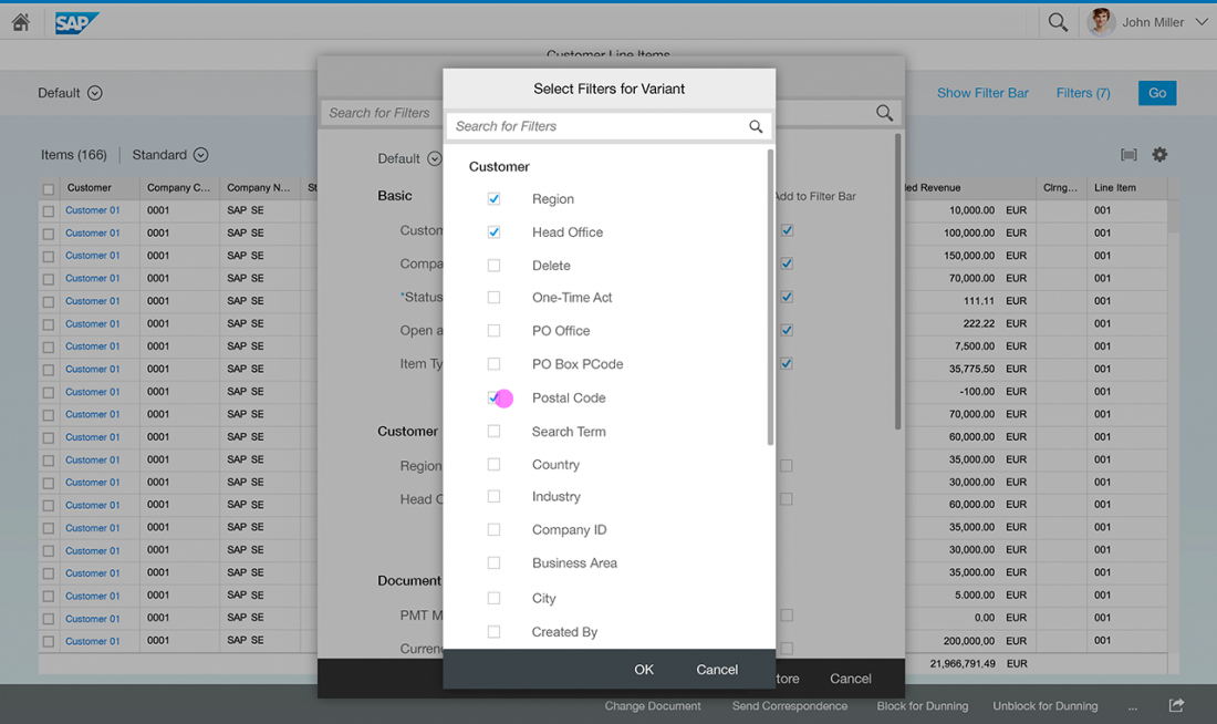
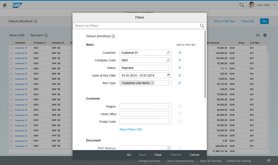
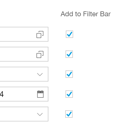
The filter dialog is the central component that shows all filters of the selected variant, allowing the user to add filters to the variant or remove then. Filters are arranged into their respective filter groups. The user can search for a specific filter by name by using the search bar at the top. Inside the filter dialog, a variant selector is available to quickly switch between variants (you can hide the variant selector if it does not fit the app’s use case). The variant name also indicates if a variant has been modified. The footer toolbar at the bottom of the dialog provides the following functions:
- Save: Saves your modified variant filter set (Save and Save As can be provided).
- Cancel: Closes the dialog and undoes all changes.
Note: Due to technical challenges, a Close button appears instead of the Cancel button. As an interim solution, the Close button only closes the dialog, but does not undo any changes. - Clear: Clears all input fields/filters (you can hide this button if it does not fit the app’s use case).
- Restore: Restores the initial variant values (you can hide this button if it does not fit the app’s use case).
- Go: Executes the selected filter set.
On desktops, the user can add filters to the expanded filter bar by selecting the relevant checkbox next to the filter (for example, frequently-edited or important filters).
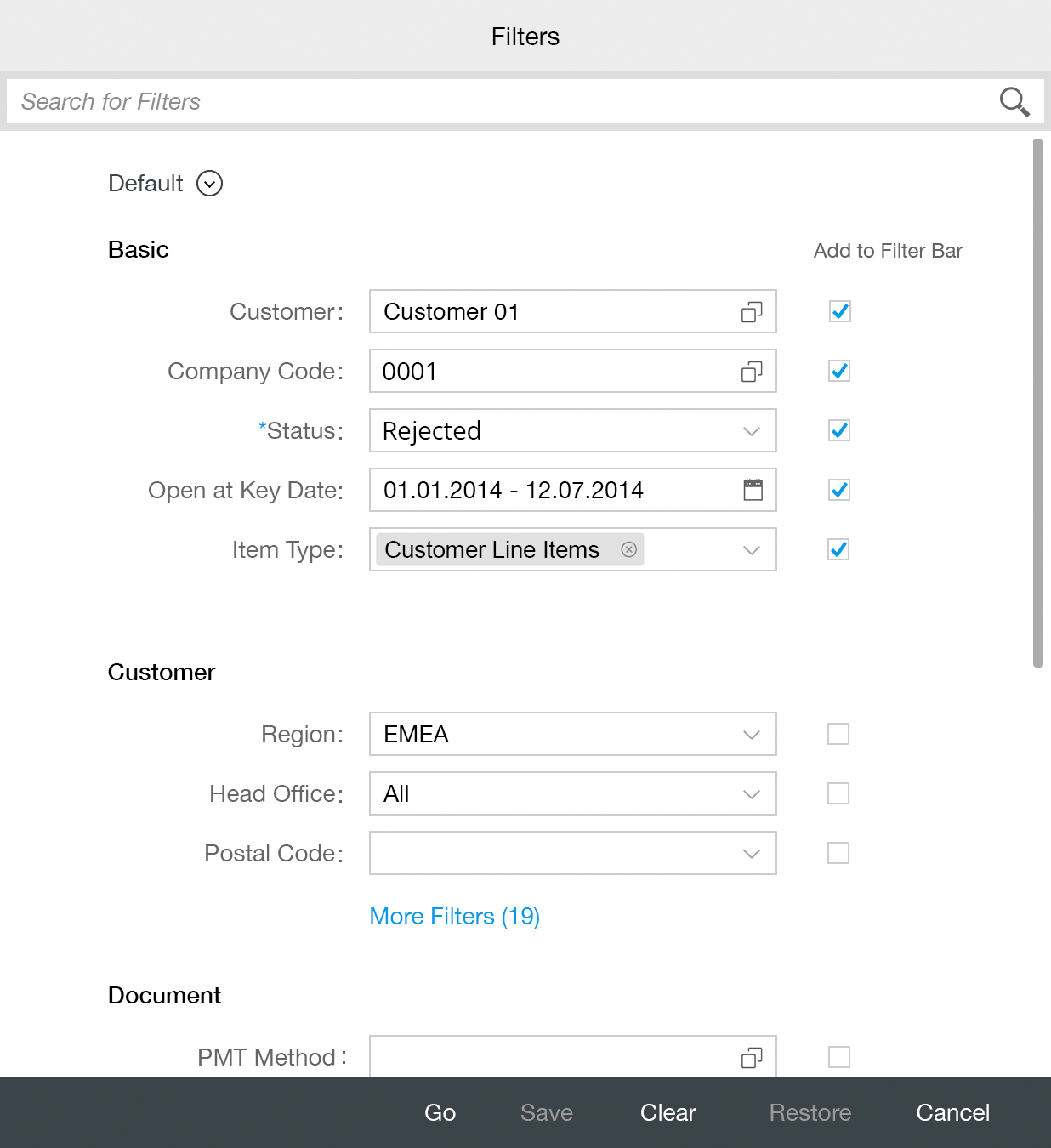
Filter dialog
Variant Selector
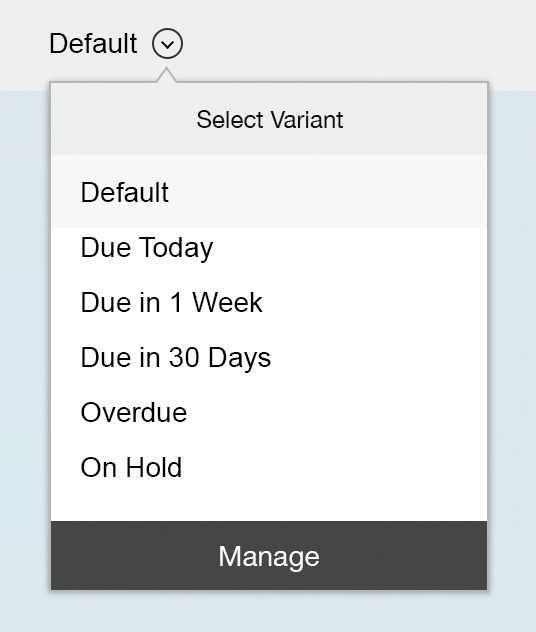
Variant selector
Filter/Input Controls

Filter/input controls
Which filter control is used in the filter dialog or the expanded filter bar depends on the use case. Use the value help control if you want to offer an advanced function for selecting single or multiple items either inline (by entering text) or by means of a dialog. If there is a predefined list for single or multiple selection, use the combo box control. For temporal information you can use the date picker or date range selector.
Additionally recommended input fields:
Behavior and Interaction
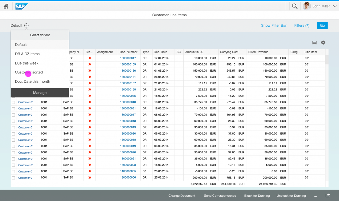
Selecting a Variant

Adding Filters to a Variant
Personalize Expanded Filter Bar
Guidelines
Default Variant Filters
Default variant
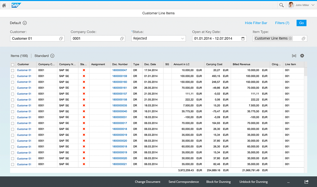
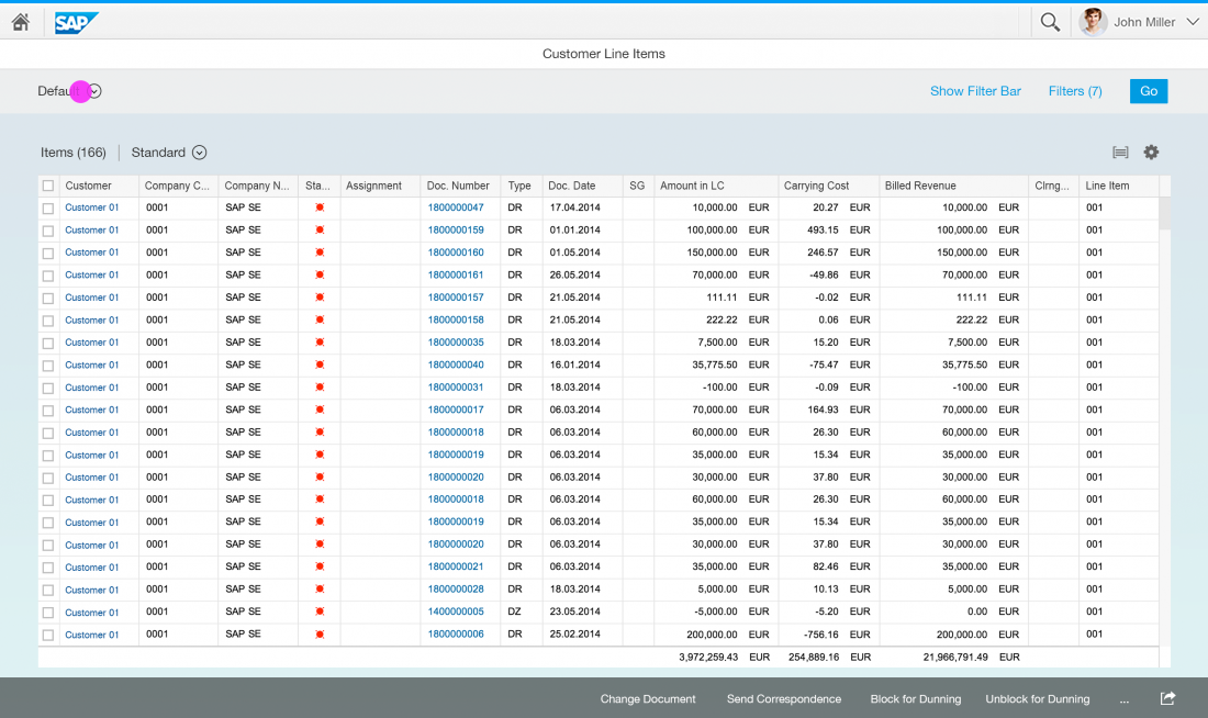
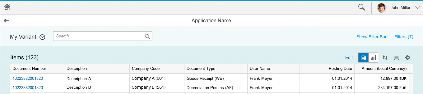
Table Filtering and Table Searching
Table without filtering option
Table with filtering option
Initial State
The filter bar can initially be collapsed or expanded, depending on the use case:
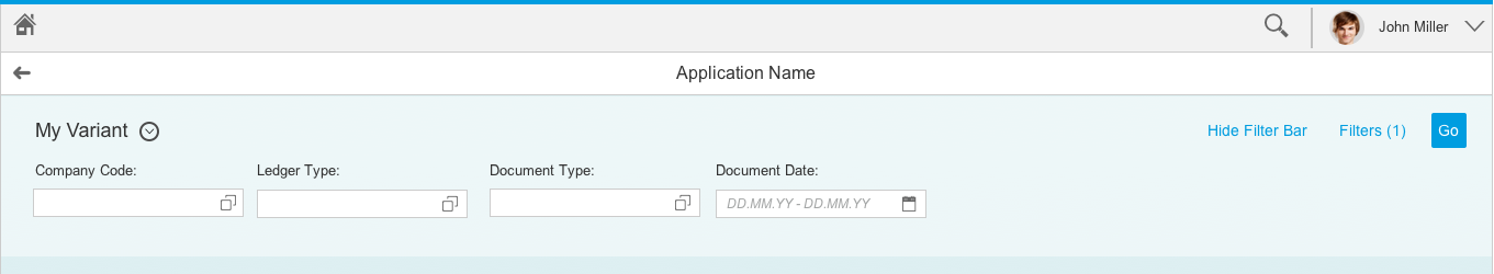
Initial State Collapsed
If the app has a default variant that is executed on loading, the table is prefilled, and the user seldom changes the filters, the app can start with a collapsed filter bar.
Initial State Expanded
If the app does not use a default variant and the user has to set a filter to obtain a first result set for the table, start with an expanded filter bar. Also, if a vast number of items are expected, include some mandatory filters. Since the user first has to enter values for these filters, start with an expanded filter bar. If you are in any doubt, start the app with an expanded filter bar.
Note: At least one filter must be defined to begin with. This filter is set within the basic group by app designers. If the use case allows, and depending on the size of the result set, provide a table that is initially filled.

Initial state collapsed
Initial state expanded
Basic Search Field
Basic search field – Filter bar expanded
Basic search field – Filter bar collapsed
Manual Update/Live Update
The filter bar is available in two separate modes: manual update mode and live update mode.
Manual Update
With manual update, the filter results are only updated when the user clicks or taps Go. A Go button is therefore essential in manual update mode. If a search field is used, it is only triggered by the Go button, and not instantly.
Live Update
With live update mode, the filter bar reacts instantly to every input change. The result table is updated every time the user changes a filter field or the search field. Therefore, a Go button is not necessary and is not shown if live update mode is used.
Additionally, the search is triggered with every letter that is entered. Starting with the first letter typed in, the table is updated with the results that match all set filters that include the search term.
Which One to Use
Use live update mode by default as it is more convenient for the user. If the user has to configure multiple filters to obtain a useful result set, or if the resulting traffic is expected to be excessively high, consider using manual update mode instead.
Filter bar in manual update mode
Filter bar in live update mode
Resources
Want to dive deeper? Follow the links below to find out more about related controls, the SAPUI5 implementation, and the visual design.
Implementation
- Filter Bar (SAPUI5 samples)
- Smart Filter Bar (SAPUI5 samples)
- Filter Bar (SAPUI5 API reference)
- Smart Filter Bar (SAPUI5 API reference)
- Variant Management Example (SAPUI5 samples)
- Variant Management Example (SAPUI5 API reference)
- Filter Item (SAPUI5 API reference)
- Filter Group Item (SAPUI5 API reference)
 Your feedback has been sent to the SAP Fiori design team.