
- SAPUI5 Version 1.122
- SAPUI5 Version 1.120
- SAPUI5 Version 1.118
- SAPUI5 Version 1.116
- SAPUI5 Version 1.114
- SAPUI5 Version 1.112
- SAPUI5 Version 1.110
- SAPUI5 Version 1.108
- SAPUI5 Version 1.106
- SAPUI5 Version 1.104
- SAPUI5 Version 1.102
- SAPUI5 Version 1.100
- SAPUI5 Version 1.98
- SAPUI5 Version 1.96
- SAPUI5 Version 1.94
- SAPUI5 Version 1.92
- SAPUI5 Version 1.90
- SAPUI5 Version 1.88
- SAPUI5 Version 1.86
- SAPUI5 Version 1.84
- SAPUI5 Version 1.82
- SAPUI5 Version 1.80
- SAPUI5 Version 1.78
- SAPUI5 Version 1.76
- SAPUI5 Version 1.74
- SAPUI5 Version 1.72
- SAPUI5 Version 1.70
- SAPUI5 Version 1.68
- SAPUI5 Version 1.66
- SAPUI5 Version 1.64
- SAPUI5 Version 1.62
- SAPUI5 Version 1.60
- SAPUI5 Version 1.58
- SAPUI5 Version 1.56
- SAPUI5 Version 1.54
- SAPUI5 Version 1.52
- SAPUI5 Version 1.50
- SAPUI5 Version 1.48
- SAPUI5 Version 1.46
- SAPUI5 Version 1.44
- SAPUI5 Version 1.42
- SAPUI5 Version 1.40
- SAPUI5 Version 1.38
- SAPUI5 Version 1.36
- SAPUI5 Version 1.34
- SAPUI5 Version 1.32
- SAPUI5 Version 1.30
- SAPUI5 Version 1.28
- SAPUI5 Version 1.26
- Latest SAPUI Version 1.124
- SAPUI5 Version 1.122
- SAPUI5 Version 1.120
- SAPUI5 Version 1.118
- SAPUI5 Version 1.116
- SAPUI5 Version 1.114
- SAPUI5 Version 1.112
- SAPUI5 Version 1.110
- SAPUI5 Version 1.108
- SAPUI5 Version 1.106
- SAPUI5 Version 1.104
- SAPUI5 Version 1.102
- SAPUI5 Version 1.100
- SAPUI5 Version 1.98
- SAPUI5 Version 1.96
- SAPUI5 Version 1.94
- SAPUI5 Version 1.92
- SAPUI5 Version 1.90
- SAPUI5 Version 1.88
- SAPUI5 Version 1.86
- SAPUI5 Version 1.84
- SAPUI5 Version 1.82
- SAPUI5 Version 1.80
- SAPUI5 Version 1.78
- SAPUI5 Version 1.76
- SAPUI5 Version 1.74
- SAPUI5 Version 1.72
- SAPUI5 Version 1.70
- SAPUI5 Version 1.68
- SAPUI5 Version 1.66
- SAPUI5 Version 1.64
- SAPUI5 Version 1.62
- SAPUI5 Version 1.60
- SAPUI5 Version 1.58
- SAPUI5 Version 1.56
- SAPUI5 Version 1.54
- SAPUI5 Version 1.52
- SAPUI5 Version 1.50
- SAPUI5 Version 1.48
- SAPUI5 Version 1.46
- SAPUI5 Version 1.44
- SAPUI5 Version 1.42
- SAPUI5 Version 1.40
- SAPUI5 Version 1.38
- SAPUI5 Version 1.36
- SAPUI5 Version 1.34
- SAPUI5 Version 1.32
- SAPUI5 Version 1.30
- SAPUI5 Version 1.28
- SAPUI5 Version 1.26
Filter Bar
sap.ui.comp.filterbar.FilterBar
Intro
The filter bar lets users set criteria to limit the data loaded and displayed in a table. It is part of the list report and the overview page, and is also available as an alternative layout to the visual filter bar in the analytical list page.
It is made up of input controls that filter objects according to various criteria, such as status or date. Users can adapt the filter bar, for example, by showing and hiding input controls or changing their order. They can also store the current set of filter criteria in a view.
The filter bar is displayed in the header area of a list report, overview page, or analytical list page. Because these floorplans are based on the dynamic page layout, the expand and collapse header functions are available.
When to Use
The filter bar is always part of the list report and overview page.
Do not use the filter bar:
- In a table in an object page section. Use the filter in the View Settings dialog instead.
- In a wizard.
- In a simple list. Use the search instead.
Filter Bar Components
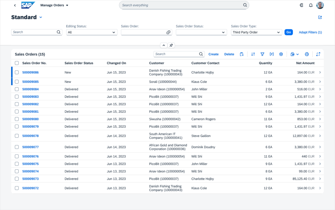
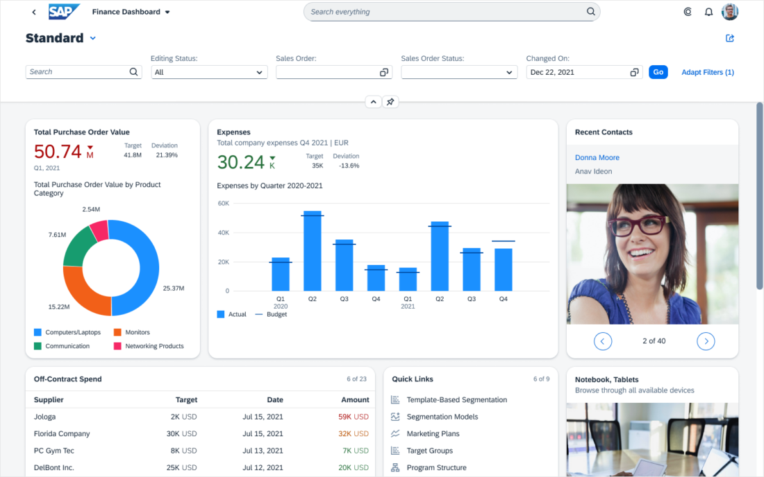
Expanded Filter Bar
The expanded filter bar consists of:
- Views (optional)
- Basic search field (optional)
- Filter input controls
- Go button (only for manual update mode)
- Adapt Filters button
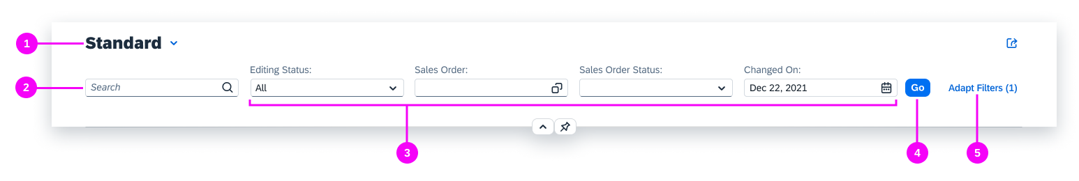
Expanded filter bar
Views (1) store the settings for the filter bar, including the values of filter input controls, the fields visible in the filter bar, and their order.
You can also use the filter bar without view management. In this case, display a page title instead.
If the basic search field (2) is available, it is displayed first. It allows users to filter the results with a given keyword. Unlike the other input control fields, the basic search field has a placeholder text instead of a label.
The filter input controls (3) are arranged in a horizontal, linear layout, with a label above them. An asterisk next to the filter label indicates the filter is mandatory.
If the browser window size is reduced or filter input controls exceed the available width, they wrap to the next line. The height of the expanded filter bar is not limited and adjusts to accommodate the visible filters. The size of the widest input control is inherited by all other filters to ensure visual cohesion.
The Go button (4) triggers the search for the manual update mode. Alternatively, you can offer the live update mode where the table results are updated each time the user changes an input control value. For more information, see Behavior and Interaction.
In most cases, only a subset of all available filters is visible in the filter bar. Users can control the visibility and order of the filters and assign values to them in the Adapt Filters dialog (5).
Next to Adapt Filters, the number of active filters is displayed in parentheses. A filter is active when a value is assigned to it either in the filter bar or the Adapt Filters dialog. Note that a filter can be active, but not visible in the filter bar.
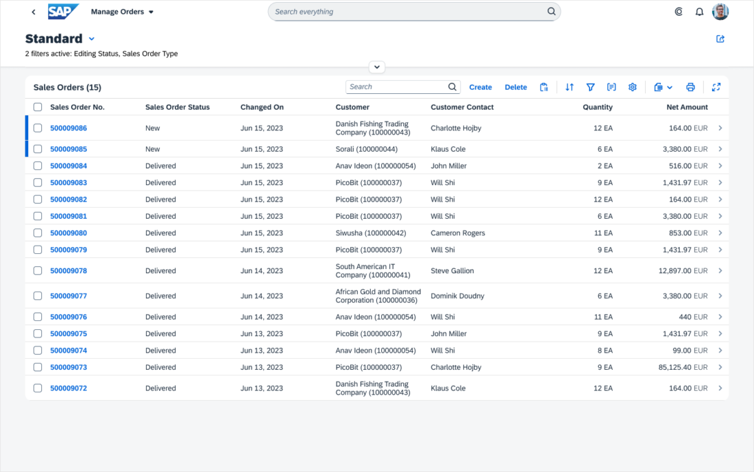
Collapsed Filter Bar
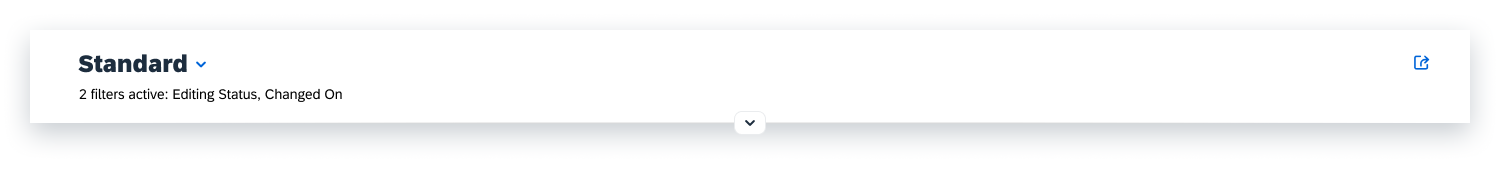
The collapsed filter bar takes up very little space, leaving most of the screen to display the results.
Collapsed filter bar
It shows a summary of the filters currently applied:
- Either 1 filter active or <n> filters active, where “n” stands for the number of applied filters.
- A comma-separated list of the currently applied filters for up to five filters. If there are more, an ellipsis (…) shows at the end of the string.
If no filters have been applied, the summary text is No filters active.
“Adapt Filters” Dialog
Users can manage all the available filters in the Adapt Filters dialog, including their visibility and order in the filter bar and the values of filters both visible and not visible in the filter bar.
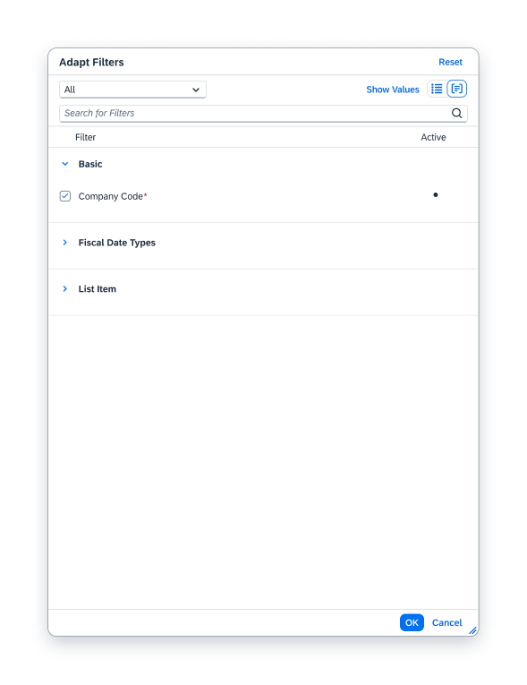
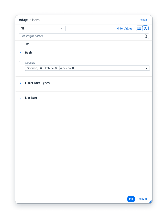
Adapt Filters dialog - list view, hidden values
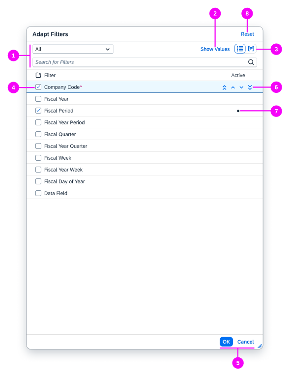
The Adapt Filters dialog consists of:
- Select control and search
- Show Values/Hide Values toggle
- List or group view
- Mandatory and optional filters
- Footer bar buttons
- Arrows to move the filter up and down
- Active filter with assigned value
When opened, the dialog displays all the available filters in the Hide Values view with the List view.
The selected filters are visible in the filter bar and displayed in the same order as in the filter bar.
Searching and Displaying Filters in the Dialog
To find filters (1), users can search for them by name or use the select control to limit the filters displayed in the dialog to certain filter types, such as visible, active, or mandatory.
Mandatory filters have an asterisk next to their label (4). They must have values for the search to return results. Users can set the values either in the filter bar or the Adapt Filters dialog.
In the dialog, when a mandatory filter has:
- No value assigned, its checkbox is automatically selected and cannot be deselected.
- A value assigned, the users can deselect it to remove the filter from the filter bar.
In the dialog, users can display the filters:
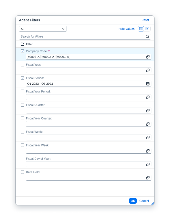
- With or without the filter values (2).
When the values are hidden, a visual indicator (7) flags the active filters.
- In the list or group view (3).
The group view shows the filters according to group. The first group is called Basic and contains the filters for the standard view that you design to ship with the app. You can design additional views to ship with the app, but no additional groups are created for these views.
Displaying Filters in the Filter Bar
All the views in the dialog allow users to select filters to be visible in the filter bar.
In the Hide Values view with the List view, users can reorder the selected filters with the arrows (6).
In the Adapt Filters footer bar (5):
- OK applies changes and closes the dialog.
- Cancel closes the dialog without applying changes.
Resetting Filters
In the header area, Reset (8) (optional) restores the selected filters and filter values to the ones in the current view. Before the filters are reset, the user gets a warning because the reset applies immediately to the filter bar, even though the dialog stays open. Clicking Cancel in the footer bar does not reverse the reset action.
Adapt Filters dialog - list view, values shown
Adapt Filters dialog - grouped view, hidden values
Adapt Filters dialog - grouped view, values shown
Filter Input Controls
To prevent unnecessary complexity in the filter bar, pick the simplest input control that works for your use case, as recommended below:
| For | Use |
| A predefined list for single or multiple selection | The select control or combo box control |
| Temporal information | The date picker or date range selector |
| Multi-input fields | Suggestions to help the user enter a valid value |
For a comprehensive overview of when to use which input field, see Which Selection Control Should I Use?
Use the value help control only as a last resort. It is especially beneficial if you want to offer an advanced function for selecting single or multiple items either inline (by entering text) or by means of a dialog.
For more information on the selection controls, see:
Behavior and Interaction
In the live update mode, the search results are updated each time the user changes the value of an input control or the search field. A Go button is not necessary.
As the user types in the search field, the search is triggered with the entry of each character. The table is updated with the results that match all the filter values and include the search term.
In the manual update mode, the search results are updated only when the users click Go or press Enter on their keyboard.
Responsiveness
The name of the view or title is always visible.
The filter area (basic search field, input controls, optional Go button, Adapt Filters dialog) varies:
- Desktop: Expanded or collapsed by default
- Tablet: Collapsed by default
- Phone: Not displayed. Accessible through filter dialog.
Examples
Top Tips
Filter Bar
Always provide a set of predefined default filters to deliver with the app (Basic group in the Apply Filters dialog). Include filters that are:
- Mandatory / crucial for the use case
- Frequently used
- Vital for reducing the number of items in the list
Users can set filters from the Basic group not to display in the filter bar, but cannot remove them from the Adapt Filters dialog.
Filter Input Controls
- Use the basic search field to provide a keyword search. Do not show a search field in the table toolbar.
- Pick the simplest selection control that works for your use case. See When to Use which Selection Control?
- For temporal filters, use the date picker or date range selector.
- To help the user enter a valid value for multi-input fields, enable suggestions.
Preset Filter Values
- Provide meaningful default values for as many filters as possible to prevent unnecessary data from loading. This is particularly important when the application has large data sets.
Example:
A default value for date ranges should reflect the time frame the user would normally apply. - For list reports and overview pages, preset values for mandatory filters to prevent error messages when the page loads.
Update Mode
- Whenever possible, use the live update mode because it is more convenient for the user.
- Consider the manual update mode only in cases where:
- The volume of unfiltered data to load would be excessively high.
- The users need to enter multiple filter values to display results they can work with.
Related Links
Implementation
- Filter Bar (SAPUI5 samples)
- Filter Bar (SAPUI5 API reference)
- Smart Filter Bar (SAPUI5 samples)
- Smart Filter Bar (SAPUI5 API reference)
- Filter Item (SAPUI5 API reference)
- Filter Group Item (SAPUI5 API reference)
 Your feedback has been sent to the SAP Fiori design team.