- Latest Version 1.128
- Version 1.126
- SAPUI Version 1.124
- SAPUI5 Version 1.122
- SAPUI5 Version 1.120
- SAPUI5 Version 1.118
- SAPUI5 Version 1.116
- SAPUI5 Version 1.114
- SAPUI5 Version 1.112
- SAPUI5 Version 1.110
- SAPUI5 Version 1.108
- SAPUI5 Version 1.106
- SAPUI5 Version 1.104
- SAPUI5 Version 1.102
- SAPUI5 Version 1.100
- SAPUI5 Version 1.98
- SAPUI5 Version 1.96
- SAPUI5 Version 1.94
- SAPUI5 Version 1.92
- SAPUI5 Version 1.90
- SAPUI5 Version 1.88
- SAPUI5 Version 1.86
- SAPUI5 Version 1.84
- SAPUI5 Version 1.82
- SAPUI5 Version 1.80
- SAPUI5 Version 1.78
- SAPUI5 Version 1.74
- SAPUI5 Version 1.72
- SAPUI5 Version 1.70
- SAPUI5 Version 1.68
- SAPUI5 Version 1.66
- SAPUI5 Version 1.64
- SAPUI5 Version 1.62
- SAPUI5 Version 1.60
- SAPUI5 Version 1.58
- SAPUI5 Version 1.56
- SAPUI5 Version 1.54
- SAPUI5 Version 1.52
- SAPUI5 Version 1.50
- SAPUI5 Version 1.48
- SAPUI5 Version 1.46
- SAPUI5 Version 1.44
- SAPUI5 Version 1.42
- SAPUI5 Version 1.40
- SAPUI5 Version 1.38
- SAPUI5 Version 1.36
- SAPUI5 Version 1.34
- SAPUI5 Version 1.32
- SAPUI5 Version 1.30
- SAPUI5 Version 1.28
- SAPUI5 Version 1.26
- Latest Version 1.128
- Version 1.126
- SAPUI Version 1.124
- SAPUI5 Version 1.122
- SAPUI5 Version 1.120
- SAPUI5 Version 1.118
- SAPUI5 Version 1.116
- SAPUI5 Version 1.114
- SAPUI5 Version 1.112
- SAPUI5 Version 1.110
- SAPUI5 Version 1.108
- SAPUI5 Version 1.106
- SAPUI5 Version 1.104
- SAPUI5 Version 1.102
- SAPUI5 Version 1.100
- SAPUI5 Version 1.98
- SAPUI5 Version 1.96
- SAPUI5 Version 1.94
- SAPUI5 Version 1.92
- SAPUI5 Version 1.90
- SAPUI5 Version 1.88
- SAPUI5 Version 1.86
- SAPUI5 Version 1.84
- SAPUI5 Version 1.82
- SAPUI5 Version 1.80
- SAPUI5 Version 1.78
- SAPUI5 Version 1.76
- SAPUI5 Version 1.74
- SAPUI5 Version 1.72
- SAPUI5 Version 1.70
- SAPUI5 Version 1.68
- SAPUI5 Version 1.66
- SAPUI5 Version 1.64
- SAPUI5 Version 1.62
- SAPUI5 Version 1.60
- SAPUI5 Version 1.58
- SAPUI5 Version 1.56
- SAPUI5 Version 1.54
- SAPUI5 Version 1.52
- SAPUI5 Version 1.50
- SAPUI5 Version 1.48
- SAPUI5 Version 1.46
- SAPUI5 Version 1.44
- SAPUI5 Version 1.42
- SAPUI5 Version 1.40
- SAPUI5 Version 1.38
- SAPUI5 Version 1.36
- SAPUI5 Version 1.34
- SAPUI5 Version 1.32
- SAPUI5 Version 1.30
- SAPUI5 Version 1.28
- SAPUI5 Version 1.26
Smart Link
sap.ui.comp.navpopover.SmartLink
Intro
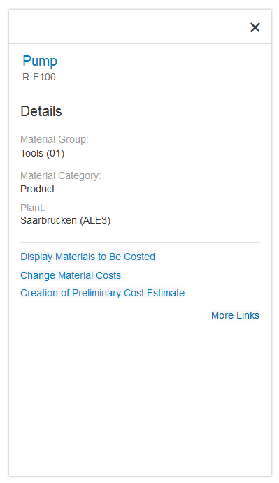
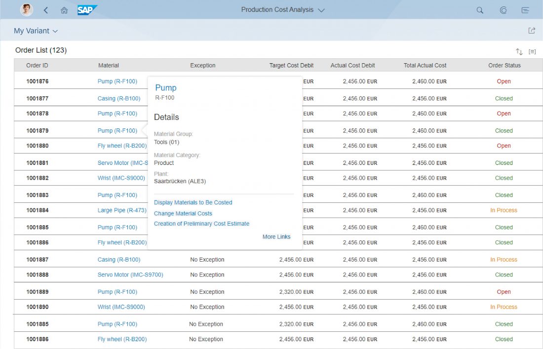
Like the quick view, the smart link triggers a popover from a text link. This popover shows additional information, such as simple object details, and offers links to related apps for the user to take action. The user can choose which links are shown in the popover by selecting them in a separate dialog.
The smart link is a smart control that uses metadata annotations to offer user-specific navigation. It analyzes the user’s assigned apps and offers only relevant navigation targets.
Usage
Use the smart link to offer direct navigation to related apps. For example:
- Navigate from a product list to the app to change the pricing
- Navigate from a sales order list to the app to see a customer’s balance
Use the smart link if:
- You want to offer related apps for navigation.
- You want to display simple object details.
Do not use the smart link if:
- You want to display more or complex information about an object. Use the object page or charts instead.
- No metadata is accessible, and only a direct link to a website, document or application is needed. Use the standard link instead.
- You need to structure information in a deeper hierarchy. Use the quick view or a list drilldown instead.
Responsiveness
The responsiveness of the smart link is based on the responsiveness of the popover and overlays the content.
On a desktop device, clicking anywhere in the background closes the popover.
On mobile devices, the smart link opens a dialog that overlays the entire content. Because the content underneath the popover is no longer directly visible to the end user, the dialog has a header and shows the object type. The dialog can be closed by clicking the close icon ( ) in the header.
Layout
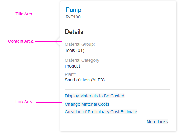
The smart link contains the following areas:
- The header bar of the smart link popover indicates the type of object and is only shown on mobile devices.
- The title area contains a title and a subtitle. The title can also be shown as a link, which can be used to navigate to the corresponding object or fact sheet. The subtitle can be used to show the ID of the object, for example.
- The content area shows object-related information, such as details about a product or contact information. You can use any UI control, based on what best fits your use case.
- The link area offers links to all other apps that are relevant for a user role. The link list includes all semantic objects defined for the app, and can also include additional links defined manually by the application development team. The link area can have two states:
Link area is empty:
If no links have been selected for the app, or if there are more than 10 links, the link area is initially empty. Instead, the user sees a Define Links button, which opens a dialog for selecting the links to be shown.
Links are shown:
As soon the link area contains links, the button text changes to More. This opens the same selection dialog.
Only the header bar is mandatory (for mobile devices). All the other sections are optional. Depending on the use case, the application could offer only a content area, or a only a link area, for example.
Behavior and Interaction
The smart link and its popover are always triggered by clicking a text element that appears as a link. This text element can be placed in any list, table, or other container. The link label can be set individually. Clicking the background closes the popover. If only one link is offered, and there is no additional information, the smart link control navigates directly to the target without opening the popover.
If the semantic object annotation is not set, the smart link is rendered as sap.m.Text by default. However, app developers can also decide to render any other control.
Link Selection Dialog
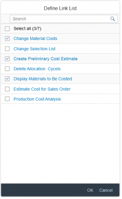
Clicking the More or Define Links button opens the Define Link List dialog. There, the user can select the app links to be displayed in the link area. The links offered in the selection list are modifiable semantic objects suggested by the smart link control. Application development teams can remove links from the selection list and change the link texts. They can also manually add links to any website or app.
Exception: Within an SAP Fiori element, the links offered in the Define Link List dialog are generated automatically. Application teams cannot adapt the list.
You can switch off the More/Define Links option by setting the property enableAvailableActionsPersonalization to “false”. By default it is set to “true”.
Smart Links in a Smart Table
Within a smart table, the link label of the smart link is set automatically using the semantic object annotation. In other words, the description cannot be changed. If there are no navigation targets, the smart link is rendered as sap.m.Text.
Guidelines
- Please check the related apps you offer carefully. Only display the ones that are relevant to the user.
- Use meaningful link names in the link area. Do not use the same link name more than once. If necessary, rename the links to suit your context (for example, “Add Product” instead of “Manage Products”).
Resources
Want to dive deeper? Follow the links below to find out more about related controls, the SAPUI5 implementation, and the visual design.


 Your feedback has been sent to the SAP Fiori design team.