
- Latest SAPUI Version 1.124
- SAPUI5 Version 1.122
- SAPUI5 Version 1.120
- SAPUI5 Version 1.118
- SAPUI5 Version 1.116
- SAPUI5 Version 1.114
- SAPUI5 Version 1.112
- SAPUI5 Version 1.110
- SAPUI5 Version 1.108
- SAPUI5 Version 1.106
- SAPUI5 Version 1.104
- SAPUI5 Version 1.102
- SAPUI5 Version 1.100
- SAPUI5 Version 1.98
- SAPUI5 Version 1.96
- SAPUI5 Version 1.94
- SAPUI5 Version 1.92
- SAPUI5 Version 1.90
- SAPUI5 Version 1.88
- SAPUI5 Version 1.86
- SAPUI5 Version 1.84
- SAPUI5 Version 1.82
- SAPUI5 Version 1.80
- SAPUI5 Version 1.78
- SAPUI5 Version 1.76
- SAPUI5 Version 1.74
- SAPUI5 Version 1.72
- SAPUI5 Version 1.70
- SAPUI5 Version 1.68
- SAPUI5 Version 1.66
- SAPUI5 Version 1.64
- SAPUI5 Version 1.62
- SAPUI5 Version 1.60
- SAPUI5 Version 1.58
- SAPUI5 Version 1.56
- SAPUI5 Version 1.54
- SAPUI5 Version 1.52
- SAPUI5 Version 1.50
- SAPUI5 Version 1.48
- SAPUI5 Version 1.46
- SAPUI5 Version 1.44
- SAPUI5 Version 1.42
- SAPUI5 Version 1.40
- SAPUI5 Version 1.38
- SAPUI5 Version 1.34
- SAPUI5 Version 1.32
- SAPUI5 Version 1.30
- SAPUI5 Version 1.28
- SAPUI5 Version 1.26
- Latest SAPUI Version 1.124
- SAPUI5 Version 1.122
- SAPUI5 Version 1.120
- SAPUI5 Version 1.118
- SAPUI5 Version 1.116
- SAPUI5 Version 1.114
- SAPUI5 Version 1.112
- SAPUI5 Version 1.110
- SAPUI5 Version 1.108
- SAPUI5 Version 1.106
- SAPUI5 Version 1.104
- SAPUI5 Version 1.102
- SAPUI5 Version 1.100
- SAPUI5 Version 1.98
- SAPUI5 Version 1.96
- SAPUI5 Version 1.94
- SAPUI5 Version 1.92
- SAPUI5 Version 1.90
- SAPUI5 Version 1.88
- SAPUI5 Version 1.86
- SAPUI5 Version 1.84
- SAPUI5 Version 1.82
- SAPUI5 Version 1.80
- SAPUI5 Version 1.78
- SAPUI5 Version 1.76
- SAPUI5 Version 1.74
- SAPUI5 Version 1.72
- SAPUI5 Version 1.70
- SAPUI5 Version 1.68
- SAPUI5 Version 1.66
- SAPUI5 Version 1.64
- SAPUI5 Version 1.62
- SAPUI5 Version 1.60
- SAPUI5 Version 1.58
- SAPUI5 Version 1.56
- SAPUI5 Version 1.54
- SAPUI5 Version 1.52
- SAPUI5 Version 1.50
- SAPUI5 Version 1.48
- SAPUI5 Version 1.46
- SAPUI5 Version 1.44
- SAPUI5 Version 1.42
- SAPUI5 Version 1.40
- SAPUI5 Version 1.38
- SAPUI5 Version 1.36
- SAPUI5 Version 1.34
- SAPUI5 Version 1.32
- SAPUI5 Version 1.30
- SAPUI5 Version 1.28
- SAPUI5 Version 1.26
Smart Link
sap.ui.comp.navpopover.SmartLink
Intro
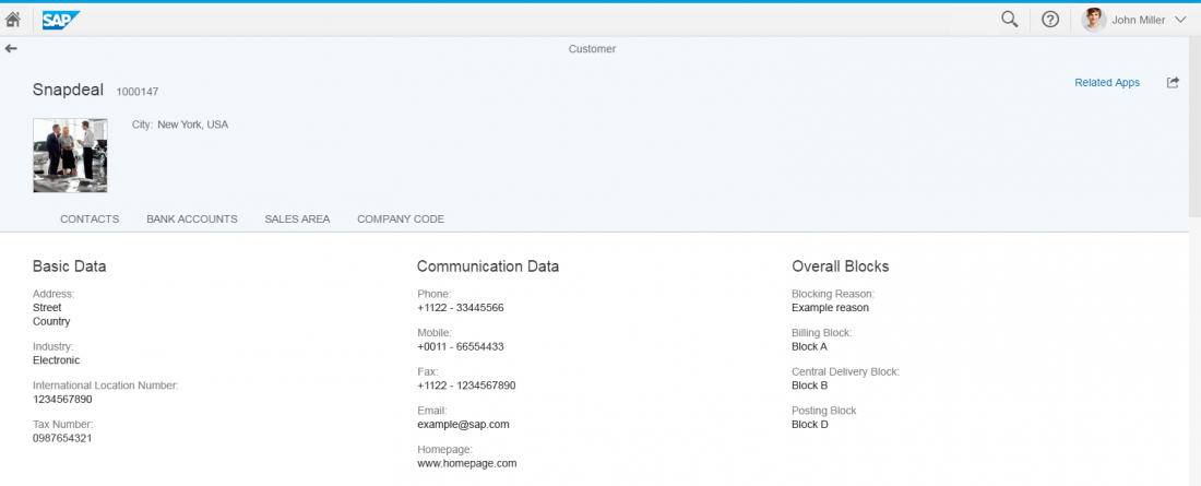
Similar to the quick view, the smart link triggers a popover from a text link. This popover offers links to related apps for the user to take action, and shows the user additional information such as simple object details.
The smart link is a smart control. It uses metadata annotations to offer the user specific navigation. It analyzes the user’s assigned apps and offers only relevant navigation targets.
Usage
Use the smart link to offer direct navigation to related apps. For example to navigate from a product list to the relevant app to change the pricing, or from a sales order list to the app to see a customer’s balance.
Use the smart link if:
- You want to offer related apps for navigation.
- You want to offer simple object details.
Do not use the smart link if:
- You want to display more or complex information about an object. Use the object page or charts instead.
- There is no metadata accessible, and only a direct link to a website, document or application is needed. Use the standard link instead.
- You need to structure information in a deeper hierarchy. Use the quick view or a list drill down instead.
- You want to display contact details. Use the quick view instead.
- You need to show related information (such as an image). Use the popover or quick view instead.
Responsiveness
The responsiveness of the smart link is based on the responsiveness of the popover and overlays the content.
Clicking the background closes the popover on desktop and smartphones.
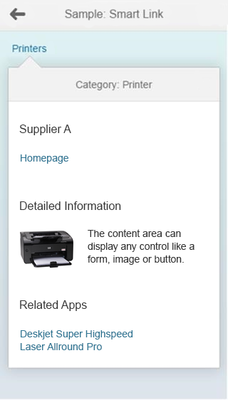
Size S - On smartphones, the smart link overlays the content
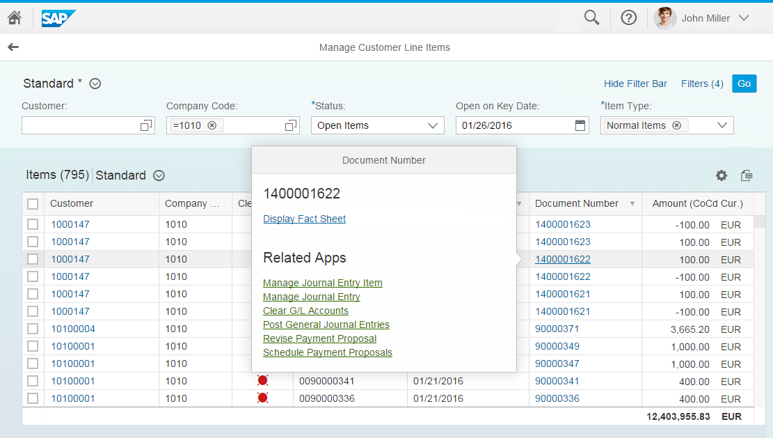
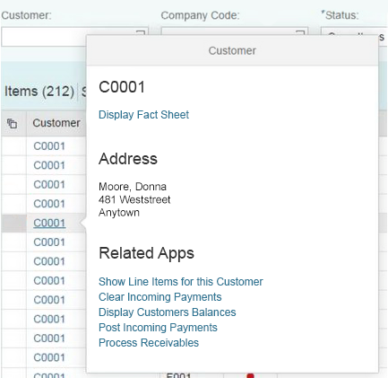
Size M - Smart link on a tablet device
Size L - Smart link in a table on a desktop device
Layout
The smart link contains the following areas:
- The header bar of the smart link popover describes the type of information offered.
- The title area provides space for a label and a main link. By default, the title and the link description of the link that triggers the popover are the same. However, both can be edited (for example, the title could display the company’s name while the link description is a customer ID).
- In the content area, the application can show any control depending on the use case.
- The Related Apps area offers links to all relevant applications of a user role. The title Related Apps cannot be changed.
The four different areas cannot be rearranged. The header bar is mandatory, while all other sections are optional. Depending on the use case, the application could only offer a Related Apps section, for example. The offered content in the popover must contain a link; otherwise the popover will not open. We do not recommend offering only one link within the popover – please use the standard link control to offer direct navigation instead.
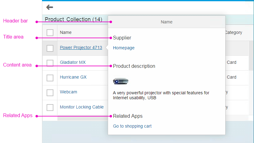
The four areas of the smart link
Behavior and Interaction
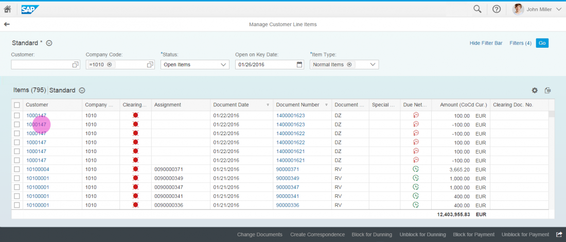
The smart link and its popover are always triggered by clicking or tapping a text element that appears as a link. This text element can be placed in any list, table, or other container. The link label can be individually set. Clicking or tapping the background closes the popover.
If the semantic object annotation is not set, the smart link is rendered as sap.m.Text by default. However, app developers can also decide to render any other control.
Smart Link Interaction
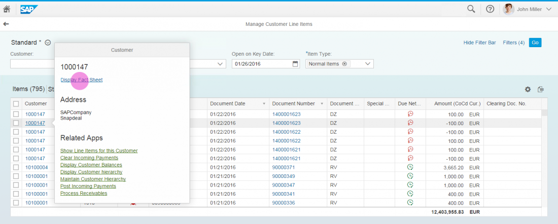
The Related App Area
The title Related Apps cannot be changed. In breakout scenarios and custom applications, the links offered in this section can be freely chosen. The smart link control will suggest semantic objects that are modifiable. It’s possible to link to any website or app.
The Smart Link in a Smart Table
Within a smart table, the link label of the smart link is automatically set depending on the semantic object annotation. This means that the description cannot be changed in a smart table. Inside the smart table, the smart link is rendered as sap.m.Text if there are no navigation targets.
Guidelines
- If you only need to offer one link to navigate, please use the standard link instead as this supports direct navigation without opening a popover.
- Please check the related apps you offer carefully. Only display the ones that are relevant to the user.
Resources
Want to dive deeper? Follow the links below to find out more about related controls, the SAPUI5 implementation, and the visual design.
 Your feedback has been sent to the SAP Fiori design team.