
- Latest SAPUI Version 1.124
- SAPUI5 Version 1.122
- SAPUI5 Version 1.120
- SAPUI5 Version 1.118
- SAPUI5 Version 1.116
- SAPUI5 Version 1.114
- SAPUI5 Version 1.112
- SAPUI5 Version 1.110
- SAPUI5 Version 1.108
- SAPUI5 Version 1.106
- SAPUI5 Version 1.104
- SAPUI5 Version 1.102
- SAPUI5 Version 1.100
- SAPUI5 Version 1.98
- SAPUI5 Version 1.96
- SAPUI5 Version 1.94
- SAPUI5 Version 1.92
- SAPUI5 Version 1.90
- SAPUI5 Version 1.88
- SAPUI5 Version 1.86
- SAPUI5 Version 1.84
- SAPUI5 Version 1.82
- SAPUI5 Version 1.80
- SAPUI5 Version 1.78
- SAPUI5 Version 1.76
- SAPUI5 Version 1.74
- SAPUI5 Version 1.72
- SAPUI5 Version 1.70
- SAPUI5 Version 1.68
- SAPUI5 Version 1.66
- SAPUI5 Version 1.64
- SAPUI5 Version 1.62
- SAPUI5 Version 1.60
- SAPUI5 Version 1.58
- SAPUI5 Version 1.56
- SAPUI5 Version 1.54
- SAPUI5 Version 1.52
- SAPUI5 Version 1.50
- SAPUI5 Version 1.48
- SAPUI5 Version 1.46
- SAPUI5 Version 1.44
- SAPUI5 Version 1.42
- SAPUI5 Version 1.40
- SAPUI5 Version 1.38
- SAPUI5 Version 1.36
- SAPUI5 Version 1.34
- SAPUI5 Version 1.32
- SAPUI5 Version 1.30
- SAPUI5 Version 1.28
- SAPUI5 Version 1.26
Chart Toolbar
sap.suite.ui.commons.ChartContainer | sap.m.Bar
Intro
The chart toolbar acts as a container for charts.
The width and height of the chart container are never defined by the app, but are always set by the container itself (as explained in Size of the Chart Container).
The toolbar is mandatory. Small charts such as dashboards, table cells, and small frames are an exception to this rule. In these cases, the developer must provide a consistent UI to enable action on the chart.
The toolbar is always placed on top of the chart. It provides actions such as multiple box selection for selecting dimensions, full screen format, personalization actions, and a toggle function for showing and hiding legends.
Responsiveness
The content of the toolbar adapts to the width of the toolbar.
In this example, you can see three perspective views (dropdowns) and three view switches.
While all three perspectives are shown on desktops, these are grouped into a single button on tablets and smartphones. The button is labeled View by by default, but can be renamed by the app team.
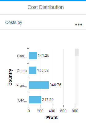
Chart toolbar size S
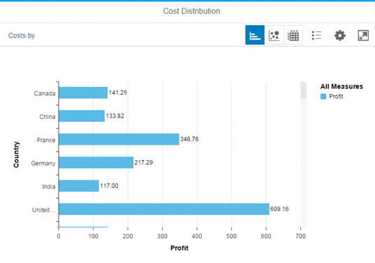
Chart toolbar size M
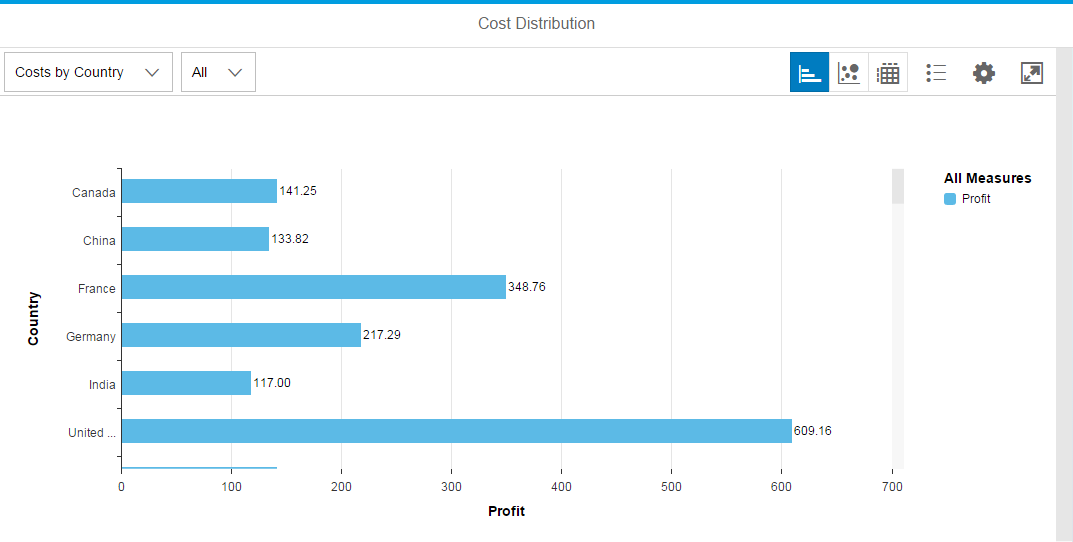
Chart toolbar size L
Components
All components of the chart toolbar are optional. It can contain the following actions:
- Perspective switch or chart/ title (Show title or perspective switch)
- View switch (optional)
- Legend (optional)
- Personalization (optional)
- Full screen mode (optional)
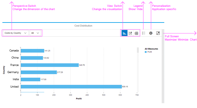
Components of the chart toolbar
Behavior and Interaction
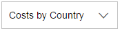
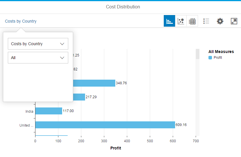
Perspective Switch/Title (Generic)

Overview chart toolbar
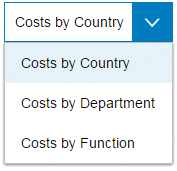
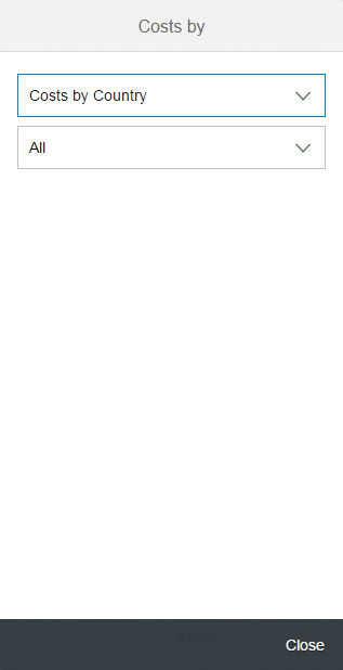
The perspective switch is left-aligned in the toolbar when a generic drop down/ select control is used. It can be used to switch between respective dimensions.
For smart business apps the view incorporates and defines the chart description, the dimension, the measure, and the defaulted chart type. The several views are preconfigured and maintained by an administrator in smart business.
Please make sure that all switches have a meaningful title. Therefore, we recommend to use a short chart description followed by the dimensions:
<Chart description> by <Dimension>
Simple perspective
Optionally, the perspective switch can be extended if the app needs to switch between specific sub dimensions. It depends on the app how many dimensions and subdimensions are needed.
In general, you can use any kind of control. However, we recommend using the select control.
<Chart description> by <Leading Dimension> <Sub Dimension>
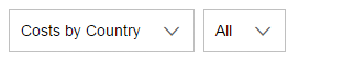
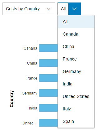
Perspective view with subdimension
If there is not enough space, all perspective switches move into one button (property: SelectorGroupLabel).
Apps can rename the default button named View by.
A click on this button opens a popover in large and medium sizes and a full-screen dialog in small sizes.
Small - Responsive behavior perspective switches
Medium - Responsive behavior perspective switches
If the app does not need a perspective switch, use the chart title (property: title).
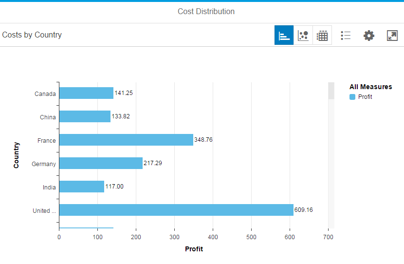
Chart with title
View Switch (Generic)
View switches are right-aligned in the toolbar. They allow the user to switch between different chart types or table layouts. You need to offer the view switch when the chart relies on subtle color differences or color gradients. Users with visual impairments can then use the table view.
Switches are optional. The buttons can be hidden, if there is no need to switch between different charts or tables.
The chart types and the number of switches need to be chosen with caution. Each app must decide which chart types are best suited to the user’s context.
We recommend using no more than three types of visualization. The sequence of chart type switches is not fixed; however, we recommend sorting them by importance and usage within the respective app.
The segmented button control is used to display the chart types. The control highlights the chart that is currently being displayed.
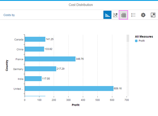
Chart toolbar with view switch
If you have more than three view switches, you can use a space-saving alternative. In this case, the segmented button morphs into one button that represents the selected view. Initially, this button shows the default chart type.
Clicking the button opens a popover with a selected menu control showing all possible views. If the user chooses a different view, the popover closes and the selected view is displayed.
Please check the responsiveness section to understand how the toolbar reacts when the screen size is restricted.
View Switch – Switch between Chart and Table
You can easily switch between tables and charts by using the view switch.
Some specific actions are only available in certain views. For example the Legend icon is only visible in the chart view. If the user selects the table view, the Filter action is visible and the Legend icon is hidden.
Icon Usage
Each visualization of a chart is represented by an icon.

Bar Chart: Font 'SAP-icons' - Unicode: #e02c - Name: horizontal-bar-chart

Horizontal Bullet Chart: Font 'SAP-icons' - Unicode: #215

Vertical Bullet Chart: Font 'SAP-icons' - Unicode: #e216

Combined Column Line Chart: Font 'SAP-icons' - Unicode: #e11f - Name: business-objects-experience

Stacked Bar Chart: Font 'SAP-icons' - Unicode: #e183 - Name: horizontal-stacked-chart

Stacked Column 100% Chart: Font 'SAP-icons' - Unicode: #e180 - Name: full-stacked-column-chart

Bar Chart : Font 'SAP-icons' - Unicode: #e182 - Name: horizontal-bar-chart-2

Column Chart: Font 'SAP-icons' - Unicode: #e0ef - Name: vertical-bar-chart

Pie Chart: Font 'SAP-icons' - Unicode: #e015 - Name: pie-chart

Stacked Bar 100% Chart: Font 'SAP-icons' - Unicode: #e17f - Name: full-stacked-chart

Table Chart: Font 'SAP-icons' - Unicode: #e0bb - Name: table-chart

Bubble Chart: Font 'SAP-icons' - Unicode: #e18e - Name: bubble-chart

Column Chart: Font 'SAP-icons' - Unicode: - Name: vertical-bar-chart-2

Scatter Chart: Font 'SAP-icons' - Unicode: & #xe18f; - Name: scatter-chart

Stacked Column Chart: Font 'SAP-icons' - Unicode: #e184 - Name: vertical-stacked-chart
Map: Font 'SAP-icons' - Unicode: #e185 - Name: choropleth-chart
Legend (Generic)
The chart Legend button (property: ShowLegend) is placed next to the view switches. The user clicks or taps this button to hide or show the legend.
The legend also allows the user to select or deselect data points.
Icon Usage
The legend is represented by the following icon:

Chart legend icon
Personalization (Generic)
Developers can add a Personalization button to the app’s chart toolbar to enable app-specific personalization charting (property: ShowPersonalization). The corresponding popover and details also need to be implemented by the developer.
We do not recommend using this feature. If you do choose to use it, exercise caution as the toolbar’s perspective switch feature already allows the preconfiguration of several combinations of dimensions, measures, and selections of chart types.
Hence, the developer should decide on the most valuable chart/data set combinations for the end user beforehand.
When viewing charts, users do not usually want to think about what chart types, dimensions, or measures are most suitable in a particular use case. Therefore, the app should provide users with the most appropriate preconfigured chart view.
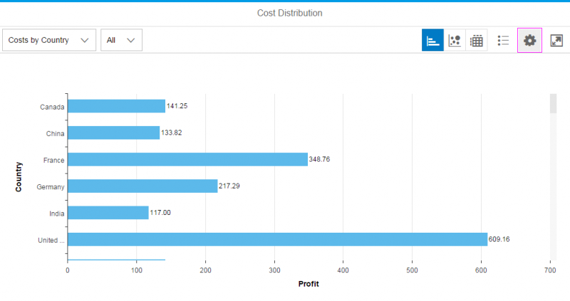
Chart personalization action
Icon Usage
Personalization is represented by the following icon:

Chart personalization icon
Zoom In/Zoom Out (Generic)
The app can add zoom in/ zoom out button in the chart toolbar to enable zoom functionality. Two icon buttons with a magnifier glass will be displayed. These buttons will be positioned just before the full screen icon and will automatically drive the zooming feature in the chart. When the zoom in or zoom out icon is pressed, the chart will automatically zoom in or out to the most appropriate scale.
Chart with zoom in/ zoom out buttons
Icon Usage
The zoom in/ zoom out functionality is represented by the following icon:
Chart zoom in/ zoom out icon
Full Screen Mode (Generic)
Alternatively, the app can use the full-screen mode of the chart container (property: FullScreen). However, the full-screen button is always placed at the top right of the toolbar. Further details are available in the Behavior and Interaction section above.
The user can toggle between embedded and full-screen mode via the Maximize full-screen toggle button. In full-screen mode, the toolbar replaces the page header bar which is usually used (the Minimize icon appears).
In full-screen mode, the chart and toolbar occupy the entire width and height.
Icon Usage
The user clicks or taps the full-screen chart icon to initiate full-screen mode. This icon is then replaced by an icon that allows the user to exit full-screen mode.

Full-screen chart icon
Guidelines
Please see the detailed Guidelines section of the toolbar overview article.
Additional Guidelines
- Think carefully about what actions you really need in the chart toolbar – do not overload the table toolbar with actions.
- Try to put the actions as close to the content as possible.
- Use tooltips like Sort, Filter, and Group to label icon buttons in the table toolbar.
Resources
Want to dive deeper? Follow the links below to find out more about related controls, the SAPUI5 implementation, and the visual design.
 Your feedback has been sent to the SAP Fiori design team.