Carousel
Intro
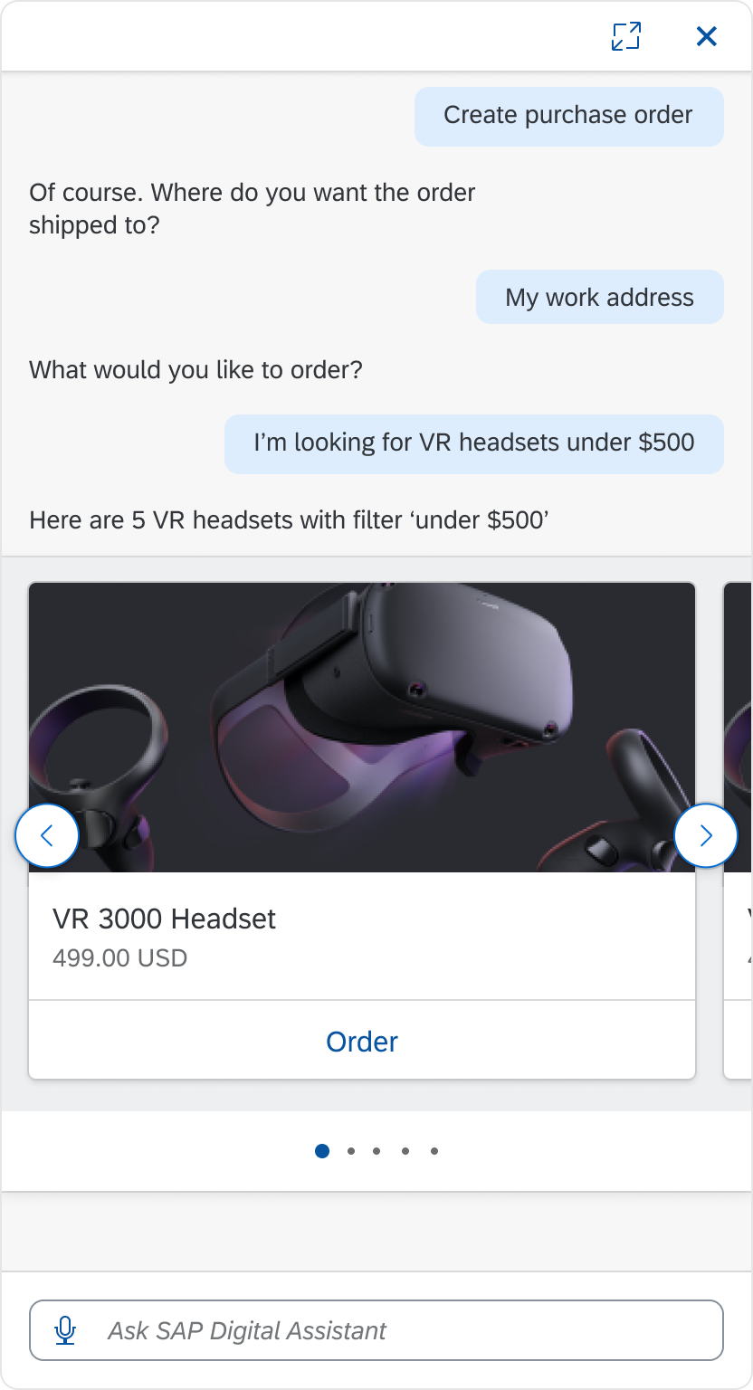
The carousel lets users browse through a set of items and view one item at a time. The user can select navigation buttons to move to the next or previous item. The carousel is most useful when the items in the carousel are visually distinct and the user can see items side-by-side for comparison.

Carousel
Usage
These are some best practices when using the carousel with the digital assistant.
Dos
- Show strong visual representations of the items in the carousel set.
- Make sure the message before the carousel clearly tells the user what happens when the user selects an item.
Don’ts
- Don’t use carousel if there is only one item in the set.
- Don’t show items that are visually similar to each other.
Structure
These are some best practices for the carousel layout.
Main View Carousel
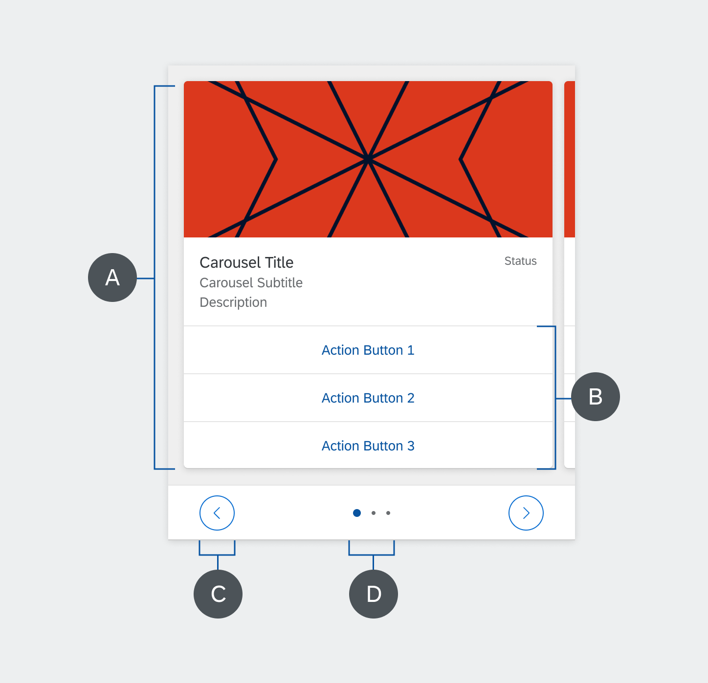
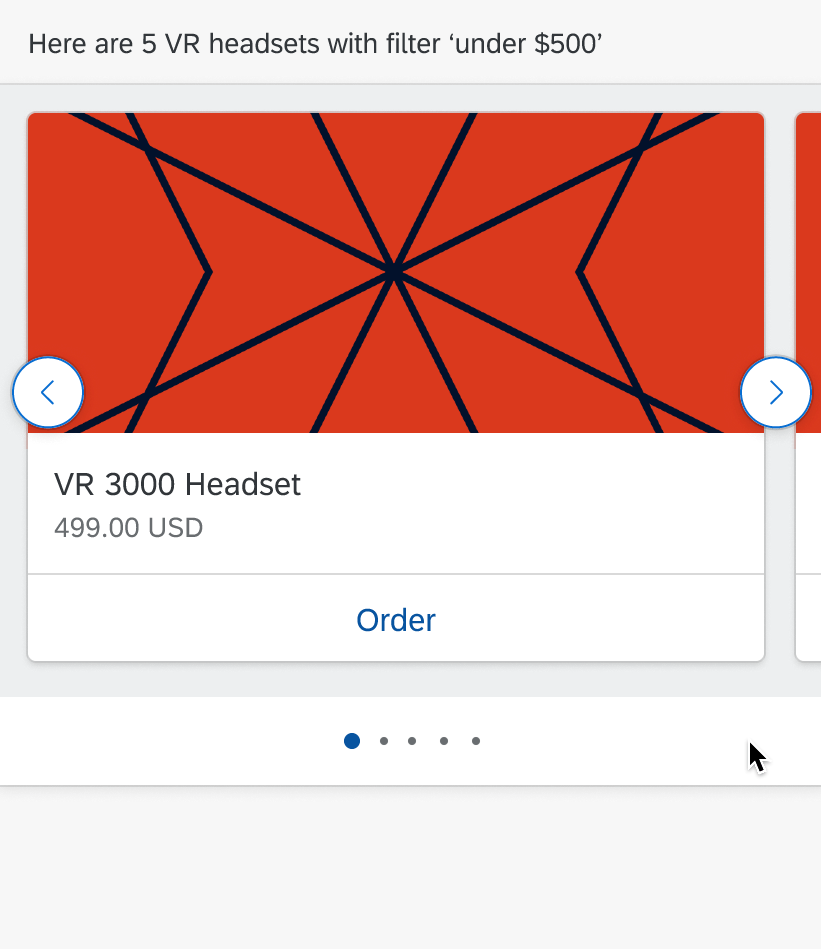
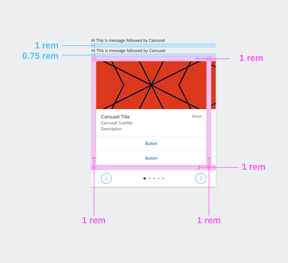
The carousel component includes content, action items, navigation buttons, and page indicators. Using buttons is optional. Refer to the image to the right for each part of the carousel layout below.
A. Content
The content includes all the items in the set to display in the carousel. Each item is shown as a Media Card.
B. Action List Items
You can attach List Card items to the content to let users to perform actions in the carousel. You can list up to three items in the list.
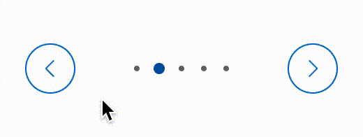
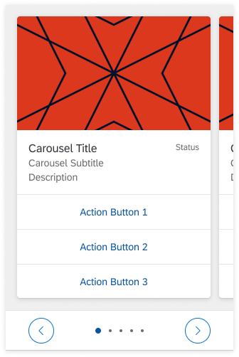
C. Navigation Buttons
Navigation buttons let the user move forward and back through the items in the carousel. The back button is on the left of the carousel and the forward button is on the right. The navigation buttons can display inside the page indicators or inside the content.
D. Page Indicators
The page Indicators show the total number of pages (items) in the carousel and the current page in the set that the user is on. Page indicators display either above or below the content.
Carouse Layout
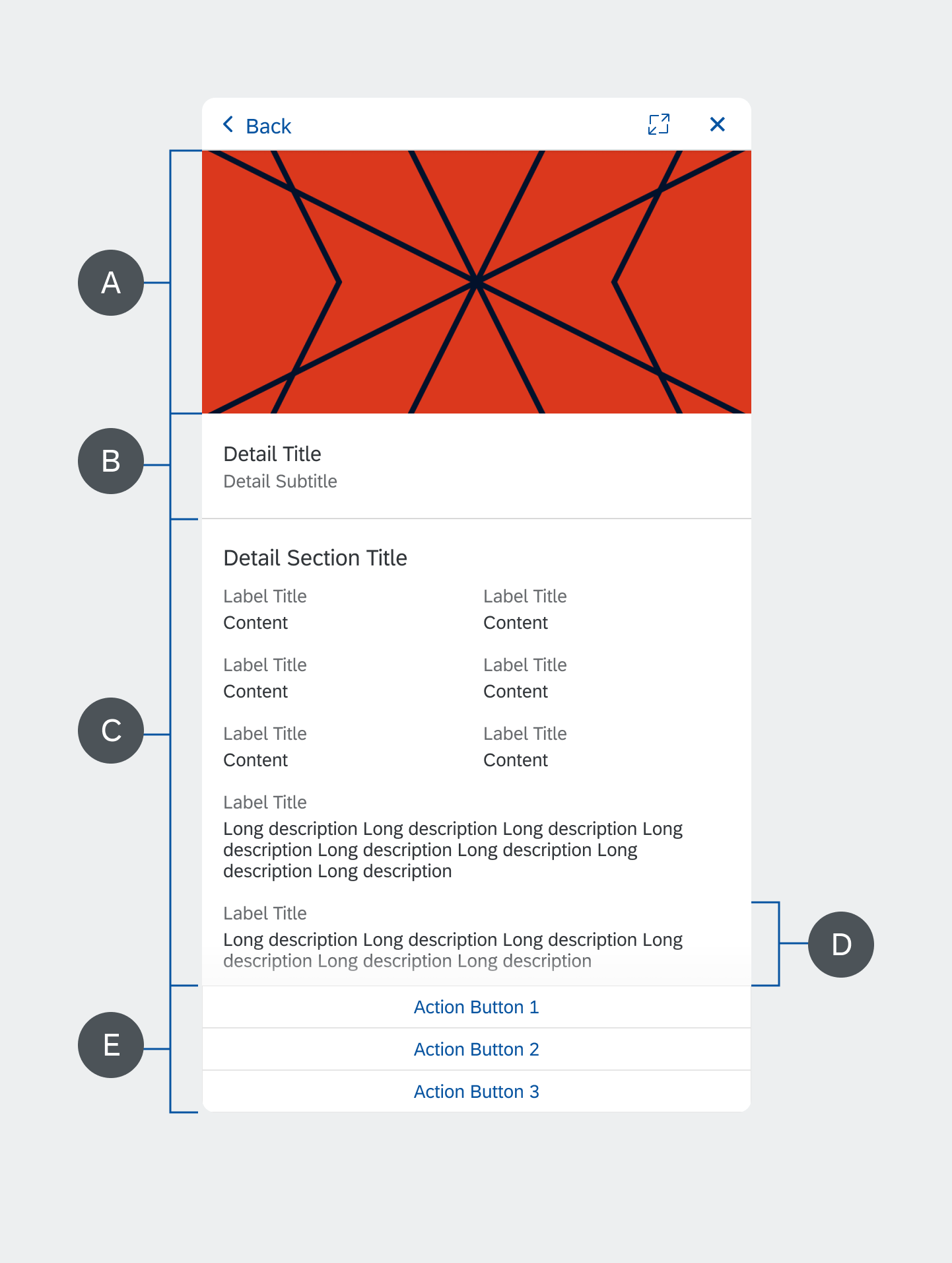
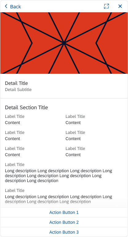
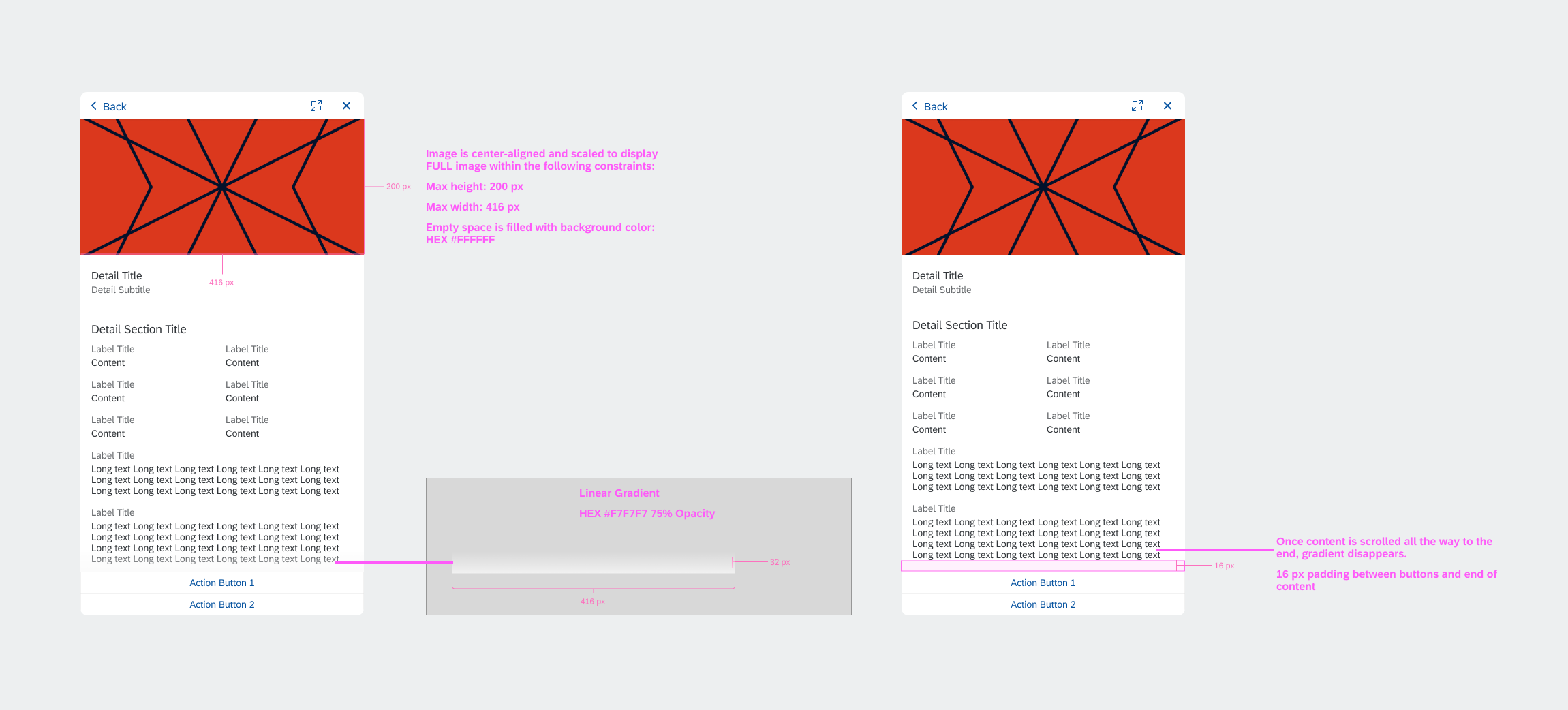
A. Image
Image is center-aligned and scaled to display the full image within the following constraints:
- Max height: 200 px
- Max width: 416 px
Empty space is filled with background color: HEX #FFFFFF
B. Header
Header consists of a title and subtitle corresponding with the information in the main view Carousel.
C. Section
The section consists of a maximum of 8 value-pairs (Label Title + Content). Display as 2-columns if there’s 1 line of content. Use a 1-column display if there’s more than 1 line of content.
2-column value-pairs are always displayed above 1-column value-pairs.
D. Value-Pair
A value-pair consists of a Label Title + Content.
In 1-column display, the value-pair content is constrained to a maximum of 250 characters. Truncate after 250 characters using ellipses.
If there is truncated content, the primary action button is “Open in App,” which will allow the user to see the full content.
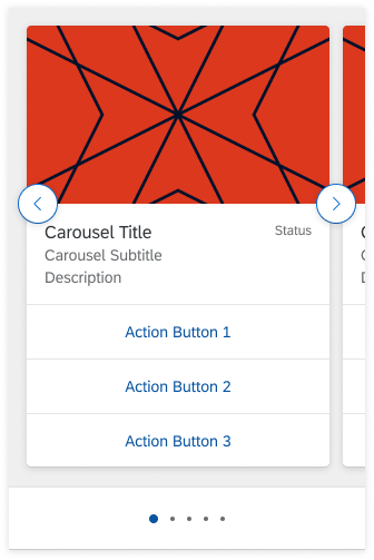
E. Action List Items
Actions available in the Carousel should be available in the Detail Page as action list items, with a maximum of 3 actions.
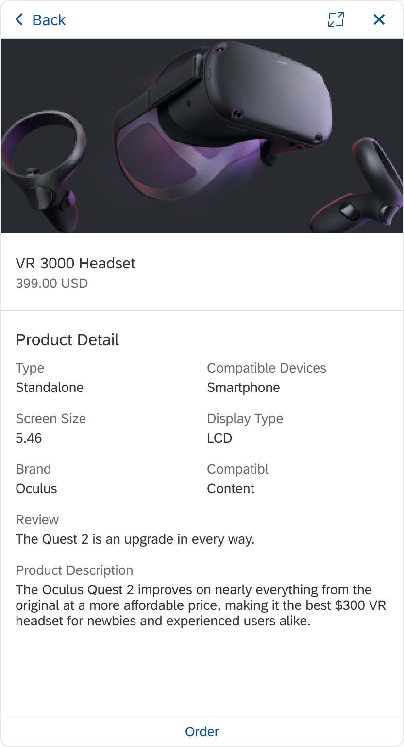
Detail Page Structure
Behavior and Interactions
The carousel in a digital assistant user interface for the web follows the Fiori 3 carousel specifications.
Navigation Button
The user moves through carousel items using the navigation buttons (right and left icons). The navigation button changes on hover, while pressing, and on select. The navigation button can display on top of or to the side of each item in the carousel. In addition, paging indicators let the user know where they are in the carousel items.
Navigation Button Behavior
Action Items List
All the items of the list are clickable buttons. When the user selects an item, the action is performed and a message displays.
Action Items List
Content
When the user hovers over the content, a light shadow displays below the card to let the user know it is clickable. When the user selects content in the carousel, a new view model opens displaying more details.
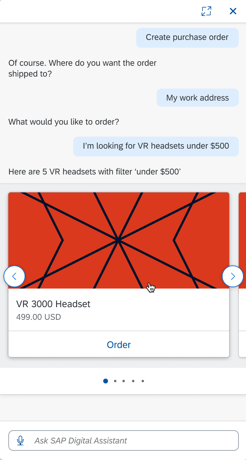
Carousel Content
Detail Page
When the user selects (clicks on) the content, the detail page opens in the panel. The carousel displays up to 3 actions on the carousel. These are also available in the detailed page as action list buttons.
Detail Page
Specifications
Carousel
These visual design specifications apply to the carousel style and spacing.
Carousel Specifications
Navigation Buttons
The navigation button style depends on if the buttons display within the page indicators or over the content. Navigation buttons over the content have a shadow that page Indicators don’t have.
Navigation Button Below Item
Navigation Button On Item
Paging Indicator: Icons
The paging indicator tells the user where they are in the carousel. The current position inside the set of items is displayed using an optional paging indicator (dots).

Page Indicator: Icon
Paging Indicator: Count
If there are more than 8 pages, the paging indicator changes from icons to numbers.

Page Indicator: Count
Action List Item
Follow the specifications for Action List Item in the Fiori Design Guidelines, if the actions are attached to the content. Apply the cozy conversation specification for actions.
Action List Item
Detail Page
There’s a padding of 16 px (1 rem) between the end of the detail page content and the action items list. If the list covers content, the content is scrollable and there’s a gradient overlaying the content above the action items list.
Colors
These colors are the standard theme to use for the carousel.

Mockup