
Data Table
FUIDataTable
Intro
A data table is a range of labeled columns and rows used to present numbers, text, or even images. Generally, data tables are a grid layout of columns and rows.
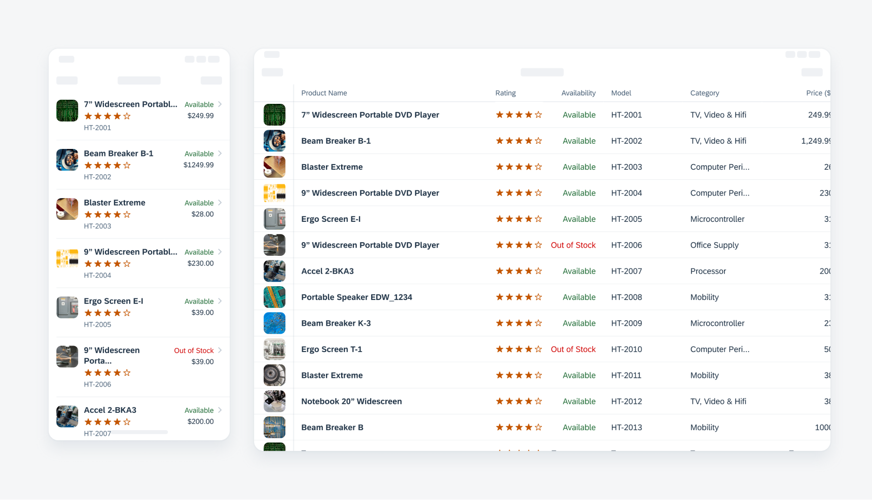
The horizontal scrollable data table with a sticky header and column is available in both compact and regular screen sizes. Alternatively, the data table will be converted to a list report by default in compact width if horizontal scrolling is not available.
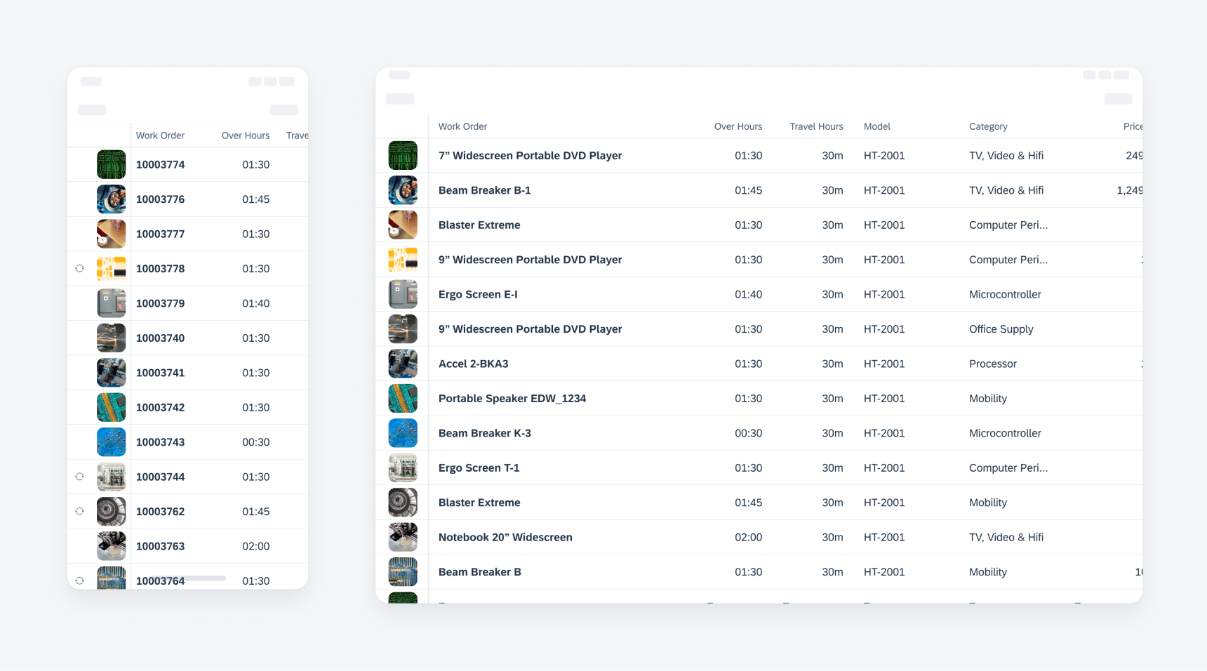
Example of data tables on compact (left) and regular screen sizes (right)
- Use data tables when users need to compare multiple attributes across items in a large data set.
- Use data tables in compact screen sizes with horizontal scrolling and sticky headers.
- Don’t use data tables in preview views.
- Don’t use data tables when users don’t need to compare multiple attributes across the items.
A. Header Row
A header row is always at the top of the data table. The row contains key data label of each column and always sticks to the top during scrolling.
B. Rows of Data
Each row represents one instance of data. Each column inside a row represents each attribute of the instance. The leftmost column can be persistent and stick to the left of the screen.
C. Persistent Column (Optional)
The first column can be set to be persistent which allows the column to stick to the left during scrolling.
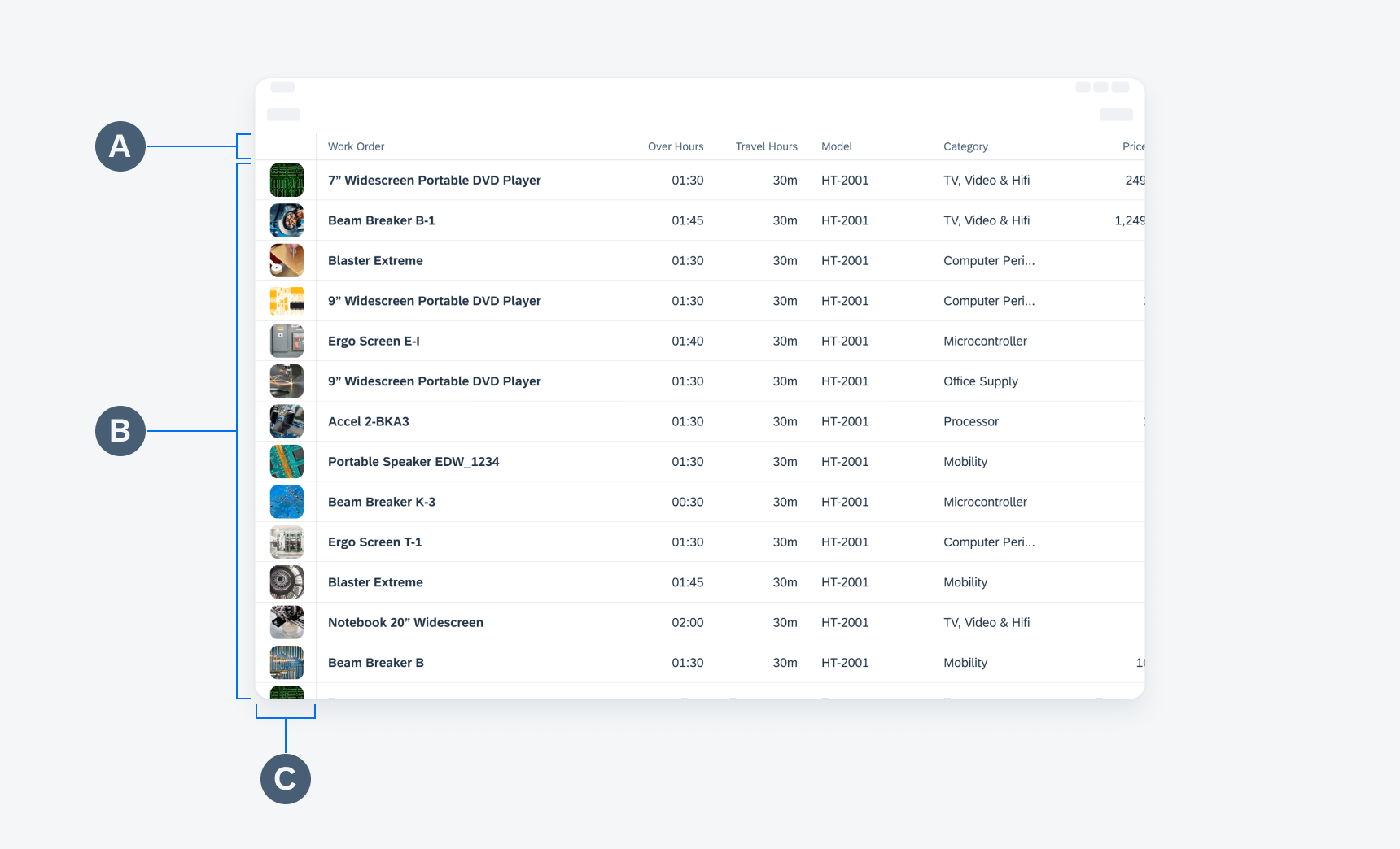
Anatomy of the data table on a regular screen
Bulk Actions
The data table allows multi-selection. The user can choose to take further actions with the selected items.
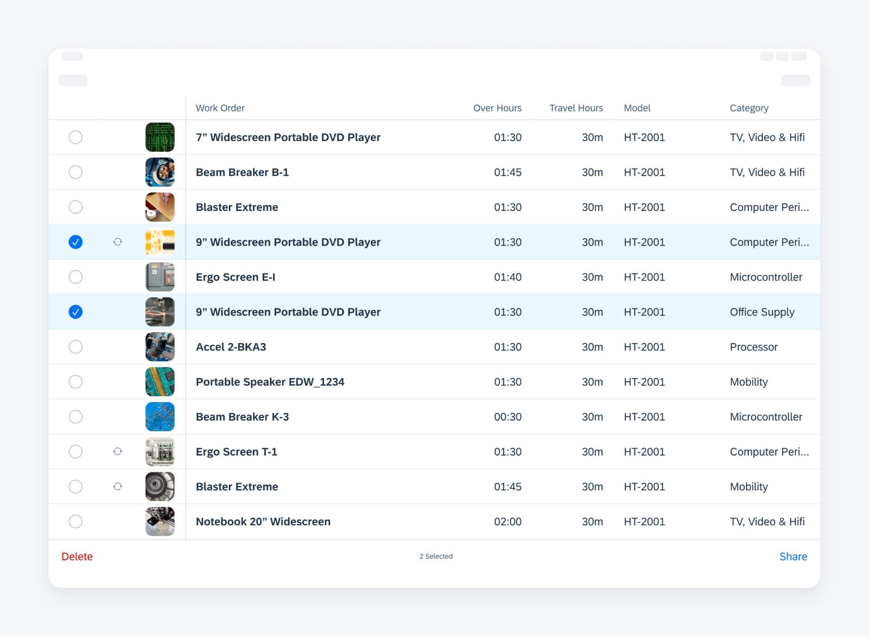
Toolbar with further actions after selecting a few rows in a data table
Add a Data Row
The “+” button, which can appear on the navigation bar or in an inline cell button, allows users to add a new data row to the current data table.
The added data appears at the location following the current order direction rules. For example, if the table is ordered by timestamp, the added row appears as the top row.
The screen scrolls to the location where the added row appears with the highlight background color. The highlight background color then fades away.
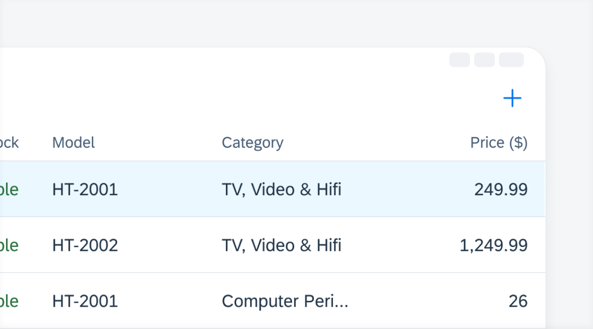
Example of a most recently added row at the top of a table
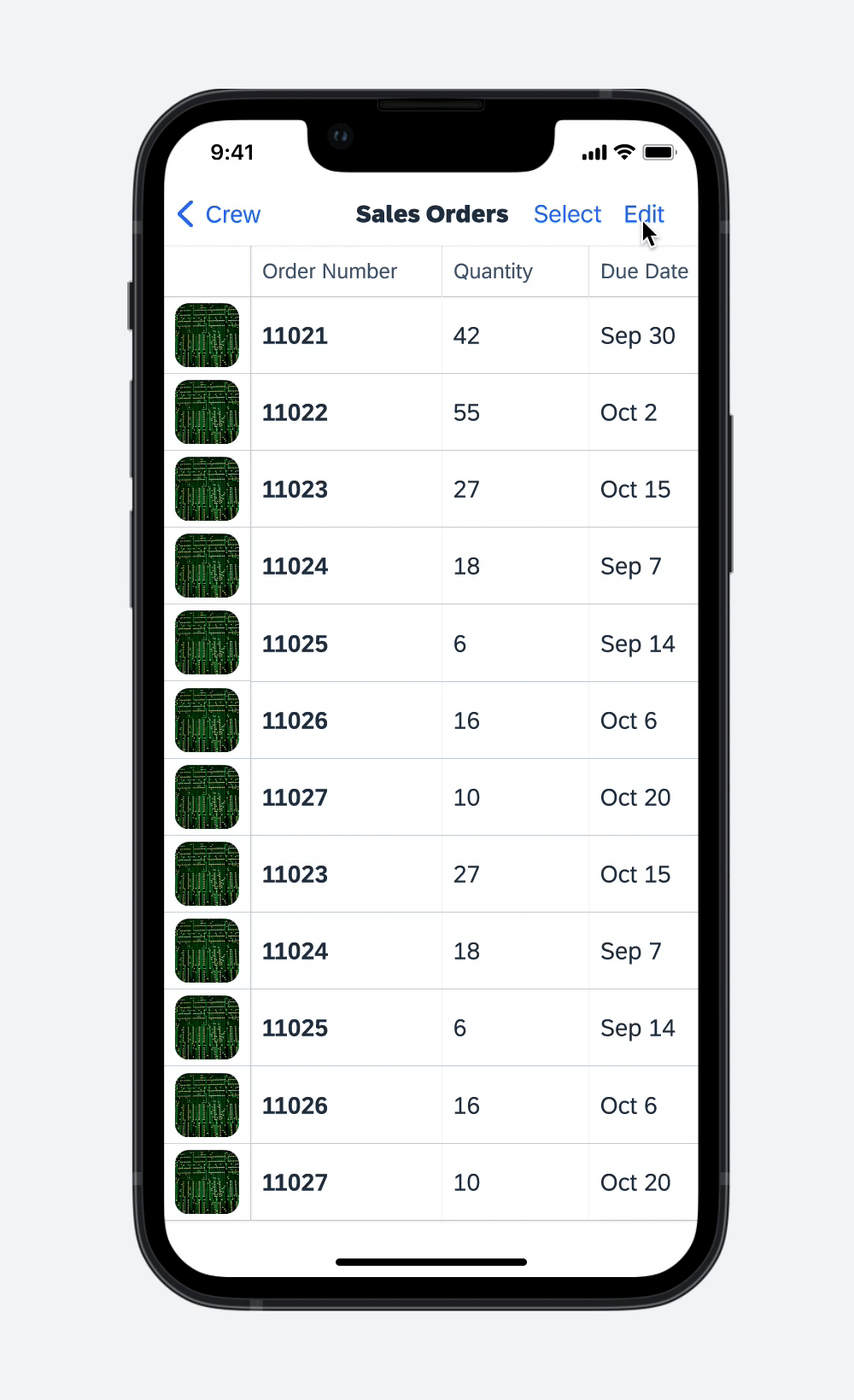
Edit a Data Row
An edit action can either be triggered after a drill-down to see object details, or it can be triggered after tapping the “Edit” button within a row.
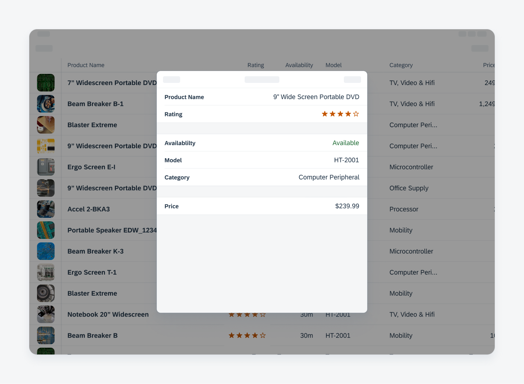
Example of an edit modal after triggering the edit mode from the data table view
Edit Data In-line
An in-line edit mode can be triggered after tapping the “Edit” button in the navigation bar. It allows the user to edit multiple data cells in-line without drilling down to the object detail pages.
In the edit mode, the user can tap on any available data table cell to edit. An active data table cell has a highlighted stroke and text background. Once the user is done editing, they can tap on the “Done” button in the navigation bar to save and exit the in-line edit mode.
User interaction of entering and exiting the in-line editing mode
If there is an invalid entry, the cell is highlighted in red and a banner with an error message pops up. If the user deselects the cell, the error is still visible with a red underline and a banner with an error message is displayed.
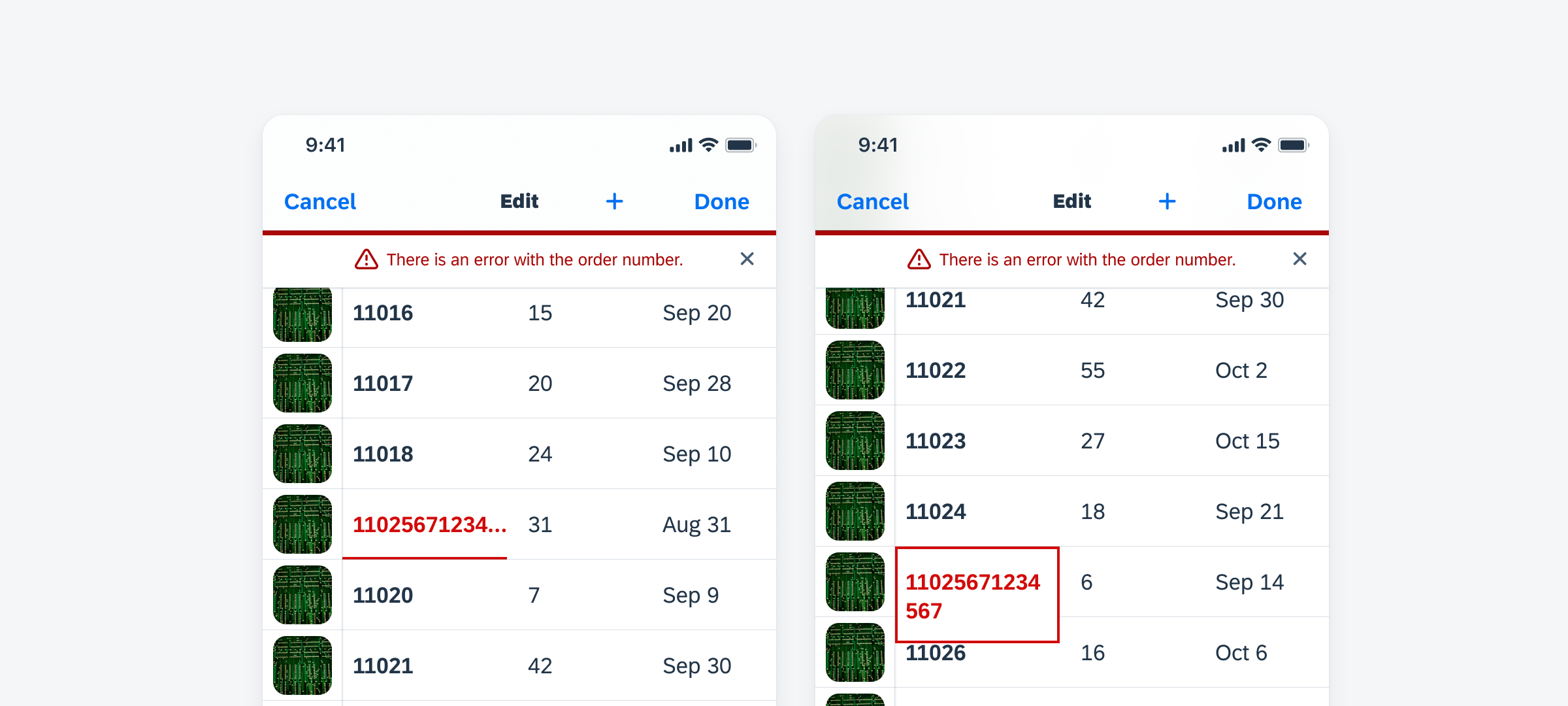
Example of an in-line error message
Currently supported data types include text, duration, time, date, and list picker.
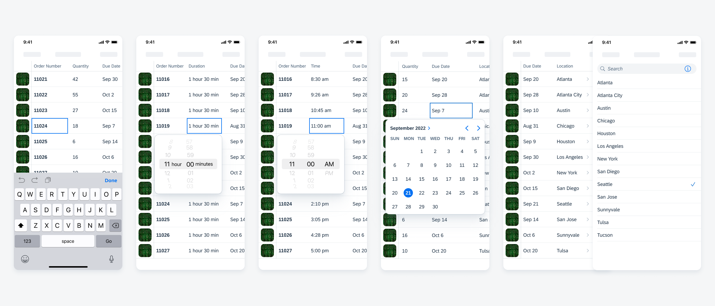
Examples of text, duration, time, date, and list picker data table cells from left to right
Read-Only State
If a data table cell can’t be edited in the in-line editing mode, the cell should be displayed as a read-only data table cell with a grey background. If the user taps on a read-only cell, a toast message pops up indicating that the tapped cell is read-only.
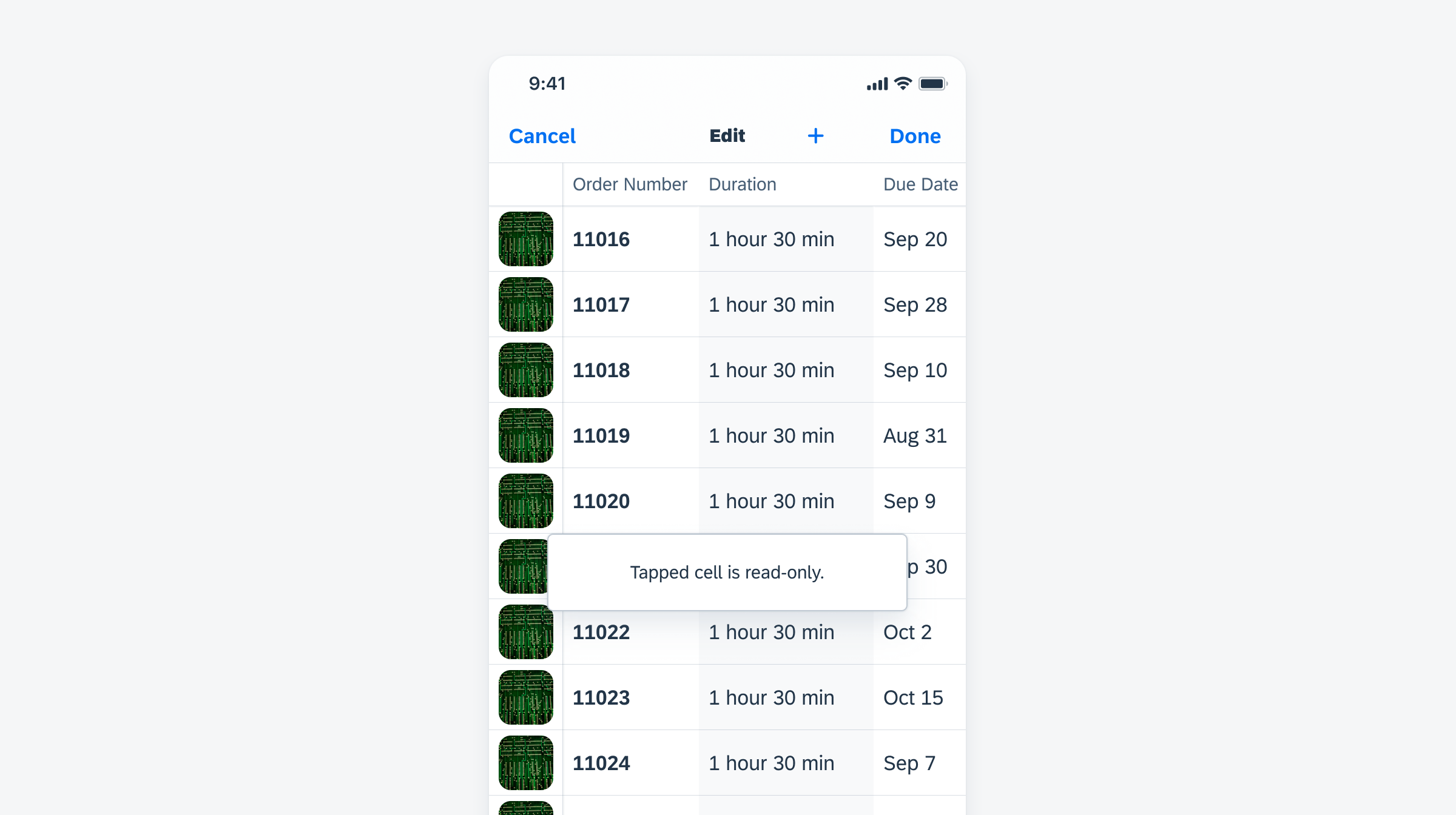
Example of a toast message after tapping on a read-only state data table cell
Example of a data table that has been converted to a list picker
Development: FUIDataTable
SAP Fiori for Android: Data Table
Related Components/Patterns: Table View, List Report, Filter Feedback Bar
 Your feedback has been sent to the SAP Fiori design team.