
Hierarchy View
FUIHierarchyView
Intro
The hierarchy view shows the relationship between parent and child objects. It serves as an entry point for a user to get an overview about where an object lives in a larger hierarchical structure.
For single level data sets, we recommend using a list report instead of a hierarchy view.
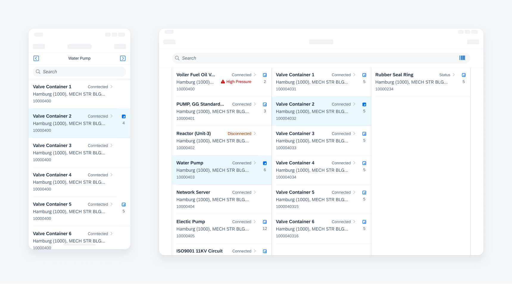
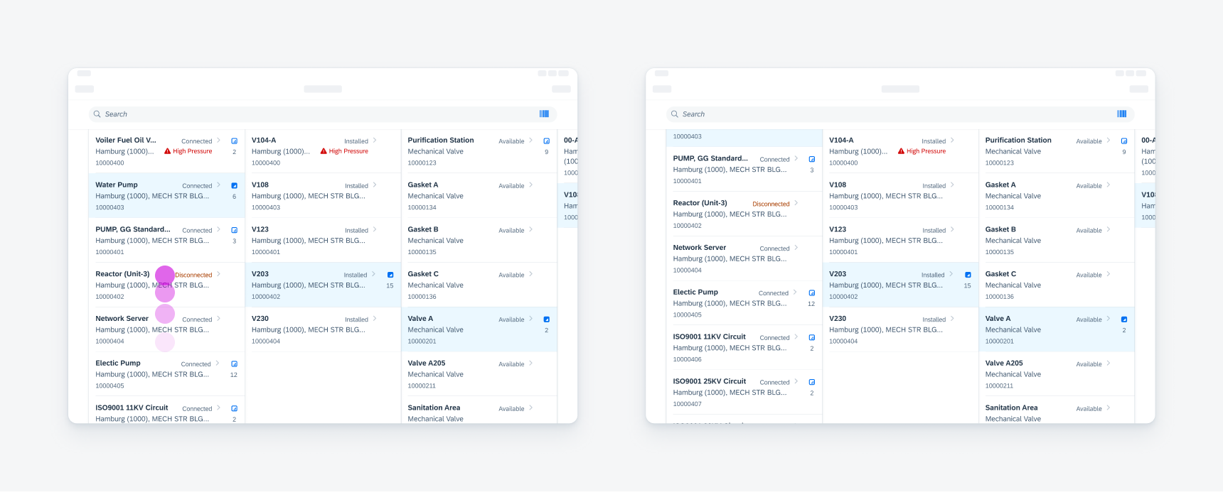
Hierarchy views on compact (left) and regular (right)
Single Line Object Cell
Use the horizontal variation of the hierarchy accessory to avoid creating unnecessary space between object cells.
Action Buttons
Be careful when using single action buttons and contact icons within an object cell. Using it next to the hierarchy icon can create too many touch targets.
Icon Stacks
Use icon stacks in an object cell with caution because they can cause heavy text truncation.
A. Breadcrumb
The breadcrumb only appears in compact width layouts. It is comprised of two elements:
- Left and right arrow icons – In addition to the left/right swipe gesture, users can tap on the arrow icons to navigate between levels in a hierarchy.
- Parent object title – This parent object title displays the name of the object that is currently in view.
B. Object Cell
The behavior and functionality of object cells follow the standard. For more guidance on object cells, see Object Cell.
B. Hierarchy Icon + Total Direct Objects
There is a default and a selected state of the hierarchy icon. Use the selected state when a parent object is expanded. The total direct objects can be omitted for lazy loading purposes.
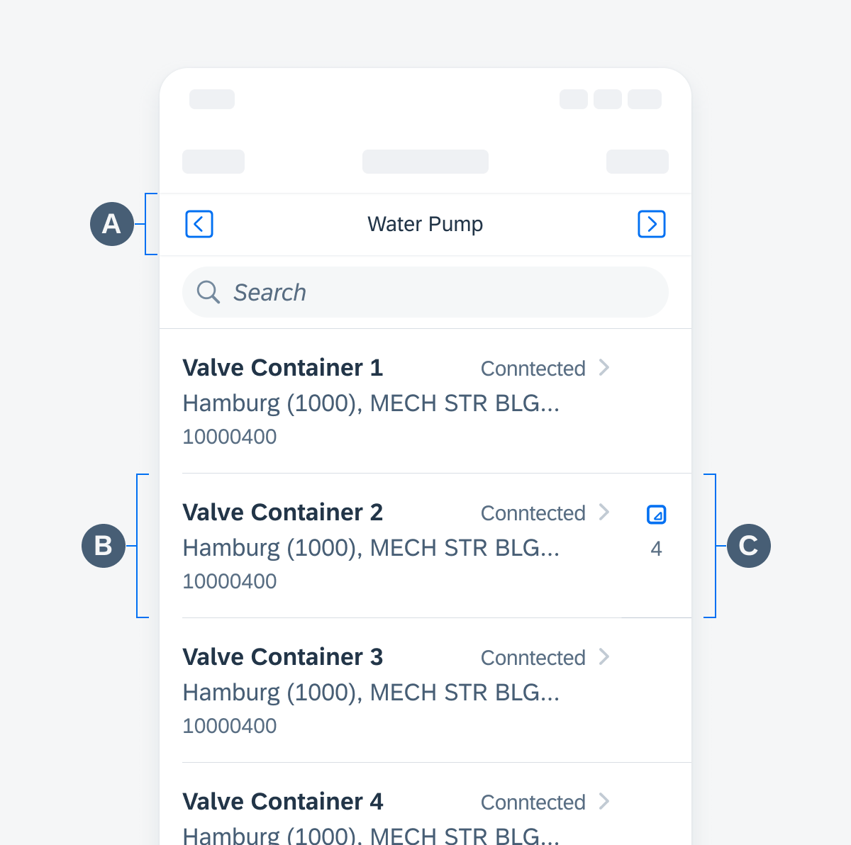
Anatomy of the hierarchy view
Hierarchy Icon
Tapping on the hierarchy icon expands the object to display its children. The hierarchy icon is hidden for objects without children.
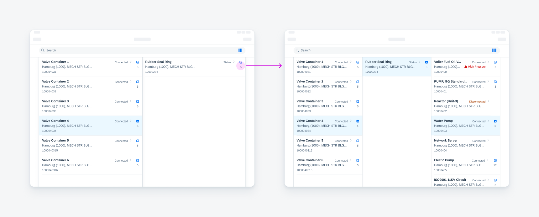
Tapping the Hierarchy icon to view its children
Horizontal Swipe
Once a path has been expanded, a horizontal scroll by swiping will snap the nearest column to the edge.
Swiping horizontally in a Hierarchy view to scroll
Vertical Scroll
Users can scroll up and down to view more objects within a single level.
Vertical scrolling on one column
Hierarchies can range from small two-level data sets to large data sets with over ten levels. The Hierarchy view can adapt to different data ranges using a column-based layout.
Two-Column Layout
In a two-column layout, the parent level objects are displayed in the first column. Child objects are displayed in the second column.
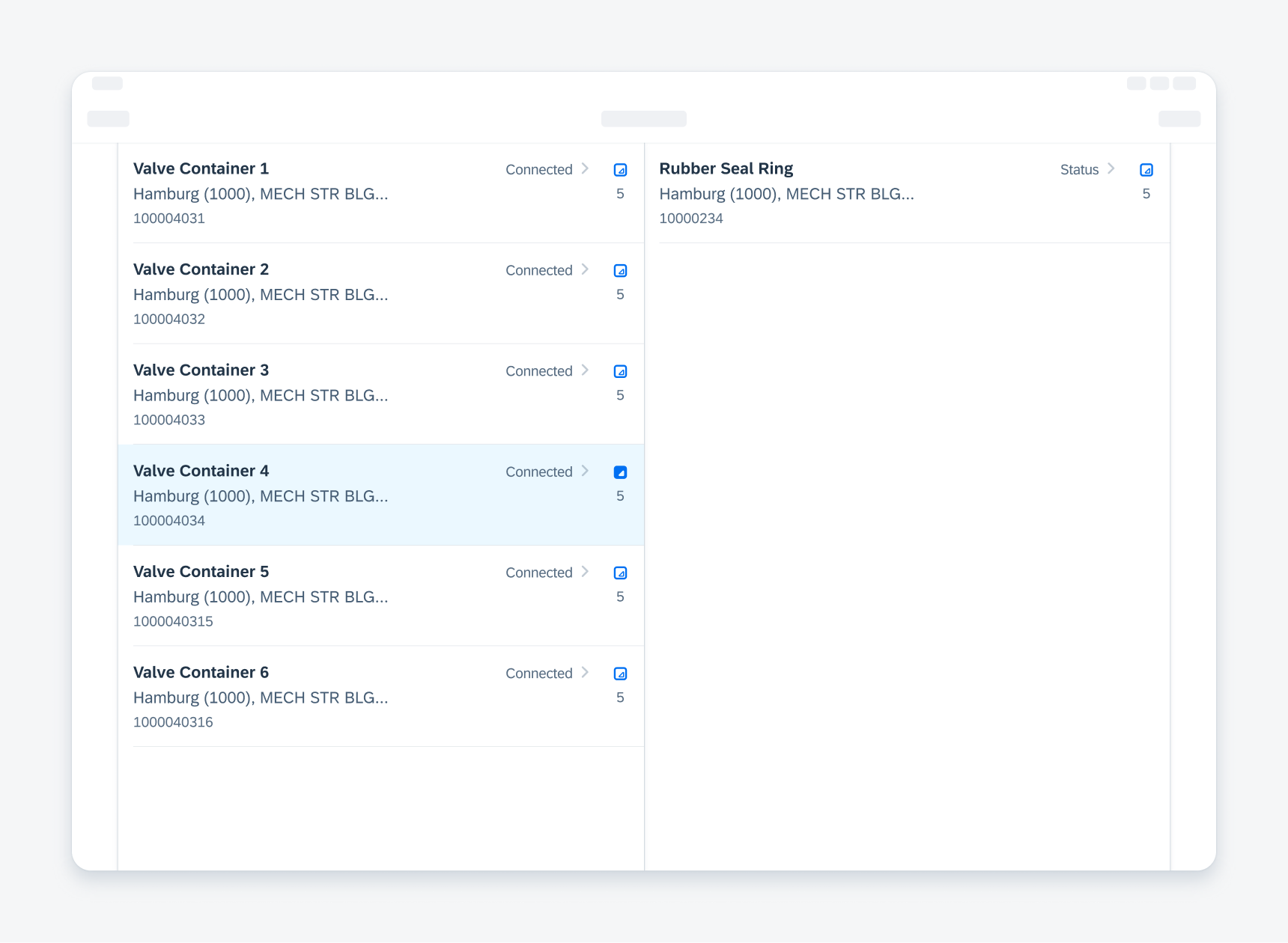
Example of a hierarchy view in a two-column layout
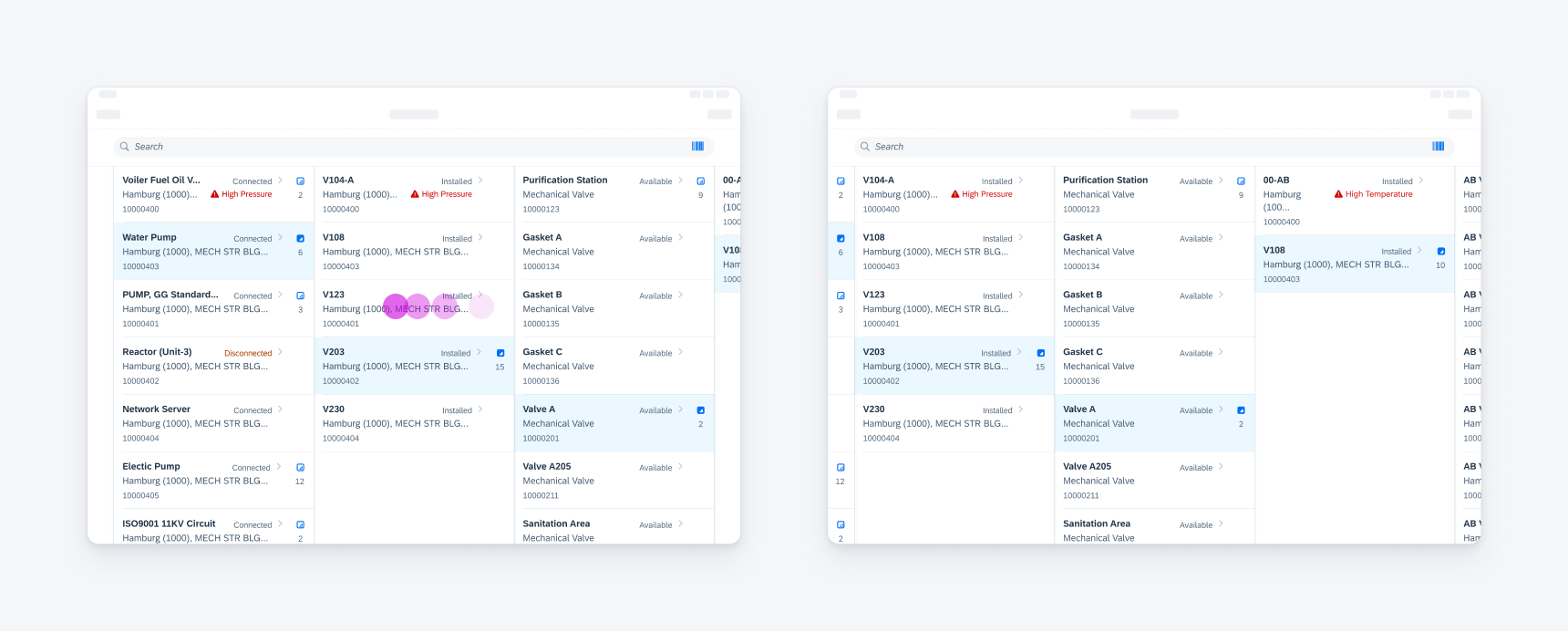
Three-Column Layout
If the second column also contains parent objects, the third column displays its children when the parent objects are expanded.
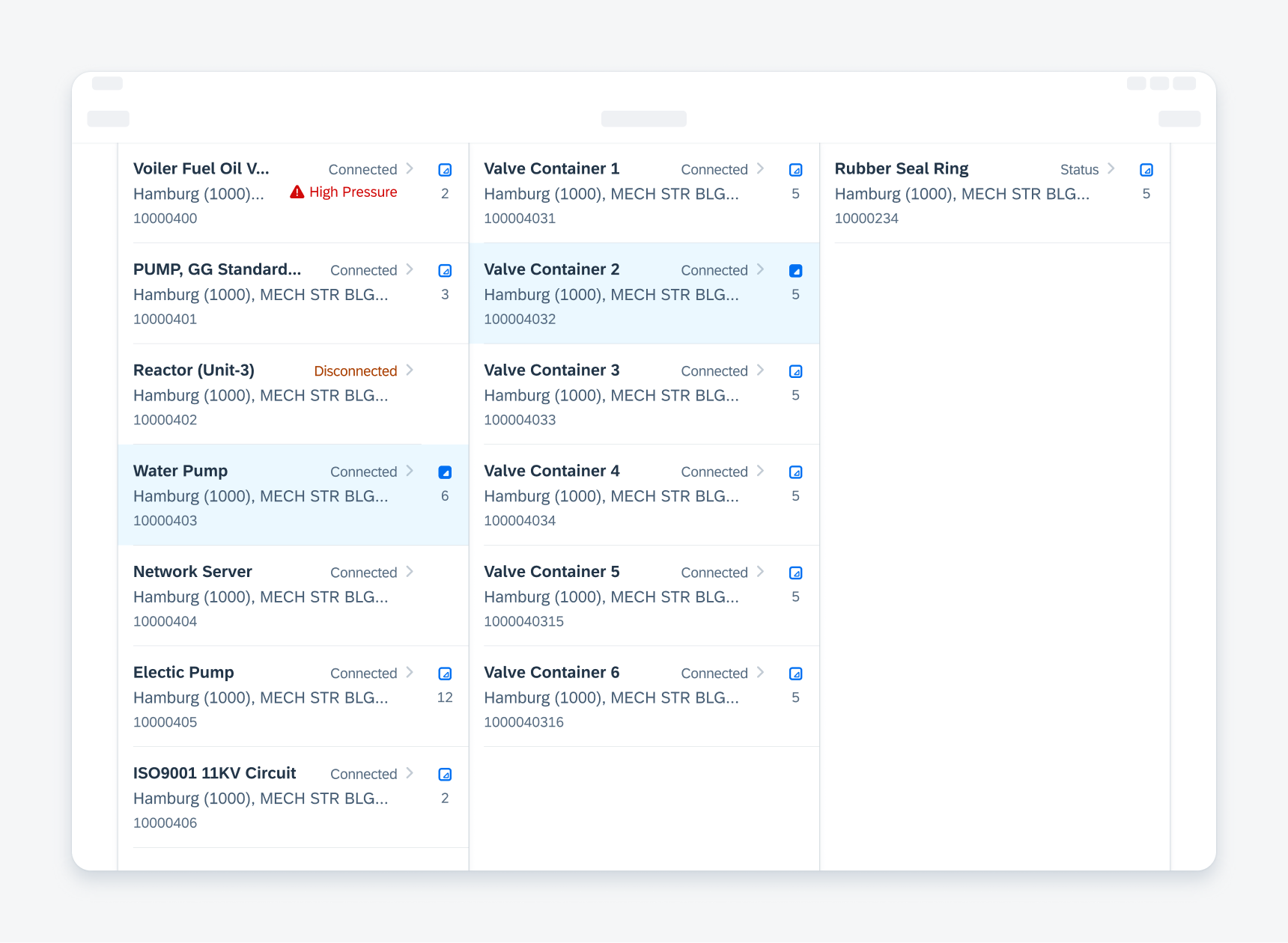
Example of a hierarchy view in a three-column layout
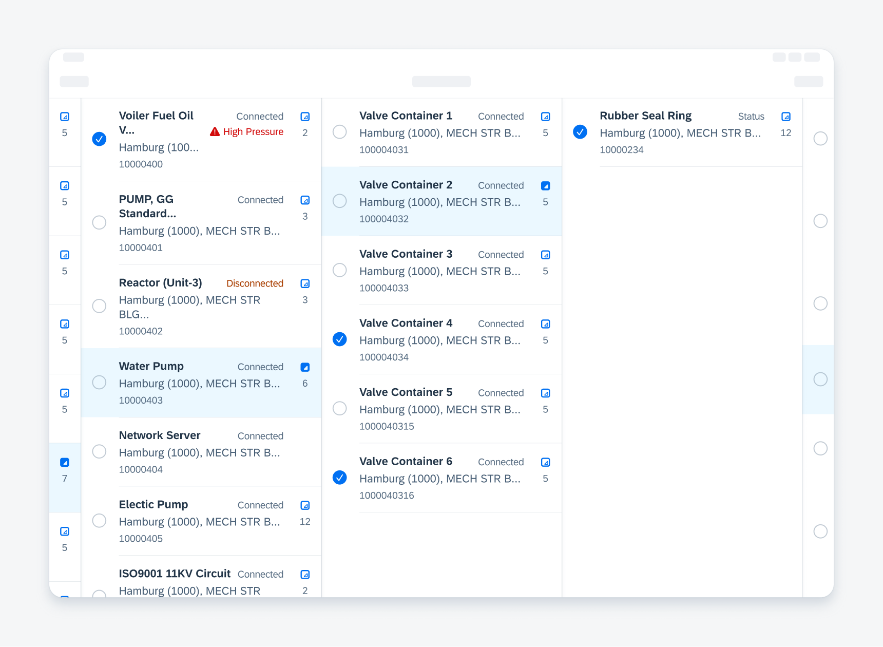
Layout with More than Three Columns
For large hierarchies that contain more than two parent levels, additional columns are added to display preceding and succeeding levels.
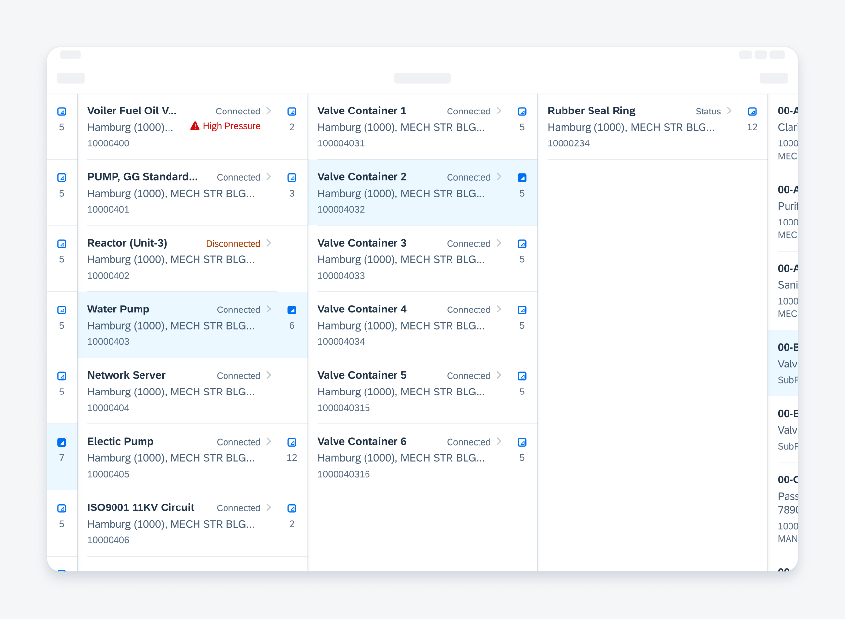
Example of a hierarchy view with more than three columns
Picker
The hierarchy view offers a picker mode where the left accessory provide a select state symbol.
Example of a hierarchy view in a picker mode
Development: FUIListFloorplan, FUIHierarchyView
SAP Fiori for Android: Hierarchy View
Related Components/Patterns: Hierarchy, List Report, Object Cell
 Your feedback has been sent to the SAP Fiori design team.