
Header
Fiori: SectionedRecyclerViewAdapter
Intro
A header is a section title that summarizes the content within that section. It is used to organize screen content into logical parts, making it easier for users to navigate and understand the information. Headers should be brief and concise, allowing users to quickly identify what each section contains.
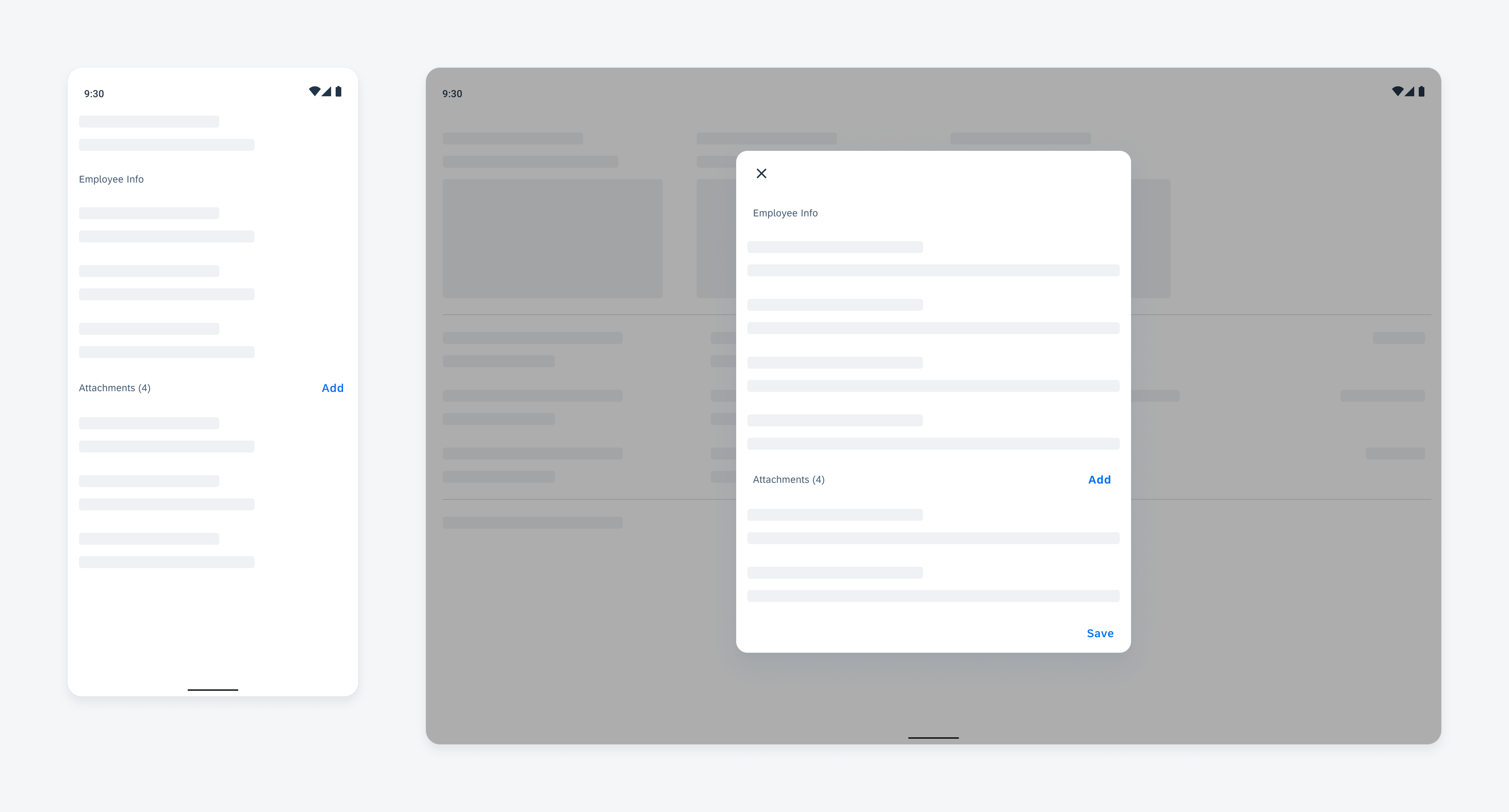
Section header in forms: compact screen (left) and expanded screen (right)
Anatomy
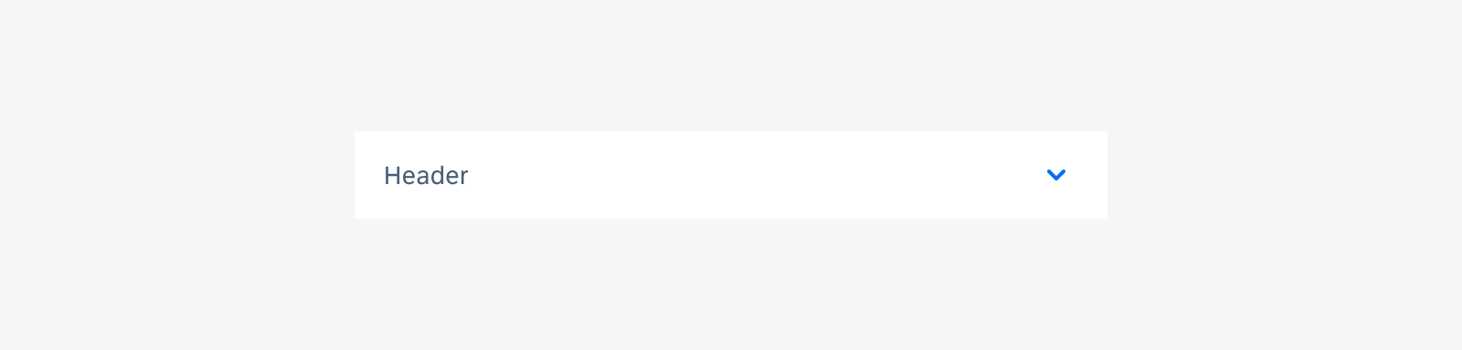
A. Header
The header indicates what the section contains.
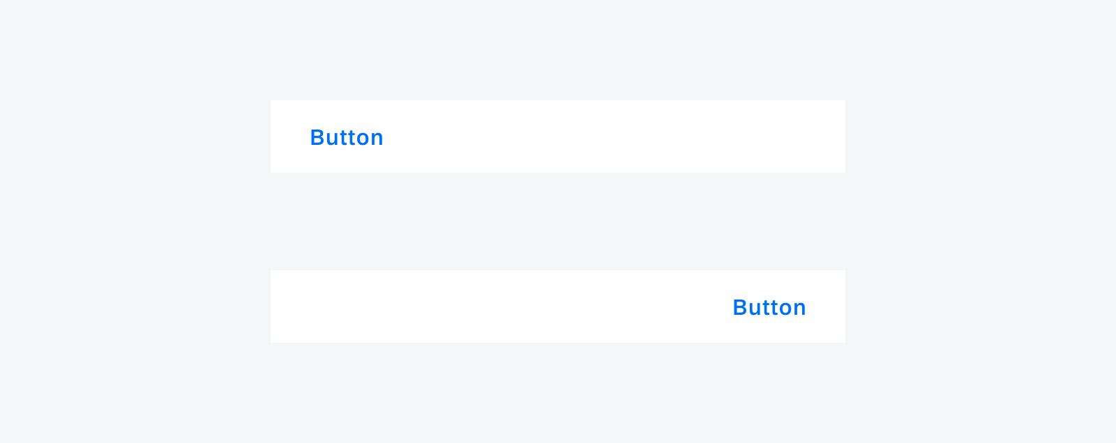
B. Button (Optional)
The button enables users to perform relevant actions to the section. The button can either be a text button or an icon button.
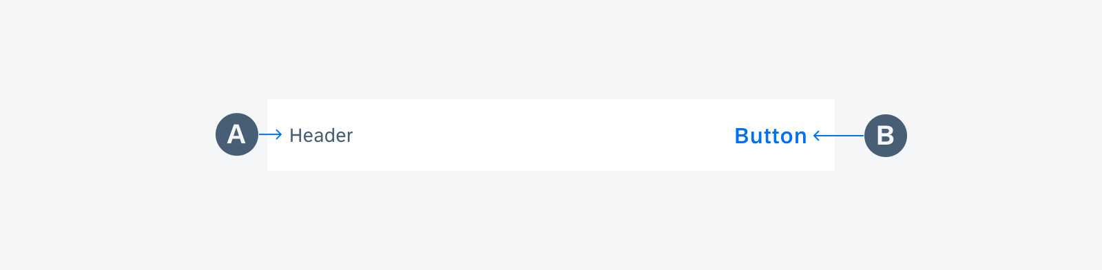
Anatomy of a section header
Variations
Section Header
A section header represents the content of a section. It uses a simple and short word or phrase to convey the purpose of the section.
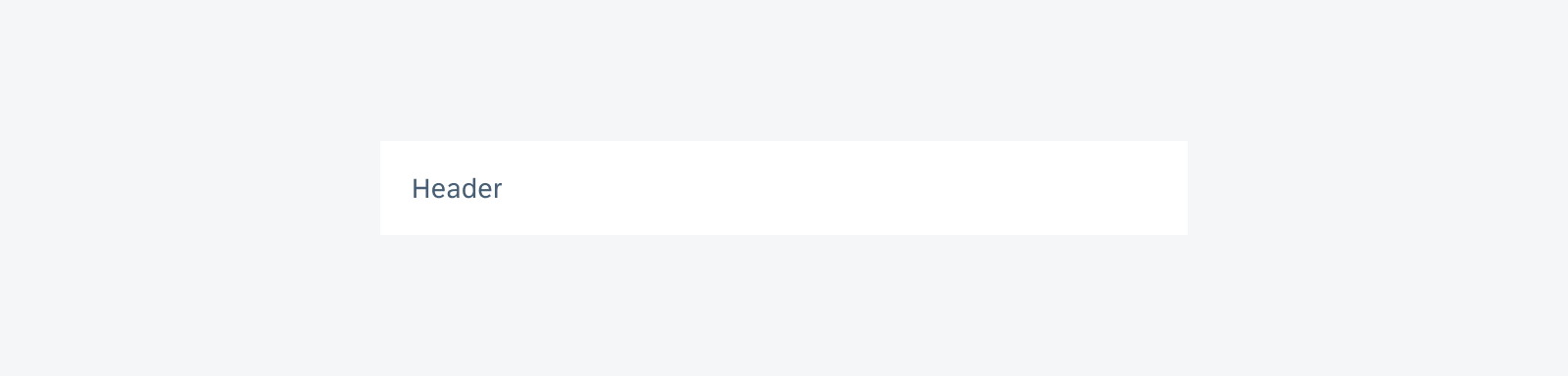
Section header on compact screen
Section Header with Button
A section header can contain an action button associated with the content of the section. The button can either be a text button or icon button, For example, the attachment header contains an “Add” button to allow users to add attachments. To learn more about that workflow, refer to the Attach article.
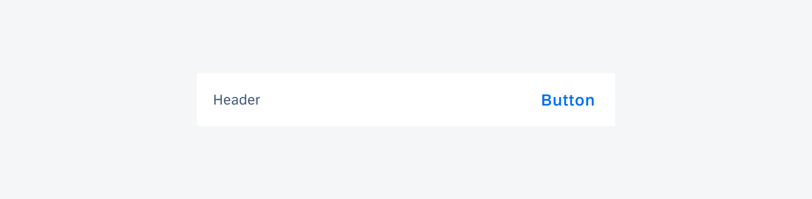
Section header with a text button
Section header with an icon button
Section Footer
A section footer provides additional actions or information at the bottom of a group section. It supports various layouts, including a left-aligned button, right-aligned button, two opposite buttons, and text only, with flexible positioning to adapt to different use cases.
Section footer with left-aligned button (top) and right-aligned button (bottom)
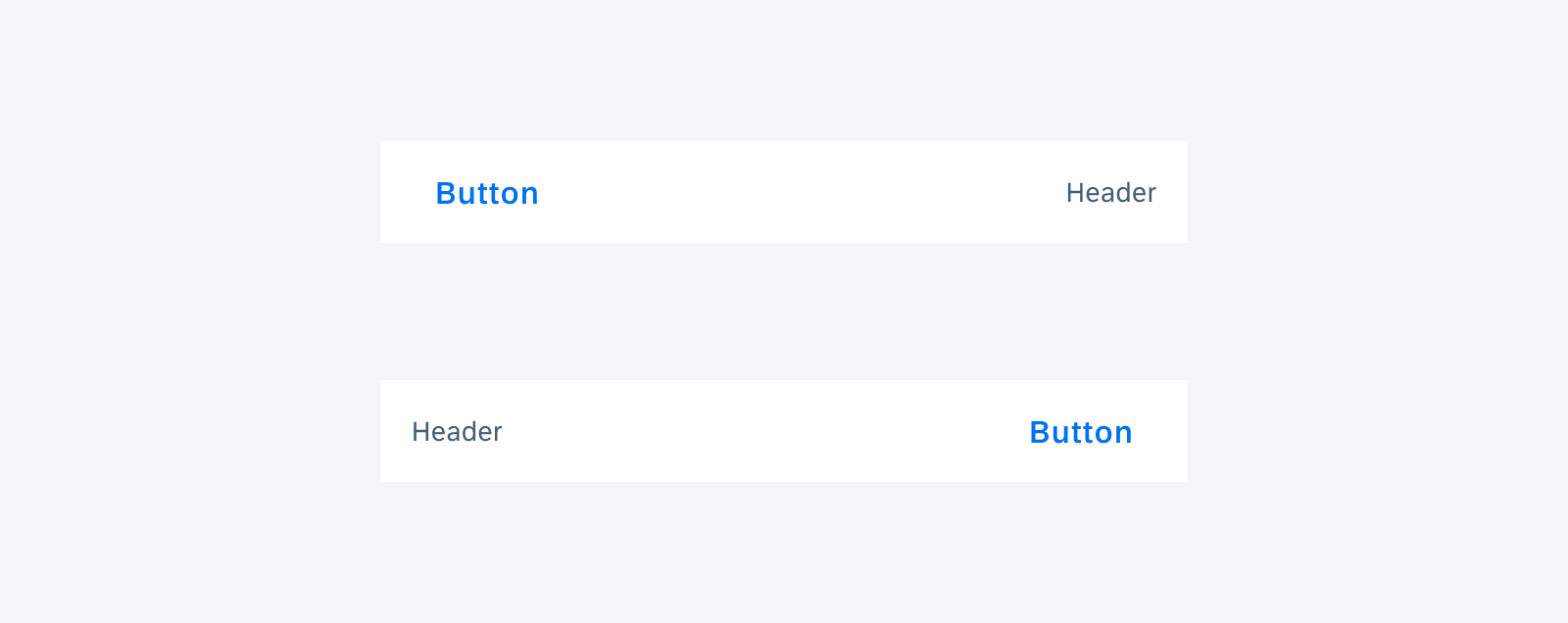
Section footer with left-aligned button and header (top) and right-aligned button and header (bottom)
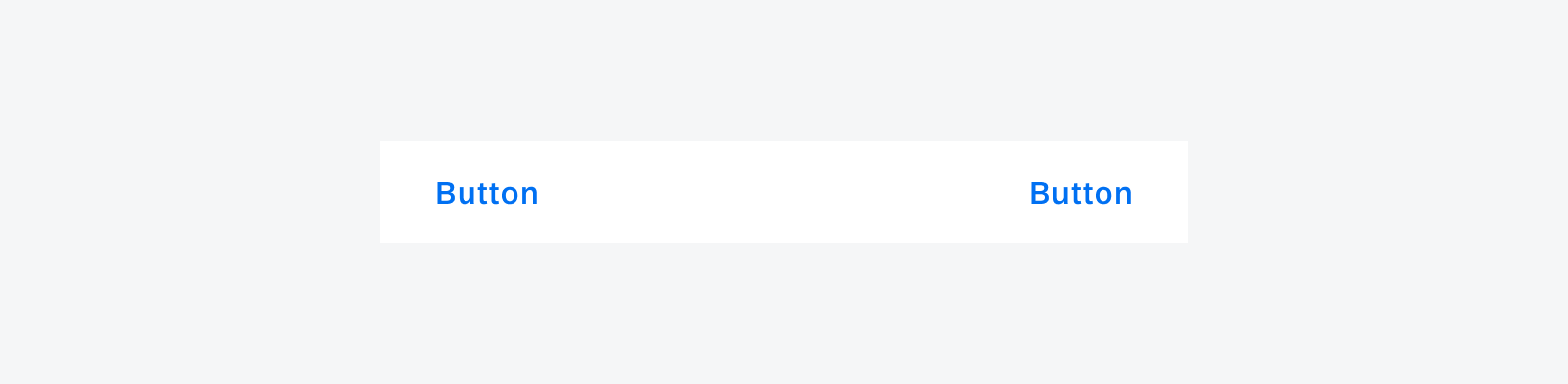
Section footer with left-aligned and right-aligned buttons
Resources
Development: SectionedRecyclerViewAdapter
SAP Fiori for iOS: Object Header, Chart Header, Profile Header, KPI Header
 Your feedback has been sent to the SAP Fiori design team.