
Profile Header
FUIProfileHeader
Intro
The profile header helps the user recognize and learn more about a person. It may also allow the user to quickly contact that person without needing to drill down into their contact details. It is usually used in an object pattern or profile and settings screen.
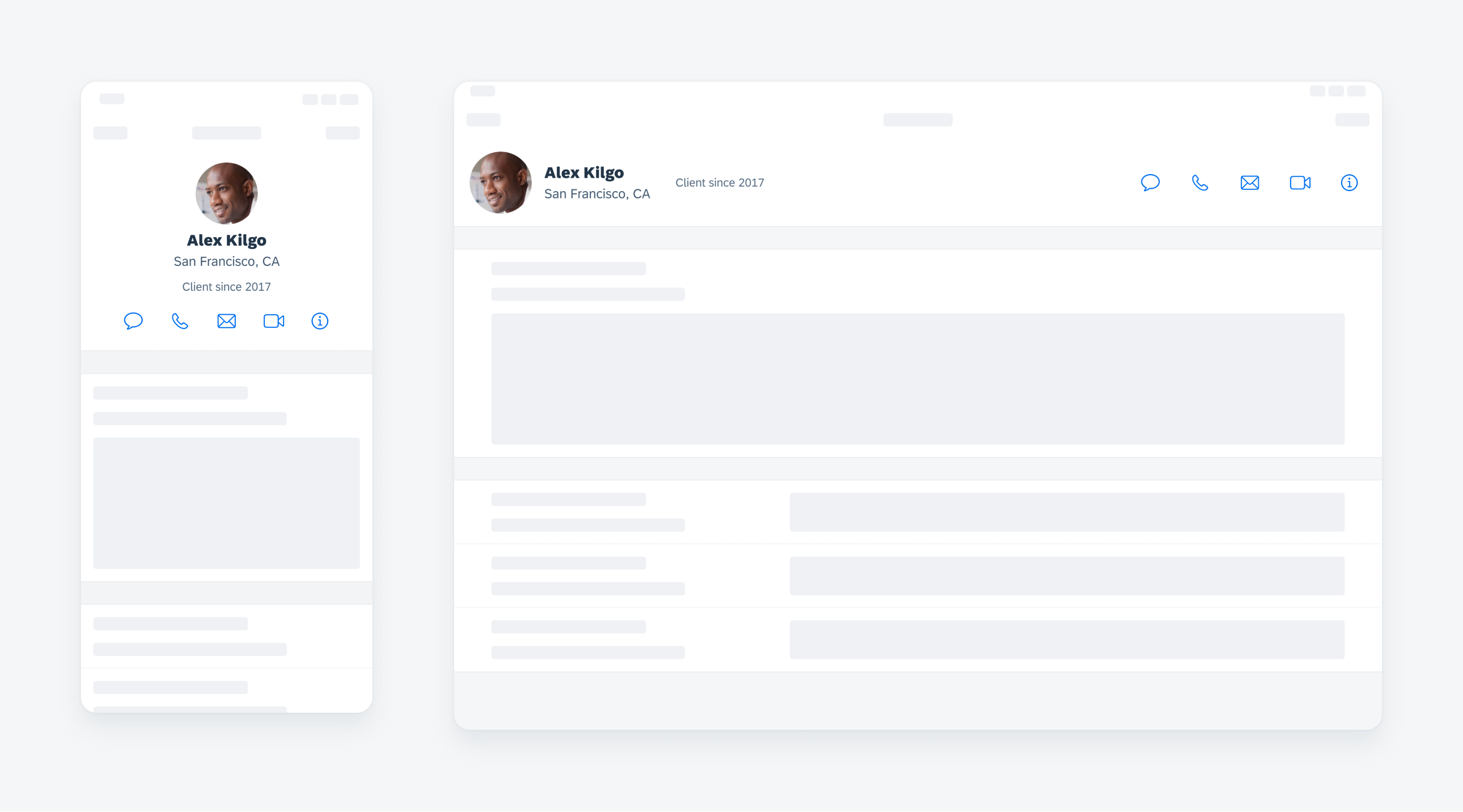
Profile header on compact (left) and on regular (right)
Use in an object pattern or profile and settings screen.
Don’t use a profile header without the full name of a person.
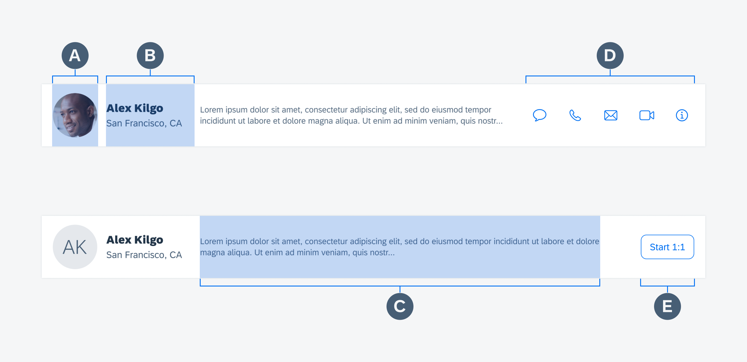
The profile header is comprised of several pieces of information about the person. The title is the only required piece in the profile header.
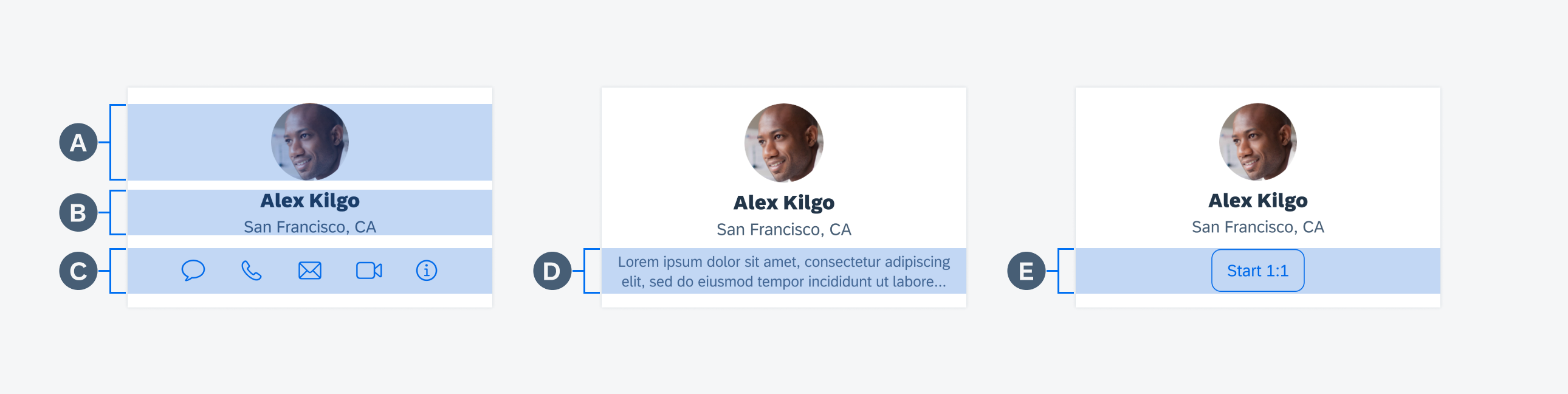
A. Image
Including an image is not required but is highly recommended, as this helps the user recognize the person in question.
B. Main Content
The main content section includes name and one additional piece of information about the person.
C. Additional Information
Additional information includes two short strings or a short paragraph of relevant text.
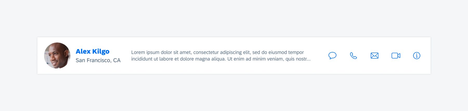
D. Action Icons
Action icons provides ways for the user to contact the person instantly.
E. Button
A button may be included to trigger an action around the object.
Profile header with five symbol type buttons (top) and with a shape type button (bottom)
In compact width, content in the profile header is always center-aligned. Given the limited space in compact width, when a description is present, action icons will not be displayed. As a designer, it is important that you decide whether the main purpose of this screen is to provide the user with a means to contact the person in question or rather to learn more about that person.
Profile header with five actions (left), with description (middle), and with a shape type button (right)
The profile header is available on both compact and regular width.
Profile header compact width (left) and regular width (right)
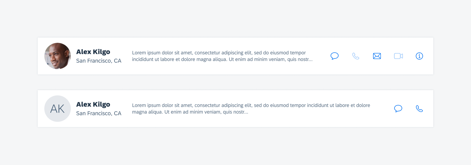
Profile Header with Action Icons
When including action items, there can be a minimum of two and a maximum of five, though having this many is not recommended. Only present icons that are frequently used in the current context. Apply a gray color to the action icon when it is disabled.
Profile header with five actions (top) and two actions (bottom)
Profile Header with Tappable Name
The profile name will be in tint color if it is tappable. Use it as an entry point to drill into more details about the person.
Profile header with a tappable name
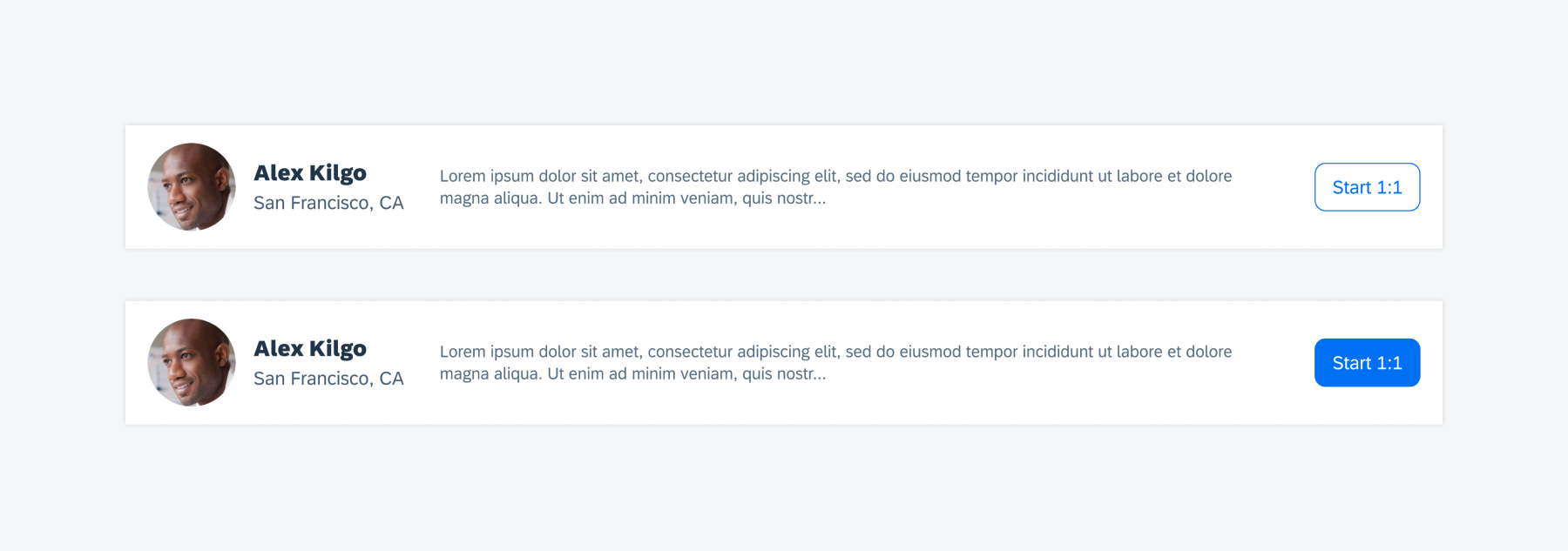
Profile Header with Action Button
As the name implies, an action button allows the user to perform an action on the current object. Common actions include adding an object to a list, starting an event with an object, or otherwise marking an object.
When an action button is tapped, it should adopt an active state; when it is tapped again, it should return to its inactive state. Button text should clearly communicate to the user what will happen when the button is tapped.
Please note that icons are also a recommended way to provide actions within the header.
Profile header with a shape type button (top) and an emphasized button (bottom)
Development: FUIProfileHeader
SAP Fiori for Android: Profile Header
Related Components/Patterns: Profile & Settings, Contact Cell
 Your feedback has been sent to the SAP Fiori design team.