- Latest Version 1.128
- Version 1.126
- SAPUI Version 1.124
- SAPUI5 Version 1.122
- SAPUI5 Version 1.120
- SAPUI5 Version 1.118
- SAPUI5 Version 1.116
- SAPUI5 Version 1.114
- SAPUI5 Version 1.112
- SAPUI5 Version 1.110
- SAPUI5 Version 1.108
- SAPUI5 Version 1.106
- SAPUI5 Version 1.104
- SAPUI5 Version 1.102
- SAPUI5 Version 1.100
- SAPUI5 Version 1.98
- SAPUI5 Version 1.96
- SAPUI5 Version 1.94
- SAPUI5 Version 1.92
- SAPUI5 Version 1.90
- SAPUI5 Version 1.88
- SAPUI5 Version 1.86
- SAPUI5 Version 1.84
- SAPUI5 Version 1.82
- SAPUI5 Version 1.80
- SAPUI5 Version 1.78
- SAPUI5 Version 1.76
- SAPUI5 Version 1.74
- SAPUI5 Version 1.72
- SAPUI5 Version 1.70
- SAPUI5 Version 1.68
- SAPUI5 Version 1.66
- SAPUI5 Version 1.64
- SAPUI5 Version 1.62
- SAPUI5 Version 1.60
- SAPUI5 Version 1.58
- SAPUI5 Version 1.56
- SAPUI5 Version 1.54
- SAPUI5 Version 1.52
- SAPUI5 Version 1.50
- SAPUI5 Version 1.48
- SAPUI5 Version 1.46
- SAPUI5 Version 1.44
- SAPUI5 Version 1.42
- SAPUI5 Version 1.40
- SAPUI5 Version 1.38
- SAPUI5 Version 1.36
- SAPUI5 Version 1.34
- SAPUI5 Version 1.32
- SAPUI5 Version 1.30
- SAPUI5 Version 1.26
- Latest Version 1.128
- Version 1.126
- SAPUI Version 1.124
- SAPUI5 Version 1.122
- SAPUI5 Version 1.120
- SAPUI5 Version 1.118
- SAPUI5 Version 1.116
- SAPUI5 Version 1.114
- SAPUI5 Version 1.112
- SAPUI5 Version 1.110
- SAPUI5 Version 1.108
- SAPUI5 Version 1.106
- SAPUI5 Version 1.104
- SAPUI5 Version 1.102
- SAPUI5 Version 1.100
- SAPUI5 Version 1.98
- SAPUI5 Version 1.96
- SAPUI5 Version 1.94
- SAPUI5 Version 1.92
- SAPUI5 Version 1.90
- SAPUI5 Version 1.88
- SAPUI5 Version 1.86
- SAPUI5 Version 1.84
- SAPUI5 Version 1.82
- SAPUI5 Version 1.80
- SAPUI5 Version 1.78
- SAPUI5 Version 1.76
- SAPUI5 Version 1.74
- SAPUI5 Version 1.72
- SAPUI5 Version 1.70
- SAPUI5 Version 1.68
- SAPUI5 Version 1.66
- SAPUI5 Version 1.64
- SAPUI5 Version 1.62
- SAPUI5 Version 1.60
- SAPUI5 Version 1.58
- SAPUI5 Version 1.56
- SAPUI5 Version 1.54
- SAPUI5 Version 1.52
- SAPUI5 Version 1.50
- SAPUI5 Version 1.48
- SAPUI5 Version 1.46
- SAPUI5 Version 1.44
- SAPUI5 Version 1.42
- SAPUI5 Version 1.40
- SAPUI5 Version 1.38
- SAPUI5 Version 1.36
- SAPUI5 Version 1.34
- SAPUI5 Version 1.32
- SAPUI5 Version 1.30
- SAPUI5 Version 1.28
- SAPUI5 Version 1.26
Get Started
Learn how to create simple and delightful SAP Fiori apps

Explore the basics of SAP Fiori
Design Principles
The design principles are the heart of SAP Fiori. Learn how to apply them to your SAP Fiori apps.
Responsiveness
SAP Fiori apps work on a multitude of devices. Check out SAP Fiori's focus on responsive and adaptive design.
SAP Fiori Launchpad Home Page
The SAP Fiori launchpad is the main entry point to SAP Fiori apps on mobile and desktop devices.
Grid Layout
Find out about the grid layout that underlies every SAP Fiori app.
Form Factors
Discover the two form factors: cozy and compact.
Navigation
Navigation in SAP Fiori follows standard navigation paradigms of various web applications.
Discover the app content model
Page Layouts (Floorplans)
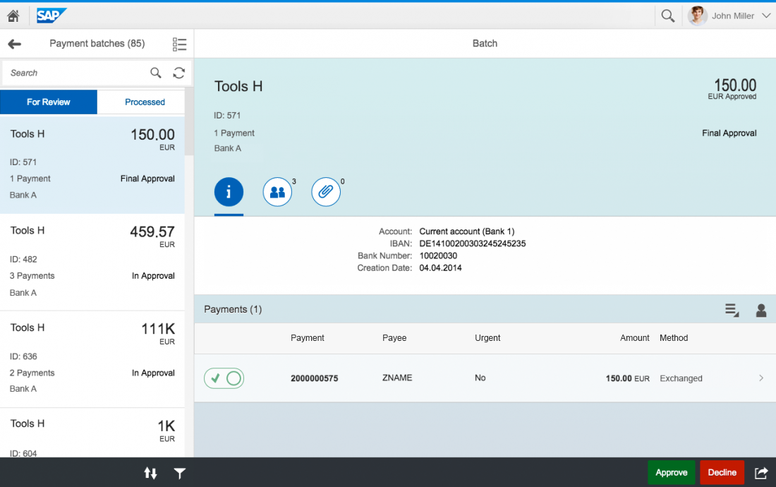
Take a look at the 'full screen' and 'split screen' page layouts.
Floorplans
Familiarize yourself with the floorplans for SAP Fiori apps.
App Types
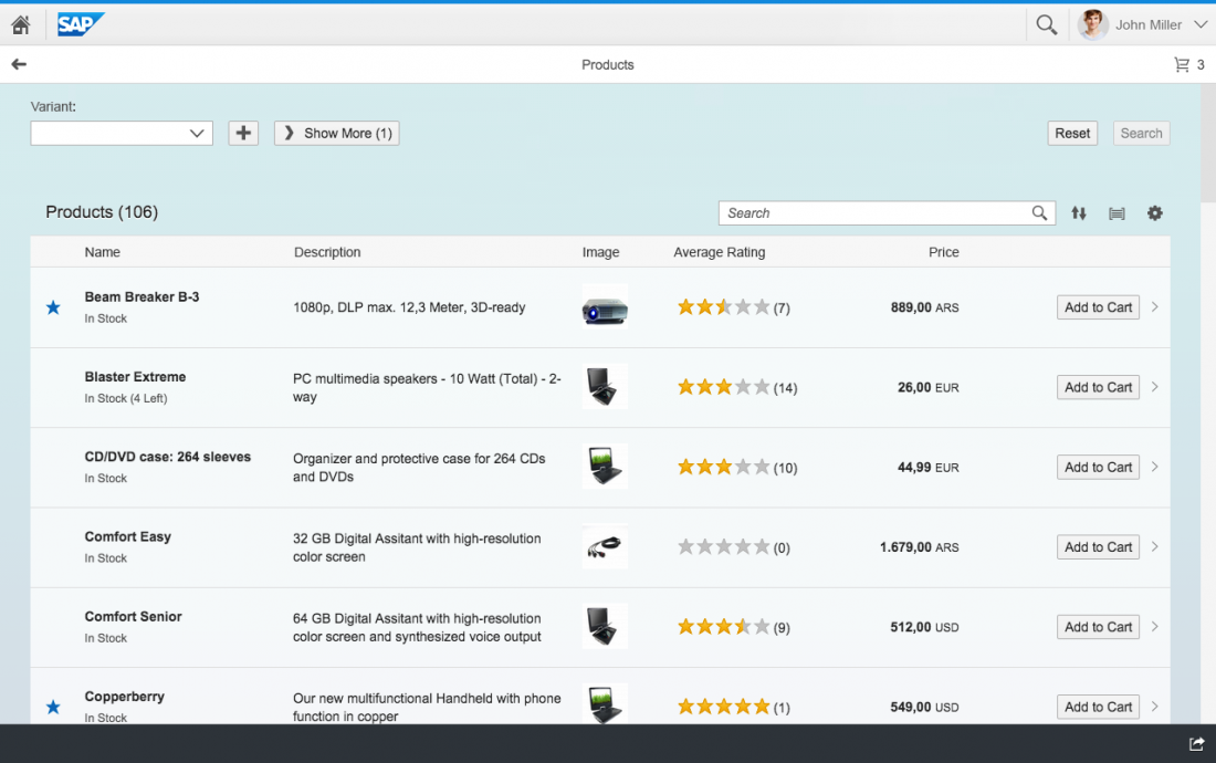
SAP Fiori supports a variety of app types. Take a look at some of the basic patterns.
Get to know SAP Fiori UI elements
'Explore' Page
Get an overview of all the UI elements, floorplans, and app types available for SAP Fiori.
UI Element: Toolbar
The toolbar enables users to change the UI or trigger an action. It is one of the most important elements in SAP Fiori.
UI Element: Chart
Charts are used to display quantitative information. They give the user access to key information contained in structured data records.
Design your SAP Fiori app
Design Stencils
Download the design stencils and start designing your own SAP Fiori app.
SAP Icon Font
Download and install the SAP icon font to create true-to-life mockups.
SAP User Experience Community
Ask design-related questions and post your design ideas in our discussion forum.


 Your feedback has been sent to the SAP Fiori design team.