
- Latest SAPUI Version 1.124
- SAPUI5 Version 1.122
- SAPUI5 Version 1.120
- SAPUI5 Version 1.118
- SAPUI5 Version 1.116
- SAPUI5 Version 1.114
- SAPUI5 Version 1.112
- SAPUI5 Version 1.110
- SAPUI5 Version 1.108
- SAPUI5 Version 1.106
- SAPUI5 Version 1.104
- SAPUI5 Version 1.102
- SAPUI5 Version 1.100
- SAPUI5 Version 1.98
- SAPUI5 Version 1.96
- SAPUI5 Version 1.94
- SAPUI5 Version 1.92
- SAPUI5 Version 1.90
- SAPUI5 Version 1.88
- SAPUI5 Version 1.86
- SAPUI5 Version 1.84
- SAPUI5 Version 1.82
- SAPUI5 Version 1.80
- SAPUI5 Version 1.78
- SAPUI5 Version 1.76
- SAPUI5 Version 1.74
- SAPUI5 Version 1.72
- SAPUI5 Version 1.70
- SAPUI5 Version 1.68
- SAPUI5 Version 1.66
- SAPUI5 Version 1.64
- SAPUI5 Version 1.62
- SAPUI5 Version 1.60
- SAPUI5 Version 1.58
- SAPUI5 Version 1.56
- SAPUI5 Version 1.54
- SAPUI5 Version 1.52
- SAPUI5 Version 1.50
- SAPUI5 Version 1.48
- SAPUI5 Version 1.46
- SAPUI5 Version 1.44
- SAPUI5 Version 1.42
- SAPUI5 Version 1.40
- SAPUI5 Version 1.38
- SAPUI5 Version 1.36
- SAPUI5 Version 1.34
- SAPUI5 Version 1.32
- SAPUI5 Version 1.28
- SAPUI5 Version 1.26
- Latest SAPUI Version 1.124
- SAPUI5 Version 1.122
- SAPUI5 Version 1.120
- SAPUI5 Version 1.118
- SAPUI5 Version 1.116
- SAPUI5 Version 1.114
- SAPUI5 Version 1.112
- SAPUI5 Version 1.110
- SAPUI5 Version 1.108
- SAPUI5 Version 1.106
- SAPUI5 Version 1.104
- SAPUI5 Version 1.102
- SAPUI5 Version 1.100
- SAPUI5 Version 1.98
- SAPUI5 Version 1.96
- SAPUI5 Version 1.94
- SAPUI5 Version 1.92
- SAPUI5 Version 1.90
- SAPUI5 Version 1.88
- SAPUI5 Version 1.86
- SAPUI5 Version 1.84
- SAPUI5 Version 1.82
- SAPUI5 Version 1.80
- SAPUI5 Version 1.78
- SAPUI5 Version 1.76
- SAPUI5 Version 1.74
- SAPUI5 Version 1.72
- SAPUI5 Version 1.70
- SAPUI5 Version 1.68
- SAPUI5 Version 1.66
- SAPUI5 Version 1.64
- SAPUI5 Version 1.62
- SAPUI5 Version 1.60
- SAPUI5 Version 1.58
- SAPUI5 Version 1.56
- SAPUI5 Version 1.54
- SAPUI5 Version 1.52
- SAPUI5 Version 1.50
- SAPUI5 Version 1.48
- SAPUI5 Version 1.46
- SAPUI5 Version 1.44
- SAPUI5 Version 1.42
- SAPUI5 Version 1.40
- SAPUI5 Version 1.38
- SAPUI5 Version 1.36
- SAPUI5 Version 1.34
- SAPUI5 Version 1.32
- SAPUI5 Version 1.30
- SAPUI5 Version 1.28
- SAPUI5 Version 1.26
Chart – Time Axis
Intro
Charts with a time axis are charts whose x-axes are optimized to display time-based dimensions.
The following charts can use the time axis:
- Bubble time chart (use: info/timeseries_bubble)
- Line time chart (use: info/timeseries_line)
- Scatter time chart (use: info/timeseries_scatter)
- Column chart (use: info/timeseries_column)
The default structure of the time axis contains one or two rows, depending on the time levels to be displayed. If there are several different levels (such as the day-month and year), the smallest time level (in this case, the day-month) is set on row 1, and the others (in this case, the year) are displayed on row 2. This structure facilitates time-based display and semantic responsiveness.
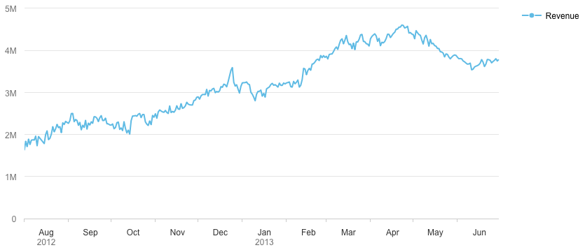
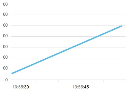
Example of a time-axis line chart
Responsiveness
Two main responsiveness rules are applied for chart width changes and in the case of zoom in/out functionality:
- Row 1: Semantic display rule for the lowest time level. Instead of hiding every second label if the chart width is too small, semantic rules are set, such as display only the first month of each quarter. If it cannot be displayed at all, such as when the user zooms out too much, it is hidden and the closest time level on row 2 goes to row 1.
- Row 2: Hide redundancy rule for the upper time levels. Since time is hierarchical, the upper level labels are not repeated, but displayed only once. These are floating labels, which are always visible when scrolling or panning.
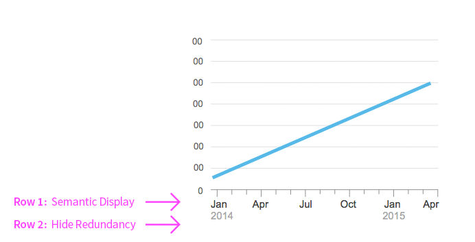
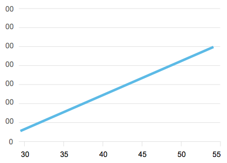
Illustration of the main rules for time axis responsiveness
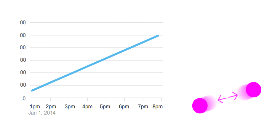
Illustration of the time axis responsiveness in the case of zooming
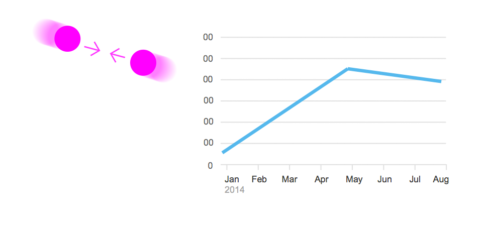
Illustration of the time axis responsiveness in the case of zooming
By default, day/month/year are displayed, but 6 time levels are actually available: year/quarter/month/day/hour/minute/second). The levels drive the zoom level and the corresponding displayed labels.
By default, the day/month/year is displayed on two rows. This structure facilitates time-based display and semantic responsiveness.
Customization
Data Display
You can set several views of the time chart:
- Detailed view: Show the smallest time level and the first data point of the data set.
- Partial view: Show a particular time range from the data set at initial view (start/end date).
- Partial view from a start date.
- Partial view to an end date.
Finally, in case there are null or missing values for line chart only, you can change the default behavior:
- Ignore: The chart does not draw the invalid measure value and connects the next value directly.
- Connect: The invalid measure value is regarded as zero.
Time Levels and Row Repartition
By default, day/month/year are displayed, but 7 time levels are available: year/quarter/month/day/hour/minute/second). The levels drive the zoom level and the corresponding displayed labels.
The axis is structured by default following one or two rows depending on the time levels that are being displayed. If there are several different levels (such as day-month and year), the smallest time level is set on row 1 ( day-month) and the others are displayed on row 2 (year). This structure facilitates time-based display and semantic responsiveness.
Time Labels
The time labels can be customized in several different ways:
- You can customize the label to any understandable date/time format like “mm DDD yyyy”, short (ex: 1/2/15), long (ex: January 2, 2015), “Mon 1”, “Mon”, Minute: “13”
- You can grey out part of the label (“00:22:58”)
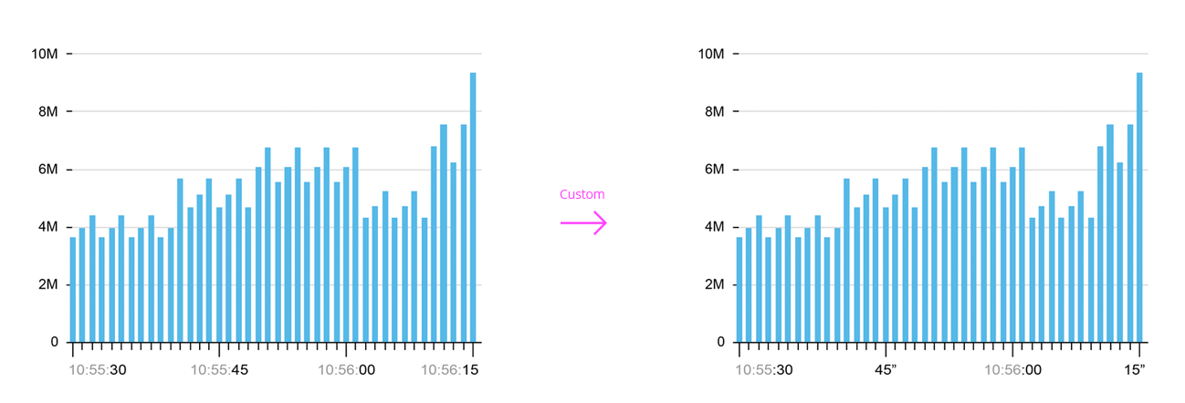
Time labels customization example
Default labels: HH:MM:SS
Customized labels: seconds only
Other
The zoom can be turned off for mobile and or desktop.
The value axis can be configured so that it changes based on the change of the highest and lowest data points on chart area during interactions such as zooming, scrolling, or panning.
Resources
Want to dive deeper? Follow the links below to find out more about related controls, the SAPUI5 implementation, and the visual design.
 Your feedback has been sent to the SAP Fiori design team.