
- Latest SAPUI Version 1.124
- SAPUI5 Version 1.122
- SAPUI5 Version 1.120
- SAPUI5 Version 1.118
- SAPUI5 Version 1.116
- SAPUI5 Version 1.114
- SAPUI5 Version 1.112
- SAPUI5 Version 1.110
- SAPUI5 Version 1.108
- SAPUI5 Version 1.106
- SAPUI5 Version 1.104
- SAPUI5 Version 1.102
- SAPUI5 Version 1.100
- SAPUI5 Version 1.98
- SAPUI5 Version 1.96
- SAPUI5 Version 1.94
- SAPUI5 Version 1.92
- SAPUI5 Version 1.90
- SAPUI5 Version 1.88
- SAPUI5 Version 1.86
- SAPUI5 Version 1.84
- SAPUI5 Version 1.82
- SAPUI5 Version 1.80
- SAPUI5 Version 1.78
- SAPUI5 Version 1.76
- SAPUI5 Version 1.74
- SAPUI5 Version 1.72
- SAPUI5 Version 1.70
- SAPUI5 Version 1.68
- SAPUI5 Version 1.66
- SAPUI5 Version 1.64
- SAPUI5 Version 1.62
- SAPUI5 Version 1.60
- SAPUI5 Version 1.58
- SAPUI5 Version 1.56
- SAPUI5 Version 1.54
- SAPUI5 Version 1.52
- SAPUI5 Version 1.50
- SAPUI5 Version 1.48
- SAPUI5 Version 1.46
- SAPUI5 Version 1.44
- SAPUI5 Version 1.42
- SAPUI5 Version 1.40
- SAPUI5 Version 1.38
- SAPUI5 Version 1.36
- SAPUI5 Version 1.34
- SAPUI5 Version 1.30
- SAPUI5 Version 1.28
- SAPUI5 Version 1.26
- Latest SAPUI Version 1.124
- SAPUI5 Version 1.122
- SAPUI5 Version 1.120
- SAPUI5 Version 1.118
- SAPUI5 Version 1.116
- SAPUI5 Version 1.114
- SAPUI5 Version 1.112
- SAPUI5 Version 1.110
- SAPUI5 Version 1.108
- SAPUI5 Version 1.106
- SAPUI5 Version 1.104
- SAPUI5 Version 1.102
- SAPUI5 Version 1.100
- SAPUI5 Version 1.98
- SAPUI5 Version 1.96
- SAPUI5 Version 1.94
- SAPUI5 Version 1.92
- SAPUI5 Version 1.90
- SAPUI5 Version 1.88
- SAPUI5 Version 1.86
- SAPUI5 Version 1.84
- SAPUI5 Version 1.82
- SAPUI5 Version 1.80
- SAPUI5 Version 1.78
- SAPUI5 Version 1.76
- SAPUI5 Version 1.74
- SAPUI5 Version 1.72
- SAPUI5 Version 1.70
- SAPUI5 Version 1.68
- SAPUI5 Version 1.66
- SAPUI5 Version 1.64
- SAPUI5 Version 1.62
- SAPUI5 Version 1.60
- SAPUI5 Version 1.58
- SAPUI5 Version 1.56
- SAPUI5 Version 1.54
- SAPUI5 Version 1.52
- SAPUI5 Version 1.50
- SAPUI5 Version 1.48
- SAPUI5 Version 1.46
- SAPUI5 Version 1.44
- SAPUI5 Version 1.42
- SAPUI5 Version 1.40
- SAPUI5 Version 1.38
- SAPUI5 Version 1.36
- SAPUI5 Version 1.34
- SAPUI5 Version 1.32
- SAPUI5 Version 1.30
- SAPUI5 Version 1.28
- SAPUI5 Version 1.26
Category Navigation
Intro
Category navigation is a rarely used pattern that can be used to replace tree-like structures with only a few levels in a responsive environment.
Usage
Use category navigation if:
- You need to show categorized data in a responsive environment.
- You need to replace a tree table on tablets and smartphones, and the tree table has a maximum of five levels.
- You need to show hierarchical data with different details at each level, and thus a tree table cannot be used.
Do not use category navigation if:
- You need only two levels, and the upper level identifies the category. In this case, use a grouped responsive table instead.
- You need more than five levels. In this case, use a tree table.
On a smartphone or tablet device, try to display the data on just five levels. You can do this in one of two ways:- Remove unnecessary root levels.
- Offer the same items in different branches.
Responsiveness
The category navigation pattern replaces the standard title of a responsive table with a breadcrumb showing the current navigation level.
A breadcrumb comprises links, icons, and text controls. App teams need to build the breadcrumb manually, and also ensure that its behavior is responsive. As soon as text is truncated, change the breadcrumb to a select control.
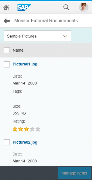
Category navigation - Size S
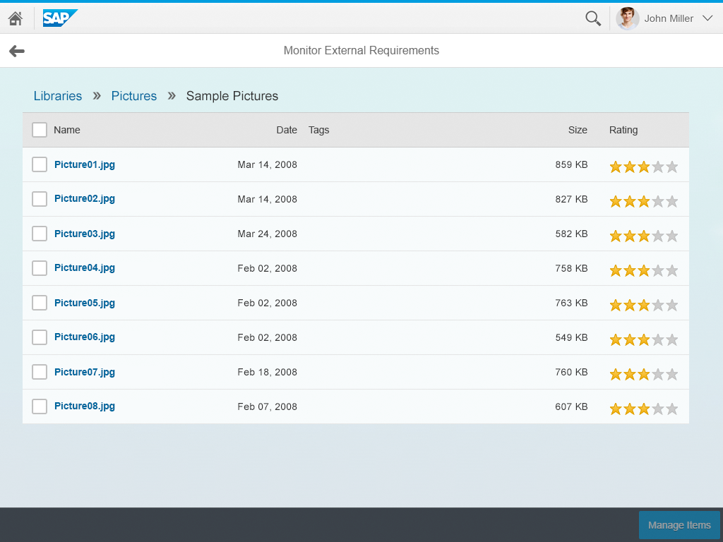
Category navigation - Size M
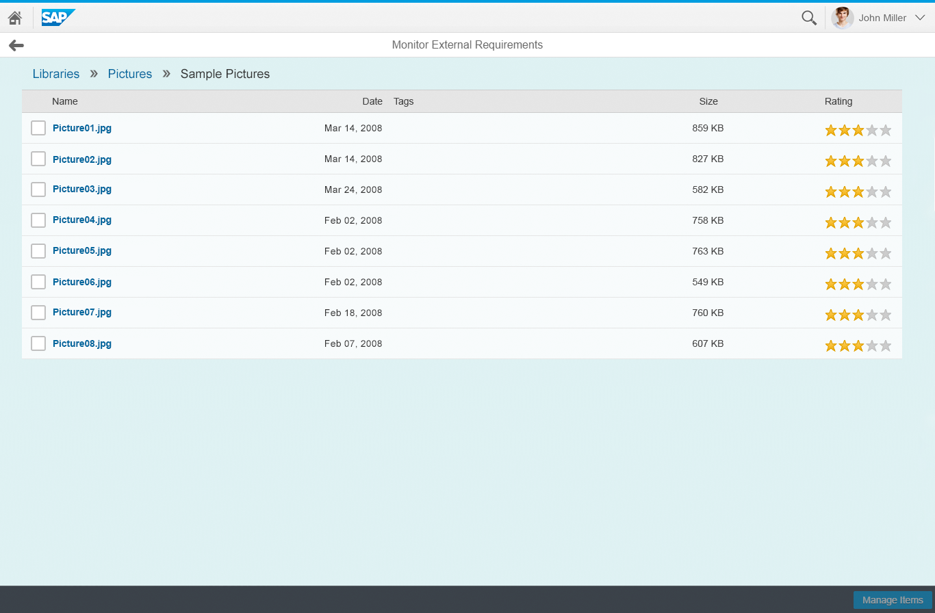
Category navigation - Size L
Layout
The breadcrumb appears in the toolbar, and replaces the table title.
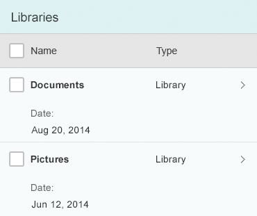
At any given level, the responsive table contains the individual line items, including their column header, as well as the categories available for further drilldown.

Category navigation - Layout
Components
Use links, icons, and text controls to implement the breadcrumb.
- Use links for the title of all levels above the current level.
- Use icon controls for the delimiters.
- Use text for the title of the current level.

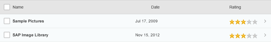
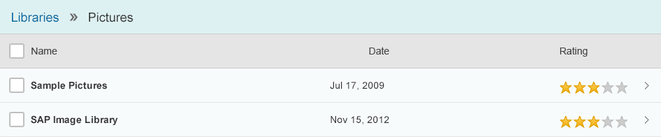
A breadcrumb showing three levels
As a result, there is no link at root level.

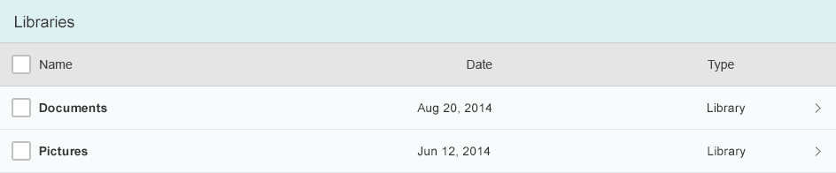
A breadcrumb showing the root level only
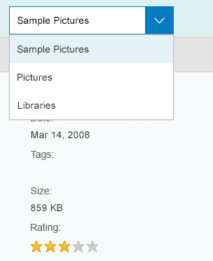
As soon as the last text in the breadcrumb is truncated, change the breadcrumb to a select control. Show the title of the current level as the selected item.
If the breadcrumb is truncated, switch to a select control
Depending on the columns shown at each level, use one or more responsive tables to list the items at the different levels.
Responsive table
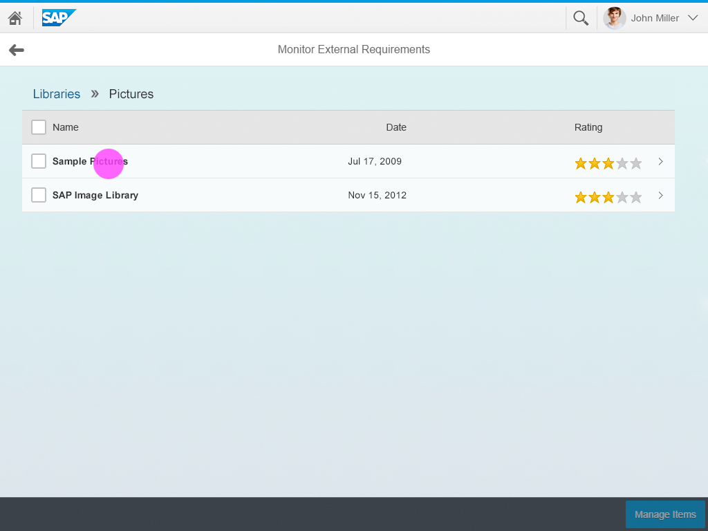
Within the responsive table, use the navigation mode of the items for container items.

Navigable container item
Do not use navigation mode for leaf items.

Leaf item not meant for navigation
Behavior and Interaction
Initially, this pattern looks like a standard responsive table with control items.
Initial state
Drill-In on Item
Clicking an item drills into it in one of the following ways:
- The content of the responsive table is changed (if all columns are the same on the second level).
- The entire responsive table is changed (if there are different columns on the second level).
State after navigating to the second level
Navigate
The user can navigate further by using navigable items.
The breadcrumb adapts accordingly. Leaves are shown without a navigation indicator.
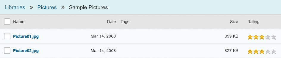
State after navigating to the third level
Guidelines
Drill-In on Item
Adapt the title to a breadcrumb.
Show navigation indicators if there are more levels.
State after navigating to the second level
Navigate
Navigate further by using control items.
Ensure that the breadcrumb adapts accordingly. Note that leaves are shown without a navigation indicator.
State after navigating to the third level
Navigate back by using one of the links inside the breadcrumb. When the user navigates back, show exactly the same state as before.
If the user navigates back, show the previous state
As soon as the last text in the breadcrumb is truncated, change the breadcrumb to a select control.

Show a select control instead of a breadcrumb on small screen sizes
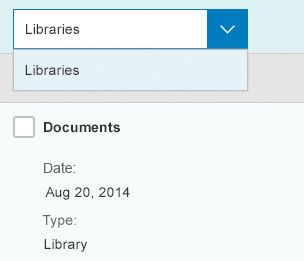
Within the select control, show all parent nodes below the current node.
Show the levels of the breadcrumb inside the select control
Keep the select control once it has been shown.
Do not revert to the breadcrumb just by navigating back within the select control, even if a breadcrumb would fit.
Do not change the select control back to a breadcrumb on navigation
Only revert to the breadcrumb if the screen width is increased again and the breadcrumb fits.
Only switch from select to breadcrumb if the screen width changes
When the user is navigating, change only the responsive table and the breadcrumb. Do not change anything else.
Do not navigate the user to another page.
Example: Drilldown with Breadcrumb Display

Resources
Want to dive deeper? Follow the links below to find out more about related controls, the SAPUI5 implementation, and the visual design.
Elements and Controls
- Responsive Table (guidelines)
- Link (guidelines)
- Text (guidelines)
- Icon (guidelines)
- Select (guidelines)
Implementation
- Responsive Table (SAPUI5 samples)
- Responsive Table (SAPUI5 API reference)
- Link (SAPUI5 samples)
- Link (SAPUI5 API reference)
- Text (SAPUI5 samples)
- Text (SAPUI5 API reference)
- Icon (SAPUI5 samples)
- Icon (SAPUI5 API reference)
- Select (SAPUI5 samples)
- Select (SAPUI5 API reference)
 Your feedback has been sent to the SAP Fiori design team.