
- Latest SAPUI Version 1.124
- SAPUI5 Version 1.122
- SAPUI5 Version 1.120
- SAPUI5 Version 1.118
- SAPUI5 Version 1.116
- SAPUI5 Version 1.114
- SAPUI5 Version 1.112
- SAPUI5 Version 1.110
- SAPUI5 Version 1.108
- SAPUI5 Version 1.106
- SAPUI5 Version 1.104
- SAPUI5 Version 1.102
- SAPUI5 Version 1.100
- SAPUI5 Version 1.96
- SAPUI5 Version 1.94
- SAPUI5 Version 1.92
- SAPUI5 Version 1.90
- SAPUI5 Version 1.88
- SAPUI5 Version 1.86
- SAPUI5 Version 1.84
- SAPUI5 Version 1.82
- SAPUI5 Version 1.80
- SAPUI5 Version 1.78
- SAPUI5 Version 1.76
- SAPUI5 Version 1.74
- SAPUI5 Version 1.72
- SAPUI5 Version 1.70
- SAPUI5 Version 1.68
- SAPUI5 Version 1.66
- SAPUI5 Version 1.64
- SAPUI5 Version 1.62
- SAPUI5 Version 1.60
- SAPUI5 Version 1.58
- SAPUI5 Version 1.56
- SAPUI5 Version 1.54
- SAPUI5 Version 1.52
- SAPUI5 Version 1.50
- SAPUI5 Version 1.48
- SAPUI5 Version 1.46
- SAPUI5 Version 1.44
- SAPUI5 Version 1.42
- SAPUI5 Version 1.40
- SAPUI5 Version 1.38
- SAPUI5 Version 1.36
- SAPUI5 Version 1.34
- SAPUI5 Version 1.32
- SAPUI5 Version 1.30
- SAPUI5 Version 1.28
- SAPUI5 Version 1.26
- Latest SAPUI Version 1.124
- SAPUI5 Version 1.122
- SAPUI5 Version 1.120
- SAPUI5 Version 1.118
- SAPUI5 Version 1.116
- SAPUI5 Version 1.114
- SAPUI5 Version 1.112
- SAPUI5 Version 1.110
- SAPUI5 Version 1.108
- SAPUI5 Version 1.106
- SAPUI5 Version 1.104
- SAPUI5 Version 1.102
- SAPUI5 Version 1.100
- SAPUI5 Version 1.98
- SAPUI5 Version 1.96
- SAPUI5 Version 1.94
- SAPUI5 Version 1.92
- SAPUI5 Version 1.90
- SAPUI5 Version 1.88
- SAPUI5 Version 1.86
- SAPUI5 Version 1.84
- SAPUI5 Version 1.82
- SAPUI5 Version 1.80
- SAPUI5 Version 1.78
- SAPUI5 Version 1.76
- SAPUI5 Version 1.74
- SAPUI5 Version 1.72
- SAPUI5 Version 1.70
- SAPUI5 Version 1.68
- SAPUI5 Version 1.66
- SAPUI5 Version 1.64
- SAPUI5 Version 1.62
- SAPUI5 Version 1.60
- SAPUI5 Version 1.58
- SAPUI5 Version 1.56
- SAPUI5 Version 1.54
- SAPUI5 Version 1.52
- SAPUI5 Version 1.50
- SAPUI5 Version 1.48
- SAPUI5 Version 1.46
- SAPUI5 Version 1.44
- SAPUI5 Version 1.42
- SAPUI5 Version 1.40
- SAPUI5 Version 1.38
- SAPUI5 Version 1.36
- SAPUI5 Version 1.34
- SAPUI5 Version 1.32
- SAPUI5 Version 1.30
- SAPUI5 Version 1.28
- SAPUI5 Version 1.26
Category Navigation
Intro
You can use the category navigation pattern to replace tree-like structures with only a few levels in a responsive environment. In this pattern, the breadcrumb control replaces the title control. The category navigation pattern is used only in rare cases.
Usage
Use category navigation if:
- You need to show categorized data in a responsive environment.
- You need to replace a tree table on tablets and smartphones, and the tree table has a maximum of five levels.
- You need to show hierarchical data with different details at each level, which cannot be represented in a tree table.
Do not use category navigation if:
- You need only two levels, and the upper level identifies the category. In this case, use a grouped responsive table instead.
- You need more than five levels. In this case, use a tree table.
On a smartphone or tablet device, try to display the data on just five levels. You can do this in one of two ways:- Remove unnecessary root levels.
- Offer the same items in different branches.
Responsiveness
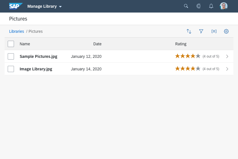
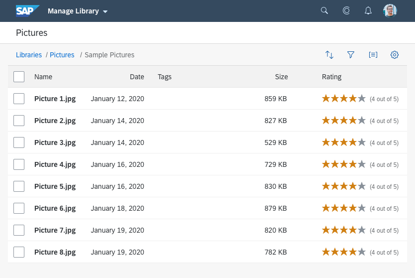
The pattern is based on a responsive table. In contrast to the standard responsive table, the title is used to display a breadcrumb showing the current level.
The breadcrumb control determines the text of the current/last element in the breadcrumb path. It only consists of text (string element).
The responsiveness is handled by the control: As soon as the breadcrumb is truncated, it provides a dropdown menu to access further navigation levels.
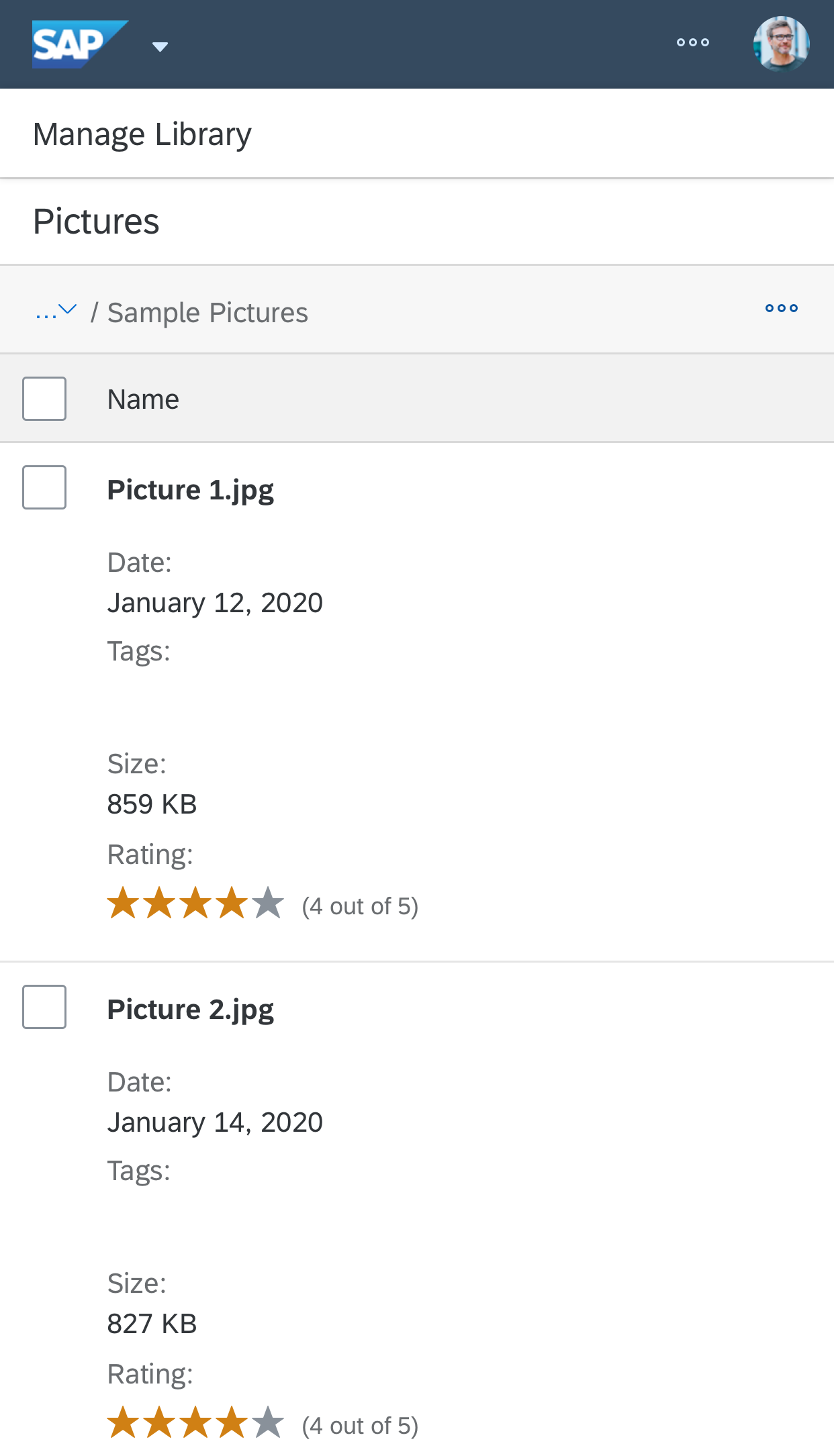
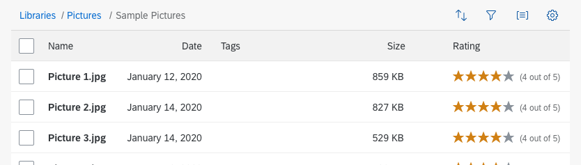
Category navigation - Size S

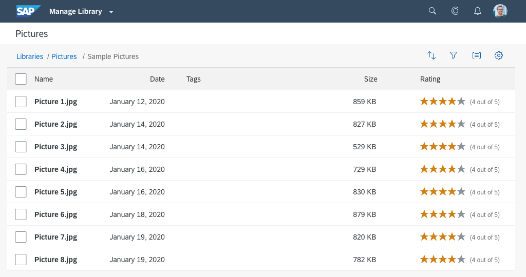
Category navigation - Size M
Category navigation - Size L
Layout
The breadcrumb appears in the toolbar, and replaces the table title.
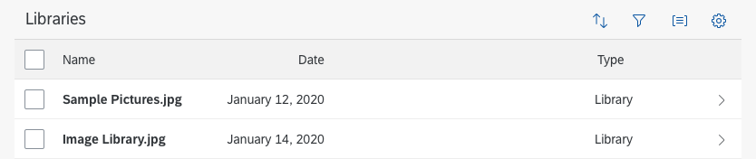
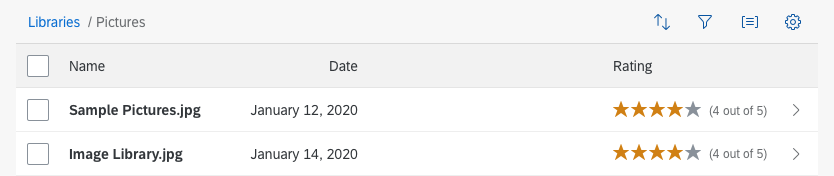
At any given level, the responsive table contains the individual line items, including their column header, as well as the categories available for further drilldown.
Category navigation - Layout
Components
Use the breadcrumb control to implement the category navigation pattern. Display the navigation levels as text. Use links for the titles of all levels above the current level to enable fast navigation across the levels.

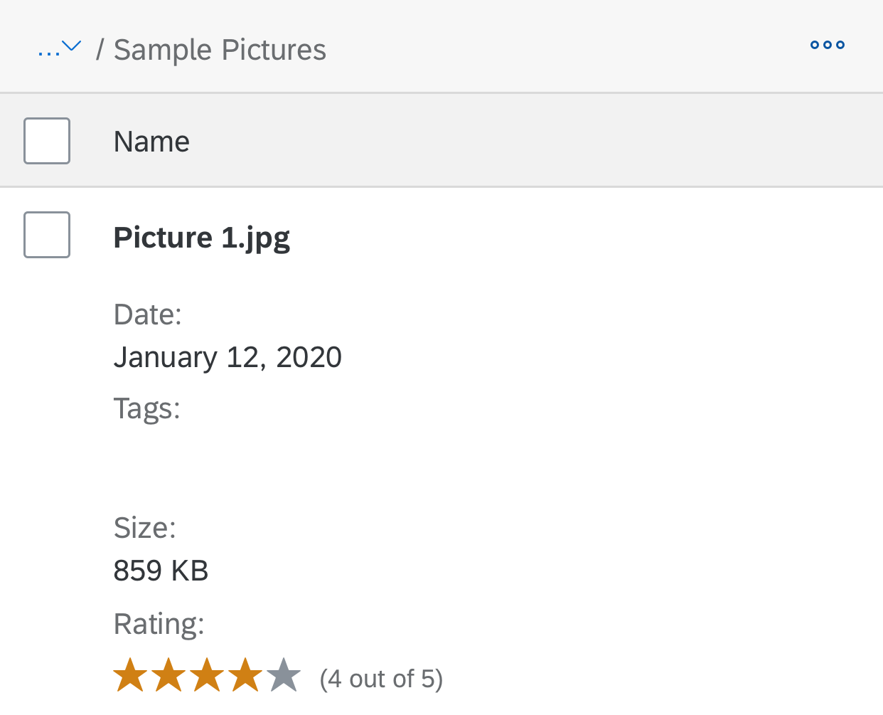
A breadcrumb showing three levels
If only the root level is displayed, there is no link.

A breadcrumb showing the root level only
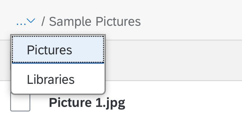
When the breadcrumb is truncated, breadcrumb control provides a dropdown menu with the hidden navigation levels. The breadcrumb shows the title of the currently selected level.

Breadcrumb changes to a dropdown menu if there is insufficient space
Use one or several responsive tables to list the items for the different levels, depending on the columns shown on each level.
Responsive table
Within the responsive table, use the item navigation mode for container items.
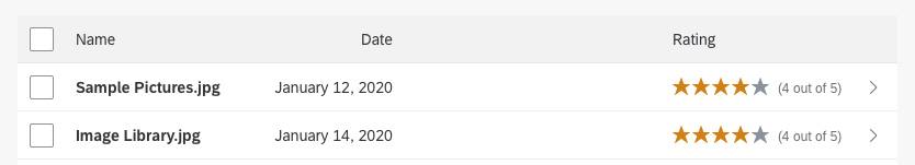
Container item with navigation indicator
Do not use the navigation mode for leaf items.
Leaf item without navigation indicator
Behavior and Interaction
Initial State
Initially, this pattern looks like a standard responsive table with control items.
Navigation to Second Level (Drill-In)
Clicking an item drills into it in one of the following ways:
- The content of the responsive table is changed (if all columns are the same on the second level).
- The entire responsive table is changed (if there are different columns on the second level).
Navigation to Third Level
You can offer further navigation at item level. The breadcrumb adapts accordingly.
Leaves at the second level do not offer further navigation.
Initial state
State after navigating to the second level

State after navigating to the third level
Guidelines
Navigation to Second Level (Drill-In)
Change the title to a breadcrumb.
Show navigation indicators if there are more levels.

State after navigating to the second level
Navigation to Third Level
Use control items to enable further navigation.
Make sure that the breadcrumb adapts accordingly. Don’t show a navigation indicator for leaves.
State after navigating to the third level
Enable backward navigation via the breadcrumb links. When the user navigates back to a higher level, show exactly the same state as before.

If navigating back, show the former state
If there is not enough space to show the entire breadcrumb, use the dropdown menu provided by the control to show the hidden navigation levels.
Show a dropdown menu within the breadcrumb control on small screens
Within the dropdown menu, show all parent nodes below the current node.
Show the levels of the breadcrumb inside the dropdown menu (select)
When the user navigates between the different levels, change only the responsive table and the breadcrumb. Do not change anything else or navigate to another page.
Example: Drilldown with Breadcrumb Display
Placement
Place the breadcrumb control in a way that makes sense to the user.
- If you are using the breadcrumb in combination with segmented buttons, place the breadcrumb above the toolbar and display the segmented buttons on the very left. That way, the page navigation is on a higher level than the view switch.
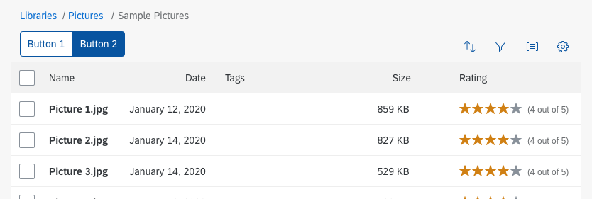
Breadcrumb with segmented buttons in hierarchy
- If you are using the breadcrumb with a tab pattern, replace the table title with the breadcrumb and display it under the tabs.
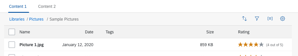
Breadcrumb with tabs
Related Links
Elements and Controls
- Responsive table (guidelines)
- Link (guidelines)
- Text (guidelines)
- Select (guidelines)
Implementation
- Responsive table (SAPUI5 samples)
- Responsive table (SAPUI5 API reference)
- Link (SAPUI5 samples)
- Link (SAPUI5 API reference)
- Text (SAPUI5 samples)
- Text (SAPUI5 API reference)
- Select (SAPUI5 samples)
- Select (SAPUI5 API reference)
 Your feedback has been sent to the SAP Fiori design team.