
- Latest SAPUI Version 1.124
- SAPUI5 Version 1.122
- SAPUI5 Version 1.120
- SAPUI5 Version 1.118
- SAPUI5 Version 1.116
- SAPUI5 Version 1.114
- SAPUI5 Version 1.112
- SAPUI5 Version 1.110
- SAPUI5 Version 1.108
- SAPUI5 Version 1.106
- SAPUI5 Version 1.104
- SAPUI5 Version 1.102
- SAPUI5 Version 1.100
- SAPUI5 Version 1.98
- SAPUI5 Version 1.96
- SAPUI5 Version 1.94
- SAPUI5 Version 1.92
- SAPUI5 Version 1.90
- SAPUI5 Version 1.88
- SAPUI5 Version 1.86
- SAPUI5 Version 1.84
- SAPUI5 Version 1.82
- SAPUI5 Version 1.80
- SAPUI5 Version 1.78
- SAPUI5 Version 1.76
- SAPUI5 Version 1.74
- SAPUI5 Version 1.72
- SAPUI5 Version 1.70
- SAPUI5 Version 1.68
- SAPUI5 Version 1.66
- SAPUI5 Version 1.64
- SAPUI5 Version 1.62
- SAPUI5 Version 1.60
- SAPUI5 Version 1.58
- SAPUI5 Version 1.56
- SAPUI5 Version 1.54
- SAPUI5 Version 1.52
- SAPUI5 Version 1.50
- SAPUI5 Version 1.48
- SAPUI5 Version 1.46
- SAPUI5 Version 1.44
- SAPUI5 Version 1.42
- SAPUI5 Version 1.40
- SAPUI5 Version 1.36
- SAPUI5 Version 1.34
- SAPUI5 Version 1.32
- SAPUI5 Version 1.30
- SAPUI5 Version 1.28
- SAPUI5 Version 1.26
- Latest SAPUI Version 1.124
- SAPUI5 Version 1.122
- SAPUI5 Version 1.120
- SAPUI5 Version 1.118
- SAPUI5 Version 1.116
- SAPUI5 Version 1.114
- SAPUI5 Version 1.112
- SAPUI5 Version 1.110
- SAPUI5 Version 1.108
- SAPUI5 Version 1.106
- SAPUI5 Version 1.104
- SAPUI5 Version 1.102
- SAPUI5 Version 1.100
- SAPUI5 Version 1.98
- SAPUI5 Version 1.96
- SAPUI5 Version 1.94
- SAPUI5 Version 1.92
- SAPUI5 Version 1.90
- SAPUI5 Version 1.88
- SAPUI5 Version 1.86
- SAPUI5 Version 1.84
- SAPUI5 Version 1.82
- SAPUI5 Version 1.80
- SAPUI5 Version 1.78
- SAPUI5 Version 1.76
- SAPUI5 Version 1.74
- SAPUI5 Version 1.72
- SAPUI5 Version 1.70
- SAPUI5 Version 1.68
- SAPUI5 Version 1.66
- SAPUI5 Version 1.64
- SAPUI5 Version 1.62
- SAPUI5 Version 1.60
- SAPUI5 Version 1.58
- SAPUI5 Version 1.56
- SAPUI5 Version 1.54
- SAPUI5 Version 1.52
- SAPUI5 Version 1.50
- SAPUI5 Version 1.48
- SAPUI5 Version 1.46
- SAPUI5 Version 1.44
- SAPUI5 Version 1.42
- SAPUI5 Version 1.40
- SAPUI5 Version 1.38
- SAPUI5 Version 1.36
- SAPUI5 Version 1.34
- SAPUI5 Version 1.32
- SAPUI5 Version 1.30
- SAPUI5 Version 1.28
- SAPUI5 Version 1.26
Full Screen Layout
sap.m.App
Intro
The full screen layout lets you exploit the full width of the screen. Use this layout for apps that need to display large amounts of data, large visualizations, or wide tables.
Avoid switching between full and split-screen layouts within an app. If your app has some screens that require the full width, and others that do not, try to stick to one layout.
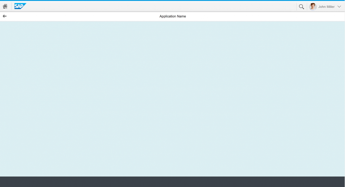
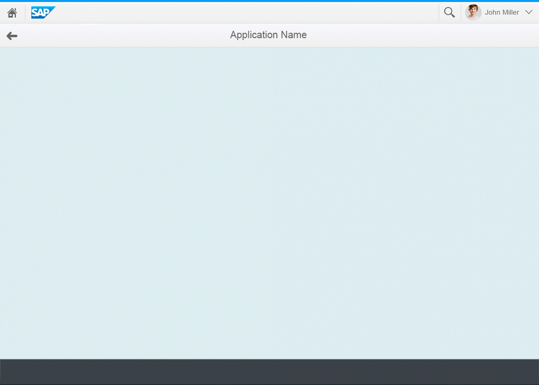
Full screen layout
Usage
Use the full screen layout if:
- Your app content requires the full width of the screen (for example, large tables, charts, or other types of visualization).
Do not use the full screen layout if:
- You only need to display a small amount of information. If you cannot avoid using the full screen layout, use letterboxing to mitigate the issue.
- You are not sure how to structure your information on the screen.
Structure
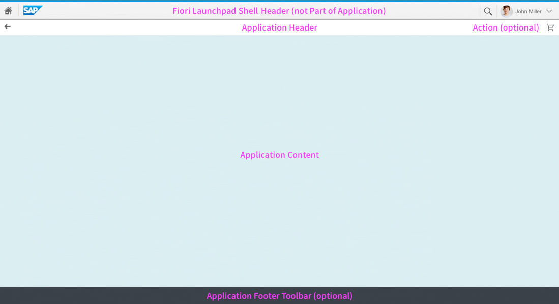
Full screen layout - Structure
Like all layouts, the full screen layout is embedded in the shell header of the SAP Fiori lauchpad. From the header, users have access to the launchpad services, including the home page, search, settings, and help. Apps are embedded in the shell and have little influence over its features.
The uppermost app element is the app header, with the back navigation, the app title, and one optional action. The app title reflects the title of the launch tile, such as Manage Products. The exceptions is the create page floorplan. From here, the user can drill down to subpages (line items). The title of the subpage shows, for example, <Sub item> (2 of 5).
The long scrollable page below contains the app content. You can either use one of the predefined floorplans, or create your own layout.
You can also add an app-specific footer toolbar at the bottom of the screen.
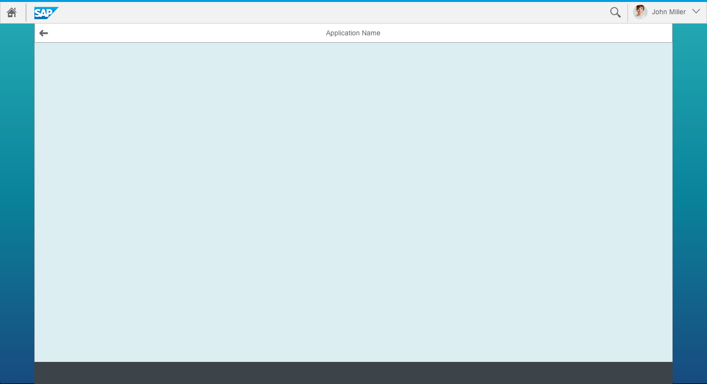
Full screen layout - Single scrolling area
The full screen layout has one single scrolling area.
Responsiveness
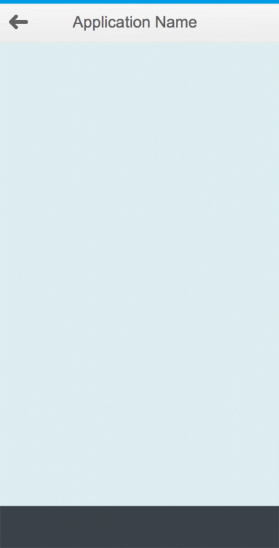
Full screen layout on a smartphone
Full screen layout on a tablet
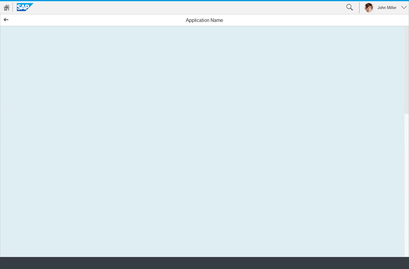
Full screen layout on a desktop
The full screen layout offers considerable freedom and flexibility. However, you also need to make sure that the app is responsive or adaptive across devices. The content is not adjusted automatically as it is for the split-screen layout. Instead, you need to select the appropriate layout and controls, and make any necessary adjustments yourself.
Full screen layout with letterboxing on a desktop device
Letterboxing means limiting the width of the content area to 1280 px. This prevents the app content from becoming too “stretched” on wide screens, and optimizes readability.
Examples
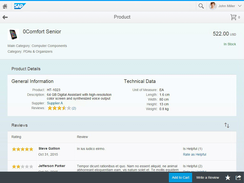
Reference App “Shop”
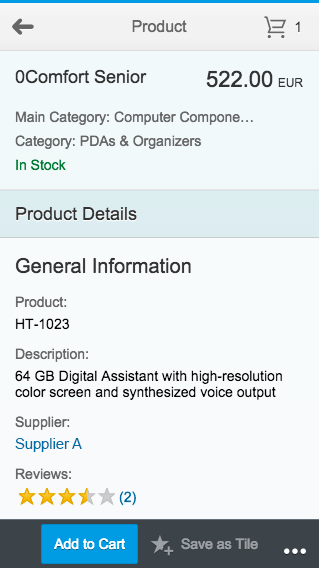
Reference app "Shop" on a smartphone
Reference app "Shop" on a tablet
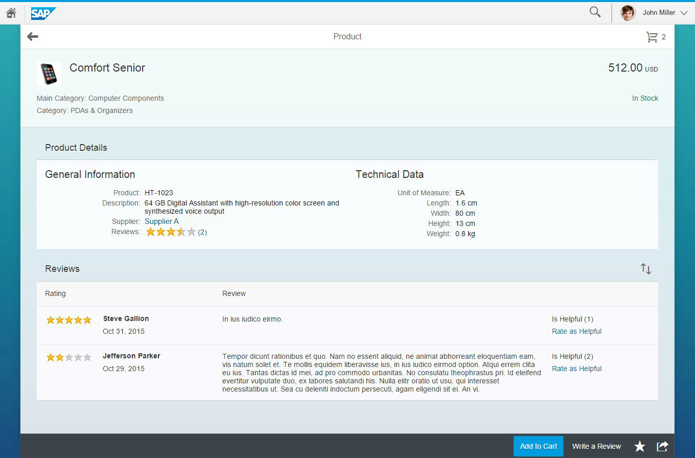
Reference app "Shop" on a desktop device
The product details screen of the reference app “Shop” shows how an app can make use of an object view floorplan in the full screen layout. This example highlights the responsive capabilities of the components used for an object view floorplan.
Resources
Want to dive deeper? Follow the links below to find out more about related controls, the SAPUI5 implementation, and the visual design.
 Your feedback has been sent to the SAP Fiori design team.