
- Latest SAPUI Version 1.124
- SAPUI5 Version 1.122
- SAPUI5 Version 1.120
- SAPUI5 Version 1.118
- SAPUI5 Version 1.116
- SAPUI5 Version 1.114
- SAPUI5 Version 1.112
- SAPUI5 Version 1.110
- SAPUI5 Version 1.108
- SAPUI5 Version 1.106
- SAPUI5 Version 1.104
- SAPUI5 Version 1.102
- SAPUI5 Version 1.100
- SAPUI5 Version 1.98
- SAPUI5 Version 1.96
- SAPUI5 Version 1.94
- SAPUI5 Version 1.92
- SAPUI5 Version 1.90
- SAPUI5 Version 1.88
- SAPUI5 Version 1.86
- SAPUI5 Version 1.84
- SAPUI5 Version 1.82
- SAPUI5 Version 1.80
- SAPUI5 Version 1.78
- SAPUI5 Version 1.76
- SAPUI5 Version 1.74
- SAPUI5 Version 1.72
- SAPUI5 Version 1.70
- SAPUI5 Version 1.68
- SAPUI5 Version 1.66
- SAPUI5 Version 1.64
- SAPUI5 Version 1.62
- SAPUI5 Version 1.60
- SAPUI5 Version 1.58
- SAPUI5 Version 1.56
- SAPUI5 Version 1.54
- SAPUI5 Version 1.52
- SAPUI5 Version 1.50
- SAPUI5 Version 1.48
- SAPUI5 Version 1.46
- SAPUI5 Version 1.44
- SAPUI5 Version 1.42
- SAPUI5 Version 1.40
- SAPUI5 Version 1.36
- SAPUI5 Version 1.34
- SAPUI5 Version 1.32
- SAPUI5 Version 1.30
- SAPUI5 Version 1.28
- SAPUI5 Version 1.26
- Latest SAPUI Version 1.124
- SAPUI5 Version 1.122
- SAPUI5 Version 1.120
- SAPUI5 Version 1.118
- SAPUI5 Version 1.116
- SAPUI5 Version 1.114
- SAPUI5 Version 1.112
- SAPUI5 Version 1.110
- SAPUI5 Version 1.108
- SAPUI5 Version 1.106
- SAPUI5 Version 1.104
- SAPUI5 Version 1.102
- SAPUI5 Version 1.100
- SAPUI5 Version 1.98
- SAPUI5 Version 1.96
- SAPUI5 Version 1.94
- SAPUI5 Version 1.92
- SAPUI5 Version 1.90
- SAPUI5 Version 1.88
- SAPUI5 Version 1.86
- SAPUI5 Version 1.84
- SAPUI5 Version 1.82
- SAPUI5 Version 1.80
- SAPUI5 Version 1.78
- SAPUI5 Version 1.76
- SAPUI5 Version 1.74
- SAPUI5 Version 1.72
- SAPUI5 Version 1.70
- SAPUI5 Version 1.68
- SAPUI5 Version 1.66
- SAPUI5 Version 1.64
- SAPUI5 Version 1.62
- SAPUI5 Version 1.60
- SAPUI5 Version 1.58
- SAPUI5 Version 1.56
- SAPUI5 Version 1.54
- SAPUI5 Version 1.52
- SAPUI5 Version 1.50
- SAPUI5 Version 1.48
- SAPUI5 Version 1.46
- SAPUI5 Version 1.44
- SAPUI5 Version 1.42
- SAPUI5 Version 1.40
- SAPUI5 Version 1.38
- SAPUI5 Version 1.36
- SAPUI5 Version 1.34
- SAPUI5 Version 1.32
- SAPUI5 Version 1.30
- SAPUI5 Version 1.28
- SAPUI5 Version 1.26
Planning Calendar
sap.m.PlanningCalendar
Intro
The planning calendar allows users to see different appointments at the same time and to create new events. It allows the user to display appointments for several objects, such as a team calendar, and compare them with each other.
Usage
Use the planning calendar if:
- You want to compare objects of the same type with each other over a period of time.
Do not use the planning calendar if:
- You want to show a calendar for one object and a detailed overview of appointments over a long time interval.
Responsiveness
In size S, the control provides pop-in behavior, which allows the user to see as many appointments as possible and to connect them with the corresponding object. If the toolbar contains too many actions for the space available, the overflow icon (…) appears.
The interval section displaying the hours, days, and months is responsive and shows 12 values in large size, 8 values in medium size, and 6 values in small size. You can override this behavior, but you should then check that the responsiveness is still working.
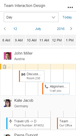
Size S
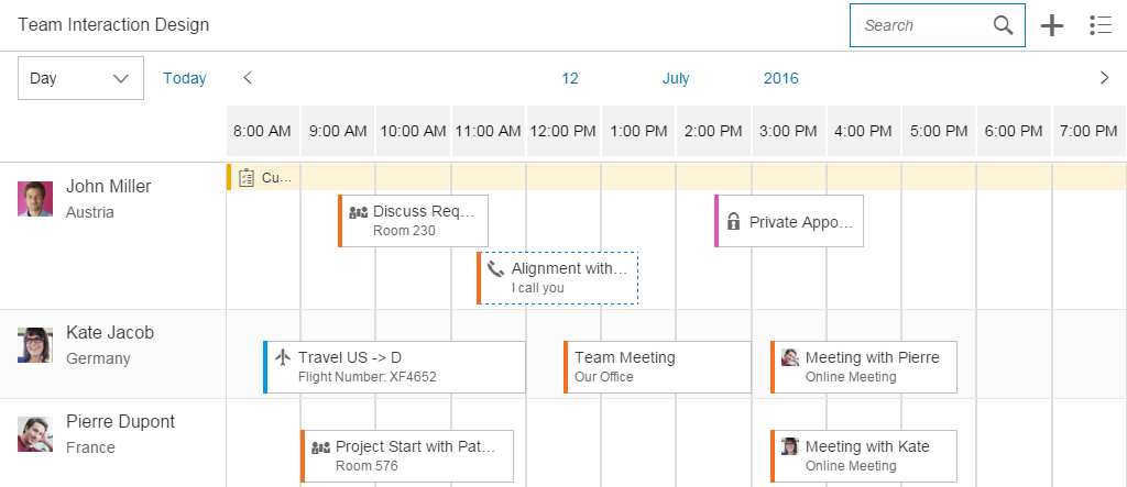
Size M

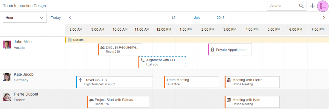
Size L
Types
You can define what size of interval the calendar should show, and whether multi selection should be possible. Additionally, the row header and the interval appointments are optional.
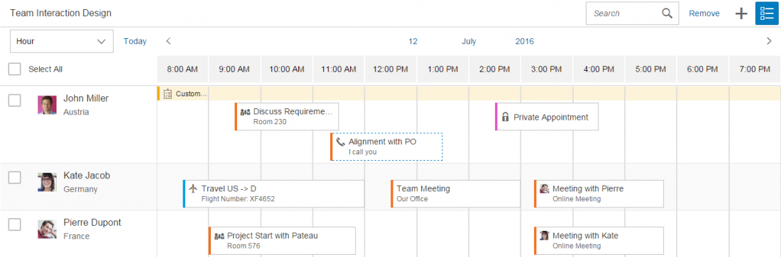
The control allows multi-select mode to be shown for the list items. This can be used, for example, to delete multiple objects from the view.
The app development team must decide whether to show the planning calendar with or without multi-select mode, or whether users should be able to switch between the two modes. Hiding the interval appointments of every object is optional.
The example on the right shows what the interaction looks like if the user can trigger multi-select mode. When the user clicks or taps the button, a checkbox appears next to each list item and a Select All option is shown. Additional actions can appear or disappear in the calendar toolbar.
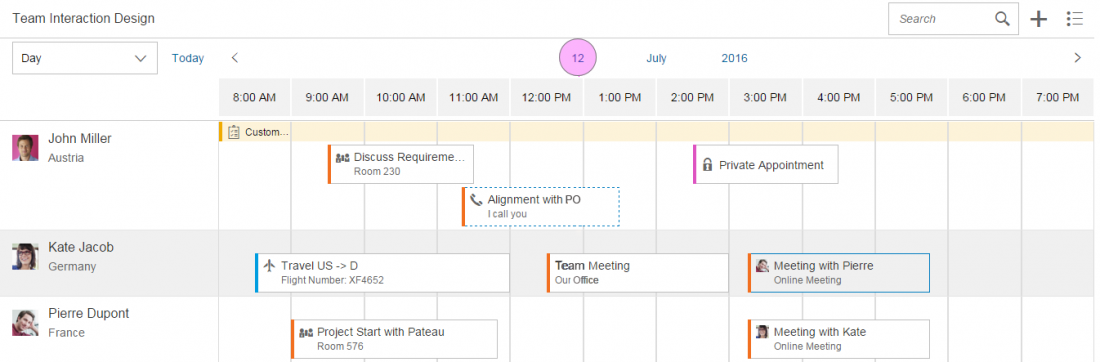
The planning calendar can also be shown in single-select mode. In this case, the row header disappears and only the appointments are visible. It can be used to show the calendar of one object. Note that the control was built mainly to compare time slots of different objects. For this reason, the time axis is shown horizontally and, depending on the interval, the appointments are truncated.
Components
This section describes the various components of the planning calendar.
The control consists of different parts:
- Toolbar
- Header
- Calendar view
- List item
- Row header
- Row
- Appointment
- Interval appointment

Parts of the planning calendar
1. Toolbar
The toolbar is optional and can contain a title as well as app-specific and generic actions.
If you have actions in the toolbar, we recommend that you use a title to describe the purpose of the planning calendar. For more information, check out the toolbar guideline article.
The generic actions are as follows:
- Search
- Add appointment (icon: add)
- Add new contact (icon: add-contact)
- Multi-select mode (icon: multi-select)
- Legend (icon: legend)
- Settings (icon: action-settings)
- Full screen (icon: full-screen/exit-full-screen)
2. Header
The calendar header comprises the left part, which includes an optional switch to see the calendar in a different view (day, month, year), and the right part, which contains the calendar view.
3. Calendar view
The calendar view defines the granularity of the appointments shown. You can decide what kind of view (hours, days, or months) they need and how many values are shown. There is a default value for the number of values to be shown. App developers can change this value, but they should then ensure that the app is still responsive.
Users can also navigate to the next or previous view, and switch easily to another year, month, or day.
4. List item
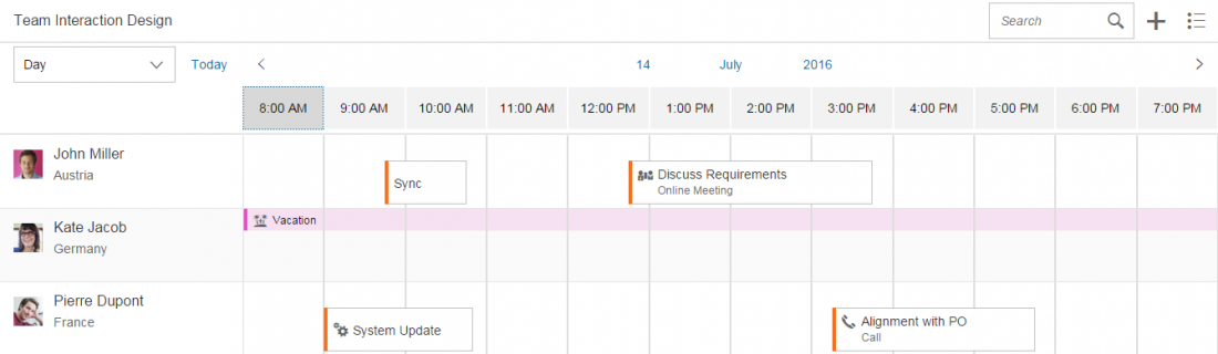
The list item contains the row header, row, appointments, and interval appointments. Each row can show different working and non-working days. This is useful if users want to view calendars from different countries that have different weekends.
5. Row header
This identifies the object for which the appointments are shown. The row header pops in if there is not enough space. It can contain a picture or icon, a title, and a subtitle.
6. Row
All appointments that appear for an object are shown here.
7. Appointment
Appointments enable an icon or picture, a title, and a subtitle to be shown. If events appear simultaneously, they are shown under each other. App developers can define the colors of different event types, and events can be shown as tentative. The control can register the click event, and the app development team must define what happens next.
If the view changes and there are too many small appointments at one time, an aggregation is shown. Otherwise, the click/touch area would be too small.
8. Interval appointment
Each row can also have interval appointments. These are smaller and always appear at the top of the row. They can be used to show events that last for a prolonged period of time, such as vacations or workshops.
Behavior and Interaction (incl. Gestures)
To create an event, the user must trigger an action by clicking the plus ( ) icon in the toolbar.
To see the details of an appointment, the user selects the appointment, thus triggering a click event. The app development team must define what kind of information is then shown.
A multi-select toggle can also be provided in the toolbar. This can be used, for example, to select multiple people to delete them from the planning calendar.
Various tooltips can be shown, but you should not use them to show additional information because users cannot access this functionality on touch devices.
Depending on the current time interval, appointments can become truncated. However, this should not be an issue because the main use case is to see whether there is a free time slot. Additionally, the user can click or tap the appointment to see the details.
1. Switch
The switch is optional and allows users to switch between different views. For example, a user can get an overview of a whole year by selecting the year view.
The average length of appointments and the use case should decide which view is the most useful.
2. Today action
The user can trigger this action to go back to the current date.
3. Back and forward navigation
The arrows allow the user to navigate to the next or previous interval.
4. Day switch
The day switch is only available if the day view is selected. It enables the user to navigate to a different day.
5. Month switch
The month switch is available if the day or month view is selected. It allows the user to switch to a different month.
6. Year switch
Day, month, and year views enable the user to switch between different years.
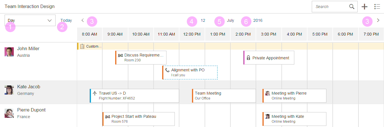
Navigation parts
Interaction Flow for Switching Days
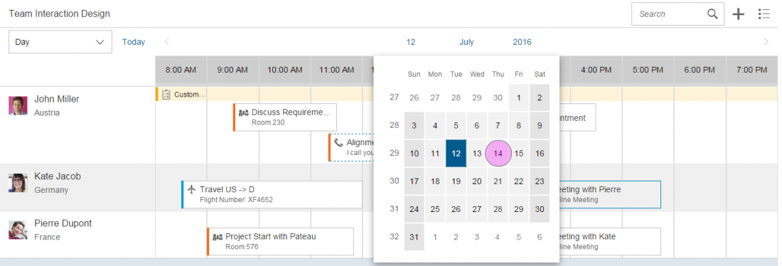
There are two ways in which the user can switch to a different day:
- Click or tap the arrows to navigate to the next or previous interval.
- Click or tap the current day to open the date picker. When the user selects a day, the picker closes and navigates the user to the selected value.
Resources
Want to dive deeper? Follow the links below to find out more about related controls, the SAPUI5 implementation, and the visual design.
Elements and Controls
- Overview Toolbar (guidelines)
- Calendar Date Interval (guidelines)
- Date Picker (guidelines)
Implementation
- Planning Calendar (SAPUI5 test suite)
- Planning Calendar Row (SAPUI5 API reference)
- Planning Calendar View (SAPUI5 API reference)
 Your feedback has been sent to the SAP Fiori design team.