
- Latest SAPUI Version 1.124
- SAPUI5 Version 1.122
- SAPUI5 Version 1.120
- SAPUI5 Version 1.118
- SAPUI5 Version 1.116
- SAPUI5 Version 1.114
- SAPUI5 Version 1.112
- SAPUI5 Version 1.110
- SAPUI5 Version 1.108
- SAPUI5 Version 1.106
- SAPUI5 Version 1.104
- SAPUI5 Version 1.102
- SAPUI5 Version 1.100
- SAPUI5 Version 1.98
- SAPUI5 Version 1.96
- SAPUI5 Version 1.94
- SAPUI5 Version 1.92
- SAPUI5 Version 1.90
- SAPUI5 Version 1.88
- SAPUI5 Version 1.86
- SAPUI5 Version 1.84
- SAPUI5 Version 1.82
- SAPUI5 Version 1.80
- SAPUI5 Version 1.78
- SAPUI5 Version 1.76
- SAPUI5 Version 1.74
- SAPUI5 Version 1.72
- SAPUI5 Version 1.70
- SAPUI5 Version 1.68
- SAPUI5 Version 1.66
- SAPUI5 Version 1.64
- SAPUI5 Version 1.62
- SAPUI5 Version 1.60
- SAPUI5 Version 1.58
- SAPUI5 Version 1.56
- SAPUI5 Version 1.54
- SAPUI5 Version 1.52
- SAPUI5 Version 1.50
- SAPUI5 Version 1.48
- SAPUI5 Version 1.46
- SAPUI5 Version 1.44
- SAPUI5 Version 1.42
- SAPUI5 Version 1.40
- SAPUI5 Version 1.36
- SAPUI5 Version 1.34
- SAPUI5 Version 1.32
- SAPUI5 Version 1.30
- SAPUI5 Version 1.28
- SAPUI5 Version 1.26
- Latest SAPUI Version 1.124
- SAPUI5 Version 1.122
- SAPUI5 Version 1.120
- SAPUI5 Version 1.118
- SAPUI5 Version 1.116
- SAPUI5 Version 1.114
- SAPUI5 Version 1.112
- SAPUI5 Version 1.110
- SAPUI5 Version 1.108
- SAPUI5 Version 1.106
- SAPUI5 Version 1.104
- SAPUI5 Version 1.102
- SAPUI5 Version 1.100
- SAPUI5 Version 1.98
- SAPUI5 Version 1.96
- SAPUI5 Version 1.94
- SAPUI5 Version 1.92
- SAPUI5 Version 1.90
- SAPUI5 Version 1.88
- SAPUI5 Version 1.86
- SAPUI5 Version 1.84
- SAPUI5 Version 1.82
- SAPUI5 Version 1.80
- SAPUI5 Version 1.78
- SAPUI5 Version 1.76
- SAPUI5 Version 1.74
- SAPUI5 Version 1.72
- SAPUI5 Version 1.70
- SAPUI5 Version 1.68
- SAPUI5 Version 1.66
- SAPUI5 Version 1.64
- SAPUI5 Version 1.62
- SAPUI5 Version 1.60
- SAPUI5 Version 1.58
- SAPUI5 Version 1.56
- SAPUI5 Version 1.54
- SAPUI5 Version 1.52
- SAPUI5 Version 1.50
- SAPUI5 Version 1.48
- SAPUI5 Version 1.46
- SAPUI5 Version 1.44
- SAPUI5 Version 1.42
- SAPUI5 Version 1.40
- SAPUI5 Version 1.38
- SAPUI5 Version 1.36
- SAPUI5 Version 1.34
- SAPUI5 Version 1.32
- SAPUI5 Version 1.30
- SAPUI5 Version 1.28
- SAPUI5 Version 1.26
Analytical Card
Intro
The analytical card is used for data visualization. It consist of two areas: a header area that displays the aggregated value of a key measure (KPI), and a chart area that displays a visual representation of the data. It is a single object card and does not contain a footer area. The analytical card can only be used in the overview page (OVP).
The KPI header area includes:
- Title (mandatory)
- A KPI with the respective unit (mandatory)
- A subtitle (optional)
- The subtitle can show the filter criteria used for the chart, and can contain up to two lines of text
- A percentage (optional)
- A triangle indicator (optional, showing upward or downward trend)
The KPI itself adopts the semantic colors red (negative), green (positive), or gray (neutral).
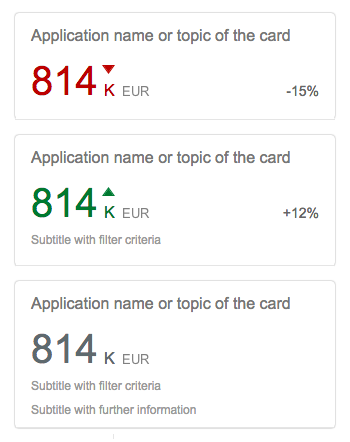
KPI header
Responsiveness
The analytical card has a uniform horizontal width of either 20 or 25 rem, depending on the screen size. The vertical height is flexible. The VizFrame charts within the cards are fully responsive.
Types
There are six chart types currently supported by the analytical card:
- Line
- Bubble
- Column
- Stacked column
- Vertical bullet
- Donut
In general, the line chart is the most efficient chart for showing the evolution of a trend over a period of time.
- Avoid showing more than four lines in the same card.
- When showing more than one line in the chart, different units should not be displayed. All the lines should use the same unit, such as “Euro”.
Use the line chart if…
- You want to emphasize the evolution of a trend over a period of time.
- You want to visualize data that contains an intrinsic order, such as age, a range, or a rating (but excluding time). In this case, there is an idea of a progression or trend, and the best way to represent these values is to use the horizontal axis.
Note: For time series, we recommend using the time axis. See the section Guidelines (Time Axis) in this article for more information.
Do not use the line chart if…
- You want to emphasize the values themselves. Use a column chart instead.
- The data does not contain an intrinsic order.
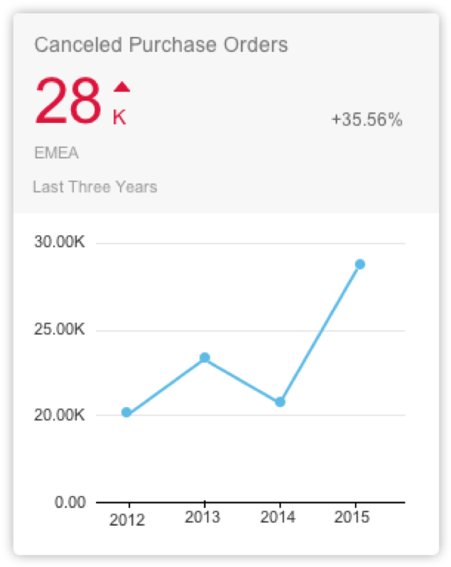
Analytical card with line chart
A bubble chart is a type of chart that displays the correlation between three sets of numerical values. One set is represented in the horizontal axis, another set is represented in the vertical axis and the third set is encoded in the size of the bubbles.
We recommend showing only one or two series. Because series are represented by specific bubble colors, having too many series/colors can make the chart hard to read. The sizes of the bubbles are determined by the values in the third data series. The measure that is represented in the bubble size should be explained in the title.
Color
- If the goal is to isolate outliers within a cloud of other bubbles, use the same color for all bubbles.
- If the goal is to group bubbles that have the same characteristic, use one color per group. Warning: Too many colors can make the chart hard to read.
- If the goal is to compare bubbles individually, then use one color per bubble. Warning: Use only this option if there are very few bubbles. Too many bubbles can make the chart hard to read.
Use the bubble chart if…
- You need a rough approximation of the values encoded in the bubble size.
- You want to represent data with three dimensions on a 2D chart.
- You want to compare and show the relationships between labeled/categorized circles, by the use of positioning and proportions.
- You want to display the correlation between three sets of numerical values.
Do not use the bubble chart if…
- You need to represent information only with two dimensions.
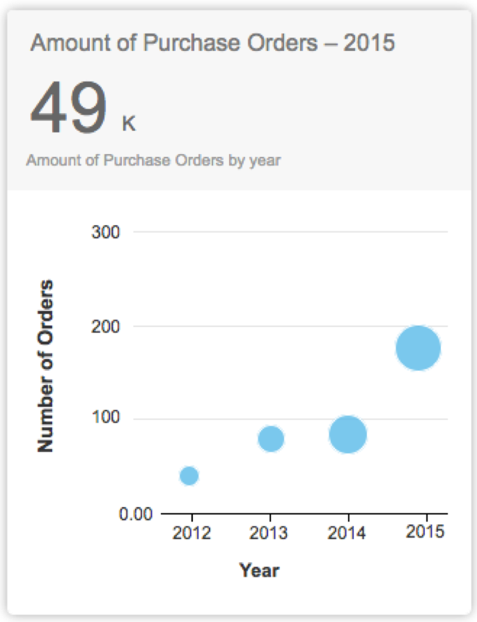
Analytical card with bubble chart
Column charts are used to compare multiple values over time or over values containing an intrinsic order (such as age).
Columns are clustered side-by-side along the horizontal axis and are color-coded by series.
- We recommend using no more than two series and a maximum of four category items.
- If you want to show the trend over time of two series, you can use the line chart with two lines instead of two series of columns.
Use the column chart if…
- Category items represent a time series. The natural orientation for time is from left to right.
- Category items contain an intrinsic order. For example, age, range, and ranking.
- You want to emphasize the values themselves rather than the trends.
Do not use the column chart if…
- Your data is not related to a time category or to a category with an intrinsic order.
- You want to emphasize the evolution of the trend over a period of time. Use the line chart instead.
Note: For time series, we recommend using the time axis. See the section Guidelines (Time Axis) in this article for more information.
For more detailed information, see column chart.

Analytical card with column chart
This type of visualization depicts items stacked on top of one other in columns, with the item categories differentiated by colored bars or strips.
This chart works only for time series and categories with an intrinsic order.
Use the stacked column chart if…
- You want to display variation of the sum of measures over a period of time.
- The sum of the values is as important as the individual items.
Do not use the stacked column chart if…
- Accuracy or comparisons are of primary importance. In this case, a line graph might be the better option.
Note: For time series, we recommend using the time axis. See the section Guidelines (Time Axis) in this article for more information.
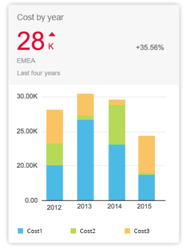
Analytical card with stacked column chart
Vertical Bullet Chart
The bullet chart is used to compare a primary value to a secondary over time or over a category containing an intrinsic order, such as age, range, or ranking.
The bullet chart supports primary values, comparison values and additional values. For more information, see bullet chart.
Use the bullet chart if…
- You want to compare a primary value to a secondary value using a reference point. For example, if you want to compare actual and planned costs per quarter.
- The category items represent a time series. The natural orientation for time is from left to right.
- The category items contain an intrinsic order.
Do not use the bullet chart if…
- Your data does not contain an intrinsic order.
- You have only one series of data.
- There is no data series that act as a reference point for the other data series.
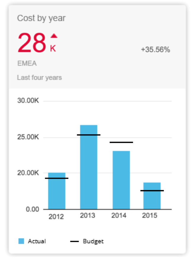
Analytical card with bullet chart
The donut chart is used for representing parts of a whole, and the whole should always represent 100%. The data is displayed in rings, where each ring represents a data series.
We recommend using a maximum of four sections in the donut chart.
Use the donut chart if…
-
You want to visualize the part to whole as a percentage.
-
You have one or more category items that you want to plot.
Do not use the donut chart if…
- You want to plot negative or zero values.
- You have more than four categories or sections.
- You want to compare data over time. You can use the column chart, line chart, stacked column chart, or bullet chart instead.

Analytical card with donut chart
Behavior and Interaction
In the analytical card, sections of charts can be tapped or clicked in order to display additional information via navigation to a more detailed screen. It is up to the app developer to provide meaningful navigation. For example, tapping or clicking on a section of a donut chart allows the user to navigate to an object page for more information.
Selecting data points individually is the only interaction that is provided within the charts of the card. Otherwise, clicking or tapping a blank area does not trigger any action.
Guidelines
Number of Data Points
There is no technical limitation regarding the number of data points, but be aware that the user experience can be very degraded when there are too many data points. For example, labels in the horizontal axis will be displayed at 450. In the bubble chart, too much bubbles might lead to unreadable information.
Axis Title
The axis titles are always hidden, except in the bubble chart. Use the title or the subtitle of the analytical card to convey this information. For example, Revenue by quarter conveys that the y-axis represents the revenue and x-axis represents the quarters.
Axis Labels
Try to avoid displaying labels at 450. Use abbreviations for dates, such as Jan or Feb for months, or Q1 or Q2 for quarters.
Legend
Colors are automatically assigned and cannot be customized.
Resources
Want to dive deeper? Follow the links below to find out more about related controls, the SAPUI5 implementation, and the visual design.
 Your feedback has been sent to the SAP Fiori design team.